Project in R – Uber Data Analysis Project
Expert-led Online Courses: Elevate Your Skills, Get ready for Future - Enroll Now!
Welcome to part 2 of R and Data Science Projects designed by DataFlair. In our series of R projects, we are trying to use all the concepts related to Machine learning, AI and Data Science.
We recommend you to follow all the steps given in the projects so that you will master the technology rapidly. In today’s R project, we will analyze the Uber Pickups in New York City dataset. This is more of a data visualization project that will guide you towards using the ggplot2 library for understanding the data and for developing an intuition for understanding the customers who avail the trips. So, before we start, take a quick revision to data visualization concepts.
R Data Science Project – Uber Data Analysis
Talking about our Uber data analysis project, data storytelling is an important component of Machine Learning through which companies are able to understand the background of various operations. With the help of visualization, companies can avail the benefit of understanding the complex data and gain insights that would help them to craft decisions. You will learn how to implement the ggplot2 on the Uber Pickups dataset and at the end, master the art of data visualization in R.
In this project, we will uncover the Uber pickups pattern of New York City at different temporal intervals. This will help not only in analyzing the general trends in the amount of rides, but also in analyzing the shape of the curve, for example, how many rides were given at particular day of the week or particular hour of the day.
With such patterns, it is possible not only to reveal periods with the increased demand for Uber but also to define how the demand changes during the day or month and even which of the bases is the most popular. They are essential in enhancing market strategies towards operations and customer relations.
You can download the dataset utilized in this project here – Uber Dataset
1. Importing the Essential Packages
In the first step of our R project, we will import the essential packages that we will use in this uber data analysis project. Some of the important libraries of R that we will use are –
- ggplot2
This is the backbone of this project. ggplot2 is the most popular data visualization library that is most widely used for creating aesthetic visualization plots.
- ggthemes
This is more of an add-on to our main ggplot2 library. With this, we can create better create extra themes and scales with the mainstream ggplot2 package.
- lubridate
Our dataset involves various time-frames. In order to understand our data in separate time categories, we will make use of the lubridate package.
- dplyr
This package is the lingua franca of data manipulation in R.
- tidyr
This package will help you to tidy your data. The basic principle of tidyr is to tidy the columns where each variable is present in a column, each observation is represented by a row and each value depicts a cell.
- DT
With the help of this package, we will be able to interface with the JavaScript Library called – Datatables.
- scales
With the help of graphical scales, we can automatically map the data to the correct scales with well-placed axes and legends.
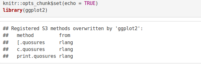
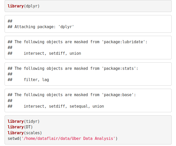
library(ggplot2)
library(ggthemes)
library(lubridate)
library(dplyr)
library(tidyr)
library(DT)
library(scales)
Input Screenshot 1:
Input Screenshot 2:
The Input Screenshot 3:
2. Creating vector of colors to be implemented in our plots
In this step of data science project, we will create a vector of our colors that will be included in our plotting functions. You can also select your own set of colors.
Code:
colors = c(""#CC1011", "#665555", "#05a399", "#cfcaca", "#f5e840", "#0683c9", "#e075b0"")Input Screenshot 4:

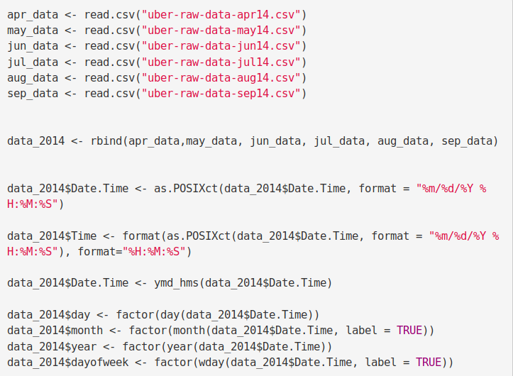
3. Reading the Data into their designated variables
Now, we will read several csv files that contain the data from April 2014 to September 2014. We will store these in corresponding data frames like apr_data, may_data, etc. After we have read the files, we will combine all of this data into a single dataframe called ‘data_2014’.
To master this R Uber data analysis project, you need to know everything related to data frames in R
Then, in the next step, we will perform the appropriate formatting of Date.Time column. Then, we will proceed to create factors of time objects like day, month, year etc.
Code:
apr_data <- read.csv("uber-raw-data-apr14.csv")
may_data <- read.csv("uber-raw-data-may14.csv")
jun_data <- read.csv("uber-raw-data-jun14.csv")
jul_data <- read.csv("uber-raw-data-jul14.csv")
aug_data <- read.csv("uber-raw-data-aug14.csv")
sep_data <- read.csv("uber-raw-data-sep14.csv")

data_2014 <- rbind(apr_data,may_data, jun_data, jul_data, aug_data, sep_data)

data_2014$Date.Time <- as.POSIXct(data_2014$Date.Time, format = "%m/%d/%Y %H:%M:%S")

data_2014$Time <- format(as.POSIXct(data_2014$Date.Time, format = "%m/%d/%Y %H:%M:%S"), format="%H:%M:%S")

data_2014$Date.Time <- ymd_hms(data_2014$Date.Time)

data_2014$day <- factor(day(data_2014$Date.Time))
data_2014$month <- factor(month(data_2014$Date.Time, label = TRUE))
data_2014$year <- factor(year(data_2014$Date.Time))
data_2014$dayofweek <- factor(wday(data_2014$Date.Time, label = TRUE))
Input Screenshot 5:
Code:
data_2014$hour <- factor(hour(hms(data_2014$Time)))
data_2014$minute <- factor(minute(hms(data_2014$Time)))
data_2014$second <- factor(second(hms(data_2014$Time)))
Input Screenshot 6:

Plotting the trips by the hours in a day
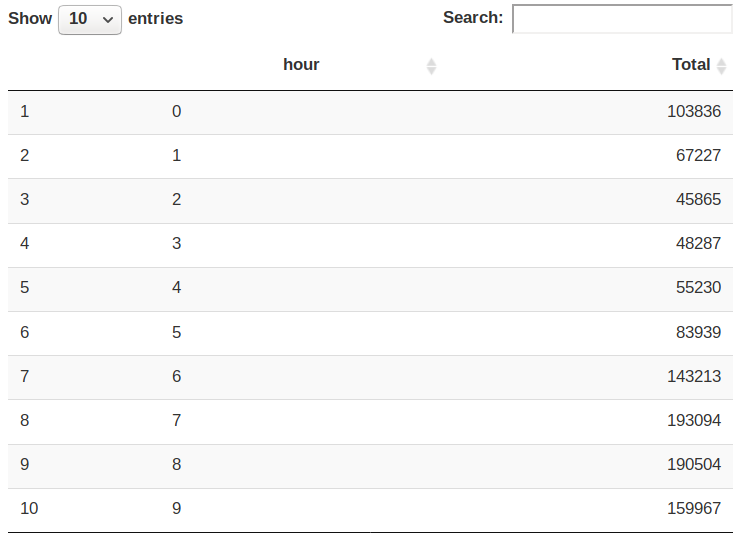
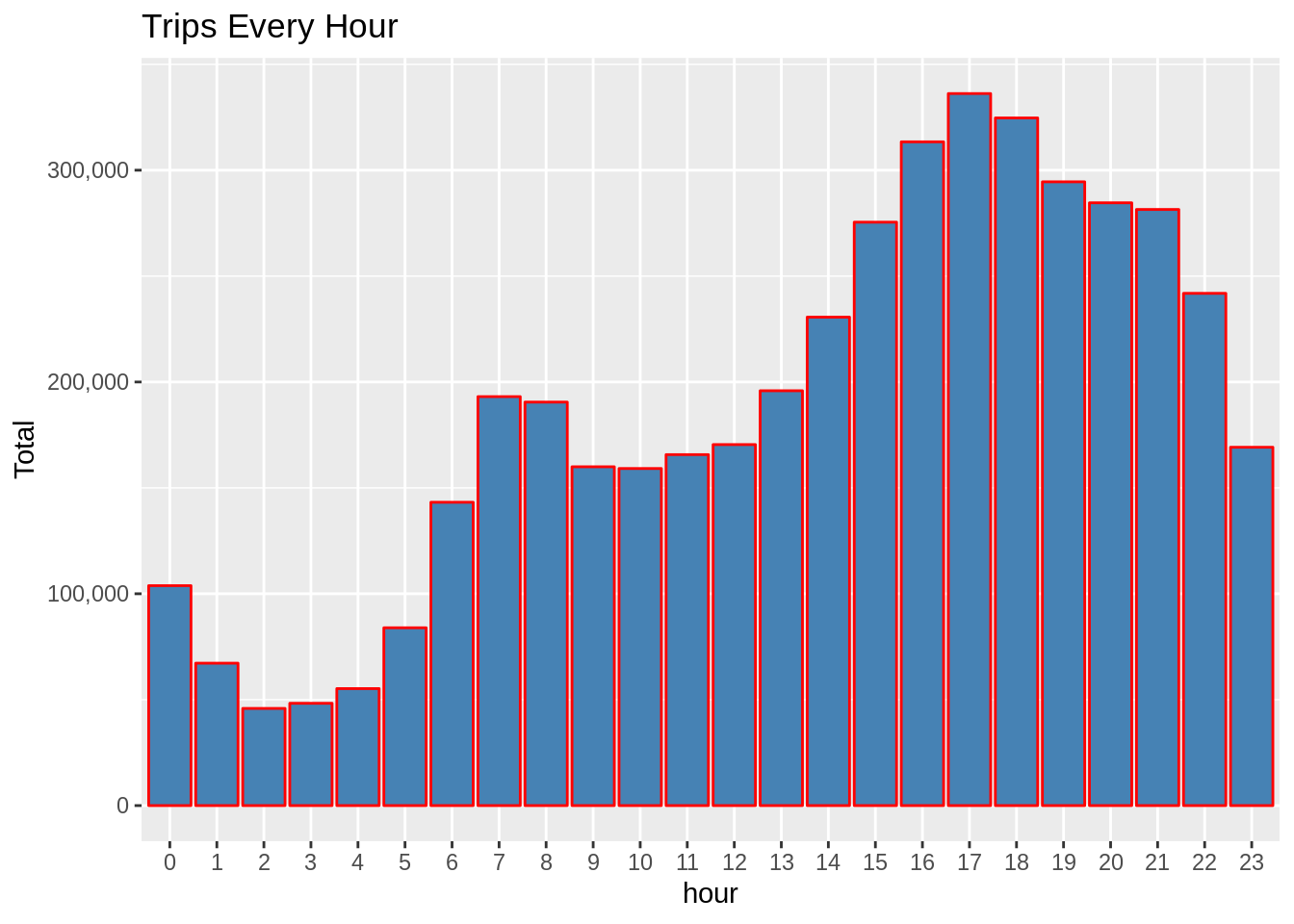
In the next step or R project, we will use the ggplot function to plot the number of trips that the passengers had made in a day. We will also use dplyr to aggregate our data. In the resulting visualizations, we can understand how the number of passengers fares throughout the day. We observe that the number of trips are higher in the evening around 5:00 and 6:00 PM.
hour_data <- data_2014 %>%
           group_by(hour) %>%
               dplyr::summarize(Total = n())
datatable(hour_data)
Input Screenshot 7:
Output Screenshot:
Code:
ggplot(hour_data, aes(hour, Total)) +
geom_bar( stat = "identity", fill = "steelblue", color = "red") +
ggtitle("Trips Every Hour") +
theme(legend.position = "none") +
scale_y_continuous(labels = comma)
month_hour <- data_2014 %>%
group_by(month, hour) %>%
dplyr::summarize(Total = n())
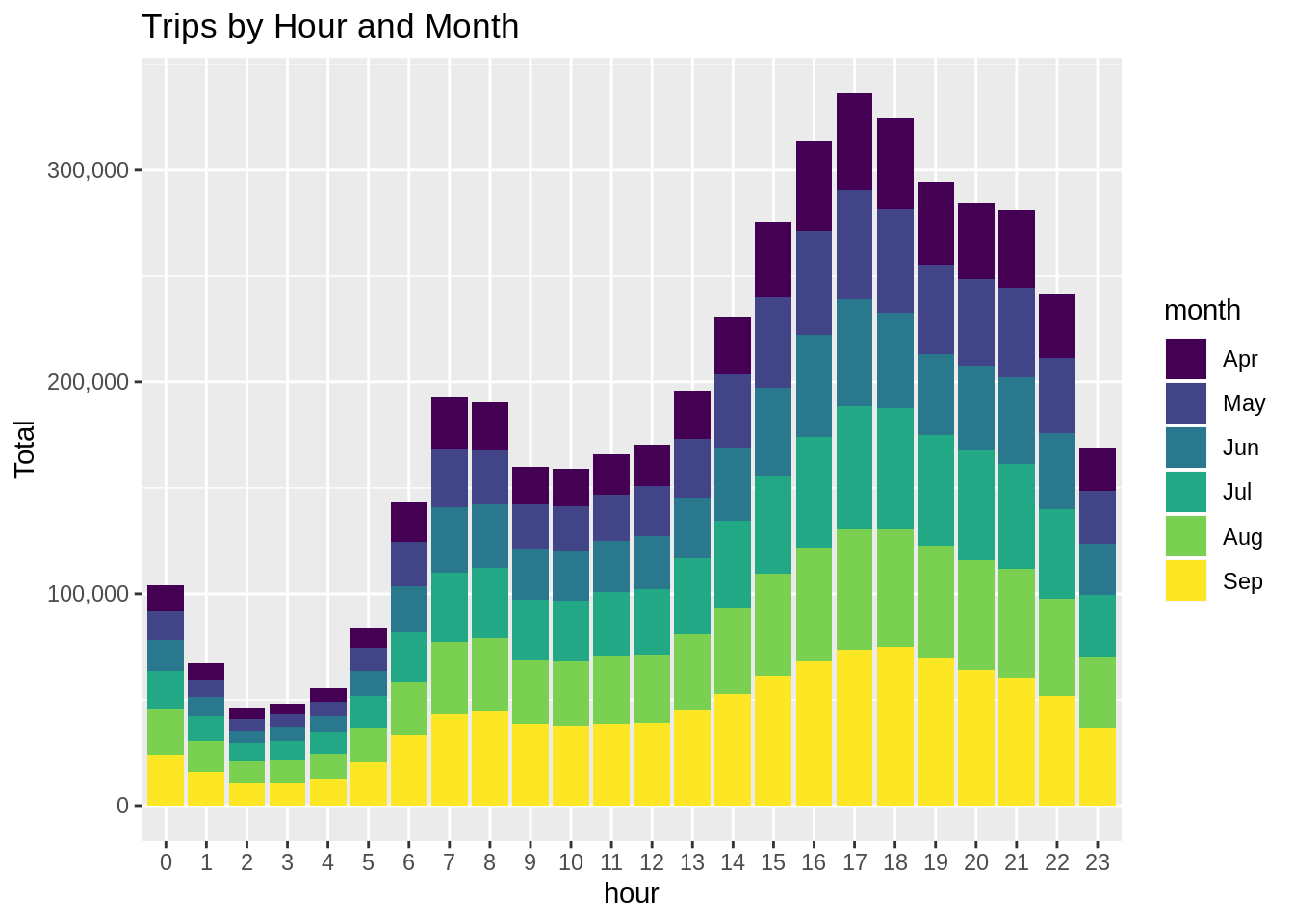
ggplot(month_hour, aes(hour, Total, fill = month)) +
geom_bar( stat = "identity") +
ggtitle("Trips by Hour and Month") +
scale_y_continuous(labels = comma)Input Screenshot 8:
Input Screenshot 9:
Output:
Output:
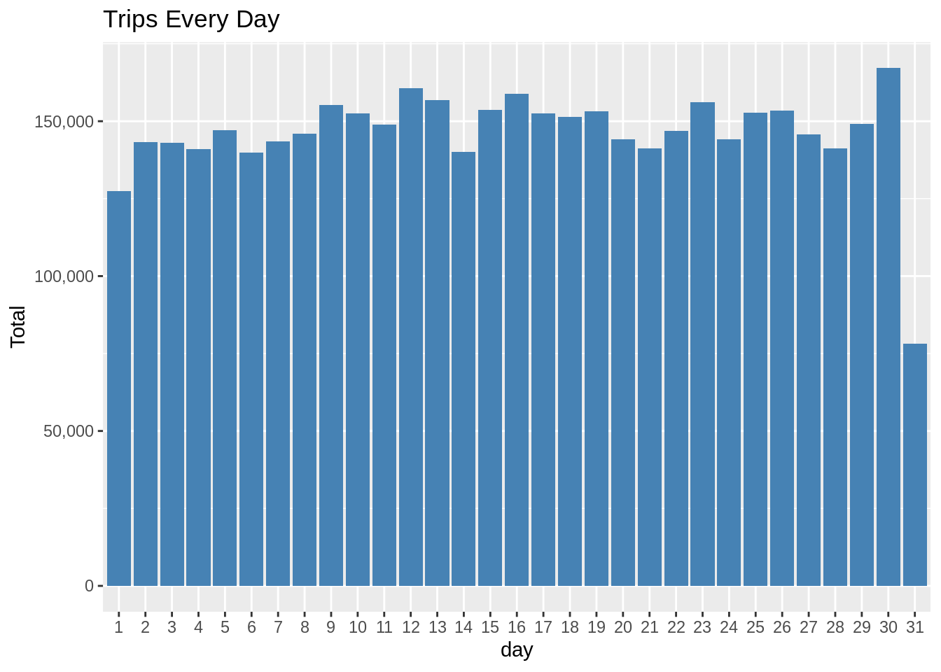
Plotting data by trips during every day of the month
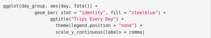
In this section of DataFlair R project, we will learn how to plot our data based on every day of the month. We observe from the resulting visualization that 30th of the month had the highest trips in the year which is mostly contributed by the month of April.
Code:
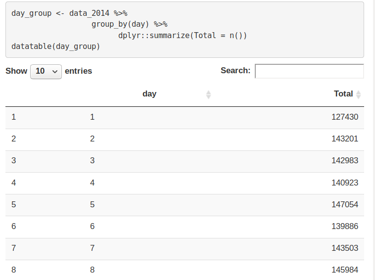
day_group <- data_2014 %>%
          group_by(day) %>%
             dplyr::summarize(Total = n())
datatable(day_group)
Output Screenshot:
Code:
ggplot(day_group, aes(day, Total)) +
        geom_bar( stat = "identity", fill = "steelblue") +
           ggtitle("Trips Every Day") +
            theme(legend.position = "none") +
            scale_y_continuous(labels = comma)
Input Screenshot 10:
Output:
Code:
day_month_group <- data_2014 %>%
         group_by(month, day) %>%
             dplyr::summarize(Total = n())

ggplot(day_month_group, aes(day, Total, fill = month)) +
        geom_bar( stat = "identity") +
           ggtitle("Trips by Day and Month") +
            scale_y_continuous(labels = comma) +
            scale_fill_manual(values = colors)
Input Screenshot 11:
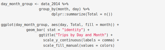
Output:
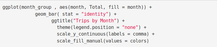
Number of Trips taking place during months in a year
In this section, we will visualize the number of trips that are taking place each month of the year. In the output visualization, we observe that most trips were made during the month of September. Furthermore, we also obtain visual reports of the number of trips that were made on every day of the week.
Code:
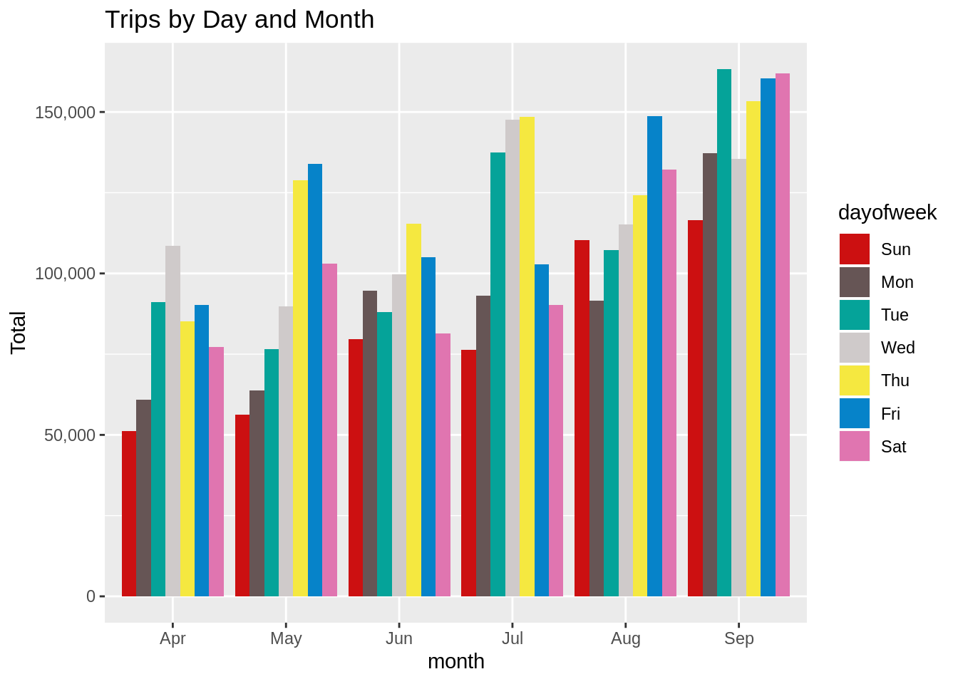
month_group <- data_2014 %>%
          group_by(month) %>%
             dplyr::summarize(Total = n())
datatable(month_group)
Output Screenshot: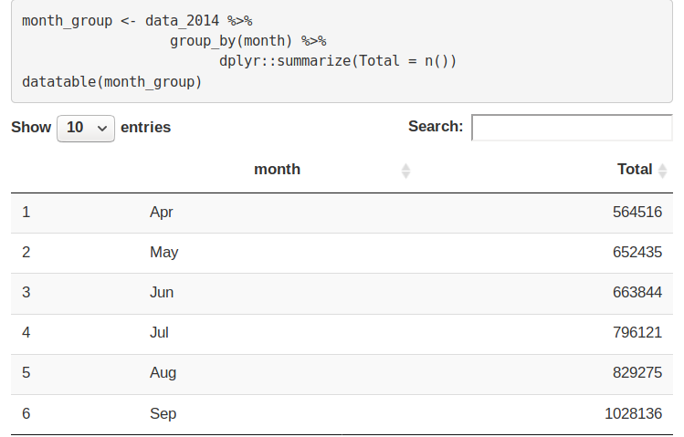
Code:
ggplot( , aes(month, Total, fill = month)) +
        geom_bar( stat = "identity") +
           ggtitle("Trips by Month") +
            theme(legend.position = "none") +
            scale_y_continuous(labels = comma) +
            scale_fill_manual(values = colors)
Input Screenshot 12:
Output: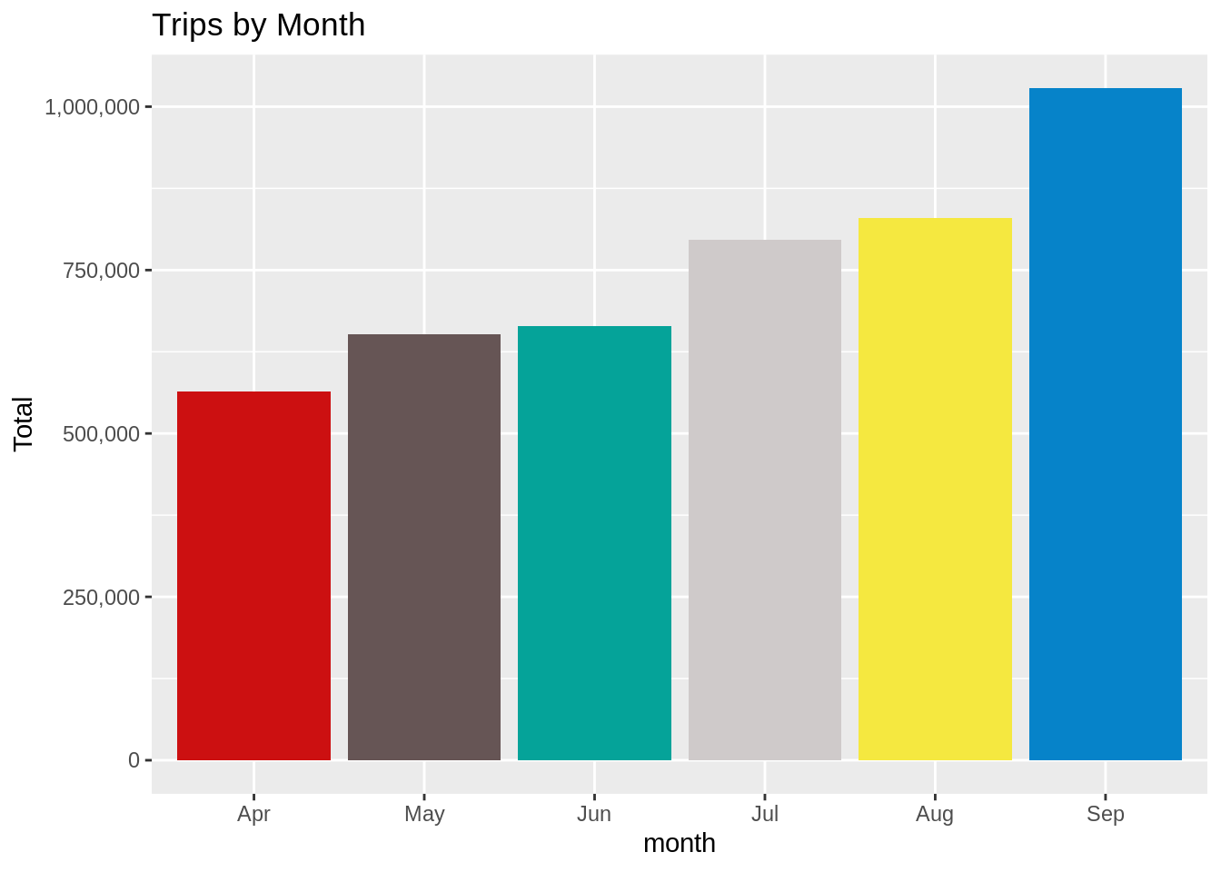
month_weekday <- data_2014 %>%
         group_by(month, dayofweek) %>%
             dplyr::summarize(Total = n())

ggplot(month_weekday, aes(month, Total, fill = dayofweek)) +
       geom_bar( stat = "identity", position = "dodge") +
          ggtitle("Trips by Day and Month") +
           scale_y_continuous(labels = comma) +
           scale_fill_manual(values = colors)
Input Screenshot 13:

Output:

Finding out the number of Trips by bases
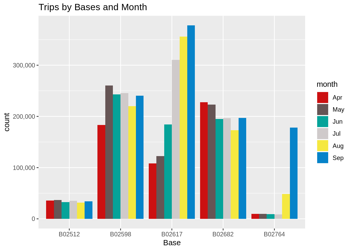
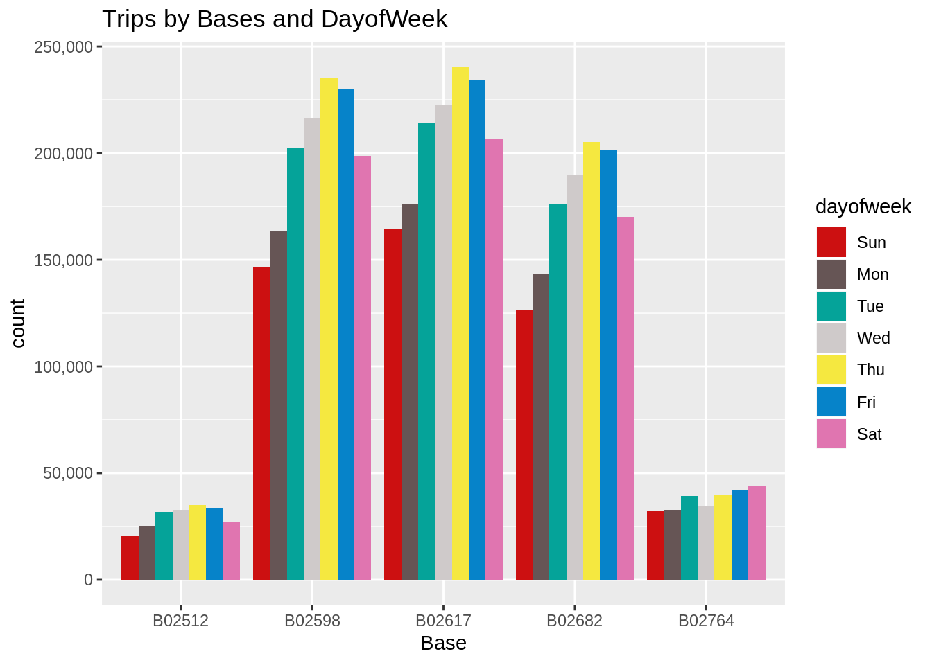
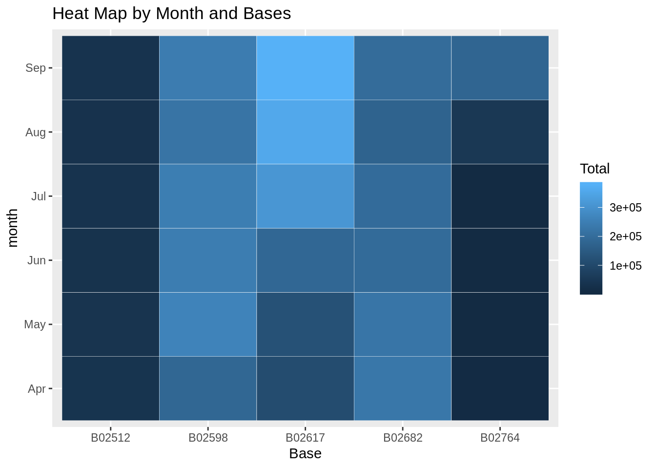
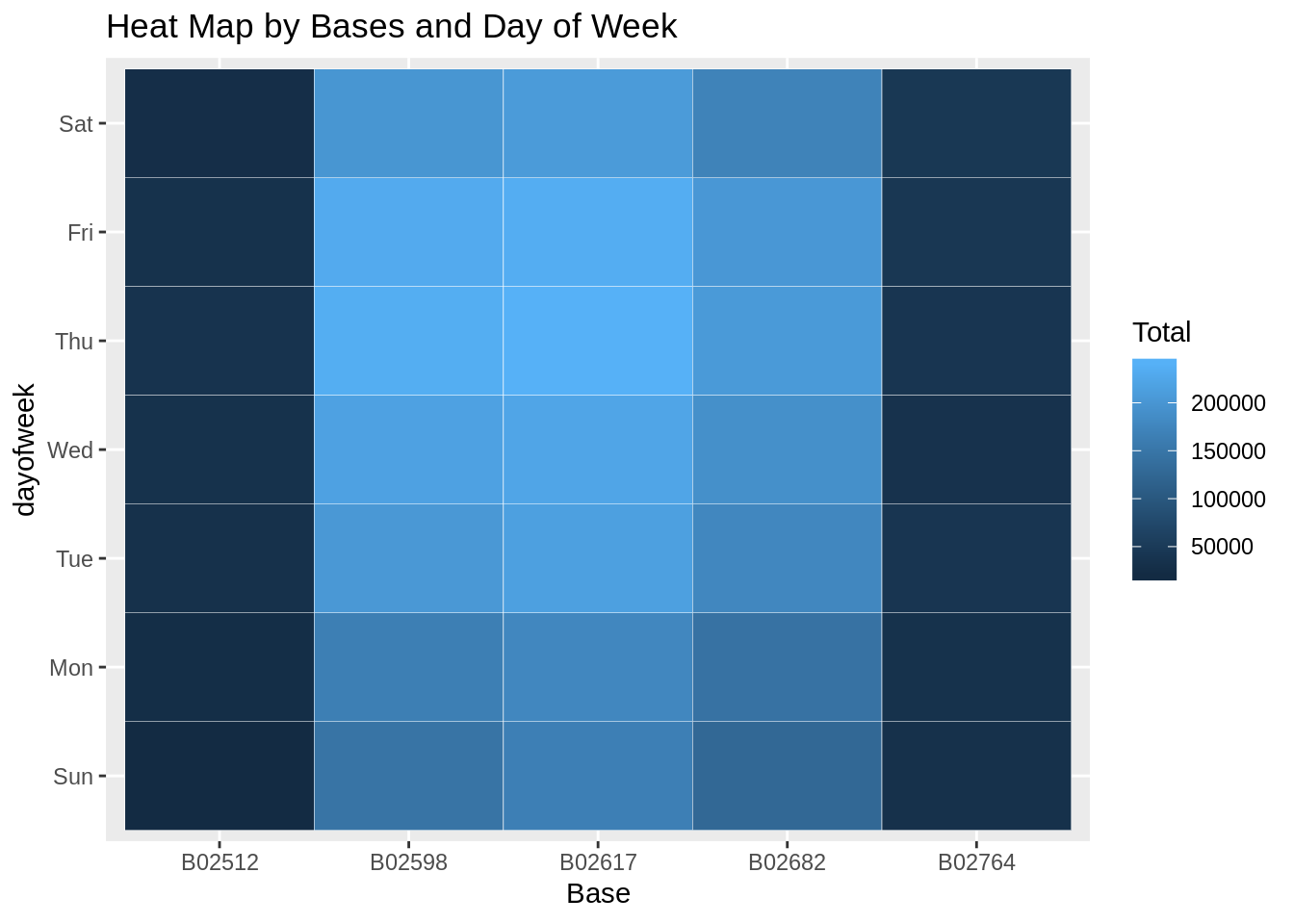
In the following visualization, we plot the number of trips that have been taken by the passengers from each of the bases. There are five bases in all out of which, we observe that B02617 had the highest number of trips. Furthermore, this base had the highest number of trips in the month B02617. Thursday observed highest trips in the three bases – B02598, B02617, B02682.
Code:
ggplot(data_2014, aes(Base)) +
 geom_bar(fill = "darkred") +
 scale_y_continuous(labels = comma) +
 ggtitle("Trips by Bases")
Input Screenshot 14:

Output:
Code:
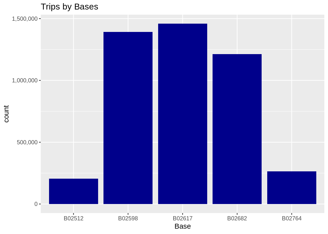
ggplot(data_2014, aes(Base, fill = month)) +
 geom_bar(position = "dodge") +
 scale_y_continuous(labels = comma) +
 ggtitle("Trips by Bases and Month") +
 scale_fill_manual(values = colors)
Input Screenshot 15:
Output:
Code:
ggplot(data_2014, aes(Base, fill = dayofweek)) +
 geom_bar(position = "dodge") +
 scale_y_continuous(labels = comma) +
 ggtitle("Trips by Bases and DayofWeek") +
 scale_fill_manual(values = colors)
Output:
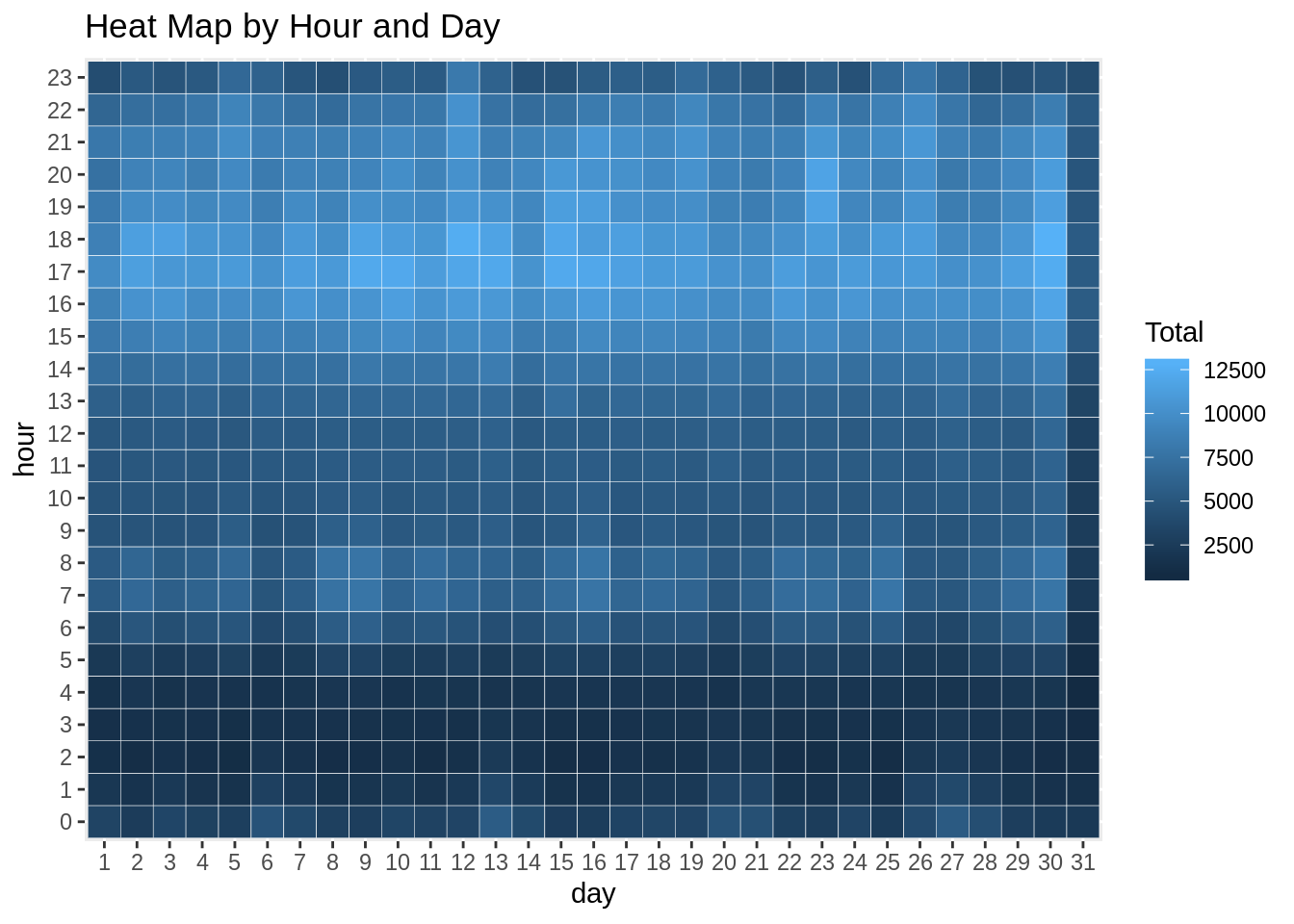
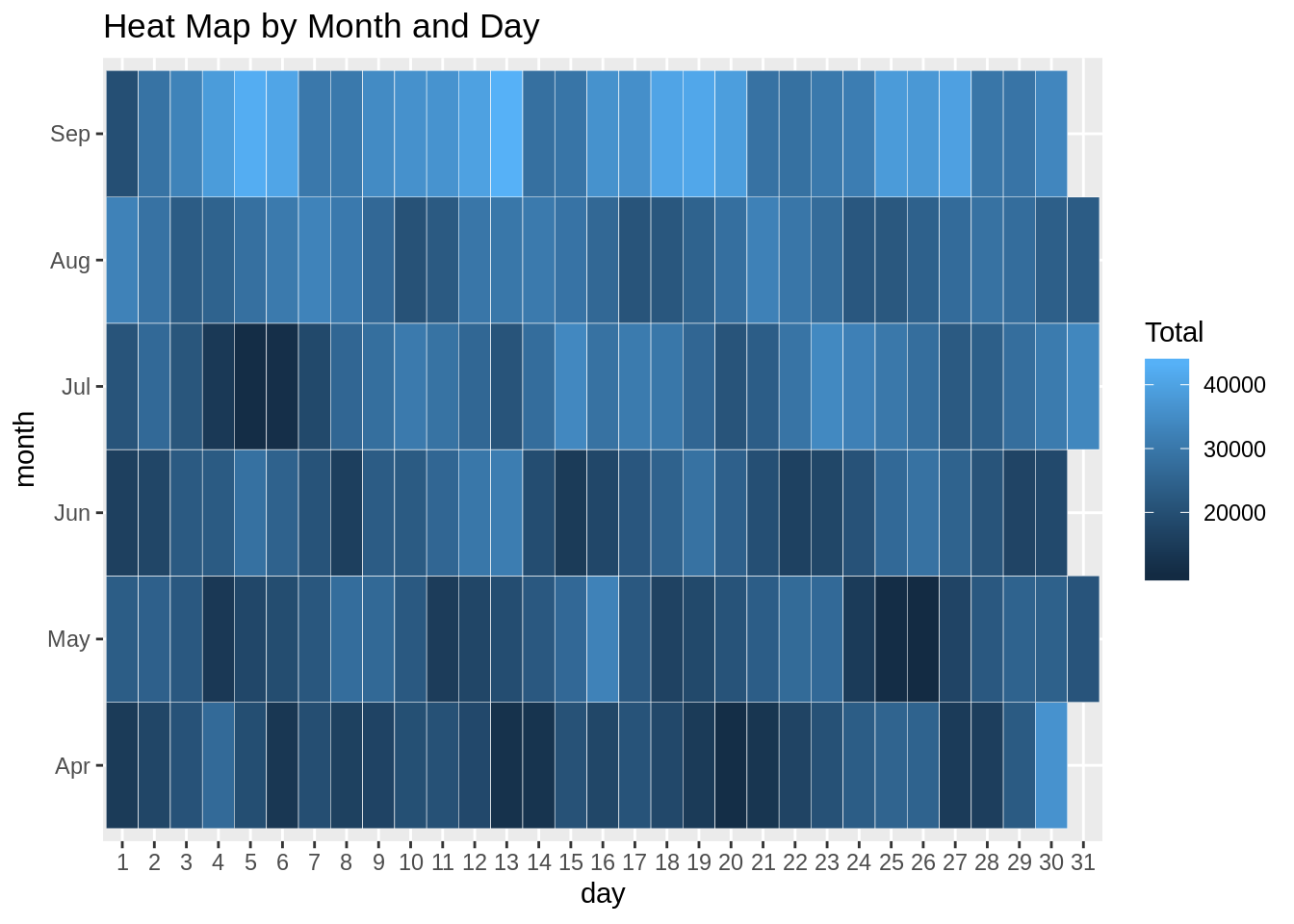
Creating a Heatmap visualization of day, hour and month
In this section, we will learn how to plot heatmaps using ggplot(). We will plot five heatmap plots –
- First, we will plot Heatmap by Hour and Day.
- Second, we will plot Heatmap by Month and Day.
- Third, a Heatmap by Month and Day of the Week.
- Fourth, a Heatmap that delineates Month and Bases.
- Finally, we will plot the heatmap, by bases and day of the week.
Code:
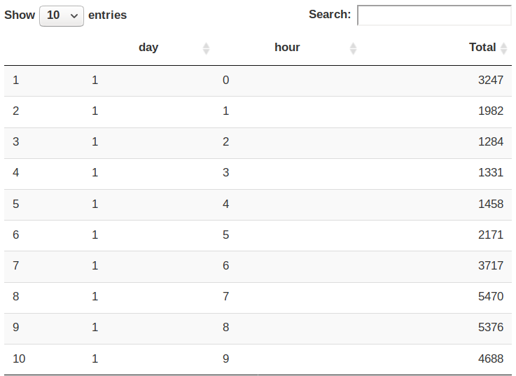
day_and_hour <- data_2014 %>%
         group_by(day, hour) %>%
            dplyr::summarize(Total = n())

datatable(day_and_hour)
Input Screenshot 16:
Output Screenshot:
Code:
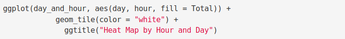
ggplot(day_and_hour, aes(day, hour, fill = Total)) +
            geom_tile(color = "white") +
              ggtitle("Heat Map by Hour and Day")
Input Screenshot 17:
Output:
Code:
ggplot(day_month_group, aes(day, month, fill = Total)) +
            geom_tile(color = "white") +
              ggtitle("Heat Map by Month and Day")
Input Screenshot 18:

Output:
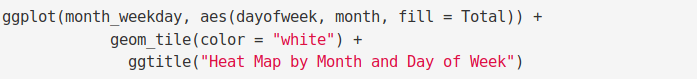
Code:
ggplot(month_weekday, aes(dayofweek, month, fill = Total)) +
            geom_tile(color = "white") +
              ggtitle("Heat Map by Month and Day of Week")
Input Screenshot 19:
Output:

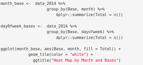
Code:
month_base <-  data_2014 %>%
                    group_by(Base, month) %>%
                        dplyr::summarize(Total = n())

day0fweek_bases <-  data_2014 %>%
                    group_by(Base, dayofweek) %>%
                        dplyr::summarize(Total = n())

ggplot(month_base, aes(Base, month, fill = Total)) +
            geom_tile(color = "white") +
              ggtitle("Heat Map by Month and Bases")
Input Screenshot 20:
Output:
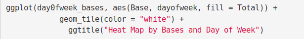
Code:
ggplot(day0fweek_bases, aes(Base, dayofweek, fill = Total)) +
            geom_tile(color = "white") +
              ggtitle("Heat Map by Bases and Day of Week")
Input Screenshot 21:
Output:
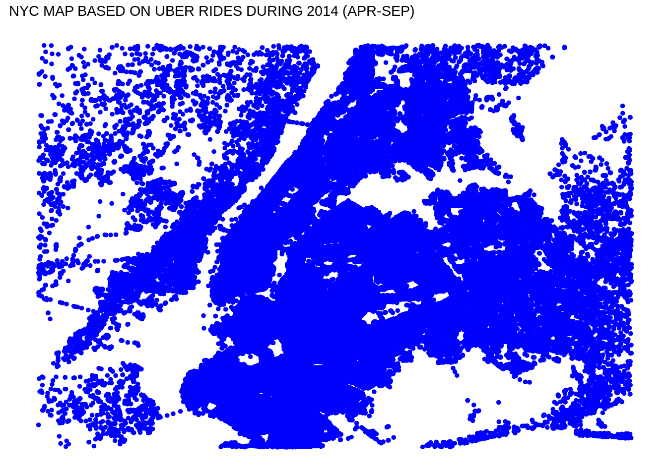
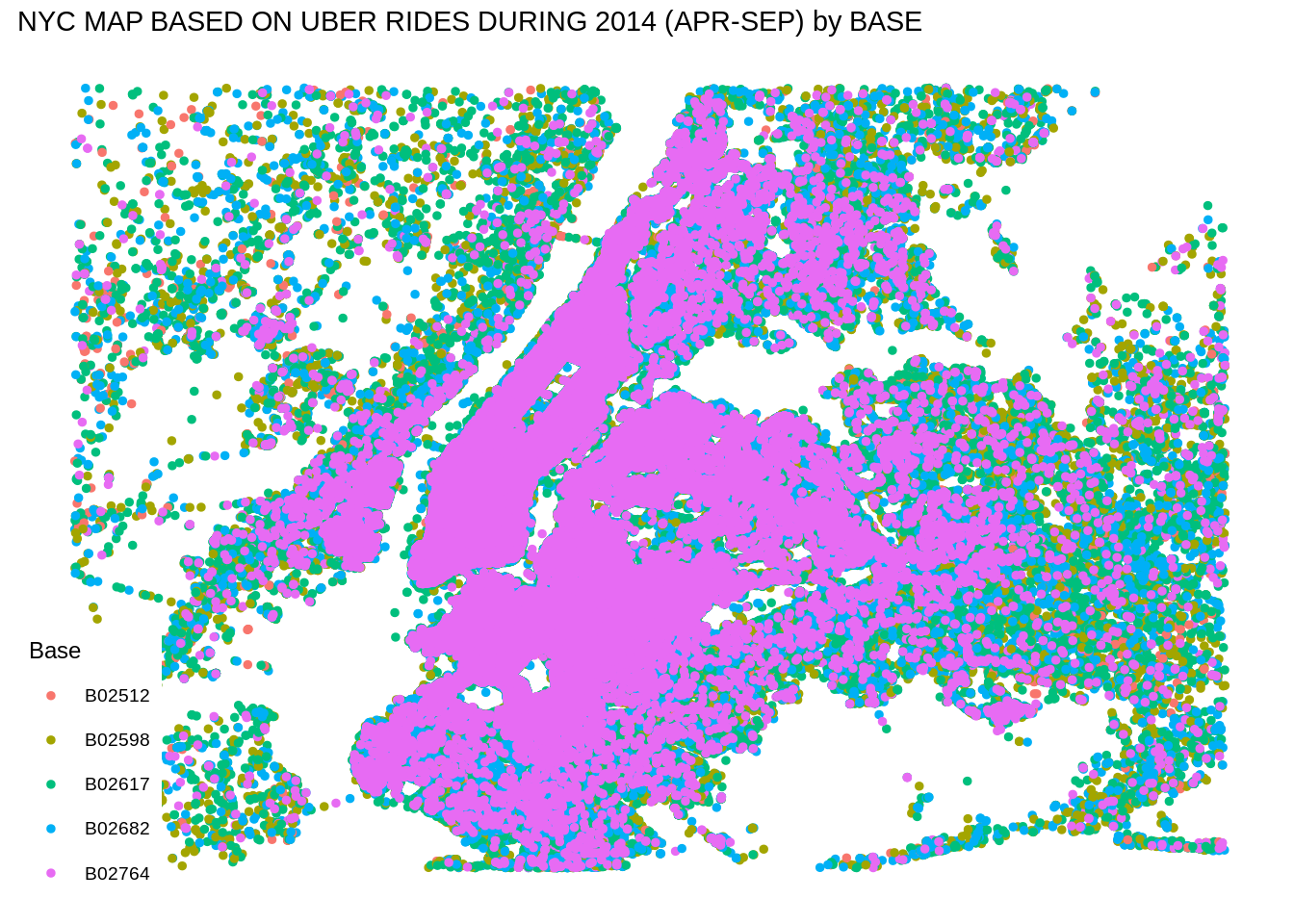
Creating a map visualization of rides in New York
In the final section, we will visualize the rides in New York city by creating a geo-plot that will help us to visualize the rides during 2014 (Apr – Sep) and by the bases in the same period.
Code:
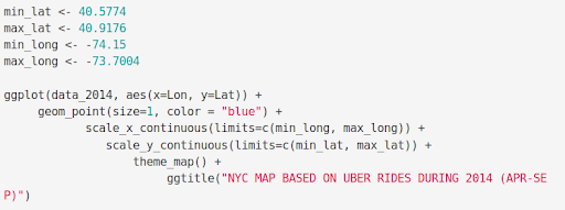
min_lat <- 40.5774
max_lat <- 40.9176
min_long <- -74.15
max_long <- -73.7004

ggplot(data_2014, aes(x=Lon, y=Lat)) +
  geom_point(size=1, color = "blue") +
     scale_x_continuous(limits=c(min_long, max_long)) +
      scale_y_continuous(limits=c(min_lat, max_lat)) +
        theme_map() +
           ggtitle("NYC MAP BASED ON UBER RIDES DURING 2014 (APR-SEP)")

ggplot(data_2014, aes(x=Lon, y=Lat, color = Base)) +
  geom_point(size=1) +
     scale_x_continuous(limits=c(min_long, max_long)) +
      scale_y_continuous(limits=c(min_lat, max_lat)) +
       theme_map() +
          ggtitle("NYC MAP BASED ON UBER RIDES DURING 2014 (APR-SEP) by BASE")
Input Screenshot 22:
Output:
Uber data analysis using R
Output:
Summary
At the end of the Uber data analysis R project, we observed how to create data visualizations. We made use of packages like ggplot2 that allowed us to plot various types of visualizations that pertained to several time-frames of the year. With this, we could conclude how time affected customer trips. Finally, we made a geo plot of New York that provided us with the details of how various users made trips from different bases.
Hope you enjoyed the above R Data Science Project. Keep visiting DataFlair for more interesting projects related to the latest technologies like Big Data, R and Data Science. If you face any issue while practicing the same, comment us below. We will definitely help.
Master R technology for Free – Check R Tutorials Series
Did you know we work 24x7 to provide you best tutorials
Please encourage us - write a review on Google


Hello! thank you for this amazing explanation. How many observations is this and how many variables? Can you please send me the rmd file (full code in R) Thank you!
Base on the last code (input screenshot 22) is showing “Warning message:
Removed 71701 rows containing missing values (geom_point).” and the plot is blank. What will be the problem and the possible solution?
Thank you for your great support.
can u send the dataset for this
Hey
can anyone please give me the ER diagram of this project
Warning message:
Removed 71701 rows containing missing values (geom_point).” and the plot is blank.
Please help me sir , give me the solution to fix this …screenshot 21 and 22 .
I also got this error, please fix this error.
For this task, we have to use the coord_cartesian argument. Within the coord_cartesian argument, we are defining the axis limits of our ggplot2 plot:
Can u provide code for this…
used coord_cartesian argument issue Removed 71701 rows containing missing values (geom_point) gets resolved but the plot is blank solution?
Warning message:
Removed 71701 rows containing missing values (geom_point).”
please fix this error
What data sets/packages/libraries were used to implement the project? Why?
What visualizations were employed to delineate the data? Why were these used compared to other options?
How was the final project visualized (e.g., plot, visual report, etc.)? Do you feel this was the best way? Support your rationale.
What type of data science project idea do you feel would be worth conducting in your specific field or industry? Explain your choice.
This is super-comprehensive..
Thank you so much for this step-by-step.
Thanks a lot !
Warning message:
Removed 71701 rows containing missing values (`geom_point()`).
Why this error? Please solve the error.
To solve the problem, replace (“theme_map()”) with (“theme_void()”) which is part of the ggplot package. When running the code, give it some time, around 30 seconds to complete due to the size of the data.
ggplot(data_2014, aes(x = Lon, y = Lat)) +
geom_point(size = 1, color = “blue”) +
scale_x_continuous(limits = c(min_long, max_long)) +
scale_y_continuous(limits = c(min_lat, max_lat)) +
theme_void() +
ggtitle(“NYC MAP BASED ON UBER RIDES DURING 2014 (APR-SEP)”)
ggplot(data_2014, aes(x = Lon, y = Lat, color = Base)) +
geom_point(size = 1) +
scale_x_continuous(limits = c(min_long, max_long)) +
scale_y_continuous(limits = c(min_lat, max_lat)) +
theme_void() +
ggtitle(“NYC MAP BASED ON UBER RIDES DURING 2014 (APR-SEP) by BASE”)