Android GridLayout – Arrange your view in grid form
We offer you a brighter future with industry-ready online courses - Start Now!!
In this Android GridLayout tutorial, we will learn how to use GridLayout in Android including its implementation, specifications, and attributes.
Let us not get confused with GridView and GridLayout to be the same. GridView simply gives us a two-dimensional view to display the items on the screen, under ViewGroup. On the other hand, GridLayout is a layout manager that arranges the views in a grid.
Explore the concept of Android GridView with Dataflair.
In Android GridLayout, we can specify the number of columns and rows that the grid will have. We can customize the GridLayout according to our requirements, like setting the size, color or the margin for the Layout.
So, a GridLayout basically places its children in a rectangular grid. This grid has a set of a number of thin lines that separate the view area into cells. Suppose you have a grid of N columns, then we will have N+1 grid indices that would be starting from 0.
Introduction to Android GridLayout
1. To declare GridLayout, we need to define it in an XML file as follows:
<GridLayout
xmlns:android= “http://schemas.android.com/apk/res/android”
android: id= “@+id/GridLayout”
android: layout_width= “match_parent”
android: layout_height= “match_parent”
</GridLayout>
Android GridLayout can be the best tool if used in the right way. It supports high flexibility and has great performance.
2. To add children to Android GridLayout, we can specify them in the <GridLayout> tag. To do it, you can consider the following code:
<GridLayout
      xmlns:android=      “http://schemas.android.com/apk/res/android”
      android: id= “@+id/GridLayout”
      android: layout_width= “match_parent”
      android: layout_height= “match_parent”
      android:column= “1”
      android:row= “1”
             <RadioButton
                   android:id= “@+id/but1”
                   android:layout_column= “0”
                   android:layout_row= “0”
                   android:text= “Radio Button”
             >
             <RadioButton
                   android:id= “@+id/but2”
                   android:layout_column= “0”
                   android:layout_row= “1”
                   android:text= “Radio Button”
             >

</GridLayout>
Specifications of Android GridLayout
1. Row and Columns
The children can occupy the cells in contiguous cells, by defining them as follows:
For rows:
This defines the number of rows that would be occupied and how the children would be aligned within the group of cells.
GridLayout.LayoutParams#rowSpec
For Columns:
This defines the number of columns that would be occupied and how the children would be aligned within the group of cells.
GridLayout.LayoutParams#columnSpec
2. Default Cell Assignment
If children do not have specified rows and columns then, the cell location is assigned automatically using the following:
- GridLayout#setOrintation(int)
- GridLayout#setRowCount(int)
- GridLayout#setColumnCount(int)
3. Space
We can also specify some space between the Children using Space view instance, or by setting the following:
- ViewGroup.MarginLayoutPaarams#leftMargin
- ViewGroup.MarginLayoutPaarams#topMargin
- ViewGroup.MarginLayoutPaarams#rightMargin
- ViewGroup.MarginLayoutPaarams#bottomMargin
Attributes of Android GridLayout:
To define the specifications of Android GridLayout, we use GridLayout.Spec. The Specifications here describes the characteristics of the rows and columns of a group of cells. For a description of the characteristics of a GridLayout, we can use the following XML Attributes:
- android:alignmentMode – It sets the alignment of the margins and the boundaries.
- android:columnCount – It sets the maximum number of columns to create when positioning children automatically.
- android:columnOrderPreserved – It ensures that the column boundaries appear in the same order as its column indices.
- android:rowCount – It set the maximum no. of rows to create when positioning children automatically.
- android:rowOrderPreserved -It ensures that the row boundaries appear in the same order as its row indices.
- android:useDefaultMargins – It tells the GridLayout to use margins if no margin is specified in the parameter. For this, it needs to be set on True.
Android GridLayout implementation
Now we will implement GridLayout in our application using the following steps:
- Create a new project and name it. I have named it as GridLayout.
- Now, open the activity_main.xml file and write the following code:
<?xml version="1.0" encoding="utf-8"?>
<androidx.constraintlayout.widget.ConstraintLayout xmlns:android="http://schemas.android.com/apk/res/android"
xmlns:tools="http://schemas.android.com/tools"
android:layout_width="match_parent"
android:layout_height="match_parent"
tools:context=".MainActivity">
<GridLayout
android:id="@+id/GridLayout1"
android:layout_width="match_parent"
android:layout_height="match_parent"
android:columnCount="2"
android:orientation="horizontal"
android:rowCount="4"
tools:context=".GridXMLActivity"
tools:layout_editor_absoluteX="56dp"
tools:layout_editor_absoluteY="0dp">
<ImageButton
android:id="@+id/imageButton1"
android:layout_width="160dp"
android:layout_height="90dp"
android:layout_gravity="left|top"
android:src="@drawable/scene1" />
<ImageButton
android:id="@+id/imageButton2"
android:layout_width="160dp"
android:layout_height="90dp"
android:layout_gravity="left|top"
android:src="@drawable/scene2" />
<ImageButton
android:id="@+id/imageButton3"
android:layout_width="160dp"
android:layout_height="90dp"
android:src="@drawable/scene3" />
<ImageButton
android:id="@+id/imageButton4"
android:layout_width="160dp"
android:layout_height="90dp"
android:layout_gravity="left|top"
android:src="@drawable/scene4" />
<ImageButton
android:id="@+id/imageButton5"
android:layout_width="160dp"
android:layout_height="90dp"
android:layout_gravity="left|top"
android:src="@drawable/scene5" />
<ImageButton
android:id="@+id/imageButton6"
android:layout_width="160dp"
android:layout_height="90dp"
android:layout_gravity="left|top"
android:src="@drawable/scene6" />
</GridLayout>
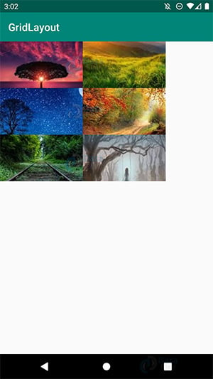
</androidx.constraintlayout.widget.ConstraintLayout>In the above, we have added the images in the drawable class, you can add images as per your choice.
3. After writing the code for the layout, we will run it and following would be the output-
Summary:
In this Android GridLayout tutorial, we have learned what is Android GridLayout. We also saw the attributes required for the customization of GridLayout in Android. We came to know how we define it in the XML file and how we create its children. In the end, we also implemented it using Image Button. So yes, this was all for this tutorial, see you in the next tutorial.
Now Personalize your application with DataFlair.
I hope you liked this tutorial. Do share this on social media now to give benefits to your friends as well.
Your opinion matters
Please write your valuable feedback about DataFlair on Google
