SAS Pie Chart – The 5 Mins Guide to Learn the Types of Pie Charts in SAS
Placement-ready Online Courses: Your Passport to Excellence - Start Now
Previously, we looked at SAS bar charts for analysis and representation of data, now, we will discuss the different types of pie charts in SAS. The syntax and diagrams will help you to understand the implementation of pie charts in SAS in a better way. So, let us get started with SAS Pie Chart.
What is SAS Pie Chart?
SAS Pie Chart creates simple, group, or stacked charts that represent the relative contribution of the parts to the whole by displaying data as slices of a pie. Each slice represents a category of data. The size of a slice represents the contribution of the data to the total chart statistic.
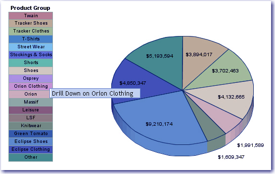
This is how SAS pie chart looks like.
Let’s learn about the types of pie charts in SAS.
1. SAS PROC TEMPLATE Procedure
SAS pie chart is created using PROC TEMPLATE which takes parameters to control percentage, labels, color, a title of the chart.
Syntax-
PROC TEMPLATE;
DEFINE STATGRAPH pie;
BEGINGRAPH;
LAYOUT REGION;
PIECHART CATEGORY = variable
DATALABELLOCATION = OUTSIDE
CATEGORYDIRECTION = CLOCKWISE
START = 180 NAME = 'pie';
DISCRETELEGEND 'pie' /
TITLE = ' ';
ENDLAYOUT;
ENDGRAPH;
END;
RUN;
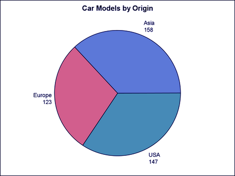
2. Simple Pie Chart in SAS
Let us begin with an example of cars inbuilt dataset. We will then look in detail at all of the parameters used in the syntax above.
Example-
proc template;
define statgraph simplepie;
begingraph;
entrytitle "Car Models by Origin";
layout region;
piechart category=origin / datalabellocation=outside;
endlayout;
endgraph;
end;
run;
proc sgrender data=sashelp.cars
template=simplepie;
run;
The PIECHART performs discrete binning for the CATEGORY column and calculates appropriate summarization statistics (sum, mean, and so on) based on the setting for the STAT=option.
You can use the START= and CATEGORYDIRECTION= options to control the pie slice positions and display order.
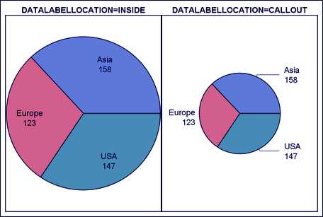
3. SAS Pie Charts with Data Labels
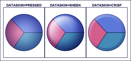
In this type of SAS pie chart, we can specify whether we want data values inside the chart or outside the chart. We can also represent value both as a fraction as well as percentage. We then use options like DATASKIN to modify the appearance of our chart.
DATALABELLOCATION = AUTO | INSIDE | OUTSIDE | CALLOUT
specifies whether to display the slice labels within the pie slices or outside of the pie circumference.
DATASKIN= NONE | PRESSED | SHEEN | CRISP | GLOSS | MATTE
enhances the visual appearance of the filled pie slices.
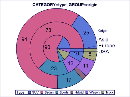
4. Grouped Pie Chart in SAS
SAS grouped pie chart has various concentric circles in the form of groups where each variable is grouped along with the other variable of the same data set.
GROUP=column | expression
creates a separate concentric stacked cylinder for each unique group value of the specified column. The grouped rings are displayed in data order.
PROC TEMPLATE;
DEFINE STATGRAPH simplepie;
BEGINGRAPH;
LAYOUT REGION;
PIECHART CATEGORY = type / Group = origin
DATALABELLOCATION = INSIDE
DATALABELCONTENT=ALL
CATEGORYDIRECTION = CLOCKWISE
DATASKIN= SHEEN
START = 180 NAME = 'pie';
DISCRETELEGEND 'pie' /
TITLE = 'Car models by origin';
ENDLAYOUT;
ENDGRAPH;
END;
RUN;
PROC SGRENDER DATA = cars1
TEMPLATE = pie;
RUN;
This was all in the SAS Tutorial.
Summary
We studied the concept of SAS pie chart, how can we create a pie chart in SAS and the different kinds of SAS pie charts:
- SAS PROC TEMPLATE Procedure
- SAS Simple Pie Chart
- SAS Pie Charts with Data Labels
- SAS Grouped Pie Chart
that can be used to represent our data.
If you have any queries, feel free to ask in the comment section.
Did you like this article? If Yes, please give DataFlair 5 Stars on Google


