SAS Scatter Plot – Learn to Create Different Types of Scatter Plots in SAS
Interactive Online Courses: Elevate Skills & Succeed Enroll Now!
Previously, we learned about boxplot in SAS for analysis and representation of data, now we will move on to SAS scatter plot. We will learn to create different types of scatter plots in SAS.
So, let us get started.
What is SAS Scatter plot?
A scatter plot in SAS Programming Language is a type of plot, graph or a mathematical diagram that uses Cartesian coordinates to display values for two variables for a set of data. Below are representations of the SAS scatter plot.
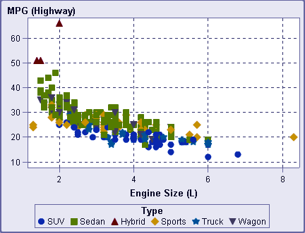
SAS Scatter Plot Example 1:
Example 2:
The PROC SGSCATTER Procedure
SAS PROC SGSCATTER helps to create different scatter plots in SAS. The syntax is:
PROC sgscatter  DATA=DATASET;
   PLOT VARIABLE_1 * VARIABLE_2
   / datalabel = VARIABLE group = VARIABLE;
RUN;
The SGSCATTER procedure creates a paneled graph of scatter plots for multiple combinations of a variable.
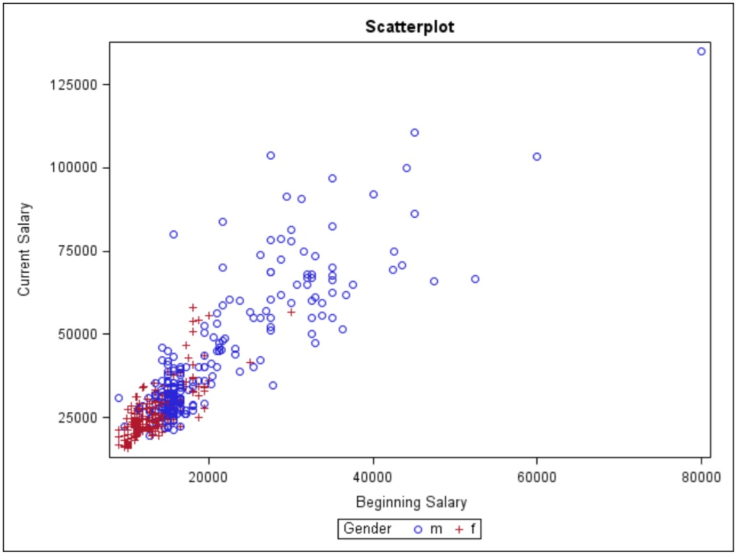
SAS Simple Scatter Plot
In this type of SAS Scatter plot, two variables are selected and are grouped with respect to a third variable.
Example:
proc sgplot data=mylib.employee;
 scatter x=salbegin y=salary / group=gender;
run;
SAS Scatter Plot with Prediction Ellipse
An ellipse approximates a region that contains 95% of the population. By default, the ellipse statement creates a prediction ellipse. The ellipse acts as an estimation parameter to predict the strength of correlation between the two variables.
Example:
proc sgplot data=sashelp.iris;
title "Iris Petal Dimensions";
scatter x=petallength y=petalwidth;
ellipse x=petallength y=petalwidth;
run;

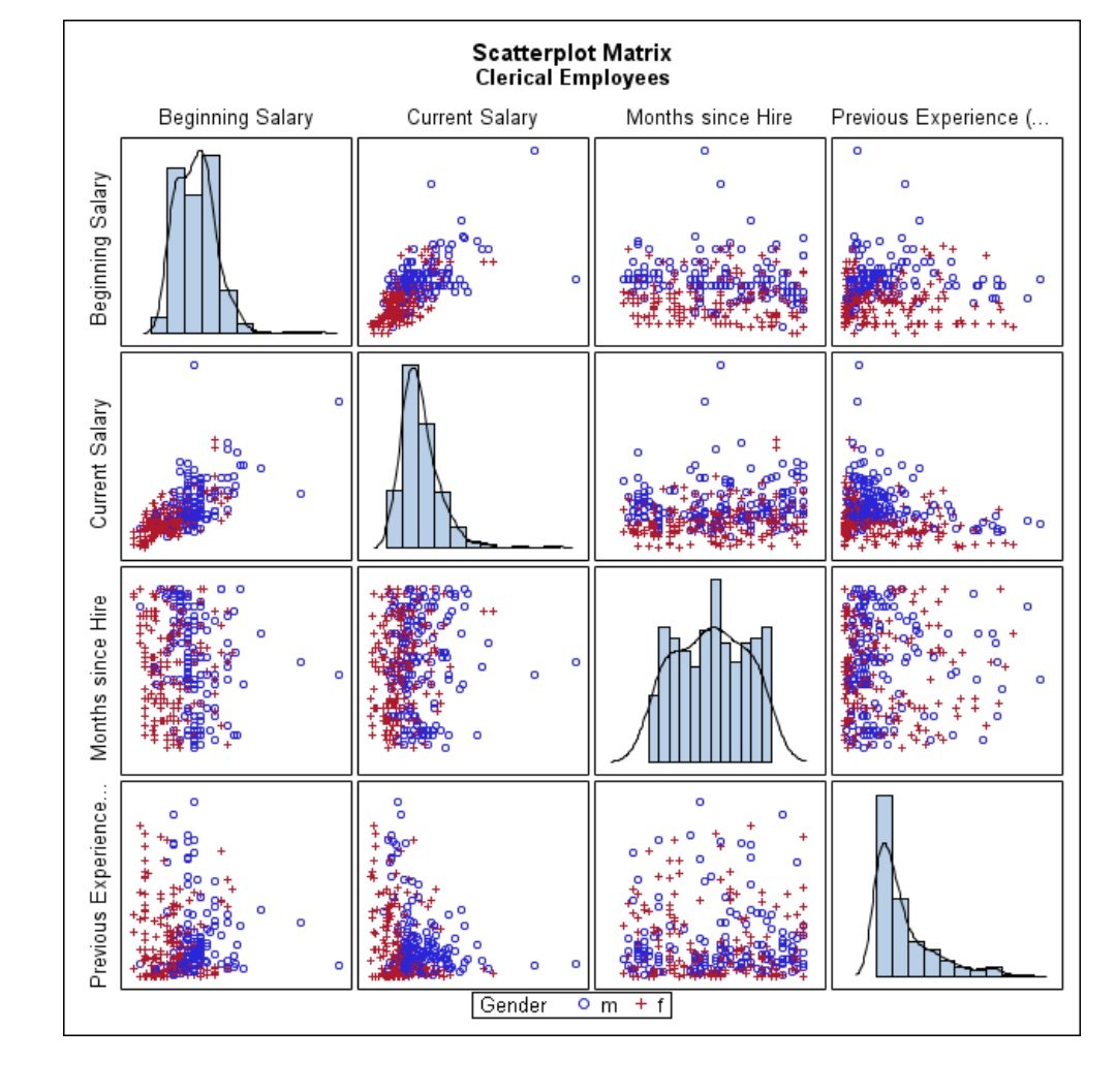
Scatter Matrix in SAS
SAS Scatter Matrix consists of several pairwise scatter plots that are presented in the form of a matrix. The matrix tells us the correlation between different variables and whether they are positive or negative. They help us roughly determine if there is a correlation between multiple variables.
Example-
proc sgscatter data=mylib.employee;
where jobcat=1;
matrix salbegin salary jobtime prevexp / group=gender diagonal=(histogram kernel);
 run;
 Summary
I hope now you are clear with the concept of scatter plot in SAS, how can we create a SAS scatter plot and what are the different kinds of scatter plots in SAS that can be used to represent our data.
Stay tuned for more interesting topics and for any queries post your doubts in the comments section below.
If you are Happy with DataFlair, do not forget to make us happy with your positive feedback on Google


What is the analysis of the scatter plot