Create Graph using Python – Graph Plotting in Python
Master Python with 70+ Hands-on Projects and Get Job-ready - Learn Python
We would have come across situations when we have to plot graphs and find the nature of the curve, especially in school and college. Even if you are the one dealing with a lot of math, you tend to use plots. In this project, we will build a Graph Creator using Python that saves not only your time but also eases your work. Let’s start by discussing the application and its features.
What is Graph Creator?
Graph Creator is an application that plots the graphs from the values of the two coordinates given by the user. However, it has the following options to give the points:
1. Enter manually
2. Uploading from a file,
In addition, the points on the plot can be moved to modify the graph and also reset to the original shape.
Features of the graph creator:
- Data visualization: Any dataset or number can be turned into a visual representation instantly.
- Customization: Users can change font size, chart type, color, and layout as per their requirements.
- Data import and export: It allows you to transfer data from Excel and Google Sheets, and also allows finished images from (JPG/PNG).
- Specialised: It allows you to use specialized tools for creating difficult diagrams.
Graph Creator in Python
We will be building this project using the Python modules Tkinter, Matplotlib, NumPy, SciPy, path, and os. We use the Tkinter module to build the GUI to interact with the user and the Matplotlib to build the interactive plots. The NumPy and SciPy modules are used to get a range of values to plot a smooth curve from the given points. And finally, we use the path and os modules for uploading the file with the points of the plot.
Download the Source Code for Graph Creator
Please download the source code for the graph creator using the link: Graph Creator Project
Prerequisites
This project requires the developer to have a basic understanding of Python, Tkinter, Matplotlib, Numpy, and SciPy modules. The above-mentioned modules can be installed using the following commands:
pip install tk
pip install matplotlib
pip install numpy
pip install scipy
Path and os modules are available in the Python standard library.
Steps to Build the Graph Creator Project in Python
We will be following the steps below to build the graph creator:
1. First, import the required modules
2. Then, we create the Tkinter window
3. We add the required components to the window
4. After this, we write the following functions
a. a function to add the points manually
b. function to clear the values
c. function to upload the values from an Excel file
d. function to generate an interactive graph
1. Importing the required modules
The first step is to import all the required modules. Hence, we import all the modules we discussed above and the required functions and components.
#Importing the modules
import tkinter as tk
from tkinter import *
from tkinter import filedialog
from path import Path
import os
import pandas as pd

import matplotlib.animation as animation
from matplotlib.widgets import Slider, Button
import matplotlib as mpl
from matplotlib import pyplot as plt
import scipy.interpolate as inter
import numpy as np
2. Creating the Tkinter window
Now we create a new GUI and set its properties. Here we use
a. title() to set the main title of the window
b. configure() to set the background color
c. minsize() and geometry() to manage the size of the window
#Creating the window
wn = Tk()
wn.title("DataFlair Graph Creator")
wn.configure(bg='mint cream')
wn.minsize(width=500,height=500)
wn.geometry("700x600")
3. Adding the required components to the window
Now we create the global variables:
A. To store the coordinates
B. To create a variable to show the coordinates added to the label
C. To create a variable that stores the index of the point the mouse clicked on while trying to drag
Then we add canvas and heading, followed by entries to take the coordinates. And then a label to show these points. After this, we have 4 buttons for:
A. To add the values of the points given as input and display them on screen
B. To clear the added values
C. To upload the input coordinates from a file in the device
D. To generate the plot from the given values
#Creating the global variables
xVals=[] #Stores x coordinate values
yVals=[] #Stores y coordinate values
points=StringVar() #Variable to update the points displayed
ptInd = None #active point to know the mouse action point

#Creating the canvas and adding heading
Canvas1 = Canvas(wn)
Canvas1.config(bg="mint cream")
Canvas1.pack(expand=True,fill=BOTH)

headingFrame1 = Frame(wn,bg="snow3",bd=5)
headingFrame1.place(relx=0.25,rely=0.1,relwidth=0.5,relheight=0.13)

headingLabel = Label(headingFrame1, text="DataFlair Graph Creator", fg='black', font = ('Courier',15,'bold'))
headingLabel.place(relx=0,rely=0, relwidth=1, relheight=1)

# Instruction to add coordinates
Label(wn, text="Enter the two coordinates and click on Add",fg='black',bg="mint cream",font = ('Calibre',12)).place(relx=0.05,rely=0.3)
lable = Label(wn,text="X Value: ", bg="mint cream",fg='black',font = ('Calibre',10))
lable.place(relx=0.05,rely=0.35)

#Takes x and y values of a point
xCord = Entry(wn,font = ('Calibre',10))
xCord.place(relx=0.3,rely=0.35, relwidth=0.62)

# Title
lable2 = Label(wn,text="Y Value: ",bg="mint cream", fg='black',font = ('Calibre',10))
lable2.place(relx=0.05,rely=0.4)

yCord = Entry(wn,font = ('Calibre',10))
yCord.place(relx=0.3,rely=0.4, relwidth=0.62)

labelFrame = Frame(wn,bg="white")
labelFrame.place(relx=0.1,rely=0.45,relwidth=0.8,relheight=0.25)

#Displays the added points
my_label = Label(labelFrame,textvariable=points,font = ('Courier',10),bg="white")
my_label.place(relx=0.07,rely=0.05)

#Add Button
Add = tk.Button(wn,text="Add",bg='#d1ccc0', fg='black',command=add)
Add.place(relx=0.1,rely=0.9, relwidth=0.18,relheight=0.08)

#Upload Button
Upload = tk.Button(wn,text="Upload",bg='#f7f1e3', fg='black', command=uploadValues)
Upload.place(relx=0.3,rely=0.9, relwidth=0.18,relheight=0.08)

#Clear button
Clear = tk.Button(wn,text="Clear",bg='#f7f1e3', fg='black', command=clearValues)
Clear.place(relx=0.5,rely=0.9, relwidth=0.18,relheight=0.08)

#Generate button
Generate = tk.Button(wn,text="Generate",bg='#f7f1e3', fg='black', command=generateGraph)
Generate.place(relx=0.7,rely=0.9, relwidth=0.18,relheight=0.08)

#Runs till the window is closed by the user
wn.mainloop()
4. Creating the function to add the points manually
In this function add_values_screen(), we
a. Run the for loop to add all the x and y values into a string form
b. Store this string in the points variable
c. Displaying the points on the label
d. Clearing the entries
In the function add(), we
a. Get the x and y values
b. Add to the lists xVals and yVals, respectively
c. Run the function add_values_screen()
#Function to display the values on the screen
def add_values_screen():
    global labelFrame, points,xVals,yVals,xCord,yCord

    vals=''
    for i in range(len(xVals)):
        vals+='('
        vals+=str(xVals[i])
        vals+=','
        vals+=str(yVals[i])
        vals+=')'
        vals+=', '
    print(vals)
    points.set(vals)
    xCord.delete(0, END)
    yCord.delete(0, END)
    my_label.config(textvariable=points)

#Function to add the lists storing the coordinates given as input and display them
def add():
    global wn,xCord,yCord,xVals,yVals,labelFrame, points

    x=int(xCord.get())
    y=int(yCord.get())
    xVals.append(x)
    yVals.append(y)
    #print(x,y)
    add_values_screen()
5. Creating the function to clear the values
In this function, we clear the lists storing the values and the widgets. We use the clear() function to delete elements of the list. Furthermore, we use the set() function to clear the variable ‘points’. And delete() function to clear the entries.
#Function to delete the values given as coordinates
def clearValues():
    global wn,xCord,yCord,xVals,yVals,labelFrame
    xVals.clear()
    yVals.clear()
    points.set('')
    xCord.delete(0, END)
    yCord.delete(0, END)
    my_label.config(text='')
6. Creating the function to upload the values from an Excel file
In this function,
a. Clear the values
b. Give a pop-up window for the user to select the file from which values should be taken
c. Then read the values by converting them to a dataframe and store them in the lists
d. And then run the function add_values_screen()
#Function to upload the excel file and extract the x and y coordinate values
def uploadValues():
    clearValues()
    global xVals,yVals
    path = filedialog.askopenfilename() #Get the path of the PDF based on the user's location selection
    df = pd.read_excel(path) # can also index sheet by name or fetch all sheets
    clmns=list(df.columns)
    xVals = df[clmns[0]].tolist()
    yVals = df[clmns[1]].tolist()

    add_values_screen()
7. Creating the function to generate an interactive graph
This is the function to generate the graph that also helps to click and drag the points on the plot.
In this,
a. We first set the limits for the plot based on the values given as input
b. Then make a copy of the values to use for future use while resetting
c. Then we get a smooth curve fitting the points using the function InterpolatedUnivariateSpline()
d. Then we create the subplot
#Function to generate the graph based on the input values
def generateGraph():
    global xVals,yVals

    #Setting the limits of the plot
    N=len(xVals)
    xmin = min(xVals)-5
    xmax = max(xVals)+5
    ymin = min(yVals)-5
    ymax = max(yVals)+5

    #making the copy of the x and y points to not lose the original ones
    x=xVals.copy()
    yvals=yVals.copy()

    #getting a smooth curve for the given points
    mySpline = inter.InterpolatedUnivariateSpline (x, yvals)

    #setting the rcParams
    mpl.rcParams['figure.subplot.right'] = 0.8

    #setting up a plot
    fig,axes = plt.subplots(1,1,figsize=(9.0,9.0),sharex=True)
    ax1 = axes

    epsilon = 5 #max pixel distance for the mouse click
This is a function to update the curve when the slider is changed. Here, we get the y values from the slider and create a new updated smooth curve. And then update the plot with this curve.
#This function updates the curve when the slider is moved
 def update(val):
     for i in np.arange(N):
         yvals[i] = sliders[i].val
     print(yvals)
     l.set_ydata(yvals)
     mySpline = inter.InterpolatedUnivariateSpline (x, yvals)
     m.set_ydata(mySpline(X))
     # redraw canvas while idle
     fig.canvas.draw_idle()
In this function, we get the original curve by taking the values from the global variable yVals. Then create the smooth curve, plot the curve, and also update the slider.
#This function resets the values to the original ones
   def reset(event):
       global yVals
       X = np.arange(0,xmax+1,0.1)
       print(yVals)
       for i in np.arange(N):
           sliders[i].reset()
       mySpline = inter.InterpolatedUnivariateSpline (x, yVals)
       l.set_ydata(yVals)
       m.set_ydata(mySpline(X))
       for i in np.arange(N):
           sliders[i].set_val(yvals[i])
       # redraw canvas while idle
       fig.canvas.draw_idle()
This function gets the index of the point on which the mouse is pressed. Although it is hard to click on the exact location of the points. So, epsilon is used to set the boundary around the points. And if the mouse is clicked within this boundary, then the index of that point is returned.
#This function get the index of the vertex under point if within tolerance of epsilon
def get_ind_under_point(event):

    trans = ax1.transData.inverted()
    tinv = ax1.transData
    xy = trans.transform([event.x,event.y])
    x_reshape = np.reshape(x,(np.shape(x)[0],1))
    y_reshape= np.reshape(yvals,(np.shape(yvals)[0],1))
    xy_vals = np.append(x_reshape,y_reshape,1)
    xytrans = tinv.transform(xy_vals)
    xtrans, ytrans = xytrans[:, 0], xytrans[:, 1]
    d = np.hypot(xtrans - event.x, ytrans - event.y)
    indseq, = np.nonzero(d == d.min())
    ind = indseq[0]
    if d[ind] >= epsilon:
        ind = None

    return ind
The function button_press_callback() runs when the mouse button is pressed. However, if the button is pressed on one of the x-values of the curve, then get the index of that point.
The function button_release_callback() runs when the button is released, and this removes the index value to None.
#This function run where there is a mouse click
   def button_press_callback(event):
       global ptInd
       print("press")
       if event.inaxes is None:
           return
       if event.button != 1:
           return
       ptInd = get_ind_under_point(event)
       print(ptInd)


   #This function runs when the mouse click is released
   def button_release_callback(event):
       global ptInd
       print("Release")
       if event.button != 1:
           return
       print("Re:",ptInd)
This is a function that runs when the mouse is moved. In this, if the movement is around the point, with the mouse clicked previously. Therefore, it means the user is trying to drag the point. Then, we get the y coordinate of the new location of the mouse and change the curve accordingly, along with the slider.
#This function runs when there is any movement in the mouse
    def action_notify_callback(event):
        global ptInd
        print("Move",ptInd)
        if ptInd is None:
            return
        if event.inaxes is None:
            return
        if event.button != 1:
            return
        print("Move")
        yvals[ptInd] = event.ydata

        # update curve via sliders and draw
        sliders[ptInd].set_val(yvals[ptInd])
        fig.canvas.draw_idle()
Here, we
a. Set the properties of the aces and plot the points and the smooth curve
b. Then we create the slider and set the y values
c. And we run the update() function when the slider is moved
d. And write the commands to track the mouse movements and actions
e. FThen show the plot
#Setting the plot properties
   X = np.arange(0,xmax+1,0.1)
   ax1.set_yscale('linear')
   ax1.set_xlim(xmin, xmax)
   ax1.set_ylim(ymin,ymax)
   ax1.set_title('DataFlair Graphs')
   ax1.set_xlabel('x--->')
   ax1.set_ylabel('y--->')
   ax1.grid(True)
   ax1.yaxis.grid(True,which='minor',linestyle='--')
   ax1.legend(loc=2,prop={'size':20})
   #Drawing the plot
   l, = ax1.plot (x,yvals,color='k',linestyle='none',marker='o',markersize=8)
   m, = ax1.plot (X, mySpline(X), 'g-', label='Your Graph')

   #Creating the sliders for all values
   sliders = []
   for i in np.arange(N):

       axamp = plt.axes([0.84, 0.8-(i*0.05), 0.12, 0.02])
       # Slider
       s = Slider(axamp, 'p{0}'.format(i), ymin, ymax, valinit=yvals[i])
       sliders.append(s)
   #Updating the graph when slider is changed
   for i in np.arange(N):
       sliders[i].on_changed(update)
   axres = plt.axes([0.84, 0.8-((N)*0.05), 0.12, 0.02])
   #Button to get back the original plot
   btn = Button(axres, 'Reset')
   btn.on_clicked(reset)

   #Checking the motion and action of the mouse and running corresponding function
   fig.canvas.mpl_connect('button_press_event', button_press_callback)
   fig.canvas.mpl_connect('button_release_event', button_release_callback)
   fig.canvas.mpl_connect('motion_notify_event', action_notify_callback)

   #Showing the plot
   plt.show()
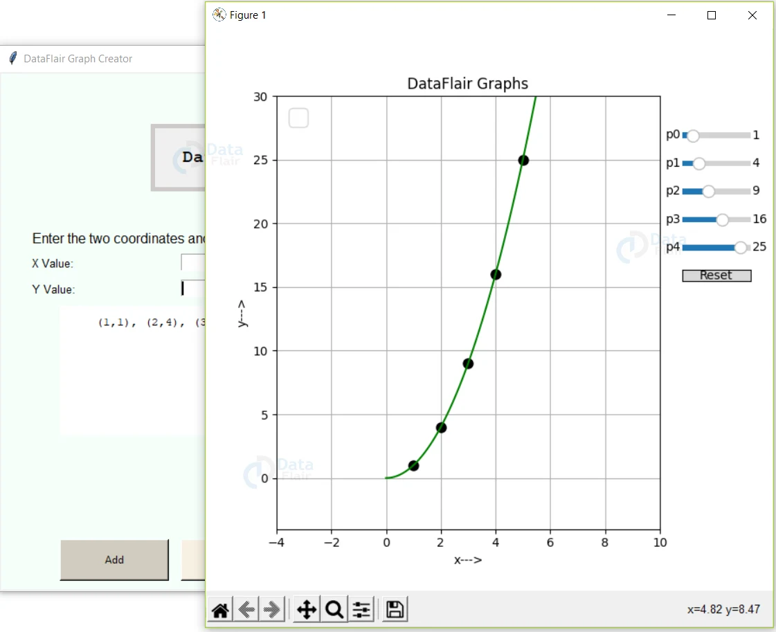
Output of Python Graph Creator Project
GUI image of the Graph Creator project
Summary
Congratulations, you have successfully built the graph creator project using Python. Hope you have enjoyed building it.
Did you like our efforts? If Yes, please give DataFlair 5 Stars on Google


