Responsive Web Design using HTML and CSS
Full Stack Web Development Courses with Real-time projects Start Now!!
It is essential for a developer to create web-pages that are responsive on all devices, i.e., they fit as per the device’s size. Responsive web-pages automatically adjust themselves as per the different devices and viewports. HTML and CSS can be used to hide, shrink, enlarge, etc. a web-page so that it looks attractive on all devices. Let us see how to make responsive web design using HTML and CSS.

Developing responsive web design is not only about the aesthetic appeal of the layout for different devices, it is also about enhancing the usability. If a website is properly designed to match a specific gadget, then people are likely to spend more time on that site and go through the content. This in return can make the engagement rates higher and the conversion metrics even better. Also, the use of responsive design is advisable in SEO because the search engines rank websites that are friendly to users across devices high.
For an overall user-friendly experience, it is thus essential to adapt our web-pages to different devices. For example,
Desktop
Tablet
Phone
HTML Responsive Methods
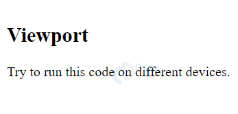
1. Setting Viewport in HTML
As discussed in the previous articles, the <meta> tag of the head is useful to create a viewport for a website.
<!DOCTYPE html>
<html>
<head>
<meta name="viewport" content="width=device-width, initial-scale=1.0">
</head>
<body>
<h2>Viewport</h2>
<p>Try to run this code on different websites.</p>
</body>
</html>
Output-
As we can see, the web-page’s scaling is controlled by the browser using the meta viewport.
2. HTML Responsive Images
Images that fit well within an HTML document, precisely with scale, are responsive images. The width of the image is set to 100% to make it responsive.
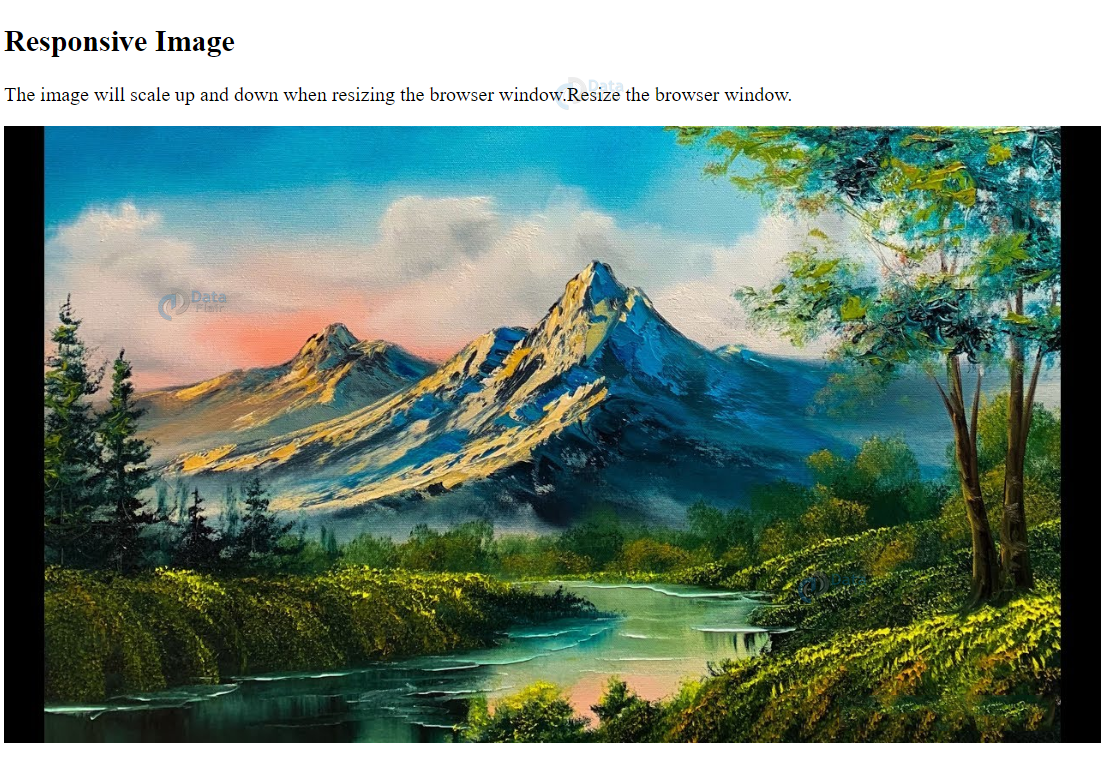
<!DOCTYPE html>
<html>
<head>
<meta name="viewport" content="width=device-width, initial-scale=1.0">
</head>
<body>
<h2>Responsive Image</h2>
<p>The image will scale up and down when resizing the browser window.Resize the browser window.</p>
<img src="images/landscape.jpg" style="width:100%;">
</body>
</html>
Output-
When the user opens a webpage, images adapt to fit the screen size, thus the appearance of the webpage is good, this is accomplished with the help of CSS. This is especially the case for business to consumer sites where, for example, product images have to be sharp and well-defined across different screens.
Responsive images also help in cutting down the loading time since, for instance, a small device will only download a small image, which will improve the user experience immensely.
Use of max-width property in HTML
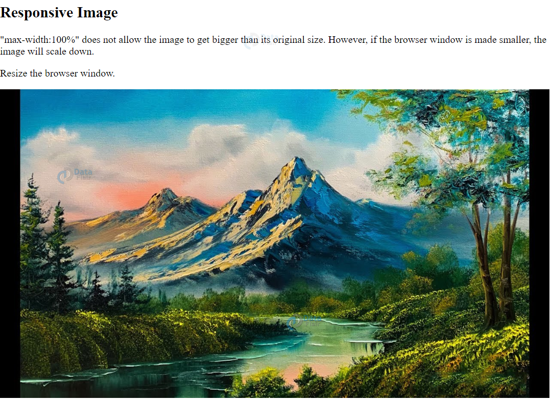
The max-width property set to 100% enables scaling of the image down its original size, if required. It is never scaled up to its original size.
For example:
<!DOCTYPE html>
<html>
<head>
<meta name="viewport" content="width=device-width, initial-scale=1.0">
</head>
<body>
<h2>Responsive Image</h2>
<p>"max-width:100%" does not allow the image to get bigger than its original size. However, if the browser window is made smaller, the image will scale down.</p>
<p>Resize the browser window to see the effect.</p>
<img src="landscape.jpg" style="max-width:100%;height:auto;">
</body>
</html>
Output-
3. Show different Images depending on the Browser’s width in HTML
The picture element is useful for displaying different images for different devices(of different sizes).The picture element contains <source> elements that have the attributes related to the most suitable image. The <source> element contains different sources of images, each for a particular fit of the current device. For example,
<!DOCTYPE html>
<html>
<head>
</head>
<body>
<picture>
<source media="(min-width: 650px)" srcset="mountain.jpg">
<source media="(min-width: 465px)" srcset="river.jpg">
<img src="landscape.jpg">
</picture>
</body>
</html>
Output-

4. HTML Responsive Text Size
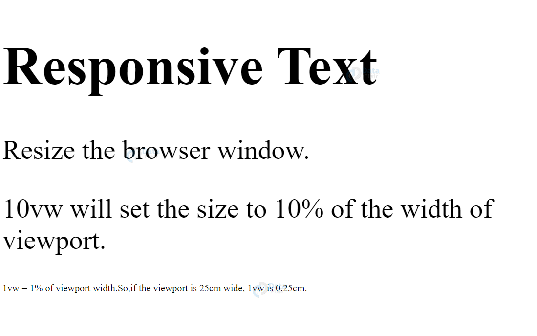
We can make text-size responsive using the ‘vw’ units (viewport width). The text-size varies according to the browser’s window size.
<!DOCTYPE html>
<html>
<head>
<meta name="viewport" content="width=device-width, initial-scale=1.0">
</head>
<body>
<h1 style="font-size:10vw;">Responsive Text</h1>
<p style="font-size:5vw;">Resize the browser window.</p>
<p style="font-size:5vw;">10vw will set the size to 10% of the width of viewport.</p>
<p>1vw = 1% of viewport width.So,if the viewport is 25cm wide, 1vw is 0.25cm.</p>
</body>
</html>
Output-
5. HTML Media Query
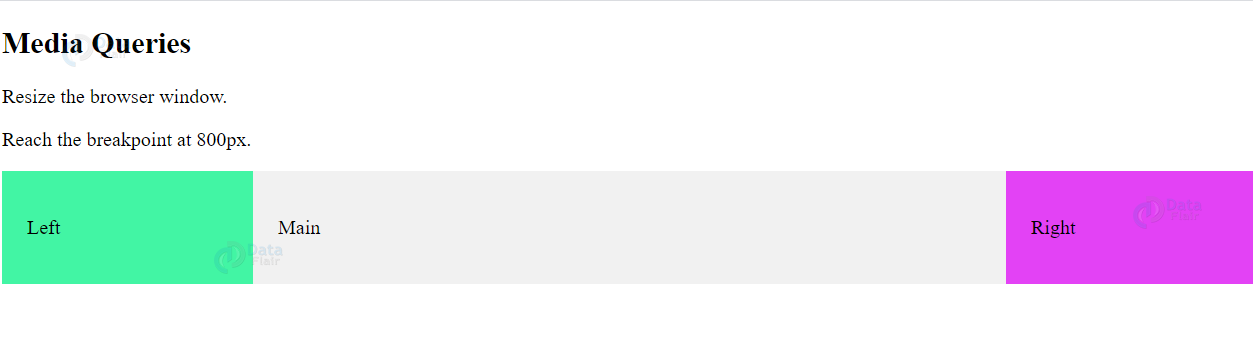
We can set different styles for the web-page on different browsers using media queries. In the following examples, the orientation of three div elements is changed as per the browser’s size.
<!DOCTYPE html>
<html>
<head>
<meta name="viewport" content="width=device-width, initial-scale=1.0">
<style>
* {
  box-sizing:border-box;
}
.left {
  background-color:#42f5a4;
  padding:20px;
  float:left;
  width:20%;
}
.main {
  background-color:#f1f1f1;
  padding:20px;
  float:left;
  width:60%;
}

.right {
  background-color:#e342f5;
  padding:20px;
  float:left;
  width:20%;
}
/* media query to add a break point at 800px: */
@media screen and (max-width:800px) {
  .left, .main, .right {
    width:100%; /* The width is 100%, when the viewport is 800px or smaller */
  }
}
</style>
</head>
<body>
<h2>Media Queries</h2>
<p>Resize the browser window.</p>
<p>Reach the breakpoint at 800px.</p>
<div class="left">
  <p>Left</p>
</div>
<div class="main">
  <p>Main</p>
</div>
<div class="right">
  <p>Right</p>
</div>
</body>
</html>
Output-
Before-
After-

HTML Frameworks
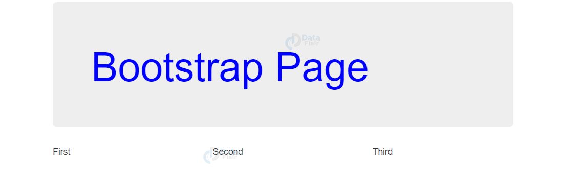
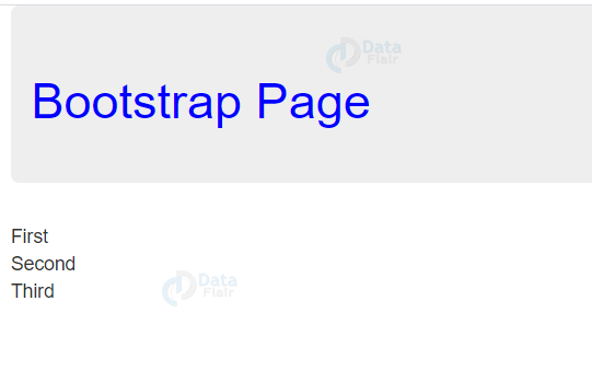
1. Bootstrap
One of the most popular web-pages is Bootstrap. It uses HTML,CSS and jquery.
<!DOCTYPE html>
<html lang="en">
<head>
<title>Bootstrap</title>
<meta charset="utf-8">
<meta name="viewport" content="width=device-width, initial-scale=1">
<link rel="stylesheet" href="https://maxcdn.bootstrapcdn.com/bootstrap/3.3.7/css/bootstrap.min.css">
<script src="https://ajax.googleapis.com/ajax/libs/jquery/3.2.0/jquery.min.js"></script>
<script src="https://maxcdn.bootstrapcdn.com/bootstrap/3.3.7/js/bootstrap.min.js"></script>
</head>
<body>
<div class="container">
  <div class="jumbotron" style="color: blue;">
    <h1>Bootstrap Page</h1>
  </div>
  <div class="row">
    <div class="col-sm-4">
      First
    </div>
    <div class="col-sm-4">
      Second
    </div>
    <div class="col-sm-4">
    Third
    </div>
  </div>
</div>
</body>
</html>
Output-
Before-
After-
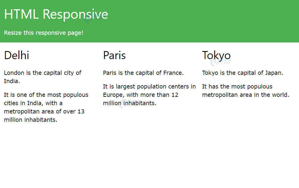
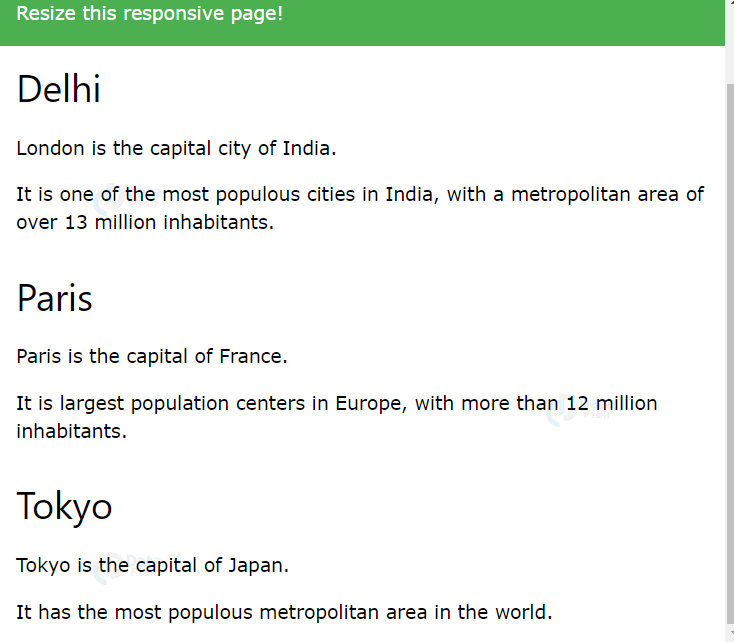
2. W3.CSS
W3.CSS stylesheet is also to make responsive web-pages. For Example
<!DOCTYPE html>
<html>
<meta name="viewport" content="width=device-width, initial-scale=1">
<link rel="stylesheet" href="https://www.w3schools.com/w3css/4/w3.css">
<body>

<div class="w3-container w3-green">
  <h1>HTML responsive</h1>
  <p>Resize this responsive page!</p>
</div>

<div class="w3-row-padding">
  <div class="w3-third">
    <h2>Delhi</h2>
    <p>Delhi is the capital city of India.</p>
    <p>It is the most populous city in India,
    with a metropolitan area of over 13 million inhabitants.</p>
  </div>

  <div class="w3-third">
    <h2>Paris</h2>
    <p>Paris is the capital of France.</p>
    <p>The Paris area is one of the largest population centers in Europe,
    with more than 12 million inhabitants.</p>
  </div>

  <div class="w3-third">
    <h2>Tokyo</h2>
    <p>Tokyo is the capital of Japan.</p>
    <p>It is the center of the Greater Tokyo Area,
    and the most populous metropolitan area in the world.</p>
  </div>
</div>

</body>
</html>
Output-
Before-
After-
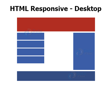
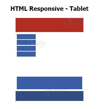
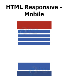
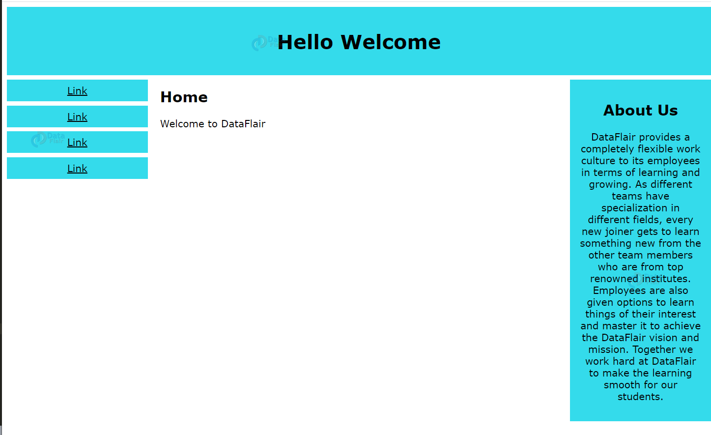
An example of responsive web-page
<!DOCTYPE html>
<html>
<head>
<meta name="viewport" content="width=device-width, initial-scale=1.0">
<style>
* {
  box-sizing: border-box;
}
.menu {
  float:left;
  width:20%;
  text-align:center;
}
.menu a {
  background-color:#34dbeb;
  padding:8px;
  margin-top:7px;
  display:block;
  width:100%;
  color:black;
}
.main {
  float:left;
  width:60%;
  padding:0 20px;
}
.right {
  background-color:#34dbeb;
  float:left;
  width:20%;
  padding:15px;
  margin-top:7px;
  text-align:center;
}
@media only screen and (max-width:620px) {
  /* For mobile phones: */
  .menu, .main, .right {
    width:100%;
  }
}
</style>
</head>
<body style="font-family:Verdana;color:black;">
<div style="background-color:#34dbeb;padding:15px;text-align:center;">
  <h1>Hello Welcome</h1>
</div>
<div style="overflow:auto">
  <div class="menu">
    <a href="#">Link</a>
    <a href="#">Link</a>
    <a href="#">Link</a>
    <a href="#">Link</a>
  </div>
  <div class="main">
    <h2>Home</h2>
    <p>Welcome to DataFlair</p>
  </div>

  <div class="right">
    <h2>About Us</h2>
    <p>DataFlair provides a completely flexible work culture to its employees in terms of learning and growing. As different teams have specialization in different fields, every new joiner gets to learn something new from the other team members who are from top renowned institutes. Employees are also given options to learn things of their interest and master it to achieve the DataFlair vision and mission. Together we work hard at DataFlair to make the learning smooth for our students.</p>
  </div>
</div>
</body>
</html>
Output-
Summary
In this article, we’ve discussed how to make responsive web design using responsive HTML pages. HTML websites that are adjustable on different devices or browser size are responsive pages. We’ve learned about the use of <meta> tag to set the viewport, responsive images, responsive text size, and media query. We’ve also looked at two popular frameworks-Bootstrap and W3.CSS.
If you are Happy with DataFlair, do not forget to make us happy with your positive feedback on Google
