HTML Button Tag – Types, Effects and Attributes
Full Stack Web Development Courses with Real-time projects Start Now!!
In this article, we are going to learn HTML Button Tags. So let’s start!!!
HTML Button
The <button> tag of HTML is used to create a clickable button. The button can contain text and other tags such as <strong>, <i>, <br>, <img>, etc. Such provisions are not given by a button created using the <input> element. The appearance of the button can be changed and manipulated using the CSS3 properties. A button consists of various attributes that tell the browser about its course of action, right from clicking.
A major flexibility of HTML buttons is the factor that they can contain icons too. So with the use of icons enclosed into buttons, the application interface is more visually and cognitively attractive. This is especially important in web applications where the space is a constraint or in cases where the button’s purpose can be further explained by the context provided through such images. You can use <i> or <img> tags to include icons into your button.
Syntax- <button type= “ ”>Content </button>
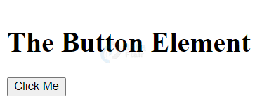
<!DOCTYPE html>
<html>
<body>
<h1>The Button Element</h1>
<button type="button" onclick="alert('Welcome to DataFlair')">Click Me</button>
</body>
</html>
Output-
HTML Button Attributes
| Attribute | Value | Description |
| autofocus | autofocus | Specifies that a button should automatically get focus as soon as the page loads. |
| disabled | disabled | Specifies that a button should be disabled. |
| form | form_id | Specifies the form to which the button belongs. |
| formaction | URL | Specifies where to send the data of the form when it is submitted. Only for type=”submit”. |
| formenctype | application/x-www-form-urlencoded multipart/form-data text/plain | Specifies how form-data should be encoded, before sending it to a server. (Only for type=”submit”) |
| formmethod | get post | Specifies how to send the form-data i.e. HTTP method, only for type=”submit” |
| formnovalidate | formnovalidate | Specifies that the form-data should not be validated, on submission. Only for type=”submit” |
| formtarget | _blank _self _parent _top framename | Specifies where to display the response after the submission of the form. |
| name | name | Specifies a name for the button. |
| type | button reset submit | Specifies the type of button. |
| value | text | Specifies an initial value for the button that will be displayed. |
HTML buttons also support global and event attributes.
Styling of Buttons in HTML
We can use CSS3 to style the button. The following are some examples.
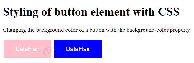
<!DOCTYPE html>
<html>
<head>
<style>
.button {
  border: none;
  color: white;
  padding: 15px 32px;
  text-align: center;
  text-decoration: none;
  display: inline-block;
  font-size: 16px;
  margin: 4px 2px;
  cursor: pointer;
}

.button1 {background-color: pink;}
.button2 {background-color: blue;}
</style>
</head>
<body>

<h1>Styling of button element with CSS</h1>
<p>Changing the background color of a button with the background-color property</p>
<button class="button button1">DataFlair</button>
<button class="button button2">DataFlair</button>
</body>
</html>
Output-
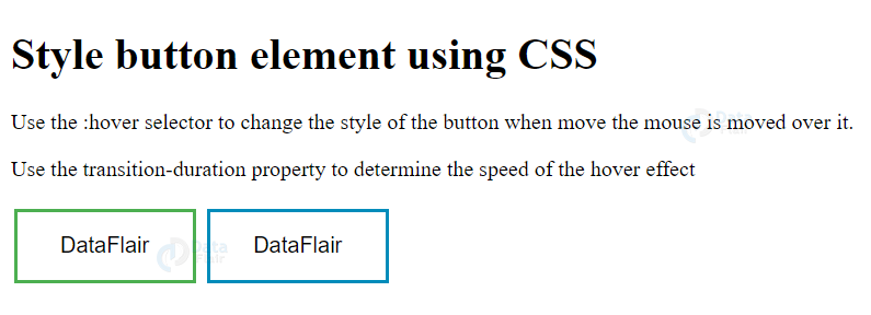
Here is another example where we will display the hovering effect on the button.
<!DOCTYPE html>
<html>
<head>
<style>
.button {
  border: none;
  color: white;
  padding: 16px 32px;
  text-align: center;
  text-decoration: none;
  display: inline-block;
  font-size: 16px;
  margin: 4px 2px;
  transition-duration: 0.4s;
  cursor: pointer;
}

.button1 {
  background-color: white;
  color: black;
  border: 2px solid #4CAF50;
}

.button1:hover {
  background-color: #4CAF50;
  color: white;
}

.button2 {
  background-color: white;
  color: black;
  border: 2px solid #008CBA;
}

.button2:hover {
  background-color: #008CBA;
  color: white;
}

</style>
</head>
<body>
<h1>Style button element using CSS</h1>
<p>Use the :hover selector to change the style of the button when mouse is moved over it.</p>
<p>Use the transition-duration property to determine the speed of the hover effect</p>
<button class="button button1">DataFlair</button>
<button class="button button2">DataFlair</button>
</body>
</html>
Output-
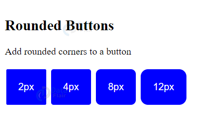
Use of Border-Radius Property
We can use the border-radius property to create round buttons.
<!DOCTYPE html>
<html>
<head>
<style>
.button {
  background-color: blue;
  border: none;
  color: white;
  padding: 20px;
  text-align: center;
  text-decoration: none;
  display: inline-block;
  font-size: 16px;
  margin: 4px 2px;
  cursor: pointer;
}

.button1 {border-radius: 2px;}
.button2 {border-radius: 4px;}
.button3 {border-radius: 8px;}
.button4 {border-radius: 12px;}
.button5 {border-radius: 50%;}
</style>
</head>
<body>

<h2>Rounded Buttons</h2>
<p>Add rounded corners to a button</p>
<button class="button button1">2px</button>
<button class="button button2">4px</button>
<button class="button button3">8px</button>
<button class="button button4">12px</button>
</body>
</html>
Output-
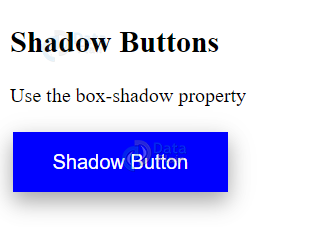
HTML Shadow Buttons
We can enhance the buttons using the shadow effect
<!DOCTYPE html>
<html>
<head>
<style>
.button {
  background-color: blue;
  border: none;
  color: white;
  padding: 15px 32px;
  text-align: center;
  text-decoration: none;
  display: inline-block;
  font-size: 16px;
  margin: 4px 2px;
  cursor: pointer;
  -webkit-transition-duration: 0.4s;
  transition-duration: 0.4s;
}
.button1 {
  box-shadow: 0 8px 16px 0 rgba(0,0,0,0.2), 0 6px 20px 0 rgba(0,0,0,0.19);
}

</style>
</head>
<body>
<h2>Shadow Buttons</h2>
<p>Use the box-shadow property</p>
<button class="button button1">Shadow Button</button>
</body>
</html>
Output-
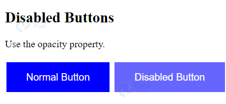
HTML Disabled Buttons
We can also create disabled buttons.
<!DOCTYPE html>
<html>
<head>
<style>
.button {
  background-color: blue;
  border: none;
  color: white;
  padding: 15px 32px;
  text-align: center;
  text-decoration: none;
  display: inline-block;
  font-size: 16px;
  margin: 4px 2px;
  cursor: pointer;
}
.disabled {
  opacity: 0.6;
  cursor: not-allowed;
}
</style>
</head>
<body>

<h2>Disabled Buttons</h2>
<p>Use the opacity property.</p>
<button class="button">Normal Button</button>
<button class="button disabled">Disabled Button</button>
</body>
</html>
Output-
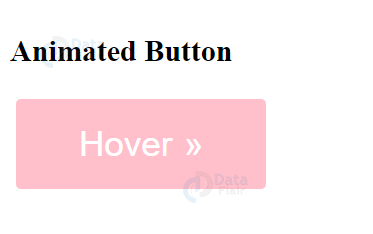
HTML Animated Button
We can also add animated hovering effects to buttons.
<!DOCTYPE html>
<html>
<head>
<style>
.button {
  display: inline-block;
  border-radius: 4px;
  background-color: pink;
  border: none;
  color: #FFFFFF;
  text-align: center;
  font-size: 28px;
  padding: 20px;
  width: 200px;
  transition: all 0.5s;
  cursor: pointer;
  margin: 5px;
}

.button span {
  cursor: pointer;
  display: inline-block;
  position: relative;
  transition: 0.5s;
}

.button span:after {
  content: '\00bb';
  position: absolute;
  opacity: 0;
  top: 0;
  right: -20px;
  transition: 0.5s;
}

.button:hover span {
  padding-right: 25px;
}

.button:hover span:after {
  opacity: 1;
  right: 0;
}
</style>
</head>
<body>
<h2>Animated Button</h2>
<button class="button" style="vertical-align:middle"><span>Hover</span></button>
</body>
</html>
Output-
HTML Button-Width Property
We can set the width of a button using CSS.
<!DOCTYPE html>
<html>
<head>
<style>
.button {
border: none;
color: white;
padding: 15px 32px;
text-align: center;
text-decoration: none;
display: inline-block;
font-size: 16px;
margin: 4px 2px;
cursor: pointer;
}
.button1 {width: 250px;background-color: blue;}
.button2 {width: 50%;background-color: pink;}
.button3 {width: 100%;background-color: purple;}
</style>
</head>
<body>
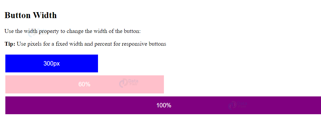
<h2>Button Width</h2>
<p>Use the width property to change the width of the button:</p>
<p><strong>Tip:</strong> Use pixels for a fixed width and percent for responsive buttons</p>
<button class="button button1">300px</button><br>
<button class="button button2">60%</button><br>
<button class="button button3">100%</button>
</body>
</html>
Output-
HTML Button Groups
We can create button groups and add borders to them using CSS.
<!DOCTYPE html>
<html>
<head>
<style>
.btn-group .button {
background-color: blue;
border: 1px solid black;
color: white;
padding: 15px 32px;
text-align: center;
text-decoration: none;
display: inline-block;
font-size: 16px;
cursor: pointer;
float: left;
}
.btn-group .button:not(:last-child) {
border-right: none; /* to prevent double borders */
}
</style>
</head>
<body>
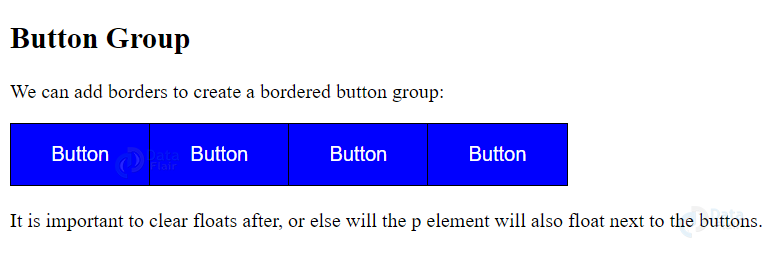
<h2>Button Group</h2>
<p>We can add borders to create a bordered button group:</p>
<div class="btn-group">
<button class="button">Button</button>
<button class="button">Button</button>
<button class="button">Button</button>
<button class="button">Button</button>
</div>
<p style="clear:both"><br>It is important to clear floats after, or else will the p element will also float next to the buttons.</p>
</body>
</html>
Output-
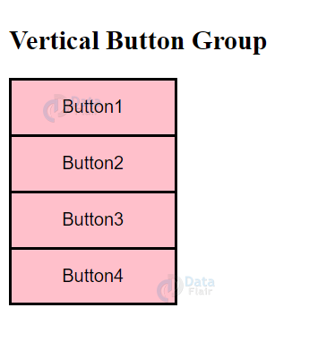
We can also create vertical button groups.
<!DOCTYPE html>
<html>
<head>
<style>
.btn-group .button {
  background-color: pink;
  border: 2px solid black;
  padding: 15px 32px;
  text-align: center;
  text-decoration: none;
  font-size: 16px;
  cursor: pointer;
  width: 150px;
  display: block;
}

.btn-group .button:not(:last-child) {
  border-bottom: none; /* to prevent double borders */
}

</style>
</head>
<body>

<h2>Vertical Button Group</h2>

<div class="btn-group">
  <button class="button">Button1</button>
  <button class="button">Button2</button>
  <button class="button">Button3</button>
  <button class="button">Button4</button>
</div>

</body>
</html>
Output-
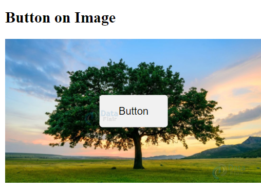
HTML Button on an Image
We can add a button on an image using CSS.
<head>
<style>
.container {
  position: relative;
  width: 100%;
  max-width: 400px;
}

.container img {
  width: 100%;
  height: auto;
}

.container .btn {
  position: absolute;
  top: 50%;
  left: 50%;
  transform: translate(-50%, -50%);
  -ms-transform: translate(-50%, -50%);
  background-color: #f1f1f1;
  color: black;
  font-size: 16px;
  padding: 16px 30px;
  border: none;
  cursor: pointer;
  border-radius: 5px;
  text-align: center;
}
</style>
</head>
<body>
<h2>Button on Image</h2>
<div class="container">
  <img src="images/tree.jpg" alt="Tree" style="width:100%">
  <button class="btn">Button</button>
</div>

</body>
</html>
Output-
Effects on HTML Buttons
We can create certain animated effects on the buttons using CSS.
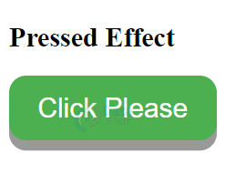
1. Pressed Effect
<html>
<!DOCTYPE html>
<html>
<head>
<style>
.button {
  display: inline-block;
  padding: 15px 25px;
  font-size: 24px;
  cursor: pointer;
  text-align: center;
  text-decoration: none;
  outline: none;
  color: #fff;
  background-color: #4CAF50;
  border: none;
  border-radius: 15px;
  box-shadow: 0 9px #999;
}
.button:hover {background-color: #3e8e41}
.button:active {
  background-color: #3e8e41;
  box-shadow: 0 5px #666;
  transform: translateY(4px);
}
</style>
</head>
<body>
<h2>Pressed Effect</h2>
<button class="button">Click Please</button>
</body>
</html>
Output-
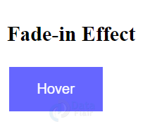
2. Fade-in effect
<!DOCTYPE html>
<html>
<head>
<meta name="viewport" content="width=device-width, initial-scale=1">
<style>
.button {
  background-color: blue;
  border: none;
  color: white;
  padding: 16px 32px;
  text-align: center;
  font-size: 16px;
  margin: 4px 2px;
  opacity: 0.6;
  transition: 0.3s;
  display: inline-block;
  text-decoration: none;
  cursor: pointer;
}

.button:hover {opacity: 1}
</style>
</head>
<body>

<h2>Fade-in Effect</h2>

<button class="button">Hover</button>
</body>
</html>
Output-
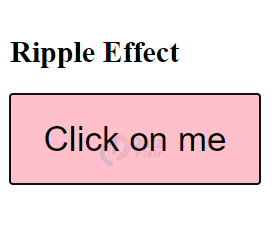
3. Ripple Effect
<!DOCTYPE html>
<html>
<head>
<style>
.button {
  position: relative;
  background-color:pink;
  border: none;
  font-size: 28px;
  padding: 20px;
  width: 200px;
  text-align: center;
  transition-duration: 0.4s;
  text-decoration: none;
  overflow: hidden;
  cursor: pointer;
}

.button:after {
  content: "";
  background: #f1f1f1;
  display: block;
  position: absolute;
  padding-top: 300%;
  padding-left: 350%;
  margin-left: -20px !important;
  margin-top: -120%;
  opacity: 0;
  transition: all 0.8s
}

.button:active:after {
  padding: 0;
  margin: 0;
  opacity: 1;
  transition: 0s
}
</style>
</head>
<body>

<h2>Ripple Effect</h2>

<button class="button">Click on me</button>

</body>
</html>
Output-
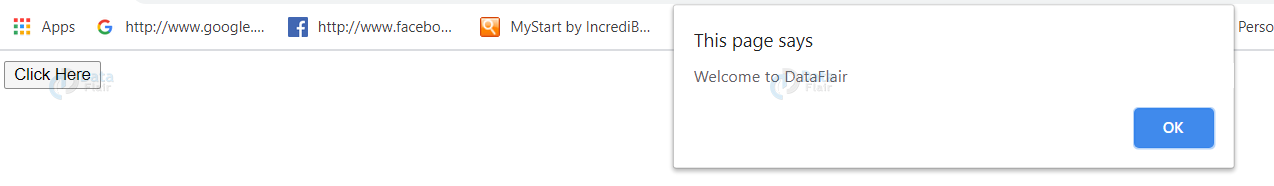
JavaScript on Buttons
We can incorporate javascript on buttons for validation. This can be used within forms for successful validation of information provided by the user.
<!DOCTYPE>
<html>
<body>
<button name="button" value="okay" type="button" onclick="Hello()">Click Here</button>
<script>
function Hello(){
alert("Welcome to DataFlair");
}
</script>
</body>
</html>
Output-
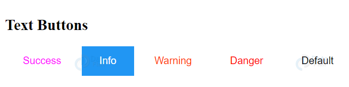
Text Buttons
To create text buttons, we remove the border and background-color.
<!DOCTYPE html>
<html>
<head>
<meta name="viewport" content="width=device-width, initial-scale=1">
<style>
.btn {
  border: none;
  background-color: inherit;
  padding: 14px 28px;
  font-size: 16px;
  cursor: pointer;
  display: inline-block;
}
.success {
  color: #ff00ff;
}

.success:hover {
  background-color: #4CAF50;
  color: white;
}

.info {
  color: dodgerblue;
}

.info:hover {
  background: #2196F3;
  color: white;
}

.warning {
  color: #ff3300;
}

.warning:hover {
  background: #ff9800;
  color: white;
}

.danger {
  color: red;
}

.danger:hover {
  background: #f44336;
  color: white;
}

.default {
  color: black;
}

.default:hover {
  background: #e7e7e7;
}
</style>
</head>
<body>

<h2>Text Buttons</h2>
<button class="btn success">Success</button>
<button class="btn info">Info</button>
<button class="btn warning">Warning</button>
<button class="btn danger">Danger</button>
<button class="btn default">Default</button>
</body>
</html>
Output-
Summary
In this article, we discussed the HTML button tag. It helps to create standard buttons in an HTML document. We looked at its attributes and how it can be used at ease as compared to the input tag. We’ve also discussed the manipulation of HTML buttons using CSS3- background-color property hovering effect, border-radius property, shadow buttons, disabled buttons, animated buttons, button-width, button groups, button on an image and animated effects on buttons and use of javascript on buttons and text buttons.
We work very hard to provide you quality material
Could you take 15 seconds and share your happy experience on Google


Hello, how do you make a HTML button and link it to a site?