HTML Layout Elements and Techniques
Full Stack Web Development Courses with Real-time projects Start Now!!
It is important to have a systematic and aesthetic organization of the elements in an HTML web-page. It makes the web-page better and provides an overall visual appeal to the users. The users can go through the multiple columns and achieve a smooth and simple flow of information. It typically describes the way in which a web-page can be arranged. Let us learn more about HTML Layouts and their Techniques.
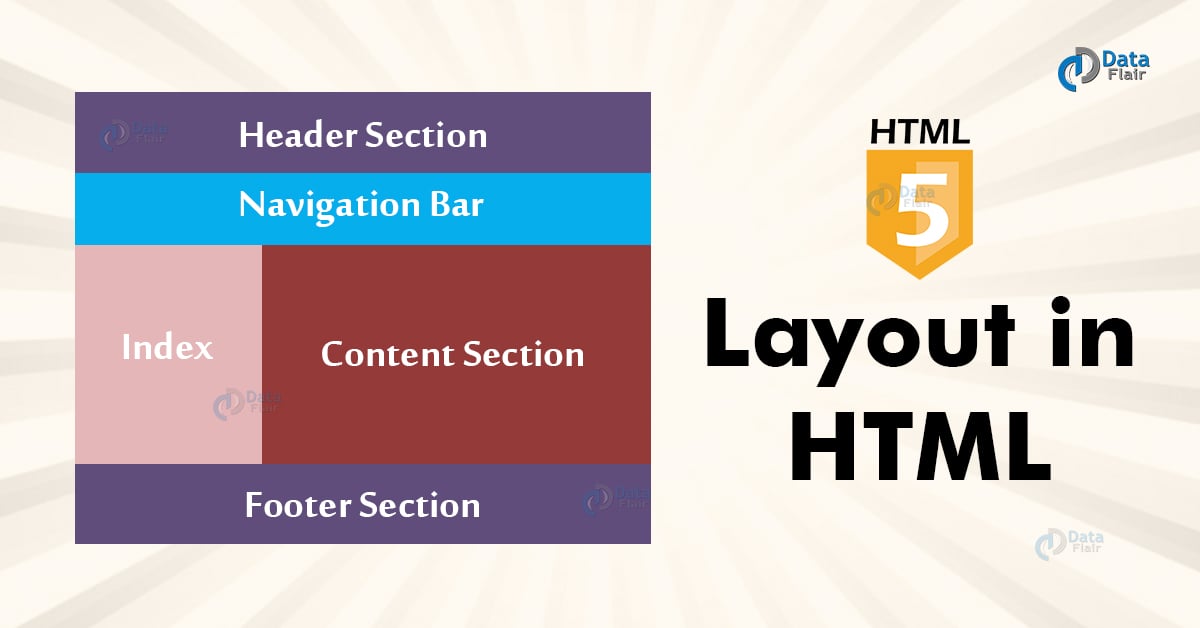
HTML Page Layout
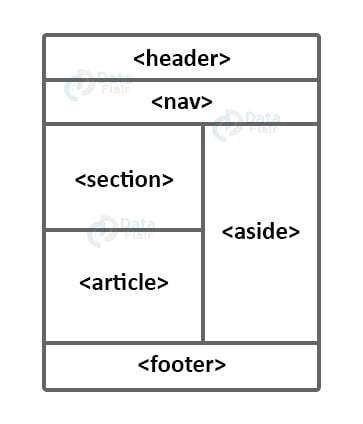
1. HTML Header- This section is displayed on top of the web-page and defines the header information related to it. The <header> tag defines the header section.
2. HTML Navigation Bar- The menu regarding the contents of the web-page is displayed using a navigation bar. It contains hyperlinks related to the web-page. The <nav> tag defines the navigation section.
3. HTML Index/Sidebar- It contains the other information related to the web-page, for example, advertisements. It’s not mandatory to use an index. The <aside> tag defines the index/sidebar section.
4. HTML Content Section- This section contains the purpose and details of the web-page that showcases the website’s real purpose.It is defined using <section> or <article> tags.
5. HTML Footer- The footer contains the other relevant information related to the web page, such as contact information or address. The <footer> tag defines this section.
6. HTML Additional Details- The <details> element is used to display additional details. The <summary> tag defines this section.
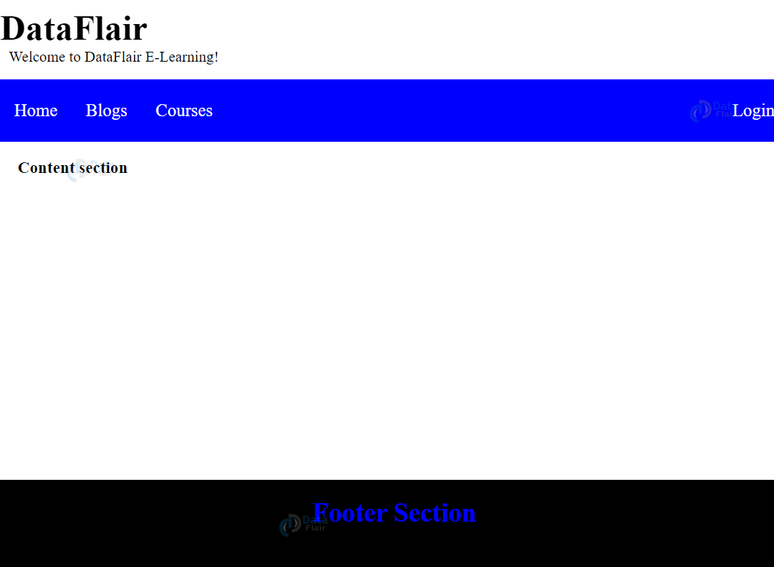
HTML Layout Elements
<!DOCTYPE html>
<html>
<head>
   <title>HTML Layout</title>
   <style>
      .head1 {
         font-size:40px;
         color:#blue;
         font-weight:bold;
      }
      .head2 {
         font-size:17px;
         margin-left:10px;
         margin-bottom:15px;
      }
      body {
         margin: 0 auto;
         background-position:center;
         background-size: contain;
      }

      .nav {
         position: sticky;
         top: 0;
         background-color: blue;
         padding:10px 0px 10px 0px;
         color:white;
         margin: 0 auto;
         overflow: hidden;
      }
      .nav a {
         float: left;
         color: white;
         text-align: center;
         padding: 14px 16px;
         text-decoration: none;
         font-size: 20px;
      }
      .nav-log {
         right: auto;
         float: right;
      }
      footer {
         width: 100%;
         bottom: 0px;
         background-color: #000;
         color: blue;
         position: absolute;
         padding-top:20px;
         padding-bottom:50px;
         text-align:center;
         font-size:30px;
         font-weight:bold;
      }
      .body_sec {
         margin-left:20px;
      }
   </style>
</head>

<body>

   <!-- Header Section -->
   <header>
      <div class="head1">DataFlair</div>
      <div class="head2">Welcome to DataFlair E-Learning!</div>
   </header>

   <!-- Menu Navigation Bar -->
   <div class="nav">
      <a href="#home">Home</a>
      <a href="#blogs">Blogs</a>
      <a href="#courses">Courses</a>
      <div class="nav-log">
         <a href="#login">Login</a>
      </div>
   </div>

   <!-- Body section -->
   <div class = "body_sec">
      <section id="Content">
         <h3>Content section</h3>
      </section>
   </div>

   <!-- Footer Section -->
   <footer>Footer Section</footer>
</body>
</html>
Output-
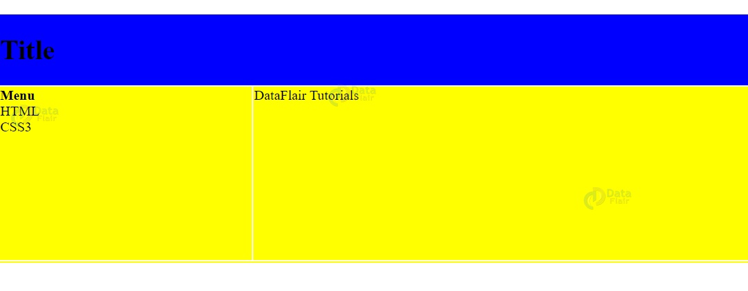
HTML Table Layout
<!DOCTYPE html>
<html>
   <head>
      <title>HTML Layout Table</title>
   </head>
   <body>
      <table width = "100%" border = "0">
         <tr>
            <td colspan = "2" bgcolor = "Blue">
               <h1>Title</h1>
            </td>
         </tr>
         <tr valign = "top">
            <td bgcolor = "yellow" width = "50">
               <b>Menu</b><br />
               HTML<br />
               CSS3<br />
            </td>

            <td bgcolor = "yellow" width = "100" height = "200">
               DataFlair Tutorials
            </td>
         </tr>
         <tr>
            <td colspan = "2" bgcolor = "yellow">
            </td>
         </tr>
      </table>
   </body>
</html>
Output-
HTML Layout Techniques
To create systematic and aesthetic layouts on our web-page, we can use HTML Layouts.
1. CSS Framework
W3.CSS and Bootstrap are popular CSS frameworks.
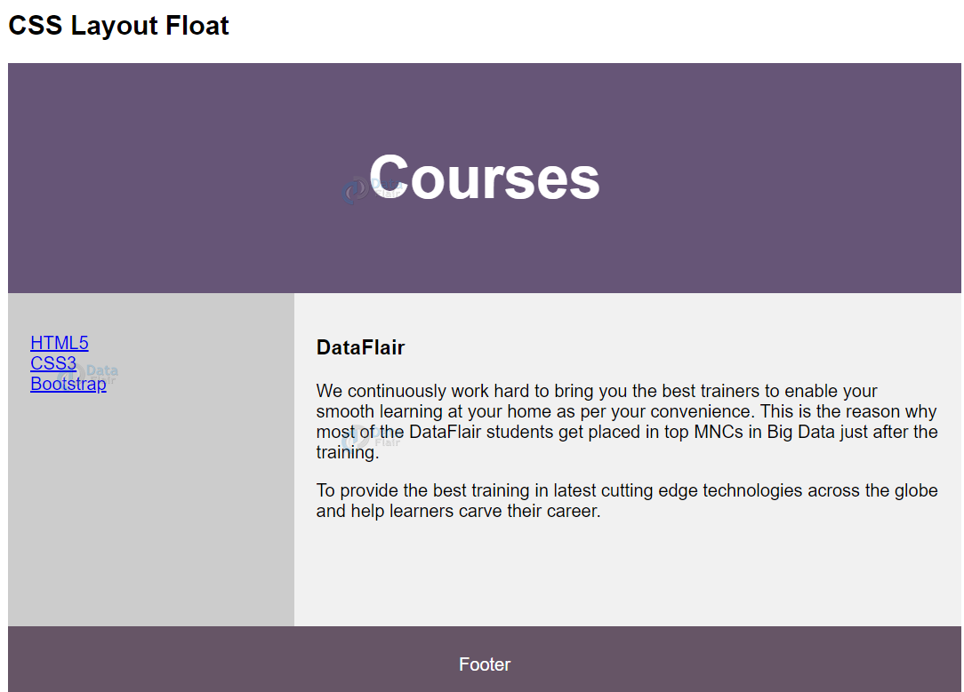
2. CSS Float Layout
We can use the CSS float property to create layouts.
<!DOCTYPE html>
<html lang="en">
<head>
<title>CSS Template</title>
<meta charset="utf-8">
<meta name="viewport" content="width=device-width, initial-scale=1">
<style>
* {
  box-sizing: border-box;
}

body {
  font-family: Arial, Helvetica;
}

/* Style the header */
header {
  background-color: #657;
  padding: 30px;
  text-align: center;
  font-size: 35px;
  color: white;
}

/* Create two columns/boxes that float next to each other */
nav {
  float: left;
  width: 30%;
  height: 300px;
  background: #ccc;
  padding: 20px;
}

/* Style the list */
nav ul {
  list-style-type: none;
  padding: 0;
}

article {
  float: left;
  padding: 20px;
  width: 70%;
  background-color: #f1f1f1;
  height: 300px;
}

/* Clear floats after the columns */
section:after {
  content: "";
  display: table;
  clear: both;
}

/* Style the footer */
footer {
  background-color: #656;
  padding: 10px;
  text-align: center;
  color: white;
}

@media (max-width: 600px) {
  nav, article {
    width: 100%;
    height: auto;
  }
}
</style>
</head>
<body>
<h2>CSS Layout Float</h2>
<header>
  <h2>Courses</h2>
</header>
<section>
  <nav>
    <ul>
      <li><a href="#">HTML5</a></li>
      <li><a href="#">CSS3</a></li>
      <li><a href="#">Bootstrap</a></li>
    </ul>
  </nav>
  <article>
    <h1>DataFlair</h1>
    <p>We continuously work hard to bring you the best trainers to enable your smooth learning at your home as per your convenience. This is the reason why most of the DataFlair students get placed in top MNCs in Big Data just after the training.</p>
    <p>To provide the best training in latest cutting edge technologies across the globe and help learners carve their career.</p>
  </article>
</section>
<footer>
  <p>Footer</p>
</footer>
</body>
</html>
Output-
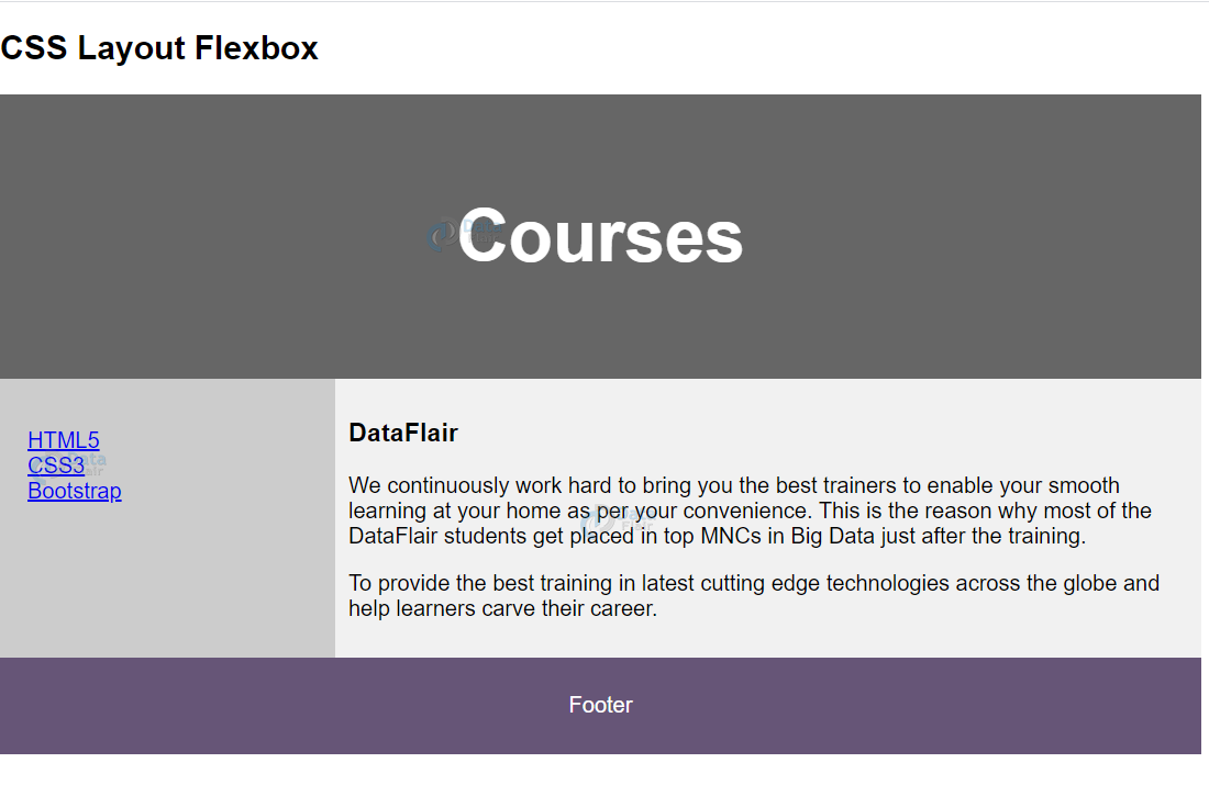
3. CSS Flexbox Layout
Flexbox layout of CSS is used to ensure the flexibility of the web-page over different devices.
<!DOCTYPE html>
<html lang="en">
<head>
<title>CSS Template</title>
<meta charset="utf-8">
<meta name="viewport" content="width=device-width, initial-scale=1">
<style>
* {
  box-sizing: border-box;
}

body {
  font-family: Arial, Helvetica;
}

/* Style the header */
header {
  background-color: #666;
  padding: 30px;
  text-align: center;
  font-size: 35px;
  color: white;
}

/* Container for flexbox */
section {
  display: -webkit-flex;
  display: flex;
}

/* Style the menu */
nav {
  -webkit-flex: 1;
  -ms-flex: 1;
  flex: 1;
  background: #ccc;
  padding: 20px;
}

/* Style the list */
nav ul {
  list-style-type: none;
  padding: 0;
}

/* Style the content */
article {
  -webkit-flex: 3;
  -ms-flex: 3;
  flex: 3;
  background-color: #f1f1f1;
  padding: 10px;
}

/* Style the footer */
footer {
  background-color: #657;
  padding: 10px;
  text-align: center;
  color: white;
}
@media (max-width: 600px) {
  section {
    -webkit-flex-direction: column;
    flex-direction: column;
  }
</style>
</head>
<body>
<h2>CSS Layout Flexbox</h2>
<header>
  <h2>Courses</h2>
</header>
<section>
  <nav>
    <ul>
      <li><a href="#">HTML5</a></li>
      <li><a href="#">CSS3</a></li>
      <li><a href="#">Bootstrap</a></li>
    </ul>
  </nav>
  <article>
    <h1>DataFlair</h1>
    <p>We continuously work hard to bring you the best trainers to enable your smooth learning at your home as per your convenience. This is the reason why most of the DataFlair students get placed in top MNCs in Big Data just after the training.</p>
    <p>To provide the best training in latest cutting edge technologies across the globe and help learners carve their career.</p>
  </article>
</section>
<footer>
  <p>Footer</p>
</footer>
</body>
</html>
Output-
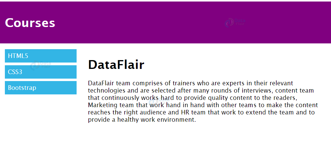
4. CSS Grid Layout
The CSS grid layout consists of rows and columns, thus making it easier to design than float and flexbox.
<!DOCTYPE html>
<html>
<head>
<meta name="viewport" content="width=device-width, initial-scale=1.0">
<style>
* {
  box-sizing: border-box;
}
.row::after {
  content: "";
  clear: both;
  display: table;
}
[class*="col-"] {
  float: left;
  padding: 15px;
}
.col-1 {width: 8.33%;}
.col-2 {width: 16.66%;}
.col-3 {width: 25%;}
.col-4 {width: 33.33%;}
.col-5 {width: 41.66%;}
.col-6 {width: 50%;}
.col-7 {width: 58.33%;}
.col-8 {width: 66.66%;}
.col-9 {width: 75%;}
.col-10 {width: 83.33%;}
.col-11 {width: 91.66%;}
.col-12 {width: 100%;}
html {
  font-family: "Lucida Sans", sans-serif;
}
.header {
  background-color: purple;
  color: #ffffff;
  padding: 15px;
}
.nav ul {
  list-style-type: none;
  margin: 0;
  padding: 0;
}
.nav li {
  padding: 8px;
  margin-bottom: 7px;
  background-color: #33b5e5;
  color: #ffffff;
}
.nav li:hover {
  background-color: #0099cc;
}
</style>
</head>
<body>
<div class="header">
  <h1>Courses</h1>
</div>

<div class="row">
  <div class="col-3 nav">
    <ul>
      <li>HTML5</li>
      <li>CSS3</li>
      <li>Bootstrap</li>
    </ul>
  </div>
  <div class="col-9">
    <h1>DataFlair</h1>
    <p>DataFlair team comprises of trainers who are experts in their relevant technologies and are selected after many rounds of interviews, content team that continuously works hard to provide quality content to the readers, Marketing team that work hand in hand with other teams to make the content reaches the right audience and HR team that work to extend the team and to provide a healthy work environment.
    </p>
  </div>
</div>
</body>
</html>
Output-
Summary
In this article, we’ve discussed the layout of elements in an HTML document. HTML layouts are of great importance as they provide a systematic view and add to the web page’s visual appeal. We can use <div> or <table> elements to create HTML layout. We’ve also looked at the four major CSS layouts- CSS Framework, CSS float, CSS flexbox, and CSS grid.
These techniques not only make a website easier for users to navigate by depicting a clean and easily understandable design but also make it more accessible as well as SEO friendly. Therefore, by using these techniques the developers can ensure their websites are adaptable, accessible, and aesthetically pleasing, providing a seamless experience for all users.
Hope you enjoyed the article!!!! Do share your feedback in the comment section.
We work very hard to provide you quality material
Could you take 15 seconds and share your happy experience on Google
