Pandas Visualization – Plot 7 Types of Charts in Pandas in just 7 min.
Get Job-Ready: Data Analysis using Python with 70+ Projects Start Now!!
Python Pandas is mainly used to import and manage datasets in a variety of format. Today, a huge amount of data is generated in a day and Pandas visualization helps us to represent the data in the form of a histogram, line chart, pie chart, scatter chart etc.
Pandas Visualization
Visualization of data is important to understand the nuances of your dataset. Before we start Pandas Virtualization, we have to import the essential libraries. NumPy, Pandas, and Matplotlib.
>>> import numpy as np
>>> import pandas as pd
>>> import matplotlib.pyplot as plt
Next, we will import data from a csv file. The CSV file can be found at: https://download.mlcc.google.com/mledu-datasets/california_housing_train.csv
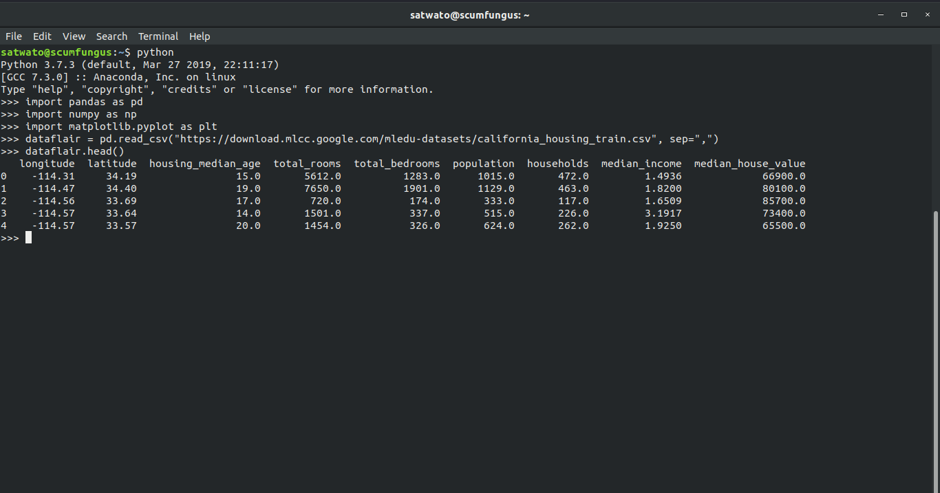
After importing the file, we will print the first 5 rows of the dataset using the .head() function.
>>> dataflair = pd.read_csv("https://download.mlcc.google.com/mledu-datasets/california_housing_train.csv", sep=",")
>>> dataflair.head()
Output:
longitude latitude housing_median_age total_rooms total_bedrooms population households median_income median_house_value
0 -114.31 34.19 15.0 5612.0 1283.0 1015.0 472.0 1.4936 66900.0
1 -114.47 34.40 19.0 7650.0 1901.0 1129.0 463.0 1.8200 80100.0
2 -114.56 33.69 17.0 720.0 174.0 333.0 117.0 1.6509 85700.0
3 -114.57 33.64 14.0 1501.0 337.0 515.0 226.0 3.1917 73400.0
4 -114.57 33.57 20.0 1454.0 326.0 624.0 262.0 1.9250 65500.0
Types of Visualization in Pandas
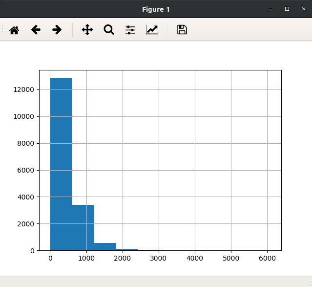
1. How to Plot a Histogram in Pandas?
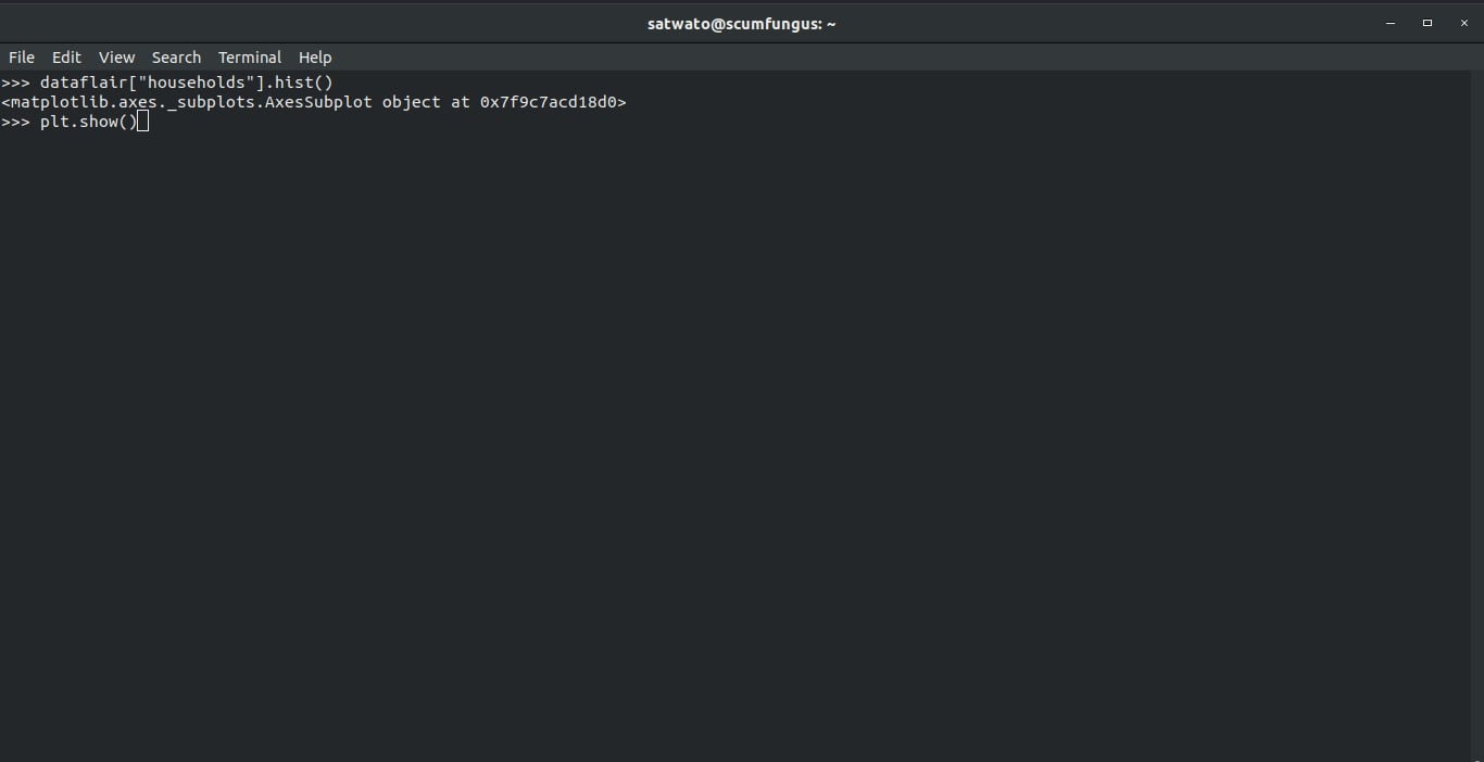
With the help of .hist() function, we can plot a histogram based on the parameters. In the example below, we have tried to find the histogram based on the “household” column.
>>> dataflair["households"].hist()
>>> plt.show()
Do you know what makes Python Pandas Unique?
Output:
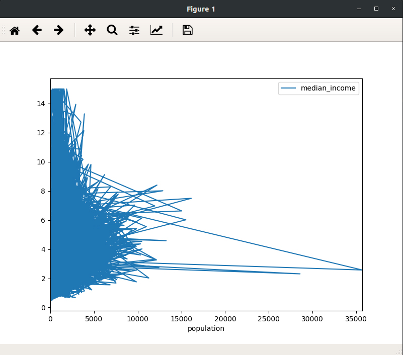
2. How to Plot a Line Chart in Pandas?
The .line function gives a line plot. We can set the x and y axis. In the example, we chose x-axis as the “population” and y-axis is “median income”.
>>> dataflair.plot.line(x='population', y='median_income', figsize=(8,6))
>>> plt.show()
Output:
Recommended Reading – 10 Amazing Applications of Pandas
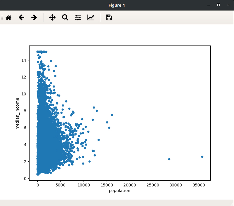
3. How to Plot Scatter Chart in Pandas?
The .scatter function lets us plot a scatter graph. Just like the previous function, the x and y-axes can be defined and the size of the graph can be set by the figsize parameter.
>>> dataflair.plot.scatter(x='population', y='median_income', figsize=(8,6))
>>> plt.show()
Output:
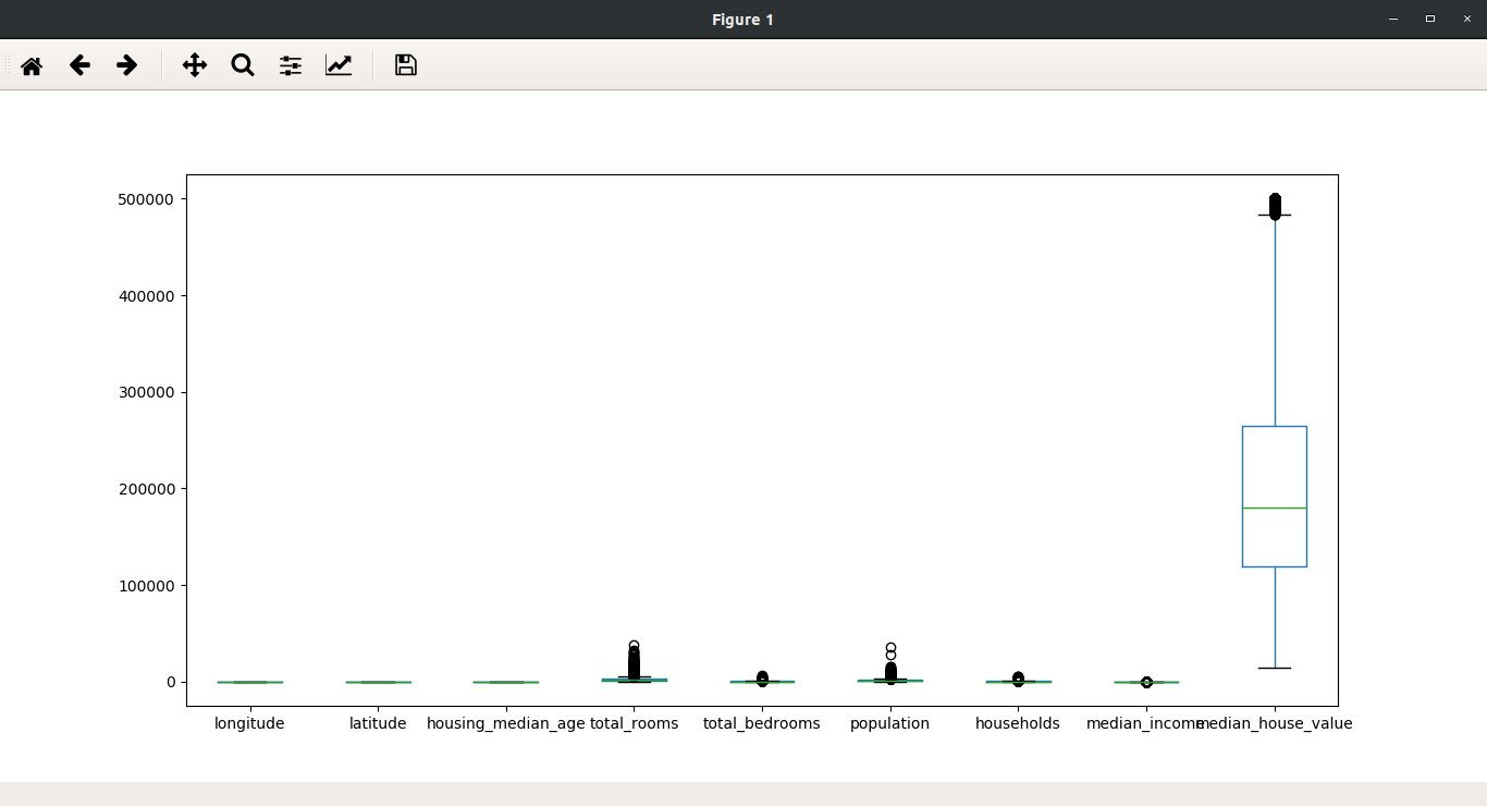
4. How to Plot a Boxplot in Pandas?
A boxplot is basically a five number summary of the data. It consists of the minimum, maximum, first quartile, median or second quartile, and the third quartile. The small dots are the outliers of the data. Here, we use .box function to plot a box plot graph.
>>> dataflair.plot.box(figsize=(8,6))
>>> plt.show()
Don’t forget to check out- Pandas Function Applications
Output-

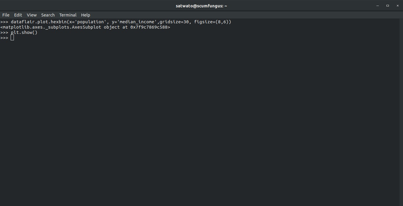
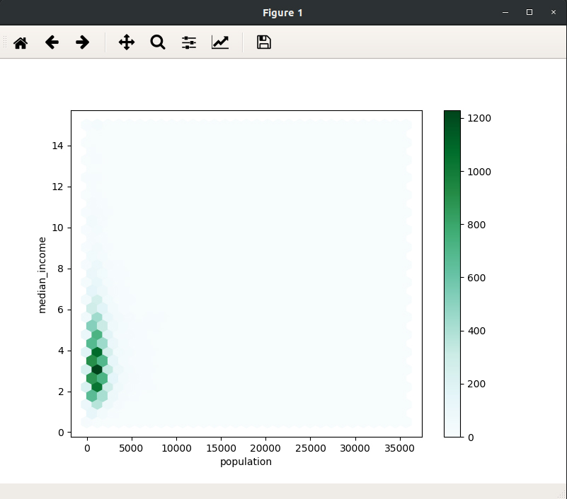
5. How to Plot Hexagonal Chart in Pandas?
In such a graph a hexagon represents points of intersection. The increase in the points of intersection increases the darkness of the color of the hexagon. We can create a hexagonal chart with the help of .plot.hexbin function.
>>> dataflair.plot.hexbin(x='population', y='median_income',gridsize=30, figsize=(8,6))
>>> plt.show()
Output-
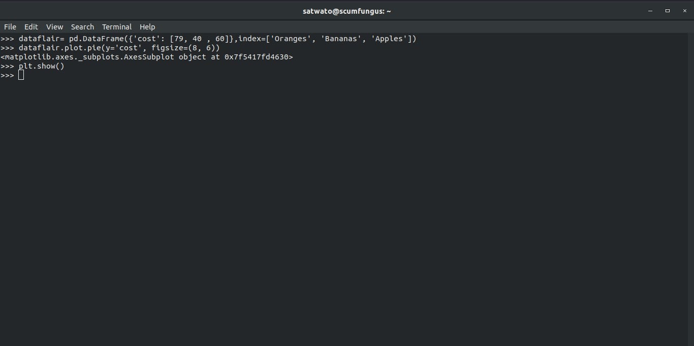
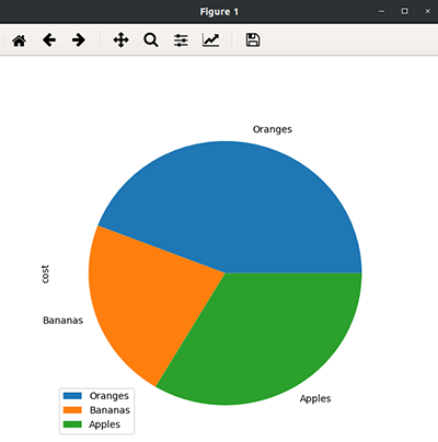
6. How to Plot a Pie Chart in Pandas?
We can plot a pie chart with the help of .plot.pie function. But first, we will make a new dataset which is smaller and has less values to represent, unlike our previous dataset. Therefore, the pie chart would be indecipherable.
>>> dataflair= pd.DataFrame({'cost': [79, 40 , 60]},index=['Oranges', 'Bananas', 'Apples'])Now, we will plot the pie chart using:
>>> dataflair.plot.pie(y='cost', figsize=(8, 6))
>>> plt.show()
Output-
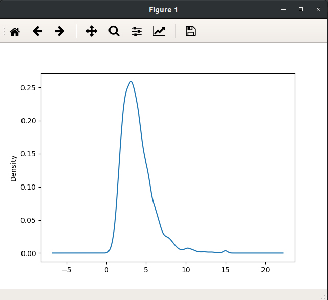
7. How to Plot Kernel Density Chart in Pandas?
We can plot kernel density graphs with the help of the .kde function. This gives us the graph for a particular column, in this case, “median_income”, and the density corresponding the various values of the column values.
>>> dataflair["median_income"].plot.kde()
>>> plt.show()
Output-
Summary
The data visualization capabilities of Pandas are depended on the Matplotlib library.
Now, you can plot any kind of charts with the help of Pandas visualization. You can use .hist(), .line , .scatter , .box, plot.hexbin, .plot.pie, .kde functions to plot respective charts. We discussed each function with the help of an example. Hope, you liked it!
Explore 5 Core Options to Customize Your Data
At last, don’t forget to comment below.
Did you like our efforts? If Yes, please give DataFlair 5 Stars on Google


can anyone help?
kernel density function kde as given hear does not work.
>>> dataflair[“median_income”].plot.kde()