Using Matplotlib with Jupyter Notebook
Machine Learning courses with 100+ Real-time projects Start Now!!
Matplotlib and Jupyter Notebook are two popular tools used by data scientists and analysts for generating visual representations of data and doing exploratory data analysis. Jupyter Notebook is an online platform for collaborative document creation and sharing that integrates live code, equations, visualisations, and explanatory text.
Alternatively, Matplotlib is a popular Python package that has robust features for creating a variety of visuals. This article is meant to serve as a tutorial for integrating Matplotlib into Jupyter Notebook and making the most of its features for better data visualisation.
Configuring Jupyter Notebooks in Matplotlib
Matplotlib Installation
Installing the library is a prerequisite for using Matplotlib. Depending on your Python distribution, you can install Matplotlib using either pip or conda. To install pip, type the following into your terminal or command prompt:
pip install matplotlib
The following command can be used with conda:
conda install matplotlib
After the installation is finished, you may double-check by using a Python script or Jupyter Notebook to import the library.
Matplotlib imports in Jupyter Notebook
Importing the appropriate Matplotlib modules is a prerequisite for using Matplotlib in Jupyter Notebook. The pyplot module is often imported because it offers a plotting interface similar to that of MATLAB. Use the following code to import Matplotlib into a cell in your Jupyter Notebook:
import matplotlib.pyplot as plott
The pyplot module is brought in and given the plt alias. This convention-based alias simplifies the invocation of Matplotlib routines.
Backend Inline and Magic Commands in Matplotlib
Inline backend configuration
Plots created using Matplotlib are shown in a separate window apart from Jupyter Notebook. Plots may be shown outside of the Jupyter Notebook. However, it is more efficient to do it inside the notebook itself. To do this, the inline backend should be activated. In order to do this, preface your Jupyter Notebook with the following magic command:
%matplotlib inline
With this setup in place, the notebook will automatically update to show inline any Matplotlib plots made in succeeding cells.
Making Use of Magic Commands
Jupyter Notebook offers a set of “magic commands” that greatly expand the software’s capabilities. Using the magic instructions provided by Matplotlib, you may adjust the parameters of your plots directly in the cells of your Jupyter Notebook. A few examples of what you can do using magic commands include changing the figure size, giving plots names, and saving plots to files. Here’s how to use a magic command to adjust the size of your figures:
%matplotlib inline
%config InlineBackend.figure_format = 'png'
%config InlineBackend.print_figure_kwargs = {'bbox_inches': 'tight'}
%config InlineBackend.figure_dpi = 150


import matplotlib.pyplot as plott


# Create and customize your plot here
Plotting the Basics in Jupyter Notebook
Line Graph Creation
Line graphs help visualise data trends and patterns. Matplotlib makes making line graphs in Jupyter Notebook a breeze. The following is a sample of the code needed to create a simple line plot:
import matplotlib.pyplot as plott


list_a = [5, 10, 15, 20, 25]
list_b = [2, 4, 6, 8, 10]


plott.plot(list_a, list_b)
plott.xlabel('X-axis')
plott.ylabel('Y-axis')
plott.title('Line Plot DatFlair')
plott.show()
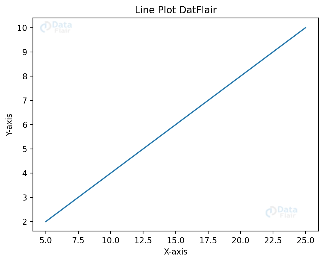
You have complete control over the look of the plot, from the lines to the markers to the colours.
Creating Scatter Diagrams
It is standard practice to use scatter plots to display correlations between variables. Scatter plots may be quickly and easily made using Matplotlib. A sample of code to produce a scatter plot is as follows:
plott.scatter(list_a, list_b)
plott.title('Scatter Plot DatFlair')
plott.show()

Marker sizes, colours, and transparency levels are additional ways to personalise scatter plots.
With Matplotlib and Jupyter Notebook, you can also include supplementary elements like legends, annotations, and numerous plots in a single figure. You may acquire valuable insights from your data with the help of these core graphing methods and the adaptability of Matplotlib and Jupyter Notebook.
Saving Plots
Saving your plots as images in Matplotlib makes them easy to share or include into documents and presentations. Plots may be exported to several different file types, including PNG, JPEG, and PDF. Here’s some sample code that may be used to export a plot as a PNG file:
plott.savefig('graph.png')`
Matplotlib has a default resolution of 100 dpi when saving the plot. The dpi setting allows you to regulate the image’s resolution and quality. Here’s an example:
plott.savefig(‘graph.png', dpi=350)
The picture quality improves when the dpi is raised.
Effective Plotting with the Jupyter Notebook
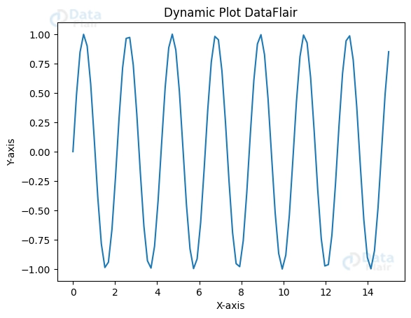
Dynamic Plot Updates
Real-time graphic updates may be necessary when dealing with live data or while making dynamic changes to settings. With the help of Jupyter Notebook’s widgets and loops, you may make dynamic changes to your graphs. Use these capabilities to build interactive graphs that change in response to live data. For example:
import matplotlib.pyplot as plott
import numpy as numpyy
from ipywidgets import interact


@interact
def update_plot(x=(1, 5)):
   list_a = numpyy.linspace(0, 15, 90)
   list_b = numpyy.sin(x * list_a)

   plott.plot(list_a, list_b)
   plott.xlabel('X-axis')
   plott.ylabel('Y-axis')
   plott.title('Dynamic Plot DataFlair')
   plott.show()
Enhancing plot efficiency
Matplotlib is capable of efficiently rendering complicated graphs and handling enormous datasets. Optimising plot performance, however, becomes critical when working with large volumes of data or complex visualisations. Performance may be greatly enhanced by using methods like downsampling data, creating subplots, and making use of efficient plot types. Moreover, when making sophisticated plots, it is sometimes preferable to use Matplotlib’s object-oriented interface rather than pyplot’s.
Conclusion
In this piece, we took a look at how to effectively visualise data using Matplotlib and Jupyter Notebook. We practised exporting plots as interactive HTML pages and saving them in a variety of picture file formats. We also found strategies for effective charting in Jupyter Notebook, such as dynamically updating charts when new data or parameters are introduced and maximising plot efficiency when dealing with huge datasets and complicated visualisations.
Matplotlib is often considered the best package for data visualisation because of the flexibility it affords users. With Jupyter Notebook’s dynamic and collaborative environment, data can be explored, analysed, and presented in many ways. If you want to make the most of data visualisation in your projects and studies, you should learn as much as you can about Matplotlib in Jupyter Notebook.
Did we exceed your expectations?
If Yes, share your valuable feedback on Google


