Markers in Matplotlib
Machine Learning courses with 100+ Real-time projects Start Now!!
You may make all kinds of plots and charts with the help of Matplotlib, a Python package for data visualisation. Markers are used extensively in data visualisation because of their importance in accurately depicting data points. In this piece, we will dive deep into Matplotlib’s markers and see how they may be utilised to improve data visualisation.
Learning Markers in Matplotlib
Intro to Markers
Data points on a plot may be represented by markers in Matplotlib. In order to highlight certain data points or to discriminate across several datasets, they are often employed in scatter plots and line plots. When working with enormous datasets or wanting to draw attention to key data points, markers are invaluable.
Marker Types and Their Availability
Different marker styles are available in Matplotlib for changing the look of individual data points. Dots, squares, triangles, and crosses are all standard marker shapes. Plots may be made more aesthetically pleasing and instructive by modifying factors such as the size, colour, and transparency of these markers.
Marker Fundamentals
Marked Scatter Diagrams
Relationships between two continuous variables may be easily visualised using scatter plots. Markers make scatter plots more evocative and aid in data comprehension.
The scatter() function in Matplotlib enables you to generate scatter plots complete with markers. Individual data points may be given a unique look by adjusting the marker’s style, size, and colour. For instance:
import matplotlib.pyplot as plott


list_a = [1, 2, 3, 4, 5]
list_b = [2, 8, 27, 64, 125]


plott.scatter(list_a, list_b, marker='o', s=70, c='red')
plott.title("Markers and Scatter Plot")
plott.xlabel("X-axis")
plott.ylabel("Y-axis")


plott.show()

This code line creates a scatter graph with 70-point circular markers in red. Scatter plots that properly reflect our information may be made by experimenting with various marker styles and adjustment choices.
Line Diagrams with Markers
To better understand trends and patterns in continuous data along a continuous axis, such time-line graphs are often used. Line plots benefit from markers because they allow the reader to focus on particular locations along the line.
Matplotlib’s plot() function’s marker option allows for the addition of markers to line graphs. Because of this, we are able to choose the marker type and modify its design. For instance:
plott.plot(list_a, list_b, marker='s', markersize=10, markerfacecolor='red', markeredgecolor='blue')
plott.title("Markers and Line Plot")
plott.xlabel("X-axis")
plott.ylabel("Y-axis")


plott.show()

In this code sample, square markers of size 10, with a red marker face colour and a blue marker edge colour, are added to the line plot. By playing around with these settings, we may make the markers seem to best serve our visualisation goals.
Matplotlib also allows users to manipulate the positioning of markers along the line. Markers may be presented at user-defined intervals through the plot() function’s markevery option. By doing so, we may highlight relevant data while decreasing the overall number of markers. For instance:
plott.plot(list_a, list_b, marker='s', markevery=2)
plott.title("Line Plot with alternative Markers")
plott.xlabel("X-axis")
plott.ylabel("Y-axis")


plott.show()

To reduce the number of markers without sacrificing their usefulness, this code snippet only places them every other data point along the line plot.
Marker Personalization
Size of Markers
You may change the visual effect of the marks by adjusting their size. Markers may be made bigger or smaller by using the markersize parameter. Case in point:
plott.scatter(list_a, list_b, marker='s', s=50)

Sometimes, it helps to adjust the size of your markers according to the data you’re working with. To do this, use an array of sizes as the value for the s option. A few examples:
list_size = [10, 20, 30, 40, 50]
plott.scatter(list_a, list_b, marker='s', s=list_size)

Marker Colour
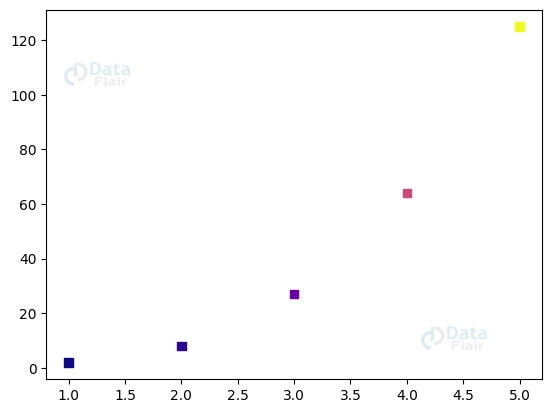
Different data points or categories may be represented by markers of varying colours. Markers may be given different hues depending on the value of the c parameter. Case in point:
list_colors = ['black', 'blue', 'maroon', 'red', 'green']
plott.scatter(list_a, list_b, marker='s', c=list_colors)

Colormaps are a useful tool for efficiently mapping colours to corresponding data. We may colour-code markers according to their associated data values using a colormap. A few examples:
plott.scatter(list_a, list_b, marker='s', c=list_b, cmap='plasma')
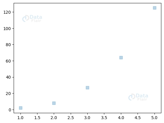
Transparency Markers
To modify the degree to which markings are visible, one may alter their transparency or alpha value. Markers’ opacity may be adjusted with the use of the alpha parameter. Case in point:
plott.scatter(list_a, list_b, marker='s', alpha=0.7)

Transparent markers allow us to create aesthetically attractive effects, such as superimposing markers to show how densely spaced data points are. Modifying the marker’s opacity and size will do this. A few examples:
plott.scatter(list_a, list_b, marker='s', s=50, alpha=0.3)
Unique Marker Purposes
Indicators with Margin of Error
Combining error bars and markers is a common way to convey data variability or uncertainty. Matplotlib allows for a more complete depiction of data by allowing the addition of error bars to plots alongside markers. Case in point:
plott.errorbar(list_a, list_b, yerr=0.7, fmt='s')

Annotations & Marker Labels
Markers may have extra information about individual data points added in the form of labels or annotations. Labels with text may be placed at given locations using the text() method. Example in point:
plott.scatter(list_a, list_b, marker='o')
for i, j in zip(list_a, list_b):
   plott.text(i, j, f'({i}, {j})')
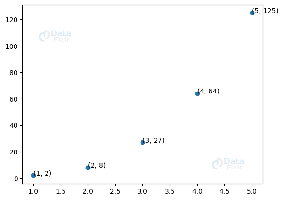
Adding labels or comments to markers improves the readability and interpretability of our charts, making it simpler for readers to grasp the underlying data.
Conclusion
Matplotlib’s use of markers is essential for plotting data. They make it possible to draw attention to relevant data, emphasise important patterns, and communicate effectively. Marker size, colour, and transparency, among other parameters, allow us to build eye-catching plots that aid in data comprehension.
Markers with error bars and marker labels are two examples of these advanced features that help to visualise uncertainty and annotate data. The full potential of your visualisations may be unlocked by experimenting with the many marker types and modification options offered by Matplotlib.
You give me 15 seconds I promise you best tutorials
Please share your happy experience on Google


