Introduction to Matplotlib
Machine Learning courses with 100+ Real-time projects Start Now!!
Data visualisation refers to the practice of transforming numerical or textual information into a visual format with the purpose of improving readability, comprehension, and analysis. It’s a crucial part of data analysis since it helps us see connections and trends that might otherwise be hidden in a table or spreadsheet.
Popular in the Python community, Matplotlib is a package for visualising data in a variety of formats, including still images, animations, and interactive graphs. Line plots, scatter plots, bar charts, histograms, and heat maps are just some of the plots, graphs, and charts that may be made using its many features and capabilities.
Users of Matplotlib have a wide range of options for customising their plots, including changing the colours, labels, titles, and more. It also supports many output formats, such as PNG, PDF, SVG, and EPS, making it simple to export visualisations for incorporation into documents, presentations, and more. When it comes to data visualisation and understanding that data, Matplotlib is an excellent tool.
Getting Started with Matplotlib Tutorial
Matplotlib is a Python toolkit for data visualisation that includes many helpful tools and methods for making a broad variety of graphs, charts, and plots. Starting out with Matplotlib? Here’s a quick intro.
Matplotlib is a famous data visualization python library. It’s useful for creating interactive, and animated visualizations. With just few lines of codes, it allows you to generate plots, histograms, bar charts, scatter plots, etc. for visualization of data.
Installation and Setup in Matplotlib
The Python package manager, pip, is used to install Matplotlib:
pip install matplotlib
Displaying the Matplotlib version indicates that the installation was successful:
import matplotlib
matplotlib.__version__
Following installation, the following command may be used to bring it into a Python script or notebook:
import matplotlib.pyplot as plott
Basic Components of a Matplotlib Plot
The figure, the axes, and the plot are the standard parts of a Matplotlib plot. The figure serves as the plot’s outermost boundary; it may be compared to a window or a page. Within a figure, the axes serve as secondary containers for things like lines, bars, and labels. The last stage is the plot, a graphical display of the information along the axes.
Creating a Simple Plot:
Defining some data to plot is the first step in creating a basic line plot in Matplotlib. For a set of points, we might, for instance, establish two sets of integers to stand for their x and y coordinates. The plott.figure() method produces a new figure object, which we can then use to construct a new figure. Using the Axes object returned by the add_subplot() function, we can then build a new set of axes inside the figure. At last, we can make a line plot by including our data in the axes through the plot() method.
import matplotlib.pyplot as plott


x_axis_dataflair = [3, 7, 9, 11, 15]
y_axis_dataflair = [12, 18, 22, 28, 36]


fig = plott.figure()
ax = fig.add_subplot(1, 1, 1)


ax.plot(x_axis_dataflair, y_axis_dataflair)
plott.show()
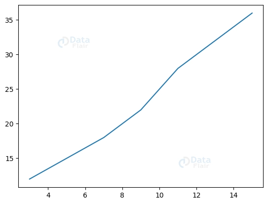
To visualise the data, this code first generates a new figure with a single set of axes, then adds a line plot to the axes using the x and y values, and then calls plott.show() to display the plot.
Creating Basic Plots with Matplotlib
Matplotlib is a library full of methods and tools for making all kinds of graphs, charts, and plots. In this short tutorial, we’ll look at Matplotlib and how to use it to generate common types of graphs, including line plots, scatter plots, and bar charts.
Line Plot
Line plots are a kind of graph that employs lines to connect data points. The Matplotlib plot() method returns a line plot when we provide it with the x and y parameters. Consequently, as an illustration:
import matplotlib.pyplot as plott


y_axis_dataflair = [12, 22, 32, 42, 52]


plott.plot( y_axis_dataflair)
plott.show()
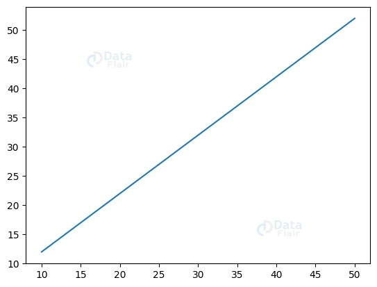
The data you provide for y_axis_dataflair will be used to generate a line plot using the code above.
Scatter Plot
Markers of varying sizes depict data points in a scatter graph. Matplotlib’s scatter() function is used to make a scatter diagram, and it takes the x and y data as its inputs. Thus, to provide an example:
import matplotlib.pyplot as plott


x_axis_dataflair = [10, 20, 30, 40, 50]
y_axis_dataflair = [12, 22, 32, 42, 52]


plott.scatter(x_axis_dataflair, y_axis_dataflair)


plott.show()
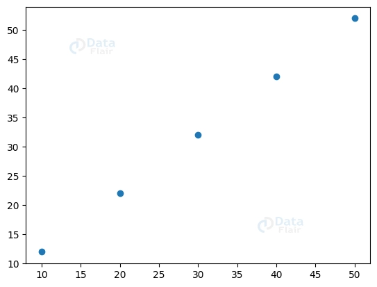
This code generates a scatter plot using the values from the x_axis_dataflair and y_axis_dataflair variables.
Bar Chart
Plots using rectangular bars of varying heights depict data in bar charts. Matplotlib’s bar() function, which requires just the x and y values to plot as inputs, may be used to generate a bar chart. So, to illustrate:
import matplotlib.pyplot as plott


x_axis_dataflair = [4, 8, 12, 16, 20]
y_axis_dataflair = [12, 22, 32, 42, 52]


plott.bar(x_axis_dataflair, y_axis_dataflair)


plott.show()
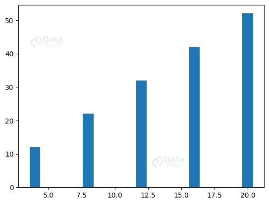
This code generates a bar chart using the data from the variables x_axis_dataflair and y_axis_dataflair.
Customization Options
Matplotlib gives you a lot of leeway to personalise any of these plots. Using Matplotlib’s methods, we may modify the plot in many ways, such as by altering its colour, size, and labels. Some instances are listed below.
Customising Line Plot
import matplotlib.pyplot as plott


x_axis_dataflair = [10, 20, 30, 40, 50]
y_axis_dataflair = [12, 22, 32, 42, 52]


plott.plot(x_axis_dataflair, y_axis_dataflair, color='blue', linewidth=3.0)


plott.xlabel('x axis')
plott.ylabel('y axis')
plott.title('Line Plot')


plott.show()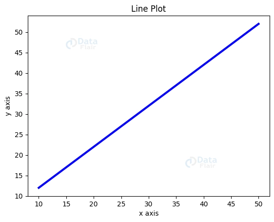
Here, we’ve made the line width 3 times larger and set the colour to blue on the line plot. By using the xlabel(), ylabel(), and title() methods, we were able to label the axes and give our plot a name. Similarly, below we showcase the scatter plot and experiment with the values.
import matplotlib.pyplot as plott


x_axis_dataflair = [10, 20, 30, 40, 50]
y_axis_dataflair = [12, 22, 32, 42, 52]


plott.scatter(x_axis_dataflair, y_axis_dataflair, c='red', s=500)


plott.title('Scatter Plot')
plott.xlabel('x axis')
plott.ylabel('y axis')


plott.show()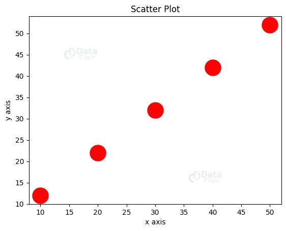
Customising and adding Markers
Each data point in your plots may be represented by one of many different marker styles, all of which are included in Matplotlib. Circular, square, and triangular markers are just some of the options. The ‘marker’ argument allows for flexible marker customization by taking a string value indicating the desired marker style.
import matplotlib.pyplot as plott
import numpy as nump


x_dataflair = nump.random.rand(50)
y_dataflair = nump.random.rand(50)


plott.scatter(x_dataflair, y_dataflair, marker='o')
plott.show()
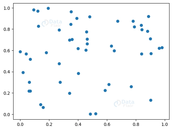
To illustrate, the above code generates a scatter plot labelled with squares. The ‘random’ function in the numpy library is used to produce a range of random x and y values. After generating x and y data, we utilise Matplotlib’s ‘scatter’ function to plot them against one another. The ‘marker’ option is set to ‘o’ to produce circle markings.
Text and font customization
The ability to alter the size and style of text and fonts is crucial in data visualisation because it facilitates the presentation of data in a manner that is both aesthetically pleasing and simple to comprehend. To ensure that your visualisations look exactly as you want them to, Matplotlib gives you a wide range of control over details like the text and font size.
Matplotlib’s ability to modify text by changing its family, size, style, and colour is one of its most used text and font customisation tools. Use the font option of the text function to do this. The following code, for instance, will generate a plot with an italicised title that is 25 points in size and uses the sans font family:
import matplotlib.pyplot as plott


plott.plot([5, 10, 15, 20], [25, 100, 225, 400])
plott.title('DataFlair Plot Graph',
         fontdict={'fontsize': 25,
                   'fontfamily': 'sans',
                   'fontstyle': 'italic',
                   'weight': 'normal',
                   'color': 'red'})
plott.show()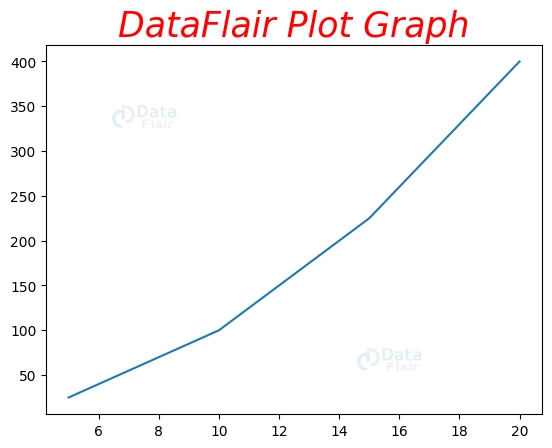
Advanced Plotting with Matplotlib
Matplotlib has methods and tools for making more intricate plots than just line plots, scatter plots, and bar charts. Here, you will find a tutorial on Matplotlib, complete with code examples and working examples, on how to use Matplotlib to generate common data visualisations like histograms, box plots, and heatmaps.
Histogram
A histogram is a special kind of graph that uses a grid of rectangles to show how values in a dataset are distributed. The hist() function in Matplotlib may be used to generate a histogram by taking a dataset as input and dividing it into discrete bins on the fly. Here’s a case in point:
import matplotlib.pyplot as plott
import numpy as nump


rand_data = nump.random.normal(0, 5, 500)


plott.hist(rand_data, bins=50, alpha=0.5, color='green')
plott.xlabel('X axis')
plott.ylabel('Y axis')
plott.title('Histogram')
plott.show()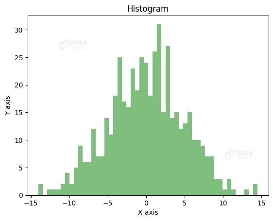
Here, we demonstrate how to use NumPy’s random.normal() method to generate a collection of 500 random values with a normal distribution. Matplotlib’s hist() function was then used to generate a histogram of the data with a bin size of 50, and the transparency and colour of the bars were customised through the alpha and colour options.
Box Plot
With the use of quartiles and outliers, we can visualise how data is distributed with the help of a box plot. With Matplotlib’s boxplot() function, we don’t have to manually determine the quartiles or outliers since the function does it for us. Here’s a sample of how it may be used:
import matplotlib.pyplot as plott
import numpy as nump


rand_data = [nump.random.normal(0,1,500), nump.random.normal(0, 3, 500), nump.random.normal(0, 5, 500)]


plott.boxplot(rand_data, labels=['1', '2', '3'])
plott.xlabel('Groups')
plott.ylabel('Y axis')
plott.title('Box Plot')


plott.show()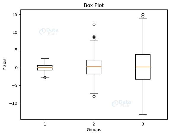
To begin, we used NumPy’s “random.normal()” function to generate 500 random numbers in three distinct groups. We used the boxplot() function in Matplotlib to display the dispersion of the data. We additionally labelled each set using the labels parameter. A box plot was the end outcome.
Heatmap
A heatmap is a kind of visualisation that uses colour to draw attention to trends and give more information within a dataset. Matplotlib’s imshow() function makes it easy to generate colour-coded heatmaps from any given dataset with no effort on your part. In this case in point:
import matplotlib.pyplot as plott
import numpy as nump


rand_data = nump.random.rand(15, 15)


plott.imshow(rand_data, cmap='cool')
plott.colorbar()
plott.title('Heatmap')


plott.show()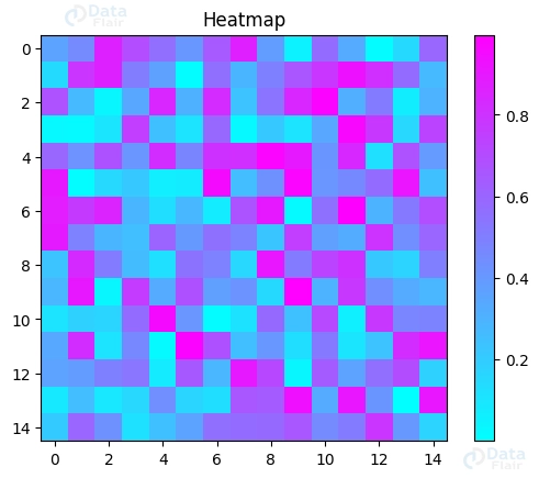
We started by generating a randomised matrix of 15 rows and 15 columns using NumPy’s random.rand() function. Next, we utilised Matplotlib’s imshow() method to transform the resulting matrix to a heatmap. The cmap argument allowed us to choose a colour map that would render the heatmap simpler to view. Ultimately, using the colorbar() method, we created a colour bar to demonstrate how the heatmap’s shades signify the map’s numerical values.
Pie Chart
In a pie chart, each section represents a different category, and the size of the section corresponds to the relative importance of that category within the total. Matplotlib’s pie chart generator makes it easy to visualise data in a familiar format. The following code, for instance, will generate a basic pie chart with three sections:
import matplotlib.pyplot as plott


lbs = ['Blueberry', 'Mango', 'Pear']
percent = [30, 45, 25]


plott.pie(percent, labels=lbs)


plott.axis('equal')
plott.title('Pie Chart')
plott.show()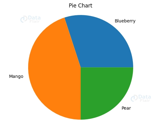
This will produce a pie chart with three sections, one for each fruit, showing their relative abundance.
Combining Plots and Subplots
Data visualisation relies heavily on the ability to combine plots and subplots in order to present numerous charts or graphs in a single image. You have full control over the look and feel of your visualisations thanks to Matplotlib’s many functions and techniques for combining plots and subplots.
Using the subplot function, you may create a grid of subplots inside a single figure, thus turning one figure into numerous plots or subplots. The subplot function requires three parameters: the total number of rows and columns, as well as the subplot index. The following code creates a diagram with two subplots:
import matplotlib.pyplot as plott


x_value = [1, 2, 3, 4]
y_value1 = [1, 8, 27, 64]
y_value2 = [1, 4, 6, 8]


plott.subplot(1, 2, 2)
plott.plot(x_value, y_value1)


plott.subplot(1, 2, 2)
plott.plot(x_value, y_value2)


plott.show()
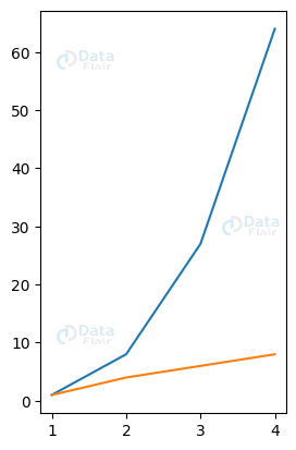
This will produce a graph with two stacked plots, one above the other, containing separate data sets.
Interactive Plotting with Matplotlib
Widget-based dynamic plotting is also supported by Matplotlib. Widgets are components of the user interface that let people see and modify graphs at the moment.
Widget-enabled interactive graphing facilitates more fluid and natural data exploration and analysis. It allows for instantaneous manipulation of plot settings, clarifying hidden linkages and patterns in the data. When investigating huge and complicated datasets, interactive charting is invaluable. This allows the data to be visualised in a variety of ways, each of which may reveal previously unseen insights and patterns.
Conclusion
Overall, Matplotlib is a robust data visualisation package that is extensively used in the scientific and data analytic communities. Matplotlib’s versatile features and extensive configuration choices make it possible to generate a wide variety of informative and appealing visualisations, which in turn may aid in the discovery of useful patterns and insights in the data. For anybody dealing with data, it is an essential tool because of its widespread use and adaptability.
We hope this article on Matplotlib inspires you to dive into Matplotlib and experiment with its capabilities and settings to generate visualisations that reveal hidden insights in your data. There is no limit to what can be done using Matplotlib when it comes to visualising data.
If you are Happy with DataFlair, do not forget to make us happy with your positive feedback on Google


