Flutter Project – Calculator App
Due to advancements in Flutter in recent years, several startups and organizations have been using it to create their apps. Flutter’s flexibility allows for the use of a single codebase to build apps on Android and iOS. Therefore, it is important to learn Flutter nowadays.
In this project, we will be working on making a Calculator in Flutter. The app will have the basic functionalities of a calculator, like addition, subtraction, multiplication, division, deletion, etc.
Through this Flutter Calculator App project, we will get to know various varieties of widgets like GridView builder, Customized button, etc, which will be used to develop this app in Flutter.
So, let’s dive in!
Prerequisites For Calculator App Using Flutter
Before starting the project, you should have the following installed on your computer:-
(i) Flutter – You can refer to the link for installing Flutter depending on your operating system.
(ii) Android Studio – This is necessary as it will be used to run app in the Android emulator.
(iii) Visual Studio Code – Although this is not necessary, you can also build apps in Android Studio. But in our case we have used VS code as it is a good code editor.
Now that the setup is ready, let’s get started!
Download Flutter Calculator App Project
Please download the source code of Flutter Calculator App Project: Flutter Calculator App Project Code.
Create New Project
First, let’s create a new project for the App.
Go to the directory on your terminal/command-line and enter the command $flutter create “Project-Name”.
Here as you can see from the below image, I am using the project-name as a calculator.

Steps to Build Flutter Calculator App
1. Creating Main Layout for the App
Let’s start with creating the main layout of the page. The below image shows the main.dart file which first executes when the app runs. Here we have set the background color for the AppBar as an Orange accent and background for the home page as black with a little white added to it. You can choose the colors according to your interest. Here, we have created a separate widget for HomeScreen, which is returned as the body for Scaffold.
import 'package:flutter/material.dart';

import './home_screen.dart';

void main() {
  return runApp(
    MaterialApp(
      theme: ThemeData(primaryColor: Colors.orangeAccent),
      home: Scaffold(
        appBar: AppBar(
          title: const Text('Calculator'),
          backgroundColor: Colors.orangeAccent,
        ),
        backgroundColor: const Color.fromARGB(255, 20, 20, 20),
        body: const HomeScreen(),
      ),
    ),
  );
}
2. Building UI of HomeScreen
Next, we start building the UI of the HomeScreen. We have used Stateful Widget for HomeScreen as can be seen below, the reason for this is that the UI needed to update as the user makes new calculations. We have also initialized two variables, userInput and finalResult, which will store the input expression by the user and the result of the expression, respectively.
class HomeScreen extends StatefulWidget {
  const HomeScreen({super.key});

  @override
  State<HomeScreen> createState() {
    return _HomeScreenState();
  }
}

class _HomeScreenState extends State<HomeScreen> {

  // These are the buttons that will be displayed on the calculator
  var buttons = [ 'AC', 'DEL', '%',  '/', '7', '8', '9',  'x',  '4',  '5', '6', '-',  '1', '2', '3', '+', '', '0', '.', '='] ;
  var userInput = '';
  var finalResult = '';
The HomeScreen consists of two parts:-(i) The Display Screen and (ii) The Buttons to give Input. The below image shows the code for displaying part of the calculator. It consists of two text fields stored in a container, the input from the user and the result, which is displayed below. These two are stored in the Column widget as they need to be displayed vertically.
The specifications like fontSize, color, padding , alignment can be seen from the code below.
@override
  Widget build(BuildContext context) {
    return Column(
      children: [
        Expanded(
          // Display part of the Calculator
          child: Column(
            mainAxisAlignment: MainAxisAlignment.spaceEvenly,
            children: [
              // Input from User
              Container(
                padding: const EdgeInsets.all(20),
                alignment: Alignment.centerRight,
                child: Text(
                  userInput,
                  style: const TextStyle(fontSize: 21, color: Colors.white),
                ),
              ),
              // Answer to the Calculation
              Container(
                padding: const EdgeInsets.all(20),
                alignment: Alignment.centerRight,
                child: Text(
                  finalResult,
                  style: const TextStyle(fontSize: 24, color: Colors.white),
                ),
              ),
            ],
          ),
        ),
Next, let’s create the buttons part of the calculator through which the user will give input as numbers and various operators like +, – *, etc. Here, we have used GridView builder to create the view for buttons, as the buttons will be arranged in the form of a grid. We have used crossAxisCount in the SilverGridDelegate as 4 so that each row will contain four buttons.
Using itemBuilder in GridView builder, we are returning the styled buttons where for each button we are passing the background color, text color, text and the function which will be executed when the button is pressed. Here StyledButton is a new widget which we have created, which is mentioned in the section.
For each unique type of button like numbers or operators, different styling is done.
// Buttons Part of the Calculator
        Expanded(
          flex: 2,
          child: GridView.builder(
            padding: const EdgeInsets.all(15),
            itemCount: buttons.length,
            gridDelegate: const SliverGridDelegateWithFixedCrossAxisCount(
                crossAxisCount: 4, mainAxisSpacing: 15, crossAxisSpacing: 15),
            itemBuilder: (BuildContext context, int index) {
              // When button is 'AC'
              if (index == 0) {
                return StyledButton(
                    bgColor: const Color.fromARGB(255, 174, 174, 174),
                    textColor: Colors.black,
                    text: buttons[index],
                    func: () {
                      setState(() {
                        userInput = '';
                        finalResult = '';
                      });
                    });
              }
              // When Button is 'DEL'
              else if (index == 1) {
                return StyledButton(
                    bgColor: const Color.fromARGB(255, 174, 174, 174),
                    textColor: Colors.black,
                    text: buttons[index],
                    func: () {
                      setState(() {
                        userInput =
                            userInput.substring(0, userInput.length - 1);
                      });
                    });
              }
              //When Button is '%'
              else if (index == 2) {
                return StyledButton(
                    bgColor: const Color.fromARGB(255, 174, 174, 174),
                    textColor: Colors.black,
                    text: buttons[index],
                    func: () {
                      setState(() {
                        userInput += buttons[index];
                      });
                    });
              }
              // When Button is '/' , 'x', '-', '+'
              else if (index == 3 || index == 7 || index == 11 || index == 15) {
                return StyledButton(
                    bgColor: Colors.orangeAccent,
                    textColor: Colors.white,
                    text: buttons[index],
                    func: () {
                      setState(() {
                        userInput += buttons[index];
                      });
                    });
              }
              // When Button is '='
              else if (index == 19) {
                return StyledButton(
                    bgColor: Colors.orangeAccent,
                    textColor: Colors.white,
                    text: buttons[index],
                    func: () {
                      setState(() {
                        finalResult = evaluate(userInput);
                      });
                    });
              }
              // For the remaining buttons
              else {
                return StyledButton(
                    bgColor: const Color.fromARGB(221, 52, 51, 51),
                    textColor: Colors.white,
                    text: buttons[index],
                    func: () {
                      setState(() {
                        userInput += buttons[index];
                      });
                    });
              }
            },
          ),
        ),
3. Styling of Button
The below code shows the styling of the button used in the calculator for which we have created a new widget. Here we are returning a GestureDetector as a button which takes the shape of a circle using the CircleAvatar widget. The font size is set to 26. The widget accepts the background color, text color, and text to be displayed as well as the function in its constructor function.
import 'package:flutter/material.dart';

class StyledButton extends StatelessWidget {
  const StyledButton(
      {required this.bgColor,
      required this.textColor,
      required this.text,
      required this.func,
      super.key});

  final Color bgColor;
  final Color textColor;
  final String text;
  final func;

  @override
  Widget build(BuildContext context) {
    return GestureDetector(
      onTap: func,
      child: CircleAvatar(
        radius: 20,
        backgroundColor: bgColor,
        child: Text(
          text,
          style: TextStyle(
              color: textColor, fontSize: 26, fontWeight: FontWeight.w600),
        ),
      ),
    );
  }
}
4. Function to Evaluate Expression
Here we have used the math expressions library available in Flutter for calculating the expression given by the user. As can be seen below before giving the input to the parser, the ‘x’ sign in the expression is replaced by the ‘*’ sign as the library recognizes the latter for multiplication. Then the expression is evaluated using the ContextModel.
import 'package:math_expressions/math_expressions.dart';

String evaluate(String exp) {
  String expModified = exp.replaceAll('x', '*');

  Parser p = Parser();
  Expression calc = p.parse(expModified);

  ContextModel cm = ContextModel();
  num eval = calc.evaluate(EvaluationType.REAL, cm);
  String result = eval.toString();

  return '= $result';
}
Flutter Calculator App Output
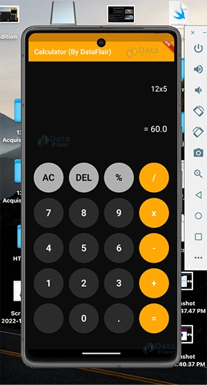
1. Multiplication
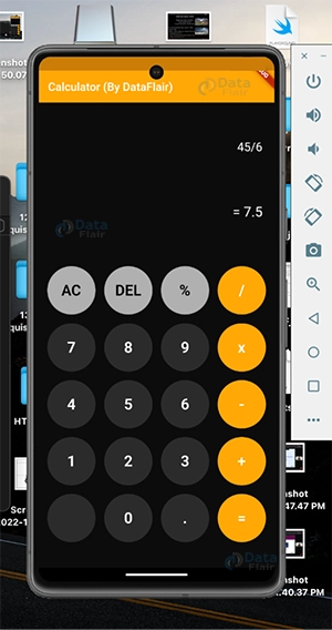
2. Divison
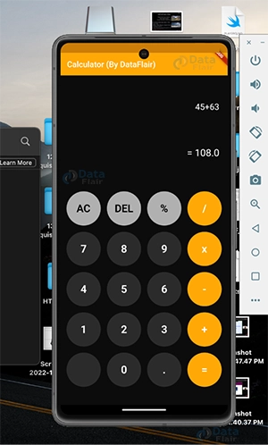
3. Addition

Conclusion
I hope through this article, you get to know how to build a calculator in Flutter and the various components included in building it like GridView builder, Custom Styled Buttons, function to evaluate mathematical expressions and much more.
Thank you for reading! Keep Learning Flutter!
Your opinion matters
Please write your valuable feedback about DataFlair on Google