3D Plotting in Matplotlib
Machine Learning courses with 100+ Real-time projects Start Now!!
When it comes to data visualisation, 3D charts are crucial since they allow for the three-dimensional depiction of data. They allow us to investigate intricate connections and patterns that would otherwise be hidden in flat, two-dimensional displays.
3D plots in matplotlib provide an engaging and easy-to-understand method of analysing and presenting data, especially when dealing with datasets with several dimensions.
The 3D charting tools of Matplotlib are a powerful asset for any data visualisation project. To start, it may show complex interconnections and patterns within the data. Matplotlib allows for the attractive visualisation of complicated data structures by adding a third dimension. Two, multi-dimensional datasets may be visualised using 3D charts, which aids in the comprehension of underlying patterns and connections.
Using Matplotlib for Three-Dimensional Plotting
Importing Necessary Libraries
Importing the required libraries is a prerequisite for digging into 3D plotting. The mpl_toolkits.mplot3d module must be imported with the main Matplotlib library in order to get access to the library’s 3D charting features. Make sure your Python installation has the necessary libraries for 3D plotting.
This code sample demonstrates how to do a basic library import:
import matplotlib.pyplot as plott
from mpl_toolkits.mplot3d import Axes3D
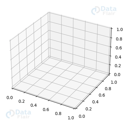
Setting Up a Three-Dimensional Axes Object
Initialising a 3D axis object is required prior to creating a 3D plot. Matplotlib’s Axes3D module allows for 3D plotting in a figure’s subplot. Therefore, this is possible. To facilitate charting, the Axes3D object is linked to the diagram.
Take the following example of code that sets up a 3D axis object:
figuree = plott.figure()
axess = figuree.add_subplot(111, projection='3d')
Elementary Three-Dimensional Graphs in Matplotlib
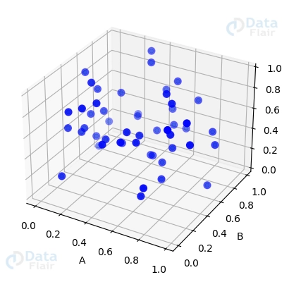
Making 3D Scatter Diagrams in Matplotlib
To see the relationships between data points, scatter plots are often employed. Scatter plots in three dimensions provide for a more accurate depiction of data. Using Matplotlib’s scatter function, you can make 3D scatter plots in which individual data points are represented by markers placed at their corresponding coordinates.
The following is a sample of the code needed to generate a 3D scatter plot:
import numpy as numpyy
import matplotlib.pyplot as plott


a = numpyy.random.rand(50)
b = numpyy.random.rand(50)
c = numpyy.random.rand(50)


figuree = plott.figure()
axess = figuree.add_subplot(111, projection='3d')


axess.scatter(a, b, c)
axess.scatter(a, b, c, s=200, c='blue', marker='.')


axess.set_xlabel('A')
axess.set_ylabel('B')
axess.set_zlabel('C')


plott.show()
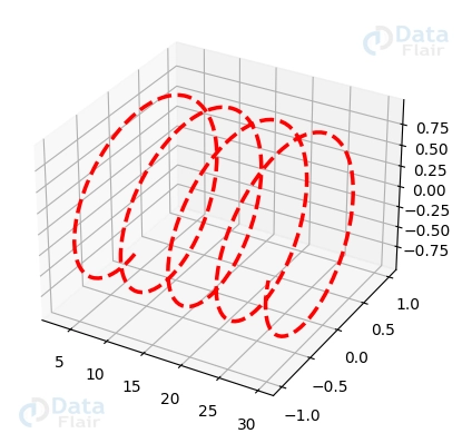
3D Line Plot Generation
Line plots are a great way to see patterns and trends in your data. Such connections may be visualised as lines or curves shown in 3D space using 3D charting. Using Matplotlib’s plot function, one may create 3D line plots, in which a route is represented by a collection of points linked by lines or curves.
This is a code sample for making a 3D line plot:
import matplotlib.pyplot as plott
import numpy as numpyy


a = numpyy.linspace(3, 30, 300)
b = numpyy.sin(a)
c = numpyy.cos(a)


figuree = plott.figure()
axess = figuree.add_subplot(111, projection='3d')


axess.plot(a, b, c, color='red', linestyle='--', linewidth=2.5)


plott.show()
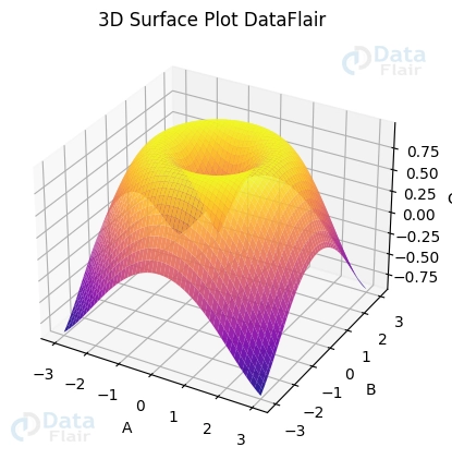
Surface Plots in Matplotlib
Surface Mapping
Surface plots may be generated with Matplotlib, allowing for three-dimensional visualisation of functions or continuous datasets. You may make plots of surfaces with the help of the plot_surface function in the Axes3D module. The surface is defined by a set of coordinates and the value of a function or dataset at those points.
This code sample demonstrates how to generate a surface plot.
import matplotlib.pyplot as plott
import numpy as numpyy


a = numpyy.linspace(-3, 3, 100)
b = numpyy.linspace(-3, 3, 100)
A, B = numpyy.meshgrid(a, b)
C = numpyy.sin(numpyy.sqrt(A**2 + B**2))


figuree = plott.figure()
axess = figuree.add_subplot(111, projection='3d')


axess.plot_surface(A, B, C, cmap='plasma', shade=True, alpha=0.9)


axess.set(xlabel='A', ylabel='B', zlabel='C', title='3D Surface Plot DataFlair')


plott.show()
Surface Plot Modifications
Several formatting choices may be used to improve the visual appeal of surface plots. By manipulating the surface’s lighting and shading, it is possible to draw attention to certain regions or features. Furthermore, by shifting the viewpoint, one may see the surface map from a variety of angles.
Think about using this code to tweak your surface plot:
import matplotlib.pyplot as plott
import numpy as numpyy


figuree = plott.figure()
axess = figuree.add_subplot(111, projection='3d')


A, B = numpyy.meshgrid(numpyy.linspace(-3, 3, 100), numpyy.linspace(-3, 3, 100))
C = numpyy.sin(numpyy.sqrt(A**2 + B**2))


axess.view_init(elev=30, azim=120)
axess.plot_surface(A, B, C, cmap='viridis', shade=True, alpha=0.8)


axess.view_init(elev=30, azim=60)
axess.plot_surface(A, B, C, cmap='plasma', shade=True, alpha=0.5)


plott.show()

Contour plots in three dimensions
The height or value of a function is represented by contour lines in a contour plot, making it possible to visualise 3D data on a 2D surface. Taking this idea further, we may generate three-dimensional contour plots in which the value of the function is shown as both contour lines and the vertical distance between them.
Let’s make a contour diagram in three dimensions using the equation z = sin(x) + cos(y):
import matplotlib.pyplot as plott
import numpy as numpyy


# Generate data
x_axis = numpyy.linspace(-2*numpyy.pi, 2*numpyy.pi, 100)
y_axis = numpyy.linspace(-2*numpyy.pi, 2*numpyy.pi, 100)
X, Y = numpyy.meshgrid(x_axis, y_axis)
Z = numpyy.sin(X) + numpyy.cos(Y)


# Create a 3D contour plot
figuree = plott.figure(figsize=(10, 8))
axess = figuree.add_subplot(111, projection='3d')
axess.contour3D(X, Y, Z, 50, cmap='plasma')


# Add labels and title
axess.set_xlabel('X-axis')
axess.set_ylabel('Y-axis')
axess.set_zlabel('Z-axis')
axess.set_title('3D Contour Plot DataFlair')


# Display the plot
plott.show()
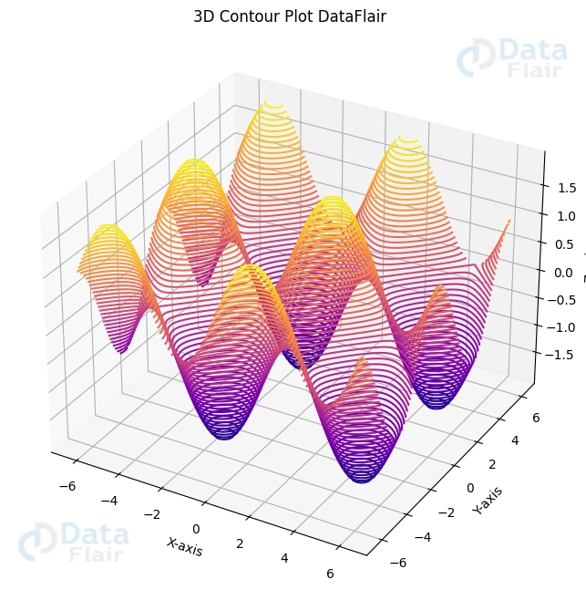
Here, an X-Y grid is generated with the help of np.meshgrid(), and Z is computed with the help of the formula z = sin(x) + cos(y). The 3D contour plot was generated using ax.contour3D(), and it has 50 contour lines coloured using the ‘viridis’ colormap.
Schematics and Topographical Maps
Other forms of 3D plots include wireframes and surface plots, both of which aid in the visualisation of data on a three-dimensional surface.
Using the same method z = sin(x) + cos(y), let’s get a 3D wireframe and surface plot:
import matplotlib.pyplot as plott
import numpy as numpyy


# Generate data
x_axis = numpyy.linspace(-2*numpyy.pi, 2*numpyy.pi, 100)
y_axis = numpyy.linspace(-2*numpyy.pi, 2*numpyy.pi, 100)
X, Y = numpyy.meshgrid(x_axis, y_axis)
Z = numpyy.sin(X) + numpyy.cos(Y)


# Create a 3D wireframe plot
figuree = plott.figure(figsize=(10, 8))
axess = figuree.add_subplot(121, projection='3d')
axess.plot_wireframe(X, Y, Z, cmap='plasma')


# Add labels and title
axess.set_xlabel('X-axis')
axess.set_ylabel('Y-axis')
axess.set_zlabel('Z-axis')
axess.set_title('3D Wireframe Plot DataFlair')


# Create a 3D surface plot
axess = figuree.add_subplot(122, projection='3d')
axess.plot_surface(X, Y, Z, cmap='plasma')


# Add labels and title
axess.set_xlabel('X-axis')
axess.set_ylabel('Y-axis')
axess.set_zlabel('Z-axis')
axess.set_title('3D Surface Plot DataFlair')


# Display the plots
plott.show()
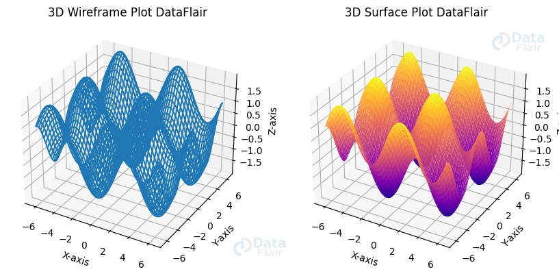
Here, the 3D wireframe plot is made using ax.plot_wireframe() and the 3D surface plot is made with ax.plot_surface(). The ‘plasma’ colormap is utilised by both plots.
Triangulations of the Surface
For 3D visualisation of data with erratic spacing, surface triangulations are a valuable tool. Matplotlib’s triplot() function in the mpl_toolkits.mplot3d.art3d module lets us generate triangulations of surfaces.
Let’s make a 3D surface triangulation map using some unrelated data:
import matplotlib.pyplot as plott
import numpy as numpyy
from mpl_toolkits.mplot3d.art3d import Poly3DCollection


# Generate random data
numpyy.random.seed(42)
x_axis = numpyy.random.rand(50)
y_axis = numpyy.random.rand(50)
z_axis = numpyy.random.rand(50)


# Create a surface triangulation plot
figuree = plott.figure(figsize=(8, 6))
axess = figuree.add_subplot(111, projection='3d')
axess.scatter(x_axis, y_axis, z_axis, color='b')


# Create the triangulation
triangles = numpyy.random.choice(range(50), size=(50, 3))
triangles = numpyy.unique(triangles, axis=0)


# Create the Poly3DCollection and add it to the plot
verts = [(x_axis[j], y_axis[j], z_axis[j]) for j in triangles]
axess.add_collection3d(Poly3DCollection(verts, facecolors='cyan', linewidths=1, edgecolors='r', alpha=.25))


# Add labels and title
axess.set_xlabel('X-axis')
axess.set_ylabel('Y-axis')
axess.set_zlabel('Z-axis')
axess.set_title('3D Surface Triangulation Plot DataFlair')


# Display the plot
plott.show()
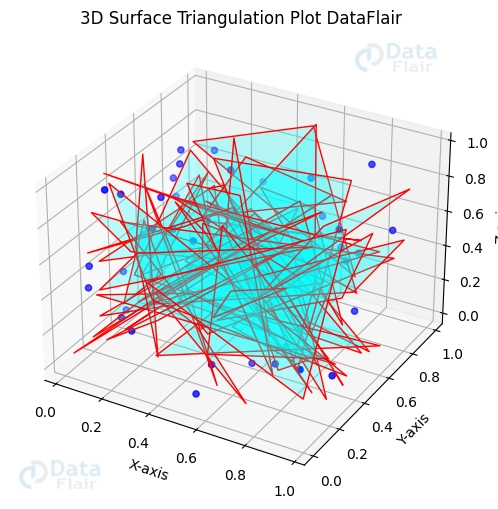
Here, x, y, and z are assigned completely arbitrary values. Then, we generate a Poly3DCollection to depict the surface by picking triangles at random from the data points.
The Möbius Strip in Visual Form
Interesting mathematical objects with only one side and one border include Möbius strips. Using parametric equations, we may generate a 3D surface map of a Möbius strip.
import matplotlib.pyplot as plott
import numpy as numpyy
from mpl_toolkits.mplot3d import Axes3D


# Generate data for Möbius strip
u_list = numpyy.linspace(0, 2 * numpyy.pi, 100)
v_list = numpyy.linspace(-1, 1, 100)
U, V = numpyy.meshgrid(u_list, v_list)
X = (1 + V / 2 * numpyy.cos(U / 2)) * numpyy.cos(U)
Y = (1 + V / 2 * numpyy.cos(U / 2)) * numpyy.sin(U)
Z = V / 2 * numpyy.sin(U / 2)


# Create a 3D surface plot of the Möbius strip
figuree = plott.figure(figsize=(10, 8))
axess = figuree.add_subplot(111, projection='3d')
axess.plot_surface(X, Y, Z, cmap='viridis')


# Add labels and title
axess.set_xlabel('X-axis')
axess.set_ylabel('Y-axis')
axess.set_zlabel('Z-axis')
axess.set_title('Möbius Strip Surface Plot DataFlair')


# Display the plot
plott.show()
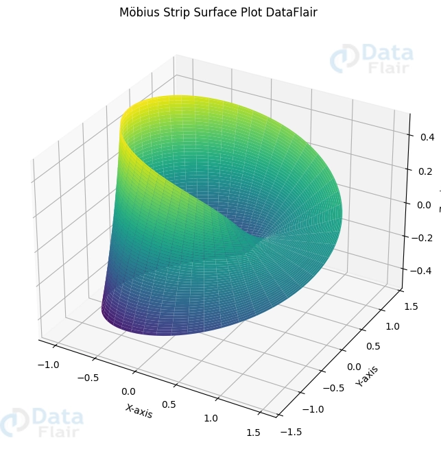
The spots on the Möbius strip are generated using parametric equations in this case. Next, a 3D surface plot is generated with the help of ax.plot_surface().
3D Graphs Can Be Saved And Exported
Exporting Graphs as Images
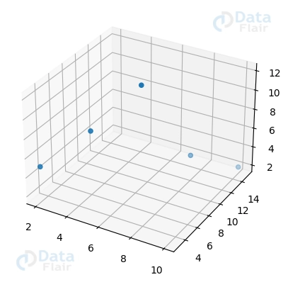
If you plan on showing your 3D plots to others or publishing them, you may wish to save them as images. The savefig function in Matplotlib enables you to store the existing figure as a variety of image formats. These include PNG and JPEG. The saved plots may have their picture quality and resolution modified.
Here’s some sample code to use if you want to export a 3D plot into a single image:
import matplotlib.pyplot as plott
from mpl_toolkits.mplot3d import Axes3D


figuree = plott.figure()
axess = figuree.add_subplot(111, projection='3d')


axess.scatter([2, 4, 6, 8, 10], [3, 6, 9, 12, 15], [5, 8, 12, 4, 2])


plott.savefig('3d_plot.png', dpi=400)
plott.savefig('3d_plot.jpg', dpi=400)
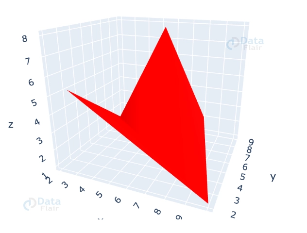
Exported Dynamic Three-Dimensional Graphs
Matplotlib can output both static picture files and dynamic 3D plots in the form of HTML files. To enable others to engage with the visualisations, just distribute or embed this file on a website. Web-based tools and frameworks, such as Plotly, that provide dynamic visual analytics, may help you do this.
In order to export a 3D plot into an interactive HTML file, below is a sample of the code that may be used:
import plotly.graph_objects as go
import numpy as numpyy


# Sample data for the 3D plot
A = [2, 4, 6, 8, 10]
B = [3, 5, 7, 9, 2]
C = [5, 3, 8, 2, 1]


# Convert Matplotlib 3D plot to Plotly 3D plot
figuree = go.Figure(data=[go.Mesh3d(x=A, y=B, z=C, color='red')])


# Export Plotly 3D plot as an interactive HTML file
figuree.write_html('interactive_plot.html')


# Show the Plotly 3D plot in the Jupyter Notebook or another interactive environment
figuree.show()
Conclusion
To sum up, the 3D plotting features of Matplotlib enable the development of impressive visualisations. With the help of the third dimension, intricate connections and multi-dimensional data sets may be accurately shown. You may begin delving into Matplotlib’s 3D plots and gaining new insights into your data using the accompanying code snippets. Have fun concocting your plans!
If you are Happy with DataFlair, do not forget to make us happy with your positive feedback on Google


