Lines in Matplotlib
Machine Learning courses with 100+ Real-time projects Start Now!!
Matplotlib is a robust Python toolkit for visualising data, with many options for making plots and charts that are both informative and aesthetically pleasing. One of the most essential aspects of data visualisation is lines, which we shall discuss in this post. Mastering Matplotlib’s line customization options is crucial for accurate data visualisation and analysis.
Knowing Lines in Matplotlib
An Overview of Lines in Matplotlib
When presenting information visually, lines are crucial elements. They link information together so that viewers may see trends, patterns, and correlations. A plot’s visual appeal and readability may be greatly improved with the careful placement of lines.
The kinds of Lines in Matplotlib
Matplotlib’s selection of line types makes it possible to alter the visual style of lines in plots. There are many other kinds of lines, but the most common ones are solid, dashed, and dotted. Different kinds of lines may be modified to meet varying requirements for visual representation.
Straight-Line Plots
Line Graph Generation
Creating line plots is the most fundamental use of lines in Matplotlib. Line plots are useful for depicting trends or changes over time when the underlying data is continuous. Matplotlib’s plot() function allows us to easily generate line plots. For instance:
import matplotlib.pyplot as plott


list_a = [1, 2, 3, 4, 5]
list_b = [7, 14, 21, 28, 35]


plott.plot(list_a, list_b)
plott.title("Line Plot DataFlair")
plott.xlabel("X-Axis")
plott.ylabel("Y-Axis")


plott.show()

This piece of code creates a basic line plot by drawing a line between the coordinates (1, 7), (2, 14), (3, 21), (4, 28), and (5, 35). A linear connection between list_a and list_b may be seen in the resultant graphic.
Several Lines on One Graph
With Matplotlib, we can plot several lines in a single plot to make side-by-side comparisons of data sets or classes much easier. We may use numerous invocations of the plot() method on separate data sets to generate multiple line plots. We may also use line styles and colours to differentiate between the lines. For example:
import matplotlib.pyplot as plott


list_a = [1, 2, 3, 4, 5]
list_b = [7, 14, 21, 28, 35]
list_c = [14, 28, 63, 112, 175]


plott.plot(list_a, list_b, color='green', label='Line A')
plott.plot(list_a, list_c, color='red', linestyle='--', label='Line B')


plott.title("Multiple Line Plot Example")
plott.xlabel("X-axis")
plott.ylabel("Y-axis")
plott.legend()


plott.show()

This code sample demonstrates how to simultaneously plot two lines. Line B is shown in a dashed red colour, whereas Line A is shown in green. The legend() method is used to show a legend describing the colours and line styles, and the label argument is used to name each line.
Line plots may successfully depict complicated datasets, and they can be made aesthetically attractive and instructive by mixing various line colours, styles, and markers.
Linear Variable Templates
Matplotlib offers a broad variety of line plot customisation options in addition to the standard line plot. Lines may be adjusted in colour, style, and width to better fit our demands in this regard. Here are a few illustrations:
plott.plot(list_a, list_b, color='maroon', linestyle=':', linewidth=4)
plott.title("Customized Line Plot")
plott.xlabel("X-axis")
plott.ylabel("Y-axis")


plott.show()

This chunk of code specifies a maroon line with a dotted linestyle and a width of 4. By playing around with these parameters, we can generate eye-catching line graphs that accurately represent our data.
Modifying Line Attributes
Line Opacity and Colour
1. Altering line colour:
Matplotlib allows users to choose their own line colours. All we have to do is tell the plot() method what colour we want by passing it a value for its colour argument. Case in point:
plott.plot(list_a, list_b, color='green')
plott.title("Line Color")
plott.xlabel("X-axis")
plott.ylabel("Y-axis")


plott.show()
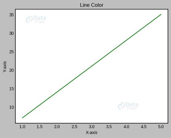
This bit of code turns the line colour. Alternatively, hexadecimal codes may be used to describe colours if you want to play around with other names.
2. Line transparency adjustment:
Line opacity may be changed by adjusting the alpha value or transparency. The alpha value controls how transparent the lines are. Case in point:
plott.plot(list_a, list_b, color='red', alpha=0.7)
plott.title("Line Transparency DataFlair")
plott.xlabel("X-axis")
plott.ylabel("Y-axis")


plott.show()
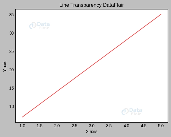
This code snippet creates a somewhat see-through line by setting alpha to 0.7.
Linearity and Spacing
1. Altering the line quality:
Matplotlib’s line styles range from solid to dashed to dotted, among others. The line style may be set using the linestyle option. Case in point:
plott.plot(list_a, list_b, linestyle='--')
plott.title("Line Style DataFlair")
plott.xlabel("X-axis")
plott.ylabel("Y-axis")


plott.show()

The ‘–‘ in this code snippet indicates a dashed line. You may experiment with various line types, such as the dashes (‘-‘) and dots (‘:’).
2. Line width regulation:
The linewidth parameter controls the relative thickness of lines. We may adjust the line spacing by increasing or decreasing the value. Case in point:
plott.plot(list_a, list_b, linewidth=5)
plott.title("Line Width DataFlair")
plott.xlabel("X-axis")
plott.ylabel("Y-axis")


plott.show()

The line width is set to 5 in this code sample. To get the required depth, try out a range of numbers.
Line Markers
1. Integrating Lines and Markers for Point-Based Data Display:
Data points may be marked with markers and connected with lines to offer context and facilitate analysis. We may label the data points by passing in the marker argument to the plot() method. For example:
plott.plot(list_a, list_b, marker='s')
plott.title("Line with Markers DataFlair")
plott.xlabel("X-axis")
plott.ylabel("Y-axis")


plott.show()

This piece of code marks the data points with circles (‘s’). Marker shapes range from squares (‘o’) to triangles (‘v’) and beyond.
2. Making changes to the look and location of markers:
Markers’ dimensions, hues, and opacities are all modifiable. In addition, we can adjust the marker size using the markersize option. Case in point:
plott.plot(x, y, marker='s', markersize=10, markerfacecolor='green', markeredgecolor='blue')
plott.title("Customized Markers DataFlair")
plott.xlabel("X-axis")
plott.ylabel("Y-axis")


plott.show()
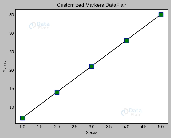
The markersize variable is set to 10, and the markerfacecolor and markeredgecolor variables are coloured green and blue, respectively, in this code snippet. To obtain the required visual appearance, try experimenting with various marker characteristics.
Merging Marker and Line Characteristics
Defined Boundaries
1. Making graphs with labels placed at data points:
Lines and markers may be plotted together using the plot() function’s linestyle and marker arguments. Case in point:
plott.plot(list_a, list_b, linestyle='--', marker='s')
plott.title("Markered Line DataFlair")
plott.xlabel("X-axis")
plott.ylabel("Y-axis")


plott.show()
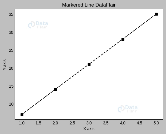
This piece of code generates a dashed line with square nodes.
2. Individual control over marker and line attributes:
Markers and lines may have their appearances altered separately by changing their individual properties. Case in point:
plott.plot(list_a, list_b, linestyle='-', marker='s', markersize=10, markerfacecolor='green', markeredgecolor='black', color='orange')
plott.title("Customized Markered Line DataFlair")
plott.xlabel("X-axis")
plott.ylabel("Y-axis")


plott.show()

This code snippet allows you to change the marker characteristics (size, face colour, edge colour) without affecting the line colour or style.
Interlinear spaces with content
1. Multiple line shading visualisation:
Matplotlib’s fill-in-the-gaps functionality makes for some quite eye-catching graphs. The fill_between() method allows us to specify the area that will be filled. Case in point:
list_a = [1, 2, 3, 4, 5]
list_b = [3, 6, 9, 12, 15]
list_c = [5, 10, 15, 20, 25]


plott.plot(list_a, list_b, color='green')
plott.plot(list_a, list_c, color='orange')


plott.fill_between(list_a, list_b, list_c, color='grey', alpha=0.6)
plott.title("Filled Area DataFlair")
plott.xlabel("X-axis")
plott.ylabel("Y-axis")


plott.show()

The code below fills the range between list_b and list_c with grey. The fill’s opacity is adjusted using the alpha setting.
Conclusion
In this detailed tutorial on Lines in Matplotlib, we’ve covered all the bases when it comes to Matplotlib’s line customisation options. Plots may be made more visually attractive and informative by combining lines with markers and adjusting their features such as colour, transparency, style, and width. We have also expanded our data visualisation capabilities by learning to make marked lines and to see filled spaces between lines.
Feel free to play with Matplotlib’s line attributes and other customisation settings as you go. Learning to modify the appearance of lines may greatly improve your data visualisations and your ability to communicate with your audience. All the best with your plans
Your 15 seconds will encourage us to work even harder
Please share your happy experience on Google


