Introduction to NumPy Matplotlib for Beginners
Machine Learning courses with 100+ Real-time projects Start Now!!
Python is a really useful tool for data science implementations. We prefer it because of the wide range of libraries and packages available in Python.
NumPy along with Matplotlib is a fundamental feature of Python. It helps to ease data interpretation and visualization. We implement the plotting functions in NumPy with the use of Matplotlib.
NumPy Matplotlib Tutorial
Let us firstly see what is Matplotlib?
We use Matplotlib to ease the analysis of statistical data. Matplotlib is a visualization tool and hence provides a visual analysis of the data.
Matplotlib is an effective replacement for the MatLab tool. It contains all the requirements for replacements. It is also effective when put to use with other GUI toolkits. We can use it alongside Tkinter and pyqt packages.
We can access matplotlib by importing its subpackage pyplot.
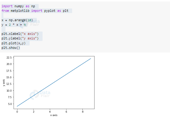
from matplotlib import pyplot as plt
The pyplot() function is very useful for demonstrating 2-D array plots.
import numpy as np
from matplotlib import pyplot as plt

x = np.arange(10)
y = 2 * x + 4

plt.xlabel("x axis")
plt.ylabel("y axis")
plt.plot(x,y)
plt.show()
Output
Matplotlib Basics
These are some basic functions available in Matplotlib :
1. Labels
We use this function to provide label tags for the x and y-axis of the graph. We use plt.xlabel() and plt.ylabel() for labeling x and y-axis respectively.
2. Title
We use plt.title() to provide a title to the plot.
3. Ticks
It provides us with the choice of label position. It is to make the plots user friendly. We use the plt.xticks() for x-axis and plt.yticks() for y-axis.
4. Plot size
We use the plt.figure() function to set the plot size. We can change the default size by providing a tuple value for the length of rows and columns.
5. Subplot
We can make subplots in an existing plot. We use the plt.subplot() function in this case. Three arguments namely: nrows(), ncols(), and index()are provided for the number of rows, columns, and the index values of each respectively.
6. Subplots
This is similar to subplots but is easier to understand. It has separate values for the figure and the axes.
These functions map to the simple line plot. The plt.plot() function gives the basic line plot. It takes 2 arrays as input. We use the plt.show() method to display the graph. We have a range of plots available for graphical representation in matplotlib.
Matplotlib Formatting Characters for plot
| Sr No. | Character | Description |
| 1 | ‘-’ | Solid line |
| 2 | ‘–’ | Dashed line |
| 3 | ‘-.’ | Dash-dot line |
| 4 | ‘:’ | Dotted line |
| 5 | ‘.’ | Point marker |
| 6 | ‘,’ | Pixel marker |
| 7 | ‘o’ | circle marker |
| 8 | ‘v’ | Triangle down marker |
| 9 | ‘^’ | Triangle up marker |
| 10 | ‘<’ | Triangle left marker |
| 11 | ‘>’ | Triangle right marker |
| 12 | ‘1’ | Tri down marker |
| 13 | ‘2’ | Tri up marker |
| 14 | ‘3’ | Tri left marker |
| 15 | ‘4’ | Tri right marker |
| 16 | ‘s’ | Square marker |
| 17 | ‘p’ | Pentagon marker |
| 18 | ‘*’ | Star marker |
| 19 | ‘h’ | Hexagon1 marker |
| 20 | ‘H’ | Hexagon2 marker |
| 21 | ‘+’ | Plus marker |
| 22 | ‘x’ | X marker |
| 23 | ‘d’ | Thin diamond marker |
| 24 | ‘D’ | Diamond marker |
| 25 | ‘|’ | Vline marker |
| 26 | ‘_’ | Hline marker |
Matplotlib Color abbreviations
| Sr no. | Abbreviation | color |
| 1 | ‘b’ | Blue |
| 2 | ‘g’ | Green |
| 3 | ‘r’ | Red |
| 4 | ‘c’ | Cyan |
| 5 | ‘m’ | Magenta |
| 6 | ‘y’ | Yellow |
| 7 | ‘k’ | Black |
| 8 | ‘w’ | White |
Different Types of Plots in Matplotlib
There are different varieties of graphs available in matplotlib for providing a better understanding of the data set.
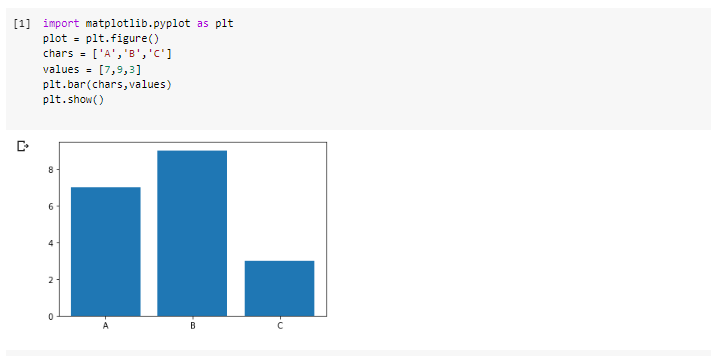
1. Bar graph in matplotlib
It is a very useful type of plot when we have categories of the data. We use it to depict the values in each category by the height of the bars. We can use plt.bar() function for bar graph and plt.barh() for horizontal bar graph.
There can be horizontal and vertical bar graphs. The horizontal bar graphs denote the width and index position. The vertical graphs denote a bottom argument.
import matplotlib.pyplot as plt
plot = plt.figure()
chars = ['A','B','C']
values = [7,9,3]
plt.bar(chars,values)
plt.show()
Output
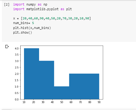
2. Histogram in Matplotlib
Histograms are useful when depicting the distribution of a single variable. It helps in the visualization of the variation of a single variable. The histogram can be plot using the plt.hist() function. We can customize Histograms accordingly using different arguments.
import numpy as np
import matplotlib.pyplot as plt

x = [20,40,60,90,40,50,20,70,30,20,10,90]
num_bins= 5
plt.hist(x,num_bins)
plt.show()
Output
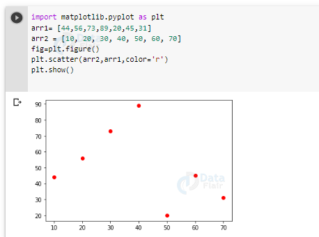
3. Scatter Plot in Matplotlib
It is also a useful type of plot. It is mainly useful when we want to perform data comparison. We use it mainly for making different comparisons amongst the observations. We use plt.scatter()for this plot.
import matplotlib.pyplot as plt
arr1= [44,56,73,89,20,45,31]
arr2 = [10, 20, 30, 40, 50, 60, 70]
fig=plt.figure()
plt.scatter(arr2,arr1,color='r')
plt.show()
Output
4. Box Plot in Matplotlib
We use it to represent a summary of the data. It displays five things – the minimum value, the first quartile, the median, the third quartile, and the maximum value. We can plot it using the plt.boxplot() function.
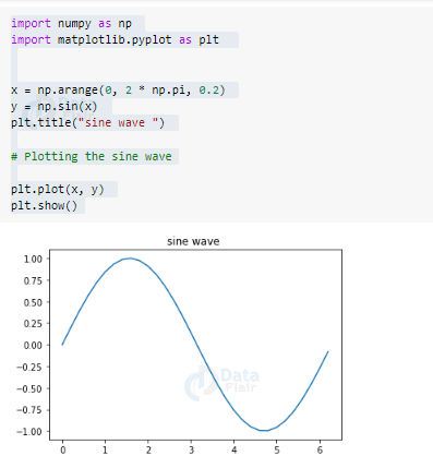
5. Sine wave Plot in Matplotlib
We use matplotlib to plot trigonometric functions. We can plot the sine wave using plotting functions.
import numpy as np
import matplotlib.pyplot as plt


x = np.arange(0, 2 * np.pi, 0.2)
y = np.sin(x)
plt.title("sine wave ")

# Plotting the sine wave

plt.plot(x, y)
plt.show()
Output
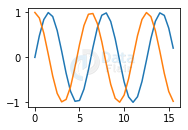
6. Subplot() in Matplotlib
We use subplot for plotting two different graphs. We can plot two different graphs in one figure. Here we take an example to plot both sine and cos graphs together.
import numpy as np
import matplotlib.pyplot as plt

x = np.arange(0, 5 * np.pi, 0.5)
y_sin = np.sin(x)
y_cos = np.cos(x)
plt.subplot(2, 2, 2)
plt.plot(x, y_sin)


plt.subplot(2, 2, 2)
plt.plot(x, y_cos)
plt.show()
Output
Customization of Graphs in Matplotlib
We can perform customization on graphs to make it more presentable and user friendly. We can make it more attractive by adding colors and lines.
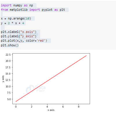
1. Color
We can specify the color of the graph as an argument. We can pass the name of the color as a string.
import numpy as np
from matplotlib import pyplot as plt

x = np.arange(10)
y = 2 * x + 4

plt.xlabel("x axis")
plt.ylabel("y axis")
plt.plot(x,y, color='red')
plt.show()
Output
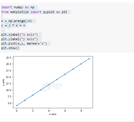
2. Marker in Matplotlib
Markers represent the points of the plot. We can change the type of marker by passing a string parameter specifying the type.
import numpy as np
from matplotlib import pyplot as plt

x = np.arange(10)
y = 2 * x + 4

plt.xlabel("x axis")
plt.ylabel("y axis")
plt.plot(x,y, marker='x')
plt.show()
Output
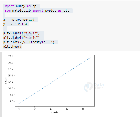
3. Linestyle in Matplotlib
We can define the type of line of the plot. We can pass it the type as a string argument.
import numpy as np
from matplotlib import pyplot as plt

x = np.arange(10)
y = 2 * x + 4

plt.xlabel("x axis")
plt.ylabel("y axis")
plt.plot(x,y, linestyle=':')
plt.show()
Output
Summary
Matplotlib is a very useful feature of the NumPy library. It is meant to ease data interpretation. The functions available allows for visual interpretation of the data. The visual representation makes the use of data more user-friendly.
Your 15 seconds will encourage us to work even harder
Please share your happy experience on Google


