Types of Charts in Excel
Interactive Online Courses: Elevate Skills & Succeed Enroll Now!
Different Types of Charts can be used for different scenarios to get the best result. Likewise, there are few types of Charts in Excel that are most commonly used for almost all types of Scenarios. Each of the Charts varies according to its nature and one can choose the preferred chart.
The most used charts are Pie Charts, Bar Charts, Column Charts, Combo Charts, Line Charts, and the Scatter Charts. There are many advanced and 3D Charts used for specific datasets.
To insert a chart in Excel:
Step 1: Open an MS Excel worksheet and click on the “Insert” button from the menu bar.
Step 2: From the Insert tab, go to the “Charts” option, there you would find different types of charts. You can choose the desired chart from it.
Note: Choose the chart as required. For example: Choose Bar chart while going through the bar chart example.
Step 3: Then we need to select the data for which the graph has to be plotted
Types of Charts in Excel
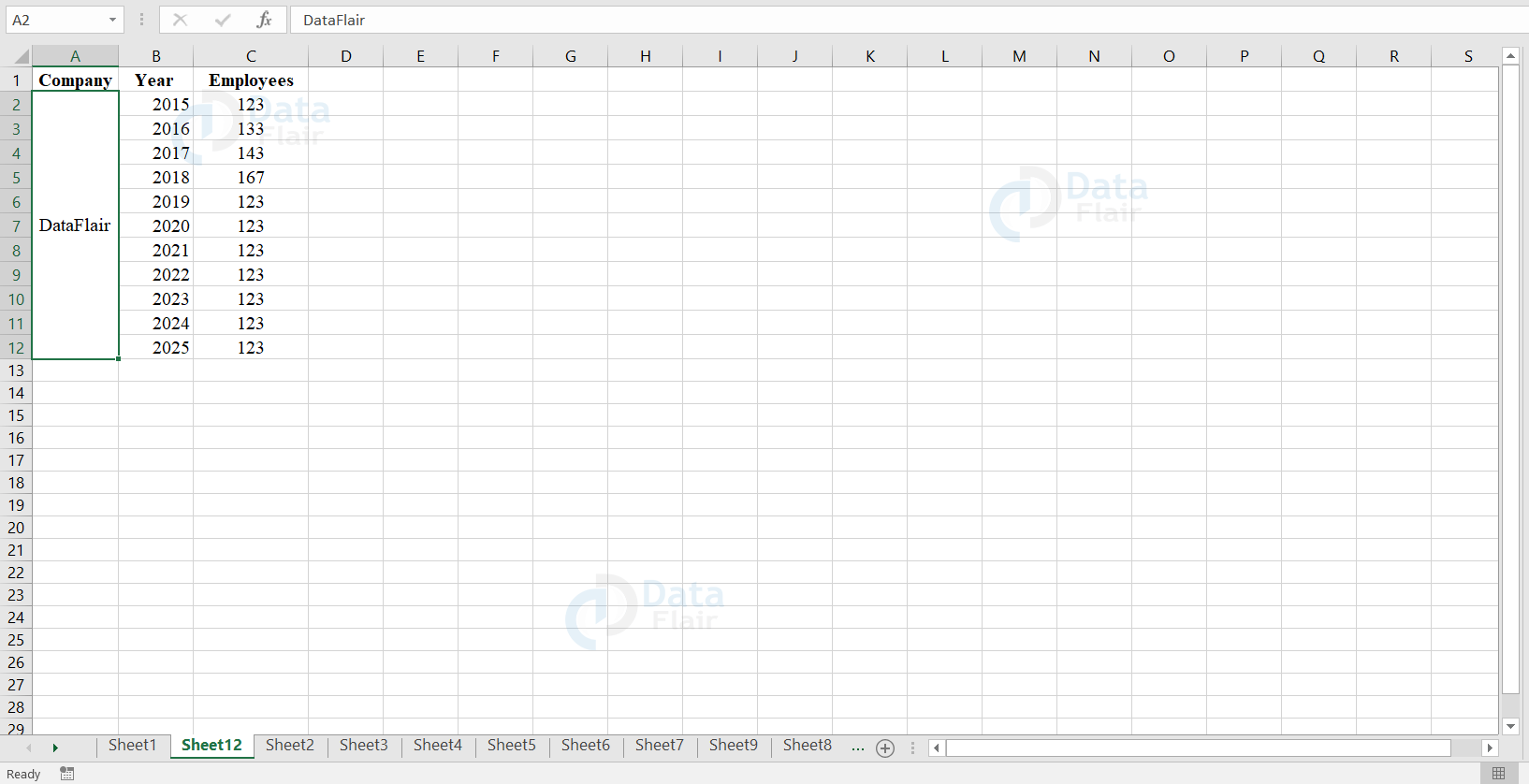
To explore the different types of charts, we are going to make use of the following dataset:
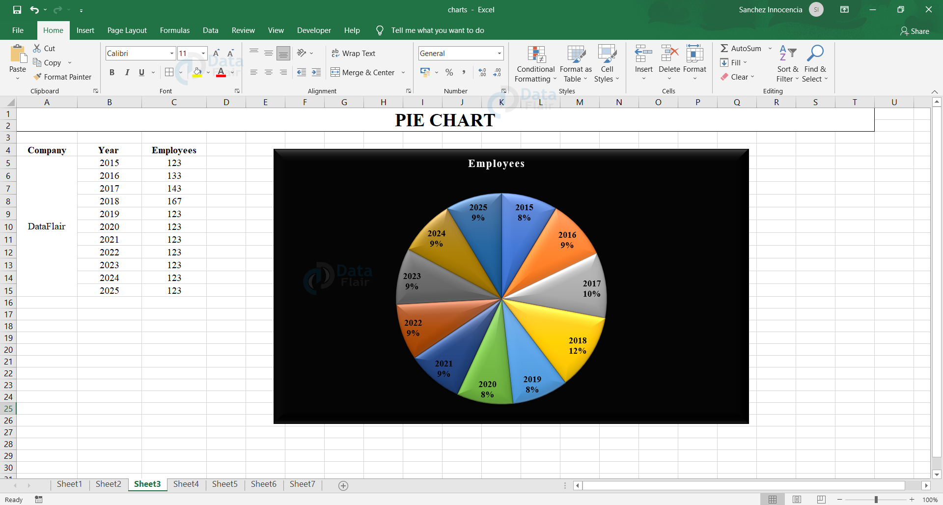
1. Pie Chart in Excel
Pie Chart is one that resembles a Pie. These are mainly used when one wants to represent the data in percentages. Here each data point i.e, the pie shows the respective percentages. Pie charts are best when we have one data series.
Types of Pie Chart
The pie chart has the following sub types and they are 2-D pie chart and 3-D pie chart. The 2-D pie chart is further classified into pie of pie and bar of pie.
a. Pie of Pie and Bar of Pie
These charts focus on pie charts with smaller values pulled out into a secondary pie or Stacked Bar chart. These charts make the data values easier to distinguish. These charts are generally used to show the proportions of total value and to make small percentages also readable.
b. 3-D Pie
Pie charts are either depicted in a 2-D or a 3-D format.The user can pull out the slices of a pie chart manually to highlight the slices. The user can use these chart types to show a proportion of the whole pie or when the chart contains only a few slices in the pie.
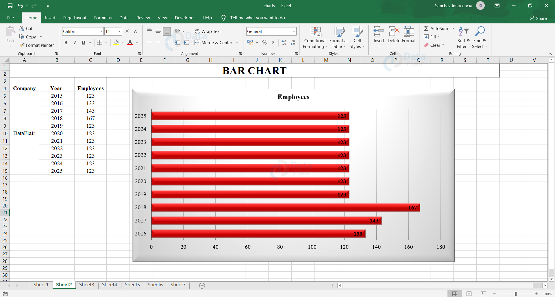
2. Bar Chart in Excel
Bar Charts are frequently used when one needs to compare the values for a few categories. These are mainly used as comparative chart fitting the dataset, that should be compared and it will be represented in the form of bars. This Chart is the most familiar and this is the one which can be used for interpreting easily. It works well for data of Ordinal Type. This type of Chart is horizontal.
Types of Excel Bar Chart
The bar charts are further classified into three types and they are stacked bar chart, 100% stacked bar chart and clustered bar chart.
a. Stacked Bar Chart in Excel
A stacked bar chart is a basic Excel chart type that allows the comparison of components across categories. Data values are plotted as horizontal bars stacked from left to right.
Stacked bars make it easier to compare total bar lengths. However, the first series of data which is next to the axis alone is quite difficult to compare the relative size of the components that construct each bar. Also, as categories or data series are increased, stacked column charts become visually complex.
To explore the stacked bar chart, we are going to make use of the different datasets:
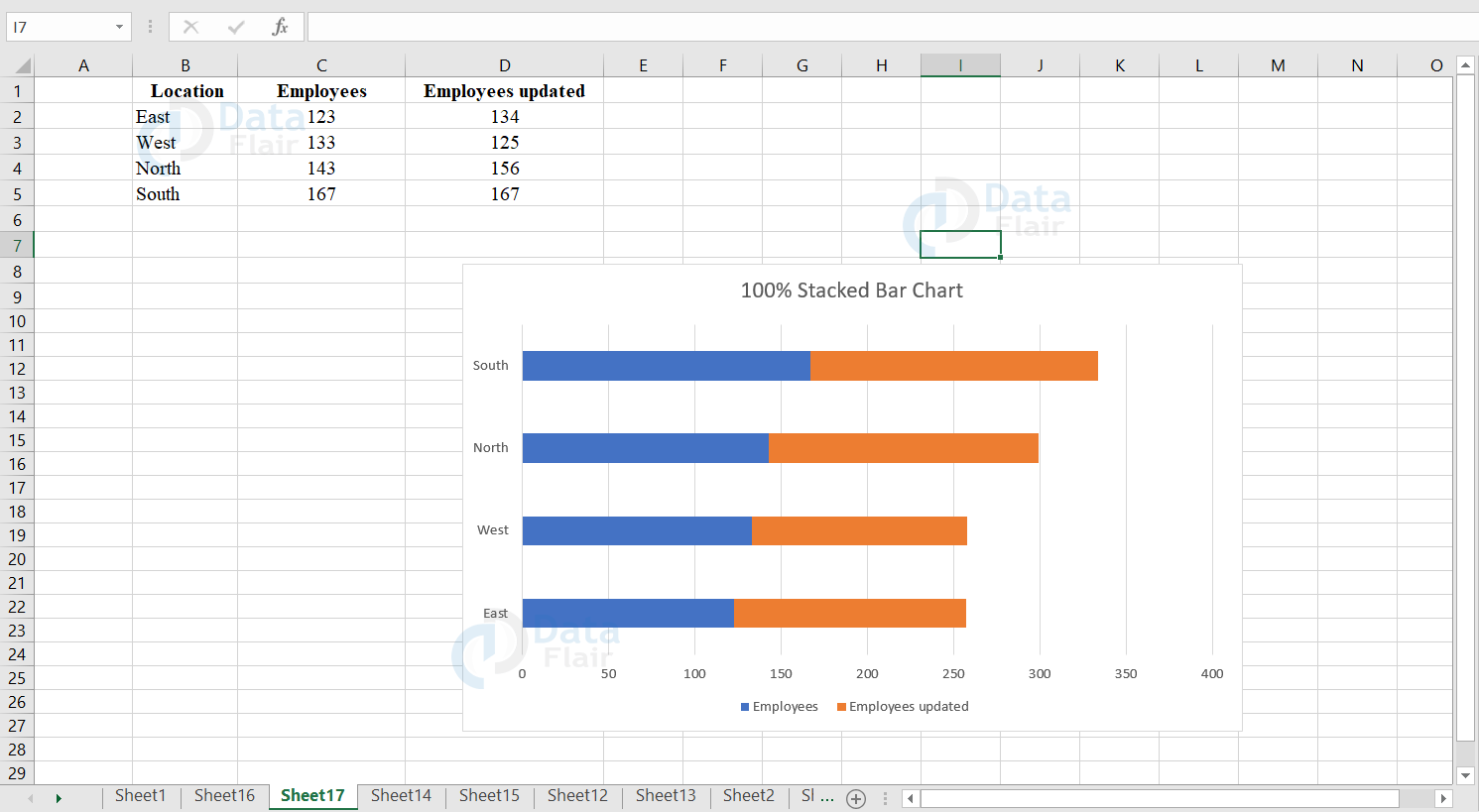
b. 100% Stacked Bar Chart in Excel
A 100% stacked bar chart is an excel chart type that shows the relative percentage of multiple data values in stacked bars. Here the cumulative of stacked bars always equal 100 percent. The 100% stacked bar chart can depict from part to whole proportions over time. The stacked bar chart is generally difficult to compare the relative size of the components that construct each bar.
In stacked bar charts, the first data series which is next to the axis is easy to compare visually, but the other data values are harder to compare as they are not aligned to a common element. To explore a 100% stacked bar chart, we are going to make use of the different datasets:
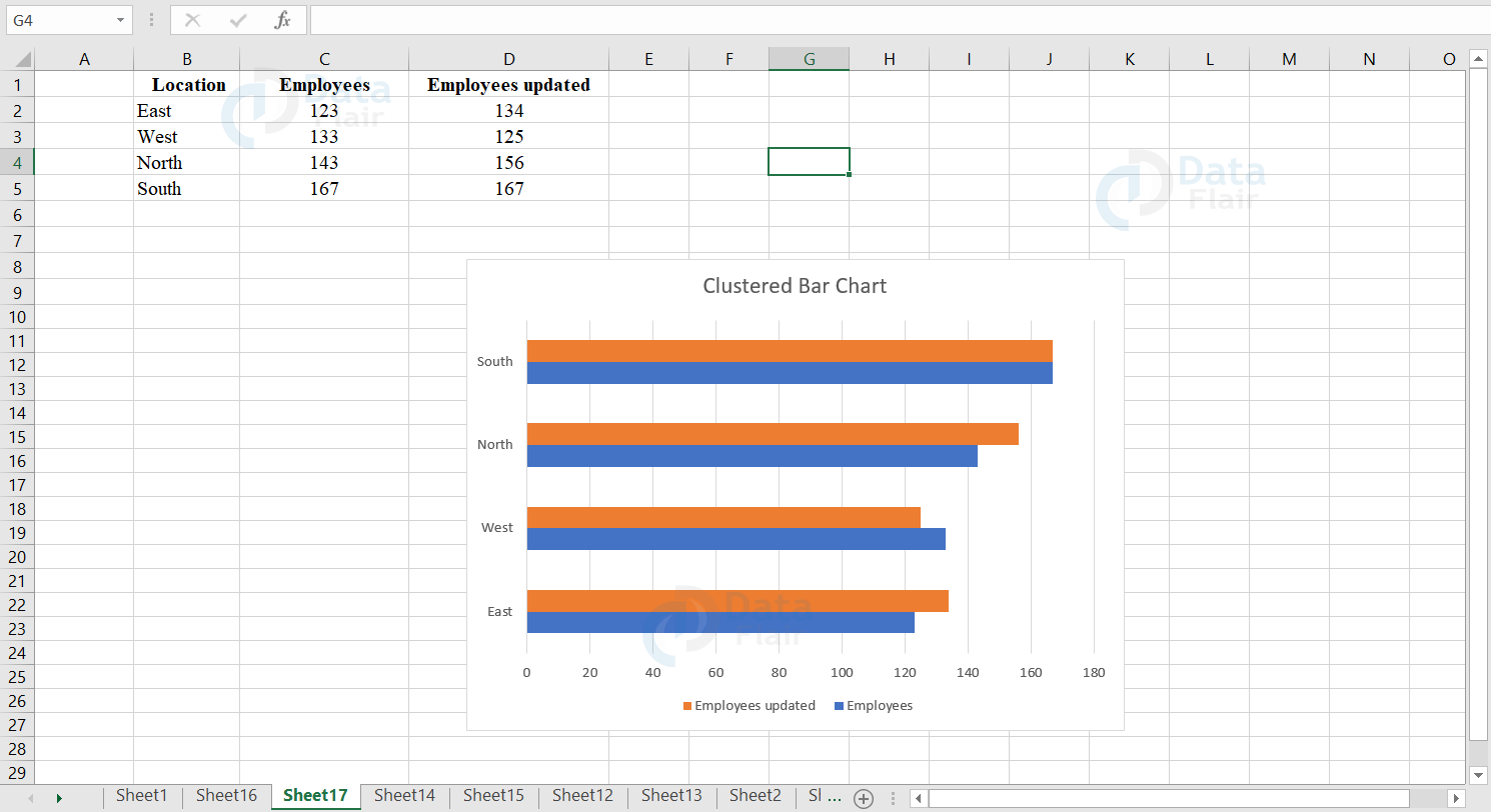
c. Clustered Bar Chart in Excel
A clustered bar chart is an excel chart type that displays more than one data value in clustered horizontal columns. Each data value shares the same axis labels and the horizontal bars are grouped by category. Clustered bars allow the user to directly compare multiple data series in a particular category, but it’s more difficult for the user to compare the same data values across categories.
The clustered bar charts become visually complex when the number of categories or data values increase. This chart works best in situations where data values are limited. To explore clustered bar chart, we are going to make use of the different dataset:
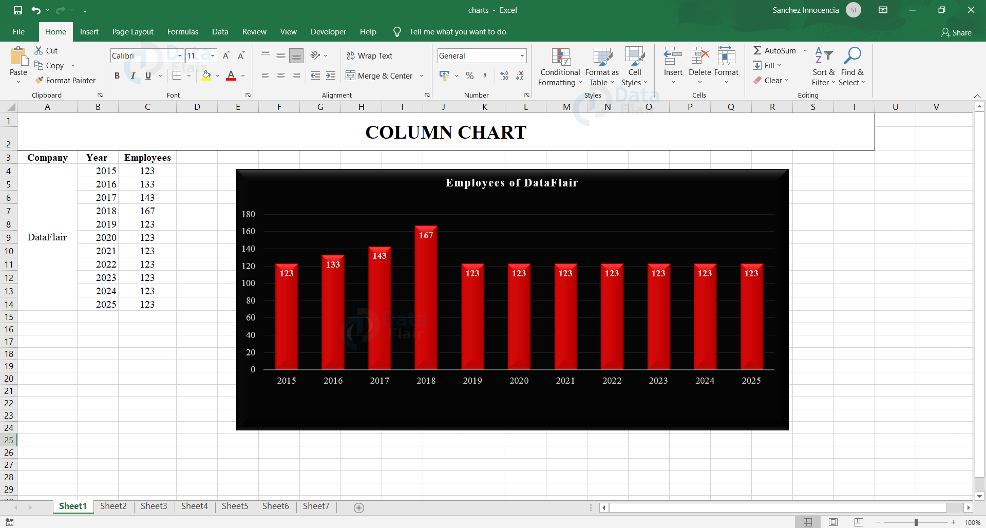
3. Column Chart in Excel
Column Charts are also used when one needs to compare the values for a few categories but this is basically where the chart is vertically displayed. This type of chart is widely used to compare items of a specific range of values. This Chart mainly holds good for comparing items of a single category with individual sub-items like comparing the income/revenue between regions.
Types of Excel Column Chart
The column charts are further classified into three types and they are stacked column chart, 100% stacked column chart and clustered column chart.
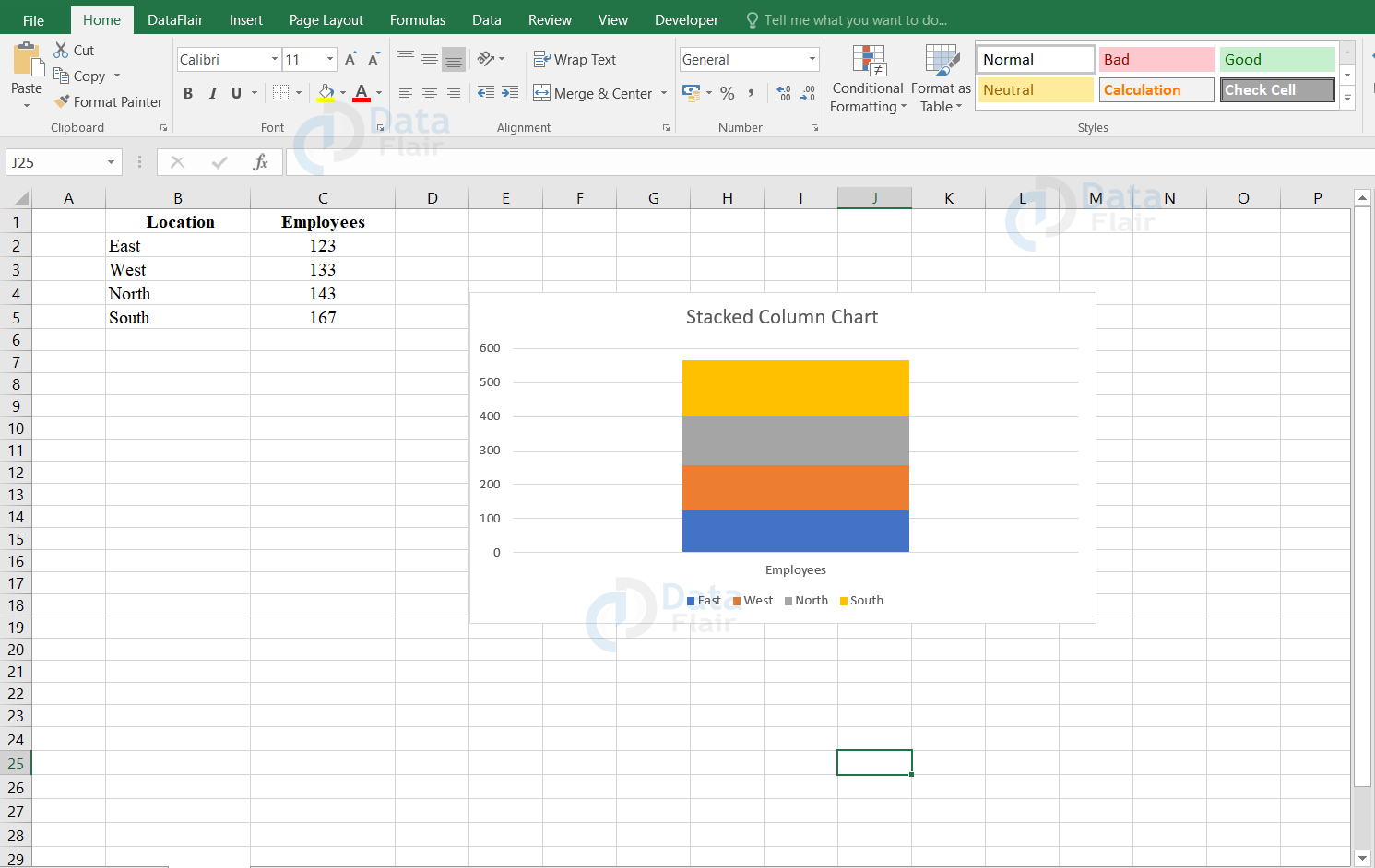
a. Stacked Column Chart in Excel
A stacked column chart is a basic Excel chart type that allows the user to compare over time from part to whole or across categories.
In a stacked column chart, the data values are stacked one on the other like layers in vertical columns. The first series of data points which lie next to the x-axis and total bar length is quite difficult to compare the relative size of the components that construct each bar. As categories or data values are increased, stacked column charts quickly become quite complicated. To explore the stacked column chart, we are going to make use of the different dataset:
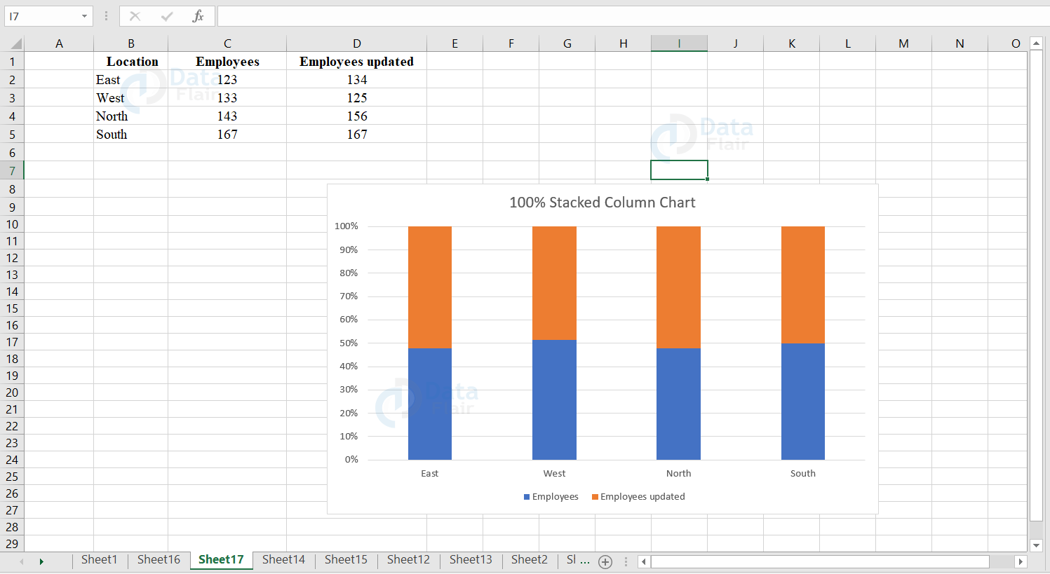
b. 100% Stacked Column Chart in Excel
A 100% stacked column chart is an excel chart type that shows the relative percentage of multiple data values in stacked columns. Here the cumulative of stacked columns always equal 100 percent. The 100% stacked column chart can depict from part to whole proportions over time.
The stacked column chart is generally difficult to compare the relative size of the components that construct each column. To explore 100% stacked column chart, we are going to make use of the different dataset:
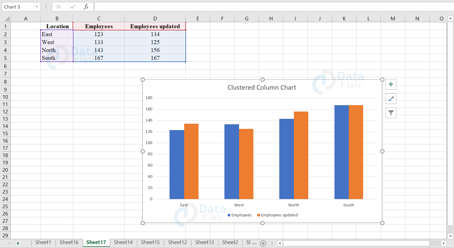
c. Clustered Column Chart in Excel
A clustered column chart is an excel chart type that displays more than one data value in clustered vertical columns. Each data series shares the same axis labels and the vertical bars are grouped by category.
The clustered columns allow the user to directly compare multiple data series but they may become visually complex quickly. This chart works best in situations where data values are limited. To explore clustered column chart, we are going to make use of the different dataset:
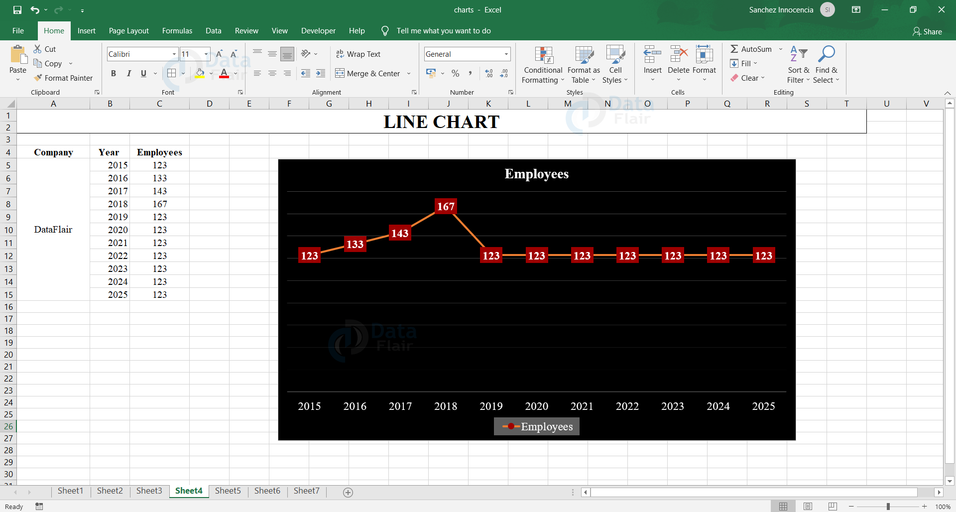
4. Line Chart in Excel
Line charts are commonly used for visualizing the trends for a particular period of time like the days, months, years, etc. These can be further used for dataset containing dates or text/numeric labels on the X axis.
Types of Line chart
The line chart is classified into two types and they are 2D line chart and 3D line charts. The 2-D line charts are further classified into 100% stacked line, line with markers, stacked line with markers and 100% stacked line with markers.
a. Line with Markers
Line charts depict individual data values. Line charts work best when the user has multiple data series in the chart. Line charts can show trends over time on the basis of days, month, years etc. A Line chart can appear with or without markers.
b. Stacked Line with Markers
Stacked Line charts indicate the individual data values in the range. Stacked line charts can highlight the trend of the contribution of each value over time. A stacked line chart can appear with or without markers. Sometimes reading the stacked line charts can be difficult as they sum the data and it is difficult to focus on the lines that are stacked.
c. 100% Stacked Line and 100% Stacked Line with Markers
100% stacked line charts indicate the individual data values in the range. 100% stacked line charts can highlight the trend of the percentage of each value over time. A 100% stacked line chart can appear with or without markers. Sometimes reading the stacked line charts can be difficult.
Note: The user can use a Line chart without markers when the category order is important and when there are many values that are approximate. The user can use a line chart with markers when the category order is important and when there are limited categories.
d. 3-D Line
The 3-D Line charts depicts every individual row and column of data as a 3-D Ribbon. 3-D Line charts can show trends over the basis of time such as days, months, years etc. They can also show trends over the categories. This chart has horizontal, vertical and depth axes that the user can change. The third axis in the chart can indicate some lines in front of others.
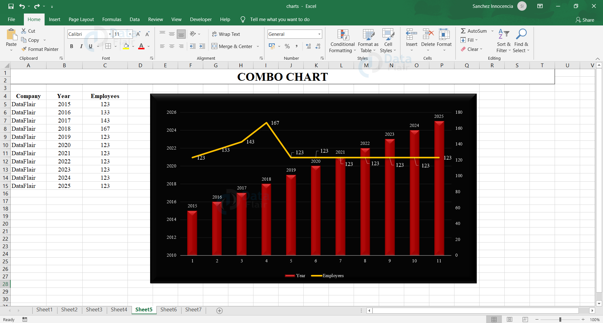
5. Combo Chart in Excel
Combo Charts are basically used for displaying different types of dataset in different ways in the same chart or a single chart. This is a combined chart, where we combine different kinds of data into a single chart. For example, we may combine a bar chart with the line chart as given below.
Types of Combo Chart in Excel
The combo charts are classified into three types and they are clustered columns either with line or line on secondary axis, stacked area and custom combination.
a. Clustered Column – Line
Clustered Column -Line chart is used to focus on the different types of information. This chart combines a clustered column and a line chart which shows some data series as columns and others as lines in the same chart itself.
b. Clustered Column – Line on Secondary Axis
Clustered Column – Line on Secondary Axis charts is also used to focus on the different types of information. This chart combines a clustered column and a line chart. These charts together show some data series as columns and others as lines in the same chart itself. A secondary axis works well in a chart that shows a combination of column and line charts. The user uses these charts when the range of values vary widely and it is a mixed type of data.
c. Stacked Area – Clustered Column
This chart highlights the different types of information in the data values. The values for the associated data series are shown by the scale of the secondary vertical axis. This chart combines a stacked area and a clustered column in the same chart.
d. Custom Combo Chart
The user can also create a combo chart that is customized according to the requirement.
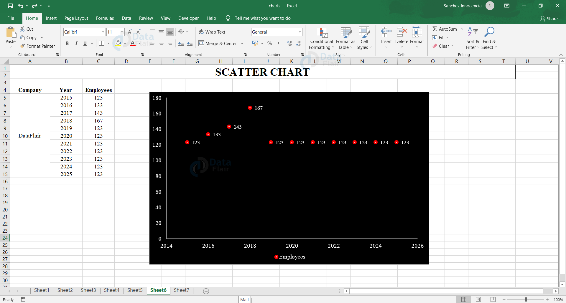
6. Excel Scatter Chart
Scatter charts are commonly used for comparing and displaying the values that are statistical, scientific, etc. This shows a relationship among the numeric values in several data series and can be plotted as two groups of x and y coordinates.
Types of Scatter chart
The scatter chart is classified into following subtypes such as scatter with smooth lines and markers, scatter with straight lines and markers.
a. Scatter with smooth lines and markers
The lines in the chart display a smooth curve that connects the data values. These charts are very much helpful to compare two or more sets of data values or pairs of data.
b. Scatter with Straight Lines and Markers
The lines in the chart link the data values with straight lines. These charts are very much helpful to compare two or more sets of data values or pairs of data.
Note:
The user can use a scatter chart either with smooth lines and markers or straight lines and markers together when there are limited data values. When the dataset is huge the user can either use a scatter with smooth lines or scatter with straight lines.
7. Area Chart in Excel
The user uses the area chart when they want to see the changes over time such as days, weeks, months, years, etc. This graph grabs the focus to the total value across the trend. The area chart helps to represent the relationship of a part to the whole. In simple terms, we can say that the user uses the area chart to focus on the magnitude of change over time.
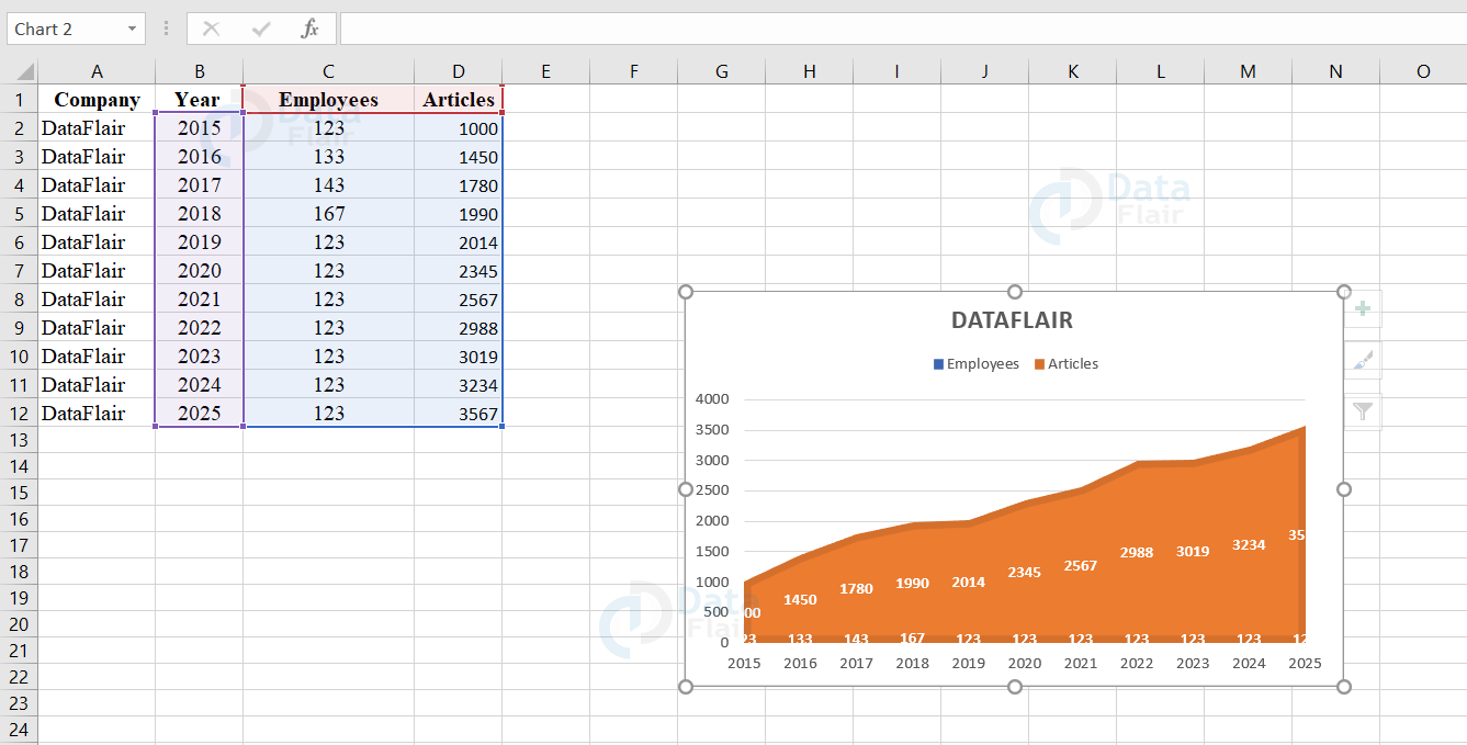
The area charts are further classified into stacked area charts, 3-D stacked area charts, 100% stacked area charts and 3-D 100% stacked area charts.
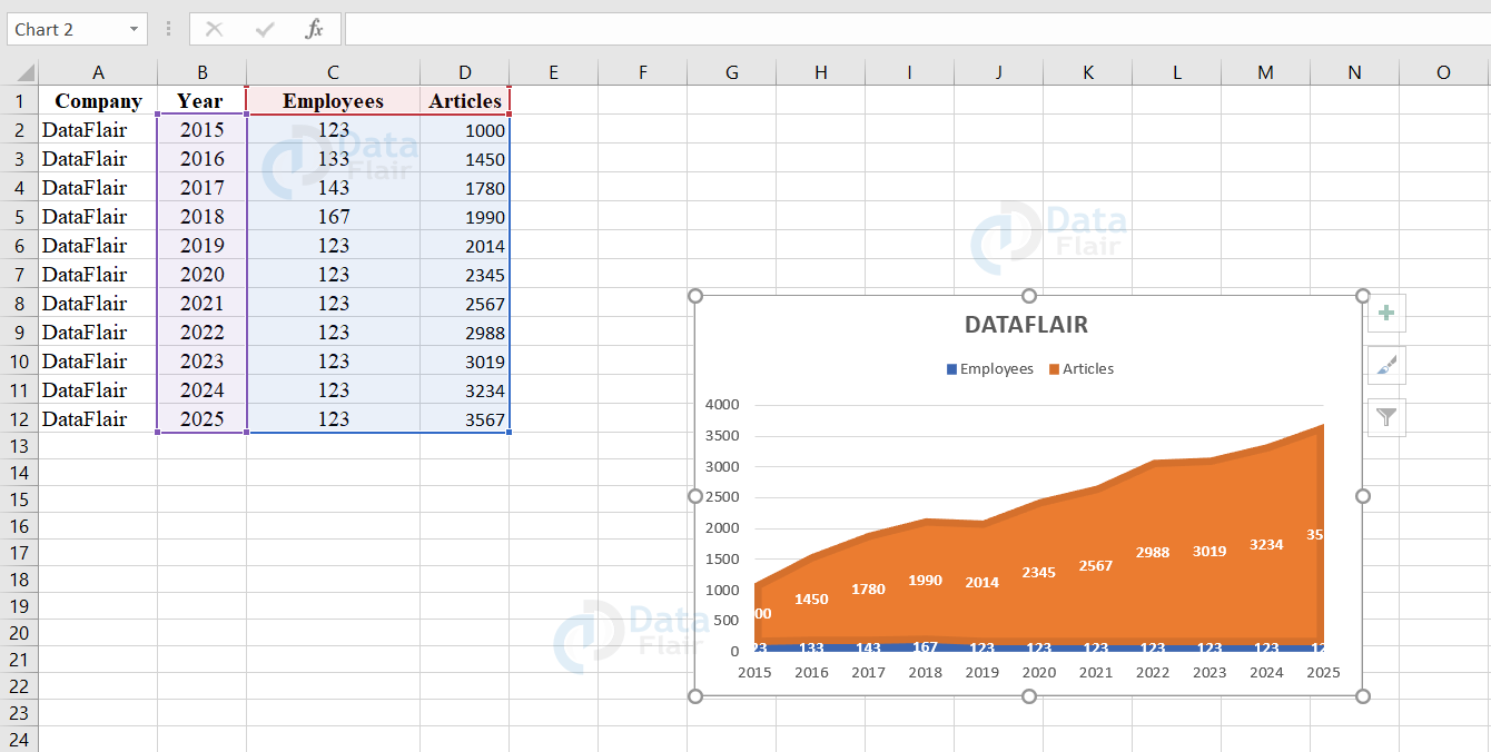
a. Stacked Area and 3-D Stacked Area Chart
The user uses the stacked area chart when they want to see the trend and the contribution of each value in the data point. It can also be represented in 2D or 3D format. The 3D format is also the same but they do not use a depth axis.
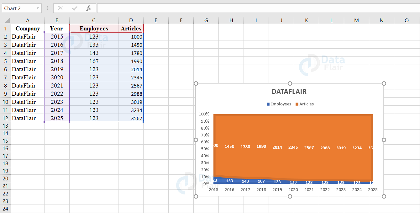
b. 100% Stacked Area and 3-D 100% Stacked Area
The user uses the 100% stacked area chart when they want to see the trend and the contribution of each value in the data point by their percentage. The 3D format is also the same but they do not use a depth axis.
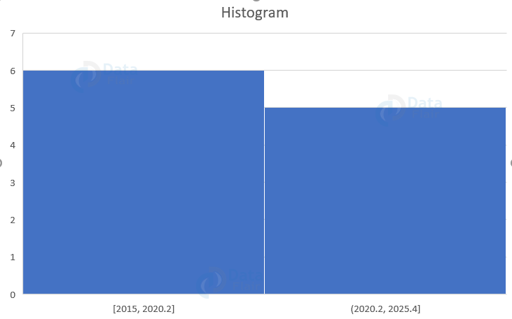
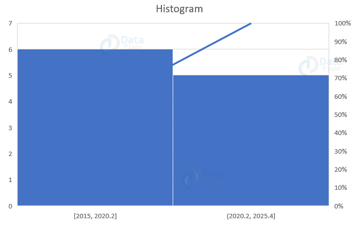
8. Excel Histogram charts
The histogram chart is available from office 2016 and newer versions. It shows the frequencies within a distribution. There is a column in the chart called bin and it can be changed further to analyze the data. This chart shows the distribution of data into frequency bins. There are other sub type charts available and they are histogram chart, pareto chart etc.
9. Pareto chart in Excel
A Pareto chart is a sorted histogram chart that contains both columns sorted in descending order and the line in the graph represents the cumulative total percentage.
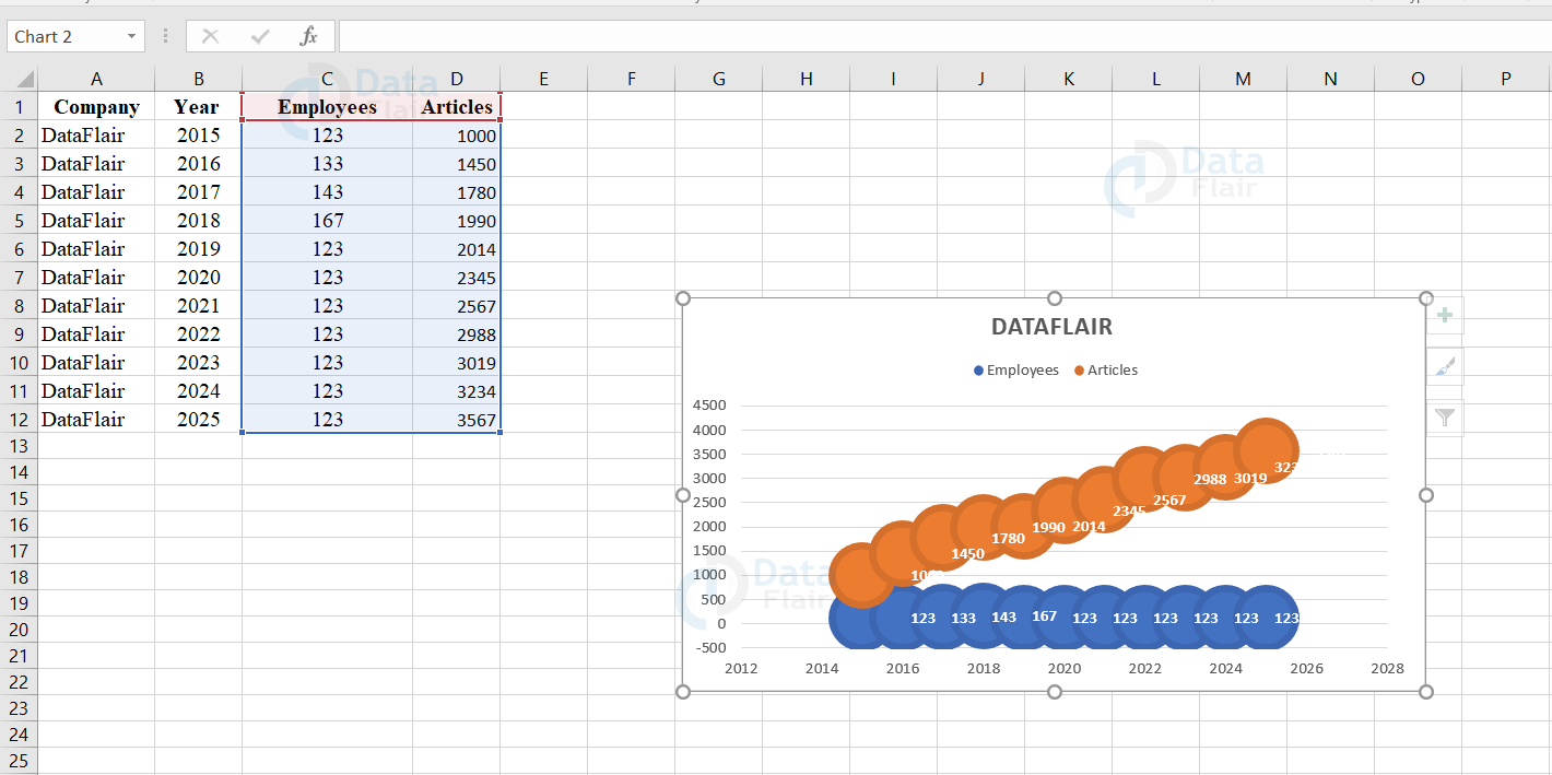
10. Bubble Chart and 3D Bubble Chart in Excel
The bubble chart is more similar to the scatter chart and in addition, the bubble denotes the data points. The user uses the bubble chart to compare and see the relationship between the bubbles of the data series. When there are too many bubbles in the chart, it makes the users difficult to read. So make sure the data capacity is limited. The user also uses the bubble chart to analyze patterns and correlations. The 3D format is also the same but they do not use a depth axis.
11. Stock Charts in Excel
The user uses the stock charts to view the fluctuations in the stock prices. These charts are also useful to view the fluctuations in other datasets such as daily temperature, rainfall, etc. To make use of the stock charts, the data should be in a specific order. This chart compares the aggregate values of several data points.
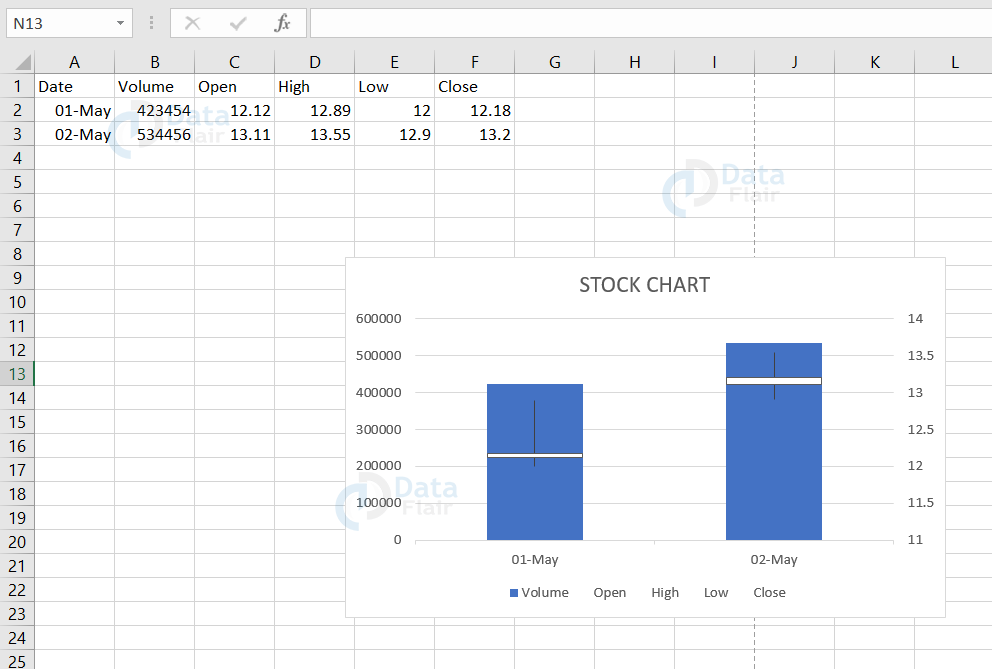
Types of Stock charts
The stock has following subtypes and they are High low close, Open high low close, Volume high low close and volume high low close. These charts are used to exemplify the stock prices. The charts with four values are actually used to depict the trend of stocks over a time period.
a. High-Low-Close
This chart requires three values and those are high, low and close. Arrange these values in the same order i.e., high, low, close.
b. Open-High-Low-Close
This chart requires four values and those are open, high, low and close. Arrange these values in the same order i.e., open, high, low, close.
c. Volume-High-Low-Close
This chart requires four values and those are high, low and close. Arrange these values in the same order i.e., volume, high, low, close.
d. Volume-Open-High-Low-Close
This chart requires five values and those are open, high, low and close. Arrange these values in the same order i.e., volume, open, high, low, close
Summary:
The types of charts such as the Pie Chart, the Bar Chart, the Column Chart, the Line Chart, the Area Chart, the Combo Chart, and the Scatter Chart etc are explained along with its uses.
If you are Happy with DataFlair, do not forget to make us happy with your positive feedback on Google


