Sparklines in Excel
We offer you a brighter future with industry-ready online courses - Start Now!!
What is Sparkline in Excel?
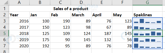
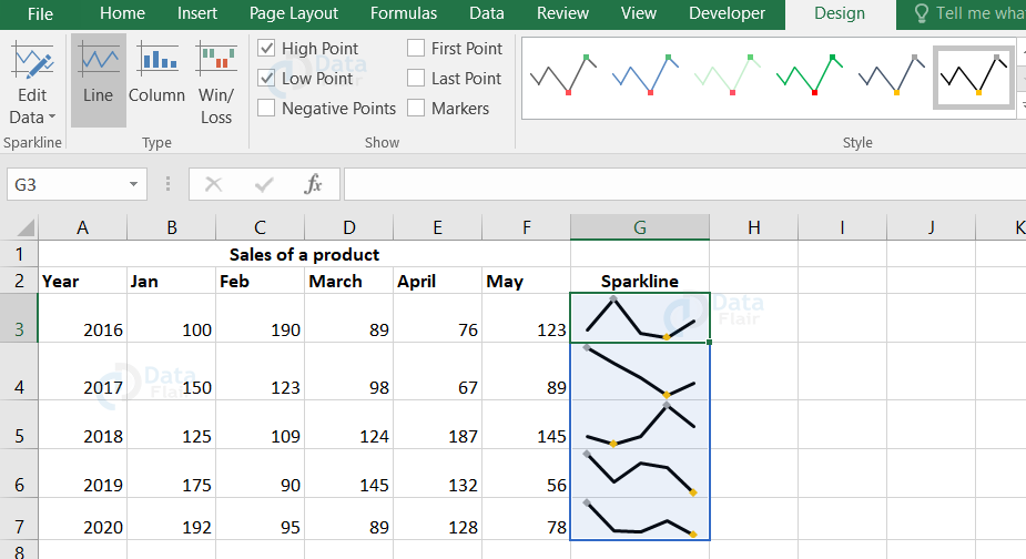
Sparkline is a small graph that represents a series of data. It fits into a single cell. The three different data visualizations are:
- Line
- Column
- Win/Loss
It is an instant chart for a particular range of values. Sparklines helps in showcasing the data trends.
Why use Sparklines?
Sparkline is one of the common visualization techniques used in dashboards to picture a particular portion from a huge dataset. Sparkline fits into a cell itself. When the cell size increases, sparklines are also adjusted according to the size of the cell. In sparkline, you can quickly see the relationship of the data.
Advantages of Sparklines in Excel
1. Visualization of the data like temperature or stock market price are easier.
2. Sparkline transforms the data into a compact form.
3. Sparkline helps in analyzing the data trends for a particular time.
4. Negative values and fluctuations are clearly seen in the analysis of data.
5. Sparkline automatically adjusts its size once the cell width is being altered.
Types of Excel Sparklines
Excel Sparklines are of 3 types as below:
1. Line sparkline
Line Sparkline forms line graphs and the high values are being indicated with much of a height difference.
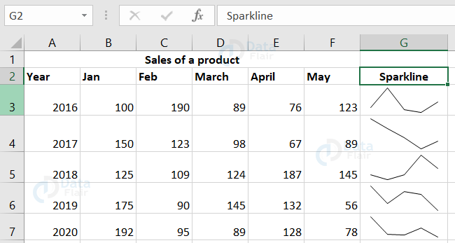
The data values are plotted considering the minimum value as the lowest point and the maximum value as the highest point.
2. Column Sparkline
Column Sparkline forms bar or column charts. Each bar shows each respective value.
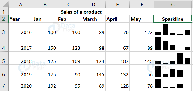
Using column sparkline, we can visualize the data in solid bar graphs.
3. Win/Loss Sparkline
It indicates the negative values like ups and downs on the dataset.
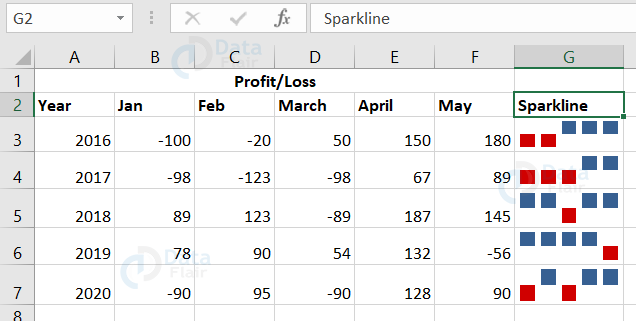
From this, we can clearly observe how the data are positively and negatively deviated.
Compare Sparklines
Each sparkline has its own vertical scale taking the maximum value at the top and minimum value at the bottom of the cell by default.
To compare the column sparklines, follow the steps:
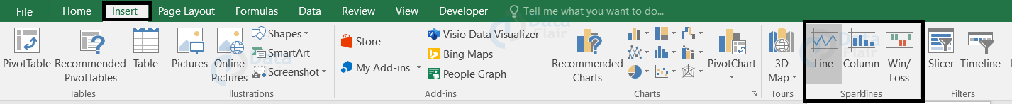
1: Go to the Insert tab and choose the sparkline from the ribbon.
2: Choose column sparkline.
3: Place the cursor on the sparkline & select the sparklines.
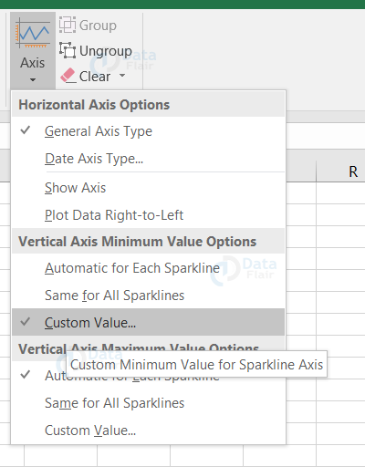
4: Go to the Design tab and click on the axis from the group “group”.
5: Select same for all sparklines option under vertical Axis Minimum Value and Vertical Axis Maximum Value headings.
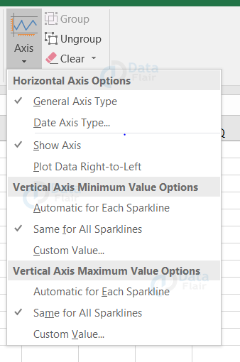
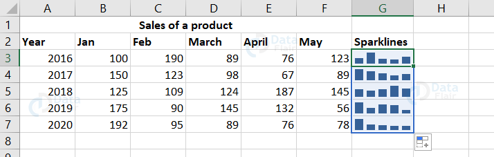
From this, we can observe that the sales of the product were relatively high in the year 2018 compared to the other years.
How to insert sparklines
Go to the insert tab and choose any one of the sparklines from the ribbon.
Different visualizations are available based on the type we choose. Lines represent the line charts, the bar chart represents the column type sparklines and the waterfall chart represents the win/loss type.
How to insert Sparklines in Excel?
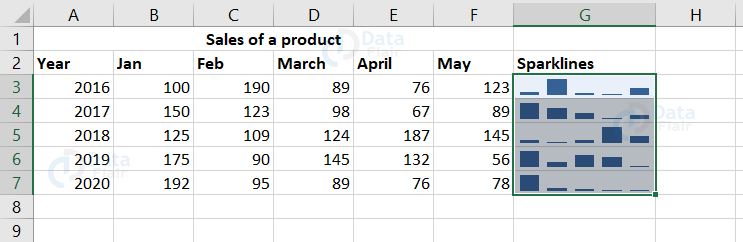
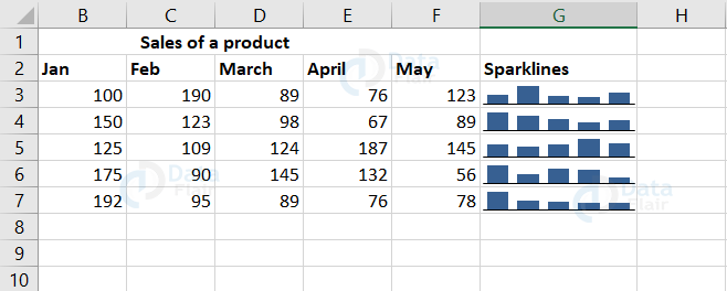
Select a particular row of the data and insert Sparklines in Excel. To make a quick analysis of the data, let’s insert sparklines.
1: Go to the insert tab and select any one type of sparkline.
2: A window appears and there you can select the range of cells to which the Sparkline should be available.
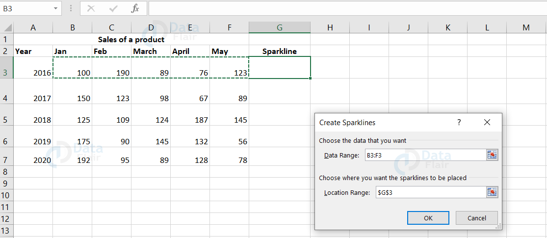
Note: By clicking the data range box, you can choose the range of cells.
3: Choose the first row of the data for the year 2016 in the ‘Data Range’ text box. Here, the range is from B3 : F3 cells.
4: Location range indicates where you want to insert the Sparkline and here it is G3 cell.
5: Finally, press the ‘OK’ button.
6: The Sparkline will be inserted into the G3 cell. You can apply the Sparkline to the entire data by dragging it.

Now, the Sparkline is being created for the selected data in the G column cells.
How to add sparklines to multiple cells in Excel?
1: Go to the insert tab and select any one type of sparkline.
2: A window appears and there you can select the range of cells to which the Sparkline should be available.
Note: By clicking the data range box, you can choose the range of cells.
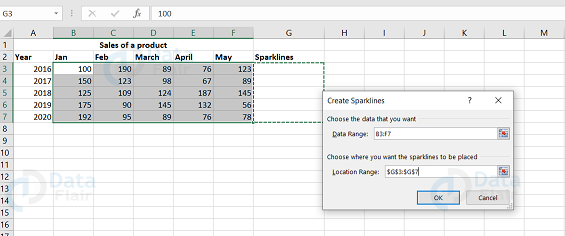
3: Choose the rows of the data in the ‘Data Range’ text box. Here, the range is from B3 : F7.
4: Location range indicates where you want to insert the Sparkline and here it is G3: G7 cell.
5: Finally, press the ‘OK’ button.
The Sparkline will be inserted into the G column cells.
Inserting sparklines using the quick analysis tool
Using the quick analysis tool, the sparklines are represented by the right side of your data table in MS Excel. To bring sparklines, follow the steps:
1 − Select the data from the excel sheet.
2: Click on the quick analysis tool icon and choose sparklines
3: The types of sparklines are represented, choose one among the types.
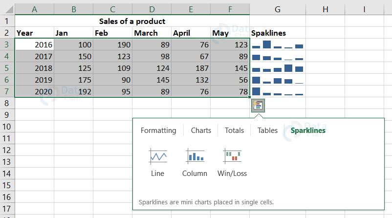
Here, we have chosen a column chart option for our dataset.
How to format Sparklines?
To format a sparkline, click on the created Sparkline, go to the design tab and there appear the sparkline tools. These tools help you to change the sparkline color and style. There are also other properties that can be modified according to the user’s convenience and those properties are style, color, thickness, type and axis.
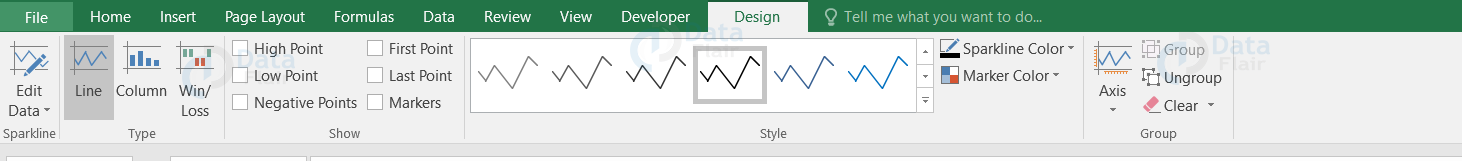
How to change the style of the Sparklines?
1: Click on the sparkline.
2: Go to the design tab and choose a style from the style option.
Note: If you want to view more designs, then click on the down arrow near to the style option.
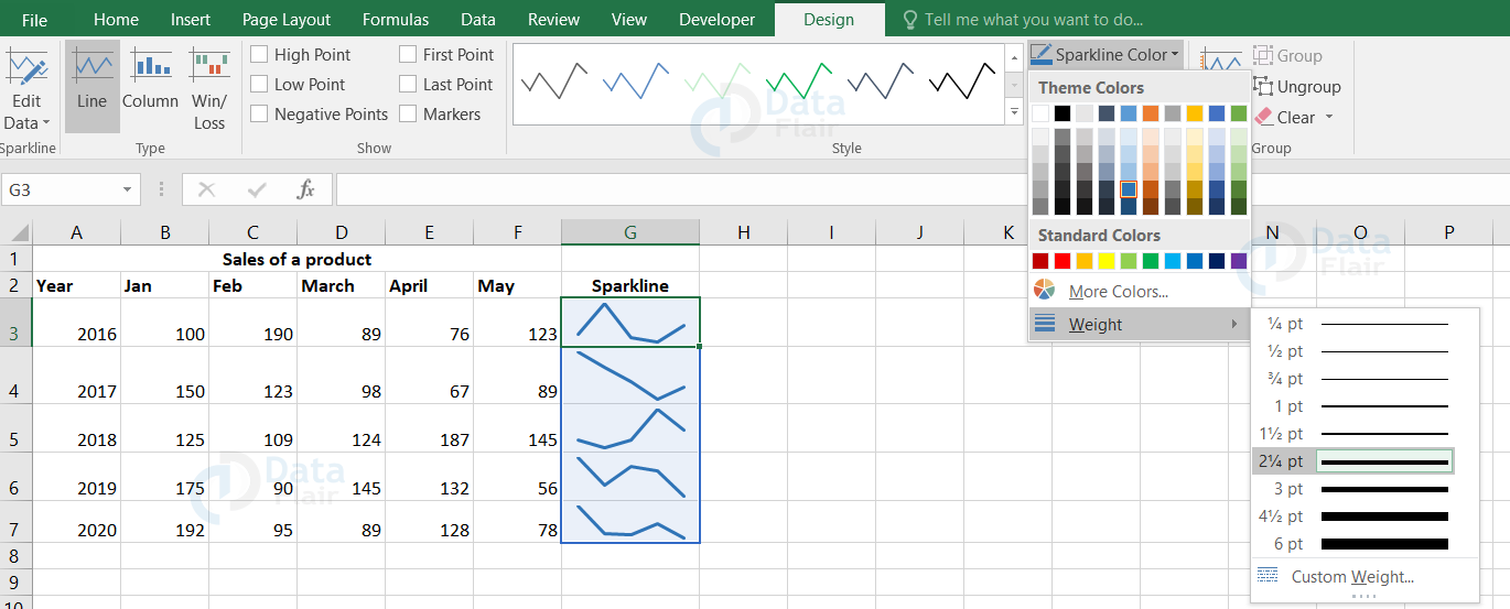
How to change the color and width of the Sparklines?
The color and thickness of the sparkline can be modified using the sparkline color option. This option provides a variety of colors for the sparklines.
1: Click on the sparkline.
2: Go to the design tab and choose the sparkline color option.
3: Choose the color you want from the option and then click on the weight option.
4: Choose the weight as per the requirement or otherwise you can custom it by clicking on the custom weights option.
5: After choosing the color and the weights, the sparklines will get automatically updated with the selected color and weight.
Highlighting the data points
There is also a property in sparkline where you can highlight the highest, lowest, and the entire data points. This is actually implemented to have a better view about the data trend.
1: Click on the sparkline and go to the design tab.
Note: The checkboxes will be visible in the ribbon.
2: Checkmark the available checkboxes to highlight the data points.
Note: The options available under this property are:
- High Point: This highlights the high spot on the sparkline.
- Low Point: This highlights the low spot on the sparkline.
- First Point: This highlights the first data point on the sparkline.
- Last Point: This highlights the last data point on the sparkline.
- Negative Points: This highlights the negative values on the sparkline.
- Markers: Only line sparkline can access this option. This highlights all the data points with a marker. There are also other color and style options available for the marker.
How to change the axis starting point
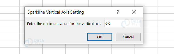
To represent the axis in sparklines, you have to set the value at 0 or any other value which may fit appropriately. To set the vertical axis, follow the steps:
1: Go to the design tab and click on the axis button.
2: Choose custom value from the vertical axis minimum value heading.
3: Enter 0 or any other minimum value for the vertical axis that may fit for your dataset in the dialog box.
4: Finally, press OK.
The sparklines of the dataset appear more realistic when the vertical axis is assigned.
Note: When the dataset contains negative values, customize the y-axis value accordingly. If the dataset contains negative values and if the axis is set to 0, then those values may disappear.
How to show x-axis in a sparkline
To display a horizontal axis in the sparkline chart, follow the steps:
1: Select the sparkline and go to the Developer tab
2: Click on the axis and choose show axis from horizontal axis options.
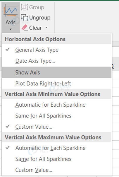
Note: This option will be very useful when the dataset contains both positive and negative values.
Hope, you can observe the horizontal line in the sparklines graph.
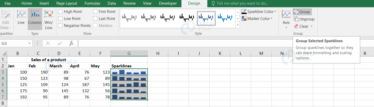
How to group and ungroup sparklines?
Grouping the sparklines is a big advantage when you insert multiple sparklines. To group sparklines, follow the steps:
1: Select two or more micro charts.
2: Go to the design tab and click on the group button.
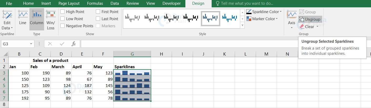
To ungroup sparklines, follow the steps:
1: Select the grouped sparklines.
2: Go to the design tab and click on the ungroup button.
Tips and notes:
1. Excel automatically groups the sparklines if they are inserted in multiple cells.
2. Choosing a single sparkline in a group selects the entire sparkline group.
3. The same type of chart is maintained by the grouped sparklines.
How to resize the sparklines?
Sparklines are automatically resized to the size of the cells.
1. To increase or decrease the sparkline’s width, make the changes in the column.
2. To increase or decrease the sparkline’s height, make the changes in row.
Sparklines & Missing Data – How does it work?
1. Sparklines ignores the non-numeric data while plotting the sparklines.
2. If the dataset contains #N/A values, they are also neglected while plotting the sparklines.
3. If the dataset has missing values, the sparklines are plotted with gaps.
4. If there are zero values, then they are represented using sparklines.
5. If the cells are hidden, then those values are neglected and if the user wants to plot the hidden cell data, then the user should enable the hidden cells first.
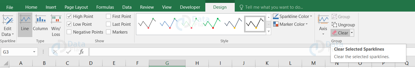
Deleting the Sparklines
To remove sparklines from the spreadsheet, go to the ‘Clear’ option.
1: Select the cell where the sparkline is.
2: Go to the design tab and click on the clear option.
Sparklines vs In-cell Charts
1. In-cell charts require some background knowledge in excel formulas and tools.
2. In-cell charts use the REPT formula repetitively to create small charts and these charts are a powerful and lightweight way to create bite-sized visualizations.
3. The main advantage is that they work in any version of excel.
4. The disadvantage is that we can create only a few charts such as bar charts and column charts.
Quick tips to use Sparklines better
1. The user can auto-fill the sparklines – Select the first set of values and click on the sparkline type from the ribbon. Then, just a drag would auto-fill the other data values sparklines.
2. Size variation – When the user adjusts the cell height and width, the sparkline in the cell also autofits the size.
3. Sparklines with conditional formatting icons – The user can create the micro charts and a better dashboard for the dataset by formatting.
4. To copy a sparkline – If the user wants to copy a sparkline from the excel worksheet, copy it as a picture option and paste it in the document or powerpoint.
5. Enable high or low points – To highlight the values, enable the points.
Disadvantages of Sparklines
The values are not represented in the sparklines and this is considered as one of the major drawbacks.
Summary
1. Sparkline is a small chart or graph which fits into a cell itself.
2. Sparkline can adjust its size if the cell size changes.
3. There are also different formats and properties available for the sparkline.
4. Sparklines are very much useful if you want to study the trend in data.
Did you know we work 24x7 to provide you best tutorials
Please encourage us - write a review on Google


