How to create Pie chart in Word?
Expert-led Online Courses: Elevate Your Skills, Get ready for Future - Enroll Now!
In this article, you will learn about pie chart , their types and how to create pie chart in word. Let’s start!!!
How to Create Pie Chart in Word?
In Word, you can insert various types of graphs and charts for comparison and study purposes. Pie charts are very popular and are used to display data, information, and statistics in a circular form. Other common names of pie charts include pie graphs, circle graphs, and circle charts.
Types of pie charts present in Word have been discussed below.
1. 2D Pie Chart
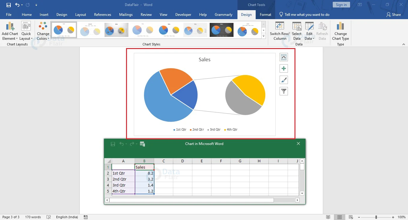
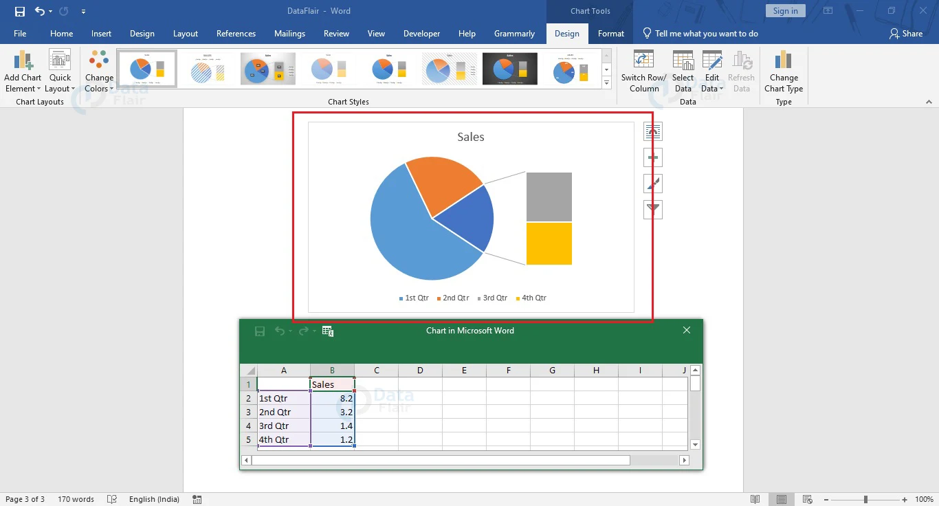
2D pie charts are the most commonly used form of pie charts. They can be in the form of Pie of Pie or Bar of Pie where a specific portion of the primary pie chart can be projected for a more detailed view.
In Pie of Pie, the projection is in the form of another pie chart, while in the case of Bar of Pie, the projection is done in the form of a bar chart.
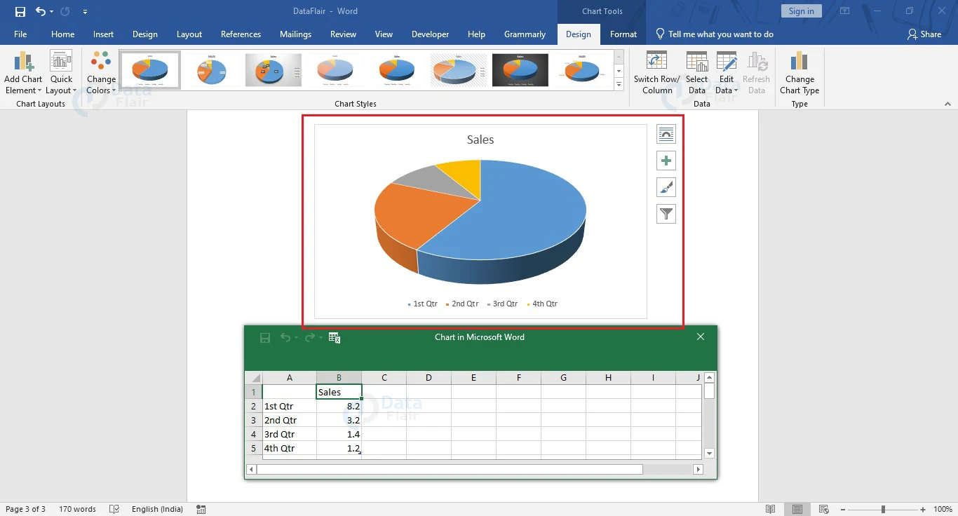
2. 3D Pie Chart
3D pie charts involve representing a pie chart in a three-dimensional (or 3D) block.
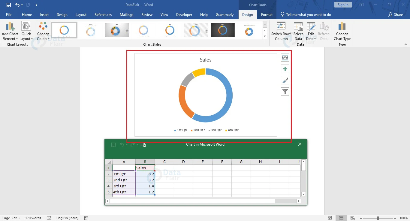
3. Donut Chart
Donut Charts are often used whenever there is more than one data to be represented in a pie chart. It looks very similar to a doughnut pie, with data in a ring and empty space in the center.
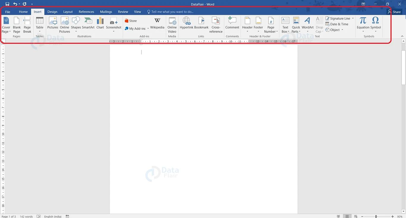
Most options and tools related to inserting and working on a Pie Chart will be found under the Insert tab.
Insert Pie Chart in MS Word
Creating a pie chart in Word is very easy. Follow these steps to create a pie chart in your Word document.
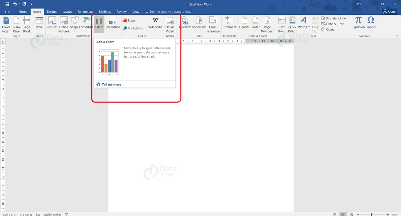
1. Place the cursor at the position where you wish to create the pie chart.
2. From the Insert tab, under the Illustrations group, click on the Chart option.
3. The Insert Chart dialog box will appear. Go to the Pie option in the left pane and choose the pie chart you wish to enter.
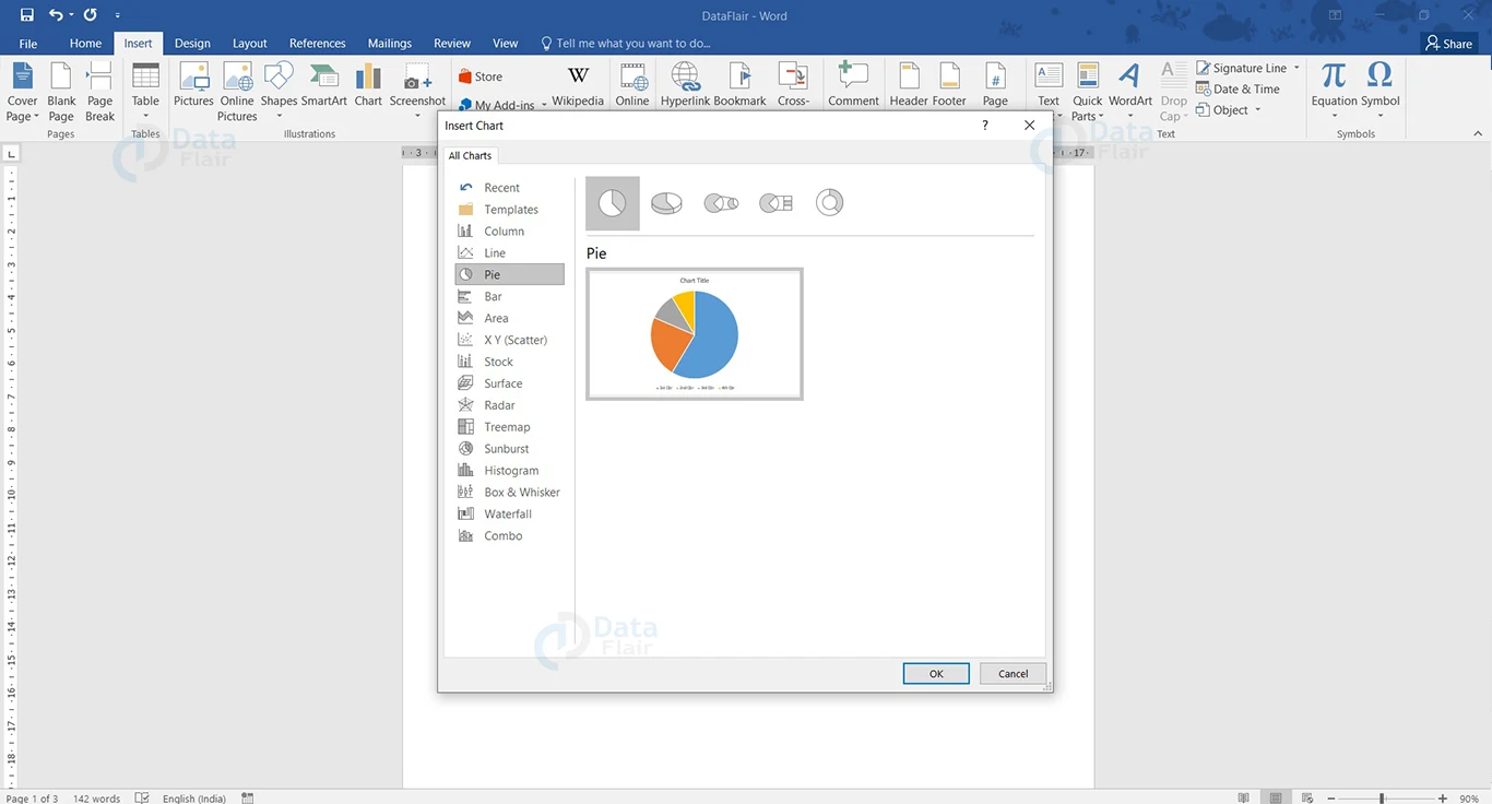
4. Click OK.
You will now see that a pie chart is present at the cursor position.

Additionally, a spreadsheet also appears along with the pie chart. In this spreadsheet, you would enter data for the pie chart. You can change the position of the chart on your page simply by holding down the left mouse button and dragging the pie chart to an appropriate location. Additionally, if you wish to resize it, drag along any of the eight knobs that appear along the edge of the chart, while holding down on the left mouse button.
Let us see how to enter pie chart data
Adding Pie Chart Data in Word
The spreadsheet that appears along with the piechart is meant for the pie chart data. It has some data by default, which you will have to overwrite to insert your data.
On the left column, write the item (or product) and on the right column, write the numerical data.
You may insert a row before the first data to give your pie chart a name.
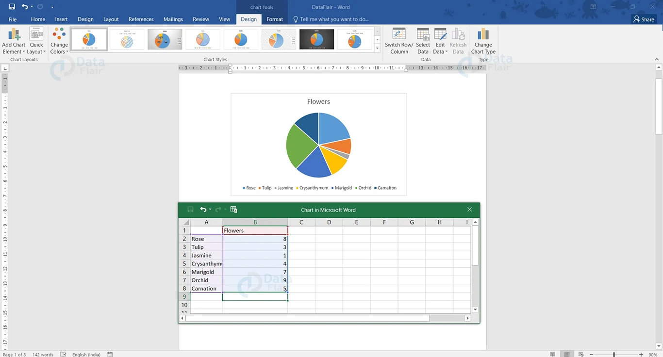
All the different colors and what they represent will be shown as a legend. Here the legend is below the pie chart.
Format Pie Chart in Word
Properly editing and formatting a pie chart makes it easier for readers to understand the data represented in it. There are quite a few editing options that you can use for pie charts in Word. To edit a pie chart, select the chart and choose the appropriate option from the quick format tools at its side.
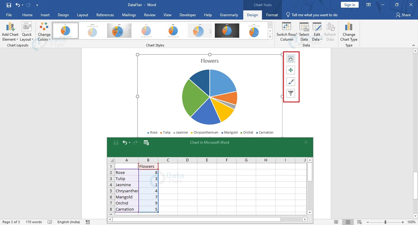
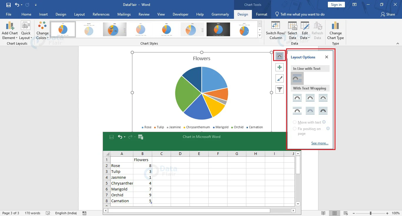
You can change the position of the chart on the page, or its placement with respect to the surrounding text, choose the appropriate option from Layout Options.
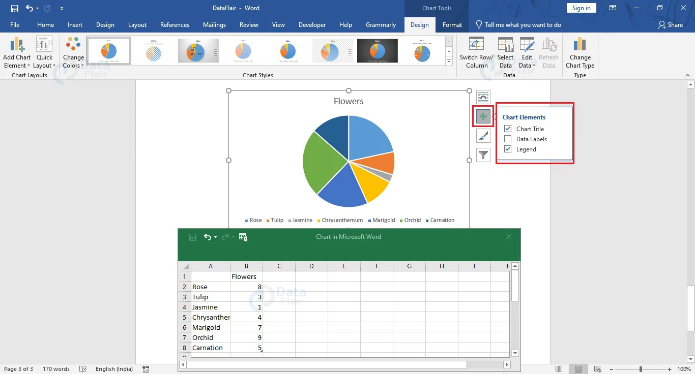
You can choose which elements to display and which ones to hide from Chart Elements. They include the chart’s title, corresponding data labels, or a legend. You can insert a proper title to your chart from here. If the chart already has an existing title, you can also change or edit it by going to the title area and clicking it. Additionally, you can also add data labels and a legend to your chart from the Data Labels and Legend options respectively.
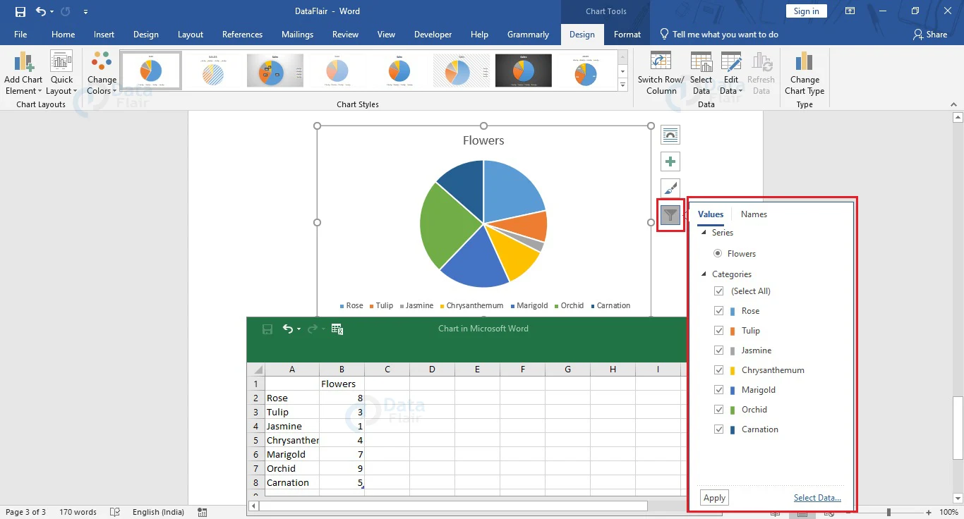
You can hide or display particular categories of the pie chart from Chart Filters. Simply click on the Chart Filters, uncheck the boxes corresponding to the categories that you wish to hide, and select Apply.
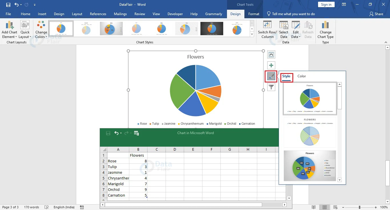
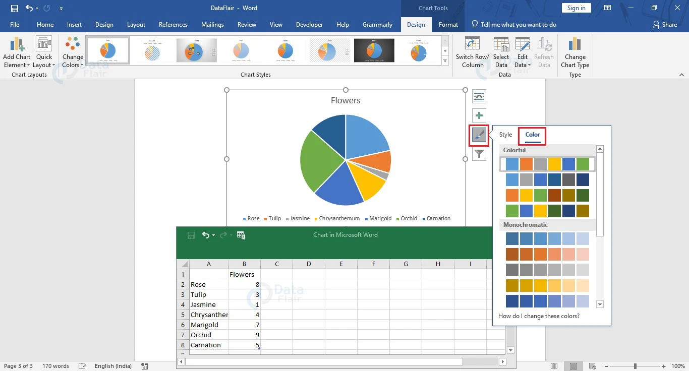
The Style and Color option allows users to edit the chart’s style or color scheme. While Style helps you select a new design, Color helps users change the pie chart colors. You can also change the color and style of your pie chart from the Chart Style section of the Design tab. To change the layout of your chart, or the relative position of your chart elements, select your pie chart and choose the appropriate style from the Quick Layout option under the Design tab.
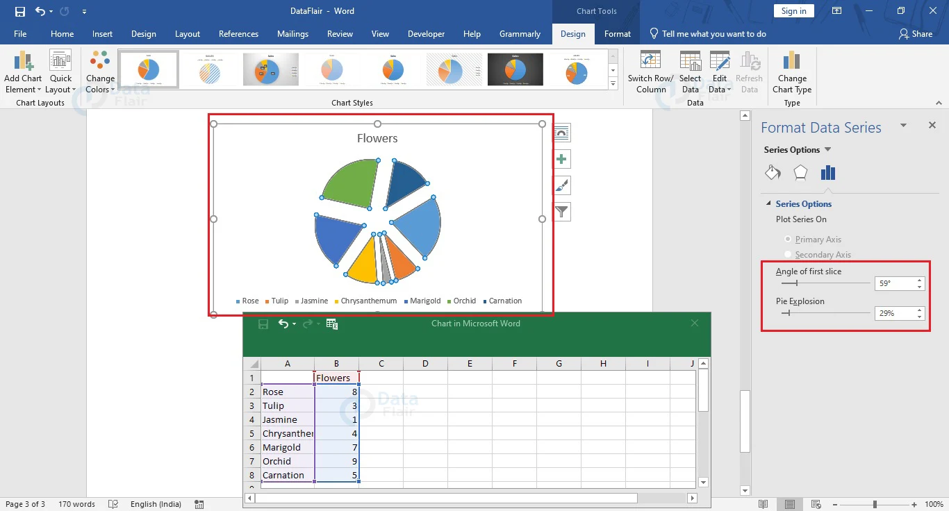
In Word, you can also separate the various elements or sections of your pie chart for presentation purposes. Simply click on the chart section that you wish to separate and drag it to the desired position. To separate all the chart sections, place your mouse pointer over the pie chart and click on the right mouse button.
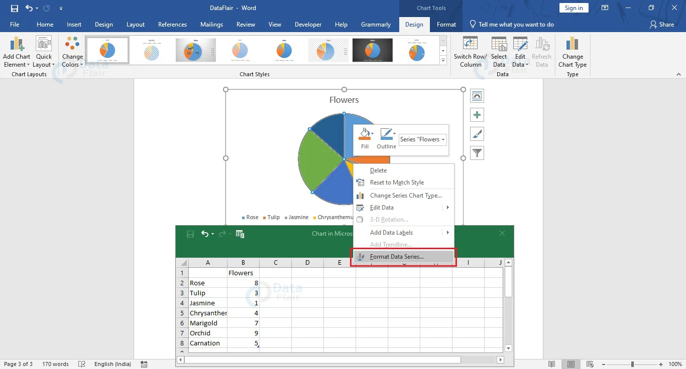
Choose Format Data Series from the menu that appears to open the Format Data Series section. In the Series Options section, drag the horizontal slider associated with the Pie Explosion option towards the right to separate the chart elements.
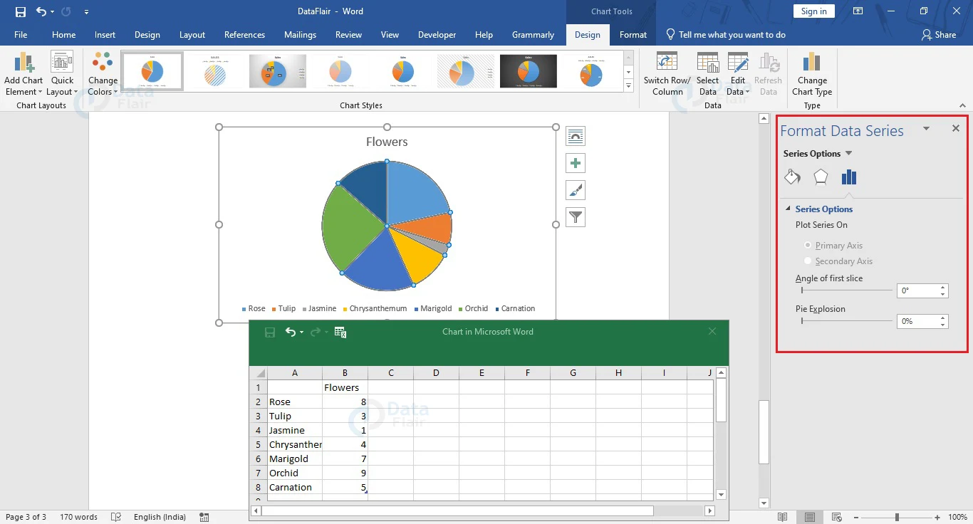
To rotate your pie chart, drag the horizontal slider corresponding to the Angle of first slice from the Format Data Series panel. Here is how the pie chart will appear after some changes.
Need of Pie Chart in Word
Pie charts are a simplistic way of representing data and can be used and understood by almost everyone. The main reasons why it is so popular are as follows:
- They help in immediate analysis and understanding of the depicted information.
- They are visually appealing.
- These are simpler data representations as compared to other graphs.
- You can explain pie charts easily with little to no jargon.
Disadvantages of Pie Chart in Word
Using a pie chart may turn out to be disadvantageous in a few cases. We have discussed a few disadvantages of using pie charts below.
- A pie chart becomes inefficient for a large data set.
- Exact data values cannot be shown in a pie chart.
- Pie charts can only be used to represent a single set of data.
- Users would face problems while comparing the data slices since exact numerical values are not present in most cases.
Conclusion
Pie charts too have their pros as well as cons. They are very helpful during presentations and take less space as compared to bar graphs and histograms. The best part about pie charts is that everyone can understand and comprehend what is shown in a pie chart.
Now that you know how to create and use a pie chart, try it yourself and have fun with pie charts in Word.
Did you know we work 24x7 to provide you best tutorials
Please encourage us - write a review on Google


hiiiiiiiiiiiiiiiiiiiiiiiiiiiiiiiiiiiiiiiiiihiiiiiiiiiiiiiiiiiiiiihiiiiiiiiiiii