Elements and Options Of Chart in Excel
Job-ready Online Courses: Click, Learn, Succeed, Start Now!
Charts in Excel are widely used to visualize the data. The tools and elements of the charts help the user to make the chart more attractive and more understandable. The user can change each and every bit of the chart with the assistance of the tools and options available in MS – Excel. let us learn about elements and options of chart in excel.
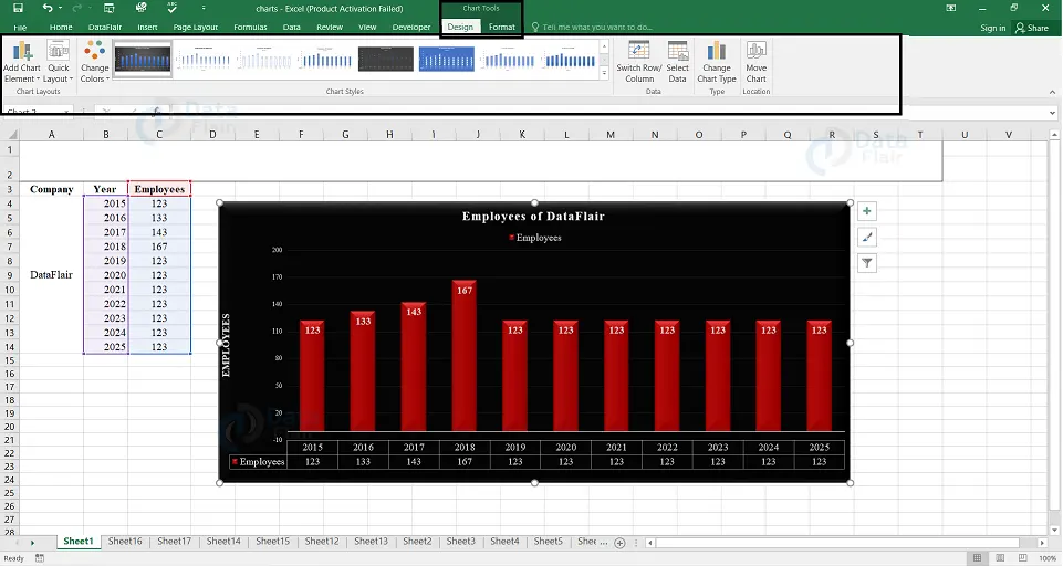
Excel Chart Styles
The user can use the elements in the chart style to customize the appearance of the chart. The user can set a style and color scheme for their chart with the assistance of chart style tools.
To add style and color to the chart, follow the steps:
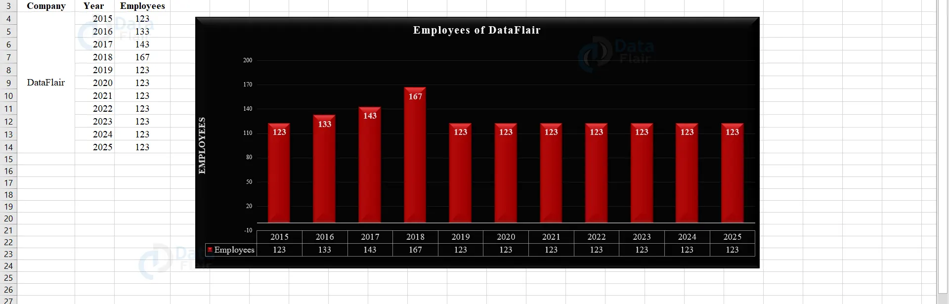
1 – Click on the chart and in the right top corner, three buttons appear at the edge of the chart.
2 – Click the second button from it. The “style” and “color” appear.
3 – Under style option, click on the required style.
4 – Under color option, choose a color from the different color scheme. The chart appears with the selected color.
Note:
Style
The user can use the option “style” to fine-tune the appearance and style of the chart.
Color
The user can use the option “color” to choose the color scheme for the chart and the changes can appear in the page layout tab also.
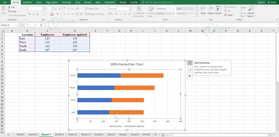
Chart Filters
The user can use chart filters to edit the data values and data names that appear on the chart dynamically. To do so, follow the steps:
1 – Click on the chart.
2 – Select the Chart Filters icon which appears at the upper-right corner of the chart. The user can see two tabs namely values and names in a new window.
Note: The series and the categories in the data are known as values. If you click on the values tab then the available series and categories will appear.
Fine Tuning
The user can use the three buttons that appear at the upper-right corner of the chart to fine-tune the charts rapidly.
The three buttons through which the user can fine-tune the chart are:
- Chart Elements – The user can use the chart elements to add chart elements like axis titles or data labels.
- Chart Styles – The user can use the chart styles to customize the look of the chart.
- Chart Filters – The user can use the chart filters to change the data that appears on the chart.
To view the fine-tuning elements, follow the steps:
1 – Click on the chart and there the user can see the three buttons at the upper right corner of the chart.
Format Style
The user can use Chart Styles to set a style for your chart.
1 – Place the cursor on the Chart.
2 – Click the “Chart Styles” icon. The style and color option appears. The user can use the style option to fine-tune the appearance and style of the chart.
3 – Click on the style option to look at the different styles available for the chart.
4 – Scroll down the options and choose according to the preferences of your chart.
Format Color
The user can use color in chart styles to select the color scheme for the chart.
1 – Click on the Chart and choose the chart style icon.
2 – Under the color option, click on the color from the different color scheme options.
Excel Chart Filters
The user can use the chart filters to edit the data points, data values, and names that are visible on the chart being displayed, dynamically.
1 – Click on the chart and choose the chart filter icon from the upper right corner of the chart.
Note: The values and names appear in a new window.
2 – Click on the values and the available series and categories appear in the data.
3 – Select or deselect the series and categories.
Note: The chart changes by displaying only the selected series and categories.
4 – Click apply, after the final selection of series and categories.
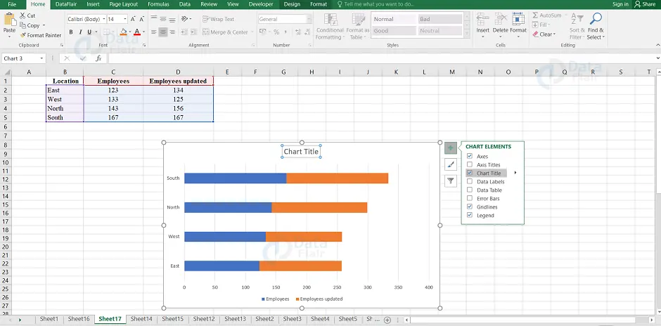
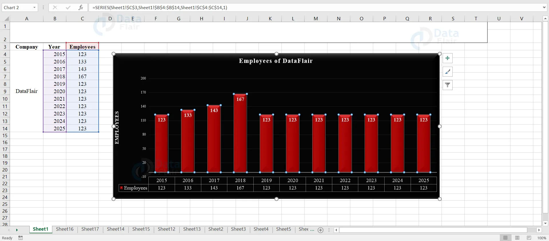
Excel Chart Elements
Chart elements give more descriptions to the charts and this helps in enhancing the data more meaningfully and also it helps in enriching the visual appearance of the data.
To insert the chart elements in the chart, follow the steps below:
1 − Select the chart. Three buttons appear at the upper-right corner of the chart. They are −
- The first symbol denotes the chart elements
- The second symbol denotes the chart styles and colors
- The third symbol denotes the chart filters
2 − Click on the first symbol, the chart element icon. The following chart elements are actually available in it.
- Axes
- Axis titles
- Chart titles
- Data labels
- Data table
- Error bars
- Gridlines
- Legend
- Trendline
The user can add, remove or change these chart elements.
3 − Place the cursor on each of these chart elements to see a preview of how they are displayed.
Note: For example, select Chart Title. The chart title in the graph will be highlighted.
Note: A small arrow which is beside the chart elements is available to indicate that there are options available in it.
4 − Check mark on the chart elements boxes, which you want in the chart to be displayed.

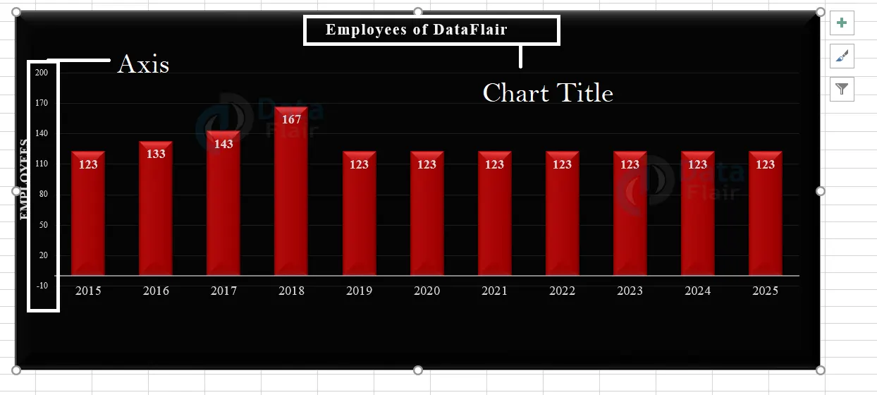
Axes in Chart
A basic chart has two axes and they are used to measure and categorize the data. The two types of axes are
- A vertical axis is also known as the value axis or y-axis.
- A horizontal axis is also known as a category axis or x-axis.
Note: A 3-D Column chart has a three-axis and the third axis is the depth axis which is also known as the series axis or the z-axis. There are some charts with no axes and those are pie and doughnut charts. The radar charts do not have horizontal axes.
Excel Chart Axis Titles
The axis titles help the user to understand the chart and also the data.
- The user can add axis titles to any horizontal, vertical, or depth axes in the chart.
- The user cannot add axis titles to charts that do not have axes such as pie or doughnut charts.
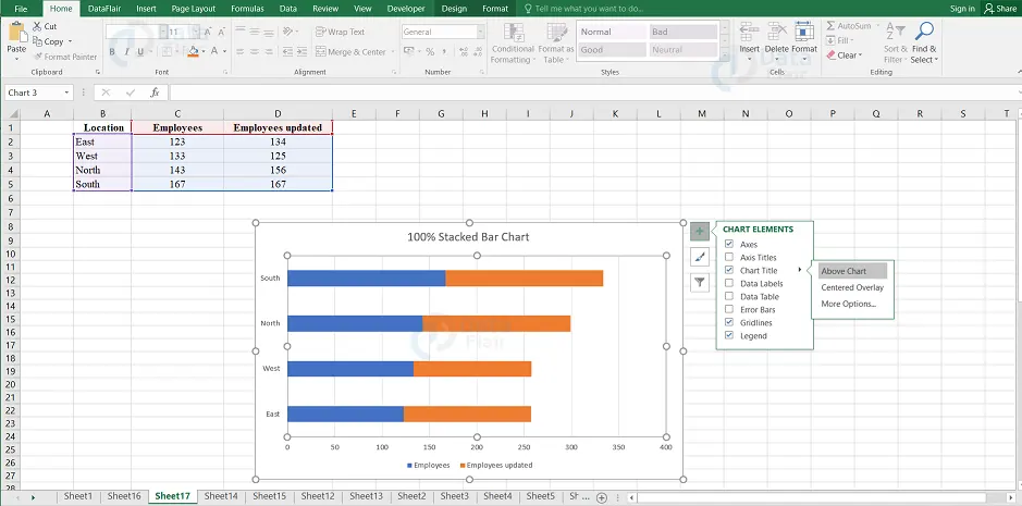
Chart Title
When the user creates a chart, a Chart Title box appears above the chart.
Note: The user can also link the chart title to the cells containing text on the worksheet. When the text on the worksheet changes, automatically the chart title also changes.
Data Labels
Data labels show the details about a data series. It makes the user understand the chart easier.
Note: The user can change the location of the data labels within the chart.
Data Table
The data table displays the table in the chart itself and it can be displayed in line, area, column and bar charts.
Note: The data table in the bar chart does not replace an axis whereas it is aligned to the chart.
Error Bars
Error bars represent the potential error amounts relative to each data marker in a data series. The user can add Error bars to a data series in 2-D area chart, bar chart, column chart, line chart and bubble chart.
Gridlines in excel
Gridlines are available to make the data easier and there are two types of gridlines and they are the horizontal and vertical chart gridlines.
Gridlines can also extend from any horizontal and vertical axes across the plot area of the chart.
The user can also display the depth gridlines in 3-D charts.
Note: The user cannot display gridlines for the chart types that do not display axes.
Legend in excel
The Legend appears by default when the user creates a chart. The user can also hide a legend by deselecting it from the elements of the chart.
Trendline
Trendlines in the chart element are generally used to graphically display the trends in data series and to analyze the prediction problems. This type of analysis is also called regression analysis.
Note: The user can extend a trendline in a chart beyond the actual data to predict the future values by using regression analysis.
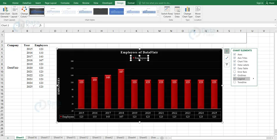
Design Tools
Chart tools consist of two tabs known as design and format tabs.
Step 1 – When the user clicks on a chart, the chart tools appear on the ribbon under the design and format tab.
Step 2 – Click on the “Design” tab at the Ribbon. Then, the ribbon holds the commands from the design tab.
Some of the Design commands on the ribbon are:
Chart layouts group
This command contains the Add chart element and quick layout options.
Chart styles group
This command contains the change colors and chart styles options.
Data group
This command contains the options such as switch row/column and select data.
Type group
This command contains the option such as Change chart type.
Location group
This command contains the option such as Move chart.
Add Chart Element
To add chart elements, follow the step:
1 – Click on the Add Chart Element. The chart elements appear in a drop-down list and these are the same elements as those in the chart elements list.
Change Colors
To change colors, click on the change colors option from the ribbon. The color schemes appear in a drop down listbox.
Switch Row/Column
The user can switch row/column to change the data between X-axis and Y-axis.
Click on the Switch Row / Column option. The data will be exchanged between X-axis and Y-axis on the chart.
Quick Formatting in Excel
The user can format charts by using the Format pane. It is quite handy and provides advanced formatting options.
To Format, any chart element, follow the steps:
1 – Click on the chart and make a right-click on the chart element.
2 – Select the Format option from the chart element drop-down list.
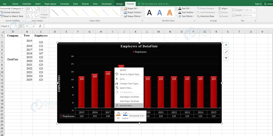
Format Pane in Excel
By default, the formatting pane appears on the right side of the chart. To view the formatting pane, follow the steps:
1 – Click on the chart and make a right-click on the horizontal axis.
2 – The user can view the formatting pane and can select the options from the formatting pane.
3 – If the user clicks on the option “Format Axis”. Then the Format pane appears for the formatting axis.
Quick Layout
The user can use Quick Layout to change the overall layout of the chart by choosing any one of the predefined layout options. To apply a quick layout, follow the steps:
1 – Choose “Quick Layout” from the ribbon.
Note: Various predefined layout options will appear.
2 – Place the cursor across the predefined layout options. The chart layout keeps changing as per the option chosen.
3 – Select the layout as per the requirement. The chart appears with the chosen layout.
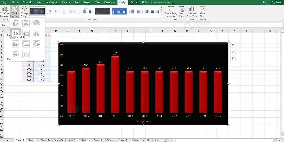
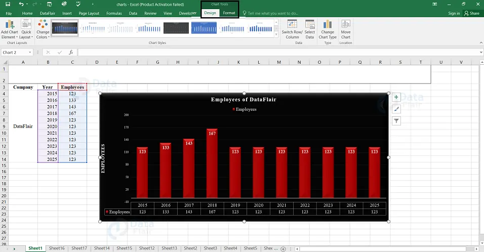
Chart Format Tools
When the user clicks on a chart, a new tab “Chart Tools” appears above the tabs of “Design” and “Format”. Choose the format tab from the ribbon and the ribbon appears with the changes to format commands.
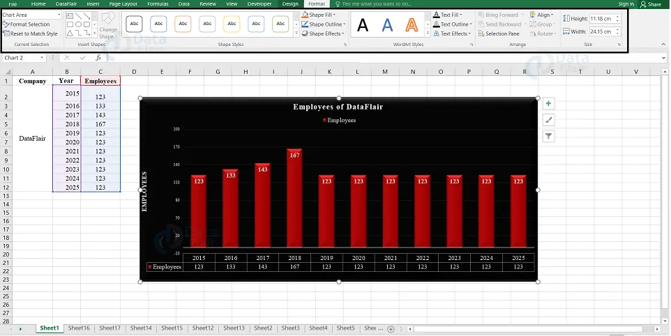
The Ribbon contains the few format commands and they are:
1. Current Selection Group
Under the current selection group, there are following options available and they are chart element selection box, format selection and reset to match style.
2. Insert Shapes Group
Under the insert shapes group, there are following options available and they are different shapes to insert, change shape.
3. Shape Styles Group
Under the shape styles group, the following options are available and they are shape styles, shape fill, shape outline, shape effects,
4. WordArt Styles
Under the wordart styles, there are few following options available and they are wordart styles, text fill, text outline and text effects.
5. Arrange Group
Under the arrange group, the following options are available and they are: bring forward, send backward, selection pane, align, group and rotate.
6. Size Group
Under the size group there are two following options available and they are shape height, shape width.
7. Current Selection Group
The user can format the chart elements using the current selection group commands.
For formatting the charts through the Ribbon, follow the given steps.
Step 1 – Select the chart element that the user wants to format. There appears a box at the top of the group.
Step 2 – Click on the Format Selection and the format pane appears for the selected chart element.
Step 3 – Using the options in the format pane, format the selected chart element.
8. Insert Shapes Group
The user can insert different shapes in the chart selecting the shapes. After the user inserts a shape, they can add text to it by using the Edit Text.
9. Shape Styles Group
- The user can change the style of the shape, choosing any of the given styles.
- The user can choose a Shape Fill Color.
- The user can Format Shape Outline.
- The user can add Visual Effects to the Shape.
10. WordArt Styles Group
- The user can use the word art to change the way the chart appears. The available options in the style group are:
- Fill the text with a color using the Text Fill command.
- Customize the Text Outline of the word.
- Add visual effects to the text by utilizing the Text Effects.
Arrange Group
To select the objects on the chart, change the order or visibility of the selected objects, the user uses the arrange group commands. Click on the selection pane command to look at the objects present on the chart. The selection pane displays the available objects on the chart.
Select the objects and then the user can do the following on the selected objects:
- Bring Forward
- Send Backward
- Selection Pane
- Align
- Group
- Rotate
- Size Group
To change the width or the height of the shape or picture on the chart, the user uses the size group commands. The user can use the shape height box and shape width box to alter the height and weight respectively of a shape or picture on Excel.
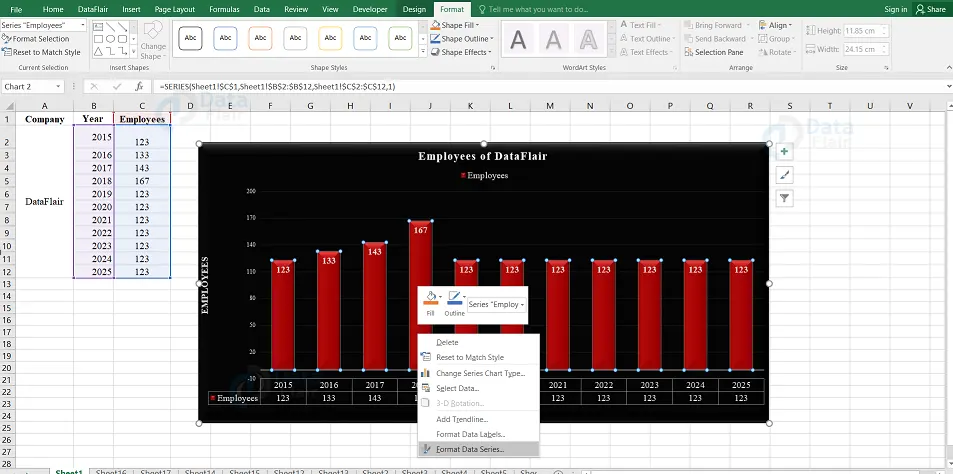
Format Data Series in excel
To format the data series, follow the steps
1 – Right-click on any of the data series on the chart and then click the Format Data Series option.
2 – Choose the required Series Options.
The user can edit the display of the series through these options.
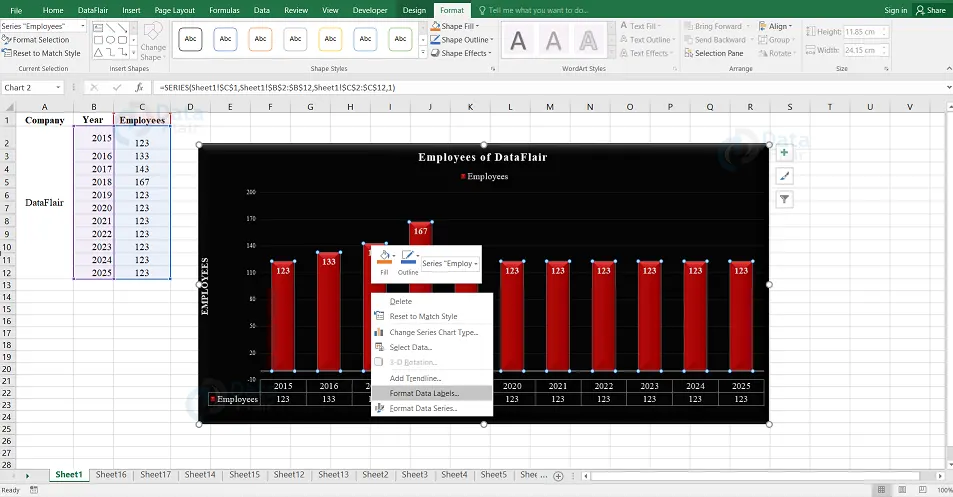
Format Data Labels
To format data labels quickly, follow the steps −
1 – Right-click on a data label. The data labels of the entire series are chosen and then click on the format data labels.
2 – Select the Label options as per the requirement.
The user can edit the display of the data labels of the selected series through the following options.
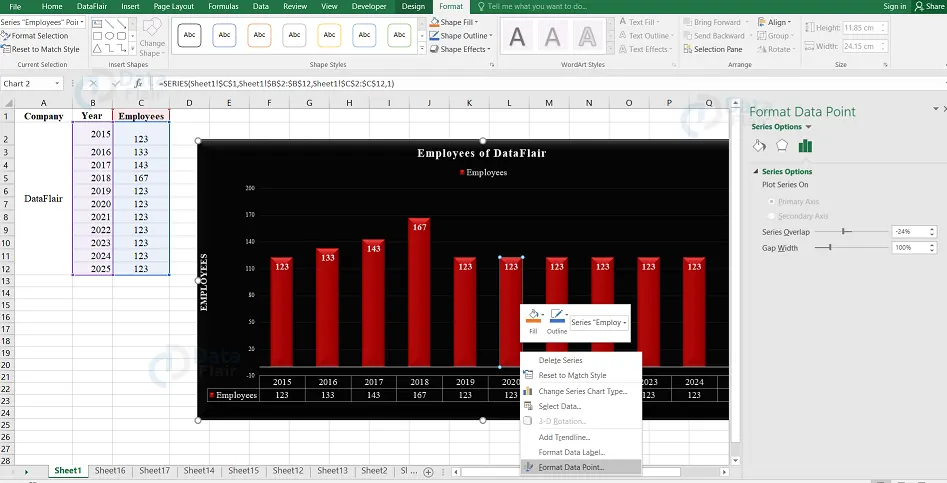
Format Data Point
To format the data point in your line chart, follow the steps
1 – Click on the data point and then the entire series is selected.
2 – Click on the data point again so that only a particular data point is selected together.
3 – Right-click that particular selected data point and then click on the “Format Data Point” option.
4 – Select the required Series Options and then the user can edit the display of the data points from the options.
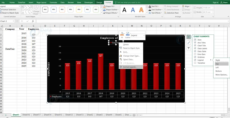
Format Legend
To format Legend, follow the steps:
1 – Right-click on the legend option and select Format Legend.
2 – Choose the required Legend Options and the user can edit the display of the legends through these options.
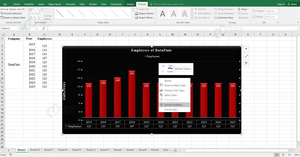
Format Major Gridlines
To format major gridlines of the chart, follow the steps:
1 – Right-click on the major gridlines and then choose “Format Gridlines”.
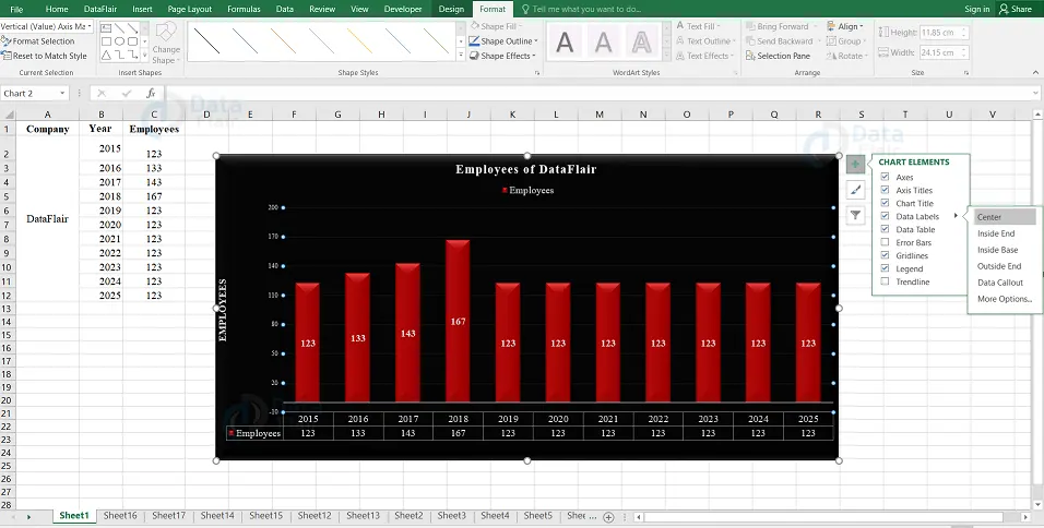
Data Label Positions
To place the data labels inside the chart, follow the steps:
1 – Click on the chart and then select chart elements.
2 – Select Data Labels and click the arrow mark beside the data label to view the other options available.
3 – Click on the option “Center” to place the data labels at the center.
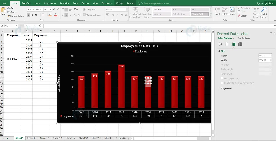
Resize a Data Label
To resize a data label, follow the steps:
1 – Click on any data label and drag as per the size required. The user can click on the size & properties icon from the format data labels task pane.
2 – Choose the size options.
Add a Field to a Data Label
The user can add a field to a data label in the chart. The corresponding field can contain explanatory text or a calculated value in it.
1 – Locate the explanatory text in a cell.
2 – Click on the data label, to which the user wants to add the field. All the data labels in the series are chosen.
3 -Click on the data label again to which the user wants to add the field.
4 – Right click the data label. In the drop-down list, Click on the Insert Data
Label Field from the drop-down list by right clicking on the data label.
5 – Click Choose Cell and the data label reference window appears.
6 – Choose the reference of the cell with the explanatory text and click on the “ok” button.
7 – Resize the data Label to view the entire text.
Connecting Data Labels to Data Points
A Leader line is a line which connects a data label and its associated data point on the chart. It is helpful when the user has placed a data label away from the data point. Just follow the below steps:
1 – Click on the data label and drag it after you view a four headed arrow.
2 − Repeat the process for all the data labels in the series and then the user can see the Leader lines for all the data labels.
3 – Move the data label as you want and still the leader line adjusts automatically.
Format Leader Lines
The user can format the leader lines so that they are displayed the way the user wants. Follow the below steps:
1 – Right click on the leader line that needs to be formatted and then choose format leader lines.
Note: The Format pane and the format leader lines appear.
2 – Select the Fill & Line icon.
3 – Choose the options to display the leader line from the line option and the leader lines will be formatted as per their choices.
Format a Single Data Label
To format a single data label, follow the steps below:
1 – Click twice on any data label that wants to be formatted.
2 – Right click on the data label and then choose Format Data Label.
Alternatively, the user can also click “More Options” in data labels options to display on the format data label task pane.
3 – Format the data label by choosing the options. Choose only one data label while formatting and select the options from the data label.
Clone Current Label
To clone the data label created, follow the below steps:
1 – Click on the “Label Options” icon from the format data labels pane.
2 – Under Data Label Series, choose Clone Current Label. This will help the user to apply the custom data label formatting quickly.
Excel Data Labels with Effects
The user can opt for many things to change the appearance of the data label like changing the Fill Color of the data label for emphasis etc. To format the data labels, follow the below steps:
1 – Right-click a data label and then select Format Data Label.
2 – Choose the “Fill & Line” icon. The options available for Fill and Line appear below it.
3 – Click Solid Fill and choose the color from Fill. The user can also choose the other options such as gradient fill, pattern & texture fill etc.
4 – Click on the Solid Line and choose color from the border.
5 – Choose the “Text Options” tab.
6 – Click on the “Solid Fill” option from the text fill option.
7 – Choose a color as required and make sure it is compatible with the data label color.
Note: The user can give the data Label a 3-D look with the Effects option.
8 – Select the “Effects” option and select the required effects.
Shape of a Data Label
The user can personalize the chart by changing the shapes of the data label. To change the shape of a data label, follow the steps:
1 – Right-click on the data Label that needs to be changed.
2 – Select the “Change Data Label Shape” in the drop-down List and then the user can look at various data label shapes.
3 – The user can choose the shape as required. Finally, the data labels will appear with the chosen shape of the user.
Summary
The user can enhance the charts using the tools and elements available in the chart options. Utilising these options, we can make the chart more attractive and easily understandable.
You give me 15 seconds I promise you best tutorials
Please share your happy experience on Google


