CSS Word Wrap Property
Full Stack Web Development Courses with Real-time projects Start Now!!
When designing web pages, one of the most important things to consider is how the text will appear on the page. The layout of text can greatly affect the readability and usability of a web page. One way to ensure that text is readable and fits nicely on the page is to use CSS Word Wrap. In this article, we will explain what CSS Word Wrap is, how it works, and provide some code examples.
What is CSS Word Wrap?
CSS Word Wrap is a CSS property that allows you to control how text is wrapped and displayed on a web page. The default value for this property is “normal,” which means that the text will break at spaces or hyphens when it reaches the edge of the containing element. However, if you have long words or URLs that extend beyond the edge of the container, you can use CSS Word Wrap to wrap the text onto a new line.
CSS Word Wrap also has a prominent role to play in the methodology of responsive website designing. With the increase of the diagonals of the devices in question, the proper scaling of text content is vital for the overall appearance of a good-quality web resource. Correct word breaking avoids the text to extend beyond its container and appear distorted which enhances the use of devices. Thus, the proper implementation of CSS Word Wrap enables designers to keep content legible and aesthetic regardless of the dimensions of the device’s screen or its orientation.
How to Use CSS Word Wrap
To use CSS Word Wrap, you simply need to apply the “word-wrap” property to the container element. There are two values for this property: “normal” and “break-word.” Let’s take a look at each of these values in more detail.
1. Normal Word Wrap in CSS
The default value for CSS Word Wrap is “normal.” This means that the text will break at spaces or hyphens when it reaches the edge of the containing element. If a word is too long to fit on the line, it will extend beyond the container.
Here’s an example of how normal word wrap works:
HTML:
<div style="width: 200px; border: 1px solid black;">
Lorem ipsum dolor sit amet, consectetur adipiscing elit. Sed ut perspiciatis unde omnis iste natus error sit voluptatem accusantium doloremque laudantium, totam rem aperiam.
</div>
Output:
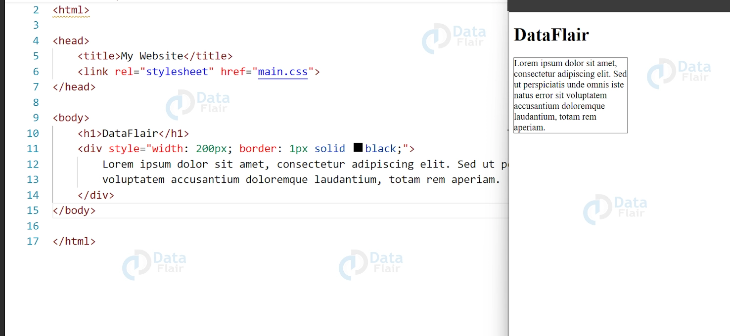
This code will produce a container with a width of 200 pixels and a black border. The text inside the container will wrap at spaces or hyphens.
2. CSS Break-Word Word Wrap
The “break-word” value for CSS Word Wrap allows you to break long words and URLs onto a new line if they extend beyond the edge of the container. This can help to improve the readability of your text by preventing long words from extending beyond the container.
Here’s an example of how break-word word wrap works:
<div style="width: 200px; border: 1px solid black; word-wrap: break-word;">
Lorem ipsum dolor sit amet, consectetur adipiscing elit. Sed ut perspiciatis unde omnis iste natus error sit voluptatem accusantium doloremque laudantium, totam rem aperiam. Thisisaverylongwordthatwillgetbrokenintomultiplelines.
</div>
Output:
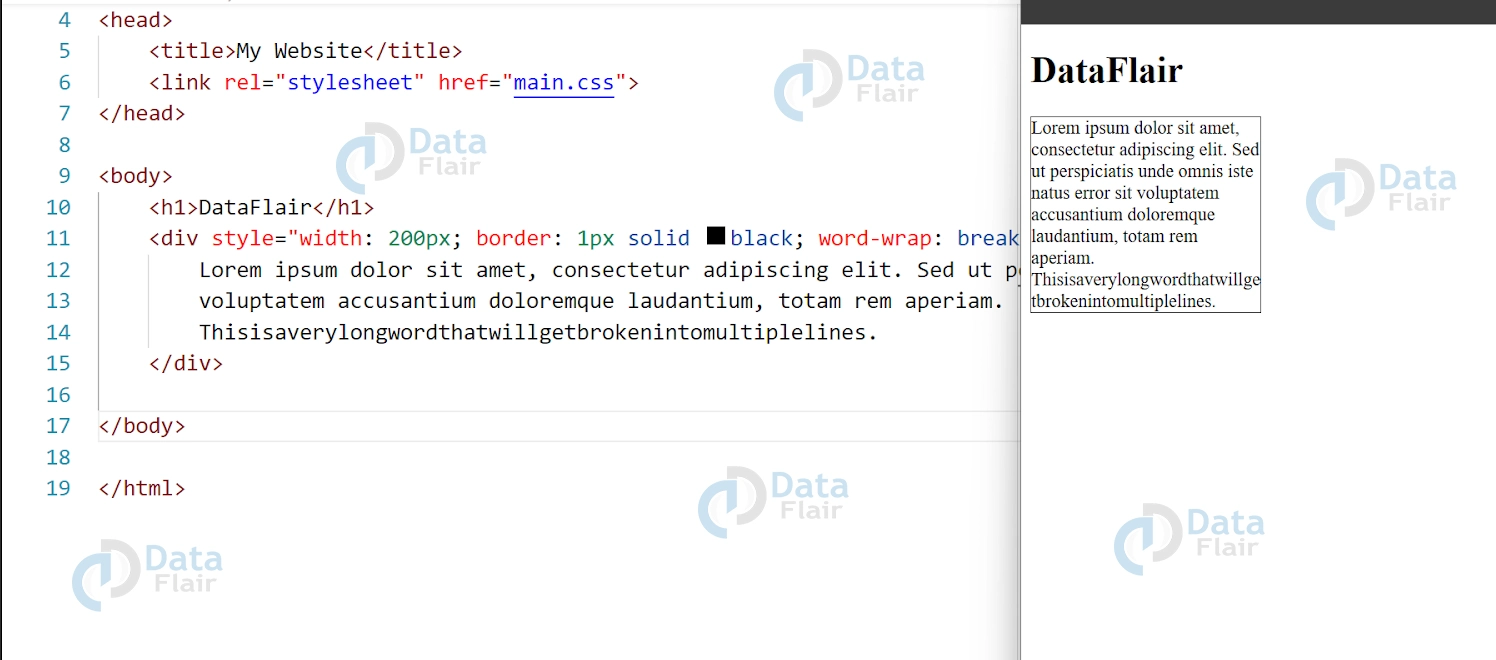
This code will produce a container with a width of 200 pixels and a black border. The text inside the container will wrap at spaces or hyphens as before, but long words will also be broken onto a new line.
CSS Word Wrap: Additional Options and Best Practices
In addition to the “normal” and “break-word” options, CSS Word Wrap also has a third option called “break-all.” This option breaks words without regard for spaces or hyphens, which can be useful if you have text in a non-Latin alphabet that doesn’t have spaces between words. However, it should be used sparingly as it can create a jagged edge on the right side of the text and make it harder to read.
When using CSS Word Wrap, it’s important to keep in mind some best practices to ensure that your text is readable and user-friendly:
1. Avoid using long words or URLs that extend beyond the edge of the container if possible. If you must use long words, use the “break-word” option to prevent them from extending beyond the container.
2. Use a font size and line height that is easy to read. If the text is too small or too close together, it can be difficult for users to read.
3. Don’t use too many different font sizes or styles on the same page. Stick to a consistent design to ensure that your text is easy to read and doesn’t distract from the content.
Using CSS Word Wrap and following best practices can help create a clean and user-friendly design, enhancing readability and engagement for your website visitors.
Browser support
CSS Word Wrap is a property that allows text to be wrapped onto a new line when it exceeds the width of its container. This is particularly useful when displaying long sentences or paragraphs, preventing them from extending beyond the container and causing unwanted overflow.
Browser support for CSS Word Wrap is excellent and widely available. According to Can I Use, a website that provides browser compatibility tables, CSS Word Wrap is supported by all major browsers, including Chrome, Firefox, Safari, and Edge. The property is also supported by older browsers like Internet Explorer 6 and 7.
To use CSS Word Wrap, you can set the word-wrap property to break-word. This will break words that exceed the width of the container and wrap them onto a new line. Here’s an example:
.container {
width: 400px;
border: 1px solid #ccc;
padding: 10px;
word-wrap: break-word;
}
In this example, the word-wrap property is used to break words that exceed the width of the container, which is set to 400px. The border and padding properties are used to create a visible container for the text.
When working with different types of contents, if you need to put a long link or the continuous text, it is useful to know the behavior of CSS Word Wrap in coordination with other styles such as the overflow and white-space. For instance, combining word-wrap with overflow: hidden can be useful in situations where too much text is placed inside the container of a fixed size, this way the content looks less chaotic.
What is overflow text in CSS?
In CSS Word Wrap, overflow text refers to text that extends beyond the boundaries of its container due to its length or formatting. This can lead to the text spilling over onto neighboring elements or beyond the visible area of the page, which can negatively impact the layout and readability of the content. By using the word-wrap property, the text can be wrapped onto a new line to prevent overflow and ensure that the content stays within its designated container.
Min content size
In CSS Word Wrap, the minimum content size refers to the minimum width or height required for an element to display its content without overflow. If an element’s content is too large for its container, it can result in overflow text, which can negatively impact the layout and readability of the content. By setting a minimum content size for an element, you can ensure that its content is displayed properly without overflow.
To set a minimum content size for an element in CSS, you can use the min-width and min-height properties. Here’s an example:
.container {
min-width: 300px;
min-height: 200px;
}
In this example, the container element is given a minimum width of 300px and a minimum height of 200px. This means that the element will always be at least 300px wide and 200px tall, even if its content is smaller. If the content is larger than the minimum size, the element will expand to fit the content.
Setting a minimum content size can help ensure that your layout remains consistent and readable, even when the content changes.
Conclusion
We can say that CSS Word Wrap is a powerful tool for controlling how text is wrapped and displayed on your web pages. By using the “word-wrap” property with the “normal,” “break-word,” or “break-all” options, you can ensure that your text is readable and user-friendly. To create an effective design, it’s essential to combine CSS Word Wrap with other best practices like proper spacing and alignment for web design.
Did you know we work 24x7 to provide you best tutorials
Please encourage us - write a review on Google
