The Power of CSS Width Property
Full Stack Web Development Courses with Real-time projects Start Now!!
CSS width is an essential aspect of web design that allows designers to control the width of elements on a web page. The use of width allows designers to create flexible and responsive layouts that adapt to a variety of screen sizes. In this article, we will explore how CSS width can be used, as well as some best practices for using it effectively.
What is CSS Width?
CSS width is used to set the width of an element on a web page. By default, the width of an element is determined by its content. However, by setting a width, designers can have more control over the layout of a web page. The width can be set using pixels, percentages, or other units of measurement.
Using Width for Fixed Layouts
One of the most basic uses of width is to create fixed layouts. A fixed layout is a layout that has a fixed width and does not change when the screen size changes. This can be achieved by using pixels to set the width of an element.
For example, if you wanted to create a fixed-width container for a webpage, you could use the following CSS:
.container {
    width: 1200px;
}
This would set the width of the .container class to 1200 pixels, creating a fixed-width container for the webpage.
Using CSS Width for Flexible Layouts
Another important use of width is to create flexible layouts. A flexible layout is a layout that changes when the screen size changes. This can be achieved by using percentages to set the width of an element.
For example, if you wanted to create a flexible container for a webpage, you could use the following CSS:
.container {
    width: 80%;
}
This would set the width of the .container class to 80% of the screen size, creating a flexible container for the webpage.
Using CSS Width for Responsive Design
<!DOCTYPE html>
<html>
    <head>
        <title>CSS units</title>
        <style>
            #parent-rel{
  height: 200px;
  width: 300px;
  background-color: purple;
}


#child-rel{
  height: 50%;
  width: 50%;
  background-color: cyan;
}
        </style>
    <link rel="stylesheet" type="text/css" href="2-unitrelative.css">
    </head>
    <body>
    <div id="parent-rel">
      <div id="child-rel">


      </div>
    </div>
  </body>
</html>
The width can also be used to create responsive designs. A responsive design is a design that adapts to different screen sizes. This can be achieved by using media queries to change the width of an element based on the screen size.
The following CSS code can be used to change the width of a container when the screen size of the container is less than 600 pixels.
@media (max-width: 600px) {
    .container {
        width: 100%;
    }
}
This would change the width of the .container class to 100% of the screen size when the screen size is below 600 pixels, creating a responsive design for the webpage.
CSS Width Values
In CSS, there are several values that can be used to set the width of an element. Understanding these values is crucial for creating responsive and visually pleasing web layouts. Below, we will discuss the various values that can be used for setting the width of an element in CSS.
1. Absolute Values:
Absolute values refer to fixed values that are set in pixels, inches, centimeters, or millimeters. They provide a precise and exact width for an element, but they are not flexible and do not adapt well to different screen sizes.
2. Relative Values:
Relative values refer to values that are set relative to the size of the parent element or the viewport. There are several types of relative values:
a. Percentage (%):
A percentage value sets the width of an element relative to its parent container. For example, if a parent container has a width of 500px and an element has a width of 50%, the element will be 250px wide.
b. Viewport Width (vw):
Viewport Width is a relative unit that represents the width of the viewport. For example, if an element has a width of 50vw, it will be 50% of the width of the viewport.
c. Viewport Height (vh):
Viewport Height is a relative unit that represents the height of the viewport. For example, if an element has a height of 50vh, it will be 50% of the height of the viewport.
d. em:
The em unit is a relative unit that is based on the font-size of the parent element. For example, if the font-size of the parent element is 16px and an element has a width of 10em, it will be 160px wide.
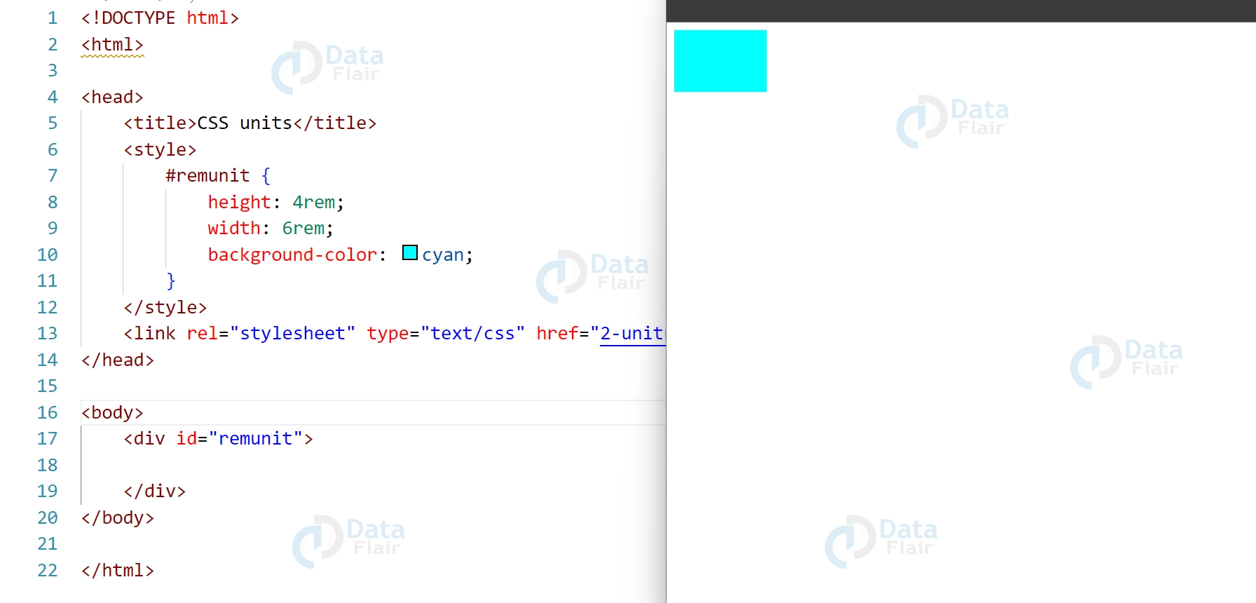
e. rem:
The rem unit is a relative unit that is based on the font-size of the root element (html). For example, if the font-size of the root element is 16px and an element has a width of 10rem, it will be 160px wide.
3. Auto:
Auto is a value that lets the browser calculate the width of an element based on its content and other properties. For example, if an element has a width of auto and a margin of 20px, the browser will calculate the width of the element based on the content and add 20px of margin on both sides.
CSS Width Browser compatibility
Browser compatibility refers to the ability of a website or web application to function and display properly across different web browsers and their various versions. In the context of CSS width, browser compatibility can play a crucial role in ensuring that the layout and design of a web page are consistent and functional across different browsers.
CSS width properties and values are generally well supported across modern web browsers, including Google Chrome, Mozilla Firefox, Apple Safari, Microsoft Edge, and Opera. However, older versions of these browsers and some less popular web browsers may not fully support certain CSS width properties and values or may interpret them differently.
Another advantage of width properties is that you have the chance to achieve full compliance with the majority of devices. Using the relative units like percentages along with the viewport width (vw) and the viewport height (vh) helps developers make their web pages pretty and responsive on any device that may be used by a user. This adaptiveness is especially vital in the modern world where users visit websites using a host of devices.
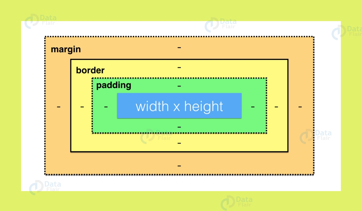
One of the most common issues with browser compatibility in CSS width is related to the box-sizing property. The box-sizing property defines how the width and height of an element are calculated, including whether or not padding and borders are included in the total width and height. The default value of this property is content-box, which means that the width and height do not include padding and borders. However, some older versions of Internet Explorer may interpret this property differently, leading to inconsistent layout and design across different browsers.
Another issue with browser compatibility in CSS width is related to the use of absolute values, such as pixels, inches, and centimeters. These values are generally well supported across modern browsers, but they may not be flexible enough to adapt to different screen sizes and resolutions. This can lead to issues with responsive design and may require the use of alternative units, such as percentages or viewport units.
To ensure browser compatibility in CSS width, it is important to test the layout and design of a web page across different browsers and their various versions. This can be done using tools such as BrowserStack or CrossBrowserTesting. This allow developers to test their web pages across multiple browsers and operating systems. Additionally, using a CSS preprocessor like Sass or Less can help ensure consistency across browsers by automatically generating vendor prefixes and fallbacks for older browsers.
Conclusion
Whenever an element on a web page has a width property, we can use it to set the width of the element. It can be specified in a variety of units, including pixels, percentages, and ems. The width property can be used in conjunction with other layout properties, such as height and margin. The width property will not work on non-replaced inline elements, such as the span tag, and should only be used on elements such as divs.
Your 15 seconds will encourage us to work even harder
Please share your happy experience on Google
