Transform Your Web Designs with these amazing CSS Transition tricks
Full Stack Web Development Courses with Real-time projects Start Now!!
CSS Transition is a feature in CSS that allows an element to smoothly change from one style to another over a specified duration of time. It adds an animated effect to the visual appearance of an element, making the change of styles more visually appealing and interactive. Transitions are defined using CSS properties such as transition-property, transition-duration, and transition-timing-function. With CSS transitions, web developers can create dynamic and visually engaging web designs without relying on JavaScript or other scripting languages.
A virtue of CSS transitions is that they are easy to implement because of the less code that is needed. Compared to JavaScript animations which call for more code and the execution of numerous conditional statements, CSS transitions only need a few lines of code. This not only speeds up the development process but also ensures that the animations created will run smoothly across all browsers as well as the various forms of devices.
Also, CSS transitions are on the hardware-accelerated, so transitions can use the GPU resources to animate elements and speed up in comparison with the CPU, which provides better performance.
Properties of CSS Transition
Here is a list of CSS transition properties
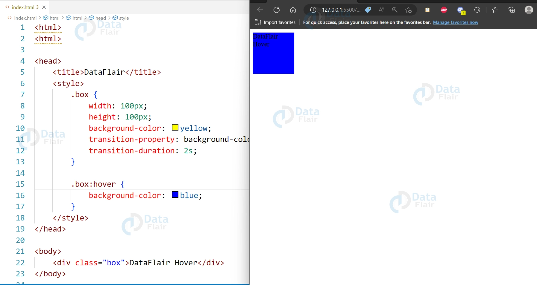
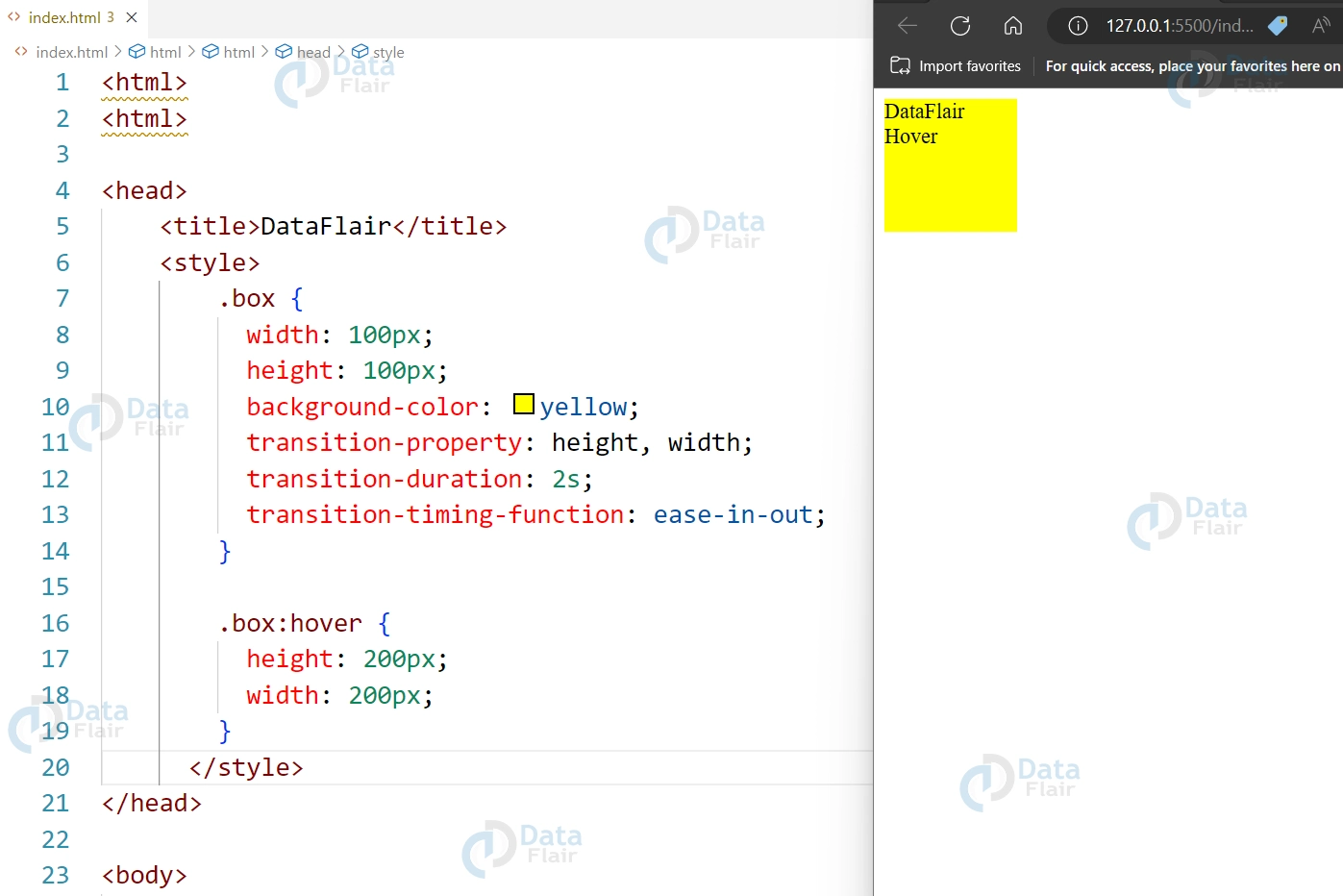
1. transition-property:
Specifies the CSS property to be transitioned.
<div class="box">DataFlair Hover</div>

<style>
  .box {
    width: 100px;
    height: 100px;
    background-color: yellow;
    transition-property: background-color;
    transition-duration: 2s;
  }

  .box:hover {
    background-color: blue;
  }
</style>
Output:
2. transition-duration:
Specifies the duration of the transition effect.
<div class="box">DataFlair Hover</div>

<style>
  .box {
    width: 100px;
    height: 100px;
    background-color: yellow;
    transition-property: background-color;
    transition-duration: 2s;
  }

  .box:hover {
    background-color: blue;
  }
</style>
Output:
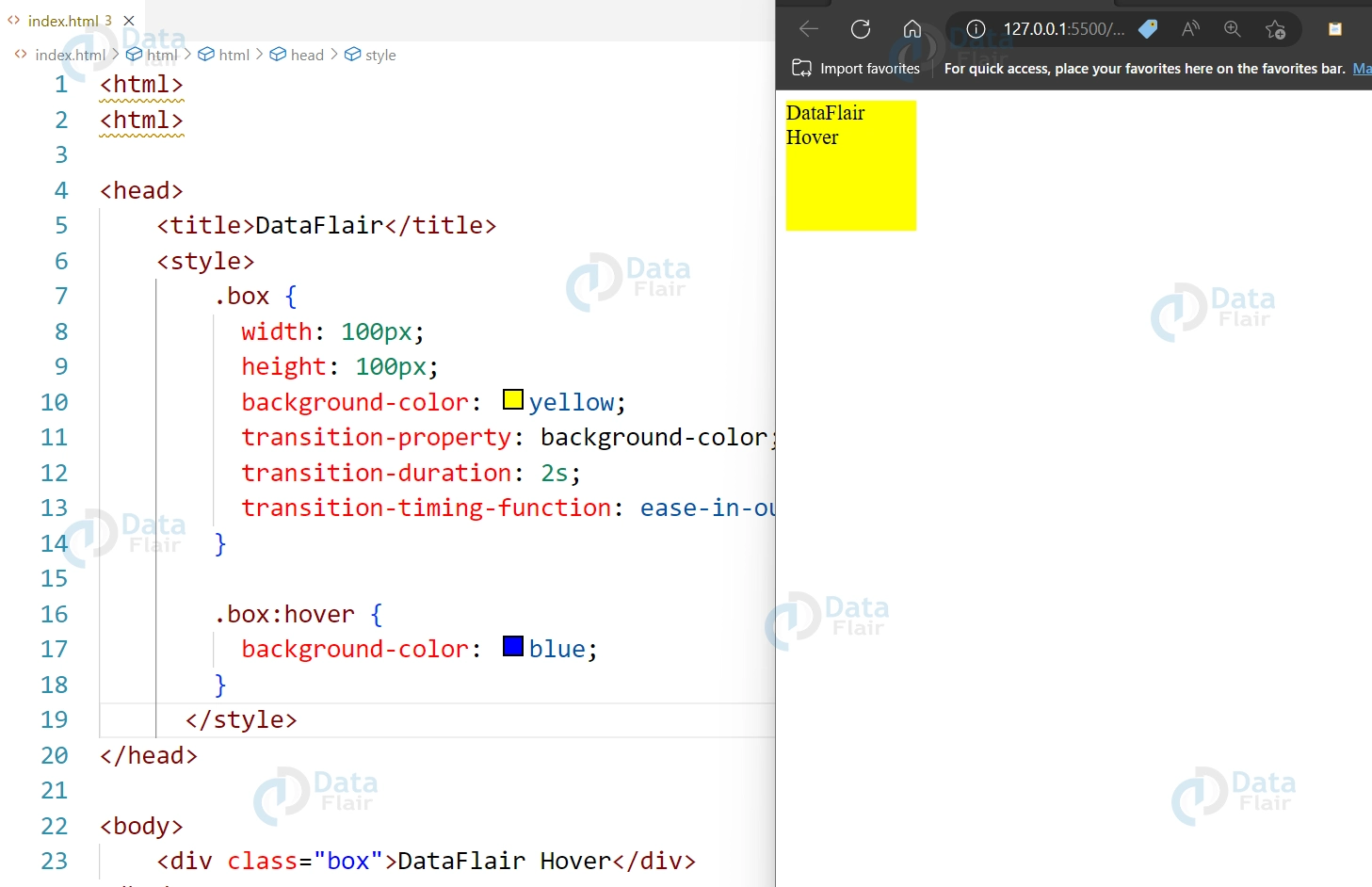
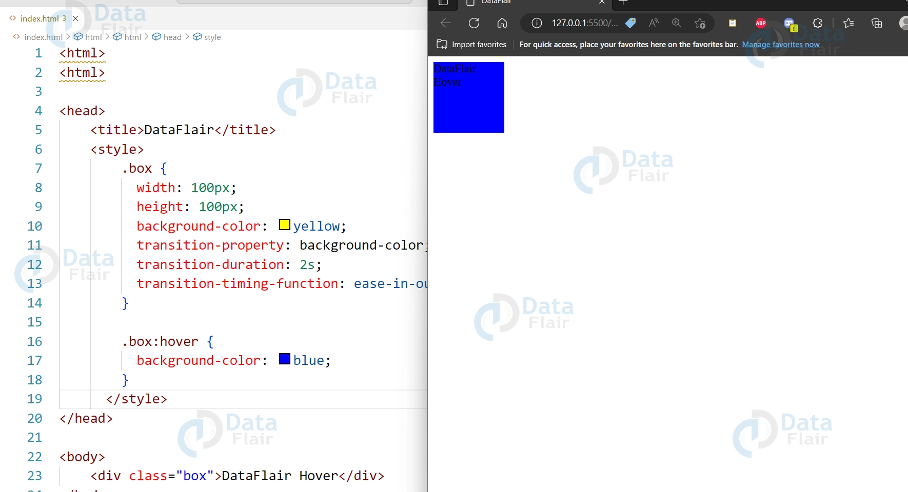
3. transition-timing-function:
The speed curve of the transition effect is specified.
<div class="box">DataFlair Hover</div>

<style>
  .box {
    width: 100px;
    height: 100px;
    background-color: yellow;
    transition-property: background-color;
    transition-duration: 2s;
    transition-timing-function: ease-in-out;
  }

  .box:hover {
    background-color: blue;
  }
</style>
Output:
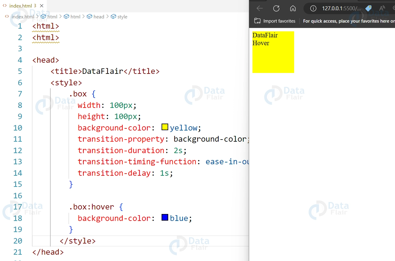
4. transition-delay:
Specifies a delay before the transition effect starts.
<div class="box">DataFlair Hover</div>

<style>
  .box {
    width: 100px;
    height: 100px;
    background-color: yellow;
    transition-property: background-color;
    transition-duration: 2s;
    transition-timing-function: ease-in-out;
    transition-delay: 1s;
  }

  .box:hover {
    background-color: blue;
  }
</style>
Output:
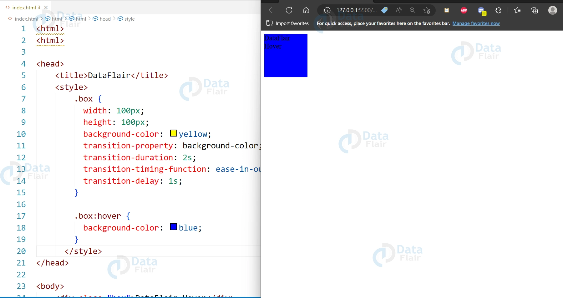
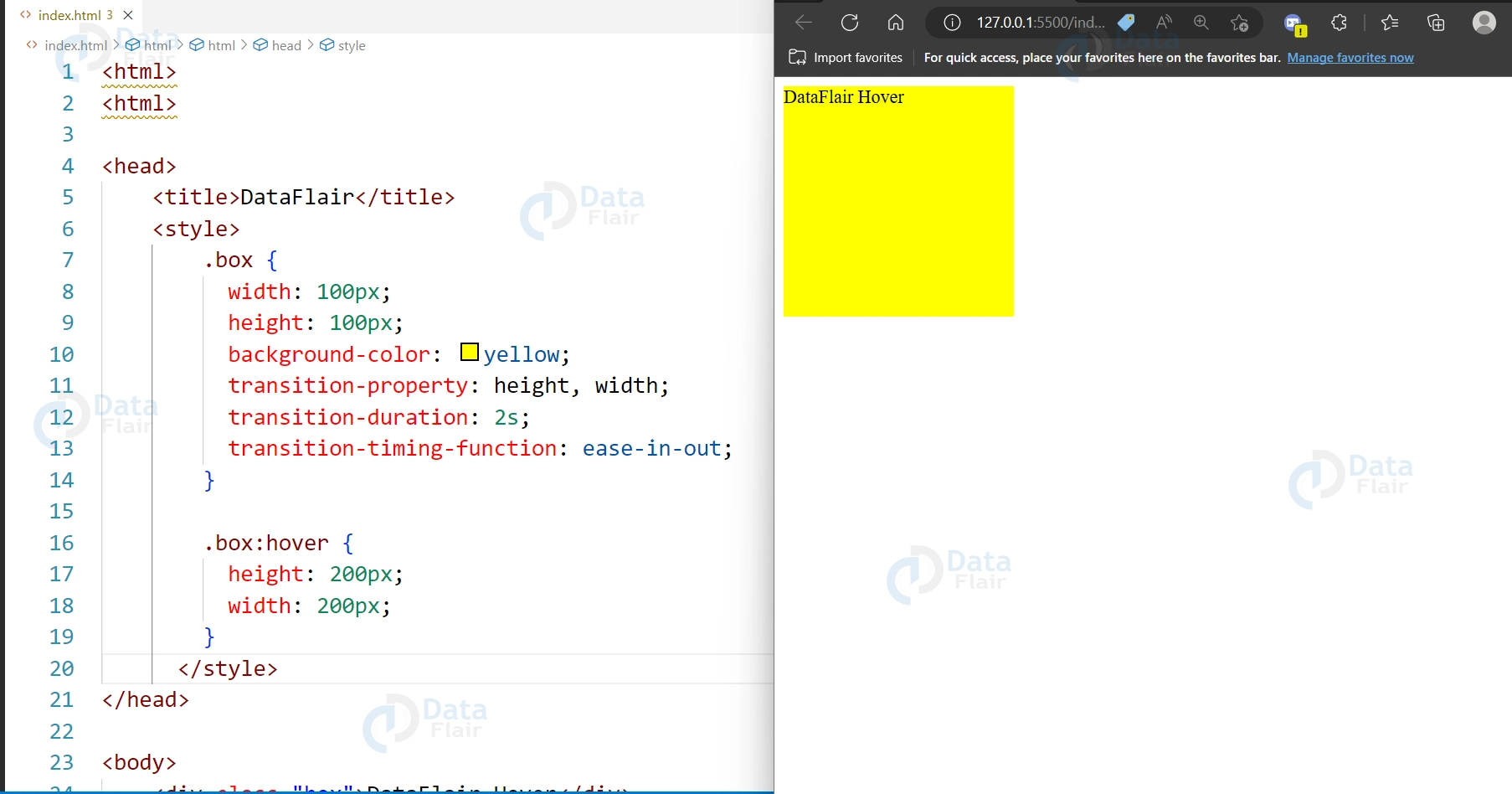
5. Transitions for height and width changes:
Code:
<div class="box">DataFlair Hover</div>

<style>
  .box {
    width: 100px;
    height: 100px;
    background-color: yellow;
    transition-property: height, width;
    transition-duration: 2s;
    transition-timing-function: ease-in-out;
  }

  .box:hover {
    height: 200px;
    width: 200px;
  }
</style>
Output:
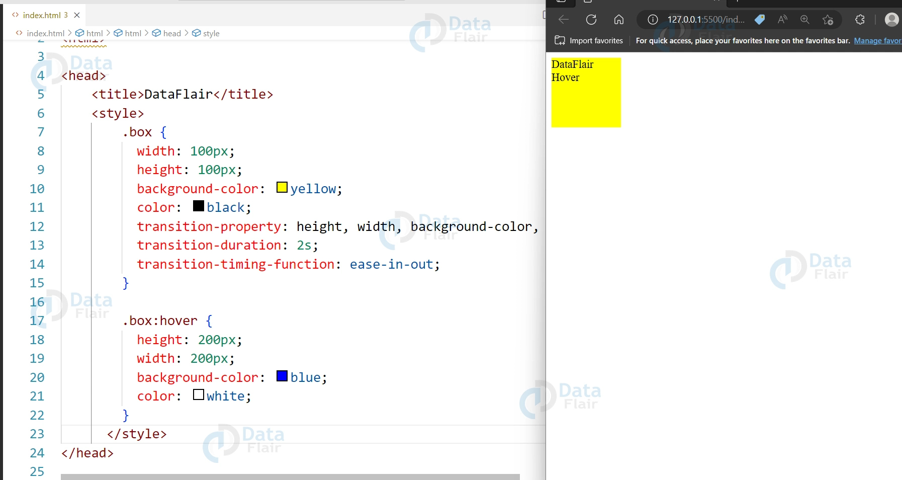
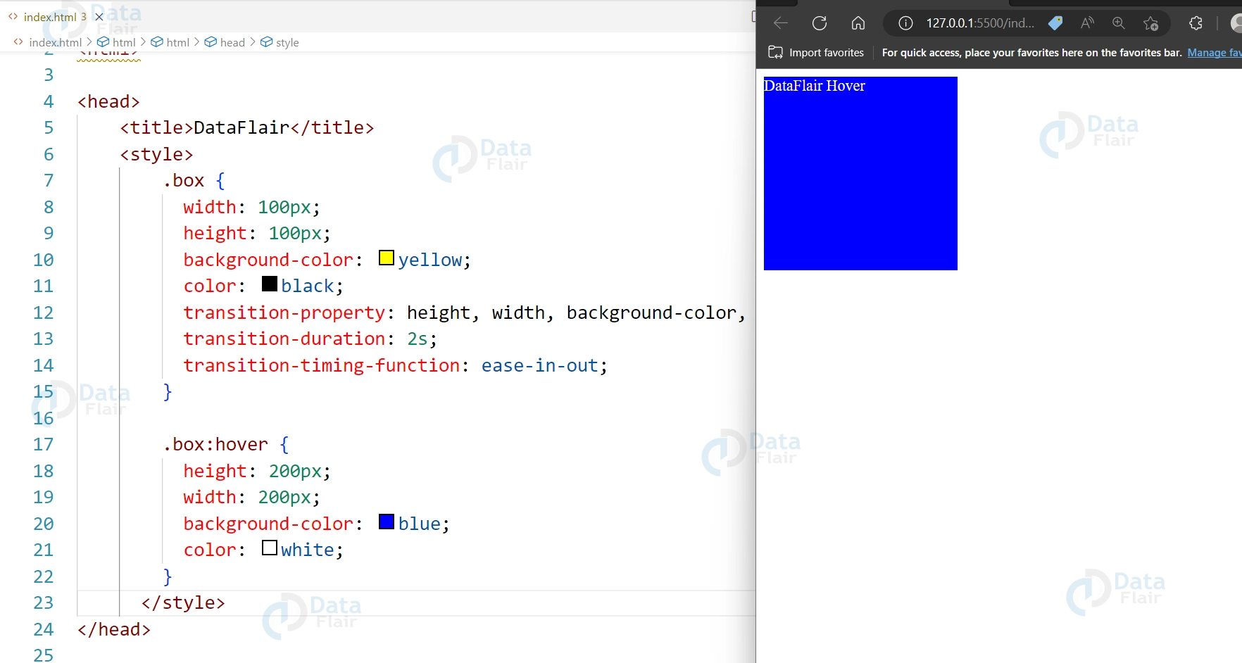
6. Transitions for multiple properties:
Code:
<div class="box">DataFlair Hover</div>

<style>
  .box {
    width: 100px;
    height: 100px;
    background-color: yellow;
    color: black;
    transition-property: height, width, background-color, color;
    transition-duration: 2s;
    transition-timing-function: ease-in-out;
  }

  .box:hover {
    height: 200px;
    width: 200px;
    background-color: blue;
    color: white;
  }
</style>
Output:

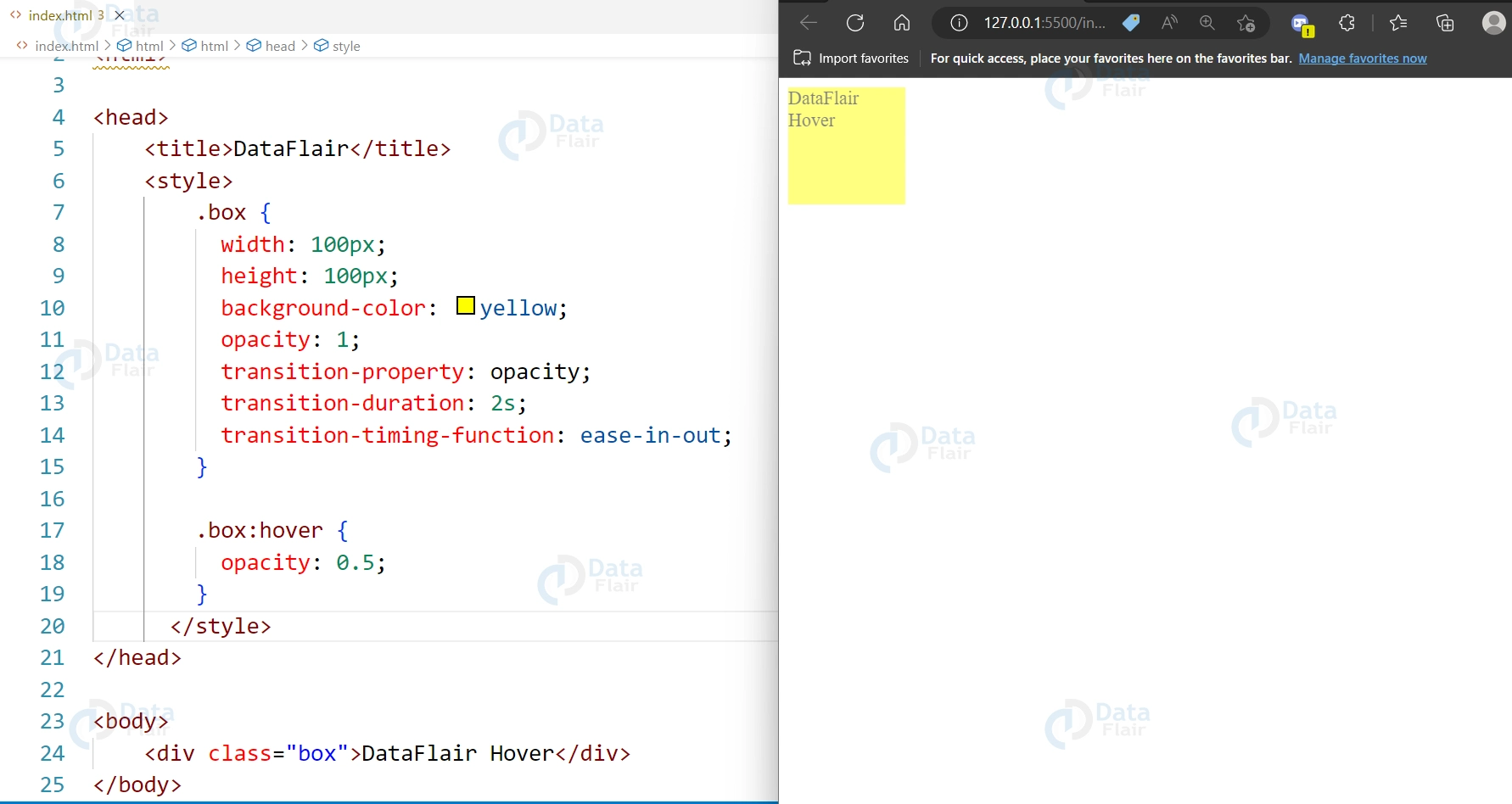
7. Transitions with opacity changes:
Code:
<div class="box">DataFlair Hover</div>

<style>
  .box {
    width: 100px;
    height: 100px;
    background-color: yellow;
    opacity: 1;
    transition-property: opacity;
    transition-duration: 2s;
    transition-timing-function: ease-in-out;
  }

  .box:hover {
    opacity: 0.5;
  }
</style>
Output:
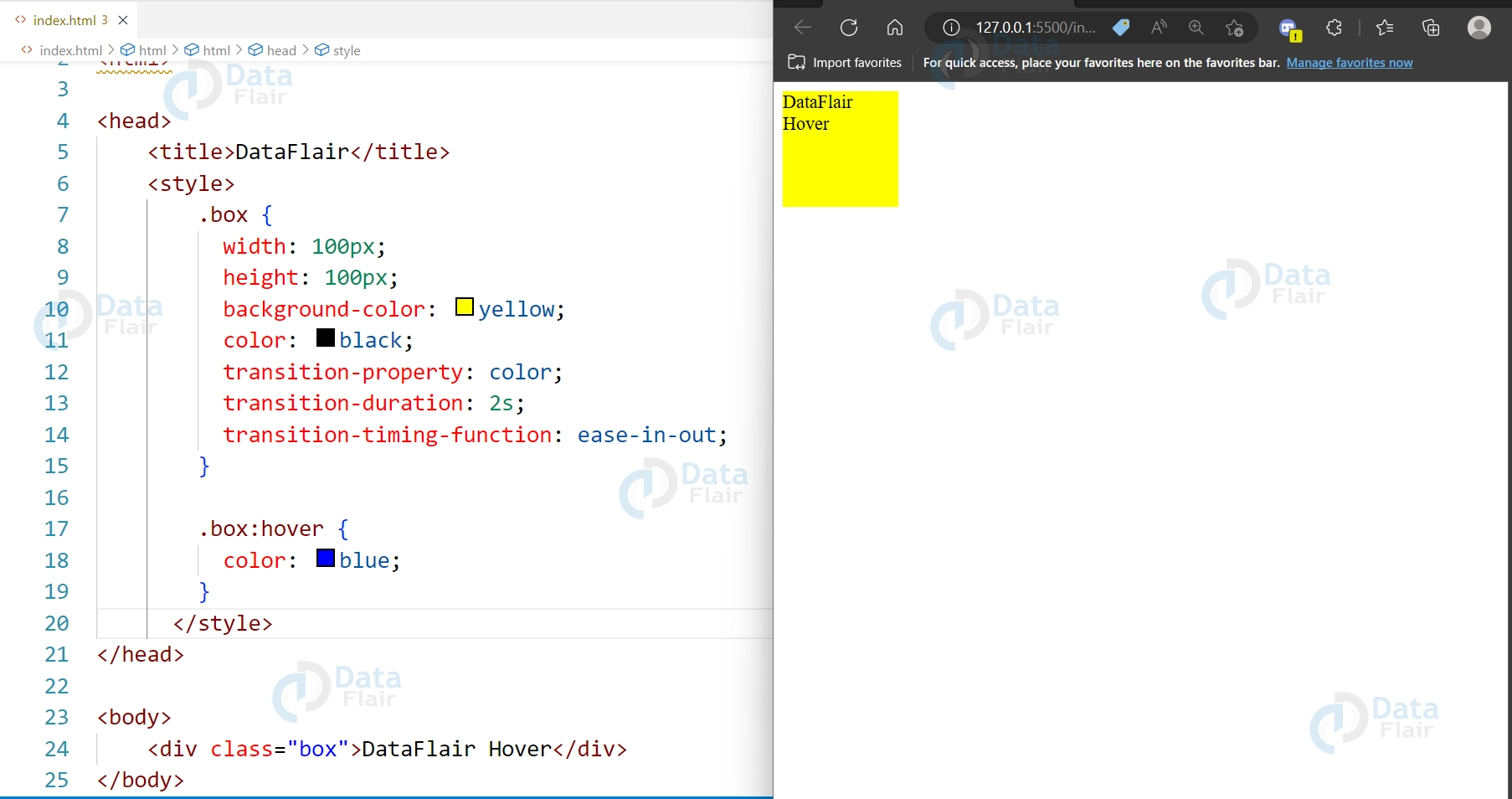
8. Transitions for text color changes:
Code:
<div class="box"><h1>DataFlair Hover</h1></div>

<style>
  .box {
    width: 100px;
    height: 100px;
    background-color: yellow;
    color: black;
    transition-property: color;
    transition-duration: 2s;
    transition-timing-function: ease-in-out;
  }

  .box:hover {
    color: blue;
  }
</style>
Output:


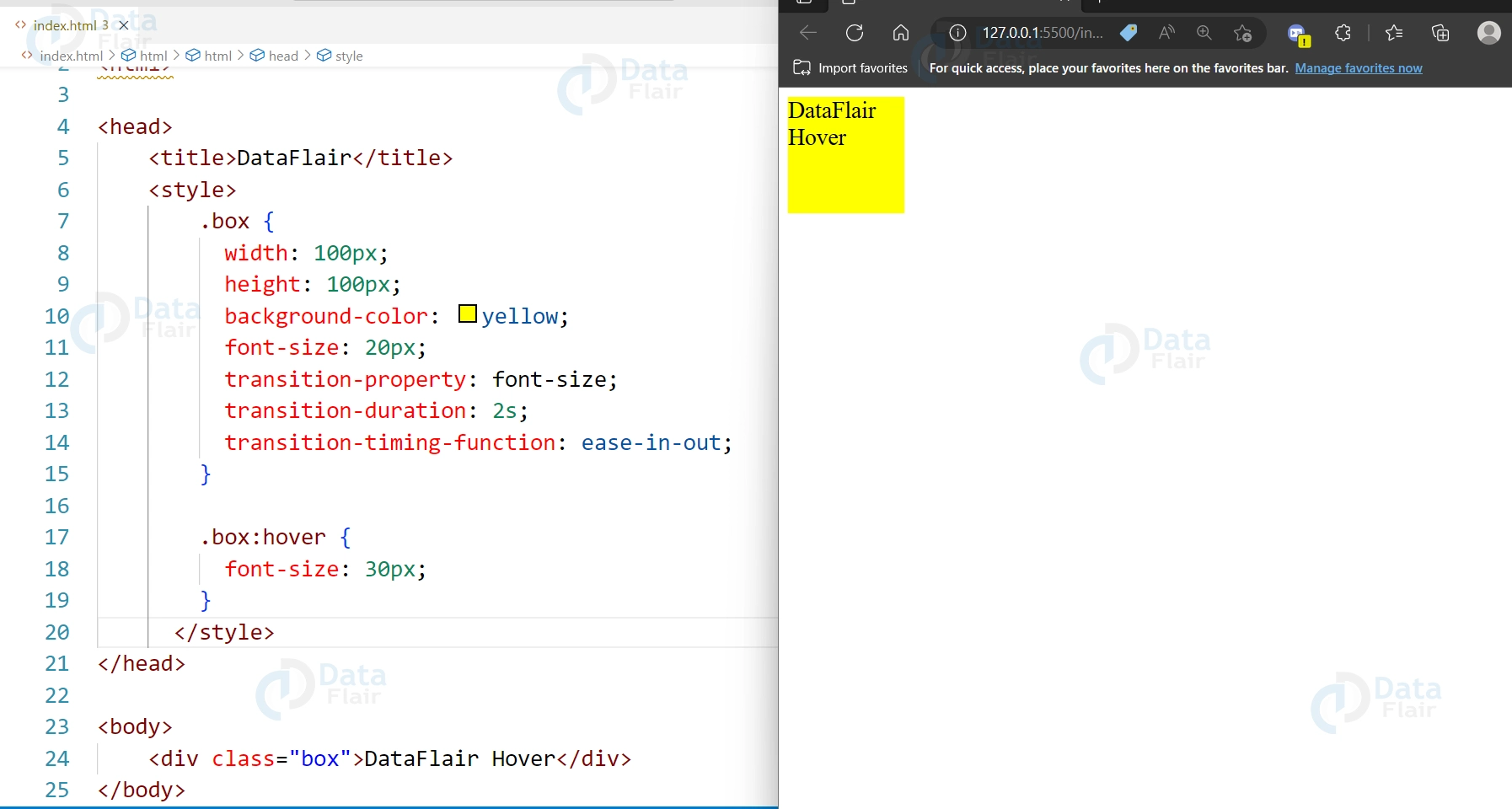
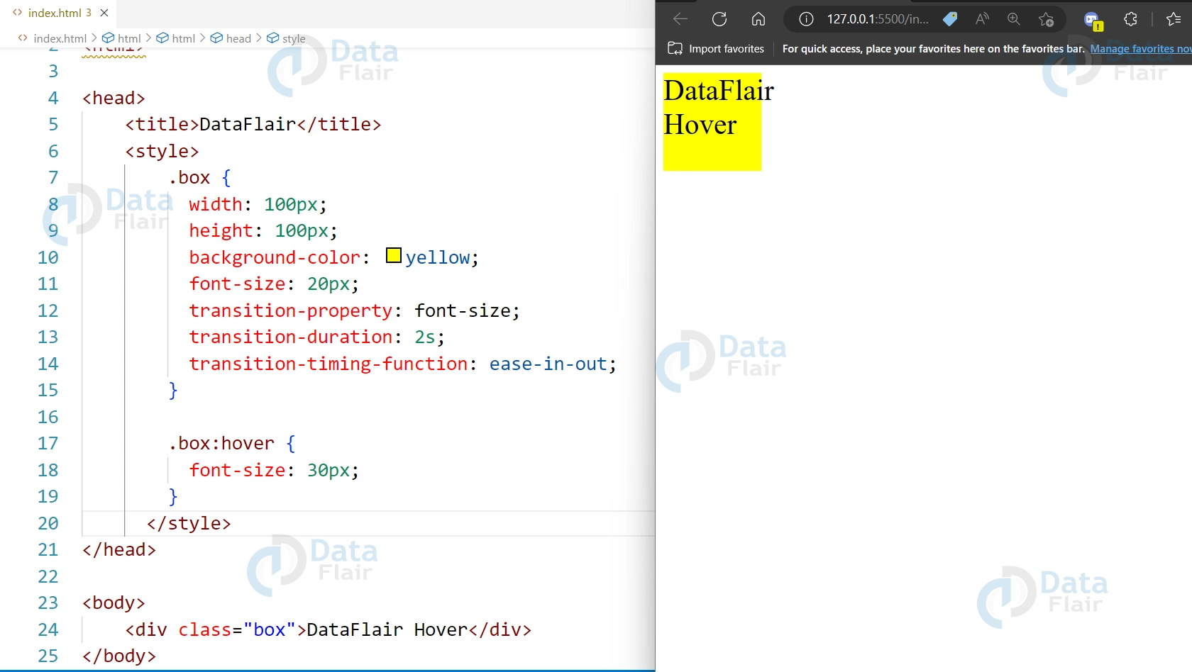
9. Transitions for font size changes:
Code:
<div class="box">DataFlair Hover</div>

<style>
  .box {
    width: 100px;
    height: 100px;
    background-color: yellow;
    font-size: 20px;
    transition-property: font-size;
    transition-duration: 2s;
    transition-timing-function: ease-in-out;
  }

  .box:hover {
    font-size: 30px;
  }
</style>
Output:
Conclusion
So we can say that CSS transitions are a powerful tool for creating dynamic and visually appealing animations in web design. You can animate changes to a variety of CSS properties, such as colours, sizes, borders, and shadows, with just a few lines of code. The transitions can be customized with different durations, timing functions, and easing curves, allowing you to create a wide range of different animation effects. CSS transitions are easy to use and can add a lot of visual interest to your web pages, making them an essential tool for any web designer or developer.
Your opinion matters
Please write your valuable feedback about DataFlair on Google
