CSS Tooltip Animation
Full Stack Web Development Courses with Real-time projects Start Now!!
A CSS tooltip is a small pop-up element that displays additional information when the user hovers over a specific element. A tooltip animation refers to the visual effect applied to the tooltip when it is shown or hidden. The animation can be implemented using CSS transitions and keyframes, allowing for smooth and visually appealing tooltip behavior.
CSS animation can be customized to match the design and style of a website, and can be applied to any HTML element that requires a tooltip. There are many different animation options available, such as fade-in, slide-in, grow, and more. The exact implementation will depend on the desired behavior, but the basic idea is to change the opacity and/or position of the tooltip element over time. To add a CSS tooltip animation, you will need to create the HTML for the tooltip, write the CSS to style and position the tooltip, and add JavaScript to show and hide the tooltip on hover.
Implementing CSS animations to tooltips will not only make the website more attractive but also helpful for the visitors. Smoother animation makes the site look more professional and well planned and therefore the level of engagement is higher. Besides, animated tooltips can highlight specific features or give more details on screen without obstructing the main content and can enhance the efficiency of a user in approaching a website.
CSS Tooltip animation options
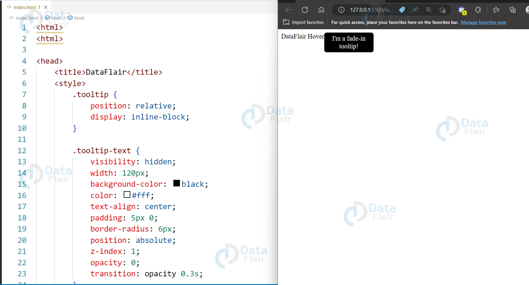
1. Fade-in:
CSS animation fade-in option is a way to gradually transition an element from being invisible to visible. It can be used to create a smooth and subtle effect when displaying elements on a webpage, such as text, images, or buttons. To create a fade-in animation, you can use the opacity property in combination with the animation property in CSS, which allows you to specify the duration, timing function, and other parameters of the animation.
HTML:
<div class="tooltip">DataFlair Hover
  <span class="tooltip-text">I'm a fade-in tooltip!</span>
</div>
CSS
.tooltip {
  position: relative;
  display: inline-block;
}
.tooltip-text {
  visibility: hidden;
  width: 120px;
  background-color: black;
  color: #fff;
  text-align: center;
  padding: 5px 0;
  border-radius: 6px;
  position: absolute;
  z-index: 1;
  opacity: 0;
  transition: opacity 0.3s;
}

.tooltip:hover .tooltip-text {
  visibility: visible;
  opacity: 1;
}
Output:
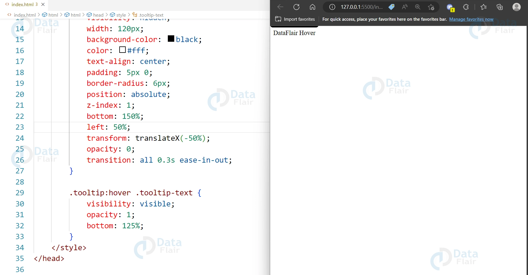
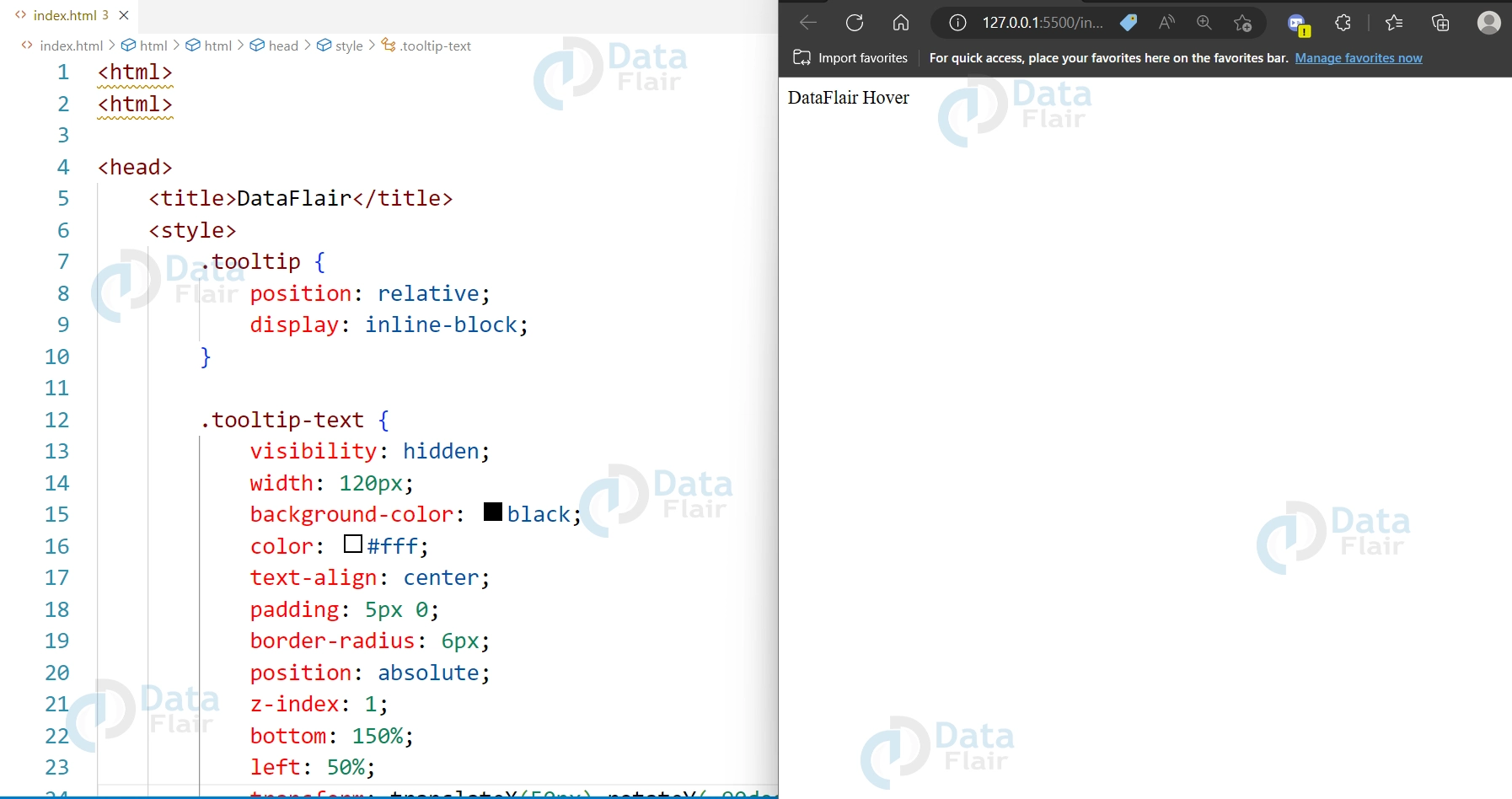
2. Slide-in:
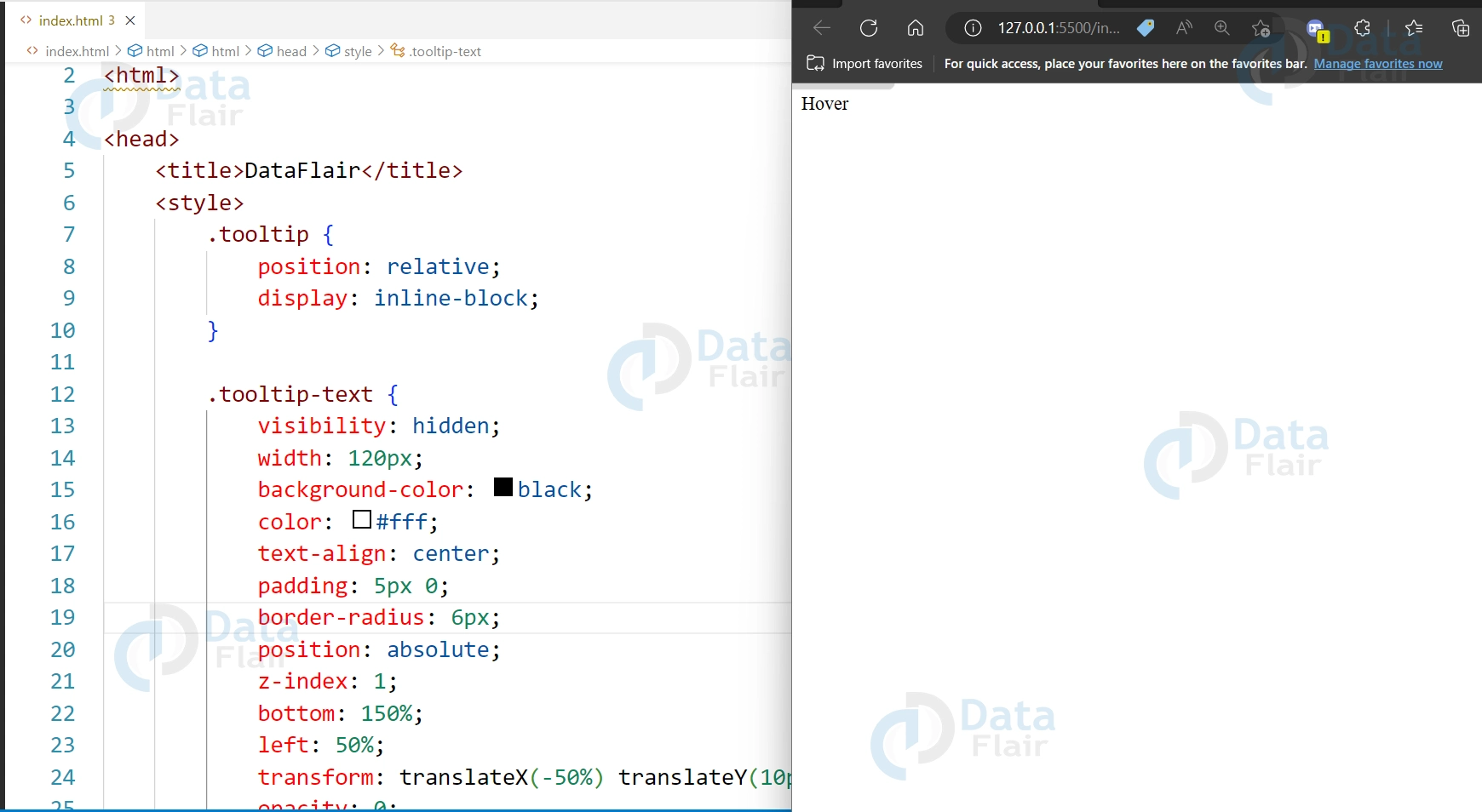
CSS animation slide-in option is a way to animate an element by sliding it into view from outside of its container. It is a popular animation effect used in web design to add interest and interactivity to a webpage. To create a slide-in animation, you can use the transform property in combination with the animation property in CSS, which allows you to specify the duration, timing function, and other parameters of the animation. You can also use the translateX() or translateY() functions to move the element horizontally or vertically, respectively.
HTML:
<div class="tooltip">DataFlair Hover
  <span class="tooltip-text">I'm a slide-in tooltip!</span>
</div>
CSS
.tooltip {
  position: relative;
  display: inline-block;
}

.tooltip-text {
  visibility: hidden;
  width: 120px;
  background-color: black;
  color: #fff;
  text-align: center;
  padding: 5px 0;
  border-radius: 6px;
  position: absolute;
  z-index: 1;
  bottom: 150%;
  left: 50%;
  transform: translateX(-50%);
  opacity: 0;
  transition: all 0.3s ease-in-out;
}

.tooltip:hover .tooltip-text {
  visibility: visible;
  opacity: 1;
  bottom: 125%;
}
Output:
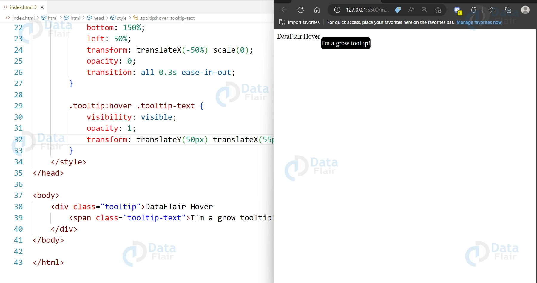
3. Grow:
CSS animation grow option is a way to animate an element by increasing its size gradually. It can be used to draw attention to a specific element or to create an interesting visual effect. To create a grow animation, you can use the transform property in combination with the animation property in CSS, which allows you to specify the duration, timing function, and other parameters of the animation. You can use the scale() function to increase the size of the element, and adjust the scale factor to achieve the desired effect.
HTML:
<div class="tooltip">DataFlair Hover
  <span class="tooltip-text">I'm a grow tooltip!</span>
</div>
CSS
.tooltip {
  position: relative;
  display: inline-block;
}

.tooltip-text {
  visibility: hidden;
  width: 120px;
  background-color: black;
  color: #fff;
  text-align: center;
  padding: 5px 0;
  border-radius: 6px;
  position: absolute;
  z-index: 1;
  bottom: 150%;
  left: 50%;
  transform: translateX(-50%) scale(0);
  opacity: 0;
  transition: all 0.3s ease-in-out;
}

.tooltip:hover .tooltip-text {
  visibility: visible;
  opacity: 1;
  transform: translateY(50px) translateX(55px) scale(0);
}
Output:
4. Flip:
CSS animation flip option is a way to create a 3D flip effect on an element. It can be used to add a unique and eye-catching animation to a webpage, such as flipping a card or revealing content. To create a flip animation, you can use the transform property in combination with the animation property in CSS, which allows you to specify the duration, timing function, and other parameters of the animation. You can use the rotateY() function to rotate the element around its vertical axis, and adjust the rotation angle to achieve the desired effect.
HTML:
<div class="tooltip">DataFlair Hover
  <span class="tooltip-text">I'm a flip tooltip!</span>
</div>
CSS
.tooltip {
  position: relative;
  display: inline-block;
}

.tooltip-text {
  visibility: hidden;
  width: 120px;
  background-color: black;
  color: #fff;
  text-align: center;
  padding: 5px 0;
  border-radius: 6px;
  position: absolute;
  z-index: 1;
  bottom: 150%;
  left: 50%;
  transform: translateX(-50%) rotateY(-90deg);
  opacity: 0;
  backface-visibility: hidden;
  transition: all 0.3s ease-in-out;
}

.tooltip:hover .tooltip-text {
  visibility: visible;
  opacity: 1;
  transform: translateX(-50%) rotateY(0);
}
Output:
5. Bounce:
CSS animation bounce option is a way to animate an element by making it appear to bounce up and down. It can be used to add a playful and dynamic element to a webpage, such as when displaying notifications or alerts. To create a bounce animation, you can use the animation property in CSS, which allows you to specify the duration, timing function, and other parameters of the animation. You can use the translateY() function to move the element vertically, and adjust the timing function to create a bouncing effect. You can also use the scale() function to decrease the size of the element slightly as it bounces.
HTML:
<div class="tooltip">Hover
  <span class="tooltip-text">I'm a bounce tooltip!</span>
</div>
CSS
.tooltip {
  position: relative;
  display: inline-block;
}

.tooltip-text {
  visibility: hidden;
  width: 120px;
  background-color: black;
  color: #fff;
  text-align: center;
  padding: 5px 0;
  border-radius: 6px;
  position: absolute;
  z-index: 1;
  bottom: 150%;
  left: 50%;
  transform: translateX(-50%) translateY(10px);
  opacity: 0;
  transition: all 0.3s ease-in-out;
}

.tooltip:hover .tooltip-text {
  visibility: visible;
  opacity: 1;
  transform: translateX(-50%) translateY(-10px);
}
Output:
Properties of CSS Tooltip animation
1. visibility: Controls whether an element is visible or hidden. Used to show and hide the tooltip text.
2. width: Specifies the width of the tooltip box.
3. background-color: Specifies the background color of the tooltip box.
4. color: Specifies the text color inside the tooltip box.
5. text-align: Specifies the horizontal alignment of the text inside the tooltip box.
6. padding: Specifies the padding inside the tooltip box.
7. border-radius: Specifies the rounded corners of the tooltip box.
8. position: Specifies the position of the tooltip box relative to the parent element.
9. z-index: Specifies the stacking order of the tooltip box. A higher z-index value means the tooltip will be displayed in front of other elements with a lower z-index value.
10. bottom and left: Specifies the position of the tooltip box along the x and y axes, respectively.
11. transform: Specifies a 2D or 3D transformation to be applied to an element. Used to create the flip animation.
12. opacity: Specifies the transparency level of an element. Used to fade in and fade out the tooltip.
13. transition: Specifies the animation effect that occurs when an element changes from one style to another. Used to animate the changes in visibility, opacity, and transform.
14. backface-visibility: Specifies whether or not the back face of an element is visible when not facing the screen. Used to hide the back face of the tooltip during the flip animation.
Conclusion
Hence we can say that CSS tooltips with animations can be a great way to enhance the user experience of a website. By using CSS properties such as visibility, opacity, transform, and transition, it’s possible to create a variety of effects to make tooltips more interesting and engaging. When used properly, tooltips can provide users with important information or context, making it easier for them to understand the content on a website. With its ability to create dynamic and animated effects, CSS is a powerful tool for creating visually appealing and functional tooltips.
Your 15 seconds will encourage us to work even harder
Please share your happy experience on Google
