CSS Responsive Design
Full Stack Web Development Courses with Real-time projects Start Now!!
In today’s digital age, having a website that looks good and functions well on all devices is essential. Smartphones, tablets, and other mobile devices require websites to adapt to different screen sizes and resolutions. CSS responsive design is important for this. This article covers the basics of CSS responsive design and includes HTML and CSS code examples to help you start.
What is CSS Responsive Design?
CSS responsive design is an approach to web design that enables web pages to respond to different screen sizes and device types. It involves using CSS media queries to adjust the layout and design of a web page based on the screen size and orientation of the device being used. CSS responsive design enables web developers to create adaptable web layouts that function effectively on various devices, from desktop computers to smartphones and others.
Using CSS Media Queries
The key to CSS responsive design is using media queries to apply different styles to a web page based on the device’s screen size and orientation. Media queries are a CSS feature that allows you to define different styles for different screen sizes and resolutions. To use media queries in your CSS code, you’ll need to use the @media rule, like this:
@media screen and (max-width: 600px) {
/* styles for screens up to 600px wide */
}

@media screen and (min-width: 601px) and (max-width: 900px) {
/* styles for screens between 601px and 900px wide */
}

@media screen and (min-width: 901px) {
/* styles for screens wider than 901px */
}
In this example, we’ve defined three different media queries, each with different styles for different screen sizes. The first media query applies to screens up to 600px wide, the second applies to screens between 601px and 900px wide, and the third applies to screens wider than 901px.
Using CSS Grid for Responsive Layouts
CSS Grid is a powerful layout system that can be used to create responsive web layouts. With CSS Grid, you can create a grid of rows and columns that automatically adjusts to fit different screen sizes and resolutions. Here’s an example of how you might use CSS Grid to create a responsive layout:
<div class="grid">
<div class="item">Item 1</div>
<div class="item">Item 2</div>
<div class="item">Item 3</div>
<div class="item">Item 4</div>
</div>

<style>
.grid {
display: grid;
grid-template-columns: repeat(auto-fit, minmax(200px, 1fr));
grid-gap: 20px;
}

.item {
background-color: #ddd;
padding: 20px;
text-align: center;
}

@media screen and (max-width: 600px) {
.grid {
grid-template-columns: repeat(auto-fit, minmax(150px, 1fr));
grid-gap: 10px;
}
}
</style>
Output
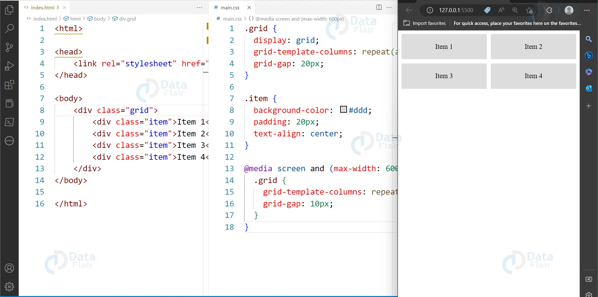
In this example, we’ve defined a CSS grid with four items. The grid-template-columns property specifies that the grid should have a minimum column width of 200px, but should also automatically adjust to fit the available space. The grid-gap property specifies the space between the grid items.
Using CSS Flexbox for Responsive Layouts
Another popular approach to creating responsive layouts is using CSS Flexbox. Flexbox is a layout system that allows you to align and distribute elements within a container. With Flexbox, you can create flexible and dynamic layouts that adapt to different screen sizes and resolutions. Here’s an example of how you might use CSS Flexbox to create a responsive layout:
<div class="flex-container">
<div class="flex-item">Item 1</div>
<div class="flex-item">Item 2</div>
<div class="flex-item">Item 3</div>
<div class="flex-item">Item 4</div>
</div>

<style>
.flex-container {
display: flex;
flex-wrap: wrap;
justify-content: space-between;
align-items: center;
}

.flex-item {
background-color: #ddd;
padding: 20px;
text-align: center;
width: calc(25% - 20px);
margin-bottom: 20px;
}

@media screen and (max-width: 600px) {
.flex-item {
width: calc(50% - 10px);
}
}
</style>
Output
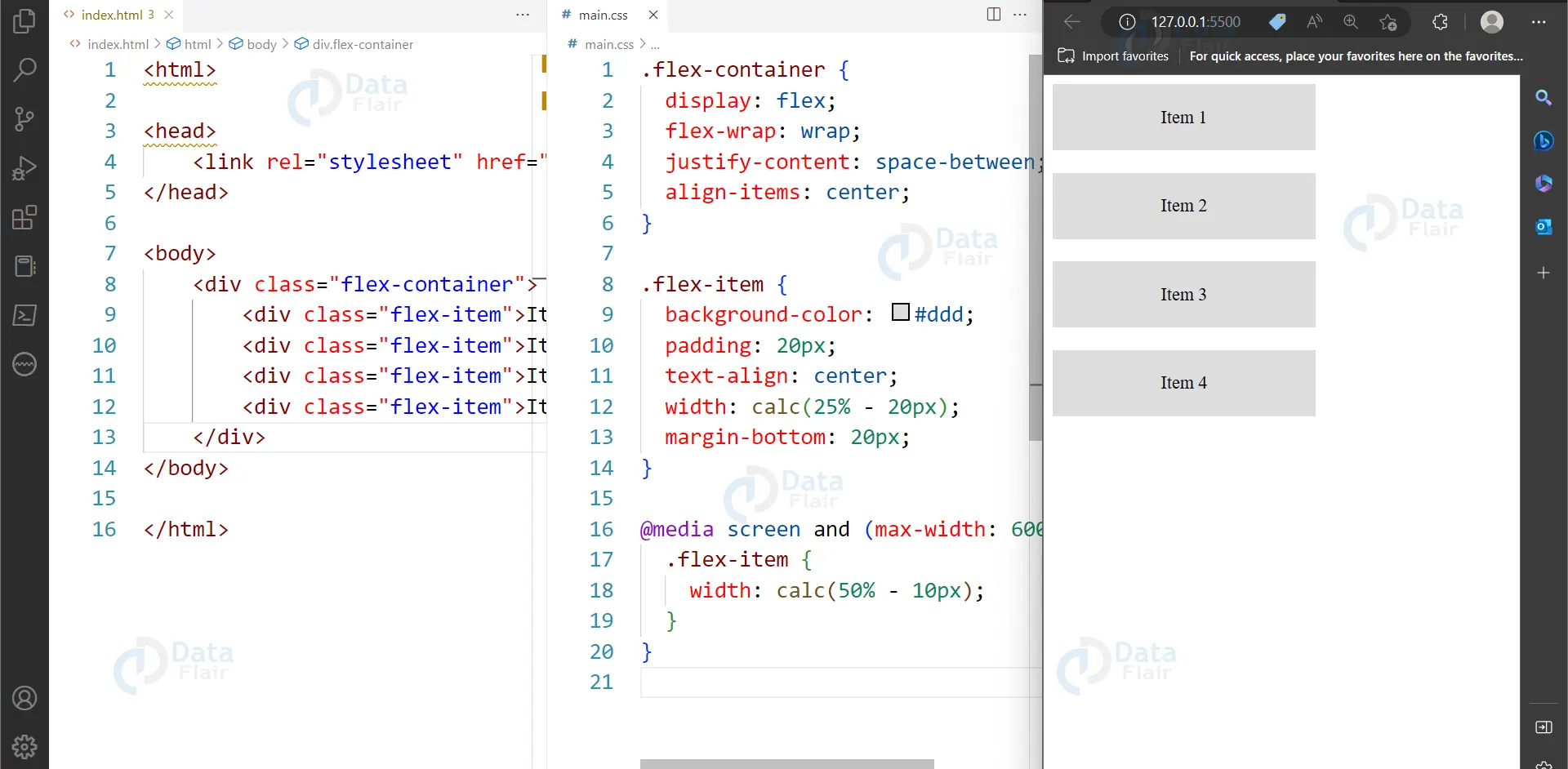
In this example, we’ve defined a Flexbox container with four items. The flex-wrap property specifies that the items should wrap to the next line if there isn’t enough space on the current line. The justify-content property specifies how the items should be distributed along the main axis, and align-items property specifies how the items should be aligned along the cross axis.
We’ve also defined a media query that adjusts the item width for screens up to 600px wide, to ensure that the items remain readable and functional on smaller screens.
CSS Responsive typography
Responsive typography is an approach to web design that ensures that the text on a website adapts and adjusts based on the device and screen size that it is being viewed on. This means that regardless of whether a user is viewing a website on a desktop computer, tablet, or smartphone, the text will be legible and easy to read.
One example of responsive typography is the website for The New York Times. The New York Times uses a variety of font sizes, weights, and styles to create a hierarchy of information on its website. They use larger font sizes for headlines and smaller font sizes for body text, and they also adjust the font sizes based on the screen size.
For example, on a desktop computer, the headlines on The New York Times website are typically around 40-50 pixels in size, while the body text is around 16-18 pixels in size. However, on a mobile device, the headlines are scaled down to around 30 pixels, while the body text is scaled up to around 20 pixels. This ensures that the text is legible and easy to read on smaller screens.
CSS Viewport meta tag
The viewport meta tag is a crucial aspect of CSS responsive design. It is used to control the layout and scaling of a web page on different devices, such as mobile phones, tablets, and desktops.
The viewport meta tag tells the browser how to adjust the page’s layout and scale according to the device’s screen size. It helps to ensure that the content of the web page is displayed correctly on all devices.
The following is an example of how the viewport meta tag can be used in HTML:
<meta name="viewport" content="width=device-width, initial-scale=1.0">
In this example, the “width=device-width” attribute sets the width of the viewport to the width of the device’s screen. The “initial-scale=1.0” attribute sets the initial zoom level of the page to 100%.
Without the viewport meta tag, the web page may not display correctly on smaller screens, and users may have to zoom in or scroll horizontally to view the content properly. It is essential to include the viewport meta tag in your web page’s head section to ensure that it is optimized for all devices and provides a better user experience.
Besides, the viewport tag will make sure that when the content is increased in proportion, there is no factor where text, for example, becomes too small to read or the elements go beyond the screen size. This rather plain yet invaluable tag is one of the principal components of the contemporary responsive web design approach, helping designers to design better and more accessible web pages.
Conclusion
We can say that CSS responsive design is a powerful tool for creating flexible and adaptable web layouts that look good and function well on any device. By using CSS media queries, CSS Grid, and CSS Flexbox, web developers can create responsive layouts that automatically adjust to fit different screen sizes and resolutions. With the right tools and techniques, you can ensure that your website looks great and works well, no matter what device your visitors use.
Your 15 seconds will encourage us to work even harder
Please share your happy experience on Google
