CSS Pseudo Classes with Examples
Full Stack Web Development Courses with Real-time projects Start Now!!
In this article, you will learn about CSS Pseudo Classes. Let’s start with what is CSS Pseudo Classes.
What are CSS Pseudo Classes?
Certain selectors can have special effects added to them using CSS pseudo-classes. To apply such effects, you don’t need to use Js or any other script. In CSS, a pseudo class is used to specify an element’s unique state. It can be used in conjunction with a CSS selection to add a state-based impact to already-existing items. Updating the appearance of an element, for instance, when a user lingers over it or clicks a link. Pseudo Class in CSS can be used for all of these things.
A selector’s term that specifies a specific state of the chosen element is called a CSS pseudo-class (s). When a user’s cursor hovers over a button, for instance, the pseudo-class:hover can be utilized to pick the button, which can subsequently be stylized.
A pseudo-class is defined as the pseudo-class name followed by a colon (:). (e.g., :hover). A set of parentheses to define the parameters is also included in a functional pseudo-class (for example,:dir()). An anchor element is the one to which a pseudo-class is attached.
Pseudo-classes permit you to apply a class to an element based on external characteristics in addition to the document tree’s content, such as the navigator’s history (:got to visit, for example), the element’s status (such as some features), or the mouse position.
A specific condition of an item is specified by a pseudo-class.
It can be utilised, for instance, to:
- When a user hovers their mouse over an element, it styles
- links that have been visited and those that have not
- Style as a component when it is highlighted
CSS pseudo-class Syntax:
A simple syntax of pseudo-classes is as follows:
Selector:pseudo-class
{
property: value;
}
Although there are many CSS pseudo-classes, in this article we’ll talk about some of the more popular ones.
- focus: It chooses the aspect on which the user is currently focusing.
- lang: It command specifies the language to be used in the given element.
- link: It adds style to the unvisited link.
- visited: It gives a visited link some flair.
- first-child: It gives an element that is the offspring of another element special effects.
- hover: As the user drags the mouse cursor over an element, hover: It provides special effects to the element.
- active: It is used to give an active element some flair.
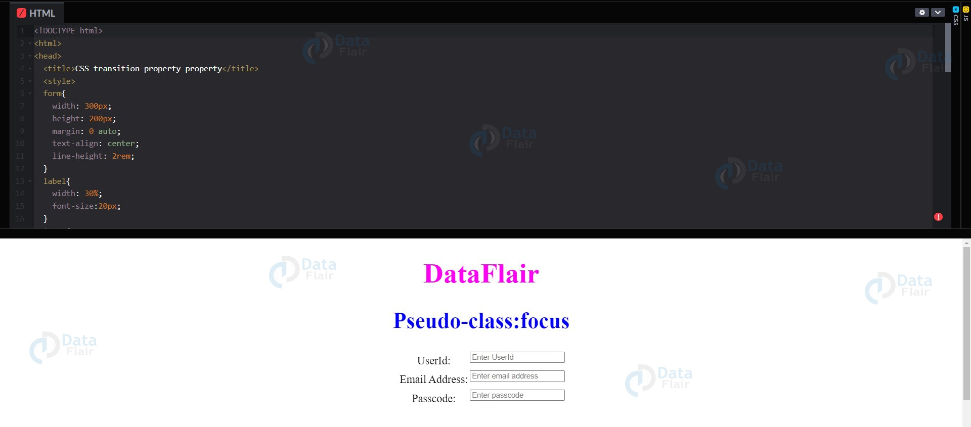
1. CSS focus Pseudo-class
The element that the user is now focusing is chosen using this pseudo-class. When a user clicks on one of the user input items used in forms, the script is invoked. The color palette of the input that is currently in focus changes in the example that follows.
For Example:
<!DOCTYPE html>
<html>
<head>
<title>CSS transition-property property</title>
<style>
form{
width: 300px;
height: 200px;
margin: 0 auto;
text-align: center;
line-height: 2rem;
}
label{
width: 30%;
font-size:20px;
}
input{
background-color: default;
float: right;
}
input:focus{
background-color: grey;
}
h1{
color: rgb(255,0,242);
text-align: center;
font-size:50px;
}
h2{
color: blue;
text-align: center;
font-size:40px;
}
</style>
</head>

<body>
<h1>DataFlair</h1>
<h2>Pseudo-class:focus</h2>
<form>
<label for="username">UserId:</label>
<input type="text" name="username"
placeholder="Enter UserId" />
<br>

<label for="emailid">Email Address:</label>
<input type="email" name="emailid"
placeholder="Enter email address" />

<label for="Password">Passcode:</label>
<input type="password" name="Password"
placeholder="Enter passcode" />
</form>
</body>
</html>
Output:
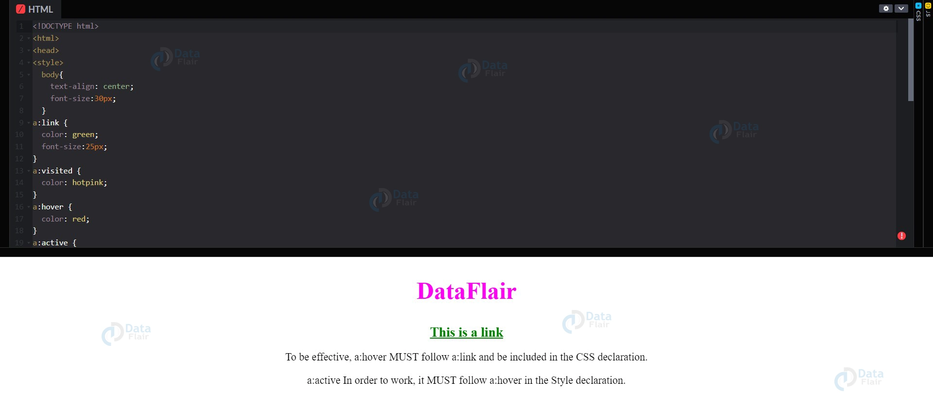
2. CSS Anchor Pseudo-classes
<!DOCTYPE html>
<html>
<head>
<style>
body{
text-align: center;
font-size:30px;
}
a:link {
color: green;
font-size:25px;
}
a:visited {
color: hotpink;
}
a:hover {
color: red;
}
a:active {
color: blue;
}
p{
font-size:20px;
}
</style>
</head>
<body>
<h2 style="color:rgb(255,0,242)">DataFlair</h2>
<p><b><a href="default.asp" target="_blank">This is a link</a></b></p>
<p>To be effective, a:hover MUST follow a:link and be included in the CSS declaration.</p>
<p>a:active In order to work, it MUST follow a:hover in the Style declaration.</p>
</body>
</html>
Output:
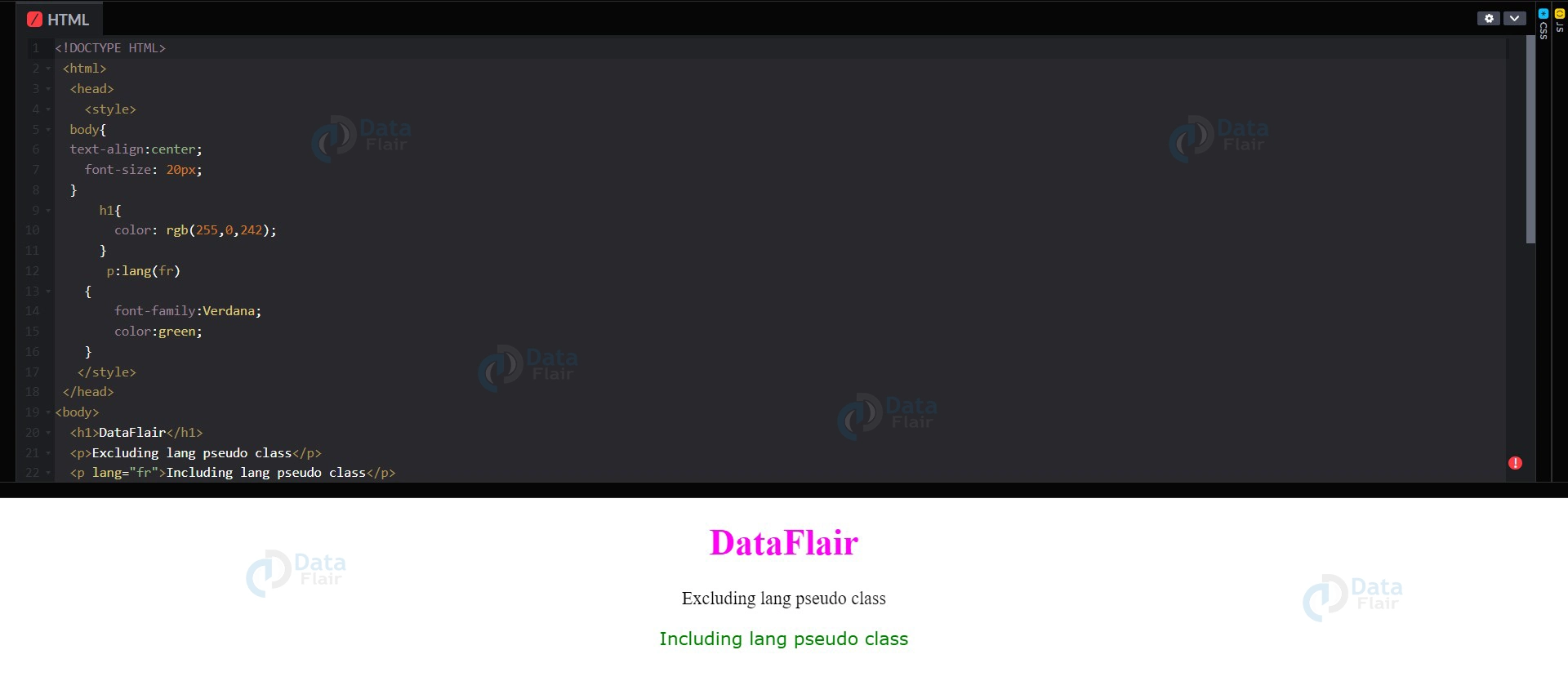
3. CSS lang pseudo classes
<!DOCTYPE HTML>
<html>
<head>
<style>
body{
text-align:center;
font-size: 20px;
}
h1{
color: rgb(255,0,242);
}
p:lang(fr)
{
font-family:Verdana;
color:green;
}
</style>
</head>
<body>
<h1>DataFlair</h1>
<p>Excluding lang pseudo class</p>
<p lang="fr">Including lang pseudo class</p>
</body>
</html>
Output:
4. CSS visited pseudo-class
The URLs that have already been viewed by the user are chosen using the visited pseudo-class. When a link is clicked in the example below, its colour changes.
<!DOCTYPE html>
<html>
<head>
<title>CSS transition-property property</title>
<style>
body{
text-align: center;
}
h1{
color: rgb(255,0,242);
font-size: 40px;
}
h2{
color: blue;
font-size: 30px;
}
a:visited{
color: green;
font-size:50px;
}
</style>
</head>

<body>
<h1>DataFlair</h1>
<h2>:visited Pseudo-class</h2>
<p>
<a href="https://www.geeksforgeeks.org/" target="_blank">
When you click this link, my color changes.
</a>
</p>
</body>
</html>
Output:

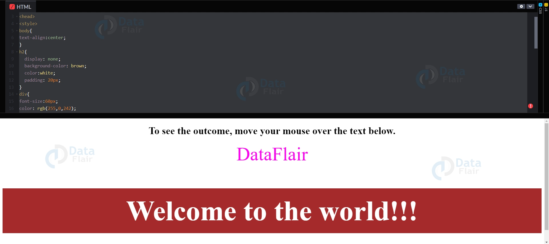
5. Merely a tooltip hover
As the user hovers the cursor over an element, a tooltip provides additional information about that element. Let’s use the “:hover” pseudo-class to build a tooltip.
<!DOCTYPE html>
<html>
<head>
<style>
body{
text-align:center;
}
h2{
display: none;
background-color: brown;
color:white;
padding: 20px;
}
div{
font-size:60px;
color: rgb(255,0,242);
}
div:hover h2 {
display: block;
}
</style>
</head>
<body>
<h1>To see the outcome, move your mouse over the text below.</h1>
<div>DataFlair
<h2>Welcome to the world!!!</h2>
</div>
</body>
</html>
Output:
6. CSS active pseudo-class
With the active pseudo-class, you can choose an element that becomes active whenever the visitors click on it. The sample that follows shows how the box’s background colour briefly changes when users tap on it.
<!DOCTYPE html>
<html>
<head>
<title>CSS transition-property property</title>
<style>
.box{
background-color: yellow;
width: 300px;
height: 200px;
margin: auto;
font-size: 40px;
text-align: center;
}
.box:active{
background-color: orange;
}
h1{
color: rgb(255,0,242);
text-align: center;
font-size: 50px;
}
h2{
color: blue;
text-align: center;
font-size: 30px;
}
</style>
</head>
<body>
<h1>DataFlair</h1>
<h2>:active Pseudo-class</h2>
<div class="box">
If you click me, I briefly change colour!
</div>
</body>
</html>
Output

7. CSS hover Pseudo class
When our cursor hovers over an element, this pseudo-class adds a particular effect to it. The illustration below shows how the box’s backdrop colour transforms from orange to yellow as your mouse reaches the box region.
<!DOCTYPE html>
<html>
<head>
<title>CSS transition-property property</title>
<style>
.box{
background-color: orange;
width: 300px;
height: 200px;
margin: auto;
font-size: 40px;
text-align: center;
}
.box:hover{
background-color: yellow;
}
h1{
color: rgb(255,0,242);
text-align: center;
font-size: 40px;
}
h2{
color: blue;
text-align: center;
font-size: 30px;
}
</style>
</head>
<body>
<h1>DataFlair</h1>
<h2>:hover Pseudo-class</h2>
<div class="box">
If you hover over me, my colour will change!
</div>
</body>
</html>
Output:

Also pseudo-classes allow the selector to select elements depending on their state with the help of ‘pseudo-classes’ which do not require the use of more JavaScript thus keeping the code simple and effective. In the future web development, CSS pseudo-classes will also continue to be a valuable tool in creating user-friendly websites.
Summary
This was all about CSS pseudo-classes and its types with examples.
Did you know we work 24x7 to provide you best tutorials
Please encourage us - write a review on Google


Good