CSS Positioning with Examples
Full Stack Web Development Courses with Real-time projects Start Now!!
CSS position is an essential property to control the layout and positioning of elements on your webpage. With CSS position, you have four different values that you can assign to an element: static, relative, absolute, and fixed.
Types of different position values
There are five different types of position values in CSS:
1. Static Positioning in CSS:
This is the default value for the position property. Elements with a static position are positioned according to the normal document flow and cannot be moved with the top, right, bottom, or left properties. This means that the element will follow the layout of its parent container and will not be affected by other elements on the page.
/* Apply static positioning to all <p> elements */
p {
  position: static;
}
2. Relative Positioning in CSS:
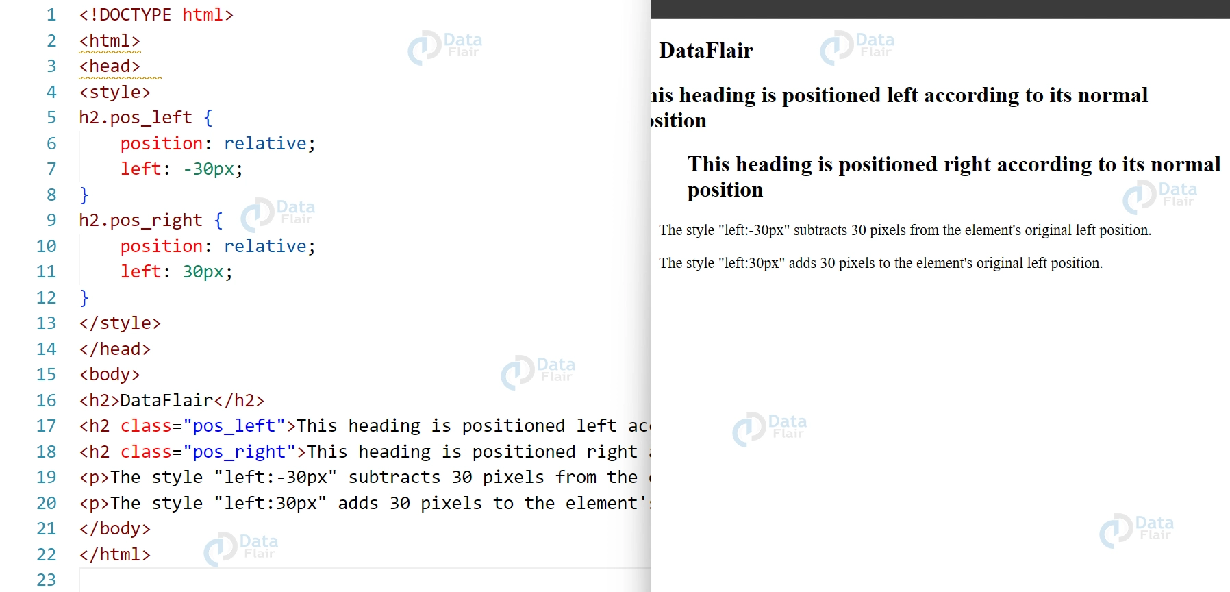
Elements with a relative position are positioned relative to their normal position in the document flow. You can use the top, right, bottom, or left properties to move a relatively positioned element away from its original position.
<!DOCTYPE html>
<html>
<head>
<style>
h2.pos_left{
    position: relative;
    left: -30px;
}
h2.pos_right{
    position: relative;
    left: 30px;
}
</style>
</head>
<body>
<h2>DataFlair</h2>
<h2 class="pos_left">This heading is positioned left according to its normal position
<h2 class="pos_right">This heading is positioned right according to its normal position
<p>The style "left: -30px"subtracts 30 pixels from the element's original left position.</p>
<p>The style "left: 30px" adds 30 pixels to the element's original left position.</p>
</body>
</html>
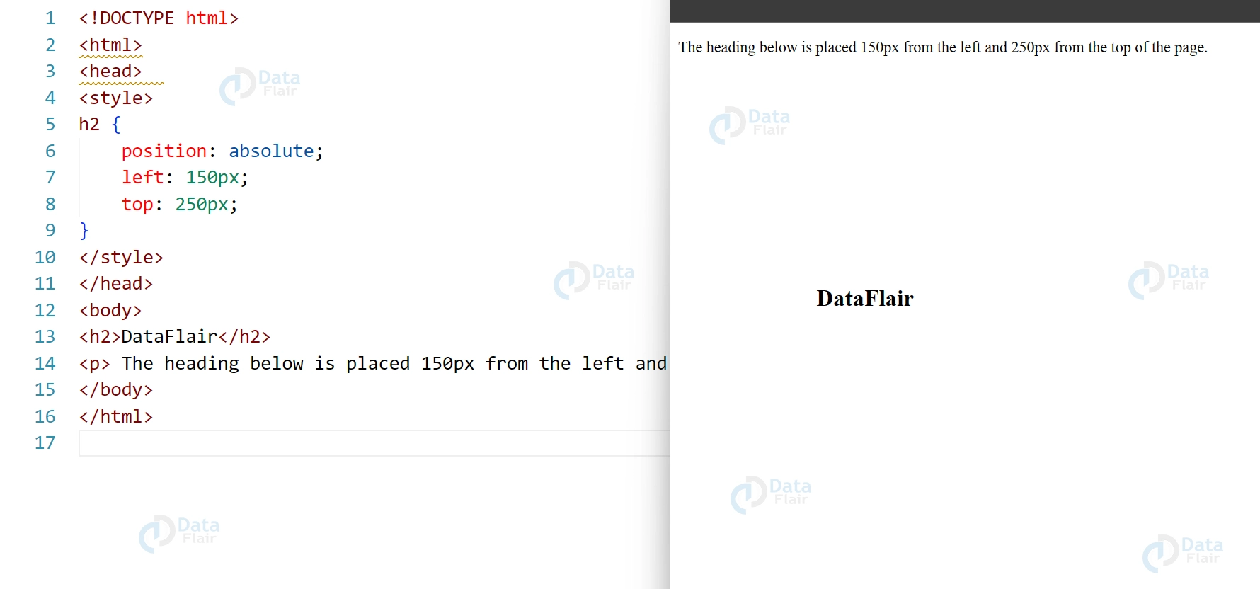
3. CSS Absolute Positioning:
Elements with an absolute position are positioned relative to their nearest positioned ancestor. If there is no positioned ancestor, the element is positioned relative to the initial containing block, which is usually the <html> element. Absolute positioning removes the element from the normal document flow, so it does not affect the layout of other elements.
<!DOCTYPE html>
<html>
<head>
<style>
h2 {
    position: absolute;
    left: 150px;
    top: 250px;
}
</style>
</head>
<body>
<h2>DataFlair</h2>
<p> The heading below is placed 150px from the left and 250px from the top of the page.</p>
</body>
</html>
4. CSS Fixed Positioning:
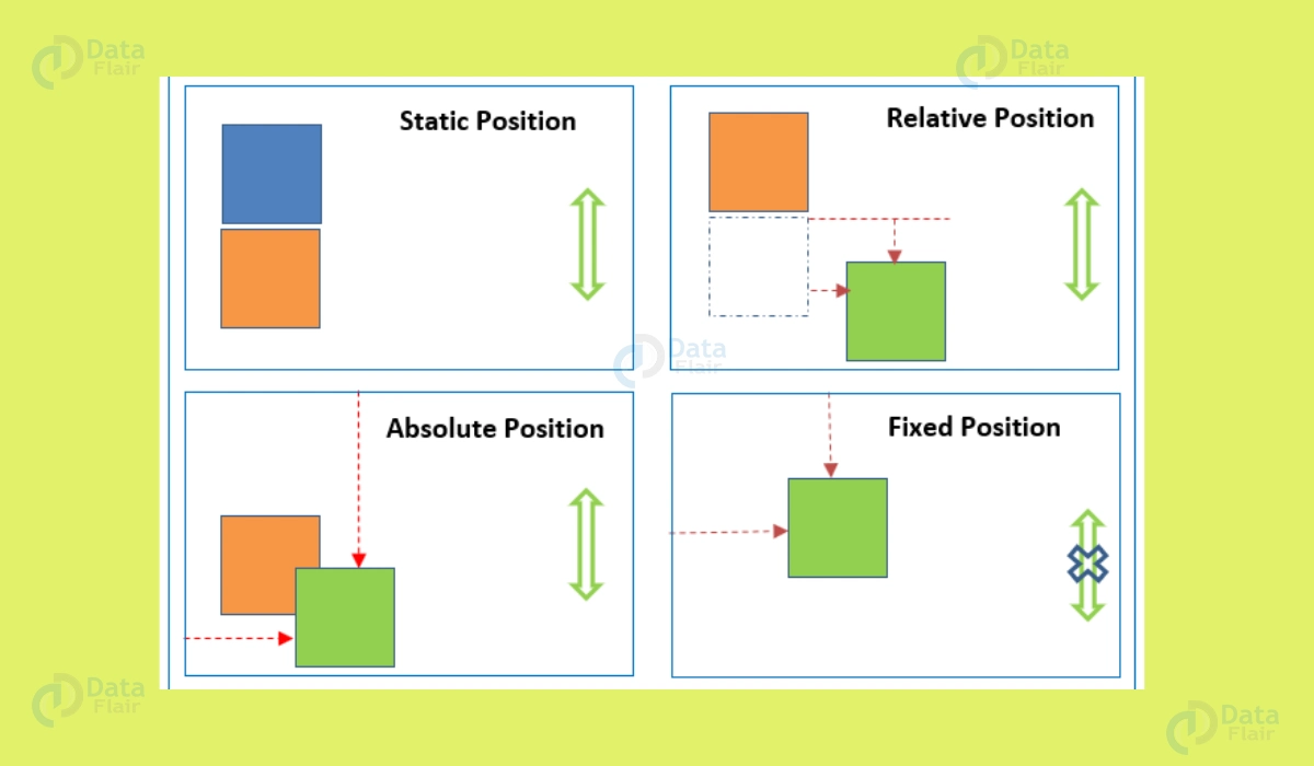
Elements with a fixed position are positioned relative to the viewport, which means they stay in the same position even if the page is scrolled. Fixed positioning also removes the element from the normal document flow. This can be particularly useful for elements like headers or navigation bars that need to remain visible at all times, regardless of scrolling.
It’s also essential to use the z-index property when using the position property. Elements can be stacked in any order you want. A higher z-index value will result in elements being positioned on top of elements with a lower z-index value, and vice versa.
Additionally, fixed positioning is great for creating floating action buttons or notifications that should stay in place while users interact with the content of a page.
Furthermore, CSS provides several layout methods for controlling the position and size of elements, such as flexbox, grid, and multi-column layout. Flexbox allows you to position and size elements according to the available space within a container. Grid, however, allows you to position and size elements within a grid of rows and columns. The multi-column layout enables you to position and size elements within multiple columns.
5. CSS Sticky Positioning
Sticky positioning is a CSS position property value that allows an element to be positioned relative to its nearest scrolling ancestor, but only when the element would otherwise be out of view. This means that the element will remain in its original position until the user scrolls the page to the point where the element is about to disappear, at which point it will become “stuck” in place, remaining visible as the user continues to scroll.
Sticky positioning is a CSS position property value that allows an element to be positioned relative to its nearest scrolling ancestor, but only when the element would otherwise be out of view. This means that the element will remain in its original position until the user scrolls the page to the point where the element is about to disappear, at which point it will become “stuck” in place, remaining visible as the user continues to scroll.
Here’s an example of how you could use sticky positioning to create a sticky navigation menu:
<nav style="position: sticky; top: 0;">
  <ul>
    <li><a href="#">Home</a></li>
    <li><a href="#">About</a></li>
    <li><a href="#">Services</a></li>
    <li><a href="#">Contact</a></li>
  </ul>
</nav>
In this example, the <nav> element is set to have a sticky position at the top of the viewport (top: 0;), so it will remain at the top of the screen as the user scrolls down the page. The navigation menu will only become “stuck” in place when the user scrolls past the initial position of the <nav> element.
Sticky positioning is particularly useful for elements that need to remain accessible while scrolling, such as headers or sidebars.
One important thing to note about sticky positioning is that it only works within a scrolling container, such as a <div> with a `overflow: scroll
CSS Positioning properties
Positioning properties in CSS, such as top, bottom, left, right, and clip, allow you to precisely position and control the layout of HTML elements on a web page. These properties work in conjunction with the position property, which sets the positioning context for the element. The top, bottom, left, and right properties specify the distance between the edges of the positioned element and the corresponding edges of its containing block.
The clip property can be used to clip an element so that only a portion of it is visible within its containing block. By using these positioning properties, you can create complex layouts and achieve pixel-perfect design on your web page. However, it’s important to use them judiciously and avoid overlapping elements or causing unintended effects on the layout of your page.
Conclusion
The CSS position property gives you considerable control over how elements are laid out and placed on your website. To an element, you can give it many values, including static, relative, absolute, and fixed. The element’s distance from its starting position can be specified using the top, right, bottom, and left properties.
Additionally, the z-index property allows you to specify the stacking order of elements. CSS provides several layout methods such as flexbox, grid, and multi-column layout for controlling the position and size of elements. With the CSS position, you have the power to create visually appealing and organized webpages that enhance the user experience.
Did you like our efforts? If Yes, please give DataFlair 5 Stars on Google
