Best Guide to CSS Gradients
Full Stack Web Development Courses with Real-time projects Start Now!!
CSS gradients are a powerful tool for web designers and developers that allow for the creation of smooth transitions between two or more colors on a web page. With CSS gradients, you can add a subtle touch of elegance and style to your website, without the need for images or other design elements. Whether you’re looking to create a gradient background, text with a gradient effect, or other gradient-based designs, CSS provides a variety of options to help you achieve the look you want. In this blog, we’ll look at how to use CSS gradients, the various types of gradients available, and some creative ways to incorporate them into your website designs.
Properties of CSS Gradient
CSS gradient properties include:
1. background-image – This property is used to specify the gradient as the background image.
2. background-repeat – This property is used to specify if the gradient should repeat or not. The default value is “repeat”.
3. background-size – This property is used to specify the size of the gradient. The default value is “auto”.
4. background-position – This property is used to specify the position of the gradient. The default value is “0% 0%”.
5. background-clip – This property is used to specify the background painting area. The default value is “border-box”.
6. background-origin – This property is used to specify the background positioning area. The default value is “padding-box”.
Examples showing the use of CSS Gradient
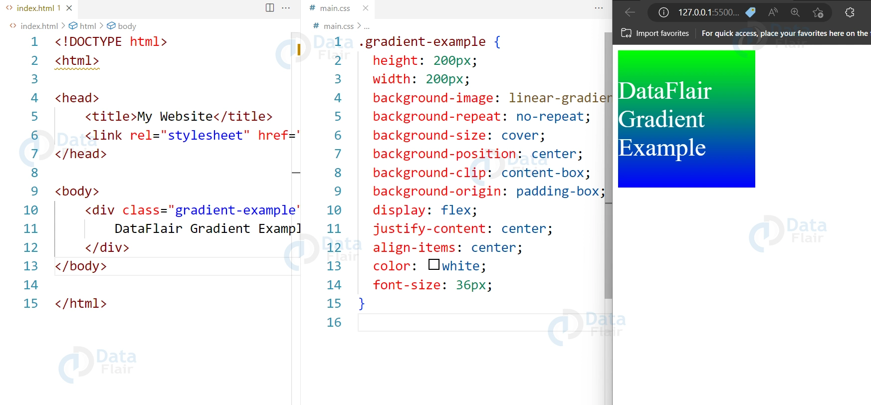
1. Linear Gradient
Here’s an example of a linear gradient from top to bottom, with additional properties specified:
HTML:
<div class="gradient-example">
  DataFlair Gradient Example
</div>
CSS:
.gradient-example {
  height: 200px;
  width: 200px;
  background-image: linear-gradient(to bottom, #00FF00, #0000FF);
  background-repeat: no-repeat;
  background-size: cover;
  background-position: center;
  background-clip: content-box;
  background-origin: padding-box;
  display: flex;
  justify-content: center;
  align-items: center;
  color: white;
  font-size: 36px;
}
Output:
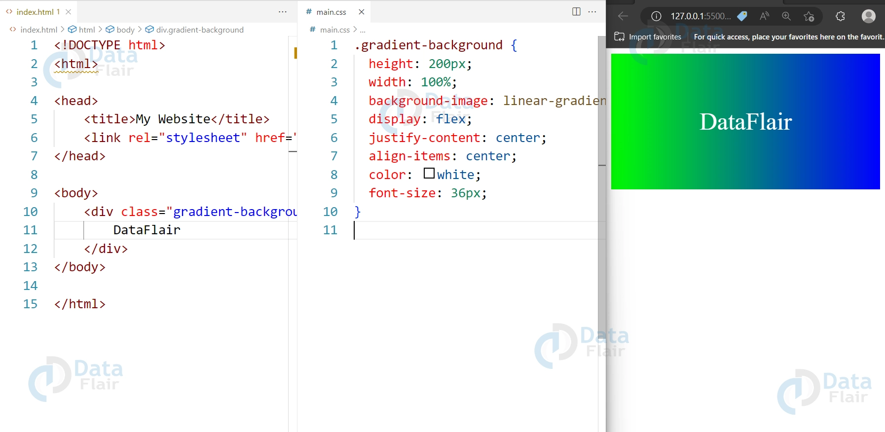
2. Gradient Background
Here’s an example of a Gradient Background:
HTML:
<div class="gradient-background">
  DataFlair
</div>
CSS:
.gradient-background {
  height: 200px;
  width: 100%;
  background-image: linear-gradient(to right, #00FF00, #0000FF);
  display: flex;
  justify-content: center;
  align-items: center;
  color: white;
  font-size: 36px;
}
Output:
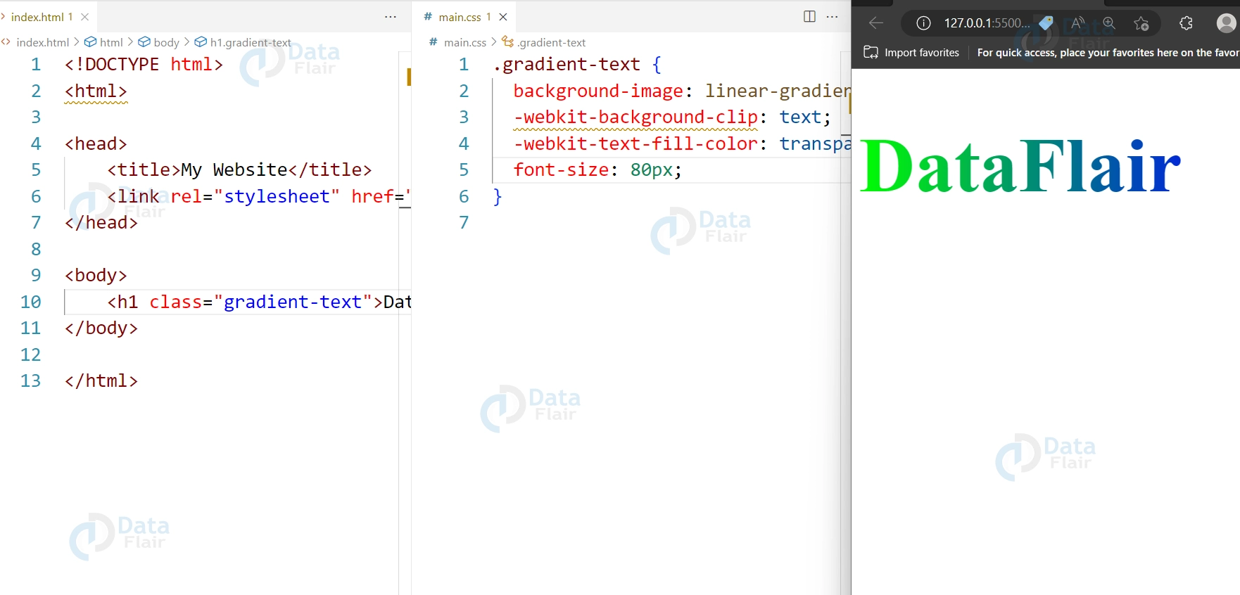
3. Gradient Text
Here’s an example of a Gradient Text:
HTML:
<h1 class="gradient-text">DataFlair</h1>
CSS:
.gradient-text {
  background-image: linear-gradient(to right, #00FF00, #0000FF);
  -webkit-background-clip: text;
  -webkit-text-fill-color: transparent;
  font-size: 80px;
}
Output:
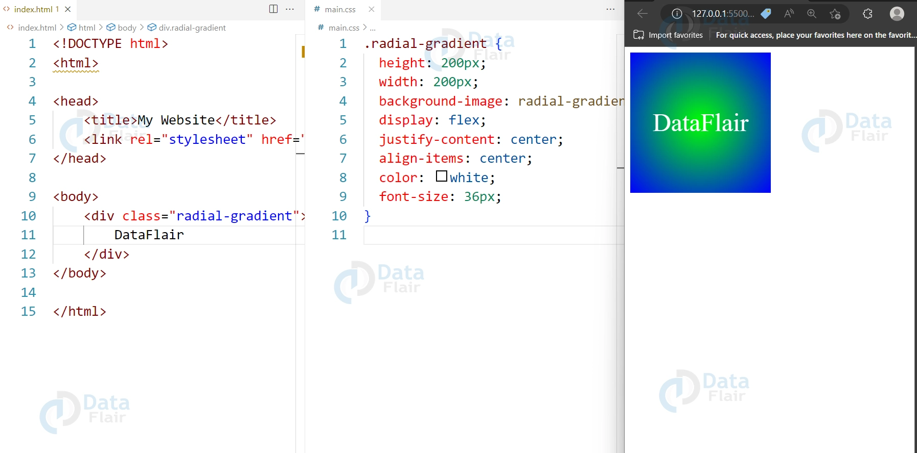
4. Radial Gradient
Here’s an example of a Radial Gradient:
HTML:
<div class="radial-gradient">
  DataFlair
</div>
CSS:
.radial-gradient {
  height: 200px;
  width: 200px;
  background-image: radial-gradient(circle, #00FF00, #0000FF);
  display: flex;
  justify-content: center;
  align-items: center;
  color: white;
  font-size: 36px;
}
Output:
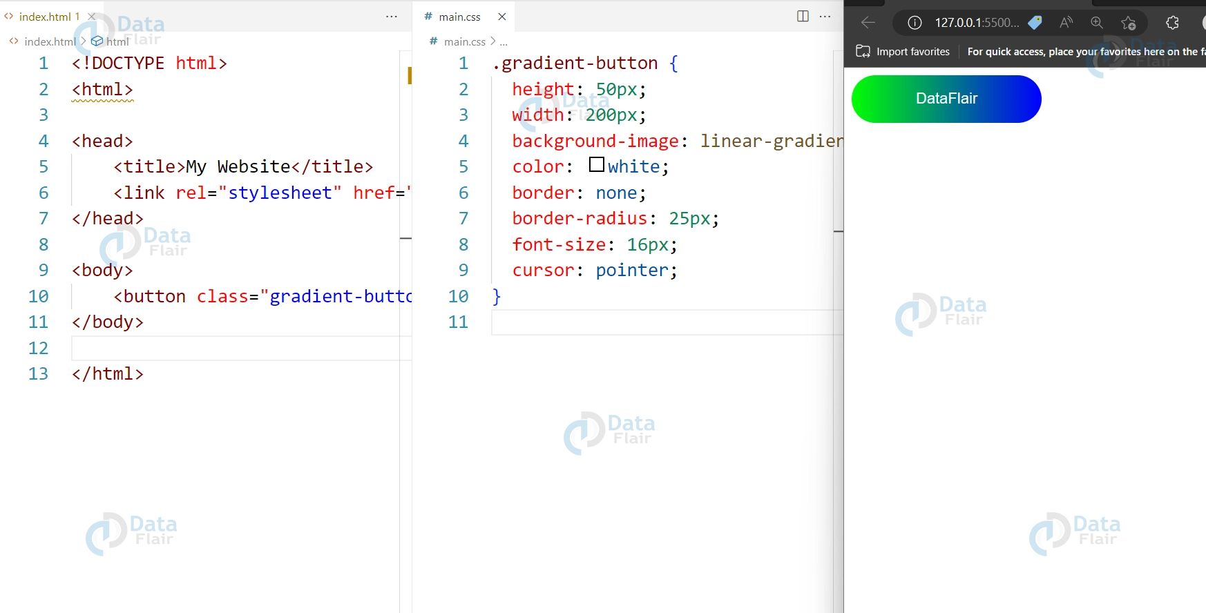
5. Radial Gradient Button
Here’s an example of a Radial Gradient:
HTML:
<button class="gradient-button">DataFlair</button>
CSS:
.gradient-button {
  height: 50px;
  width: 200px;
  background-image: linear-gradient(to right, #00FF00, #0000FF);
  color: white;
  border: none;
  border-radius: 25px;
  font-size: 16px;
  cursor: pointer;
}
Output:
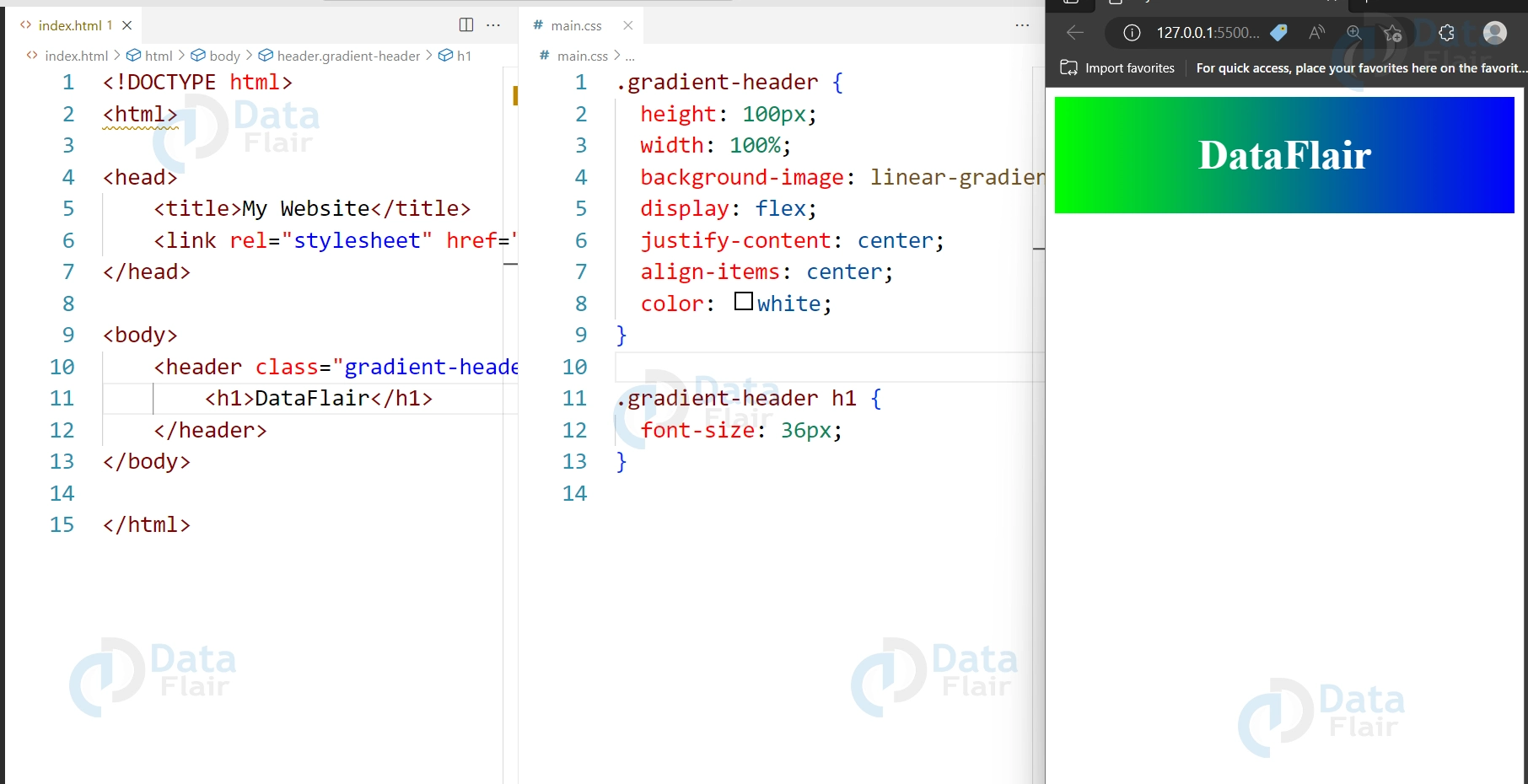
6. CSS Gradient Headers
Here’s an example of Gradient Headers:
HTML:
<header class="gradient-header">
  <h1>DataFlair</h1>
</header>
CSS:
.gradient-header {
  height: 100px;
  width: 100%;
  background-image: linear-gradient(to right, #00FF00, #0000FF);
  display: flex;
  justify-content: center;
  align-items: center;
  color: white;
}

.gradient-header h1 {
  font-size: 36px;
}
Output:
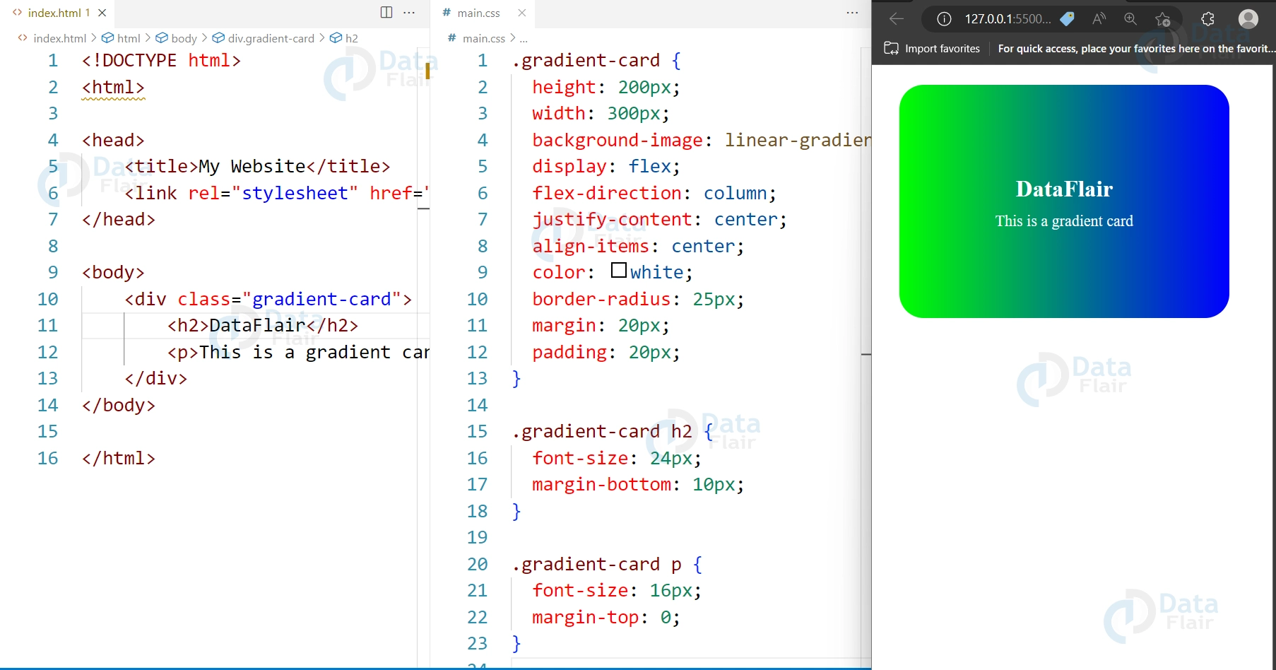
7. CSS Gradient Cards
Here’s an example of Gradient Cards:
HTML:
<div class="gradient-card">
  <h2>DataFlair</h2>
  <p>This is a gradient card</p>
</div>
CSS:
.gradient-card {
  height: 200px;
  width: 300px;
  background-image: linear-gradient(to right, #00FF00, #0000FF);
  display: flex;
  flex-direction: column;
  justify-content: center;
  align-items: center;
  color: white;
  border-radius: 25px;
  margin: 20px;
  padding: 20px;
}

.gradient-card h2 {
  font-size: 24px;
  margin-bottom: 10px;
}

.gradient-card p {
  font-size: 16px;
  margin-top: 0;
}
Output:
These examples demonstrate how CSS gradients can be used to add color and visual interest to various elements on a web page. By applying gradients, you can make your site look just as professional and designed as a site that has 3d effects, bringing depth to the layout.
Gradients in the CSS also provide for a number of different designs with ease. Such effects as color stops, angles as well as the varieties of gradations that are normally available for manipulation by the designer can be employed to offer more effects that support the general theme of the site. This makes it easy to do variations with different gradient styles in order to get the kind of touch that is most desirable.
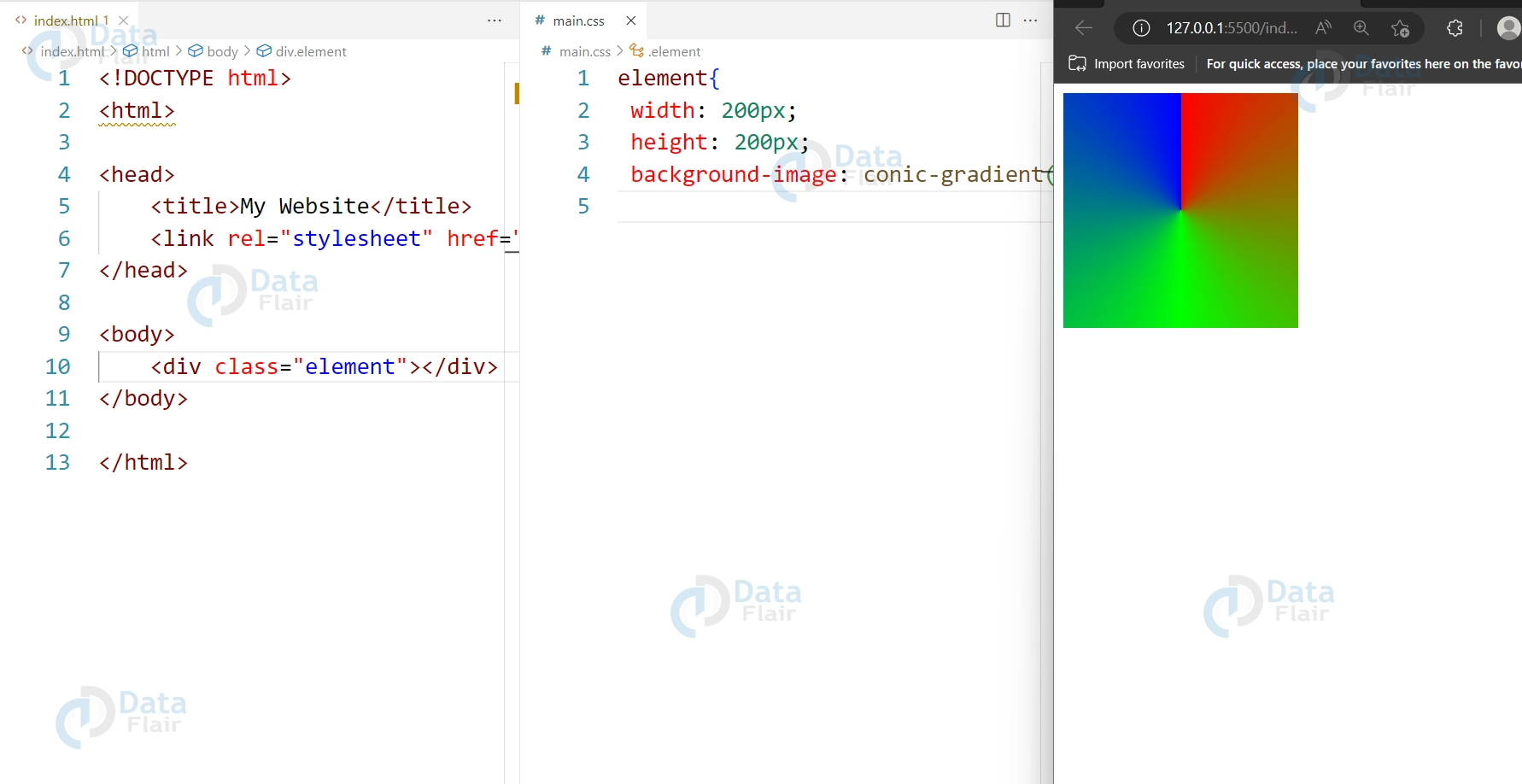
Conical Gradient Property
Conical gradients are a type of gradient in which the colors are arranged in a circular pattern around a center point, creating a cone-shaped gradient effect. This gradient property is not as widely used as linear and radial gradients, but it can be useful for creating unique and eye-catching designs.
To create a conical gradient, you can use the conic-gradient() function in the background-image property, which takes one or more color stops as arguments. You can also specify the starting angle of the gradient using the from keyword or a degree value, and the ending angle using the to keyword or a degree value.
Here’s an example code for creating a simple conical gradient:
HTML
<!DOCTYPE html>
<html>


<head>
    <title>My Website</title>
    <link rel="stylesheet" href="main.css">
</head>


<body>
    <div class="element"></div>
</body>


</html>
CSS
.element{
  width: 200px;
  height: 200px;
  background-image: conic-gradient(#FF0000, #00FF00, #0000FF);
}
CSS Linear Gradient
A linear gradient is a gradient that goes in a straight line from one color to another. To create a linear gradient, you can set the background-image property to the linear-gradient() function, which takes one or more color stops as arguments. You can also specify the direction of the gradient using the to keyword or by specifying an angle.
CSS Radial Gradient
A radial gradient is a gradient that radiates out from a center point. To create a radial gradient, you can set the background-image property to the radial-gradient() function, which takes one or more color stops as arguments. You can also specify the shape and size of the gradient using keywords such as circle, ellipse, closest-side, farthest-corner, or by specifying a length or percentage value.
Both linear and radial gradients allow you to create complex color transitions and are commonly useful in web design to create backgrounds, buttons, and other decorative elements.
Conclusion
We can conclude by saying that CSS gradients offer a versatile and easy-to-implement way to add color and visual interest to a website. With the ability to create linear, radial, and repeating gradients, as well as control the direction, angle, and color stop, CSS gradients offer a wide range of possibilities for website design.
Whether used as a background, text, or on specific elements like buttons or cards, CSS gradients can help enhance the overall look and feel of a website. As with any design element, it’s important to use gradients judiciously and in moderation to create a harmonious and visually appealing design. Overall, CSS gradients are a valuable tool for web designers and developers looking to add a touch of color and excitement to their websites.
Did we exceed your expectations?
If Yes, share your valuable feedback on Google
