Mastering CSS Float Property
Full Stack Web Development Courses with Real-time projects Start Now!!
CSS float is a property used to position elements in a webpage. By default, elements in HTML are displayed in a static, block-level format, meaning they stack vertically one on top of the other. The float property, however, allows elements to be positioned horizontally, either to the left or right of the containing element.The most common use for the float property is for image alignment.
Properties of CSS Float
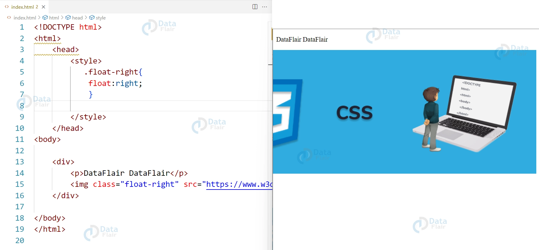
1. Image alignment:
The float property can be used to align images to the left or right of a block of text. This is done by applying the float property to the image element and setting its value to “left” or “right”.
HTML
<div>
    <p>DataFlair DataFlair</p>
    <img class="float-right" src="https://www.w3docs.com/uploads/media/default/0001/05/6d07a36ebe6d55273b39440f2391f1d7e6d4092a.png" alt="Exampl Image">
</div>
CSS
.float-right{
    float:right;
}
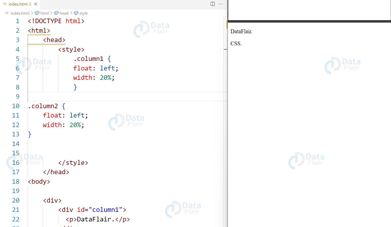
2. Column layout:
The float property can be used to create multiple columns in a webpage by applying the float property to multiple elements, such as divs, and setting their values to “left” or “right”.
HTML
<div>
  <div id="column1">
    <p>DataFlair.</p>
  </div>
  <div id="column2">
    <p>CSS.</p>
  </div>
</div>
CSS
.column1 {
    float: left;
    width: 20%;
}

.column2 {
    float: left;
    width: 20%;
}
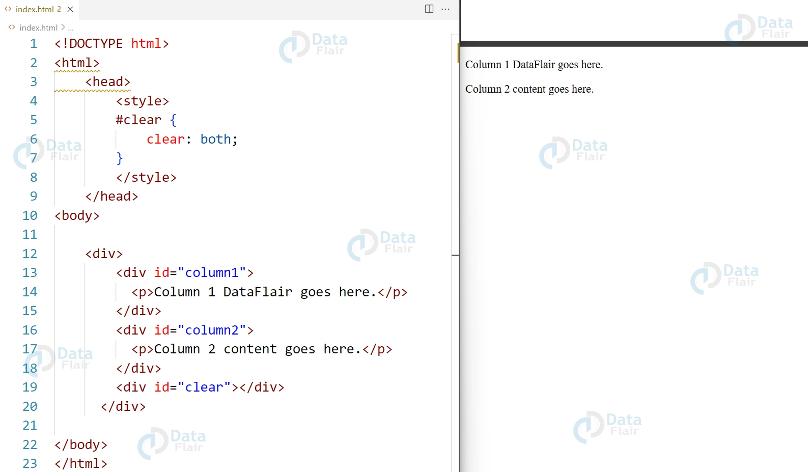
3. Clear property:
The clear property can be used to prevent elements from overlapping when using the float property. The clear property can take values like left, right or both. Generally the clear property is set to “both” on an element that comes after the floated elements.
HTML
<div>
  <div id="column1">
    <p>Column 1 DataFlair goes here.</p>
  </div>
  <div id="column2">
    <p>Column 2 content goes here.</p>
  </div>
  <div id="clear"></div>
</div>
CSS
#clear {
    clear: both;
}
4. Float property can be used to make the element(s) to float around the other elements, which is useful when we want to place an element in the center of the page or at a specific location.
HTML
<div>
  <div id="center">
    <p>Content to be centered goes here.</p>
  </div>
</div>
CSS
#center {
    float: none;
    margin: 0 auto;
    width: 50%;
}

5. Float property also helps in creating the grid layout, which is one of the most important aspect in modern web design, by applying float property to multiple elements in a container we can create a grid layout.
HTML
<div class="grid-container">
  <div id="grid-item1">
    <p>Grid item 1</p>
  </div>
  <div id="grid-item2">
    <p>Grid item 2</p>
  </div>
  <div id="grid-item3">
    <p>Grid item 3</p>
  </div>
  <div id="grid-item4">
    <p>Grid item 4</p>
  </div>
</div>
CSS
#grid-item1, #grid-item2, #grid-item3, #grid-item4 {
    float: left;
    width: 20%;
    height: 100px;
}
#IMAGE#
Float property is one of the most useful properties in layout design; nevertheless, it has weaknesses if you are unaware of them. For example, floated elements are taken out from the regular document stream which at times creates layout problems. To overcome these issues, developers make use of clearfix methods or, turn to the new layout features like Flexbox and Grid Layout.
Also, while the use of floats was at one time sufficient in achieving the kind of column layouts, today’s best practices include the use of CSS Grids and Flexbox. These methods offer better responsiveness and are more straightforward to implement compared to the complex control of layouts, which are the reasons why these forms are more famous in contemporary web designs.
Conclusion
In conclusion, we can say that the CSS float property is a powerful tool for positioning elements in a webpage, whether it’s aligning an image to the right of text or creating multiple columns in a layout. It’s important to use the clear property to prevent elements from overlapping. It also consider using more powerful layout methods such as Flexbox and Grid Layout.
Your 15 seconds will encourage us to work even harder
Please share your happy experience on Google
