CSS 3D Transforms
Full Stack Web Development Courses with Real-time projects Start Now!!
CSS 3D transforms allow web developers to add a new dimension to their designs, creating engaging and interactive 3D interfaces. CSS 3D transforms enable new visual effects by rotating, scaling, and translating elements in 3D space. This article explores the available 3D transformations and their implementation using HTML and CSS.
CSS 3D transforms offer a means by which one is able to develop and incorporate impressive effects to provide the impression of life to the web elements. These transforms empower the developers to build these experiences and envelopes that can engage users and make their web interfaces fascinating.
Moreover, 3D transforms are useful in enhancing the site’s appeal, especially through animated and other graphic-controlled types that would create depth within the site.
Types of 3D Transforms
There are three main types of 3D transforms available in CSS: rotate, translate, and scale. Each of these transforms works in a different way to create a 3D effect on an element.
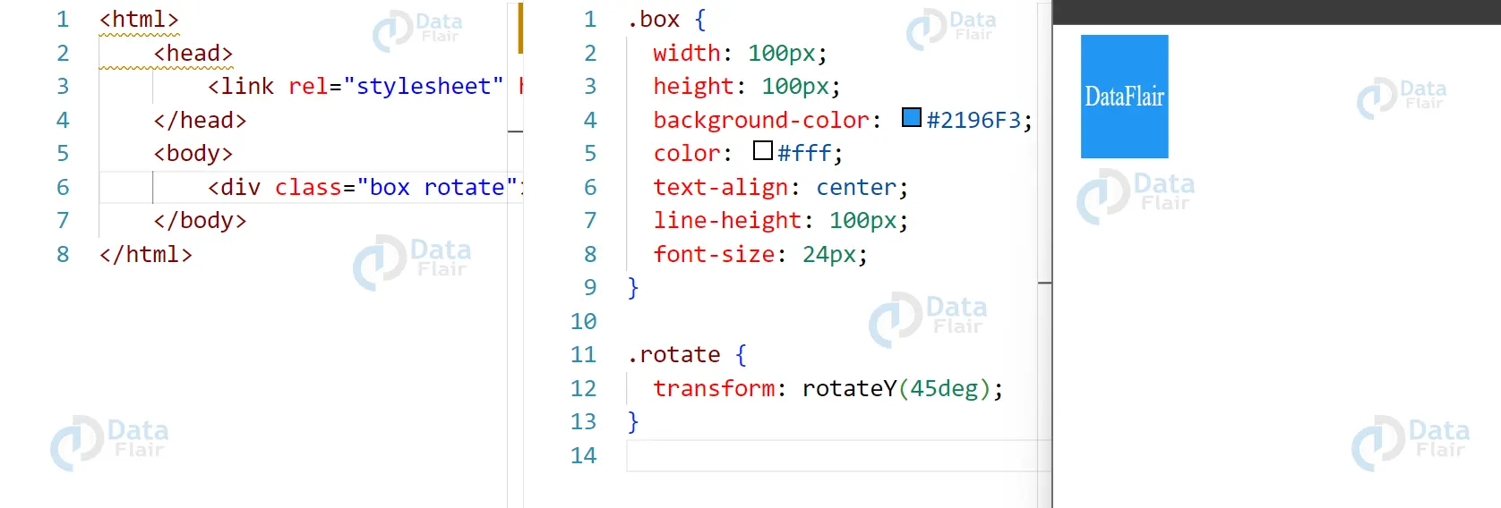
1. Rotate
The rotate transform allows you to rotate an element around an axis in 3D space. You can specify the angle of rotation as well as the axis that the element should rotate around.
HTML:
<div class="box rotate">Rotate</div>
CSS:
.box {
width: 100px;
height: 100px;
background-color: #2196F3;
color: #fff;
text-align: center;
line-height: 100px;
font-size: 24px;
}

.rotate {
transform: rotateY(45deg);
}
Output:
2. CSS Translate:
The translate transform allows you to move an element in 3D space. You can specify the amount that the element should be moved along each axis (X, Y, and Z).
HTML:
<div class="box translate">Translate</div>
CSS:
.translate {
transform: translateX(50px) translateY(50px) translateZ(50px);
}
Output:

3. CSS Scale
The scale transform allows you to change the size of an element in 3D space. You can specify the scaling factor along each axis (X, Y, and Z).
HTML:
<div class="box scale">Scale</div>
CSS:
.scale {
transform: scaleX(2) scaleY(2) scaleZ(2);
}
Output:

Features of CSS
CSS 3D transforms are a powerful way to create visually engaging interfaces and add depth to your web designs. Here are some of the key features of CSS 3D transforms, along with explanations and code examples:
1. Rotation:
CSS 3D transforms allow you to rotate an element in 3D space. You can specify the axis of rotation (x, y, or z) and the degree of rotation. Here is an example:
HTML:
<div class="box rotate-x">
This box is rotated on the X-axis.
</div>
CSS:
.box {
width: 200px;
height: 200px;
background-color: #2196F3;
color: #fff;
text-align: center;
line-height: 200px;
font-size: 24px;
transform-style: preserve-3d;
transition: transform 0.5s ease;
}

.rotate-x {
transform: rotateX(45deg);
}
Output:

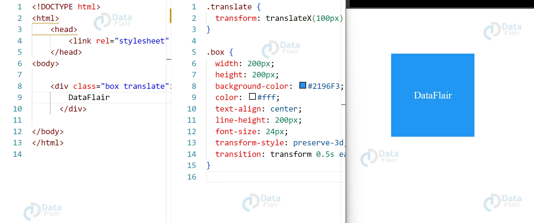
2. Translation
CSS 3D transforms also allow you to move an element in 3D space. You can specify the distance and direction of the movement using the translate() function. Here is an example:
HTML:
<div class="box translate">
This box is translated in 3D space.
</div>
CSS:
.box {
width: 200px;
height: 200px;
background-color: #2196F3;
color: #fff;
text-align: center;
line-height: 200px;
font-size: 24px;
transform-style: preserve-3d;
transition: transform 0.5s ease;
}.translate {
transform: translateX(100px) translateY(100px) translateZ(50px);
}
Output:
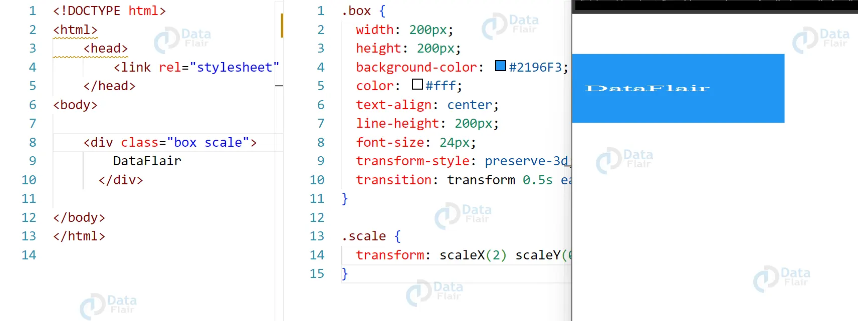
3. CSS Scaling
CSS 3D transforms also allow you to change the size of an element in 3D space. You can specify the amount of scaling using the scale() function. Here is an example:
HTML:
<div class="box scale">
This box is scaled in 3D space.
</div>
CSS:
.box {
width: 200px;
height: 200px;
background-color: #2196F3;
color: #fff;
text-align: center;
line-height: 200px;
font-size: 24px;
transform-style: preserve-3d;
transition: transform 0.5s ease;
}

.scale {
transform: scaleX(2) scaleY(0.5) scaleZ(0.5);
}
Output:
Rationale in CSS 3D
The rationale behind CSS 3D transforms is to provide web developers with the ability to create more engaging and interactive user experiences on their websites. By adding the ability to manipulate elements in 3D space, developers can create a wide range of visual effects that were previously difficult or impossible to achieve with traditional 2D transformations.
CSS 3D transforms also align with the trend toward more immersive and interactive web experiences. By creating a sense of depth and perspective, developers can make their websites feel more like physical spaces, drawing users in and making the experience more memorable and engaging.
Overall, the rationale behind CSS 3D transforms is to provide web developers with a more powerful and flexible toolset for creating engaging and immersive web experiences.
Conclusion
CSS 3D transforms allow web developers to create visually stunning and engaging interfaces by manipulating elements in 3D space. With rotate, translate, and scale transforms, it is possible to create a wide range of 3D effects that were not possible with traditional 2D transformations. By using the transform property and its various values, you can easily add 3D transforms to your HTML and CSS code. Give it a try and see how CSS 3D transforms can transform your web design game!
Your 15 seconds will encourage us to work even harder
Please share your happy experience on Google
