How to create Charts in Excel?
Expert-led Courses: Transform Your Career – Enroll Now
A pictorial representation is one that is easily visible, eye-catchy and easy to understand. Here in this tutorial, let’s discuss what is a chart and how it is being implemented and also the importance and types of charts that are commonly used for representation in Excel for a set of dataset.
Chart in Excel
A chart is a tool that is used in a spreadsheet to represent the data graphically. It is a visual representation of the data which is given in rows and columns.
Charts are basically used in analyzing the patterns and trends of the dataset. It visually gives a representation of the dataset, thereby easy for the audience to have a comparison and also find the increasing and decreasing trends. We can insert the desired chart according to one’s own wish and the dataset. Usually, a chart is basically a picture depicting large sets of data.
Importance of Charts in Excel
The importance of charts is that charts help us to visualize the dataset in a graphical manner and also helps to analyze the trends and patterns of the dataset. For making comparisons, these graphical or pictorial representations play a vital role, where comparison is made easier by just viewing the graph without making any further analysis.
Through charts, we can make many further interpretations of the dataset and it helps us to derive some conclusions from it.
Steps to insert a chart in Excel
Here are few steps which have to be carried out to insert Chart into MS Excel
Step 1: Open a New MS Excel worksheet and click on the “Insert” button from the menu bar.
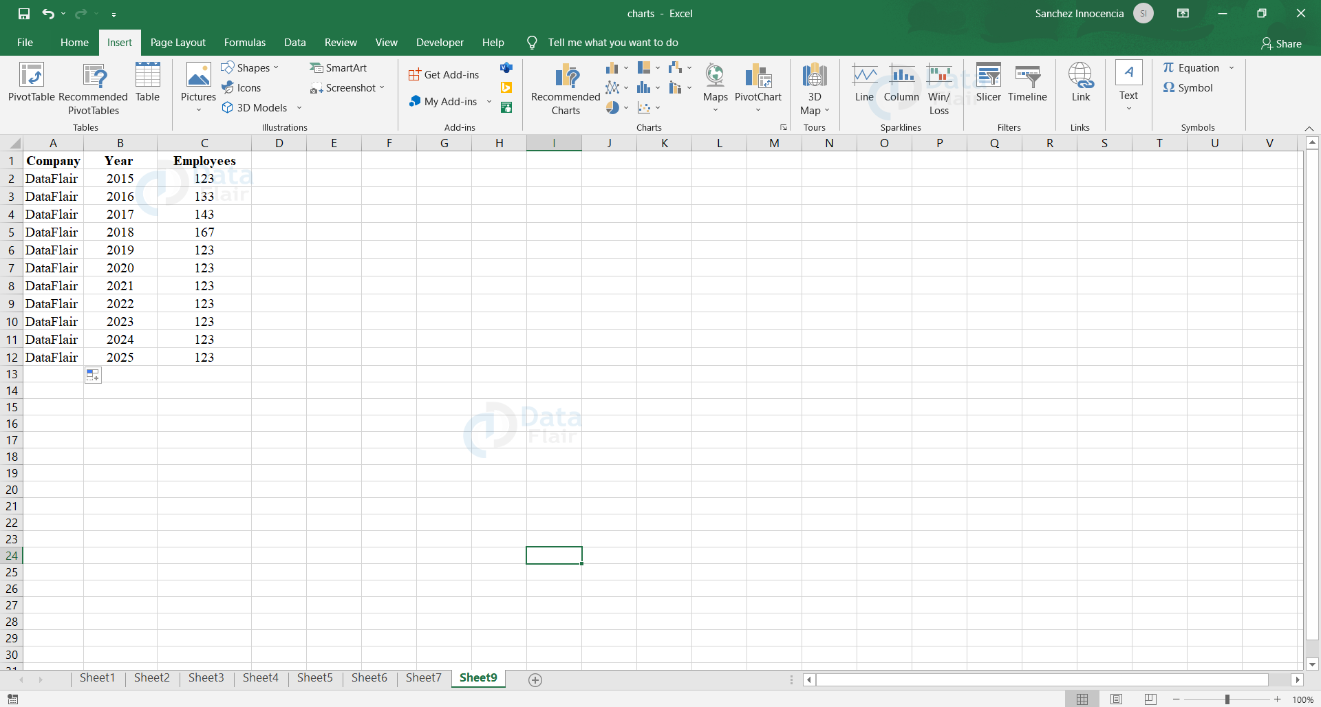
Step 2: From the Insert tab, go to the “Charts” option, there you would find different types of charts. You can choose the desired chart from it.
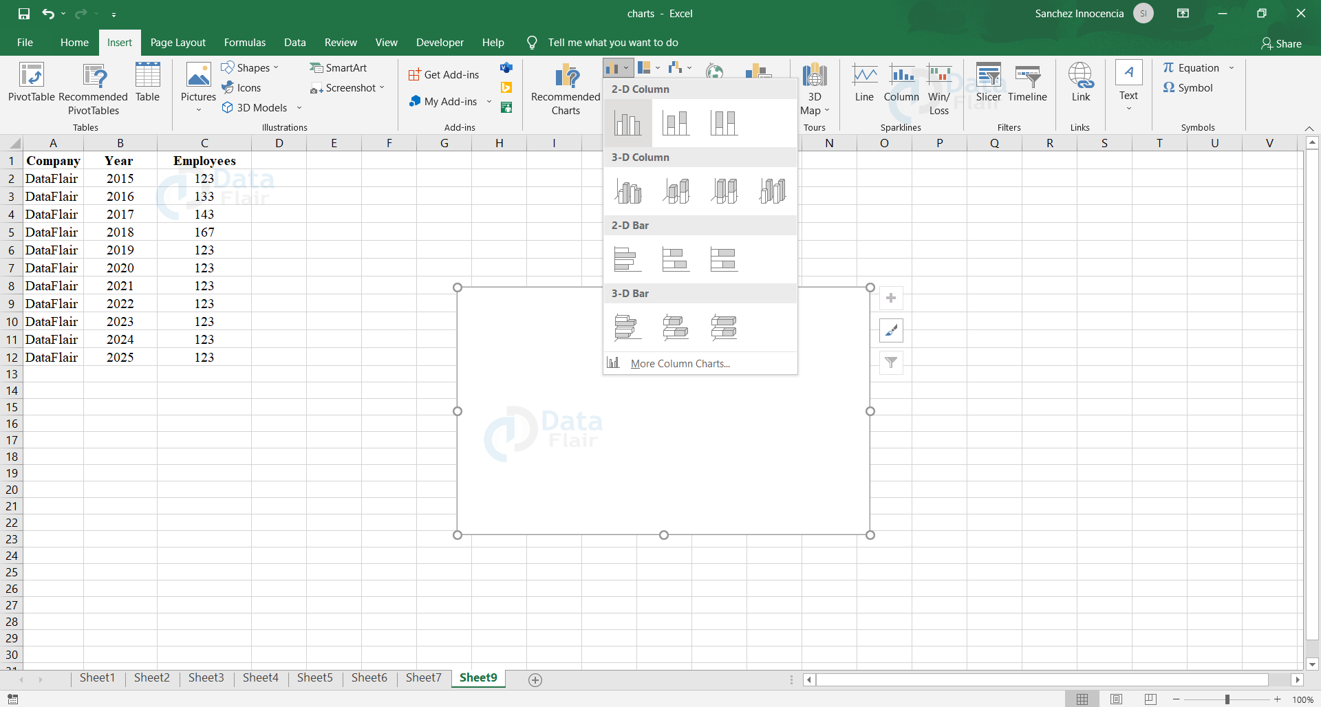
Step 3: Then we need to select the data for which the graph has to be plotted.
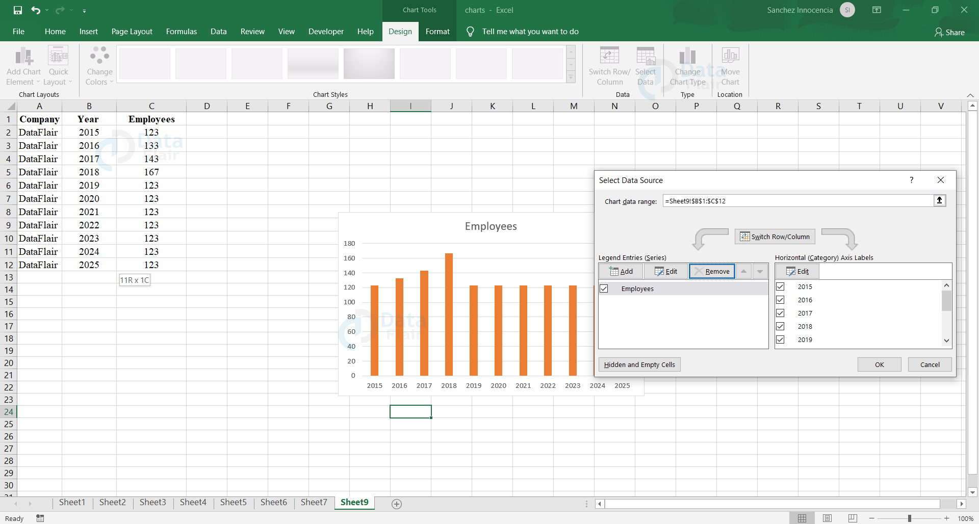
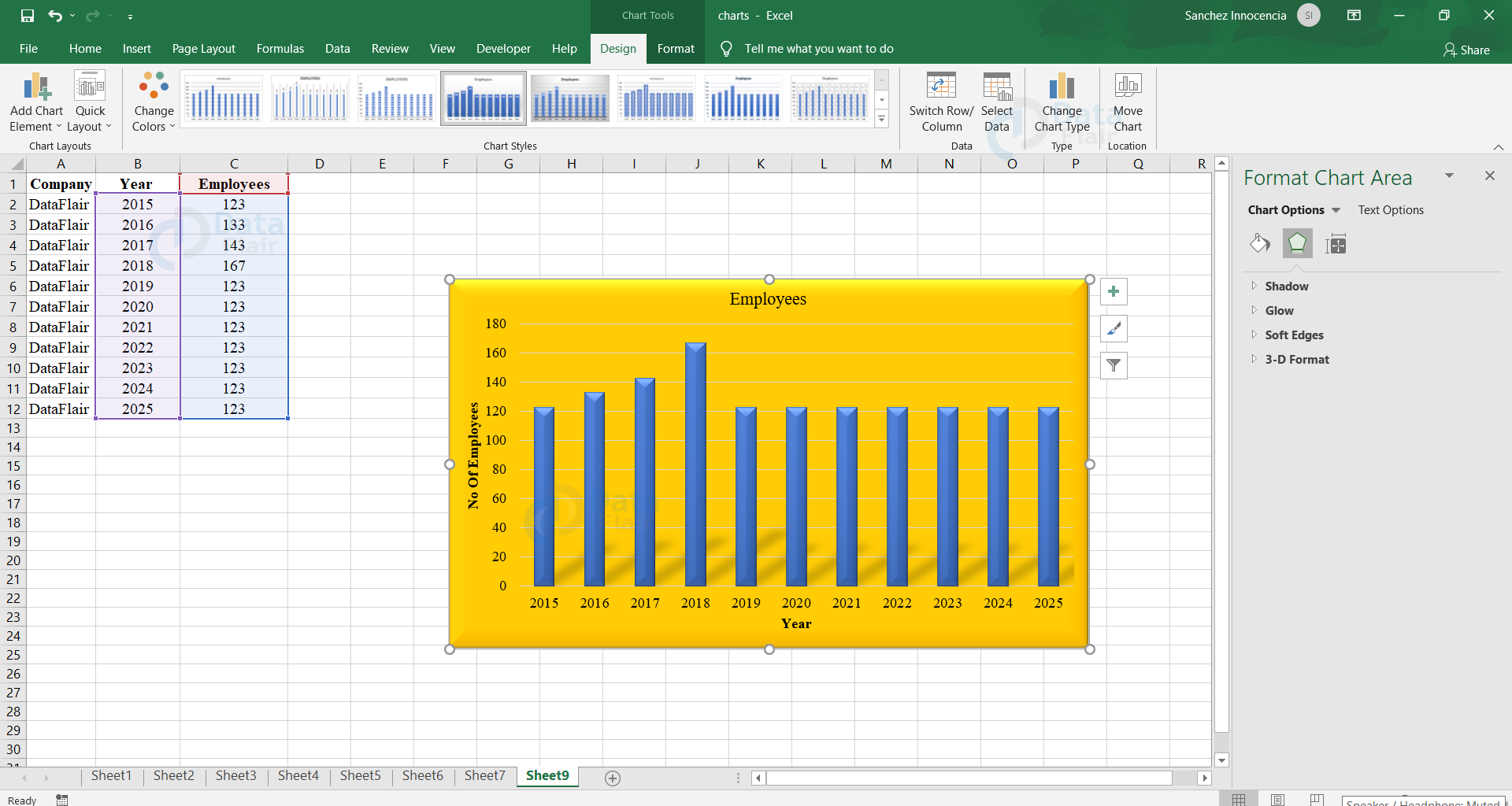
Step 4: The chart has been plotted and now we can change the format, the colour, font, design, etc of the chart from the “Format” option and make the chart according to one’s desired design. And we can also change the Effect to Glow etc to make the chart catchy.
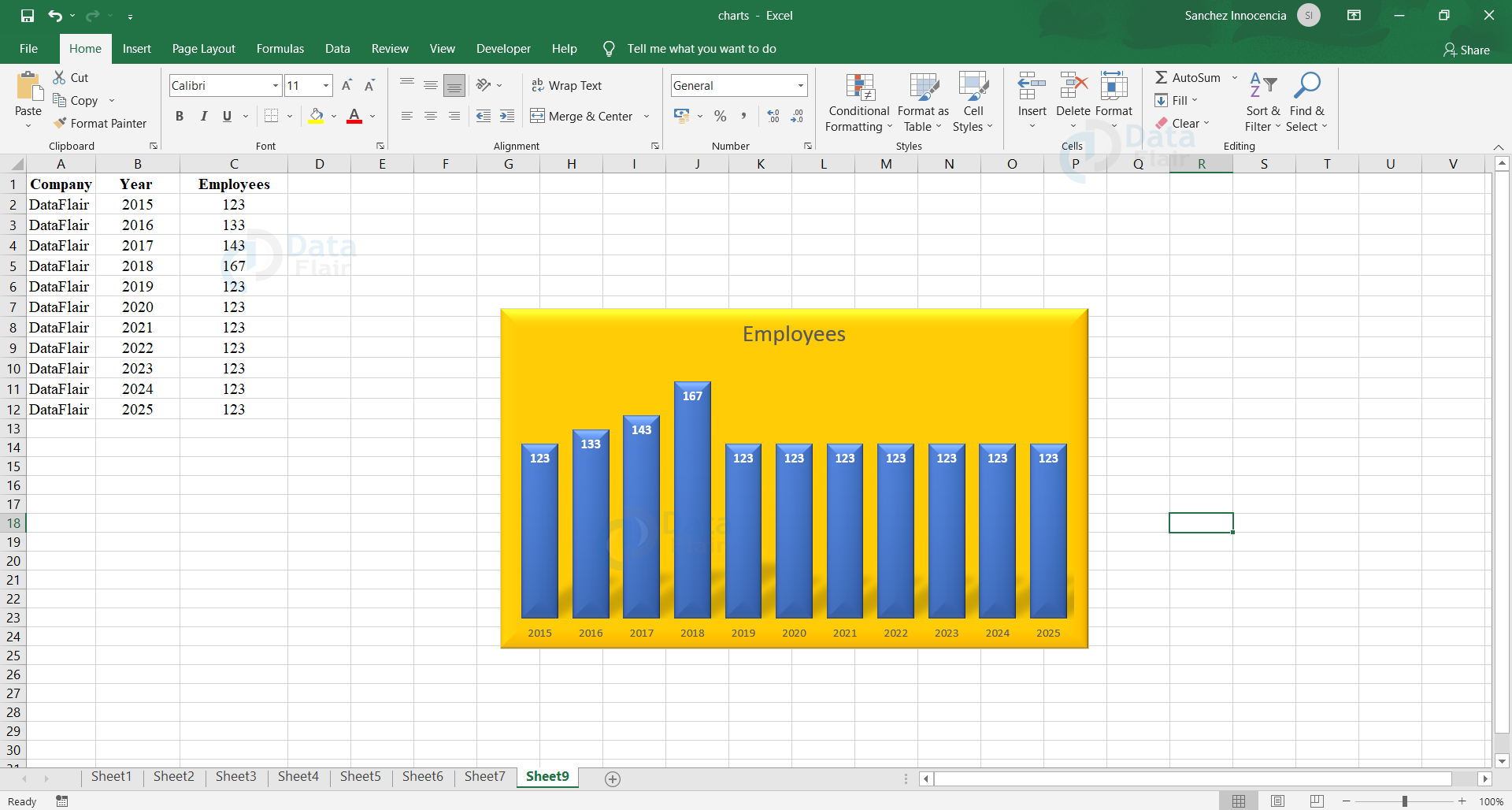
Step 5: Then, we add Data Labels, Titles, Axis Headings, Grid Lines etc to the Graph to make it more easily understandable using the Format Chart Area tab option.
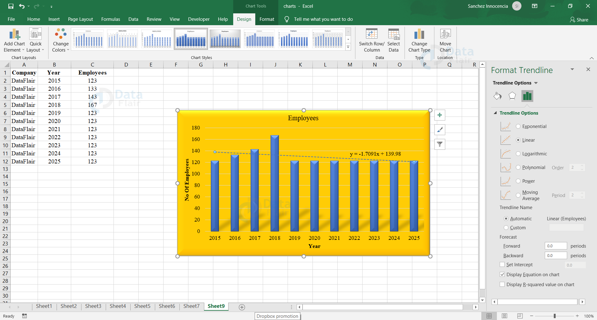
Step 6: The trend can also be predicted further using the option “Add Trendline” and can add the Trendline. One can choose the Trend to be Exponential, Linear, etc and can also add the equation of the line in the graph if required.
By following the above steps, a neat and a clear chart of your desire can be made to analyse the results.
Excel Charts Group
The user can find the Charts group under the insert tab.
The Charts group is formatted in a way that
- It helps the user find a chart suitable to the data with the Recommended Charts.
- The type of charts are visible.
- The similar and subgroups are together.
Chart Tools in Excel
When the user clicks on a chart, a new Chart Tools tab appears on the ribbon. There are two tabs under the new tab and they are Design and Format tabs.
Design Tab – This tab shows the user the different designs that are available for that particular graph.
Format Tab – This tab contains the styling options and shape filling etc to enhance the format and the appearance of the graph in the sheet.
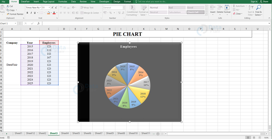
Creating Charts with Recommended Charts
The user can also use the recommended Charts option to create charts. The reasons behind the user choosing the recommended charts are
- The user wants to create a chart quickly.
- The user is not sure of the chart type that would suit the data.
- If the chart type already chosen by the user is not working with the data.
Follow the steps to create charts using recommended charts:
Step 1 − Choose the data values.
Step 2 − Click on the Insert tab at the Ribbon.
Step 3 − Select Recommended Charts option.
Note: A window displaying the various charts suiting the data appears under the Recommended Charts tab.
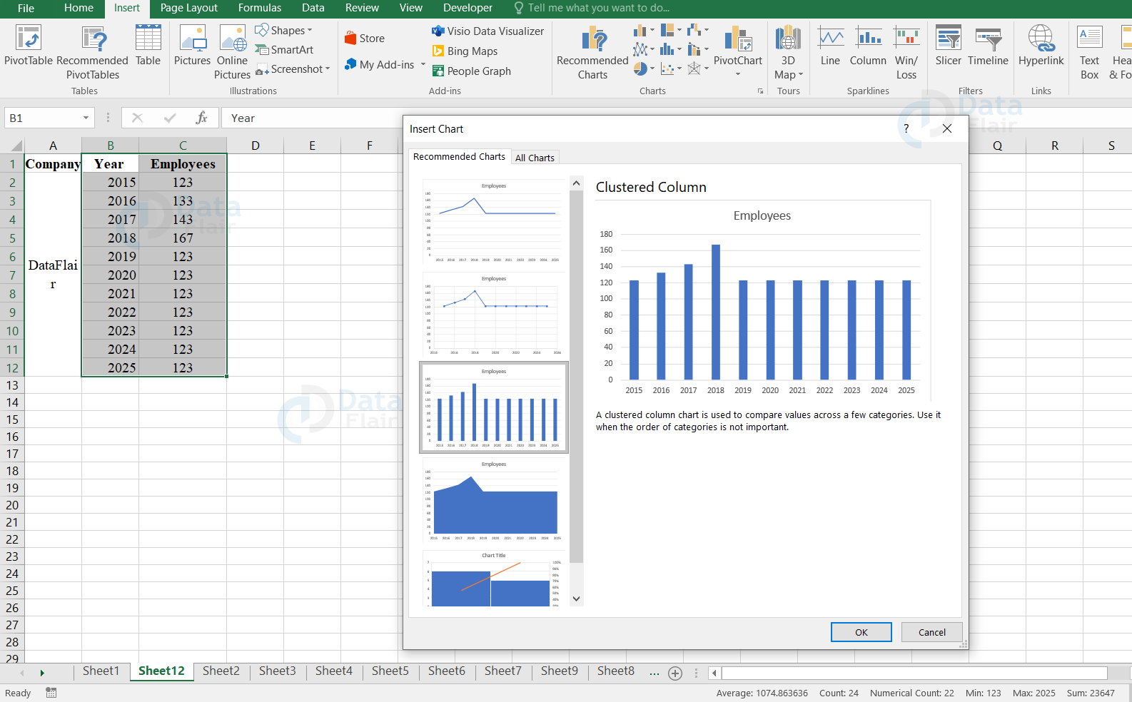
Step 4 − Pick a chart among the Recommended Charts.
Step 5 − The user can see the preview of the chosen chart at the right side.
Step 6 − Finally, press the OK button.
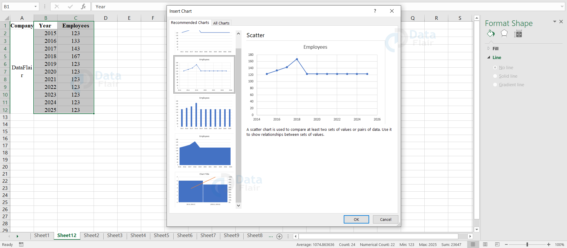
Note: Click on All charts tab to have a look at all available charts and pick a chart from it if you haven’t picked any chart from the recommended charts.
Creating Charts with Quick Analysis
To create a chart with Quick Analysis, follow the steps:
Step 1 − Select the data values.
Note: An icon appears at the right side of the selected data.
![]()
Step 2 − Click on the Quick Analysis icon.
Note: The icon contains the options such as formatting, charts, totals, tables, sparklines.
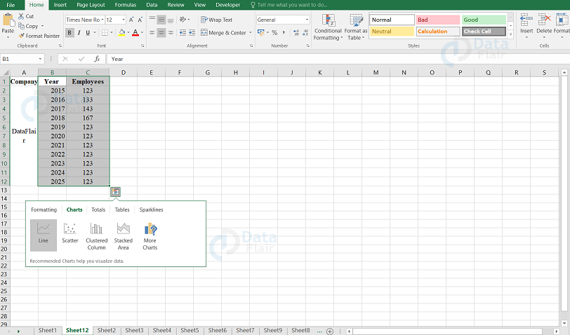
Step 3 − Click on the charts option from it.
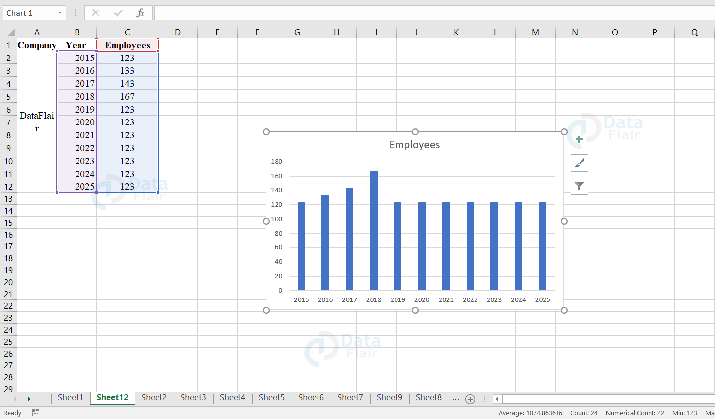
Note: The chosen chart will appear on the workbook
Step 4 − When the user moves the cursor over the Recommended Charts, the previews of the available charts will appear.
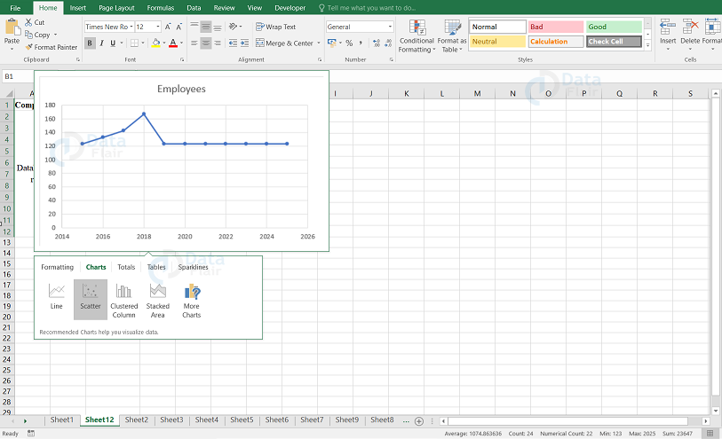
Step 5 − Click More if the user wants to have a look at more available charts.

Note: There it displays more recommended charts.
Step 6 − Finally, press the OK button.
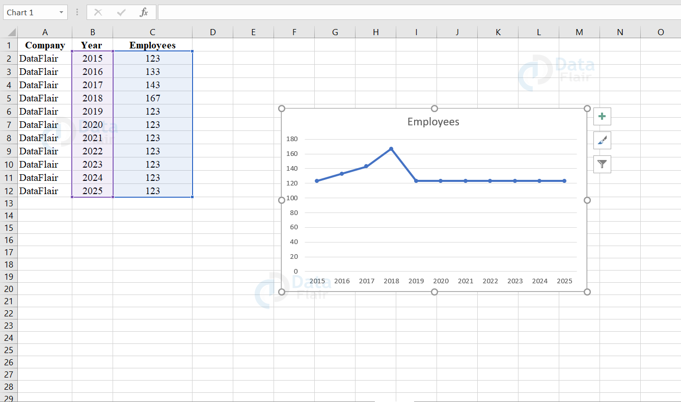
Change Chart Type in Excel
The type of charts can be changed at any time according to the user’s convenience. To change the type of the chart, follow the steps:
Step 1: Click on the chart.
Step 2: Go to the design tab and click on the change chart type.
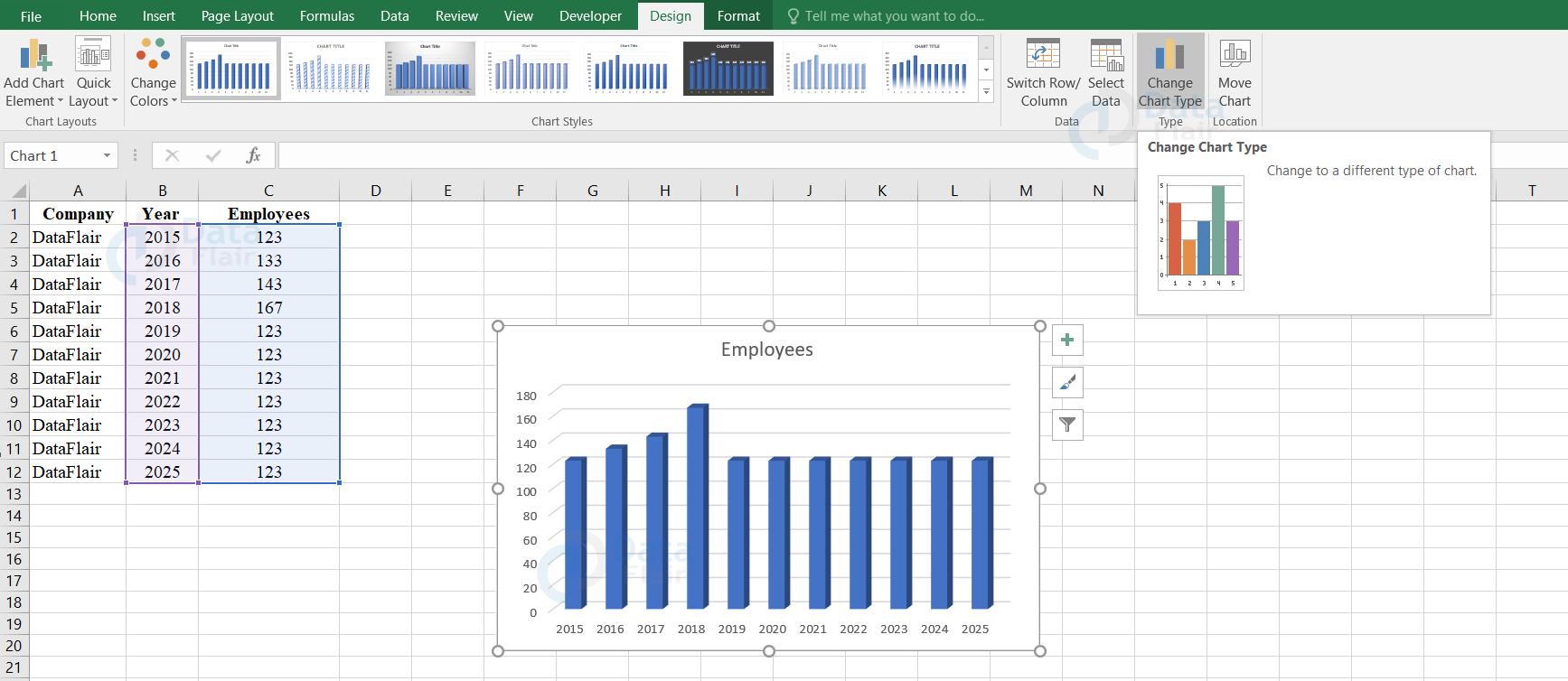
Step 3: Under all charts, choose the required chart from the left window pane.
Step 4: Click on the chart you desire.
Note: Here, we are choosing the line chart with markers.
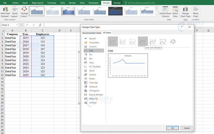
Step 5: Press ok button.
Output:
The column chart is now altered to line graph type.
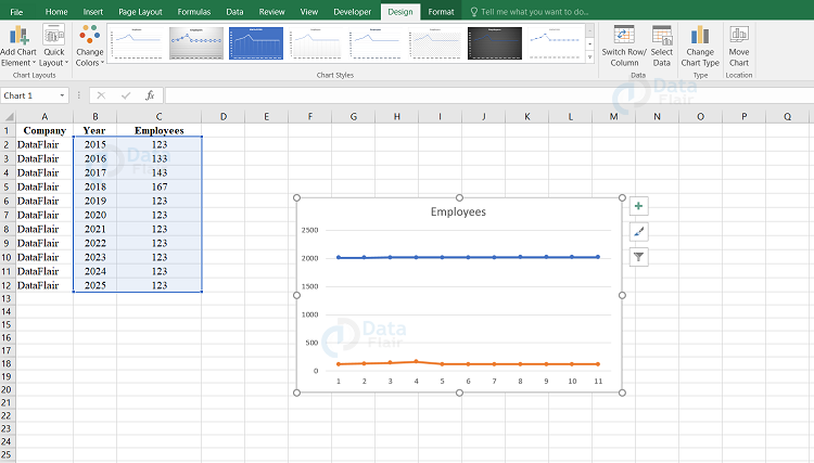
Switch Row/Column in Excel
The user can also switch the rows and columns on the horizontal axis. To switch the rows/columns, follow the steps:
Step 1: Click on the chart
Step 2: Go to the design tab and click on the switch row/column.
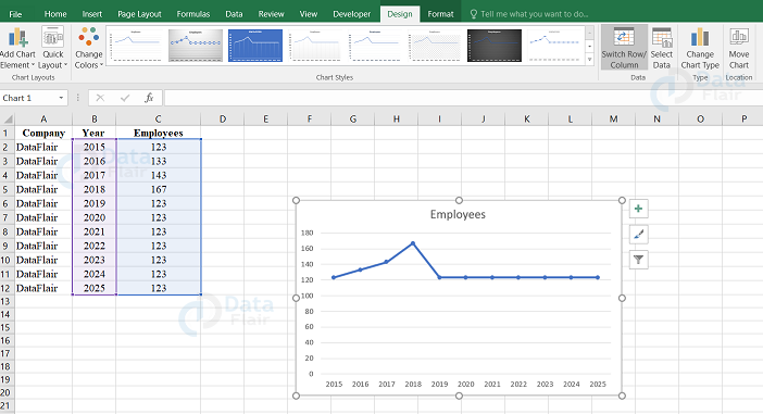
Output:
Once you click on the switch row/ column, the following output appears
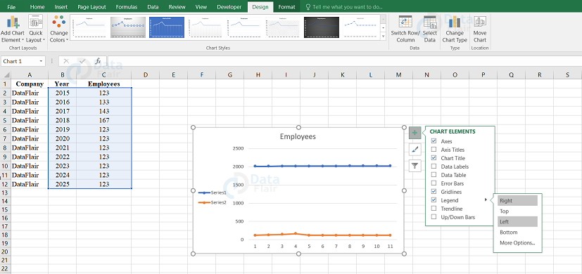
Legend Position in Excel
The user can also move the legend position as per the convenience. To change the legend position follow the steps:
Step 1: Click on the chart
Step 2: Click on the ‘+’ button from the right side.
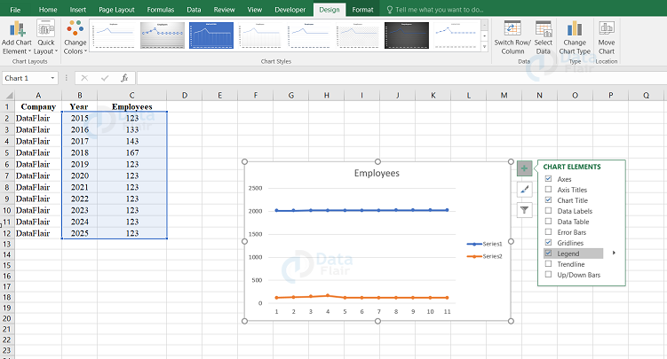
Step 3: Go to legend and click on the arrow beside it.
Step 4: Here, we are choosing the left option.
Output:
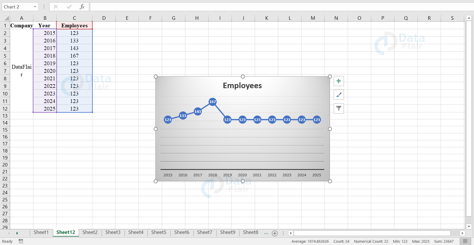
Data Labels in Excel
The user can also add the data labels to grab more attention of the reader on a single data point or series. To add the data labels, follow the steps:
Step 1: Click on the chart
Step 2: Click on the ‘+’ button from the right side.
Step 3: Go to Data Labels and click on the arrow beside it.
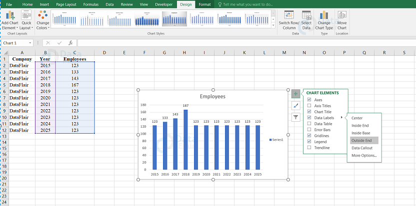
Step 4: Here, we are choosing the outside end option.
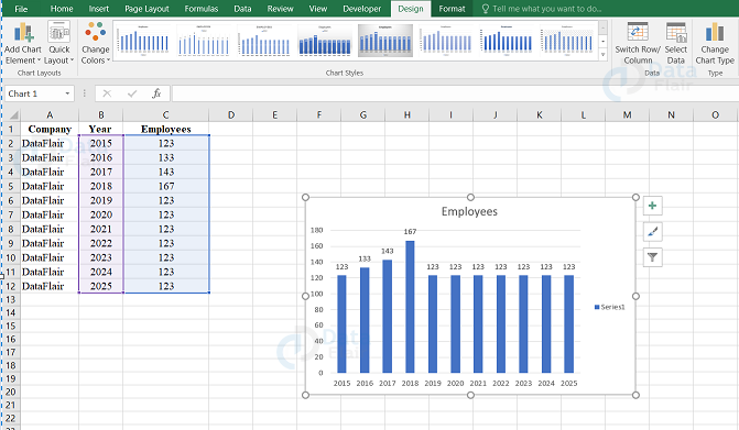
Output:
Once the user follows the steps, the following output appears
Axes in Excel
Mostly, each chart contains two axes and they are the horizontal axis and a vertical axis. We call the horizontal axis as x axis and the vertical axis as y axis. Now lets see how to change the axis type, scale of the vertical axis and how to add axis titles.
After creating a column chart, execute the steps to change the axis type
Axis Type
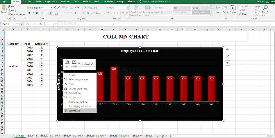
Step – 1: Right click on the horizontal axis and choose the Format Axis.
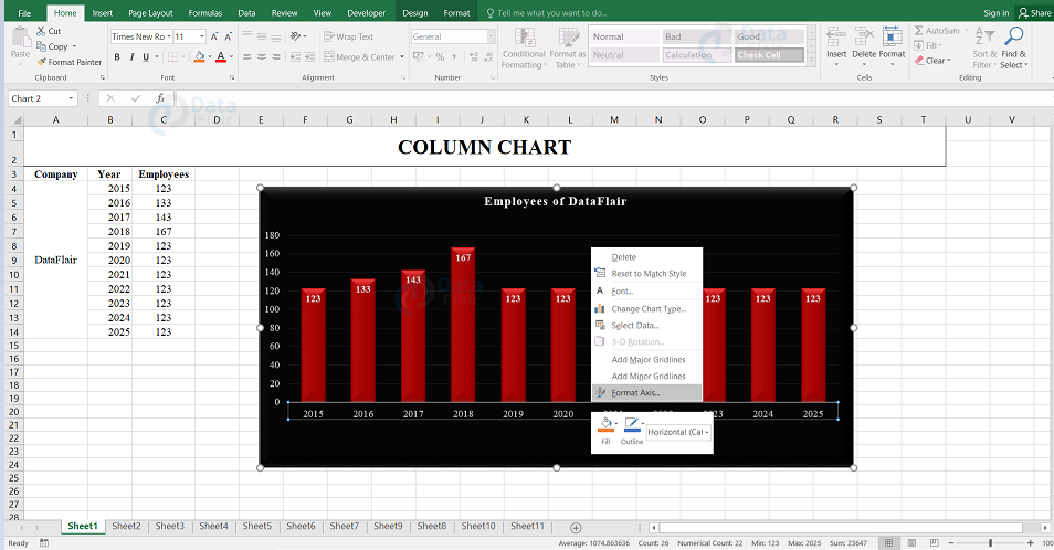
Note: The Format Axis pane appears.
Step 2: Choose the Automatically select based on data option from the pane which appears in the side.
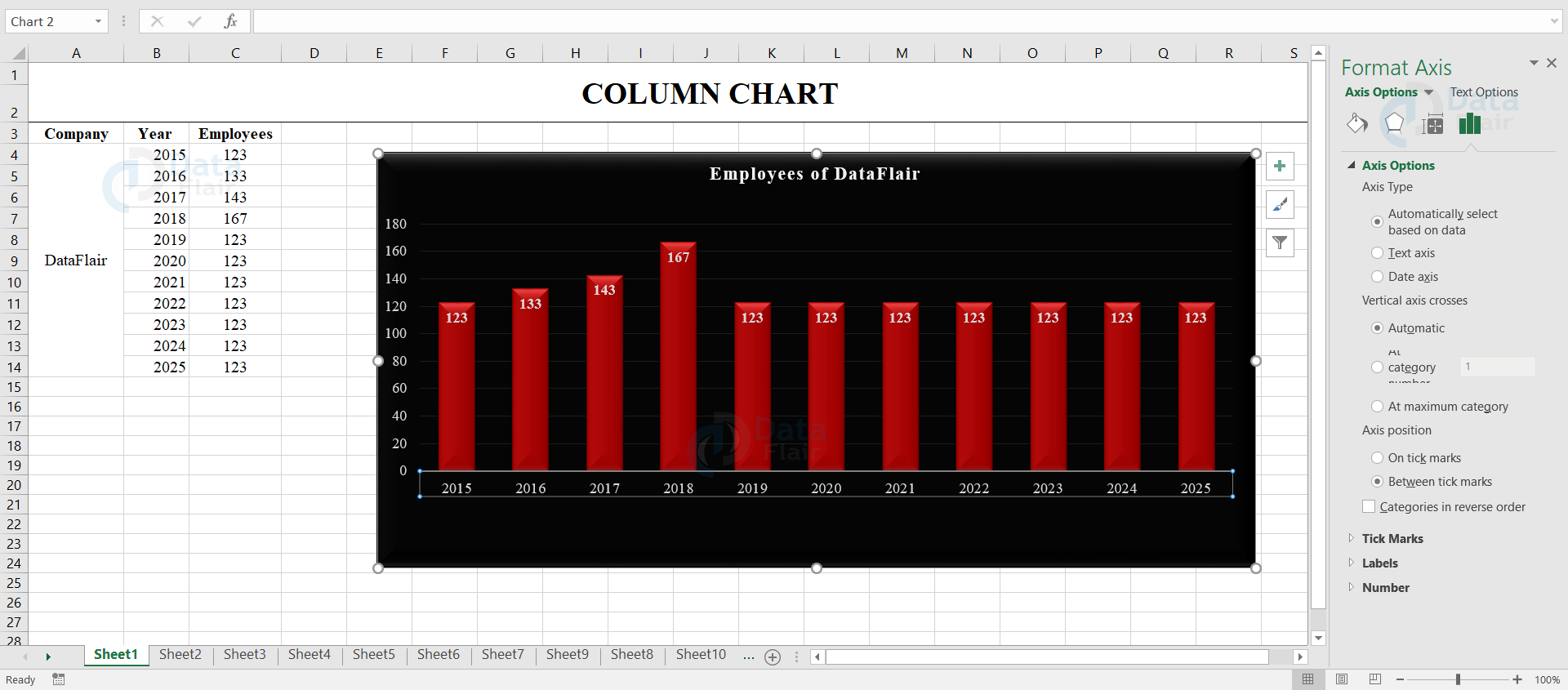
Result: This helps the user to choose the horizontal axis data also.
Axis Titles
To add a vertical axis title, follow the steps:
Step – 1: Click on the chart.
Step – 2: Click on the + button which is at the right side of the chart.
Step – 3: Click on the arrow next to Axis Titles and then mark the check box next to the Primary Vertical option.
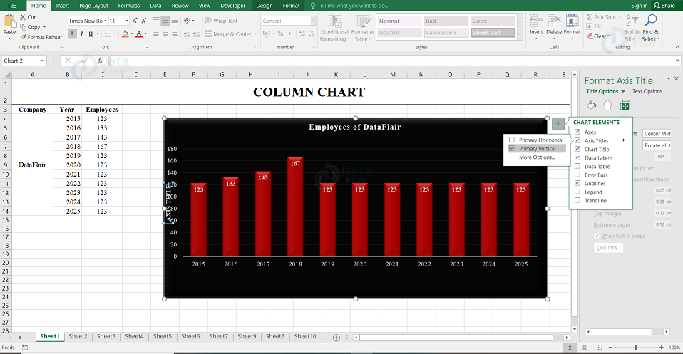
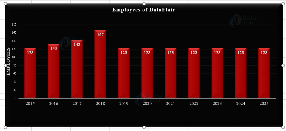
Step – 4: Enter the desired vertical axis title. Here, it is Employees.
Output:
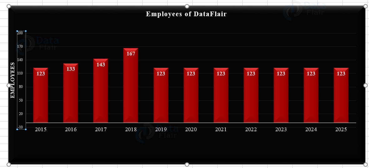
Axis Scale
In excel, the vertical axis values are automatically determined by default. The user can also change these value by following few steps:
Step – 1: Right-click on the vertical axis, and then select Format Axis option.
Note: The Format Axis pane appears.
Step 2: Change the maximum bound to 200 and major unit to 30.
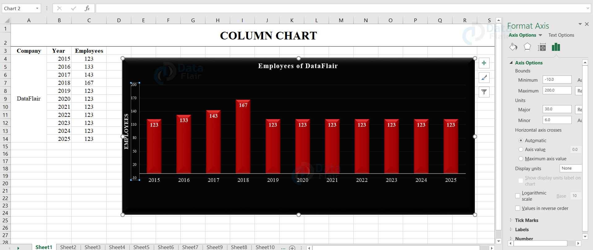
Output:
How to Resize a chart in Excel?
To resize a chart in excel, select the chart, drag and expand as per convenience.
How to Delete a chart in Excel?
To delete a chart, select the chart by clicking on its edge and press the delete key from the keyboard or else the user can right-click on the chart and choose the cut option.
Limitations of Excel chart
- The limitation of Creating a Chart in MS Excel is that it requires some additional explanation or else it can easily be manipulated and can produce a false outcome for large datasets.
- The data may be oversimplified and can produce a misleading view of the data, which again produces false results.
- Viewing an entire huge dataset as a visual representation in a spreadsheet is tough. Though there are advantages, there are also some limitations while fitting or creating a chart.
The advantages of charts
- It allows the user to visualize the data graphically.
- The user can also use charts to analyze the trends and patterns in MS Excel.
- It is easy to interpret and compare the data series.
Summary
This tutorial explains the reason for the creation of charts, their effectiveness, and their importance along with the steps for creating the charts from scratch.
If you are Happy with DataFlair, do not forget to make us happy with your positive feedback on Google


