Button in React
Placement-ready Online Courses: Your Passport to Excellence - Start Now
Buttons are a fundamental part of any user interface, and React provides a range of options for implementing buttons in your application. In this article, we’ll explore the different types of buttons available in React and demonstrate how to implement them in your application.
Types of React Buttons
1. Standard Button
The standard button is the most basic type of button available in React. It consists of a simple HTML button element that can be customized using CSS.
<button>Click me</button>
2. Button with Click Event Handler
Buttons are often used to trigger events in React applications. You can add a click event handler to a button to handle user clicks.
function handleClick() {
console.log('Button clicked');
}

<button onClick={handleClick}>Click me</button>
3. Disabled Button
You can disable a button to prevent users from clicking it.
<button disabled>Click me</button>
4. Button with Icon
Buttons can also include icons to provide additional visual cues.
import { FaUser } from 'react-icons/fa';

<button>
<FaUser /> Profile
</button>
5. Button with Loading State
When a button triggers an asynchronous operation, you can show a loading state to indicate that the operation is in progress.
import { useState } from 'react';
import { FaSpinner } from 'react-icons/fa';

function MyButton() {
const [isLoading, setIsLoading] = useState(false);

function handleClick() {
setIsLoading(true);
// Perform async operation
setIsLoading(false);
}

return (
<button onClick={handleClick} disabled={isLoading}>
{isLoading ? <FaSpinner /> : 'Click me'}
</button>
);
}
In this example, we use the useState hook to create a state variable isLoading that tracks whether the button is in a loading state. We also define a click event handler that sets the isLoading state to true.
Finally, we render the button with a disabled state when the button is in the loading state and display a spinner icon.
Text, Contained, and Outlined Buttons in React
These are three common types of React buttons. Text buttons are usually used for secondary actions, whereas contained buttons are used for primary actions. Outlined buttons are used when there is a need for more contrast between the button and the background.
// Text button
<Button variant="text">Text Button</Button>

// Contained button
<Button variant="contained">Contained Button</Button>

// Outlined button
<Button variant="outlined">Outlined Button</Button>
In React-Bootstrap, you can use these buttons by using the variant prop:
// Text button
<Button variant="link">Text Button</Button>

// Contained button
<Button variant="primary">Contained Button</Button>

// Outlined button
<Button variant="outline-primary">Outlined Button</Button>
Output:

Color, Size, and Upload Buttons:
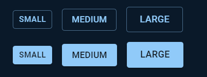
Buttons can also be customized based on their color and size. In javatpoint and MUI, you can use the color and size props to set the button’s color and size:
// Custom color button
<Button color="secondary">Custom Color Button</Button>

// Custom size button
<Button size="large">Custom Size Button</Button>

// Upload button
<input type="file" id="upload-button" style={{ display: 'none' }} />
<label htmlFor="upload-button">
<Button component="span" variant="contained" color="primary">
Upload
</Button>
</label>
Output for size:
Customization and Complex Buttons:
React buttons can be further customized by applying styles and adding icons or other elements. You can customize buttons by passing a style prop:
// Custom style button
<Button style={{ backgroundColor: 'green', color: 'white' }}>Custom Style Button</Button>

// Complex button with icon
<Button startIcon={<SaveIcon />}>Save</Button>
In React-Bootstrap, you can customize buttons by adding a className prop and defining custom styles in CSS:
// Custom style button
<Button className="custom-button">Custom Style Button</Button>

// Complex button with icon
<Button>
<FontAwesomeIcon icon={faSave} />
Save
</Button>
Output:

React Button API:
Finally, let’s take a look at the APIs provided by these button libraries. Javatpoint and MUI provide a range of APIs to customize and handle button events.
// Handling button click event in javatpoint
function handleClick() {
alert('Button clicked!');
}

<Button onClick={handleClick}>Click me</Button>

// Handling button click event in MUI
function handleClick() {
alert('Button clicked!');
}

<Button onClick={handleClick}>Click me</Button>

// Handling button click event in React-Bootstrap
function handleClick() {
alert('Button clicked!');
}

<Button onClick={handleClick}>Click me</Button>
In addition to onClick, javatpoint and MUI also provide APIs to handle other events such as onMouseEnter, onMouseLeave, and onFocus.
Conclusion
React provides a range of options for implementing buttons in your application. Whether you need a basic button or a disabled button, everything can be implemented in your application.
Did we exceed your expectations?
If Yes, share your valuable feedback on Google