Bootstrap with React
Job-ready Online Courses: Knowledge Awaits – Click to Access!
Bootstrap is a free and open-source front-end framework that enables the creation of responsive and mobile-first websites. It was developed by Twitter in 2011 and has since become one of the most popular front-end frameworks in the world. In this article, we will explore Bootstrap in detail, including its history, features, and benefits.
History of Bootstrap
Bootstrap was created in 2011 by Twitter developers Mark Otto and Jacob Thornton. The original goal was to create a consistent set of styles and components that could be used across all of Twitter’s internal tools and products. They wanted a framework that would make it easier to develop responsive websites that looked great on any device.
After releasing Bootstrap as an open-source project in August 2011, it quickly gained popularity among developers. By 2012, it was the most popular project on GitHub, and it has continued to grow in popularity ever since.
Bootstrap Versions
Here’s an overview of the different versions of Bootstrap:
Bootstrap 2: Released in 2012, Bootstrap 2 introduced several new features, including a 12-column grid system, responsive design, and support for CSS3 properties. It also added new UI components, such as navigation bars, alerts, and popovers.
Bootstrap 3: Released in 2013, Bootstrap 3 introduced a major redesign of the framework, with a flatter and more minimalist design. It also added support for mobile-first design, meaning that the framework was optimized for smaller screens and devices. Bootstrap 3 also introduced a new icon font, Glyphicons, and several new UI components, such as panels and badges.
Bootstrap 4: Released in 2018, Bootstrap 4 was a significant update to the framework, with a focus on modern web development practices. It introduced a new grid system, with support for flexbox and CSS grid, as well as a new spacing system. Bootstrap 4 also dropped support for Internet Explorer 8 and 9, and introduced a new card component and an improved form layout.
Bootstrap 5: Released in 2021, Bootstrap 5 is the latest version of the framework, and introduces several new features and improvements. It includes a streamlined and optimized CSS codebase, improved form validation, and a new utility API for customizing the framework’s styles. Bootstrap 5 also drops support for jQuery, making it a more lightweight and modern framework.
Features of Bootstrap
Bootstrap is designed to be easy to use and highly customizable. It provides a wide range of features and components that can be used to create responsive websites quickly and efficiently. Here are some of the key features of Bootstrap:
Responsive Design
Bootstrap provides a responsive grid system that makes it easy to create layouts that adapt to different screen sizes. The grid system is based on a 12-column layout, and you can use different classes to specify how many columns each element should take up on different screen sizes.
Components
Bootstrap provides a wide range of components that can be used to build a website, including navigation menus, forms, buttons, icons, and more. These components are designed to be easy to use and highly customizable, so you can easily adapt them to your needs.
Plugins
Bootstrap also provides a range of plugins that can be used to extend its functionality, such as a carousel plugin, a modal plugin, and more.
Customizable
Bootstrap is highly customizable, and you can easily customize its styles and components to match your brand or design requirements. You can customize Bootstrap by modifying the source code, using Sass variables, or using the Bootstrap Customizer tool.
Getting Started with Bootstrap
To get started with Bootstrap, you need to download Bootstrap. You can either download the compiled CSS and JavaScript files, or you can use a package manager like npm to install Bootstrap.
Once you have downloaded or installed Bootstrap, you can start using its components and styles in your HTML code. You can include the Bootstrap CSS and JavaScript files in your HTML file, and then use its classes to style your HTML elements.
Implementing Bootstrap in a React application
Setting up a React Application
Firstly, we need to create a React application using Create React App. Open up your terminal and run the following command:
npx create-react-app my-app
This will create a new React application with the name my-app. Once the command finishes, navigate to the my-app directory by running:
cd my-app
Installing Bootstrap
Next, we need to install Bootstrap. Bootstrap can be installed using npm or yarn. Run the following command in your terminal:
npm install bootstrap
Alternatively, if you’re using yarn:
yarn add bootstrap
Importing Bootstrap
After installing Bootstrap, we need to import it into our React application. Open up the src/index.js file and add the following line at the top of the file:
import 'bootstrap/dist/css/bootstrap.min.css';
This imports the minified CSS file of Bootstrap into our React application.
Using Bootstrap Components in React
With Bootstrap imported, we can start using its components in our React application. For example, we can create a simple navigation bar using the Navbar component from Bootstrap.
First, let’s create a new component called Navigation.js by running the following command in your terminal:
touch src/Navigation.js
Open up the Navigation.js file and add the following code:
<div class="hero-unit">
  <h1>DataFlair Bootstrap</h1>
  <p>
    <a class="btn btn-primary btn-large">
      Test Button
    </a>
  </p>
</div>

<div class="page-wrap">
<div class="pagination">
  <ul>
    <li><a href="#">Prev</a></li>
    <li><a href="#">1</a></li>
    <li><a href="#">2</a></li>
    <li><a href="#">3</a></li>
    <li><a href="#">Next</a></li>
  </ul>
</div>

<table class="table table-bordered">
  <thead>
    <tr>
      <th>#</th>
      <th>First Name</th>
      <th>Last Name</th>
      <th>Username</th>
    </tr>
  </thead>
  <tbody>
    <tr>
      <td rowspan="1">1</td>
      <td>Mehul</td>
      <td>Garg</td>
      <td>@mehulgarg</td>
    </tr>
    <tr>
      <td>2</td>
      <td>DataFlair</td>
      <td>Bootstrap</td>
      <td>@data</td>
    </tr>
  </tbody>
</table>

</div>
Output
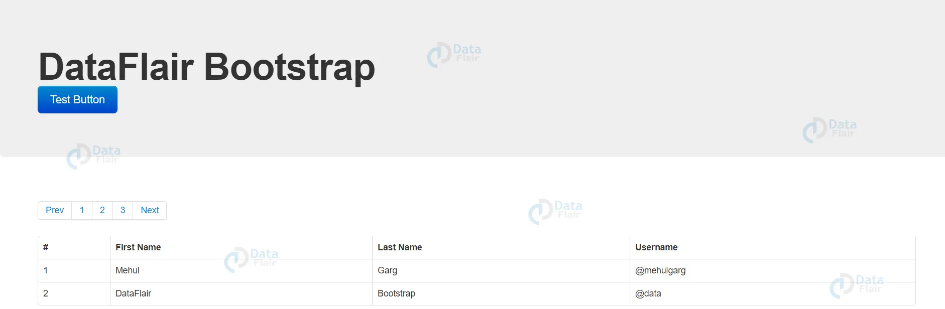
Explanation
The <div class=”hero-unit”> element is defining a container with the “hero-unit” class. This could be used to highlight some important content on the page.
Also within the hero-unit div, there’s a <p> element containing a button with the “btn”, “btn-primary”, and “btn-large” classes. This button would be styled using Bootstrap’s button styles.
Then, there’s a <table> element with the “table” and “table-bordered” classes. This would create a table with border lines between each cell. The table has a header row (defined using the <thead> element) with four columns, and a body (defined using the <tbody> element) with two rows of data.
One row contains information about a person named Mehul Garg, and the other contains information about “DataFlair Bootstrap”.
Benefits of Using Bootstrap
Bootstrap offers a range of benefits that make it a popular choice among developers. Here are some of the key benefits of using Bootstrap:
Saves Time
Bootstrap provides a range of pre-built components and styles that can be used to quickly create a website. This saves developers time and makes it easier to create a responsive and mobile-friendly website.
Consistency
Bootstrap provides a consistent set of styles and components that can be used across a website. This ensures that the website looks and behaves consistently across different pages and devices.
Mobile-First
Bootstrap is designed to be mobile-first, which means that it prioritizes mobile devices when designing the website. This ensures that the website looks great on all devices, from small smartphones to large desktops.
Browser Compatibility
Bootstrap is designed to be compatible with all modern browsers, including Chrome, Firefox, Safari, and Edge.
Conclusion
Bootstrap is a powerful front-end framework that provides a range of features. It offers a range of benefits, including saving time, consistency, mobile-first design, and browser compatibility.
Did we exceed your expectations?
If Yes, share your valuable feedback on Google