Advanced Charts and Graphs in Excel
We offer you a brighter future with industry-ready online courses - Start Now!!
The excel charts and graphs are the tools used to visualise the data by representing their values. Now, let’s discuss the advanced charts and its usage in excel.
What is an advanced chart in Excel?
Advanced charts are the charts that are beyond the basic charts in excel. If the user has more than one set of data and if the user wants to compare the data values on the same chart, then the advanced charts come in handy. The user can create the basic chart for one set of data and then they can add more datasets to that chart. The user can also format the charts, etc.
The importance of advanced charts in Excel
1. Advanced charts provide more consolidated information in a single chart. It paves way for the user to compare more than one data set and it helps alot to draw decisions.
2. Advanced charts allow the user to customize the way it appears.
Step by step example of creating advanced charts
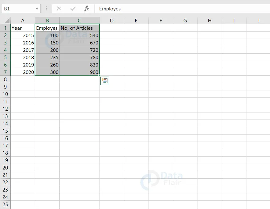
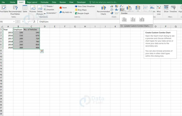
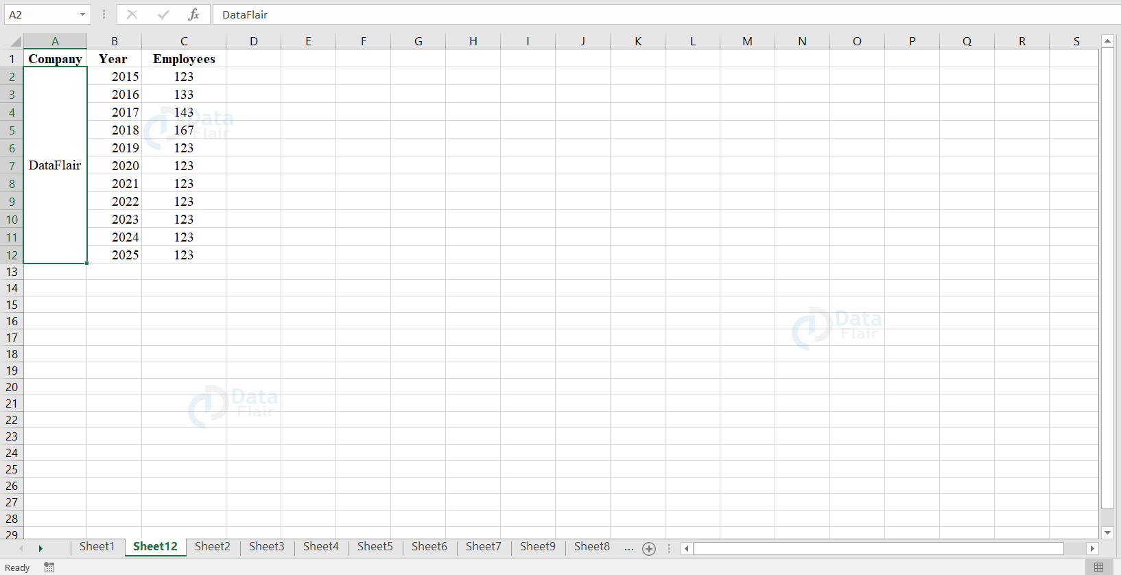
In this Excel Charts tutorial exercise, we will assume that we have a company named DataFlair where we hire employees to write articles. Now, we would like to see the relationship between the number of employees and the number of articles written per year. Let’s get into the concept of charts and how the charts could help us in it. The dataset is provided below.
| Year | Employees | No. of Articles |
| 2015 | 100 | 540 |
| 2016 | 150 | 670 |
| 2017 | 200 | 720 |
| 2018 | 235 | 780 |
| 2019 | 260 | 830 |
| 2020 | 300 | 900 |
1: Open a new workbook in Excel
- Enter the dataset provided above.
- Create a basic chart and here we are going to plot a column chart for our dataset.
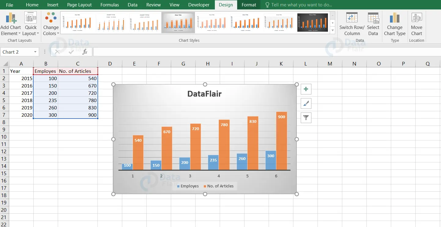
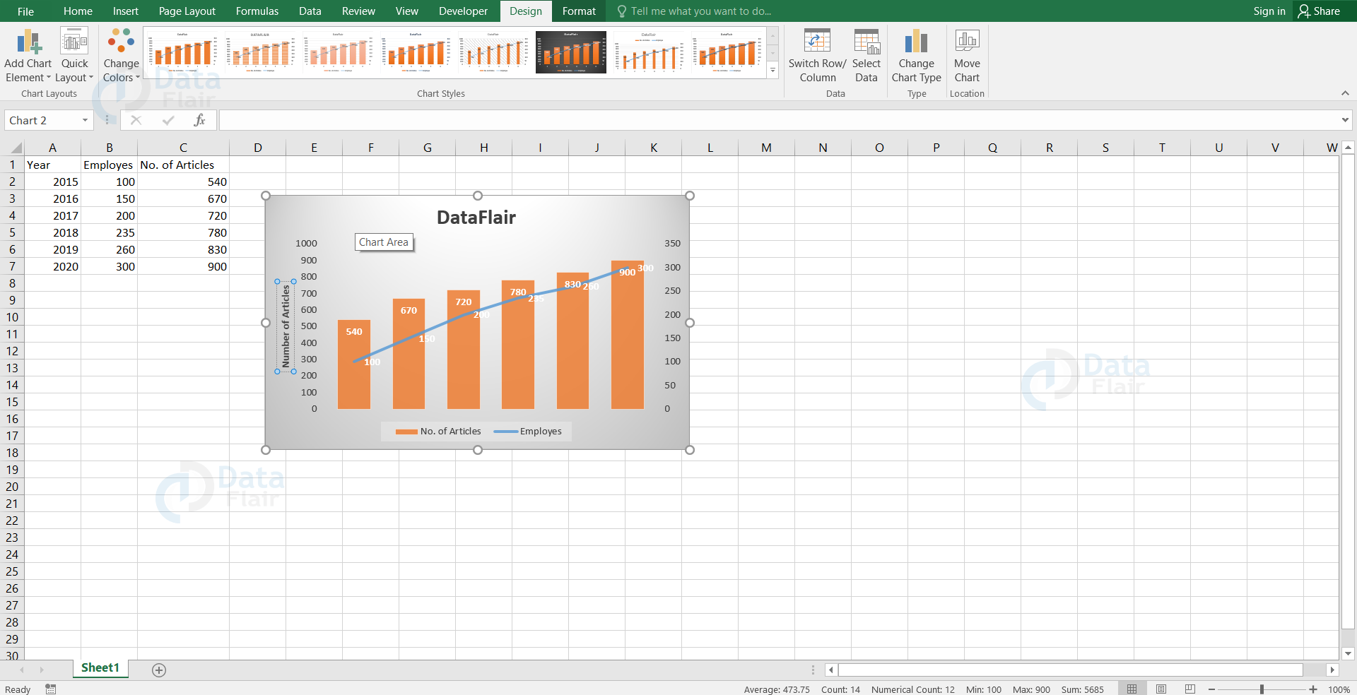
2: We have created a basic chart and now it’s time for complex graphs to play their role. Click either on the orange bars or blue bars.
Note: Here, we are going to click on the blue bars which are representing the employees.
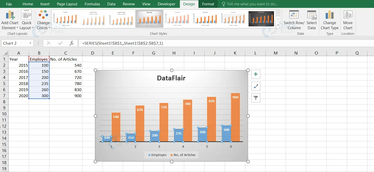
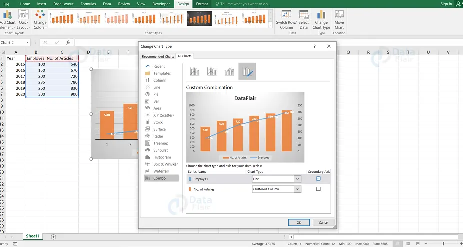
3: Go to the design tab, click on the change chart type.

Note: A dialog window appears
4: In that dialog window, navigate to combo from the left side of the panel and click on the employees chart type drop down menu.
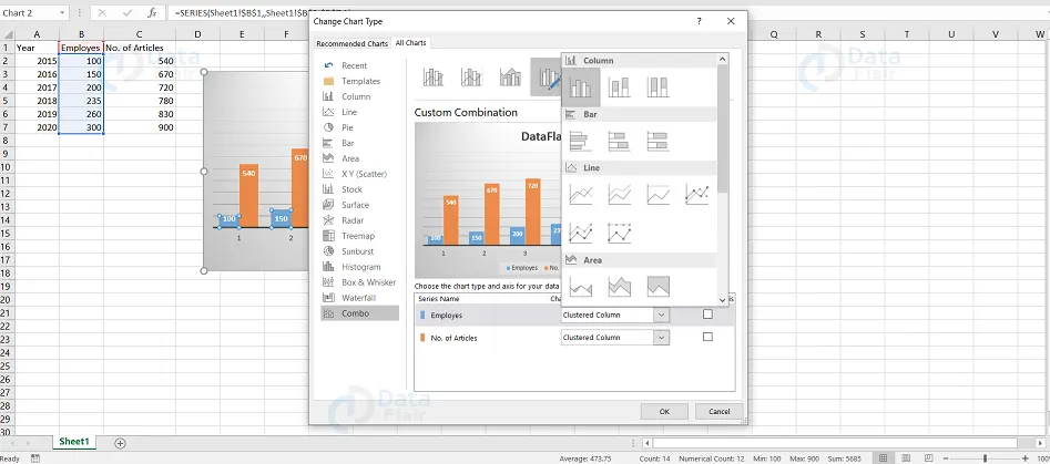
5: Choose the first graph under the line and press ok.
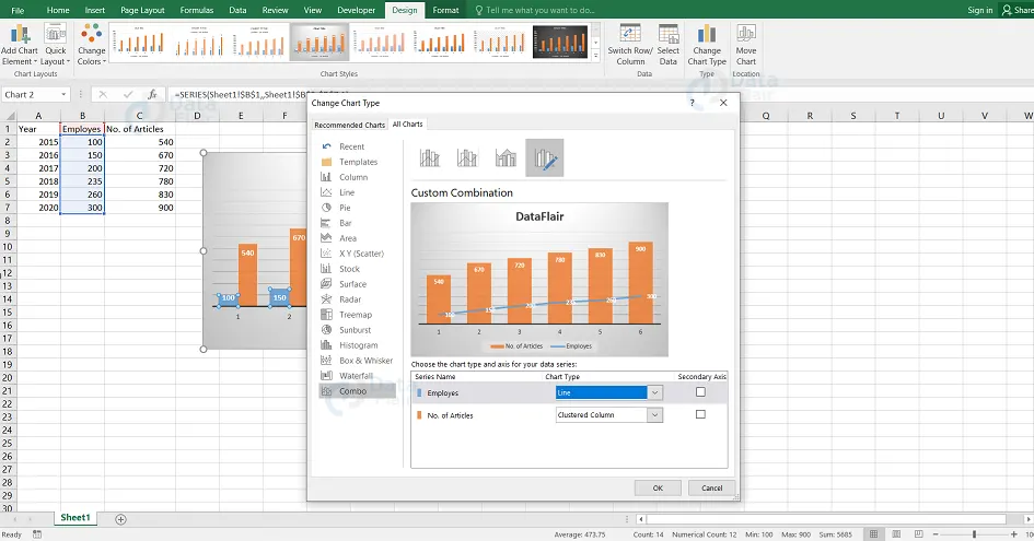
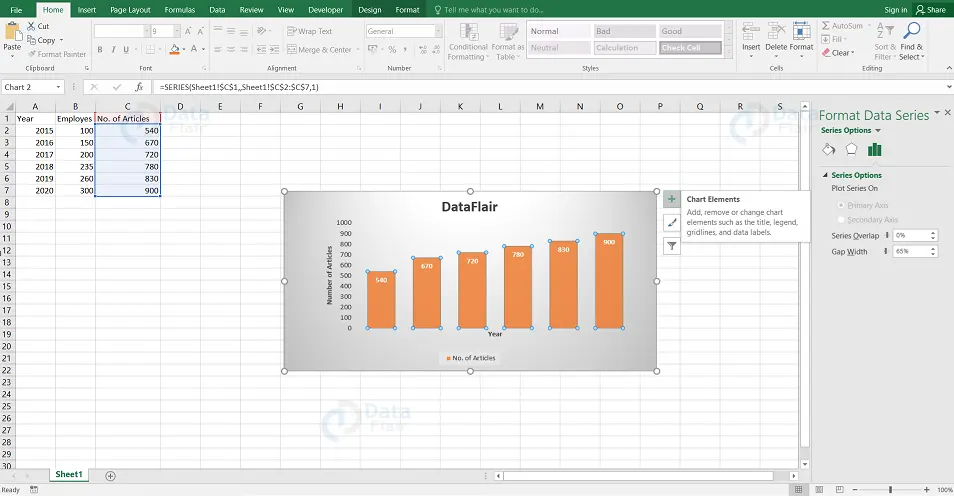
Once the steps are followed, the following output appears
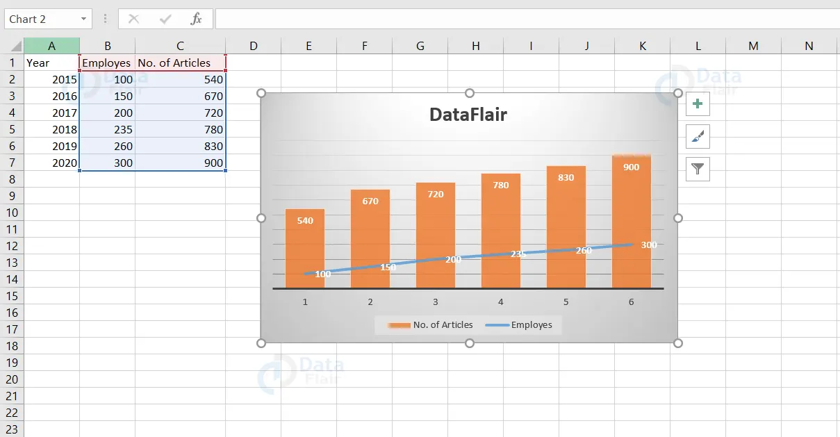
Now, we know how to create a chart with two or more types together in a single chart.
Trendline in Excel:
The trendline in the chart is a curved or straight line which visualises the direction of the data point.
Now let’s see how to add a trendline in the graph in below steps:
1: Click on the chart.
2: Click on the + button at the right side of the chart.
3: Choose the arrow next to Trendline and then click on More Options.
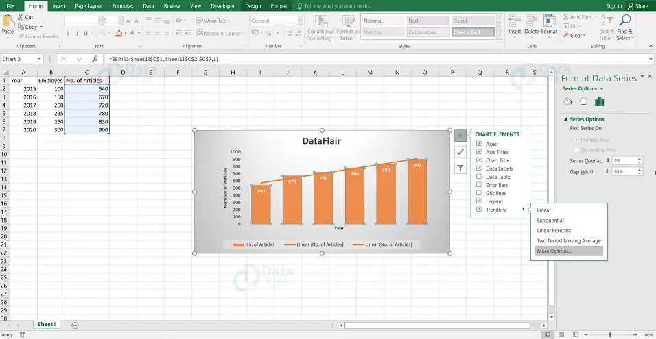
Note: The Format Trendline pane is now visible.
4: Choose an option from trendline options.
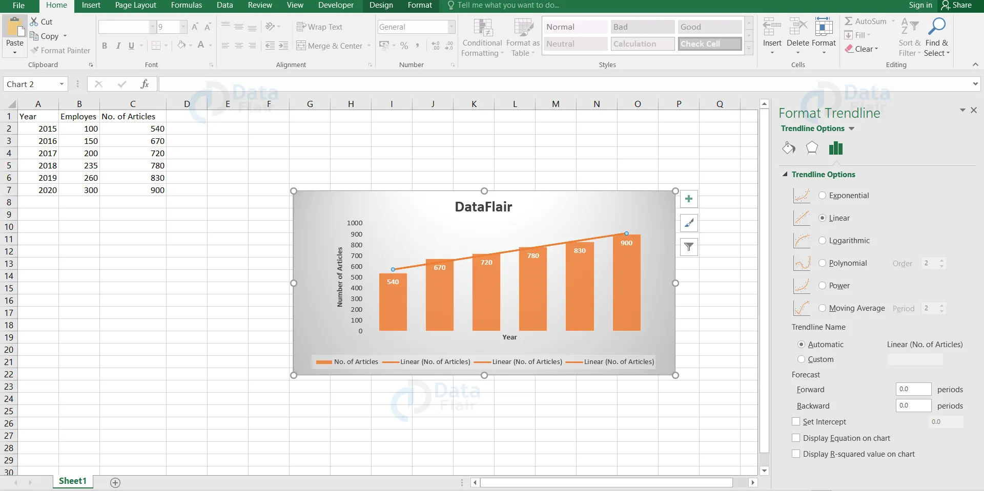
Note: Here, we are choosing the Linear trendline options.
5: Specify the number of periods to include in the forward forecast. Here, we are typing 2 in the Forward box.
6: Check mark on the Display Equation on chart and Display R-squared value on chart option.
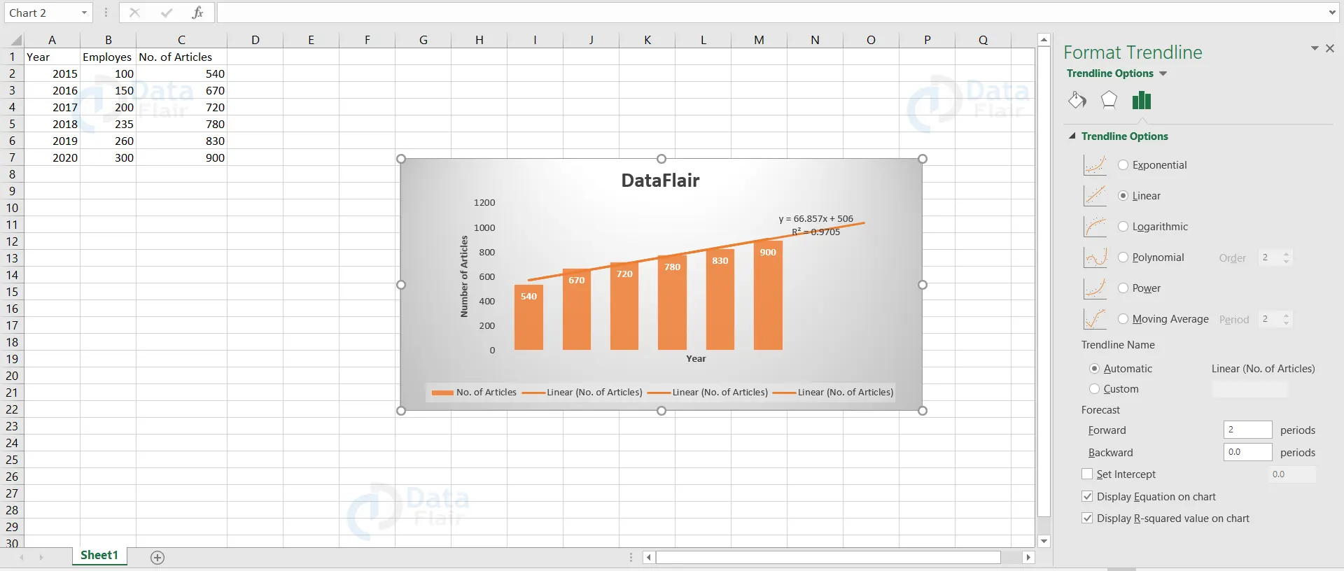
Output:
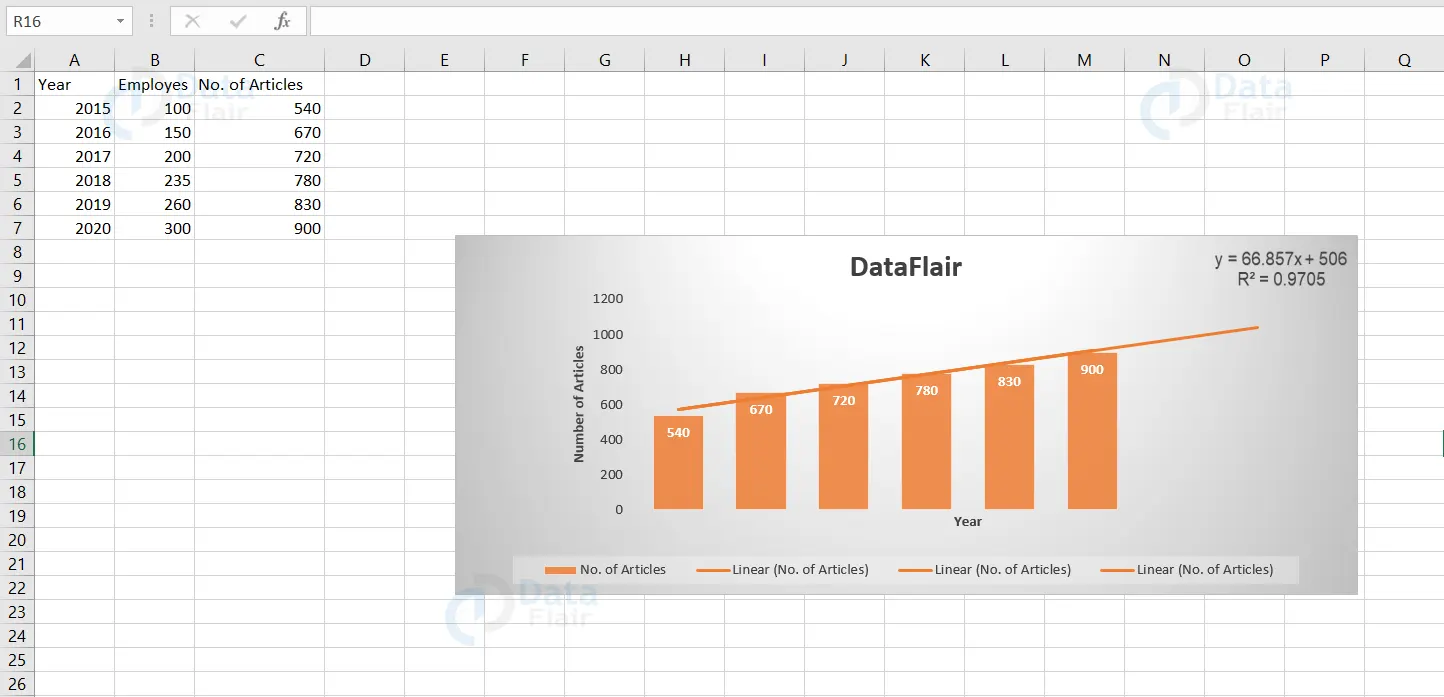
Explanation: Excel uses the method of least squares to find a line that best fits the data values. The R-squared value equals 0.9705, which represents that it is a good fit. When the R squared value is closer to 1, it denotes that it is one of the best fit data. The trendline predicts 1000 and 1100 articles approximately in the year 2021 and 2022. The user can make use of the equation. y = 66.857 * x + 1506 to predict for the upcoming years.
Secondary Axis in Excel
The primary axis is the x-axis and the y-axis which is usually on the right side of the chart is known as the secondary axis.
Let’s now add a secondary axis to our Excel chart to make it more understandable and look presentable.
1: Click on the chart.
2: Go to the Design tab and click on the change chart type.
Note: A dialog window appears.
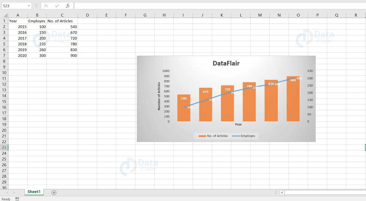
3: In that dialog window, navigate to combo from the left side of the panel and mark the checkbox below the secondary axis which is corresponding to the employees.
4: Finally, press ok.
Formatting the chart titles
To edit the chart, primary and secondary axis, follow the steps:
1: Go to the design tab and click on the add chart element.
Note: A drop down menu appears.
2: Choose Axes titles from the dropdown menu and click on the primary vertical option from it.
3: Now, edit the primary vertical axis title.
After editing the titles, the chart looks like
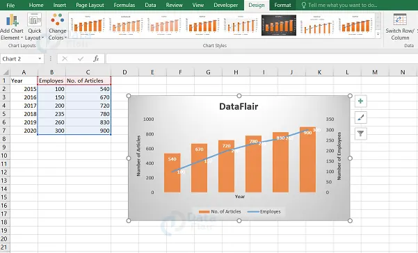
Hope you observed that we have consolidated two data sets and visualized them in such a way that it represents the effect of one data set over the other using Excel graphs.
Let’s see some advanced types of charts
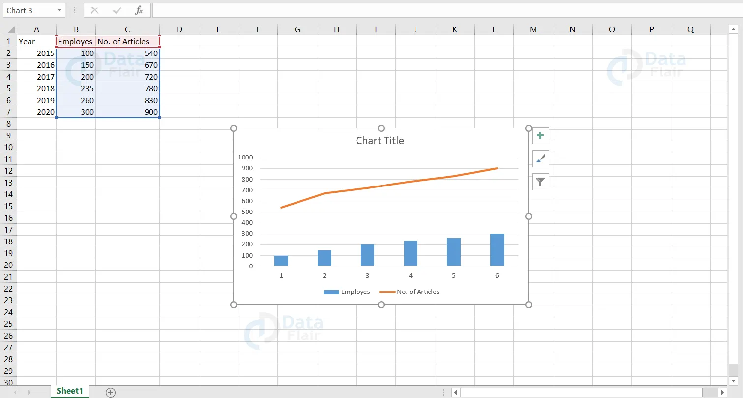
Combination Chart in Excel
Combination of two or more chart types in a single chart is known as a combination chart.
To create a combination chart, follow the steps
1: Select the data.
2: Go to the Insert tab and click on the Combo symbol from the chart groups.
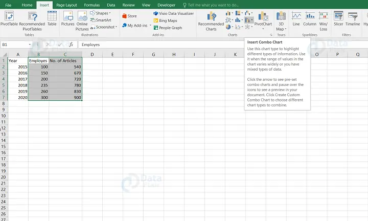
3: Choose the Create Custom Combo Chart option.
Note: The Insert Chart pane appears.
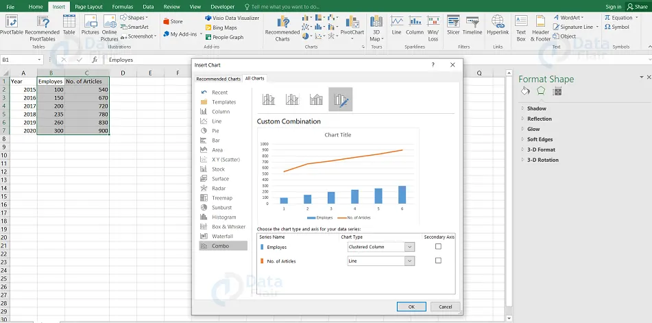
4: Choose the required combo chart.
5: Finally, press the ok button.
Output:
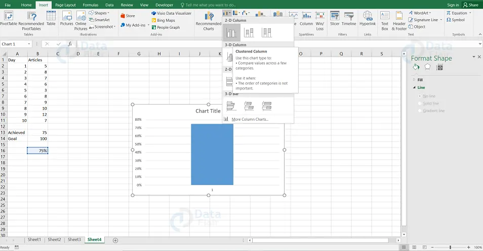
Thermometer Chart in Excel
Thermometer chart is a chart which is usually used by the user to compare the progress against the target over a specific period of time. Now let’s see how to create a thermometer chart in Excel. The user uses a thermometer chart to know how much of the goal has been achieved.
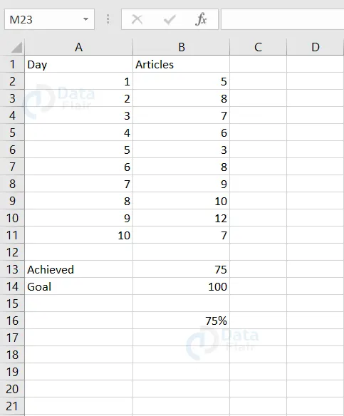
To create a thermometer chart, follow the steps:
1: Click on the B16 cell.
Note: The B16 adjacent cells should be empty.
2: Go to the Insert tab and click on the Column symbol from the chart groups.
3: Select the Clustered Column.
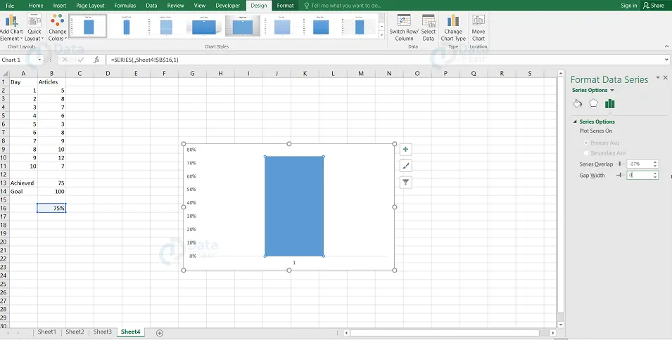
4: Remove the chart title and the horizontal axis of the column chart.
5: Right click on the bar and choose Format Data Series.
6: Change the Gap Width to 0%.
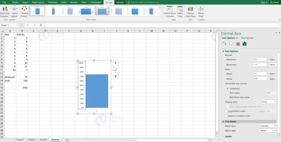
7: Right click on the percentages which are represented as y axis on the chart.
8: Choose Format Axis.
Note: Assign 0 to the minimum bound, 1 to maximum bound and choose the outside option to the Major tick mark type.
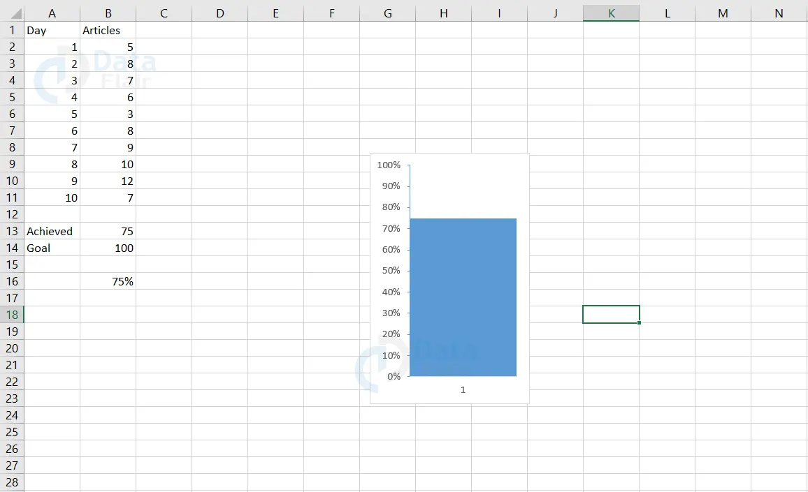
Output:
Note: To insert the upcoming charts, follow the steps
1: Open a MS Excel worksheet and click on the “Insert” button from the menu bar.
2: From the Insert tab, go to the “Charts” option, there you would find different types of charts. You can choose the desired chart from it.
Note: Choose the chart as required. For example: Choose Doughnut chart while going through the doughnut chart example.
3: Then we need to select the data for which the graph has to be plotted
Note: For the following charts, we are going to make use of different dataset and that is shown in the excel sheet below
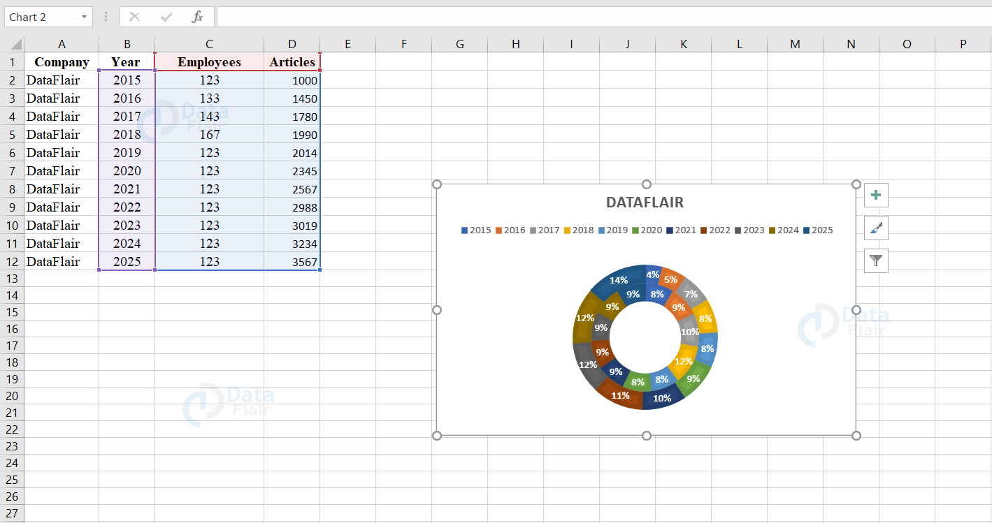
Doughnut charts in Excel
This type of chart depicts the size of the items in the series with the proportion to the sum of the items. The data are visible in the rings where each ring represents a data series. Doughnut charts are not easily understandable.
The user can use doughnut chart:
1. When the user has more than one data series.
2. When no values in the data series are negative or zero.
3. When the data does not cross seven categories.
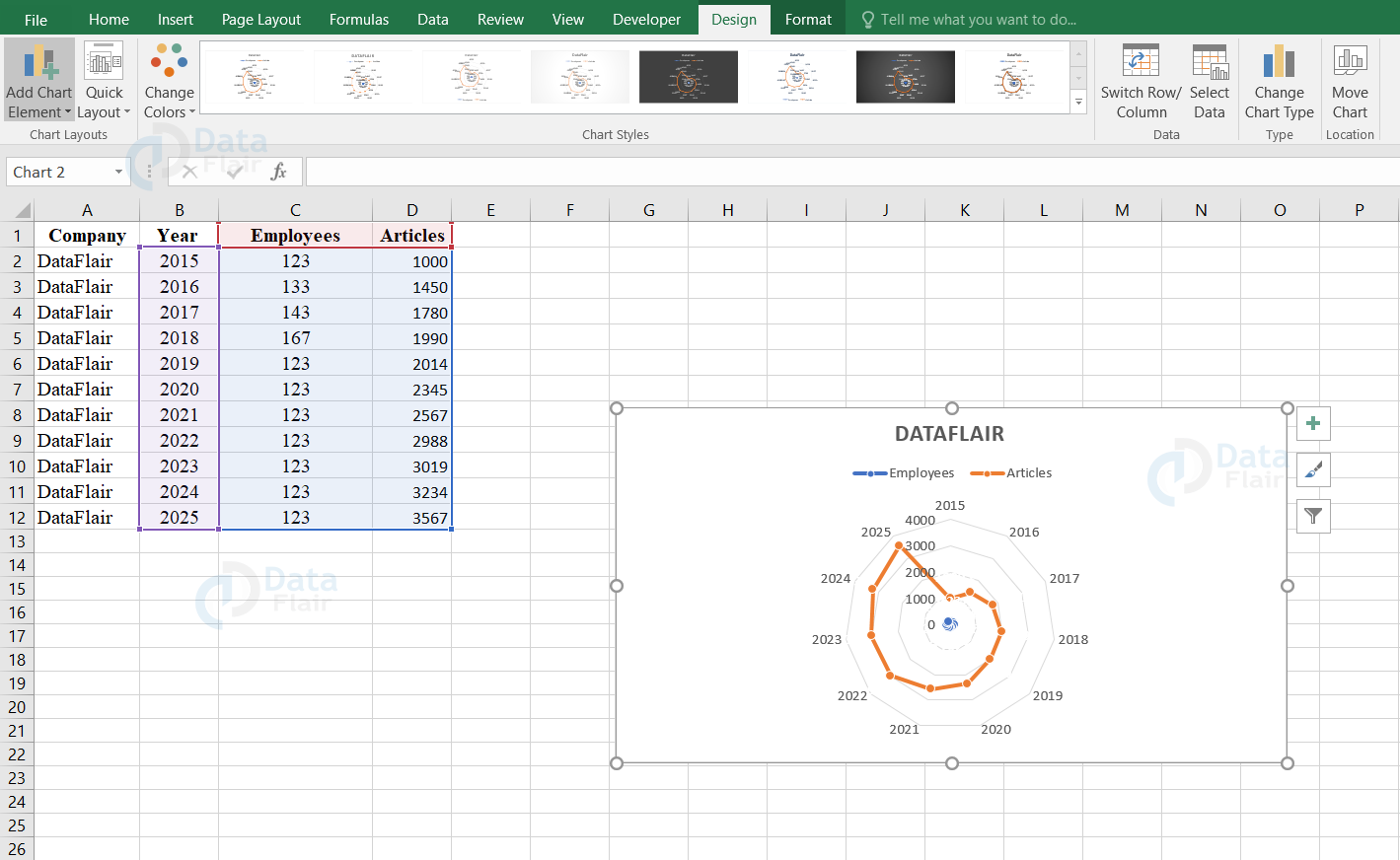
Radar and Radar with Markers
These charts represent the values relative to a center point. Radar with Markers charts represents the markers for the individual points and Radar charts are represented without the markers for the individual points. The user uses the Radar and Radar with Marker charts when the categories are not directly comparable.
Filled Radar
In filled radar charts, the data series is filled with a color. This chart represents the values relative to a center point.
Surface Charts
The user uses the surface charts to find the optimum combinations between two sets of data. The colors and patterns denote the areas that are in the same range of values. Before using the surface charts, ensure that the data series values are in numeric.
Wireframe 3-D Surface
The wireframe 3-D surface graphs are used to represent the relationships between huge datasets. These types of charts are not filled with color in between and they are made up of lines.
Wireframe 3-D Surface chart is useful
1. When the user wants to show the trends in values across two dimensions in a continuous curve.
2. When the data series are of numeric values.
3. When the data curves in the graph are behind itself.
Wireframe Contour Charts in Excel
Wireframe contour charts are the surface charts viewed from above. The wireframe charts are represented using the lines without the color bands and they are not easy to read.
Contour Charts in Excel
Contour charts are the surface charts which represent in a way that it is viewed from above and it is similar to the 2-D topographic maps. The color band in the contour chart represents the specific range and the lines connect the interpolated points of equal value.
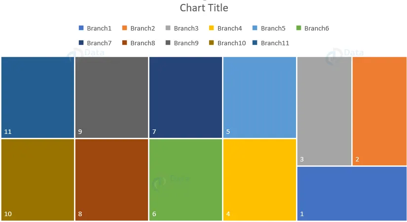
Treemap chart in excel
The treemap charts are available from office 2016 and newer versions only. The treemap chart provides a hierarchical view of the data. It is an easy way to compare many levels of categorization.
The treemap chart displays the categories by color and proximity. It can easily show huge data which would be difficult with other chart types. The treemap chart can plot empty or blank cells that exist within the hierarchical structure. The treemap charts are better for comparing proportions within the hierarchy.
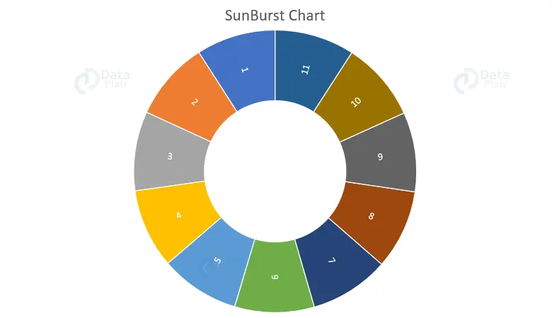
Sunburst chart in Excel
The sunburst chart is available from office 2016 and newer versions. The sunburst chart displays the hierarchical data. It is plotted even when the empty or blank cells exist within the hierarchical structure. The circles or pieces in the graph represent the hierarchy level. With one level of category, it looks similar to a doughnut chart.
A sunburst chart with multiple levels of categories depicts how the outer rings relate to the inner rings. It is more effective while showing how one ring is broken into contributing pieces. There are no other sub type charts in sunburst charts.
Box and Whisker charts in Excel
A box and whisker chart depicts the distribution of data into quartiles highlighting the mean and outliers. The vertical lines from the box are called whiskers. These lines show the variability outside the upper and lower quartiles.
Any point outside the lines or whiskers is known as the outlier. This chart is helpful when there are multiple datasets which relate to each other in some or the other way. There are no other sub type charts available.
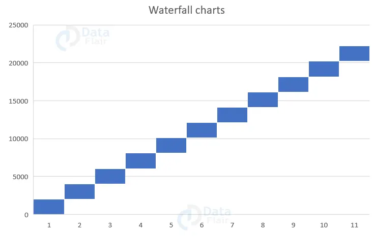
Waterfall charts in Excel
The waterfall chart is available from office 2016 and newer versions. This chart depicts the running total of the financial data as data values are added or subtracted. This chart is useful for understanding how an initial value gets affected by a series of positive and negative values. The columns are color coded so the user can quickly tell positive from negative numbers. There are no other sub type charts available.
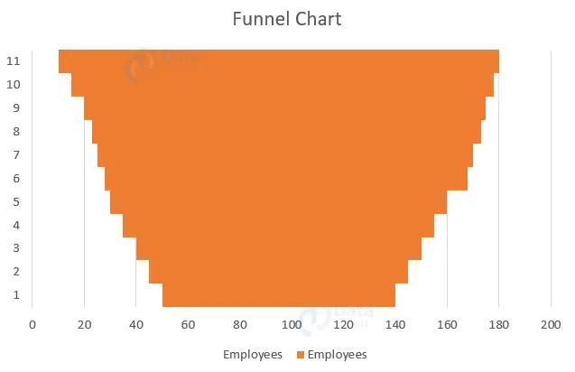
Funnel charts in Excel
The funnel chart is available from office 2016 and newer versions. This chart depicts the sales pipeline. The stages are listed in the first column and the values in the second column. The values decrease gradually to resemble a funnel by the bars. Funnel charts depict the values across multiple stages in a process.
Map chart in Excel:
You can use a Map Chart to compare values and show categories across geographical regions. Use it when you have geographical regions in your data, like countries/regions, states, countries or postal codes.
To access the map chart, click on the 3D map under Tour group from the insert tab.
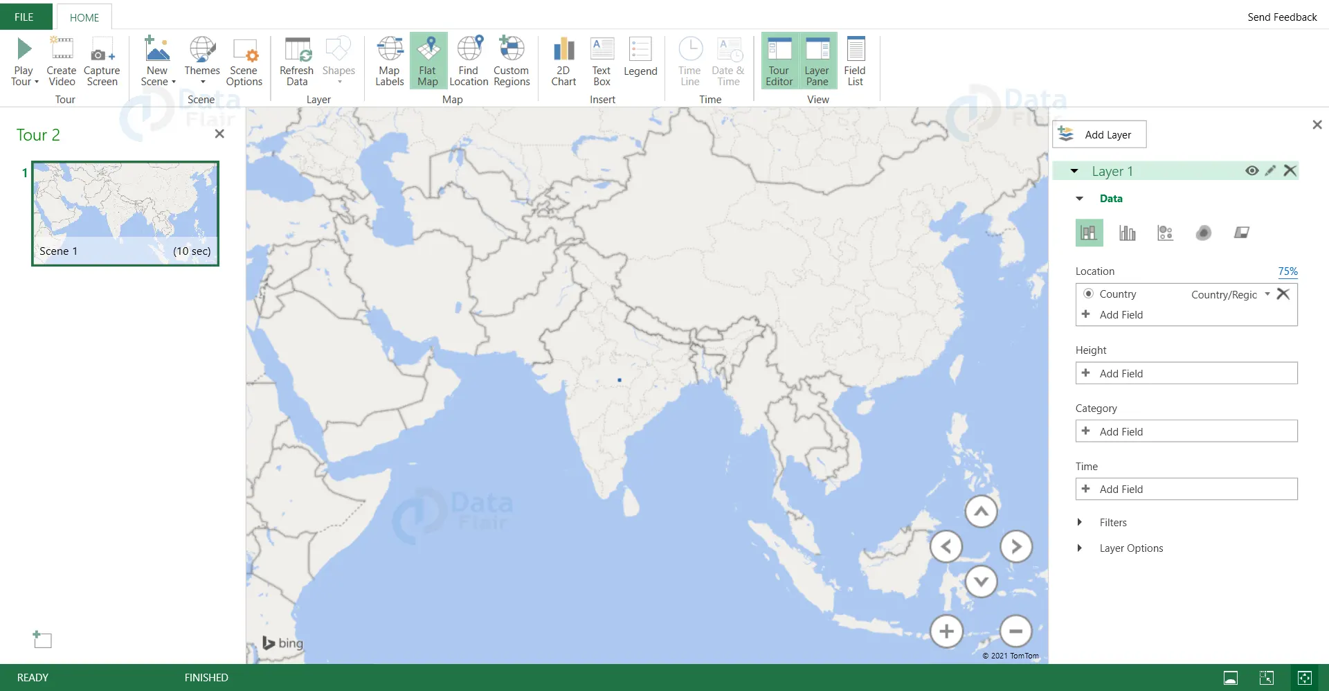
The user can use a map chart to compare the data values and show the categories across the geographical regions over a map.
The map can also be further classified into point map and flow map.
1. Point Map:
A point map is a method generally used to represent the geographical distribution of data by plotting points of the same size on a map background. The points in the map makes it easy for the user to understand the overall distribution of data, but it is not suitable when the user needs to observe a single specific data.
2. Flow Map:
The interaction data between the outflow area and the inflow area are displayed in the flow maps. The line connecting the geometric centers of gravity of the spatial elements is the expression in it. The width or color of the line represents the flow value. Flow maps help to understand the distribution of geographic migration.
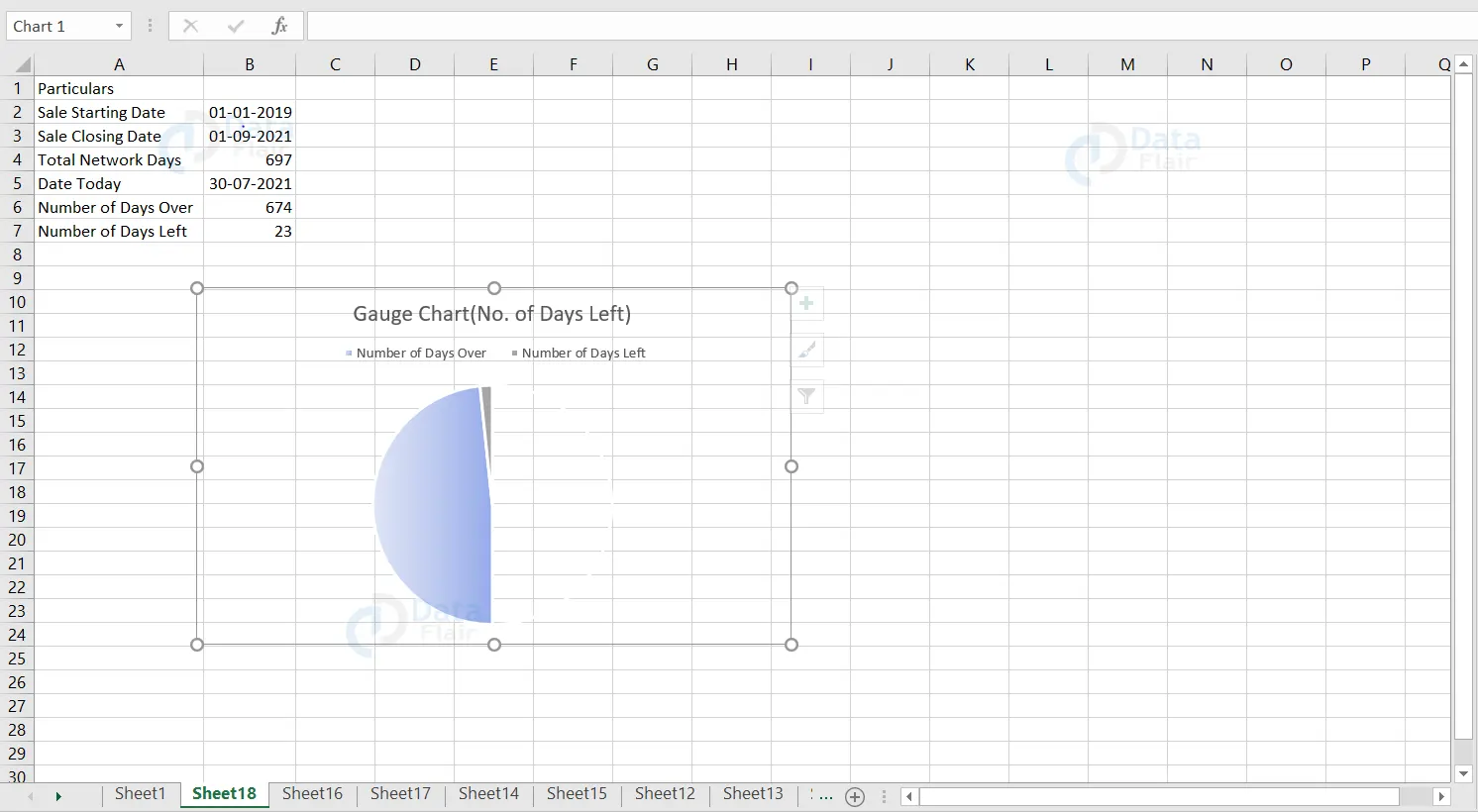
3. Gauge Chart in Excel
The meter type of dial chart is known as gauge chart. It actually appears like a speedometer with the pointer pointing towards the number on the arc at the chart. The chart measures and shows the numerical value beginning from 0 to the maximum limit as per the requirement. The user can use the Gauge chart to display profit and loss, completion status with percentage. So now let’s create a gauge chart for a sample dataset following a few steps.
1: Enter the particulars and the total network days, number of days over and left are quite important attributes to build the gauge chart.
2: Using “NetworkDays” Formula, we calculate the attributes.
3: Insert a pie chart for the calculated elements.
4: Fill it with “no color” option for the total network days pie.
5: Remove the shape outline of the chart.
6: Format the legend data if required.
By following the above steps, we create a gauge chart in excel.
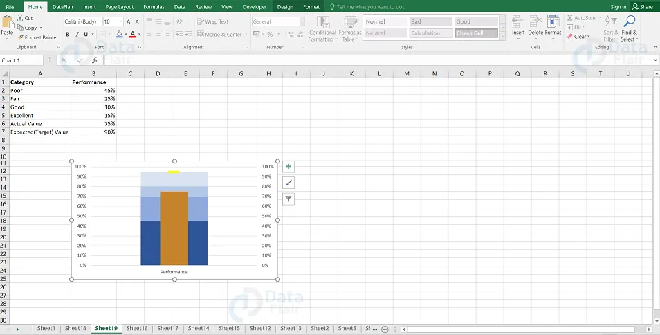
4. Bullet Chart in Excel
If you are a user of excel then you would have obviously come across the dashboards at some time. Whether in the office or somewhere wherever you use technologies. The dashboard’s main limitation is that there is not much space to present all our analytical insights.
Dashboards are mainly visuals which gives the user a simple and crisp idea about it. So, the user has to use a chart which consumes less of space to make the dashboard look more insightful and that is where the bullet charts come in. Bullet chart is one of the widely used charts when the user has to measure performance over the target. This chart can be used as a KPI speedometer under Dashboard and it consumes very less space.
How to create a Bullet Chart in excel?
To create the bullet chart, follow the steps:
1: Select the data from A1:B7 and click on the insert tab from the ribbon. Go to the charts group under the insert menu.
2: Select the Insert Column or Bar Chart dropdown and choose the Stacked Column Chart under the 2D-Column Charts section.
3: Click on the Chart and go to the Design tab.
4: Click on Switch Row/Column option under the data group.
5: Right click on the top bar and that is the data of expected/target value and select the “Change Series Chart Type…” option.
6: Change the chart type for it as Stacked Line with Market and check mark the box of the Secondary Axis option.
Note: The targeted value will appear as a dot now.
7: Click on the bar representing Average Value in the chart and right-click on it to choose the “Change Series Chart Type…” option.
8: On the Change Chart Type window, Mark the checkbox of the secondary axis
9: Select the format data series option for the actual value series.
10: Change the Gap Width to its maximum value which is 500% at the format data series window.
11: Now, click on the target value dot, right click on it and select the Format Data Series option.
12: Select Fill & Line, go to marker, click on built in and make the size as 20 under marker options.
13: Navigate towards the Fill section and change the color to Yellow instead of Green.
14: Change the border as “No Line” under the border section.
5. Animation Chart in Excel
The charts with an animated illustration and which are also profound in a dynamic way are called the animation charts. The user uses the animation chart to better understand the charts. Actually, the animation charts require a little extra effort and knowledge of macro to create dynamic changes and movements in it.
To create an animation chart, the user needs to create a normal chart for which they will add little coding in VBA to make it an animated chart. So, in order to create an animation chart, the user must have knowledge of VBA coding. It is not mandatory to use coding for animated charts if the user is good at creative thinking and then they can create charts without coding. By following the below steps, you create an animation chart:
1 – Enter the data records in an excel sheet.
2 – Click on the A,C and D cell records which are racer name, race completed support and car size details.
3 – Click on the insert option from the ribbon then choose a stacked bar from 2D columns.
4 – Remove all the extra elements such as chart title, legend etc from the chart by deselecting all the options in the chart elements menu.
5 – Right click on the chart and then select format data series.
6 – Double click on the percentage completion chart and select the “Gradient Fill” option from the right side pane of the window.
7 – Click on the car percentage data on the chart and choose a picture from your system and paste it on that part in the chart.
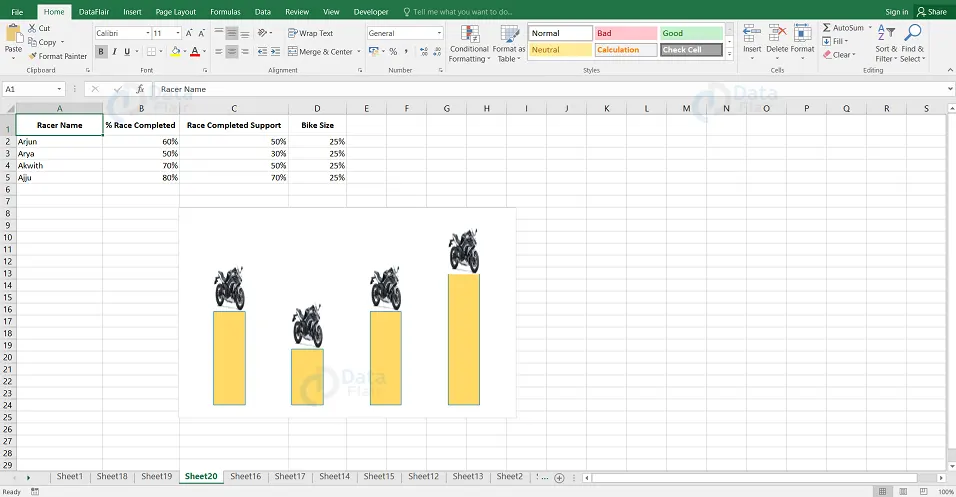
8 – Go to the developer tab and open the VBA code editor.
9 – Add the following below code in the editor module.
Note: The user needs to add the VBA code to create movements to the bikes when the percentage value of the bike size is modified.
VBA code:
Private Sub Worksheet_Change(ByVal datas As Range)
Dim data As Worksheet
Set data = ThisWorkbook.Sheets("Sheet20")
Dim i As Integer
 If datas.Column = 2 Then
 If datas.Row > 1 And datas.Row <= 5 Then
 For i = 0 To data.Range("B" & datas.Row).Value * 100
 VBA.DoEvents
 data.Range("C" & datas.Row).Value = i / 100
 Next i
 End If
 End If
End Sub
By following the above steps, the user can create an animation chart in Excel.
6. Flow Chart
To create the flow of any process from beginning to an end, the user can make use of the flow chart. The user can use different shapes from the shape option under the insert tab. Each and every flowchart begins and ends with a rectangle. The one directional arrow mark in the chart represents the direction of the flow. The user can use diamond shape when there are functions executing. Each and every shape has a unique meaning in the flow chart. Make sure to provide a name for each step to make it more understandable.
How to create a flow chart?
To create a flowchart,follow the steps:
1 – Choose the cells in the worksheet and click on the box in the upper left corner.
2 – It will open a drop down list once you right click on the column heading.
3 – Click on the column width and change it to 2.14. The changes in column width will make an effect on the worksheet.
4 – Press the OK button.
5 – Under the page layout tab, click on the align option under the arrange menu.
Note: When the user resizes the shape, it could be easy to place on the grid.
6 – Choose snap to grid option from the drop down list.
7 – Under the insert tab, click on the shapes and choose it from the flowchart category.
8 – Drag the items and place it on the worksheet.
9 – Click on the wordart and write the prerequisite in the shapes.
10 – Connect the shapes with the lines and lines are available in the lines menu in the drop down list.
By following the steps, the user can create a flowchart in excel sheet.
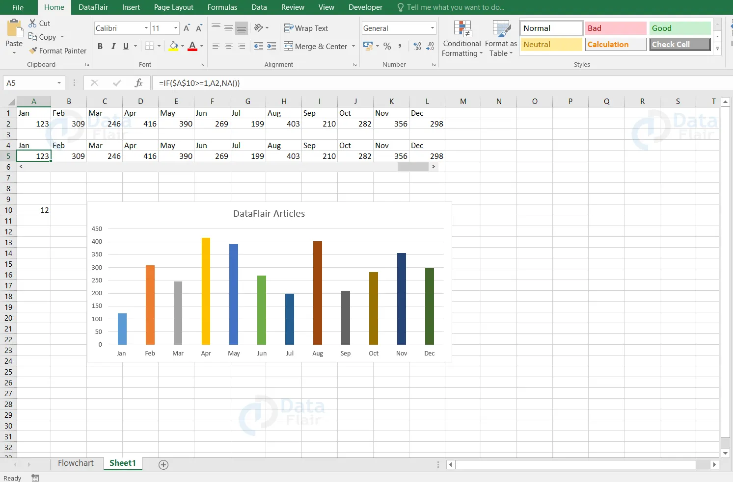
7. Interactive Chart
Interactive chart is a graphical form chart in excel and it is effective while representing the insights. These types of charts are effective and user friendly. The interactive chart works in a way that when the user clicks on the particular value, then those outputs are displayed on the chart. The user can fill the charts with different colors to make it more catchy. The user mostly prefers the charts in excel as it is easier to understand.
To create an interactive chart, follow the steps:
1 – If the chart is in vertical form then convert it into horizontal form.
2 – The user can convert a vertical table to horizontal table by copying the table and pasting it in transpose form. Also, maintain a copy of the table format alone without any values in it.
3 – Under the developer tab, insert a scroll bar in a horizontal direction.
Note: The user must be able to scroll the bar from left to right or vice versa.
4 – Right click on the scroll bar and choose format control options.
5 – Go to the control tab in the window pane.
6 – Set the maximum value to 12 as the table contains 12 months data. Mark 0 in the current value, minimum value and page change. Keep 1 as the increment change value. Specify the A10 cell in the cell link.
7 – Press the OK button.
8 – The scrollbar is ready now. When the user clicks either on the forward or backward button, it will either increase or decrease by the same number of times and the output can be seen on the A10 cell.
9 – Apply the following formula in the A5 cell. “IF($A$10>=1,A2,NA())”
Formula Explanation:
In A10 cell, the formula represents that the value in it increases or decreases by 1 when the user clicks on the scroll bar. Hence the user will have a value from the A2 cell or else it will represent the error as #N/A. As the first month is Jan, the formula is written as >=1. Similarly, for the other months the value should be changed.
10: Drag the cursor until where the formula should be applied.
11: Plot a column chart for the table.
12: Right click on the points from the plotted graph and choose the format data series option.
13: Go to fill option and choose vary colors by point option.
By following this way, the user can create an interactive chart in excel.
8. Control Chart
Control charts are one of a statistical chart to monitor a process over a particular period of time. This chart is mainly used by the manufacturer sector in order to check if the process is under control or not. A control chart is built by a line chart. It can be generated when the user has upper and lower control limits for the data, and if they want to check if the control points are lying between the limits.
To create a control chart, follow the steps:
1- Make sure you have everything in the dataset table to create a control chart. Select the points column from the dataset.
2 – Under the insert tab, go to the line chart and choose a line with markers chart.
3 – Now, the user has to add the upper and lower limit of the data.
4 – Right click on the graph and choose the select data option.
5 – Click on the add button in the select data source dialog box.
6 – Insert the series name and series values under the edit series dialog box. Click on the ok button after adding every series in the chart.
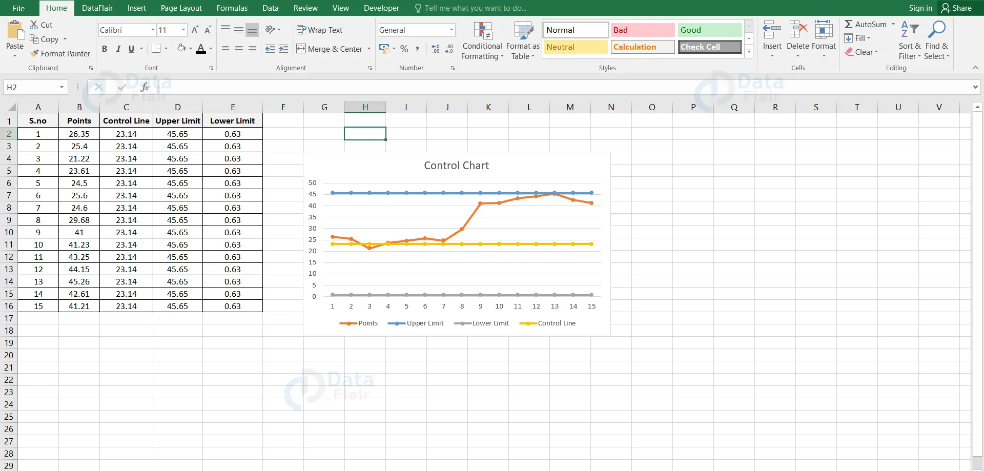
By following the above steps, the user can create a control chart.
9. Marimekko Chart in Excel
Marimekko chart is a chart which is used to visualise the categorical data for a pair of variables. This chart is mainly used by business analysts in consulting and financing companies. This chart is also referred to as mekko or matrix chart as it contains similar patterns of marimekko fabrics. Data is represented as blocks which vary in height and width. This chart helps to check out the company’s relative positioning in different segments and market segmentation analysis.
There are two variables and one variable represents the vertical axis’s height and the other variable is the width of bars or columns. In order to create a marimekko chart, the user has to spend a lot of time creating it.
To create a marimekko chart, follow the steps:
1 – Convert the data in the percentage format.
2 – Insert the stacked bar chart to the table dataset.
3 – There is a gap in between the data series in the stacked bar chart and so the user has to format it by removing the gap width across data bars.
4 – Change the gap width from 150 to 0.
5 – In the X-axis, the user can observe the multiple similar names of the company in the chart. The user can update it to a single company name record by keeping it at a middle portion and deleting the other records in the data table.
6 – The user can observe the sales data for each segment of one company overlapping each other. In order to overcome the overlapping, create boundaries across each company sales segment.
7 – Insert lines across each company’s borders and update the shape outline color to white.
8 – Increase the width of the line to have a clear visualization of the chart.
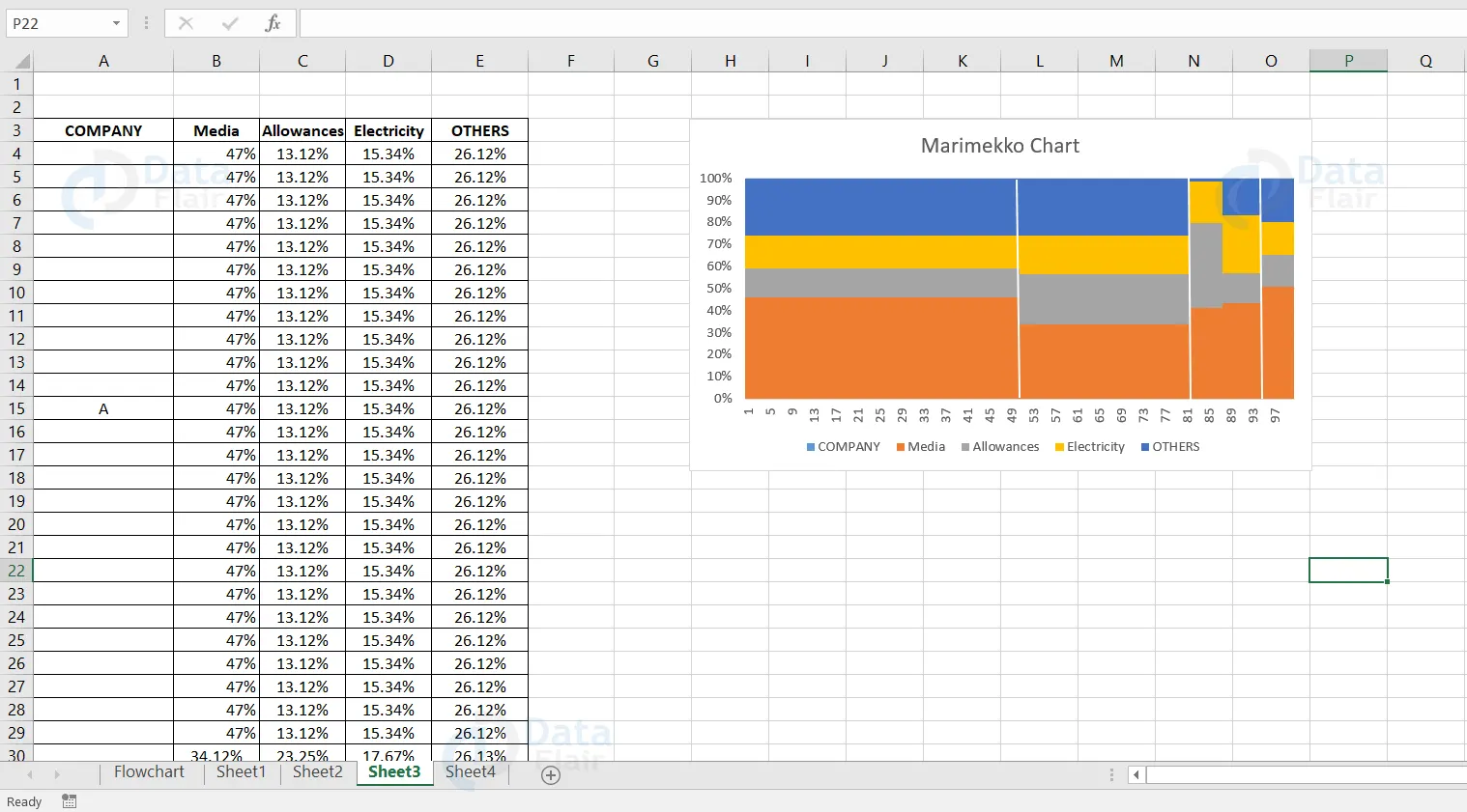
The user can create the marimekko chart by following the above steps. Each column height represents the sales in each department for individual companies. The bar width in the chart indicates the company’s sales performance compared to the other companies.
Summary
Advanced charts are widely helpful to consolidate the datasets and it also helps us to visualize the data values to identify the pattern and trends in it.
Did you like our efforts? If Yes, please give DataFlair 5 Stars on Google


