Add & Format Tables, Charts, SmartArt in PowerPoint
Job-ready Online Courses: Click, Learn, Succeed, Start Now!
Sometimes in our presentations, we may have to add a table, a chart or a SmartArt. PowerPoint has a cool feature to let you add as many tables, charts and SmartArt as you want and customise it to the maximum. Here are the steps you need to follow to add and edit the said features:
How to Add Tables in PowerPoint?
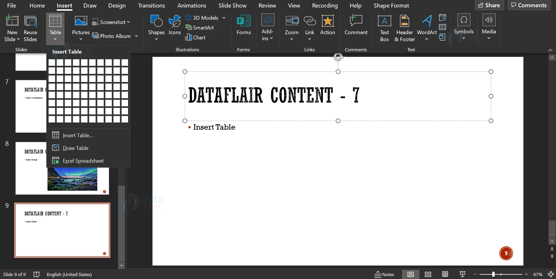
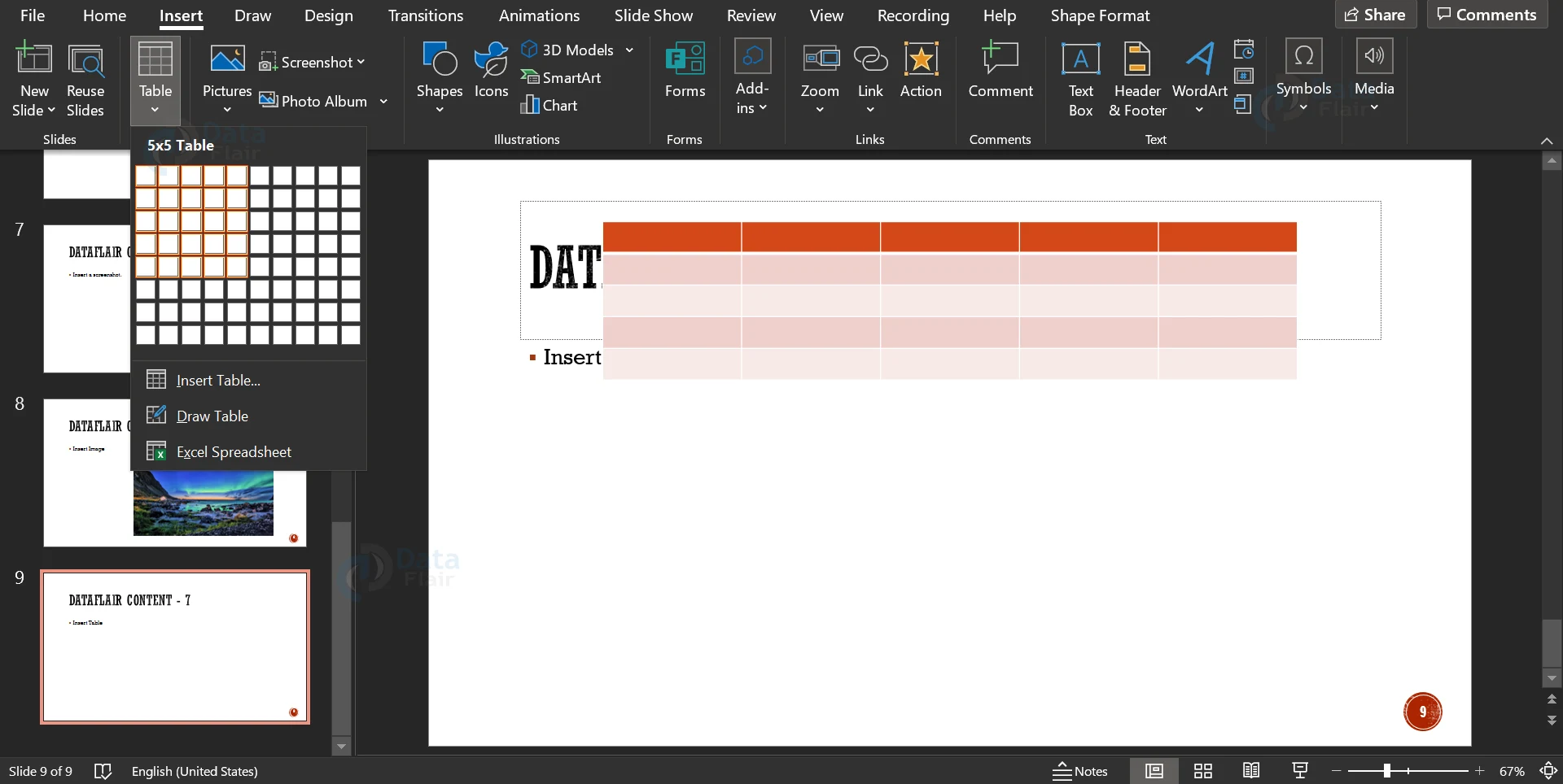
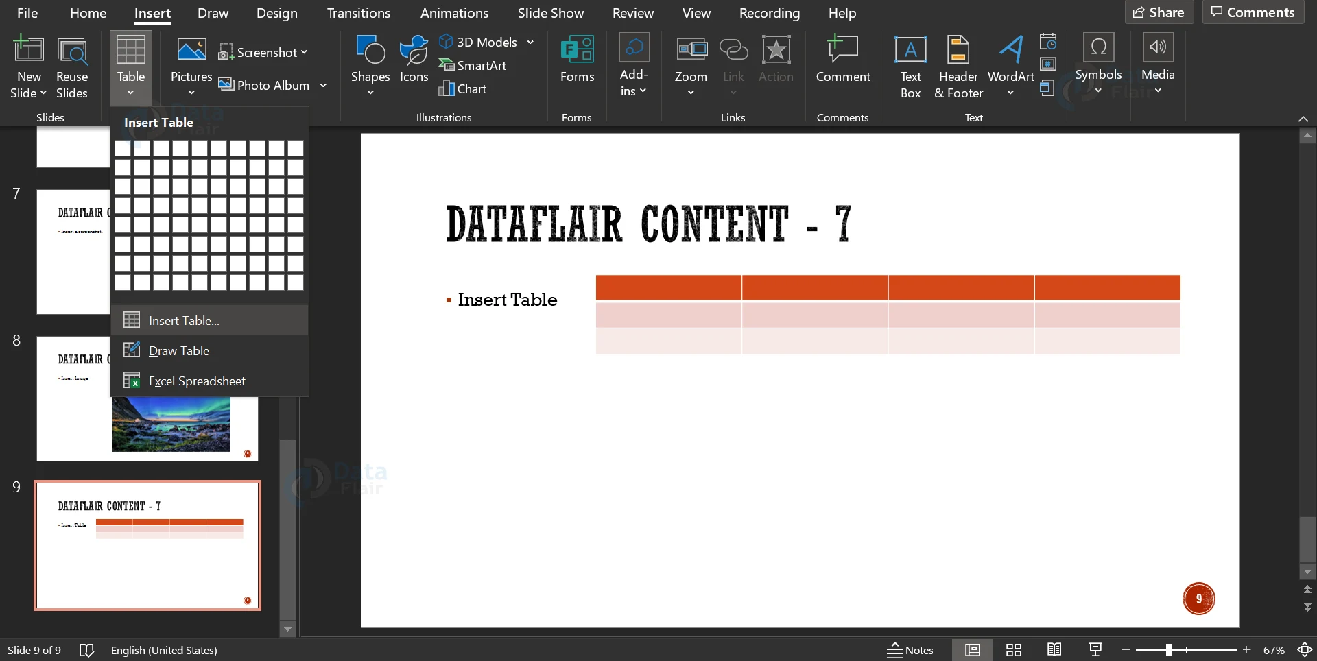
1. Click on the Insert tab to open a menu ribbon. If you hover over the Table icon, you will see rows and columns as small squares. You can click on the number of rows and columns to insert a table in the current slide.
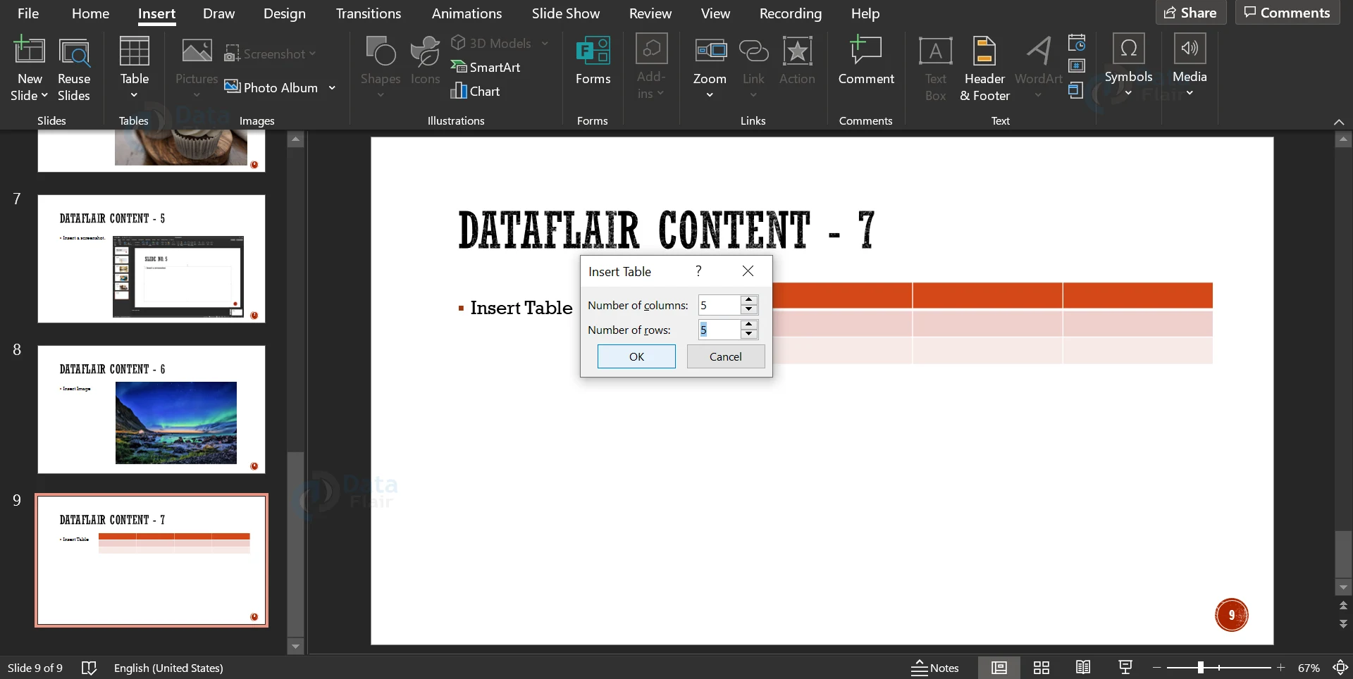
2. You can also select the Insert Table option to insert a table. A dialog box with a prompt for the number of rows and columns will appear when you click on Insert Table.
3. Click on the OK button to insert the table. In the menu ribbon, you can choose different colour schemes for your table.
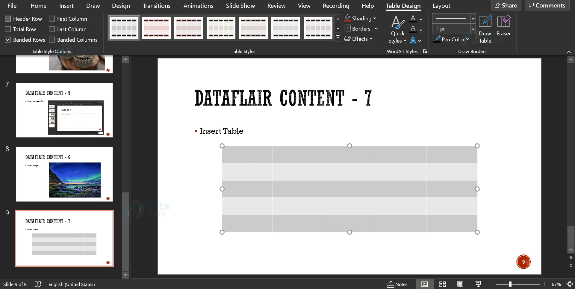
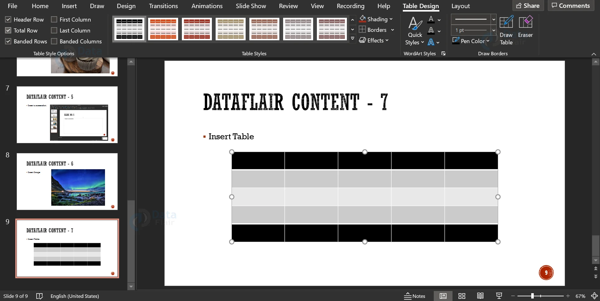
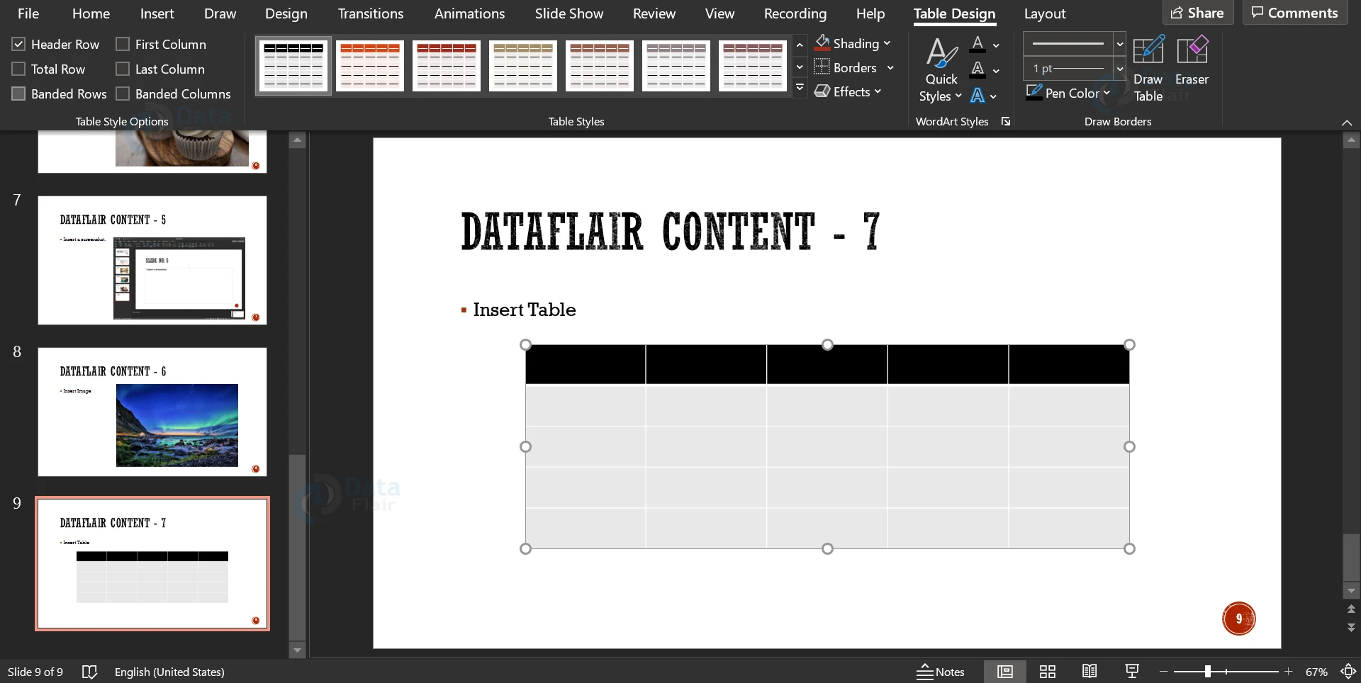
4. On the left side in the menu ribbon, you can see six checkboxes for various settings of the table. If the Header Row checkbox is selected, the header row is given a different colour. Header row has a different shade by default.
5. If you select the Total Row checkbox, the last row is filled with a different colour. Total row does not have a different colour by default.
6. If you select the Banded Rows option, alternate rows will be filled with different shades. The rows have alternate colour shades by default.
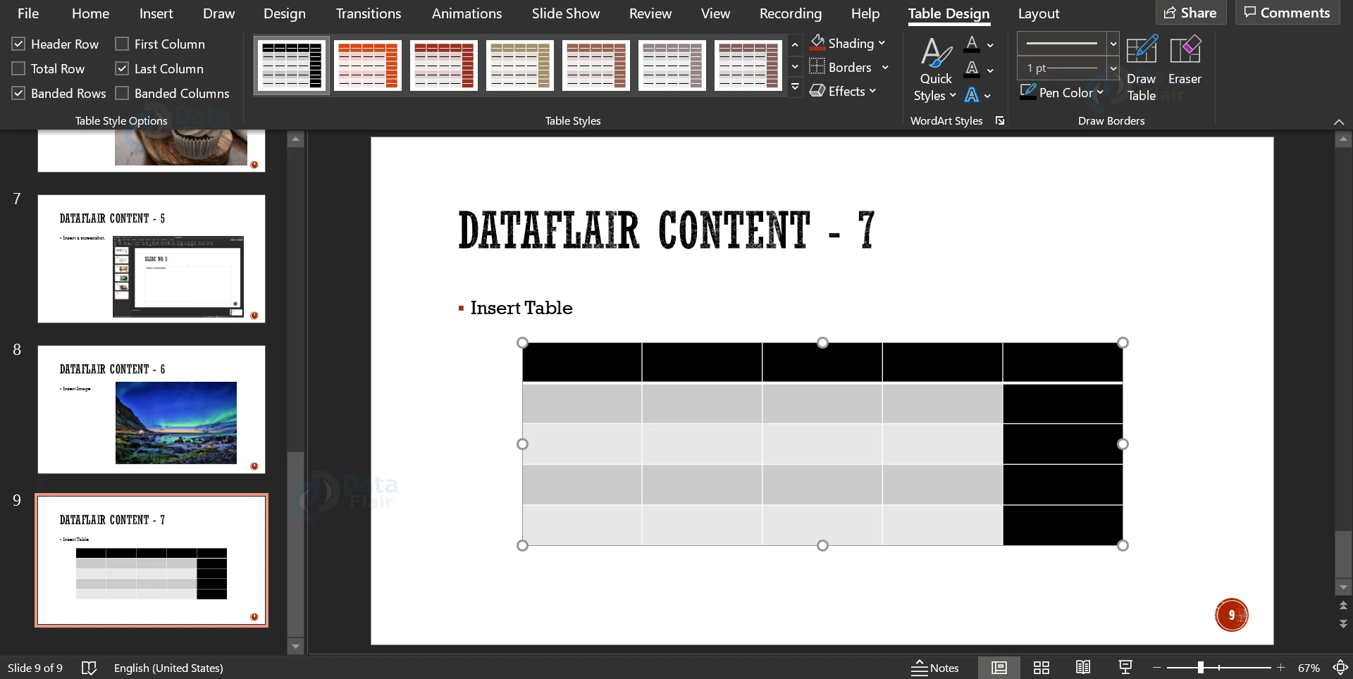
7. If you select the First Column option, the first column is given a different colour. It is unselected by default. Similarly, for the Last Column option.
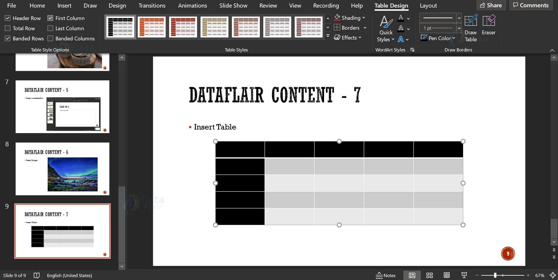
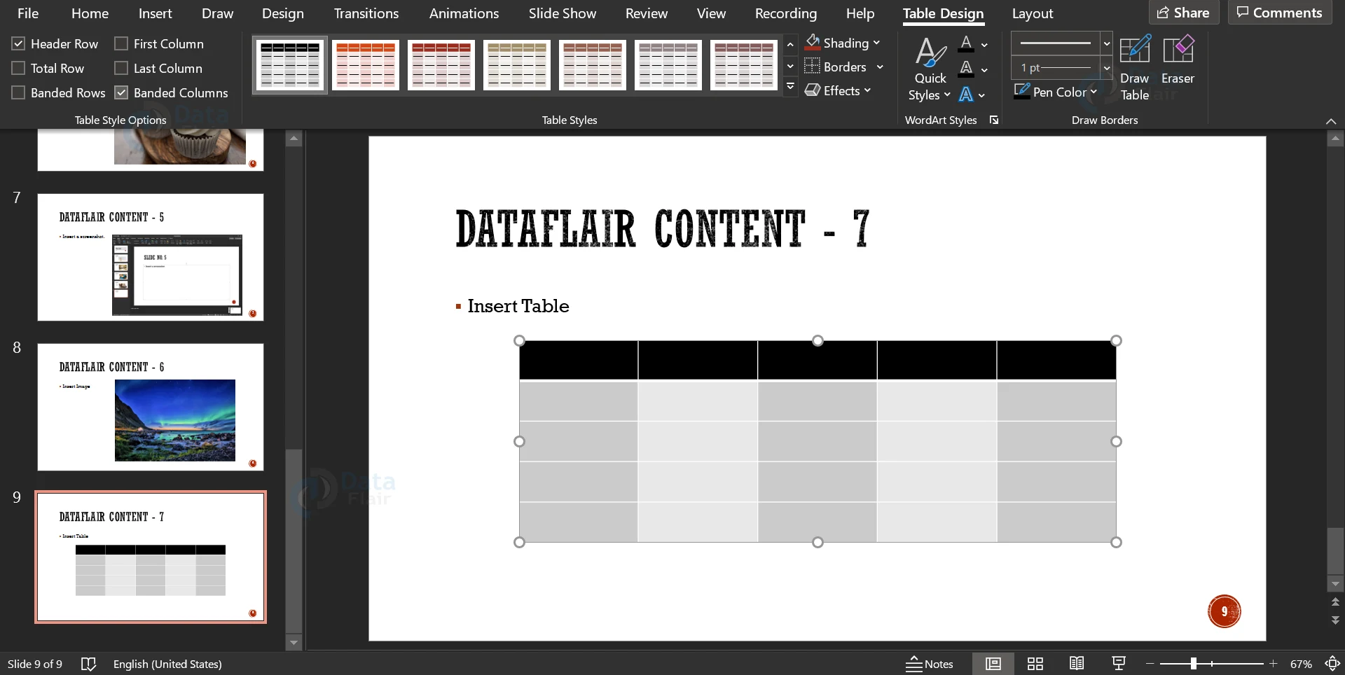
8. The Banded Columns option, while selected, fills alternate columns in different shades of colour. This is also unselected by default.
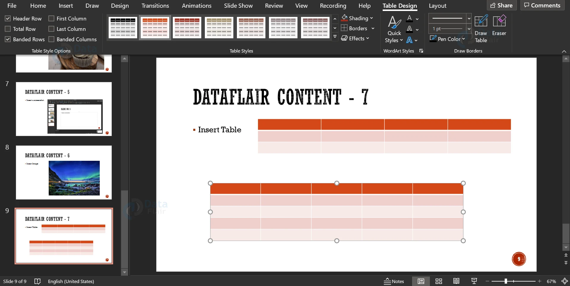
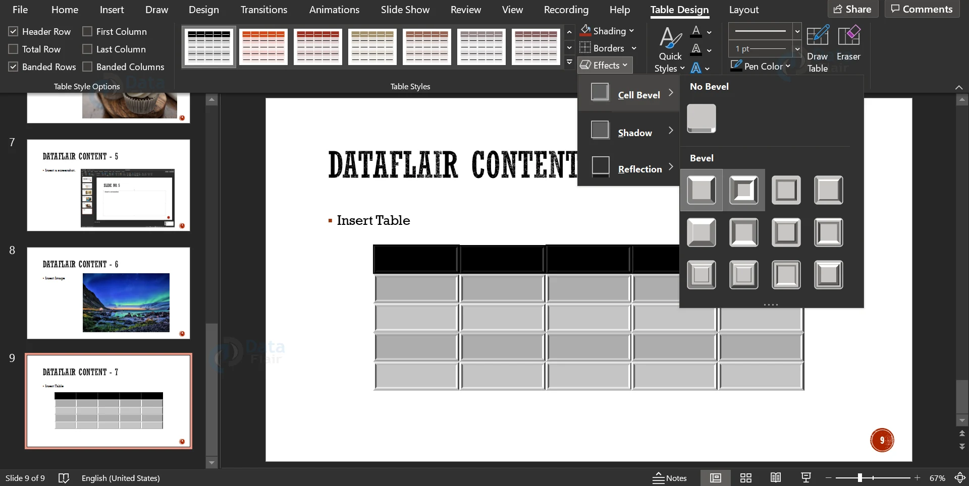
9. You can also add different effects to the cells of the table using the Effects option. This picture is for your reference.
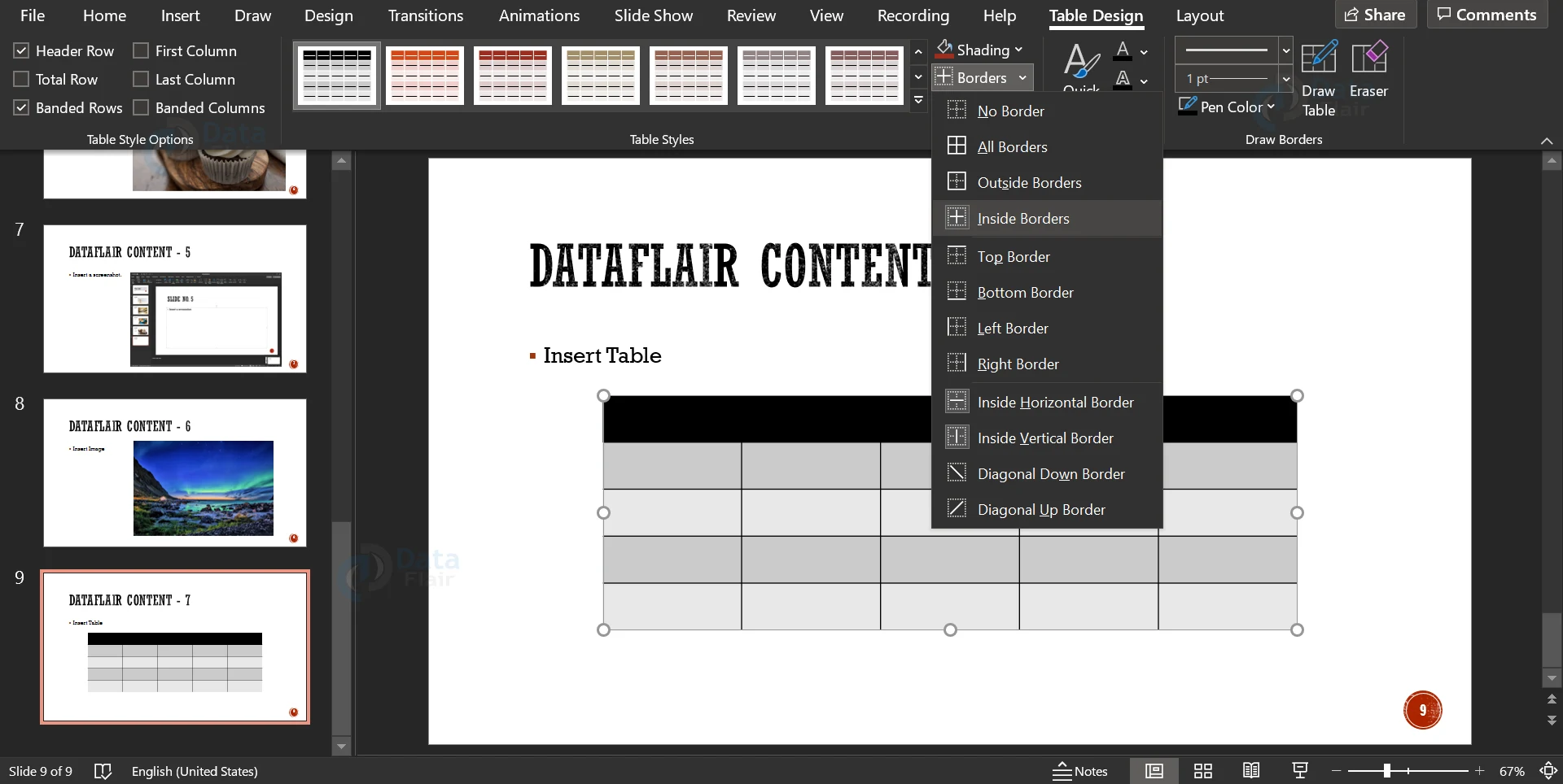
10. You can add custom borders to the table using the Borders Option. You can also add shading to the cells using the Shading option.
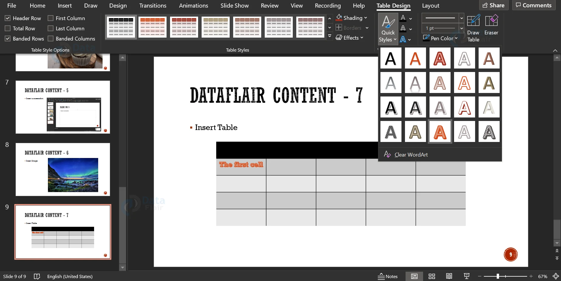
11. You can add WordArt to the data typed inside the table using the Quick Styles option.
12. You can change the thickness, colour and format of the borders using the options in the submenu Draw Borders. You can also draw a table using the Draw Table option. Using the Eraser, you can merge two or more cells by erasing the border between them.
How to Format Tables in PowerPoint?
1. In the tab named Format, you will find options to add, remove and merge rows.

2. You can also delete the entire row from the options in this tab. You can also split the cells.
3. There are options to change the justification and the vertical placement of the cell contents.
4. You can add cell margins and define a specific size for each cell.
How to Add Charts in PowerPoint?
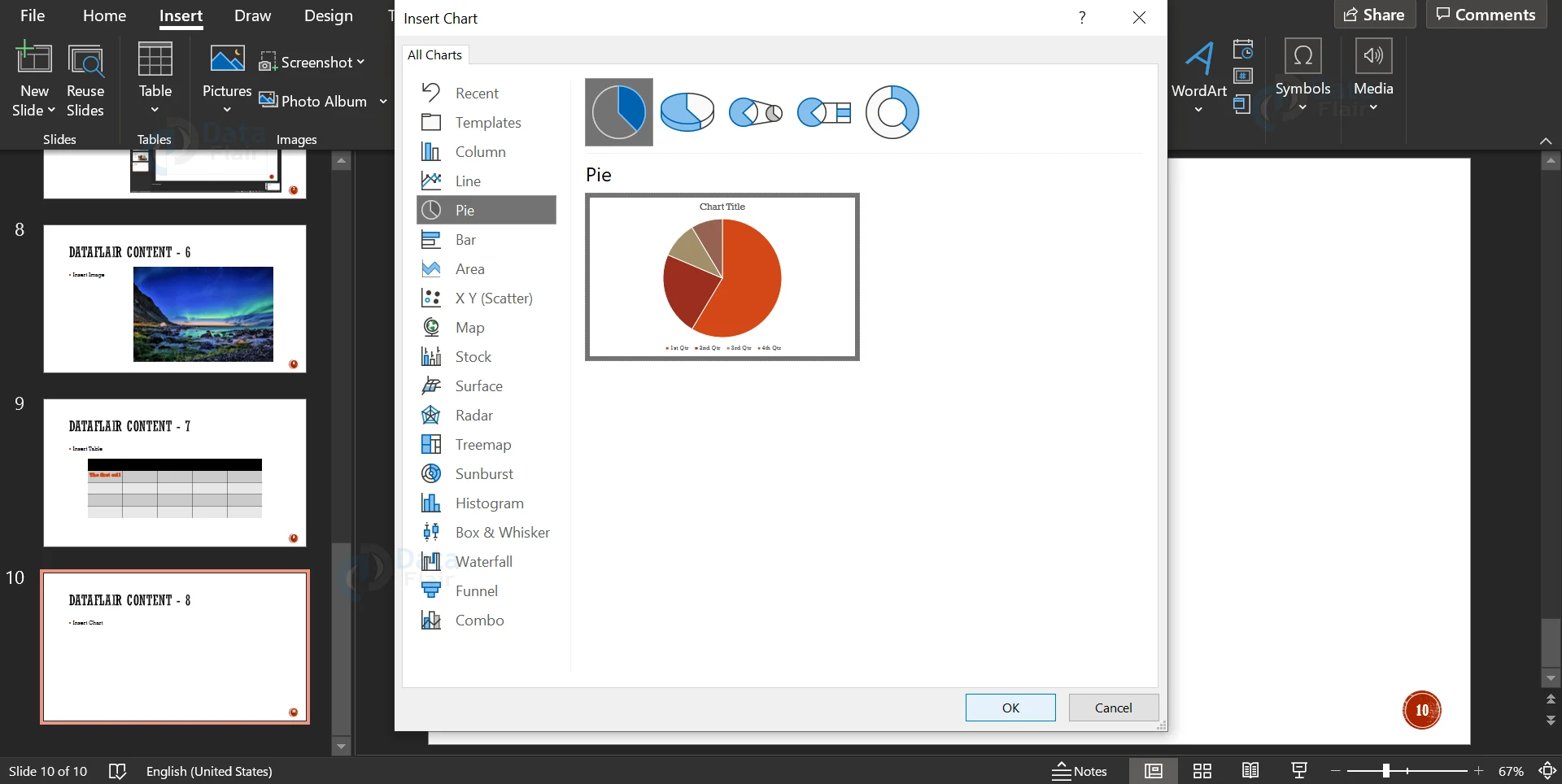
1. To insert a chart, click on the Chart option in the Insert menu ribbon.
2. Pick any kind of chart that you want to add and press Enter or click on OK. In this article, we will add a pie chart.
3. Along with the chosen chart, a dialog box with a table appears. In this table, you can add your custom values to be represented using the chart. If you accidentally close it, you can always open it back up using the Edit Table icon in the menu ribbon.
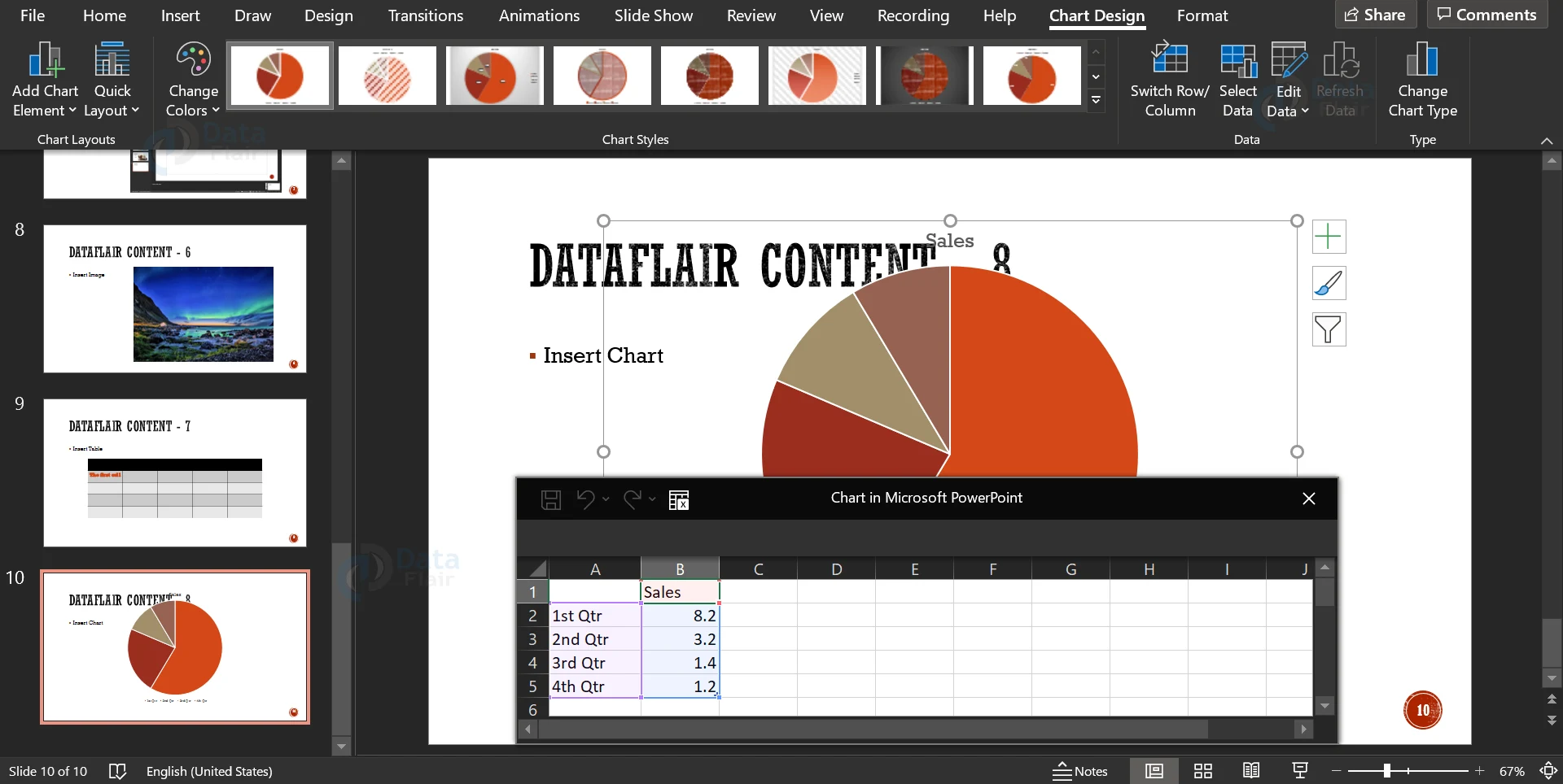
4. Similar to the tables, you can change the design of the chart using the pane in the menu ribbon.
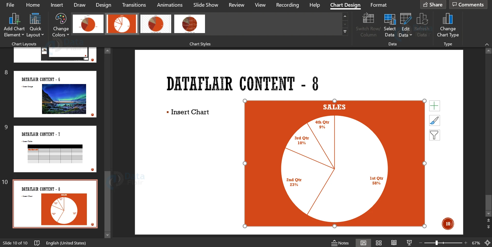
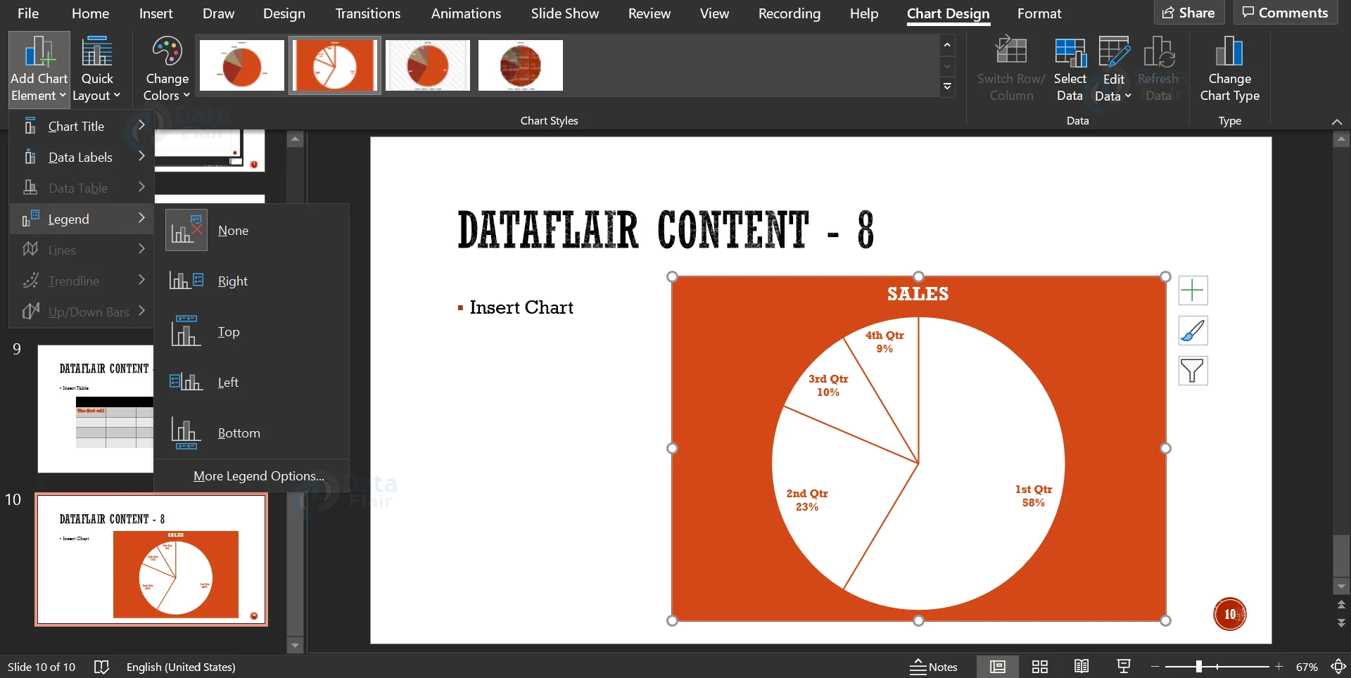
5. You can also add chart elements like Legend or a title using the Add Chart Element option and the dropdowns.
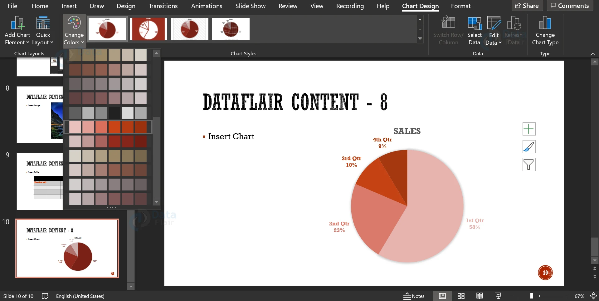
6. You can quickly change the colour scheme of the chart using the Change Colours dropdown.
7. Clicking on the Change Chart Type option will open up a dialog box similar to the one shown in Step 2. From this box, you can convert your pie chart into any other chart as per your desire.
How to Format Charts in PowerPoint?
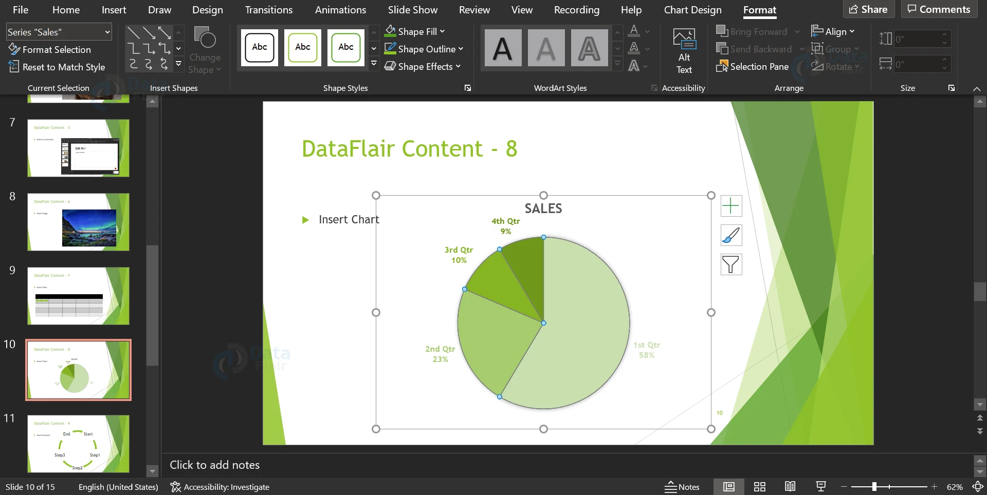
1. You can explore the formatting options available in Microsoft PowerPoint using the Format tab.
2. You can add arrows and lines of different types, you can also add borders to the text.
3. You can use shape fill, outline and effect options for your chart.
4. You can add WordArt, a very popular design tool, to your chart.
5. You can also add an Alt Text for your chart and define the depth of the chart.
How to add SmartArt in PowerPoint?
1. SmartArt is a feature in PowerPoint that allows the addition of diagrams that are not Charts or Tables. These include flow charts, cycles and matrices. In this example, we will look at how to add and customise a cycle diagram.
2. To add a SmartArt, click on the SmartArt icon in the Insert Menu ribbon. This will open a dialog box like this:
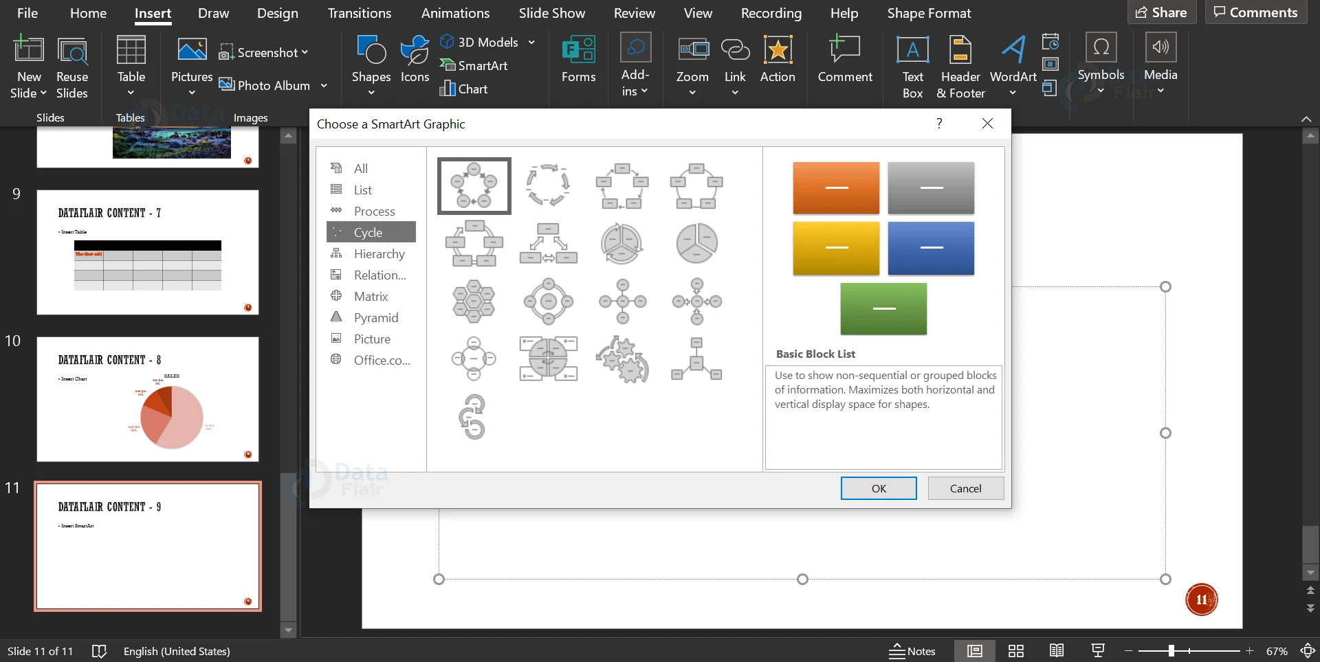
3. Choose a SmartArt based on your need and click on OK. The SmartArt appears with a box for adding the text in the elements. You can replace the placeholders with the content of your presentation.
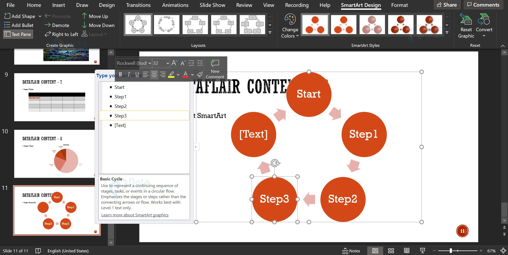
4. You can quickly change the style of the SmartArt using the pane present in the menu ribbon.
5. Clicking the Add Shape button gives you the opportunity to add another element to the SmartArt.
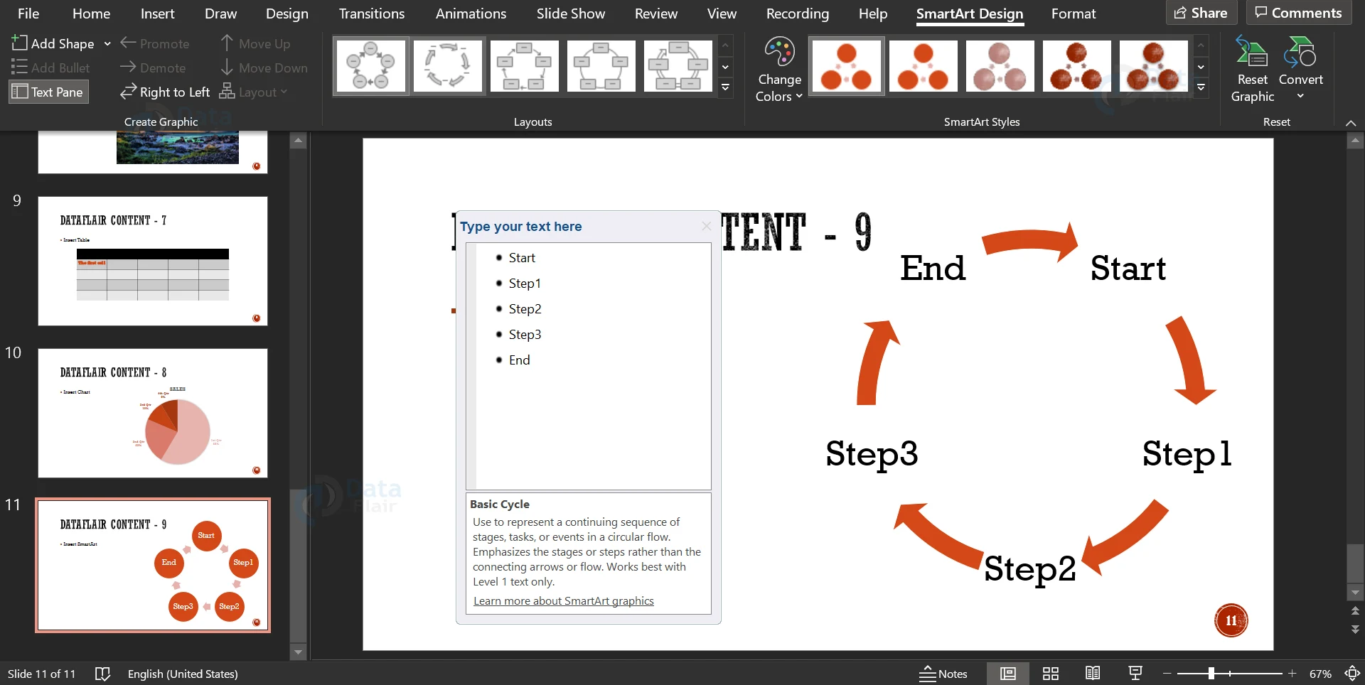
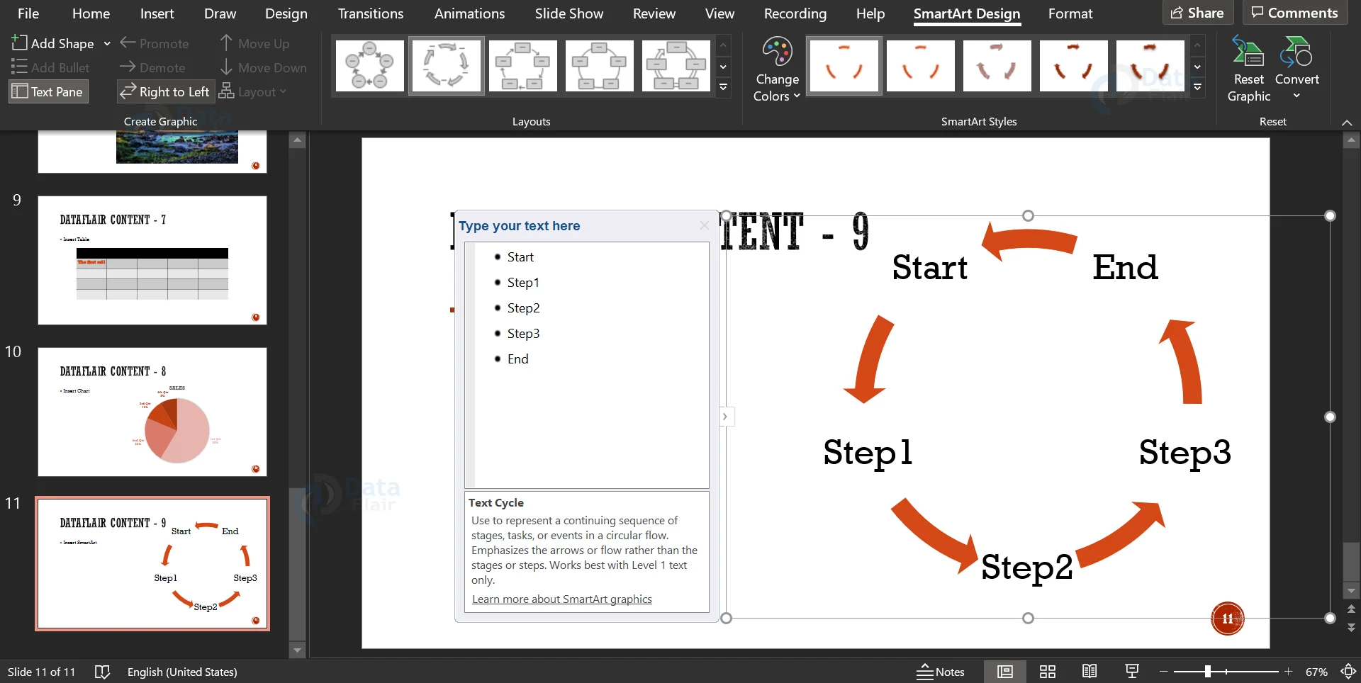
6. Click on the Right to Left button to toggle between clockwise and anticlockwise directions of the cycle. This will adjust the cycle content accordingly.
7. Click on the Text Pane button to toggle between the presence and disappearance of the box in which you can edit the text in your SmartArt.
8. You can change the colour scheme of your SmartArt using the Change Colors dropdown. You can change the design of the elements (arrows) in your SmartArt in the pane that is present in the menu ribbon.
9. To reset the elements to their default formatting, click on the Reset Graphics button.
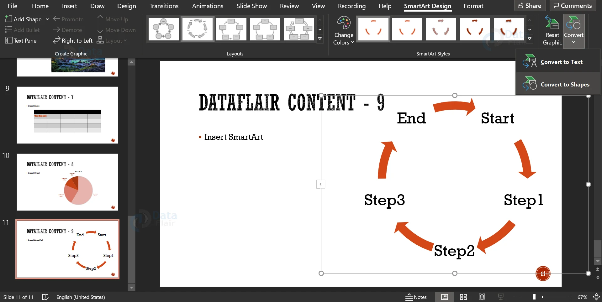
10. You can also convert the SmartArt into text, by clicking the Convert button and then clicking on the Convert to text option in the dropdown.
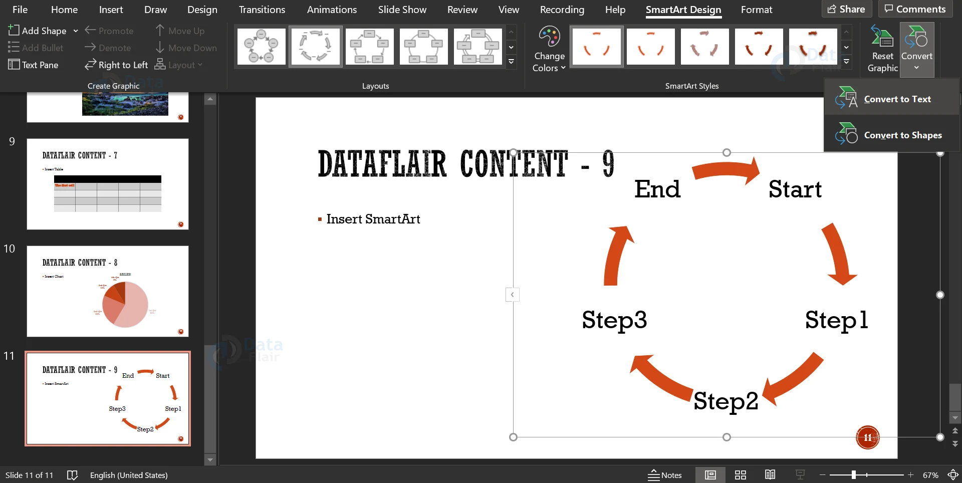
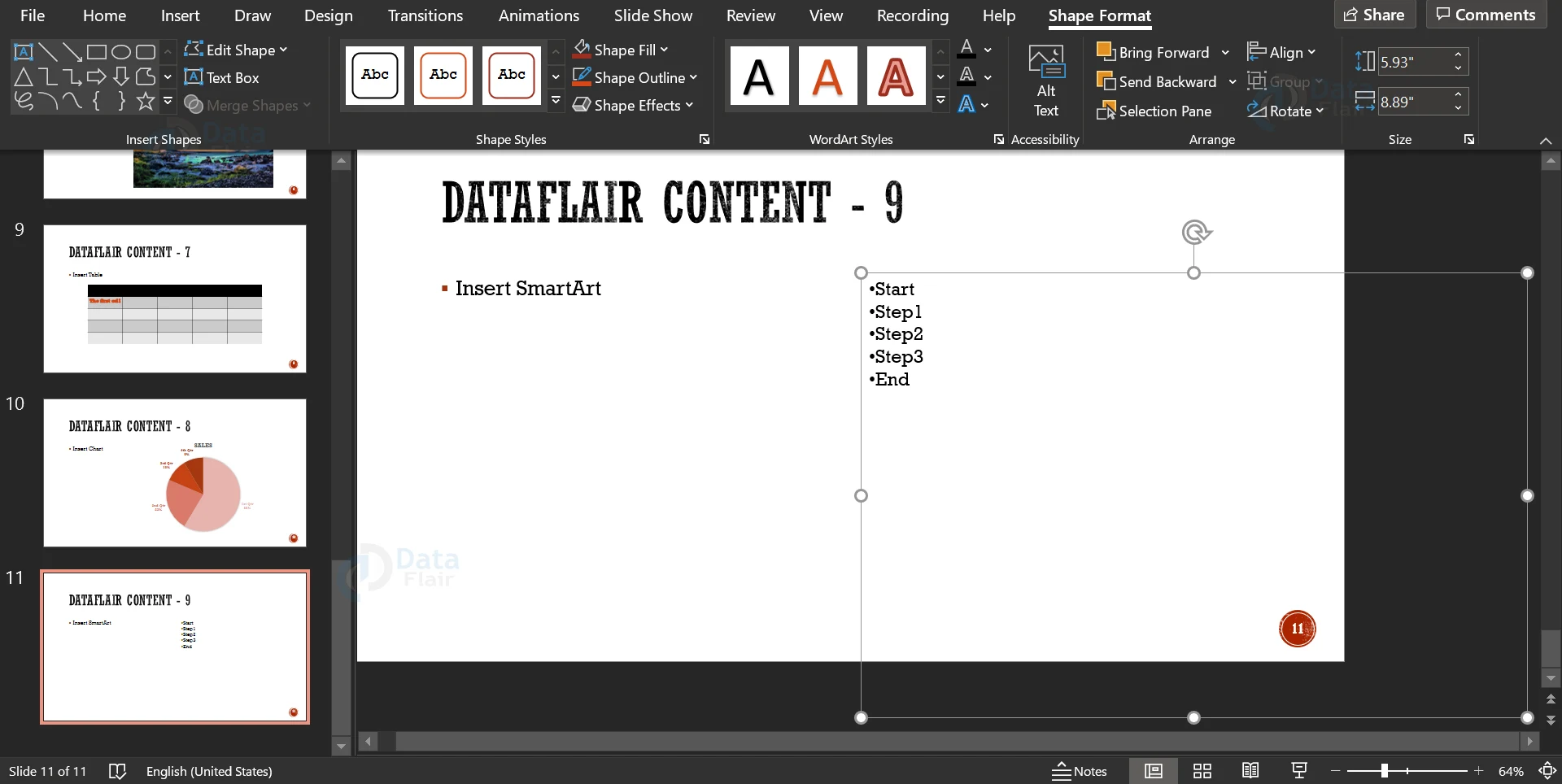
11. You can convert the SmartArt into a shape using the same icon, but by clicking on the Convert to Shape option in the dropdown. Notice that on conversion to a shape, the tab name changes from SmartArt Design to Shape Format.
How to Format SmartArt in PowerPoint?
1. Similar to the charts, you can add formatting to SmartArt using the Format pane.
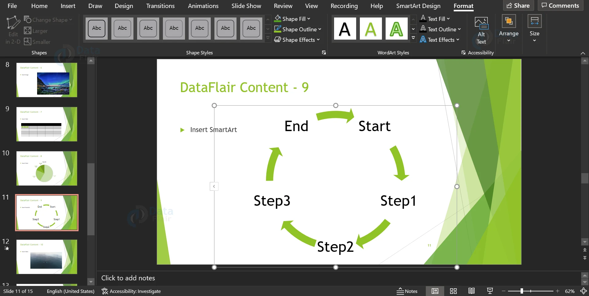
2. It is exactly similar to the Format tab of charts, with a few additional options.
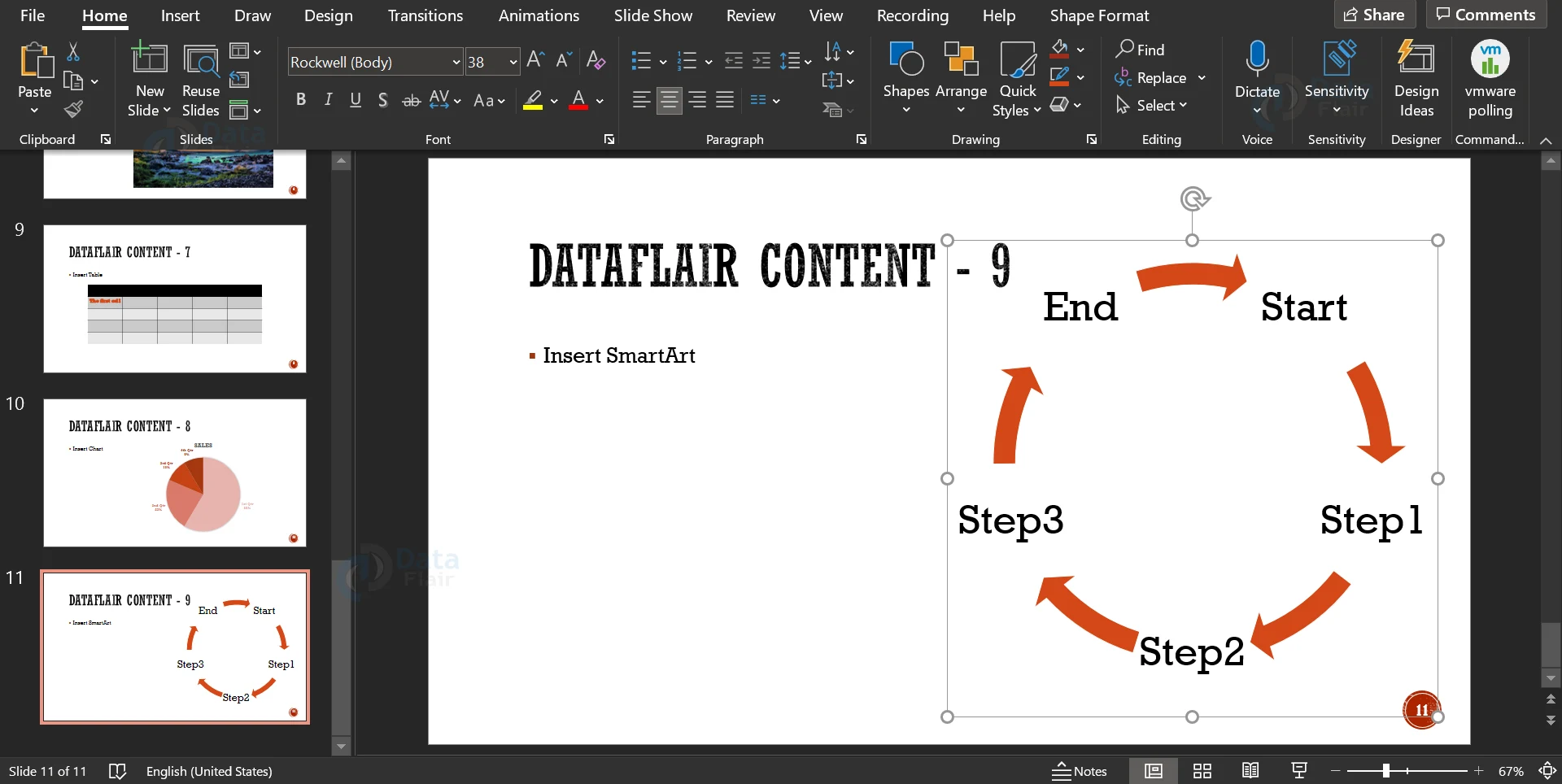
3. You can Arrange the SmartArt as you wish using the Arrange button.
4. You can also resize your SmartArt using the Size icon.
Summary
And that is a wrap for this article folks! We hope that with this article, every reader has learned a lot about the charts, tables and SmartArt in Microsoft PowerPoint. These are features that are very often used in presentations to better engage the audience and present data visually. Keep them handy in case you need to prepare a data-oriented presentation.
Did you like our efforts? If Yes, please give DataFlair 5 Stars on Google


