CSS Layout
Free Web development courses with real-time projects Start Now!!
The way we create the whole UI of the websites and CSS Layout have both seen a significant change in the last few years. Now that we have a true selection of layout techniques available to us in CSS, we frequently have to choose which course of action to pursue. In this article, I’ll go over the several layout options you have by outlining the fundamentals of how they work and what they’re used for.
What is CSS Layout?
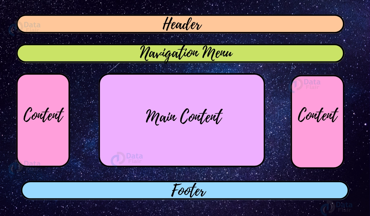
Designing a CSS layout is simple. Our website’s home page, contact page, about page, and other pages can all be designed using a CSS layout. A CSS layout may include a body section, a left pane, a right pane, a header, and a footer.
With CSS page layout techniques, we can manipulate the positioning of items on a web page based on their placement in the layout flow, surrounding elements, parent box, and viewport/window.
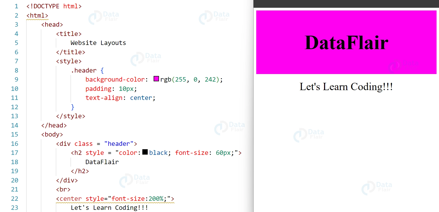
Header
At the beginning of a webpage, a header is typically found. An emblem or the name of the website is frequently present.
Example:
<!DOCTYPE html>
<html>
<head>
<title>
Website Layouts
</title>
<style>
.header {
background-color: rgb(255, 0, 242);
padding: 10px;
text-align: center;
}
</style>
</head>
<body>
<div class = "header">
<h2 style = "color:black; font-size: 60px;">
DataFlair
</h2>
</div>
<br>
<center style="font-size:200%;">
Let's Learn Coding!!!
</center>
</body>
</html>
Output:
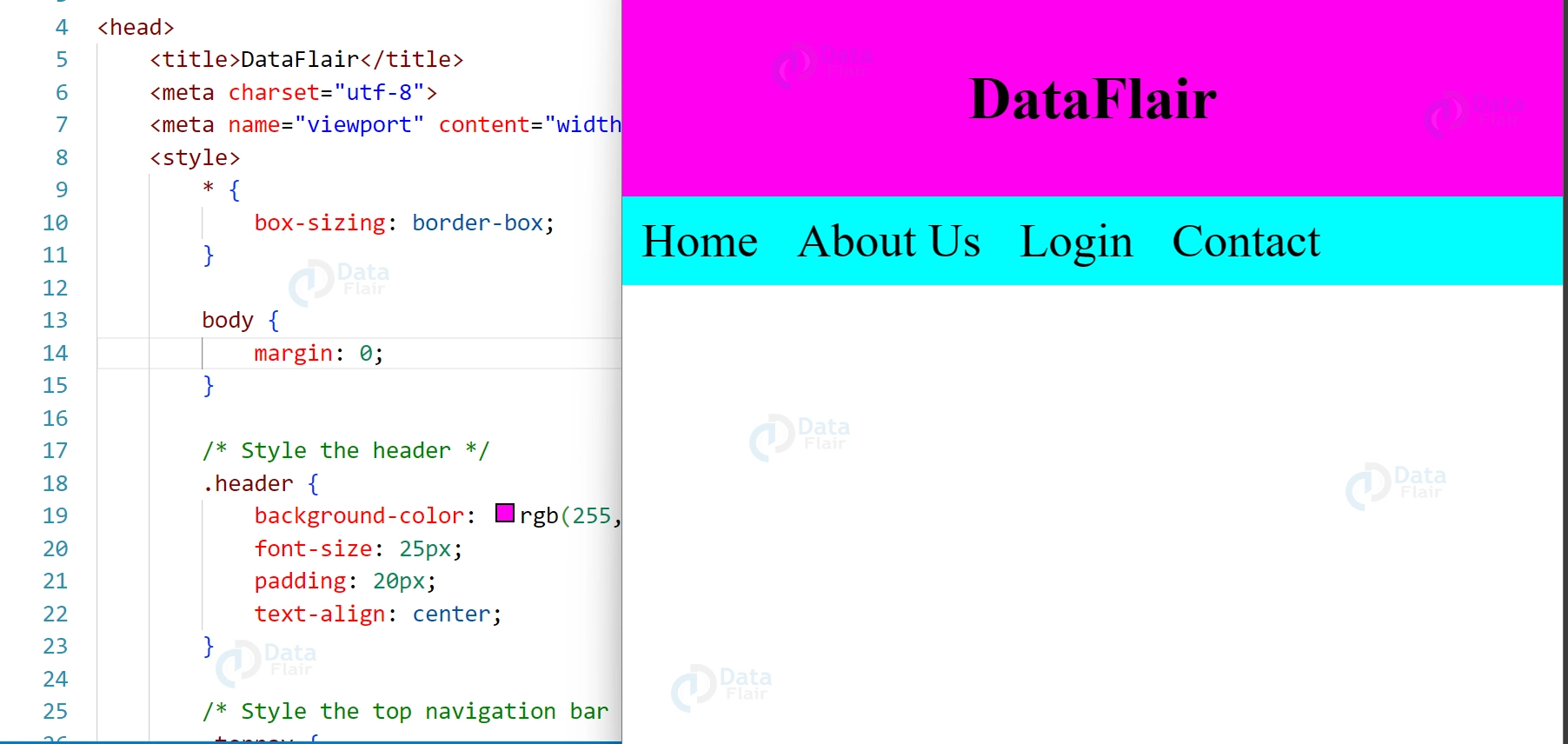
Navigation Pane
Links are listed on a navigation bar, which makes it easier for website visitors to navigate.
<!DOCTYPE html>
<html lang="en">
<head>
<title>DataFlair</title>
<meta charset="utf-8">
<meta name="viewport" content="width=device-width, initial-scale=1">
<style>
* {
box-sizing: border-box;
}
body {
margin: 0;
}
/* Style the header */
.header {
background-color: rgb(255, 0, 242);
font-size: 25px;
padding: 20px;
text-align: center;
}
/* Style the top navigation bar */
.topnav {
overflow: hidden;
background-color: rgb(0, 255, 255);
}
/* Style the topnav links */
.topnav a {
float: left;
display: block;
color: black;
text-align: center;
padding: 14px 16px;
text-decoration: none;
font-size: 40px;
}
/* Change color on hover */
.topnav a:hover {
background-color: #ddd;
color: black;
}
</style>
</head>
<body>
<div class="header">
<h1>DataFlair</h1>
</div>
<div class="topnav">
<a href="#">Home</a>
<a href="#">About Us</a>
<a href="#">Login</a>
<a href="#">Contact</a>
</div>
</body>
</html>
Output
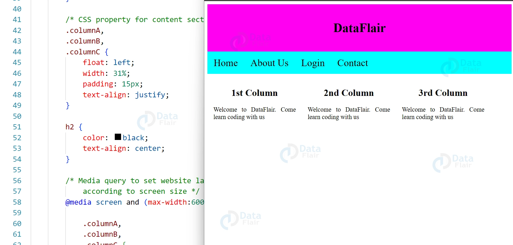
Content
The intended users influence the design in this area frequently. The following designs are the most typical layouts:
1-column (frequently used for mobile browsers).
2-column (frequently utilized for tabs and laptops).
3 format (only utilized for computers)
<!DOCTYPE html>
<html>
<head>
<title>
Layout
</title>
<style>
* {
box-sizing: border-box;
}

/*header section */
.header {
background-color: rgb(255, 0, 242);
padding: 15px;
text-align: center;
}

/* navigation menu */
.nav_menu {
overflow: hidden;
background-color: rgb(0, 255, 255);
}
.nav_menu a {
float: left;
display: block;
color: black;
text-align: center;
padding: 14px 16px;
text-decoration: none;
font-size:25px;
}
.nav_menu a:hover {
background-color: white;
color: green;
}

/* CSS property for content section */
.columnA, .columnB, .columnC {
float: left;
width: 31%;
padding: 15px;
text-align:justify;
}
h2 {
color:black;
text-align:center;
}

/* website layout according to screen size */
@media screen and (max-width:600px) {
.columnA, .columnB, .columnC {
width: 50%;
}
}
@media screen and (max-width:400px) {
.columnA, .columnB, .columnC {
width: 100%;
}
}
</style>
</head>
<body>

<!-- header of website layout -->
<div class = "header">
<h2 style = "color:black;font-size:200%">
DataFlair
</h2>
</div>
<!-- navigation menu of website layout -->
<div class = "nav_menu">
<a href = "#">Home</a>
<a href = "#">About Us</a>
<a href = "#">Login</a>
<a href = "#">Contact</a>
</div>
<!-- Content section of website layout -->
<div class = "row">

<div class = "columnA">
<h2>1st Column</h2>
<p>Welcome to DataFlair. Come learn coding with us</p>
</div>

<div class = "columnB">
<h2>2nd Column</h2>
<p>Welcome to DataFlair. Come learn coding with us</p>
</div>

<div class = "columnC">
<h2>3rd Column</h2>
<p>Welcome to DataFlair. Come learn coding with us</p>
</div>
</div>
</body>
</html>
Output:
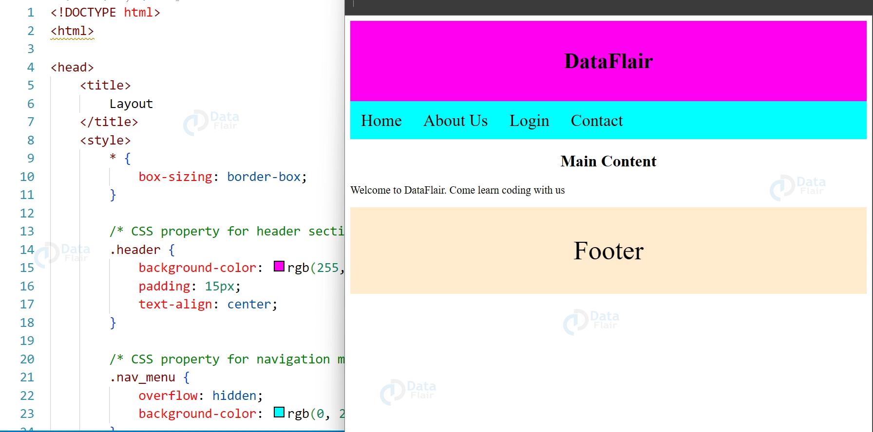
Footer
Your webpage’s footer is located there. Copyright and contact details are frequently included.
<!DOCTYPE html>
<html>
<head>
<title>
Layout
</title>
<style>
* {
box-sizing: border-box;
}

/* header section */
.header {
background-color: rgb(255, 0, 242);
padding: 15px;
text-align: center;
}

/* navigation menu */
.nav_menu {
overflow: hidden;
background-color: rgb(0, 255, 255);
}
.nav_menu a {
float: left;
display: block;
color: black;
text-align: center;
padding: 14px 16px;
text-decoration: none;
font-size:25px;
}
.nav_menu a:hover {
background-color: white;
color: green;
}

h2 {
color:black;
text-align:center;
}
.footer {
background-color: #FFEBCD;
padding: 2px;
text-align: center;
font-size: 40px;
}

/* website layout according to screen size */
@media screen and (max-width:600px) {
.columnC {
width: 50%;
text-align: center;
}
}
@media screen and (max-width:400px) {
.columnA, .columnB, .columnC {
width: 100%;
}
}
</style>
</head>
<body>

<!-- header of website layout -->
<div class = "header">
<h2 style = "color:black;font-size:200%">
DataFlair
</h2>
</div>
<!-- navigation menu of website layout -->
<div class = "nav_menu">
<a href = "#">Home</a>
<a href = "#">About Us</a>
<a href = "#">Login</a>
<a href = "#">Contact</a>
</div>
<!-- Content section of website layout -->
<div class = "columnC">
<h2>Main Content</h2>
<p>Welcome to DataFlair. Come learn coding with us</p>
</div>
<div class="footer">
<p>Footer</p>
</div>
</body>
</html>
Output:
Multicolumn layout
Multicolumn layout is a CSS layout technique that allows content to flow into multiple columns, similar to a newspaper layout. This layout method is particularly useful for presenting large amounts of text content, as it makes it easier to read by breaking up the content into smaller, more manageable chunks.
In CSS, the column-count property is used to specify the number of columns that the content should be divided into, while the column-gap property is used to define the space between each column. Additionally, there are other properties such as column width and column rule that can be used to further customize the appearance of the multicolumn layout.
Multicolumn layout is a flexible and responsive layout method that can adjust to different screen sizes and orientations. It is supported by most modern web browsers.
Flow layout
Flow layout is the default layout mode in CSS, where elements are positioned in the order they appear in the HTML markup. In this layout, elements are placed one after the other in a single column, with each element taking up the full width of its container.
The flow layout is based on the box model, where each element is treated as a rectangular box with content, padding, border, and margin. The size of each box is determined by the content it contains and any CSS properties that affect its size.
With the flow layout, designers can control the position and appearance of elements using CSS properties such as margin, padding, border, display, and float. However, the flow layout is limited in its ability to create complex and dynamic layouts, which is where other CSS layout techniques such as flexbox and grid come in.
Conclusion:
This Article is intended for both seasoned developers from other parts of the stack who want to update their layout knowledge and those who are new to CSS and need guidance on how to approach layout. Hope you enjoyed.
Did you know we work 24x7 to provide you best tutorials
Please encourage us - write a review on Google


