CSS Arrows
Full Stack Web Development Courses with Real-time projects Start Now!!
CSS arrows have become a widespread design element that website designers use to augment the visual interest of web pages. Their usage can serve multiple purposes, such as for navigation, tooltips, and callouts. CSS arrows contribute a creative aspect to a website’s design and can be easily implemented through HTML and CSS.
Creating an Arrow with CSS:
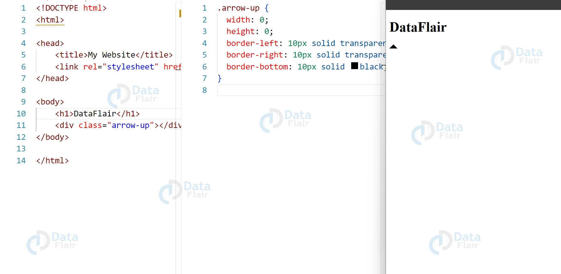
To create an arrow with CSS, we will use the border property. The border property allows us to create a triangle by manipulating the width and height of the element’s border. Here is the code for creating an arrow pointing up:
HTML:
<div class="arrow-up"></div>
CSS:
.arrow-up {
width: 0;
height: 0;
border-left: 10px solid transparent;
border-right: 10px solid transparent;
border-bottom: 10px solid black;
}
Output:
In this code, we set the width and height of the element to 0 so that it does not take up any space on the page. We then set the left and right borders to transparent, and the bottom border to black. This creates a triangle pointing upwards.
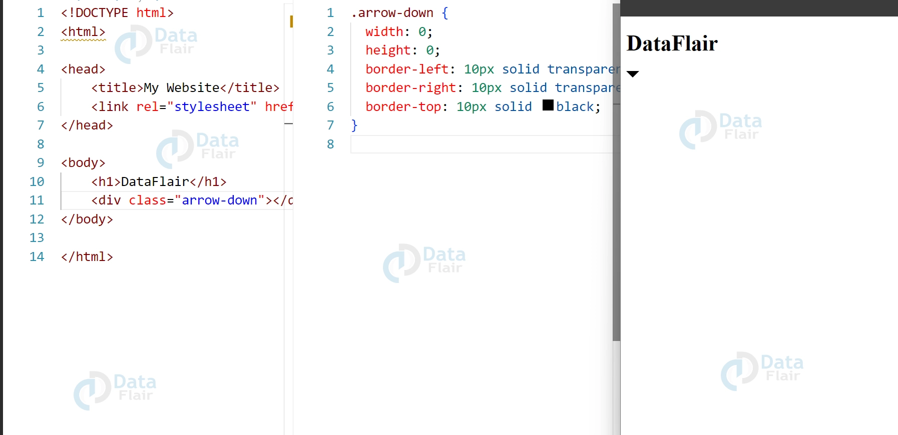
Creating Arrows with Different Directions:
We can create arrows pointing in different directions by adjusting the border properties. Here is an example of creating an arrow pointing down:
HTML:
<div class="arrow-down"></div>
CSS:
.arrow-down {
width: 0;
height: 0;
border-left: 10px solid transparent;
border-right: 10px solid transparent;
border-top: 10px solid black;
}
Output:
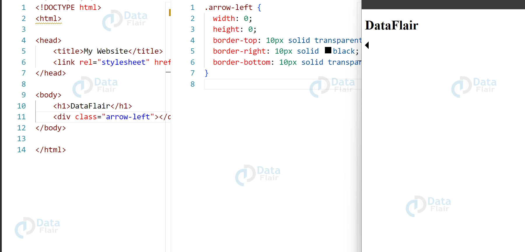
Similarly, we can create arrows pointing left and right by adjusting the border properties. Here are the codes for creating arrows pointing left and right:
HTML for left arrow:
<div class="arrow-left"></div>
CSS for left arrow:
.arrow-left {
width: 0;
height: 0;
border-top: 10px solid transparent;
border-right: 10px solid black;
border-bottom: 10px solid transparent;
}
Output:
HTML for right arrow:
<div class="arrow-right"></div>
CSS for right arrow:
.arrow-right {
width: 0;
height: 0;
border-top: 10px solid transparent;
border-left: 10px solid black;
border-bottom: 10px solid transparent;
}
Output:
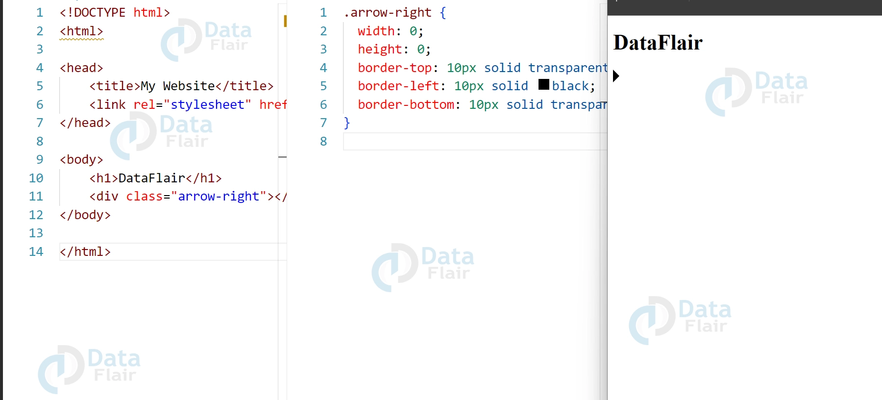
CSS arrows provide one of the pleasing methods to focus the attention of anonymous users on some definite scopes of a Web-Site, improving the navigation gently. It is easy to design and implement, and the changes made give significant results in terms of the overall use by the target audience. Due to applying the different border properties, it is possible to produce a great variety of the arrows forms as their directions, and thereby guarantee that these elements will effectively blend into any concept of the framework.
Customizing the Arrow:
We can customize the arrow by adjusting the width, height, and color of the borders. Here is an example of a customized arrow pointing up:
HTML:
<div class="arrow-up-custom"></div>
CSS:
.arrow-up-custom {
width: 0;
height: 0;
border-left: 20px solid transparent;
border-right: 20px solid transparent;
border-bottom: 20px solid #f8b195;
}
Output:
In this example, we increased the size of the arrow by increasing the border widths. We also changed the color of the bottom border to #f8b195.
Advanced Uses of CSS Arrows:
1. CSS Hover Animations:
We can create hover animations on arrows by using the :hover pseudo-class in CSS. For example, we can change the color of the arrow when the mouse hovers over it. Here is the code for a hover animation on an arrow pointing up:
HTML:
<div class="arrow-up-hover"></div>
CSS:
.arrow-up-hover {
width: 0;
height: 0;
border-left: 10px solid transparent;
border-right: 10px solid transparent;
border-bottom: 10px solid black;
transition: border-bottom-color 0.3s ease;
}

.arrow-up-hover:hover {
border-bottom-color: red;
}
Output:
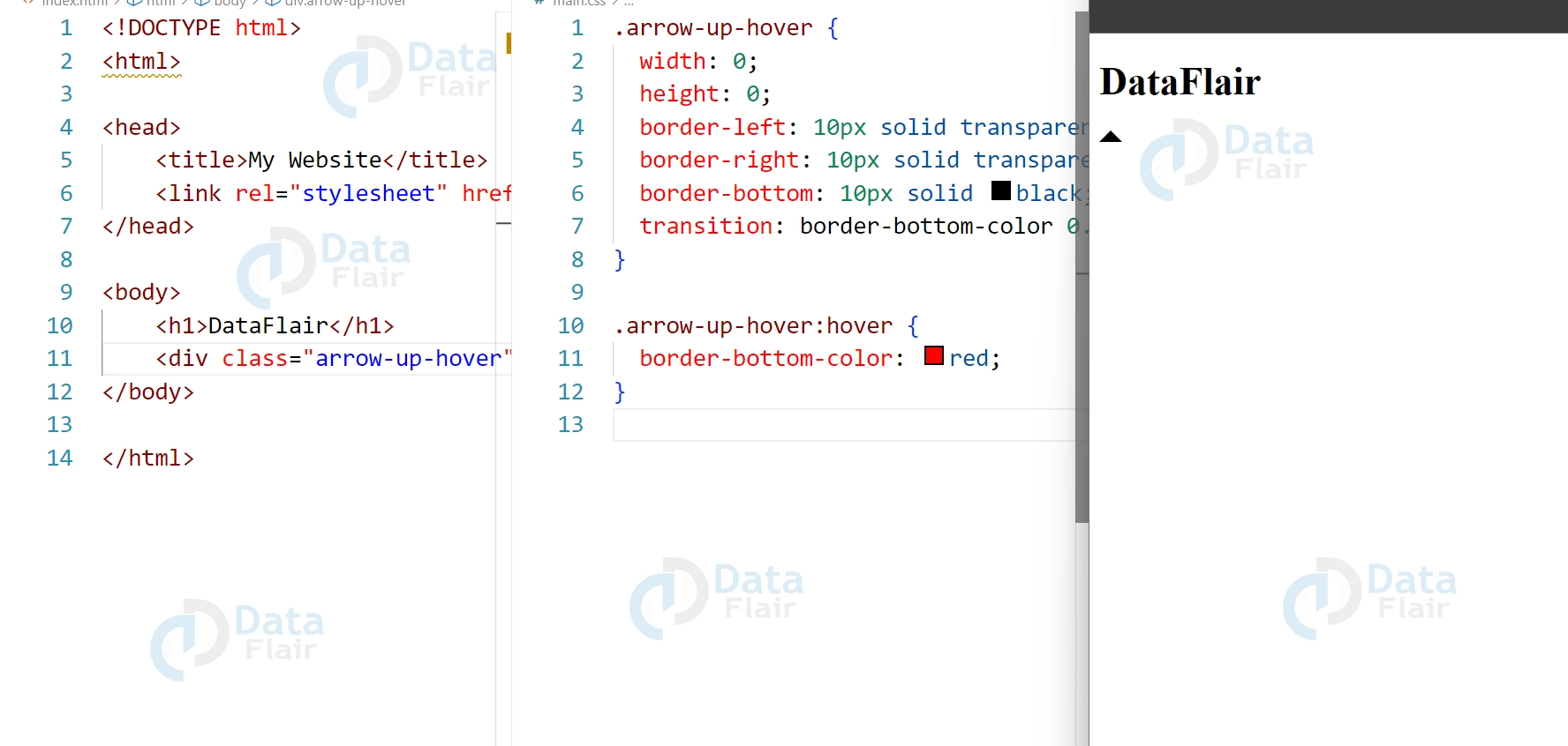
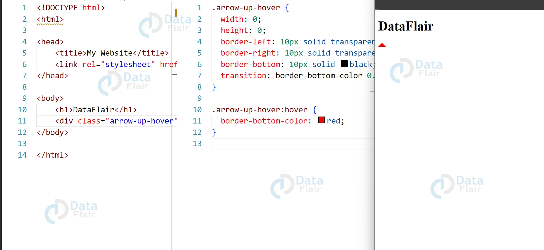
In this code, we added a transition property to the arrow to create a smooth transition when the color of the bottom border changes. We then added a :hover pseudo-class to the arrow and changed the color of the bottom border to red when the mouse hovers over it.
2. Using Arrows for Tooltips in CSS
We can use CSS arrows to create tooltips that appear when the user hovers over an element. To accomplish this task, we can utilize CSS’s :before or :after pseudo-class to produce an arrow-shaped component that emerges next to the tooltip. Below is the code for a tooltip that features an upward-pointing arrow:
HTML:
<div class="tooltip">
Hover over me
<span class="tooltiptext">This is a tooltip</span>
</div>
CSS:
.tooltip {
position: relative;
display: inline-block;
}

.tooltip .tooltiptext {
visibility: hidden;
position: absolute;
bottom: 100%;
left: 50%;
transform: translateX(-50%);
background-color: #555;
color: #fff;
padding: 5px;
border-radius: 6px;
white-space: nowrap;
}

.tooltip .tooltiptext:before {
content: "";
position: absolute;
bottom: -10px;
left: 50%;
transform: translateX(-50%);
border-width: 10px;
border-style: solid;
border-color: transparent transparent #555 transparent;
}

.tooltip:hover .tooltiptext {
visibility: visible;
}
Output:
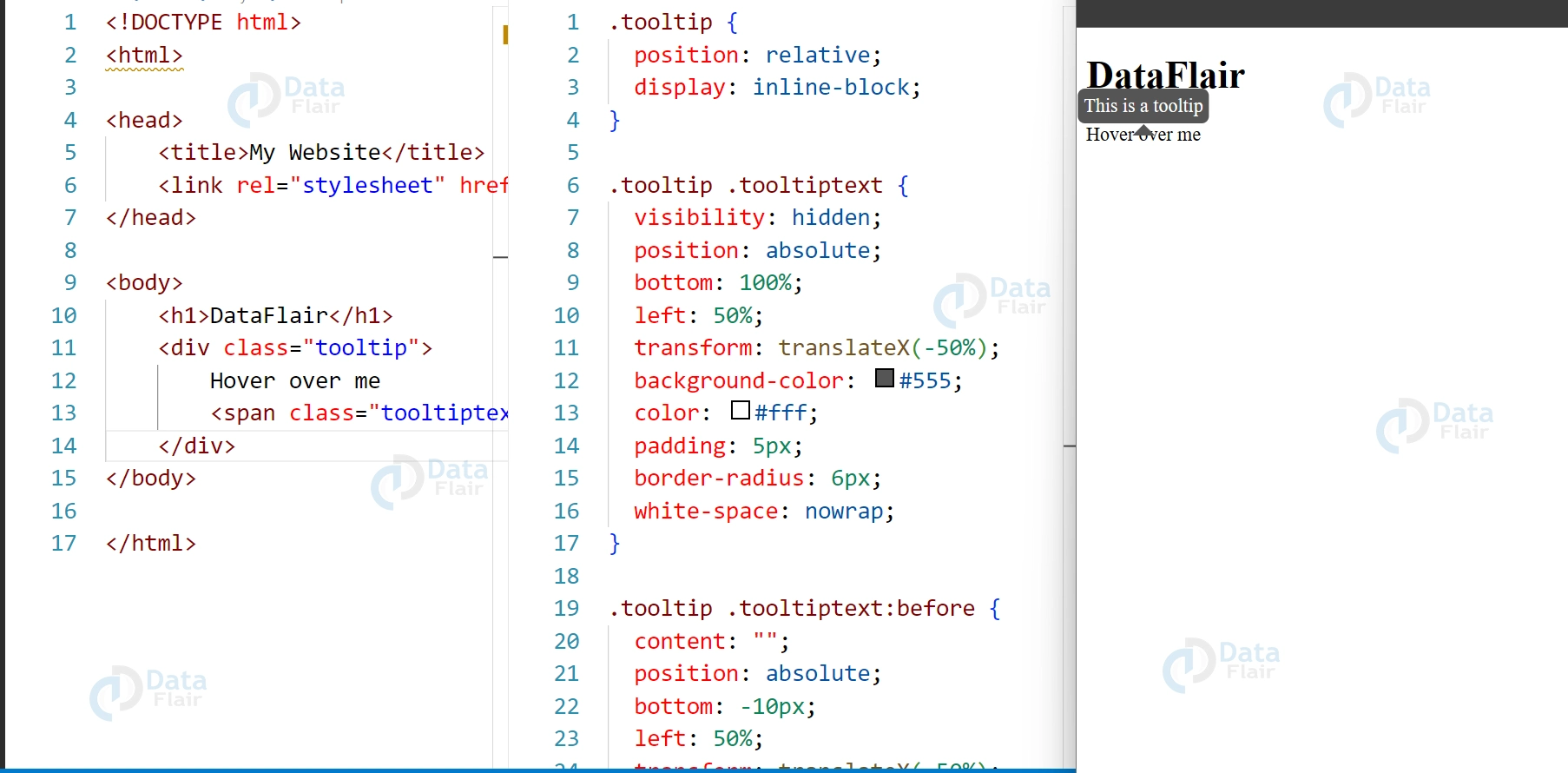
In this code, we created a tooltip using the position property in CSS. We then added a :before pseudo-class to the tooltip and created an arrow-shaped element using the border property. Also added a hover effect to the tooltip so that the tooltip appears when the user hovers over the element.
With CSS arrows combined with tooltips, one is able to improve the usability and achieve the goal of providing contextual hints on the spot. It allows the user to get the needed information just in time but does not overload the interface with large texts or numerous images.
3. Creating Arrows with Gradients:
We can create arrows with gradients in CSS by using the linear-gradient() function. This allows us to create arrows with multiple colors or create a gradient effect on the arrow. Here is an example of creating an arrow with a gradient pointing up:
HTML:
<div class="arrow-up-gradient"></div>
CSS:
.arrow-up-gradient {
width: 0;
height: 0;
border-left: 10px solid transparent;
border-right: 10px solid transparent;
border-bottom: 10px solid transparent;
border-image: linear-gradient(to top, #8e2de2, #4a00e0) 1;
}
Output:
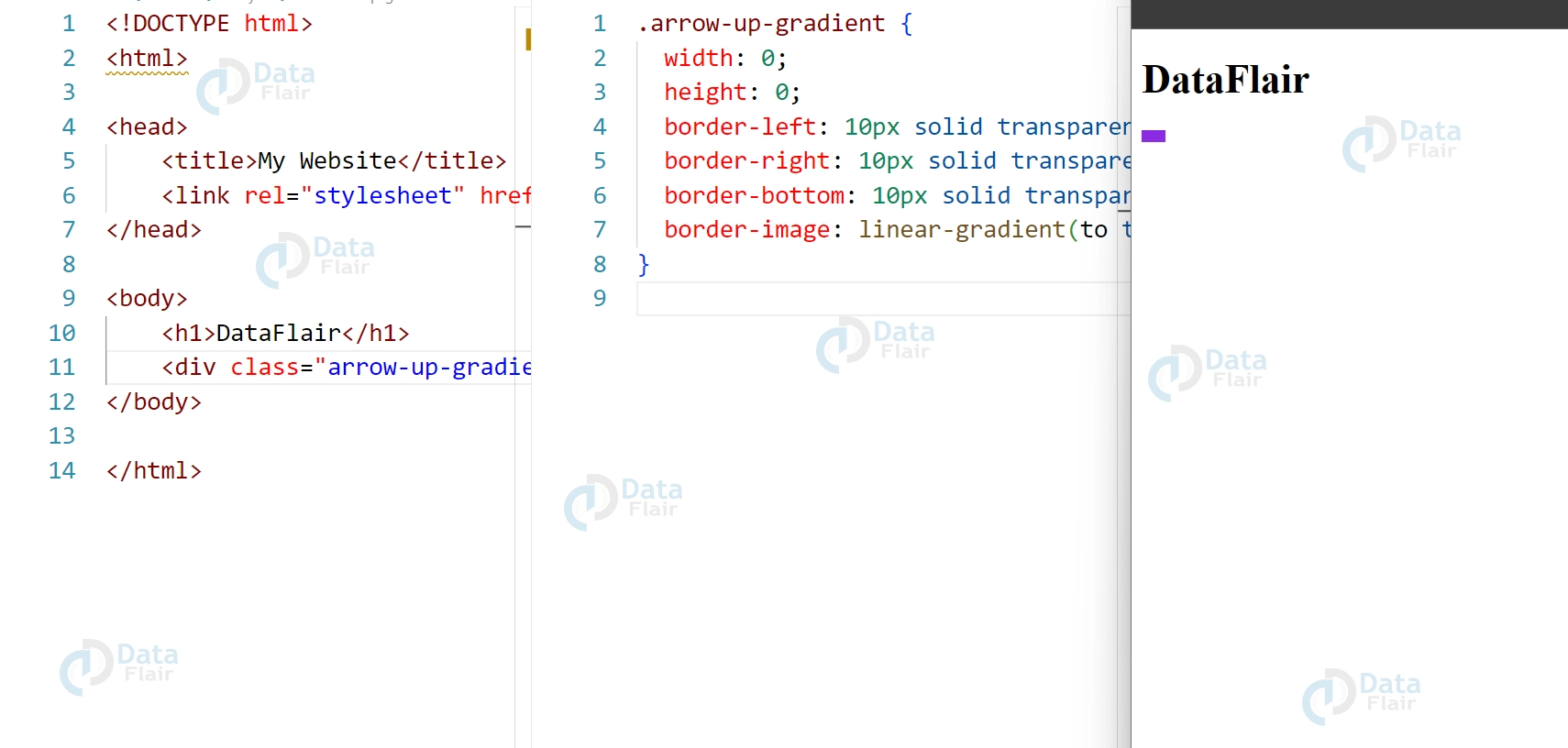
In this code, we used the border-image property in CSS to create a gradient on the arrow. We set the direction of the gradient to “to top” and set the colors of the gradient to #8e2de2 and #4a00e0. We also set the width of the gradient to 1 so that it
Animated Arrow: Adding Dynamic Movement to Your Website
Animated arrows can be a great addition to your website design, providing visual cues and drawing attention to important content. By using CSS animations, you can create arrows that move and pulse, adding a dynamic and eye-catching element to your web pages.
To create an animated arrow, you can use the @keyframes rule in CSS to define a set of animations that will be applied to the arrow. For example, you can create a pulsing arrow by using the transform property to scale the arrow up and down, or a moving arrow by using the transform property to move the arrow along the x or y axis.
Here’s an example of how to create an animated arrow that moves up and down:
.arrow-move {
position: relative;
animation: move 2s ease-in-out infinite;
}
@keyframes move {
0% {
transform: translateY(0);
}
50% {
transform: translateY(-10px);
}
100% {
transform: translateY(0);
}
}
In this code, the position property of the arrow is set to relative, which allows the arrow to be positioned relative to its parent element. The animation property is used to apply the move animation to the arrow, with a duration of 2 seconds and an ease-in-out timing function.
Conclusion
So we can say that CSS arrows are a versatile design element that can be used to enhance the visual appeal of websites. They are easy to implement using HTML and CSS, and can be customized to fit the design of any website. By using CSS arrows, web designers can add a touch of creativity to their designs and create a more engaging user experience for their visitors.
Your opinion matters
Please write your valuable feedback about DataFlair on Google
