CSS Tooltips
Full Stack Web Development Courses with Real-time projects Start Now!!
CSS tooltips are a great way to provide users with additional information about certain elements on a webpage. A tooltip is a small pop-up window that appears when the user hovers over an element. It typically contains a short description or explanation of the element.
CSS tooltips can be created using only CSS and HTML, without the need for JavaScript. They are also fully customizable, which means that you can style them to match the look and feel of your website. In this blog post, we will cover the basics of creating CSS tooltips.
CSS tooltips can be integrated with pop-up text with other CSS features such as animations and transitions to enhance the usability of the site. For instance, apply smooth transitions such as fade-in or slide in tooltips are less likely to irritate the users as compared to others. Besides, it is necessary to guarantee that these tooltips are responsive and optimized for usage on various devices to guarantee the uniformity of design for visitors on different gadgets.
Features of CSS Tooltips
Some of the features of CSS tooltips are:
1. Customizable appearance: CSS tooltips can be styled to match the look and feel of a website, with options for colors, fonts, background, borders, and more.
2. Interactive: Tooltips can provide additional information or context to users when they hover over an element.
3. Support for text and multimedia content: Tooltips can display simple text or more complex content, including images, videos, and HTML elements.
4. Cross-browser compatibility: CSS tooltips can be implemented consistently across different web browsers.
5. Easy to implement: With CSS, it is straightforward to add tooltips to a web page, making it a simple and accessible solution for web developers.
6. Accessibility: Tooltips can provide important information to users with disabilities, making it easier for them to understand and interact with a website.
7. Dynamic behavior: Tooltips can be triggered by user actions such as hovering, clicking, or tapping, and can be programmed to change based on user interactions.
Creating a Basic CSS Tooltip
To create a tooltip, we first need to create the HTML structure. The basic structure consists of a container element that wraps the element that the tooltip will be attached to, and a content element that contains the tooltip text. Here is an example:
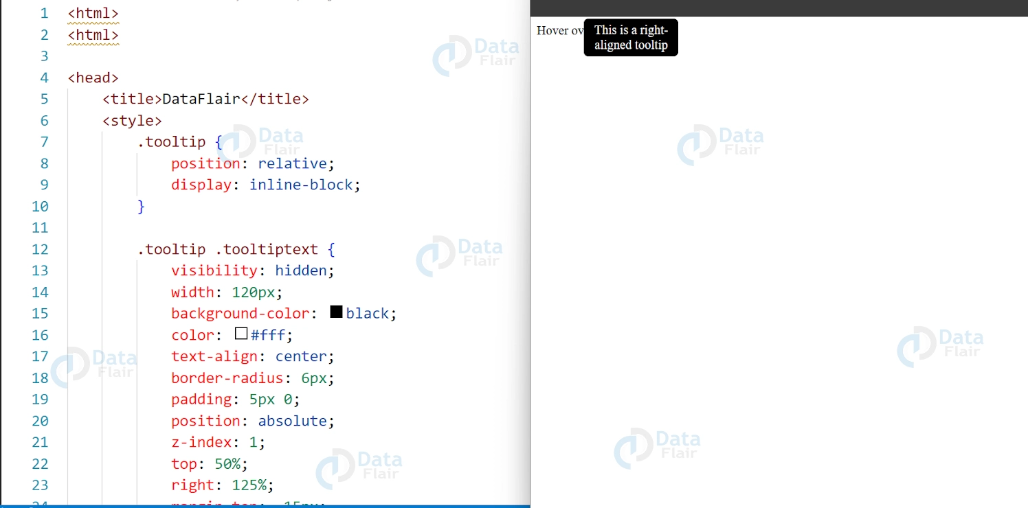
HTML:
<span class="tooltip">Hover over me
  <span class="tooltiptext tooltiptext-right">This is a right-aligned tooltip</span>
</span>
Next, we need to style the trigger element. This is the element that the user will hover over to trigger the tooltip. We can use CSS to change the appearance of the trigger element. Here is an example:
CSS:
.tooltip {
  position: relative;
  display: inline-block;
}

.tooltip .tooltiptext {
  visibility: hidden;
  width: 120px;
  background-color: black;
  color: #fff;
  text-align: center;
  border-radius: 6px;
  padding: 5px 0;
  position: absolute;
  z-index: 1;
  top: 50%;
  right: 125%;
  margin-top: -15px;
  opacity: 0;
  transition: opacity 0.3s;
}

.tooltip:hover .tooltiptext {
  visibility: visible;
  opacity: 1;
}

.tooltiptext-right {
  right: auto;
  left: 125%;
  margin-left: -60px;
}
How CSS Tooltips can be used?
1. Image Tooltips:
You can use tooltips to display a larger version of an image when a user hovers over a thumbnail.
Image tooltips are a type of tooltip that can be used to provide additional information or show product variations for images on a website. They can be particularly useful for e-commerce websites and should be designed to be responsive and easy to understand for users. By using image tooltips effectively, website owners can improve the user experience and provide users with a better understanding of their products
HTML:
<img src="https://miro.medium.com/max/600/1*OFsc0SD55jhi8cjo7aCA4w.jpeg" class="tooltip" alt="thumbnail">
  <span class="tooltiptext">
    <img src="https://www.w3docs.com/uploads/media/default/0001/05/6d07a36ebe6d55273b39440f2391f1d7e6d4092a.png" alt="full size image">
  </span>
</img>
CSS:
.tooltip {
  position: relative;
  display: inline-block;
}

.tooltip .tooltiptext {
  visibility: hidden;
  width: 500px;
  height: 500px;
  background-color: #fff;
  color: #000;
  text-align: center;
  border-radius: 6px;
  padding: 5px 0;
  position: absolute;
  z-index: 1;
  bottom: 125%;
  left: 50%;
  margin-left: -250px;
  opacity: 0;
  transition: opacity 0.3s;
}

.tooltip:hover .tooltiptext {
  visibility: visible;
  opacity: 1;
}
Output:
2. Form Field Tooltips: You can use tooltips to provide additional information or validation messages for form fields.
Form field tooltips can be used to provide users with additional information or guidance when filling out forms on a website. They can be particularly useful for complex forms that require specific formatting or have fields with specific requirements.
Example 1-
HTML:
<label for="email">Email:</label>
<input type="email" id="email" class="tooltip">
  <span class="tooltiptext">Please enter a valid email address</span>
</input>
CSS:
.tooltip {
  position: relative;
  display: inline-block;
}

.tooltip .tooltiptext {
  visibility: hidden;
  width: 120px;
  background-color: #ff0000;
  color: #fff;
  text-align: center;
  border-radius: 6px;
  padding: 5px 0;
  position: absolute;
  z-index: 1;
  top: 100%;
  left: 50%;
  margin-left: -60px;
  opacity: 0;
  transition: opacity 0.3s;
}

input:invalid + .tooltip .tooltiptext {
  visibility: visible;
  opacity: 1;
}
Output:

Example 2 –
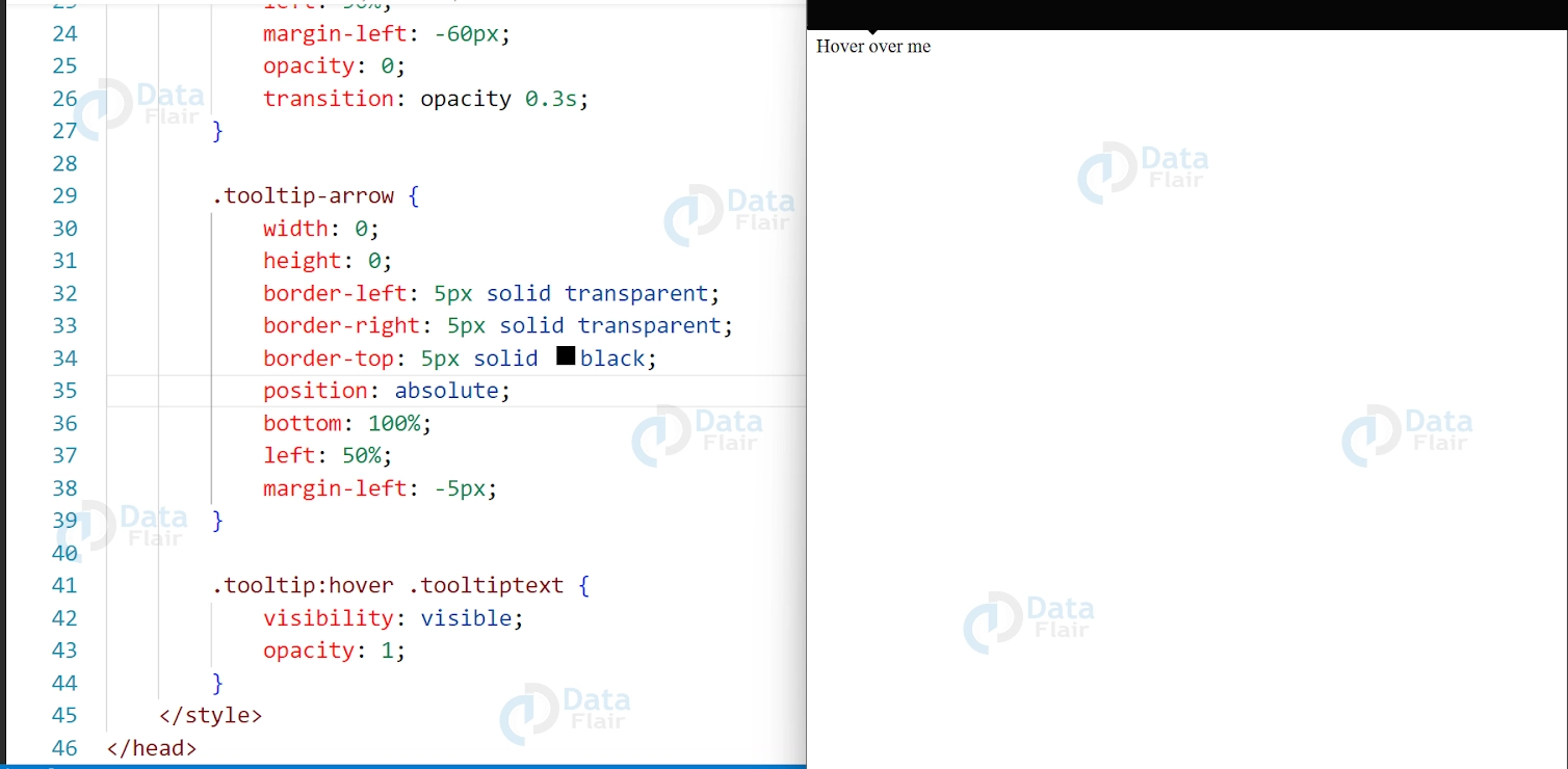
HTML:
<span class="tooltip">Hover over me
  <span class="tooltiptext">This is a tooltip with an arrow</span>
  <span class="tooltip-arrow"></span>
</span>
CSS:
.tooltip {
  position: relative;
  display: inline-block;
}

.tooltip .tooltiptext {
  visibility: hidden;
  width: 120px;
  background-color: black;
  color: #fff;
  text-align: center;
  border-radius: 6px;
  padding: 5px 0;
  position: absolute;
  z-index: 1;
  bottom: 125%;
  left: 50%;
  margin-left: -60px;
  opacity: 0;
  transition: opacity 0.3s;
}

.tooltip-arrow {
  width: 0;
  height: 0;
  border-left: 5px solid transparent;
  border-right: 5px solid transparent;
  border-top: 5px solid black;
  position: absolute;
  bottom: 100%;
  left: 50%;
  margin-left: -5px;
}

.tooltip:hover .tooltiptext {
  visibility: visible;
  opacity: 1;
}
Output:
Top, bottom, left and right tooltips in CSS
CSS tooltips are used to display additional information about an element when the user hovers over it. The positioning of a tooltip can be adjusted using the top, bottom, left, and right properties.
By default, a tooltip is displayed directly above the element it’s attached to, but you can adjust its position using these properties. For example, if you want to position a tooltip to the right of an element, you can set left: 100% to move the tooltip to the right of the element’s right edge. Similarly, if you want to position a tooltip below an element, you can set top: 100% to move the tooltip below the element’s bottom edge.
When positioning a tooltip, it’s important to keep in mind the surrounding elements and the available space on the page. You may need to adjust the tooltip’s position or add additional styles to prevent it from overlapping with other content.
Overall, using the top, bottom, left, and right properties is an effective way to position tooltips in CSS and provide additional information to users in a clear and intuitive way.
CSS Arrow Tooltips
Arrow tooltips are a popular variation of traditional tooltips that feature an arrow pointing towards the element they are associated with. This arrow is typically positioned at the top, bottom, left, or right side of the tooltip.
To create an arrow tooltip in CSS, you can use a combination of pseudo-elements, borders, and positioning properties. One common approach is to use the :before and :after pseudo-elements to create the arrow, and then style the tooltip using borders and positioning properties.
For example, to create a tooltip with an arrow pointing downwards, you could use the following CSS code:
.tooltip {
  position: relative;
  display: inline-block;
}

.tooltip:before {
  content: "";
  position: absolute;
  top: -10px;
  left: 50%;
  transform: translateX(-50%);
  border-width: 10px 10px 0 10px;
  border-style: solid;
  border-color: #ccc transparent transparent transparent;
}

.tooltip .tooltip-text {
  position: absolute;
  top: -60px;
  left: 50%;
  transform: translateX(-50%);
  padding: 10px;
  background-color: #ccc;
  color: #fff;
  border-radius: 4px;
}
In this example, the :before pseudo-element is used to create the arrow by setting the border-width, border-style, and border-color properties. The arrow is positioned at the top of the tooltip using the top and left properties, and then centered using transform: translateX(-50%).
The actual tooltip content is contained within an element with the class .tooltip-text, which is positioned above the arrow using the top property. The tooltip is centered using transform: translateX(-50%), and styled with a background color, text color, and border radius.
Overall, arrow tooltips can be a useful and visually appealing way to provide additional information to users in a clear and concise manner.
Conclusion
CSS tooltips are a useful tool for designers and developers looking to provide additional information to users without taking up too much space on the page. They are easy to implement and customize, making them a versatile tool for any website or application.CSS tooltips are a popular way to add extra information to a website or application. They provide a convenient way to display additional information when the user hovers over an element, making it easy to understand the context of a particular piece of information.
When implemented properly, tooltips can boost the effectiveness of an application’s GUI by offering more assistance and making the controls more easily navigable. Thus, with the constant development of web standards, proper adherence to the newest standards for tooltips’ design and their compliance with modern accessibility standards will always make them a useful tool for web development.
Did you know we work 24x7 to provide you best tutorials
Please encourage us - write a review on Google
