CSS Interview Questions
Full Stack Web Development Courses with Real-time projects Start Now!!
It can be difficult to prepare for a CSS interview, particularly if you don’t know what kinds of questions to anticipate. We’ll give you a list of challenging and realistic CSS interview questions in this piece so you can practice and polish up for your next interview. These questions cover a wide variety of subjects, including animations, performance improvement, and responsive design and layout.
CSS Interview Questions
1. With CSS Grid, how would you create a responsive layout? What are some typical obstacles you might experience when doing this?
You must first define a grid container and its grid items in order to use CSS Grid to build a responsive layout. Use the grid-template-columns and grid-template-rows attributes to specify the size and quantity of columns and rows, as well as the display: grid property on the container, to accomplish this.
.container {
  display: grid;
  grid-template-columns: repeat(auto-fit, minmax(200px, 1fr));
  grid-gap: 20px;
}
This code generates a container for a grid with columns that are at least 200 pixels wide and fill the available space to the maximum extent feasible (1fr). With the auto-fit keyword, the number of sections is guaranteed to change according to the available room.
To address common challenges in implementing a responsive layout with CSS Grid, you may need to use extra properties such as grid-template-areas, grid-template-rows, and grid-template-columns to build a more complex layout. To guarantee that the layout appears good on various devices and screen sizes, you might also need to adjust the grid-gap and use media queries.
This makes the layout to be responsive since it considers the different sizes of screens on which it will be displayed. By using the auto-fit value the user is able to let the grid take control of the number of columns that one desires to fetch depending on the space available.
2. What are some recommended techniques for CSS spacing, borders, and margins?
There are a few best practices for handling padding, borders, and margins in CSS that can help guarantee uniformity and maintainability in your code:
a. Use a consistent measurement unit: It’s essential to use a constant measurement unit, such as pixels, ems, or rems, when specifying padding, borders, and margins in CSS. Utilizing a variety of units can make it more difficult to keep your code over time.
b. Maintain consistency with your values: When working with elements that have numerous padding, border, and margin values (such as padding-top, padding-right, padding-bottom, and padding-left), be sure to maintain consistency with your values. In other words, be careful to also specify values for padding-right, padding-bottom, and padding-left if you specify a value for padding-top.
c. When feasible, use shorthand properties like padding and margin rather than specifying each value individually to keep your code clear and simpler to read. Instead of padding-top: 10px, padding-right: 20px, padding-bottom: 10px, and padding-left: 20px, you could use padding: 10px 20px.
d. Keep in mind that the breadth and height properties in CSS only apply by default to the content box of an element. Set the box-sizing attribute of an element to border-box to include the padding and border in the element’s overall width and height.
e. Negative margins should not be used because they can be difficult to work with and occasionally result in unforeseen layout problems. Avoid using negative borders in your CSS whenever you can.
You can make sure that your padding, borders, and margins are constant and easy to keep by adhering to these best practices.
Application of CSS Grid for major positioning and Flexbox for positioning the items within the layout makes it rather liberal and adaptable. This layout combination works in synergy with both attracting the readers’ attention and structuring the content.
3. Given the following CSS code, what is the output and why?
<html>
<head>
    <style>
        .container {
            display: flex;
            flex-wrap: wrap;
        }
        .item {
            width: 100px;
            height: 100px;
            margin: 10px;
            background-color: blue;
        }
    </style>
</head>
<body>
    <div class="container">
        <div class="item"></div>
        <div class="item"></div>
        <div class="item"></div>
        <div class="item"></div>
        <div class="item"></div>
        <div class="item"></div>
        <div class="item"></div>
        <div class="item"></div>
        <div class="item"></div>
    </div>
</body>
</html>
The result will be a row of blue rectangles with a margin of 10 pixels between each square and dimensions of 100 pixels wide by 100 pixels high. The squares will wrap to the following line once the container’s maximum breadth has been reached. This is so that the flex items can wrap onto numerous lines if their width is greater than the container’s, which is made possible by the container’s flex-wrap: wrap property.

The container is a flex container because of the display: flex attribute, which makes the flexbox layout possible. If the flex items are wider than the container, the flex-wrap: wrap property enables them to wrap to the next line. Each square’s dimensions, margin, and background colour are determined by its breadth, height, margin, and background-color properties on the.item class.
4. What is the best method to make a sticky footer that always remains at the bottom of the page, regardless of the height of the content?
There are a few stages involved in creating a sticky footer in CSS:
a. To ensure that your page content covers the full viewport, you must first create a container element and give it a min-height of 100vh.
.container {
  min-height: 100vh;
}
b. Next, you’ll need to create a separate container element for your footer and place it at the bottom of the page using position: fixed and bottom: 0:
.footer {
  position: fixed;
  bottom: 0;
  width: 100%;
  height: 100px; /* Or whatever height you want */
}
Be aware that in order for your footer to appear at the bottom of the page, you must designate a height for it.
c. Finally, you must add some padding or margin to the bottom of your container element to prevent the content of your website from covering the footer:
.container {
  min-height: 100vh;
  padding-bottom: 100px; /* Or whatever height your footer is */
}
These steps will help you make a sticky footer that will always appear at the bottom of the page, regardless of the height of the content.
5. How would you use CSS to create a smooth scrolling effect on a website?
Using CSS, you can use the scroll-behavior property to give a website a smooth scrolling effect. When a user clicks on a link that leads to an anchor on the same website, this property determines how the page should scroll.
Here's an example:
html {
  scroll-behavior: smooth;
}
When a link is clicked, the page will smoothly scroll to the destination anchor thanks to this code. It should be noted that while most contemporary browsers support the scroll-behavior property, older browsers might not.
6. How would you develop a tooltip that only uses CSS and shows when a user hovers over an element?
The ‘::before’ pseudo-element and the ‘:hover’ pseudo-class can be used to control when a tooltip should be displayed when making a CSS-only tooltip that shows when a user hovers over an element.
.tooltip {
  position: relative;
  display: inline-block;
}

.tooltip:hover::before {
  content: "Tooltip text";
  display: block;
  position: absolute;
  top: 100%;
  left: 50%;
  transform: translateX(-50%);
  background-color: black;
  color: white;
  padding: 0.5rem;
  border-radius: 4px;
}
This code defines the tooltip text in the by default hidden content attribute of the::before pseudo-element. The::before pseudo-element is presented along with the tooltip text when the user hovers over an element with the.tooltip class, which is accomplished by the:hover pseudo-class.
Position: absolute is used to place the tooltip, and left: 50% and transform: translateX(-50%) are used to center it horizontally. The tooltip is styled using CSS properties like background-color, colour, padding, and border-radius. The top value is set to 100% to position the tooltip beneath the element.
This method allows you to make a tooltip that only uses CSS and shows when a user hovers over an element.
7. How would you create a CSS-only accordion that expands and collapses sections of content when clicked?
Use the target pseudo-class to manage each section’s visibility when building a CSS-only accordion that expands and collapses content parts upon click.
<div class="accordion">
  <div class="section">
    <h2><a href="#section1">Section 1</a></h2>
    <div id="section1">
      <p>Content for section 1 goes here.</p>
    </div>
  </div>

  <div class="section">
    <h2><a href="#section2">Section 2</a></h2>
    <div id="section2">
      <p>Content for section 2 goes here.</p>
    </div>
  </div>

  <div class="section">
    <h2><a href="#section3">Section 3</a></h2>
    <div id="section3">
      <p>Content for section 3 goes here.</p>
    </div>
  </div>
</div>
The heading is contained within a h2 element and the content is contained within a div element in this code, which defines each part of the accordion. An anchor link with a href property that matches the id of the content div is present in the heading.
By default, the CSS code uses the display: none style to hide all of the content div components. The:target pseudo-class is activated when a user clicks on a heading link, which causes the associated content div to be displayed using display: block.
By employing this method, you can develop a content-expanding and -collapse accordion that uses only HTML.
8. How would you create a CSS-only dropdown menu?
It is the characteristic that describes how transparent an element is.
With the use of this attribute, we can make an image transparent that accepts values between 0.0 and 1.0. The picture is more translucent if the quantity is reduced.. IE8 and previous browser versions can accept values between 0 and 100.
HTML:
<nav>
  <ul>
    <li><a href="#">Menu item 1</a>
      <ul>
        <li><a href="#">Submenu item 1</a></li>
        <li><a href="#">Submenu item 2</a></li>
        <li><a href="#">Submenu item 3</a></li>
      </ul>
    </li>
    <li><a href="#">Menu item 2</a></li>
    <li><a href="#">Menu item 3</a>
      <ul>
        <li><a href="#">Submenu item 1</a></li>
        <li><a href="#">Submenu item 2</a></li>
      </ul>
    </li>
  </ul>
</nav>
CSS:
nav ul {
  list-style: none;
  padding: 0;
  margin: 0;
  background-color: #eee;
}

nav li {
  position: relative;
  display: inline-block;
  width: 150px;
  text-align: center;
}

nav li:hover > ul {
  display: block;
}

nav ul ul {
  display: none;
  position: absolute;
  top: 100%;
  left: 0;
  background-color: #fff;
  border: 1px solid #ccc;
}

nav ul ul li {
  display: block;
  width: 100%;
  text-align: left;
}

nav a {
  display: block;
  padding: 10px;
  color: #333;
  text-decoration: none;
}
These lines of code describe the top-level menu items as li elements with anchor links inside. Nested ul and li elements inside the parent li are used to create submenus. The CSS code uses the:hover pseudo-class on the parent li to show the submenu and hides submenus by default using display: none.
Position: absolute and top: 100% are used to place the submenu below the parent li. The menu’s look is styled using CSS elements like padding, border, and background-color.
This method allows you to develop a dropdown menu that only uses CSS and reacts to user input.
9. What is the output of the following CSS code, and how would you modify it to center the text vertically within the box?
.box {
  width: 200px;
  height: 100px;
  background-color: yellow;
  text-align: center;
  line-height: 100px;
}
A box with a yellow background, a breadth of 200 pixels, and a height of 100 pixels is the result of the CSS code. Using the text-align: center property, the content inside the box is centered horizontally. But within the box, the content is not vertically centered. In order to vertically centre the text, the line-height: 100px property is used, which sets the height of each line of text to be identical to the height of the box.
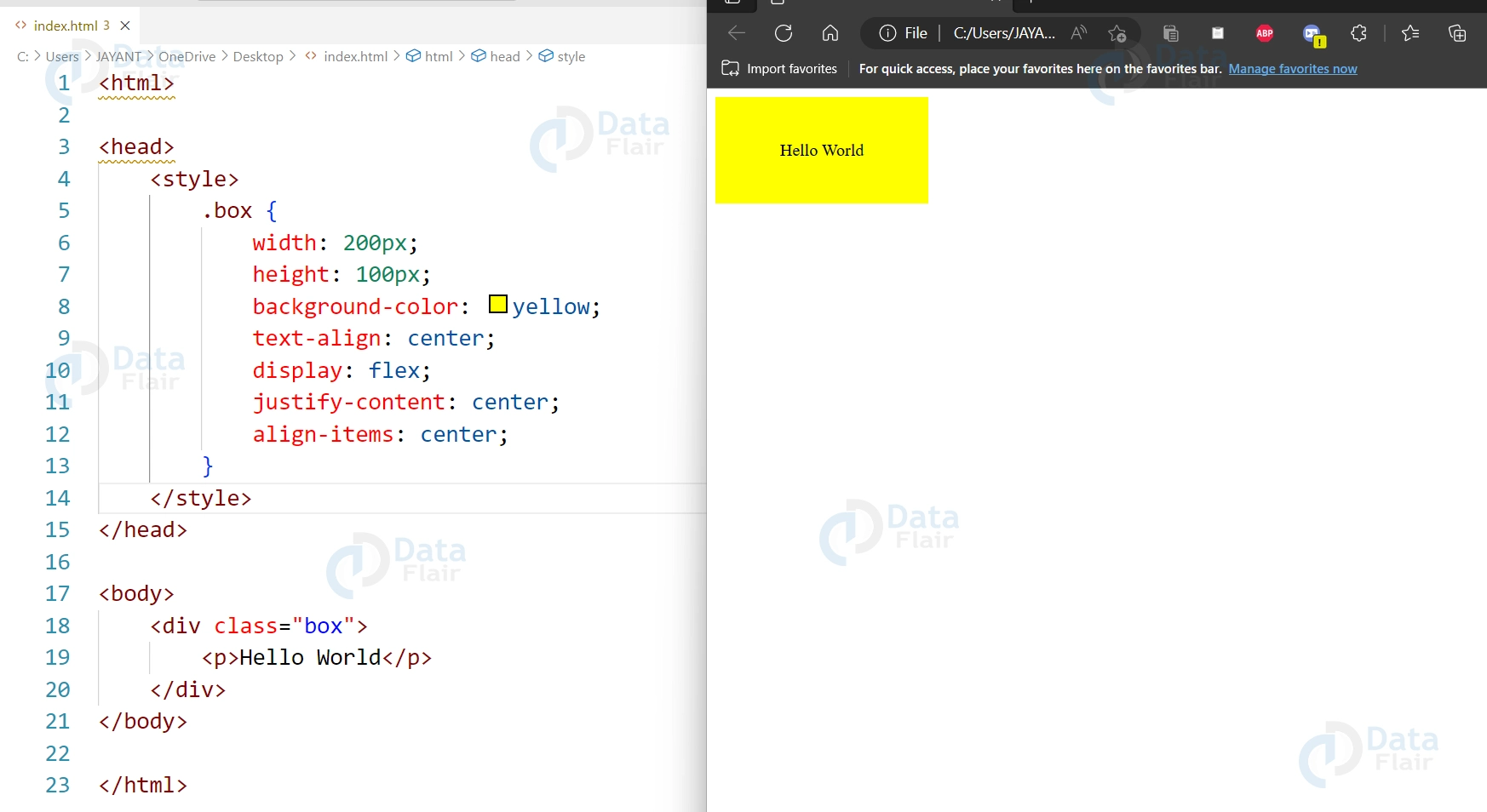
To center the text vertically within the box, you can use the display: flex property on the .box class and set the justify-content and align-items properties to center.
.box {
  width: 200px;
  height: 100px;
  background-color: yellow;
  text-align: center;
  display: flex;
  justify-content: center;
  align-items: center;
}
10. How can you use CSS to vertically and horizontally position an element?
Use the position and transform features of CSS to centre an element both horizontally and vertically. Here’s an illustration:
<html>
<head>
    <style>
        .centered {
            position: absolute;
            top: 50%;
            left: 50%;
            transform: translate(-50%, -50%);
        }
    </style>
</head>
<body>
    <div class="centered">Centered element</div>
</body>
</html>

Position: absolute is used in this code to place the div element with the class centred in an exact location. When the top and left properties are set to 50%, the element’s top-left corner is centered in the parent container’s midsection.
This, however, only places the element horizontally; it does not center it vertically. Using the transform property, we can also centre the part vertically. For both the X and Y coordinates, we use the translate function with values of -50%. This places the part in the vertical and horizontal centers.
This method, which can be used to show modal boxes, pop-up windows, and other UI elements in the center of the screen, is applicable to any element with a set width and height.
11. How can you create a sticky footer using CSS?
According to the design pattern known as the “sticky footer,” the footer of a website always remains at the bottom of the viewport, independent of the page’s content. Here is an illustration of an adhesive footer made with CSS:
<html>
<head>
    <style>
        body {
            display: flex;
            flex-direction: column;
            min-height: 100vh;
        }
        main {
            flex-grow: 1;
        }
        footer {
            margin-top: auto;
        }
    </style>
</head>
<body>
    <body>
        <header>
            <!-- Header content goes here -->
        </header>
        <main>
            <!-- Main content goes here -->
        </main>
        <footer>
            <!-- Footer content goes here -->
        </footer>
    </body>
</body>
</html>
This code implements a sticky footer using flexbox style. The display: flex and flex-direction: column attributes of the body element cause its children components to stack vertically. Flex-grow: 1 on the main element causes it to grow to cover the remaining vertical space.
The footer element is then set to margin-top: auto, which causes it to be pushed to the bottom of the screen and create a sticky footer. The body element will always cover the height of the viewport thanks to the min-height: 100vh property, even if there isn’t enough content to fill the entire page.
By using this technique, you can create a sticky footer that always stays at the bottom of the viewport, regardless of the amount of content on the page.
12. How can you create a diagonal background using CSS?
The linear-gradient() method in CSS can be used to produce a diagonal background. Here’s an illustration:
HTML:
<div class="diagonal-background">
  <p>Diagonal background</p>
</div>
CSS:
.diagonal-background {
  background: linear-gradient(to bottom right, #008080 50%, #000000 50%);
}
In this code, a diagonal background is made for the div element with the class diagonal-background using the linear-gradient() method. Two colours are passed as parameters to the function, separated by commas. The top-left corner of the part receives the first colour, and the bottom-right corner receives the second colour.
The gradient in this example will begin at the top-left corner of the element and finish at the bottom-right corner because the to bottom right keyword was used. We chose the shade of blue #008080 for the first colour, and the colour black #000000 for the second.
13. How can you create a tooltip using CSS?
When the user hovers over a feature, a tooltip—a brief, contextual tidbit—appear. The::before pseudo-element can be used to create a tooltip container and the content property can be used to define the tooltip text to create a tooltip using CSS. Here’s an illustration:
HTML:
<div class="tooltip">Hover over me!</div>
CSS:
.tooltip {
  position: relative;
}

.tooltip:hover::before {
  content: "This is a tooltip!";
  position: absolute;
  top: 100%;
  left: 50%;
  transform: translateX(-50%);
  background-color: black;
  color: white;
  padding: 5px;
  border-radius: 5px;
  font-size: 12px;
  white-space: nowrap;
}
In this code, we establish a relative positioning context for the tooltip by using the position: relative property on the div element. The tooltip text is then specified using the content property and the::before pseudo-element.
Using the:hover pseudo-class and the position: absolute property, the tooltip is presented when the user hovers over the div element. The tooltip is positioned immediately below the div element using the top: 100% and left: 50% properties, and it is horizontally centred using the transform: translateX(-50%) property.
In order to improve the tooltip’s visibility and aesthetic appeal, we specified its background colour, text colour, padding, border radius, font size, and white-space properties.
14. How can you create a sticky header using CSS?
When a user scrolls down the website, a sticky header stays fixed at the top of the screen. Using the position: fixed property to fix the header position and the top property to determine its vertical position, you can use CSS to create a sticky header. Here’s an illustration:
HTML:
<header class="sticky">
  <nav>
    <ul>
      <li><a href="#">Home</a></li>
      <li><a href="#">About</a></li>
      <li><a href="#">Contact</a></li>
    </ul>
  </nav>
</header>
<main>
  <p>Lorem ipsum dolor sit amet, consectetur adipiscing elit.</p>
</main>
CSS
.sticky {
  position: fixed;
  top: 0;
  width: 100%;
  background-color: #333;
}
An HTML header element with a navigation bar is first created in this code. The sticky header impact is then tested by creating a primary content section.
The header element’s position is fixed in CSS using the position: fixed property, and the top property is set to 0 to maintain its place at the top of the screen. To make sure the header fills the full width of the screen, we also set the width property to 100%.
To give the header’s background a dark hue, we set the background-color property to #333.
15. What is the output of the following CSS code?
.arrow {
  width: 0;
  height: 0;
  border-top: 50px solid red;
  border-right: 50px solid transparent;
  border-left: 50px solid transparent;
}
The result of the CSS code is a triangle shape with a breadth and height of 0, as well as border elements that form an upward-pointing arrow. The border-top property adds a crimson border with a 50px width to the top of the triangle. On the right and left edges of the triangle, respectively, the border-right and border-left properties add 50px-wide transparent borders.

16. Given the following CSS code, what is the output and why?
.container {
  display: grid;
  grid-template-columns: repeat(3, 1fr);
}

.item {
  background-color: blue;
  padding: 20px;
  text-align: center;
}
A grid layout with three columns and an item in each with a blue backdrop, 20px of padding, and centered text is the result of the CSS code.
Using the display: grid and grid-template-columns: repeat(3, 1fr); selectors, the.container selector generates three columns with equal widths and sets the container to a grid layout. As a result, the container will be split into three equally sized columns, each of which will occupy a small portion of the total area.
Background-color: blue; is used by the.item selector to make blue the background colour for the objects inside the container. Padding: 20px is also used to add 20 pixels of space around each item, and text-align: center is used to center the content.

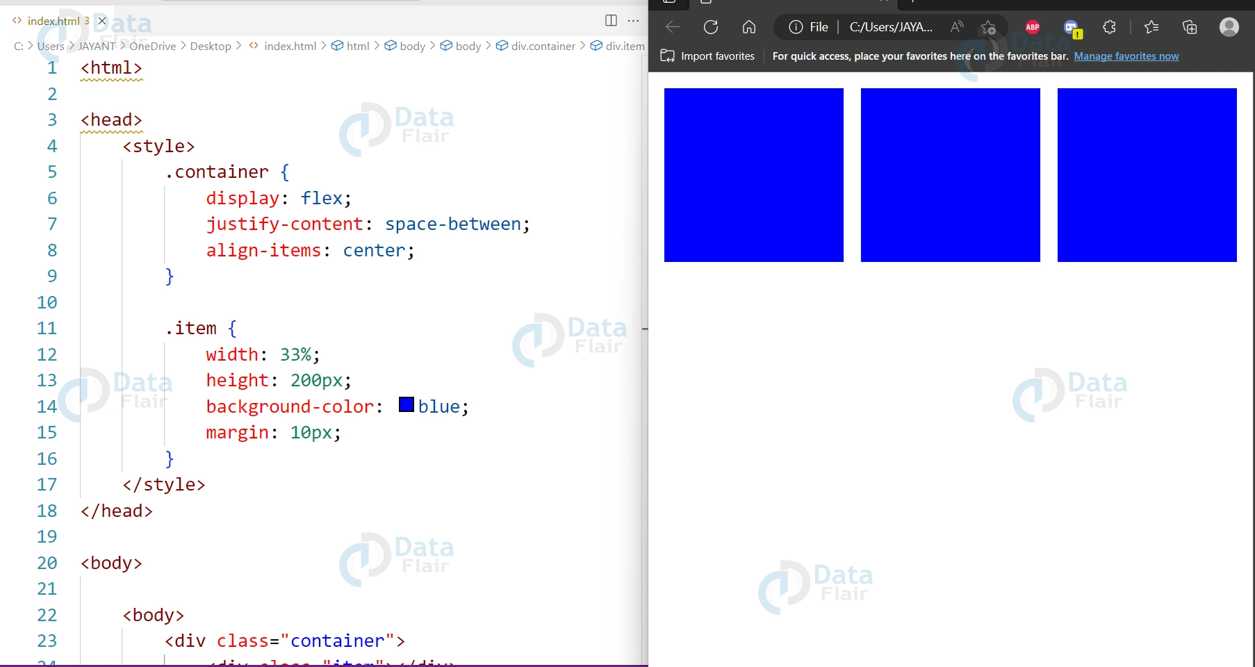
17. What is the output of the following CSS code?
.container {
  display: flex;
  justify-content: space-between;
  align-items: center;
}

.item {
  width: 33%;
  height: 200px;
  background-color: blue;
  margin: 10px;
}
The three objects in a row have a blue background and a margin of 10 pixels between them as the result of the CSS code. Due to the justify-content: space-between; property, the elements are horizontally aligned and occupy 33% of the container’s width. Using the align-items: center; property, the objects are also vertically centered.
18. What is the CSS box model, and how does it work?
The CSS box model is a design principle that describes how HTML components are displayed as boxes with content, padding, borders, and margins. The paradigm is predicated on the notion that each component of a web page is a CSS-styleable rectangle box.
The content, padding, border, and margin are the four sections that make up an HTML element according to the box paradigm. The padding area surrounds the content and creates room between it and the element’s border. The content area is where the element’s actual content is displayed. The padding and content areas are surrounded by a thin border, and the margin area separates the element from other components on the screen.
19. How do you create a responsive layout without using media queries?
A flexible and responsive layout can be made using CSS grid and its fractional element, fr. The columns and rows will automatically adjust to fit the available space if they are set to a specific amount of fr units.
20. How do you create a CSS animation that has infinite loops?
To make an animation that loops endlessly, use the animation-iteration-count property and set it to infinite.
21. How do you create a hover effect on an element that affects a different element?
To target a sibling or subsequent element, use the + or selectors, accordingly. Utilizing this selector and the :hover pseudo-class, you can make one element’s hover effect influence another.
22. How do you create a CSS-only toggle switch?
To make a toggle switch, use the checkbox input type and the:checked pseudo-class. When the label is selected, you can produce a toggle effect by styling the label element and using the for attribute to target the checkbox input.
23. How do you create a CSS-only modal dialog box?
When a user selects a link or button, a modal dialogue box can be created using the:target pseudo-class. You can produce a modal effect by styling the dialogue window and using an anchor with the href attribute set to an anchor with a # and the dialogue ID.
24. How do you create a progress bar in CSS?
You can use the::before or::after pseudo-elements and the content property to make a progress bar. You can make a bar that fills up as the progress rises by setting the width of the pseudo-element to a percentage value.
25. What will be the output of the following HTML and CSS code?
<html>
<head>
    <style>
        .container {
            display: flex;
            justify-content: center;
            align-items: center;
            height: 200px;
        }
        .text {
            font-size: 24px;
            color: white;
            text-shadow: 2px 2px black;
        }
    </style>
</head>
<body>
    <body>
        <div class="container">
            <p class="text">Hello World!</p>
        </div>
    </body>
</body>
</html>
The code will show a single paragraph element with the text “Hello World!” in white font colour and a black text background, as well as a centered container with a height of 200px.

26. How do you create a hover effect on a background image?
To give a background picture a hover effect, use the background-image property together with the::before pseudo-element. The background picture can have a hover effect by using the:hover pseudo-class to target the pseudo-element and alter its opacity or colour.
27. How do you create a CSS-only dropdown menu?
A dropdown bar that uses only CSS can be made using the display property and the:hover pseudo-class. You can produce a dropdown effect by setting the nested ul or div element to display: none and altering it to display: block on hover.
28. How do you create a responsive layout that adjusts to different screen sizes and orientations?
You can use CSS media queries to apply different styles to the same HTML content depending on the device’s screen size or orientation to make a responsive layout. Layouts that are adaptable and adjustable can also be made using CSS Grid and Flexbox.
29. How do you optimize CSS performance on a web page?
You can use methods like minimizing the size of CSS files, lowering the number of HTTP requests, utilizing CSS preprocessors like Sass or Less, and avoiding unused CSS properties and selectors to improve CSS speed. By keeping CSS files in the user’s browser cache, you can also use browser caching to quicken the time it takes for a website to load.
30. What will be the output of the following HTML and CSS code?
<html>
<head>
    <style>
        .wrapper {
            display: grid;
            grid-template-columns: repeat(3, 1fr);
            grid-template-rows: repeat(2, 100px);
            gap: 10px;
        }
        .box {
            background-color: teal;
            color: white;
            font-size: 24px;
            display: flex;
            justify-content: center;
            align-items: center;
        }
    </style>
</head>
<body>
    <body>
        <div class="wrapper">
            <div class="box">1</div>
            <div class="box">2</div>
            <div class="box">3</div>
        </div>
    </body>
</body>
</html>
The code will show a grid with three columns, two rows, and a 10px space between each grid object. Each grid cell is a box with a number inside and a teal background and font hue. The boxes are centered using flexbox. The boxes are arranged in a 3×2 grid, with the first row displaying the digits 1, 2, and 3, and the second row containing empty boxes.

Conclusion
You can succeed in the Web designer assessment with the help of this collection of CSS interview questions and solutions. These are the typical inquiries made throughout the interview.
We work very hard to provide you quality material
Could you take 15 seconds and share your happy experience on Google