


Expert-led Online Courses: Elevate Your Skills, Get ready for Future - Enroll Now!
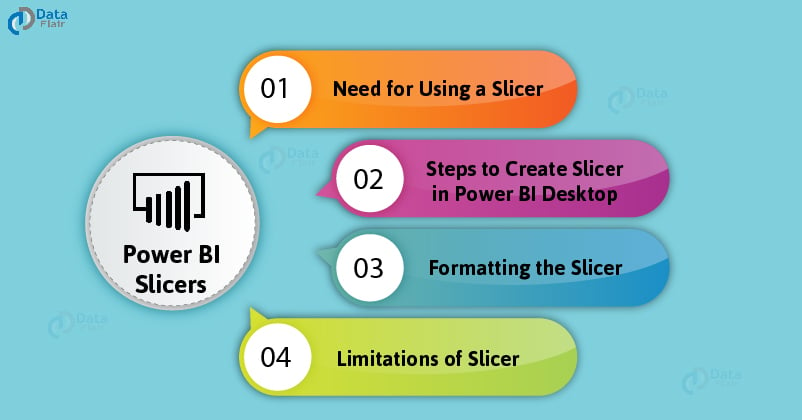
Moving ahead in the journey of interesting tools of Power BI, now it’s time to explore the slicers in Power BI. Power BI slicers are very important and useful visual elements in Power BI reports. After completing this tutorial, you will have a good command over the working of slicers, when to use them, how to create and format them and a lot more important concepts.
What are Power BI Slicers?
Slicers in Power BI are a type of on canvas visual filters. The slicers enable a user to sort and filter a packed report and view only the information they want. Unlike filters, the slicers are present as a visual on the report and let a user select values as they are analyzing the report. For instance, if you have a sales analysis report, you can make a slicer for years. From that slicer, you can select the year for which you want to see the sales metrics. The report visuals will automatically change showing the information for that year. We will understand slicers with more such examples in the sections to follow.
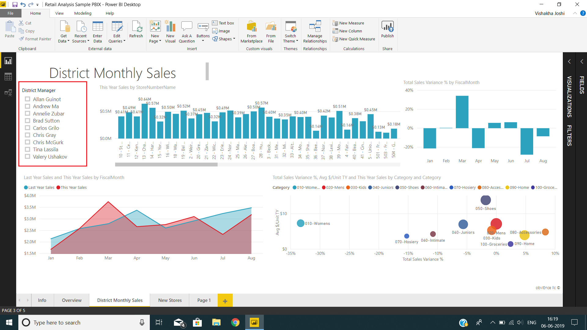
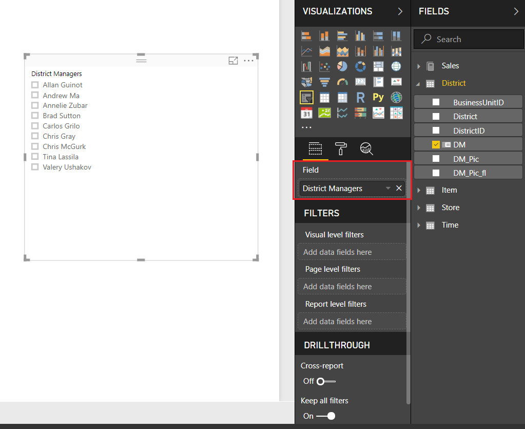
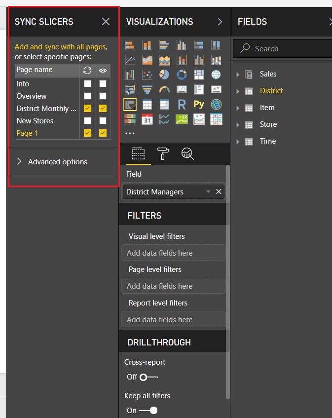
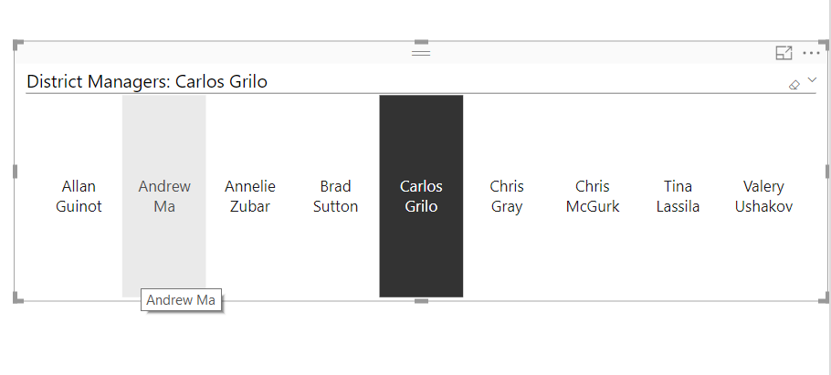
In the image of the report shown below, the visual indicated in the red box is a slicer. It contains the name of district managers. You can sort the information on district monthly sales by selecting the names of managers from the slicer.
Need for Using Power BI Slicer
You can use a slicer in your Power BI when you aim at doing one or more of the things mentioned below.
- To easily access important and frequently used filters by putting them on the report canvas.
- View a focused report by placing the slicer right next to essential graphs and charts.
- Easily view all the currently applied filters on the report instead of going to the filters drop-down list.
- To show unneeded/hidden/less used columns but keep them on for the users in case they need to use them for analysis.
Make sure to check the Power BI Filters Tutorial
How to Create Slicer in Power BI Desktop
Follow the steps given in this section to create a slicer in Power BI Desktop.
Step 1: Open Power BI Desktop app. Open an existing report or start creating a new report on the empty canvas.
From the Visualizations pane, select Slicer icon. This will bring an empty template of a Slicer on the editor.
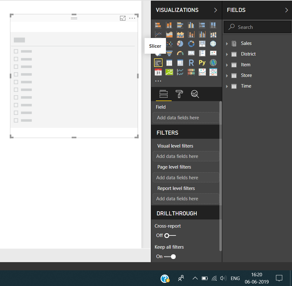
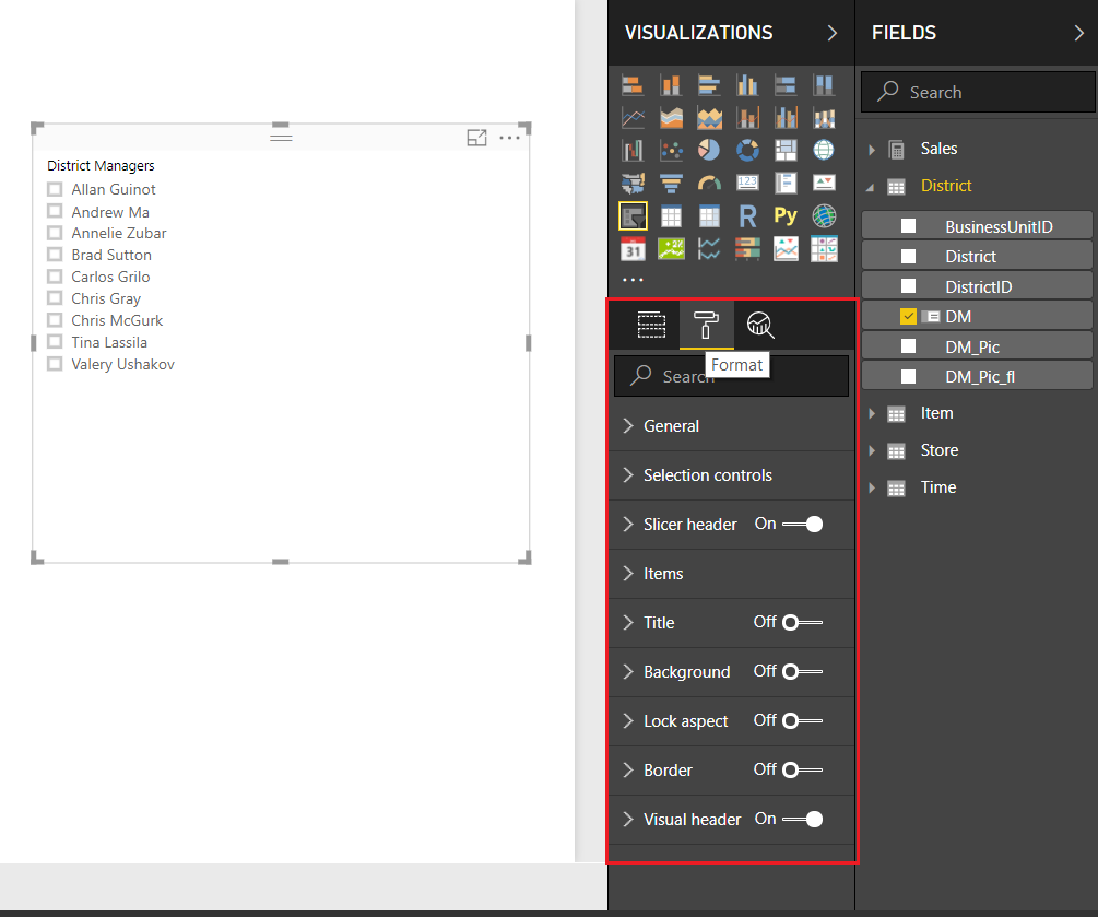
Step 2: Drag and drop a field from the Fields section to Values column (indicated by the red arrow).
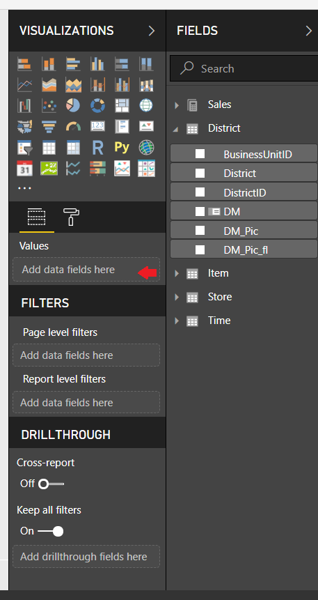
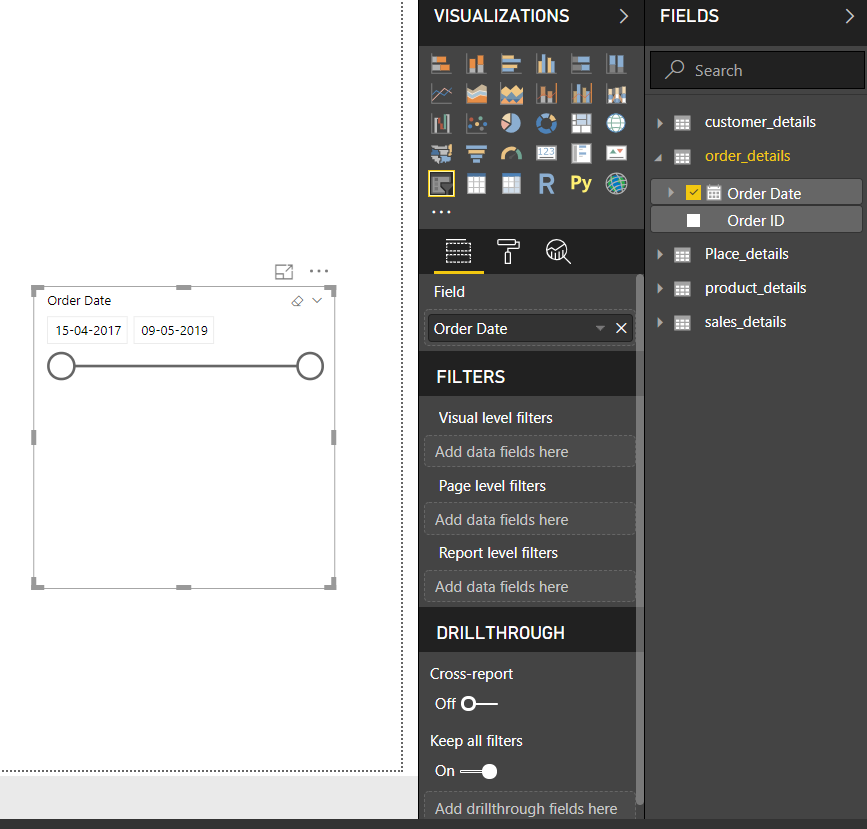
As you can see, we have added the field District Managers. A slicer with a list of district managers is made.
Step 3: You can adjust the size and position of this slicer object by pulling its corners or putting it anywhere on the canvas. To format the slicer, click on the paint roller icon. We will learn about formatting in detail in the next section.
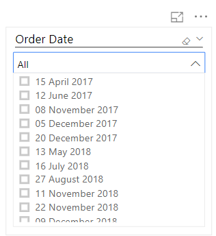
Date Slicer
A date slicer is made when you add a date field as the slicer value. The date slicer will have a sliding bar with two buttons at each end. You can slide these buttons forward or backward to adjust your range. By default, the range will be set from the oldest to the newest date.
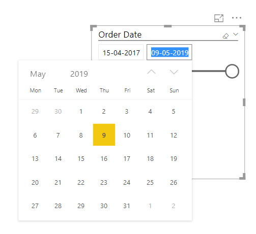
By clicking on a date, you can get a calendar view of the date.
You can change the type of date slicer from the drop-down menu. You can select from the options such as Between, Before, After, List, Dropdown and Relative. The type of your date slicer will depend on your purpose of use.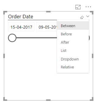
Given below is the snap of a dropdown type of date slicer.
You should definitely learn to work on Power BI KPI
Numeric Range Slicer
Just like the date slicer, when you use a numeric field to create a slicer, a numeric range slicer is created.
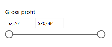
The slicer spreads the range between the two, lower and higher extremes. You can drag the ends back and forth to set a range as per your liking. All the other visuals on the report will change according to the range that you have set on the slicer bar.
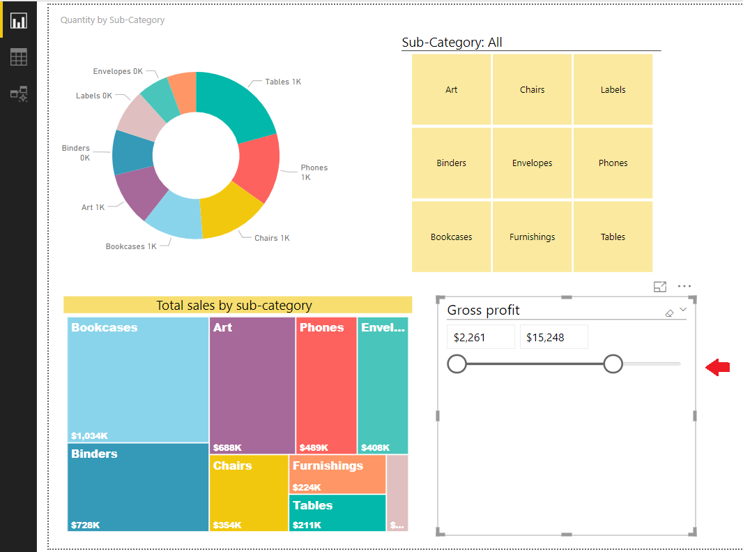
Sync Slicers
If you create a slicer on one page of a report, you can sync that newly created slicer with the visuals of all the pages of that report. By doing so, every visual on a report, irrespective of its page will respond to the selections or changes made on a slicer.
To enable the sync option, go to the View tab. Click on Sync slicers option from there and check the box.
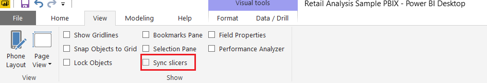
A new SYNC SLICERS pane will open on the right. It will contain the names of pages in the report. You can check the boxes in front of them. By checking on the boxes of the eye icon column, you can make the slicer visible on those pages. And, by checking on the boxes in the refresh icon column, you only sync the effects of selections made in a slicer on that page.
Formatting the Slicer
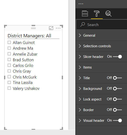
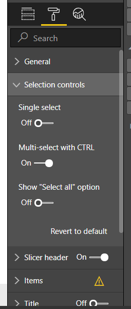
Power BI Desktop provides a range of formatting options for the slicer visual. To explore the formatting options, click on the paint roller Format icon. In the format tab, you get a lot of formatting options such as Selection controls, Slicer header, Items, Title, Background, Border, etc. In each of these tabs, sections have more options within them.
Do you know – How to perform conditional formatting in Power BI
As you can see in the picture below, we have formatted our slicer in a simple way.
From the General tab, you can set the orientation of the slicer items i.e. vertical and horizontal.
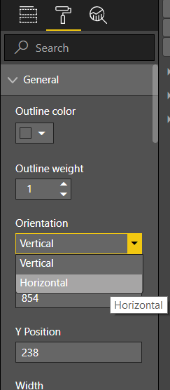
A horizontal slicer looks like this.
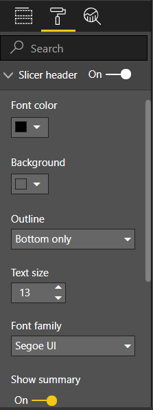
From the Slicer header tab, you can set the font and background color of the header. You can also select the outline type, text size and font type of the text.
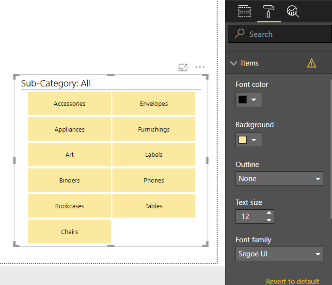
From the Items tab, you can set the font color, background color, outline type, text size, and font type of the individual slicer items.
Limitations of Power BI Slicer
The slicer comes with some limitations for its use in Power BI:
- No support for input fields in Power BI slicers.
- You cannot pin a slicer to a dashboard.
- Slicers do not support drill down in Power BI report.
- No support for visual level filters in Power BI slicers.
- The data models imported in Power BI and used in slicers do not have the time zone information. Although, you can convert a local time zone into UTC using the Query Editor in Power BI Desktop.
- The numeric range slicers do not deal with aggregated values rather it filters data on a row level.
- The slicers do not support and work with measures.
- The numeric range slicers can only be used in Power BI Desktop, you cannot use it in Power BI Service.
Learn to create a calculated table in Power BI data modeling
Summary
This concludes our Power BI slicers tutorial. We hope with the help of this information you can create slicers of your own reports in Power BI and use it for easy and smooth analysis.
Was the article useful? Share your views in the comment section. We will be waiting for your reply.