Free Matplotlib Course for Beginners with Certificate [English]
“How TechVidvan Paved My Path to Nulinz Technology.”
TechVidvan was far beyond my expectations. I have a very structured way of learning. The course curriculum was complete in itself and they focussed more on practicals rather than teaching just theory. The course covered multiple projects…Read more
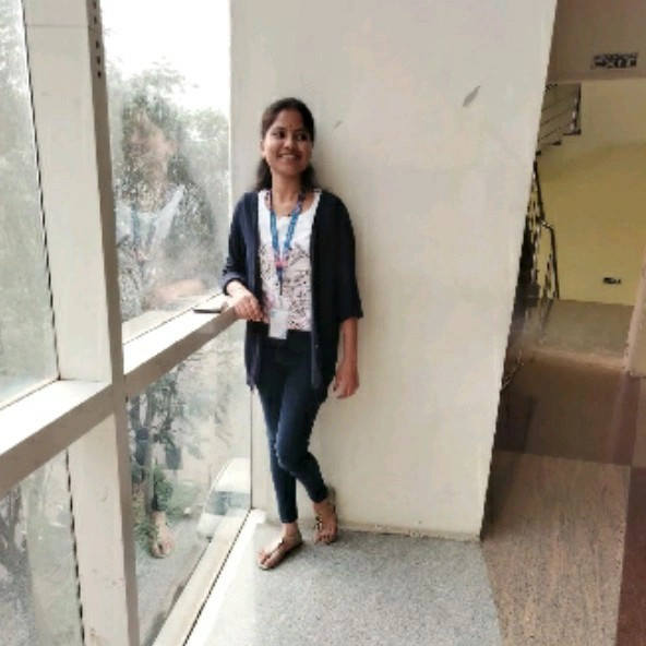
Gayathiri Kumar 
Application Developer at Nulinz Technology
“From a Curious Learner to a Python Developer at TCS: My Tech Journey with DataFlair TechVidvan.”
The world of online learning is very big, but finding a correct institute is difficult. After exploring multiple options, I opted for DataFlair TechVidvan that didn’t just go for theoretical…Read more
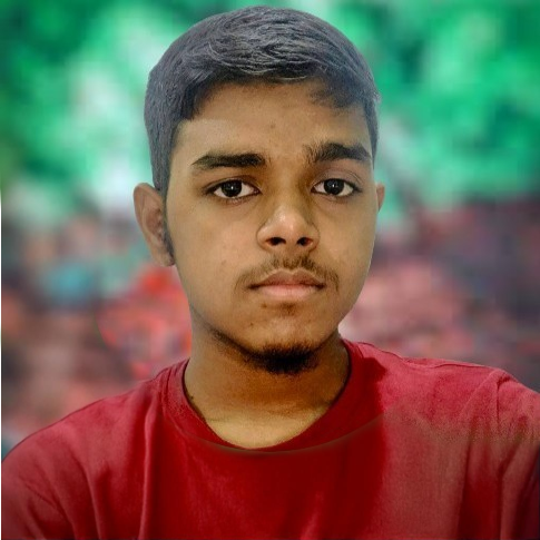
Aman Bind
System Engineer at TCS
“How DataFlair TechVidvan helped with my Final Year Placement”
As a Computer Science graduate, I had a fair knowledge of programming, but Full Stack Development was very different. I needed structured guidance, hands-on exposure, and, most importantly, real-world project experience. That’s when I found DataFlair TechVidvan….Read more
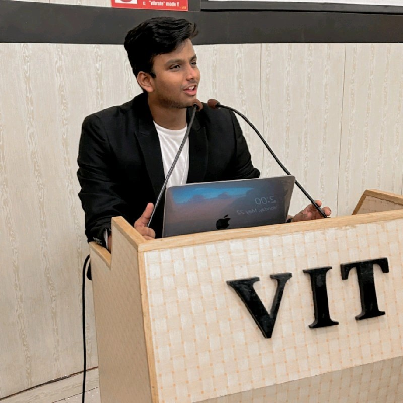
Nihal Mahansaria
Software Engineer at nference
“From Software Engineer to Data Engineer: My Journey to Walmart with DataFlair TechVidvan.”
When I decided to upskill, I explored multiple learning platforms, but most were too theoretical or lacked real-world relevance. That’s when I came across TechVidvan. I learnt Data Engineering from Rahul sir…Read more

Nishchay Agrawal
Data Engineer at Walmart
“From Video Editor to Technical Executive – My Learning Journey with DataFlair TechVidvan”
My tech journey wasn’t a straight road but a winding path filled with curiosity, exploration, and self-doubt. So I decided to gain hands-on knowledge through some institute, and there I came to…Read more
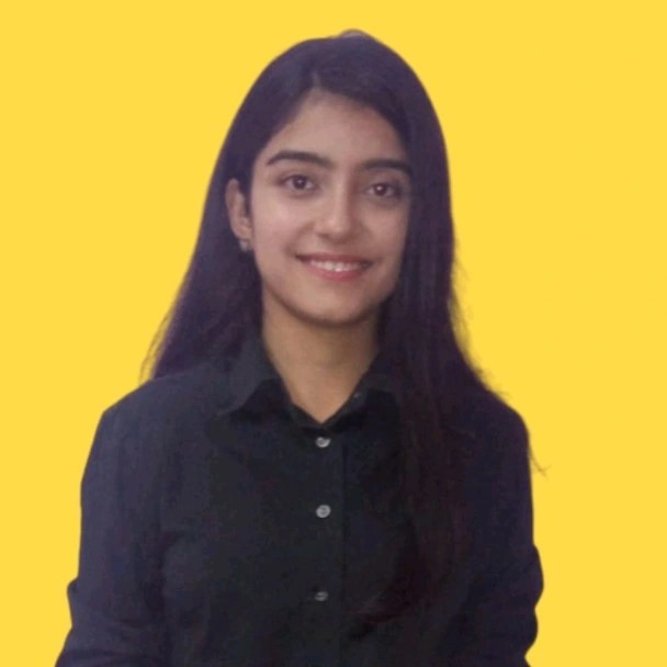
Mehak Bhatia
Technical Executive at Coach Fundation
“Breaking into Tech: My Journey from Learning C/C++ to Becoming a System Engineer at TCS.”
The hands-on approach, expert mentorship, and well-structured course on C/C++ and DSA at TechVidvan caught my attention. I also interned at DataFlair after learning to gain a better understanding….Read more

Satchit R
System Engineer at TCS