


Placement-ready Courses: Enroll Now, Thank us Later!
In this tutorial, we are going to learn about Waterfall chart in Tableau. Here, we will see step by step process of how to create a waterfall chart in Tableau. Let’s start!!!
What is Waterfall Chart?
A waterfall chart represents a gradual transition of field values from a start value to end value showing a running total with successive increments and decrements. In a normal running total, we cannot see the contribution of each category or contributing factor to the whole value.
But, in a waterfall chart, we can see how each category’s positive value increments the total value and the negative ones decrement it and then finally leads to a resultant value. This allows for an insightful analysis of how individual elements of dimensions or measures are contributing to bringing a total value of something.
Have you checked the Tableau Donut Chart recipe for maintaining your data accurately?
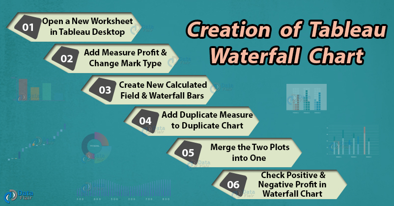
How to Create Waterfall Chart in Tableau?
Follow the steps given below to create a waterfall chart in Tableau Desktop:
Step 1: Open a New Worksheet in Tableau Desktop
Open a new worksheet in your Tableau Desktop. Make sure that you already have your dataset downloaded.
We are using our Electronic store sales data. From our data set, we select dimension; Sub-category and put it into the Columns section.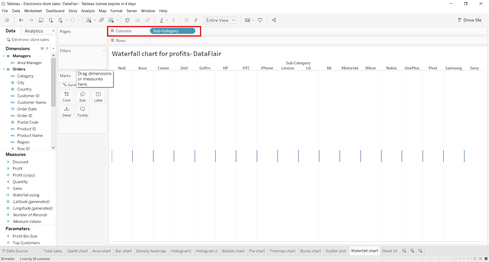
Step 2: Add Measure Profit and Change Mark Type
Next, we put a measure Profit in the Rows section.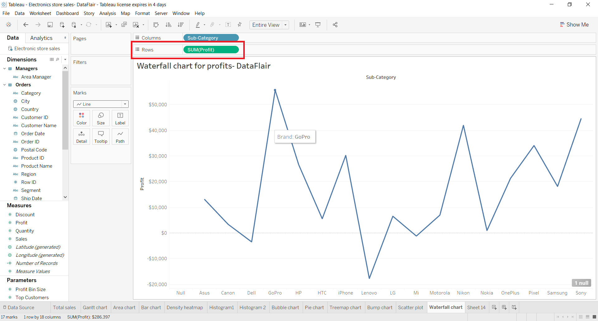
Now we need to change our mark type to Gantt Bar. Select the Gantt Bar option from the drop-down list in Marks card.
This will give us individual flat marks as data points on our plot. Next, we set a quick table calculation for the measure SUM(Profit) present in the Rows section. We add a quick calculation that is running total to our Profit field values. To do this, we right-click on SUM(Profit), select Quick Table Calculation and then select Running Total.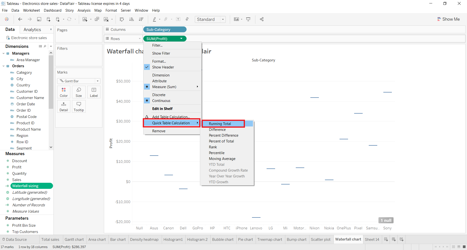
Step 3: Create New Calculated Field
Next, we need to create a new calculated field in tableau waterfall chart. For this, right-click on the measure field, then select Create and then click on Calculated Field.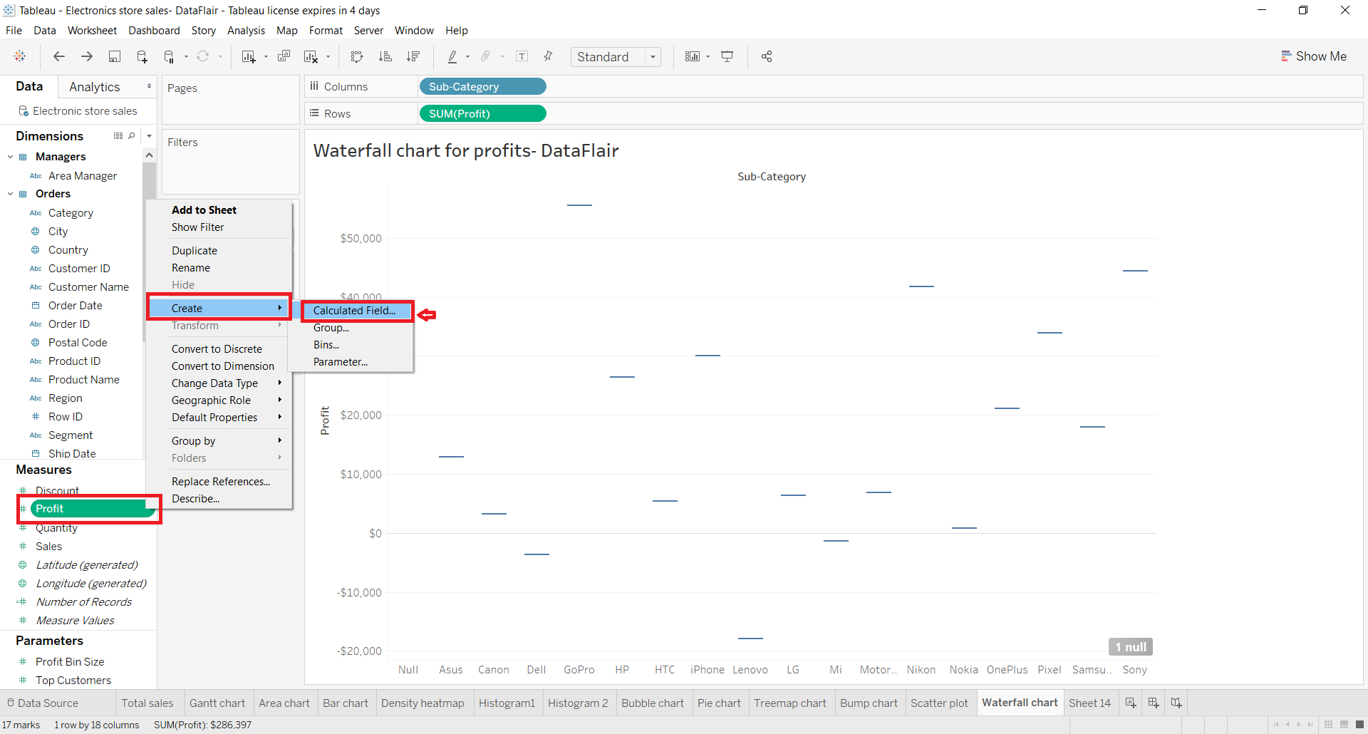
Then, an edit dialog box will open where we define the condition for our field and click on Apply. Here, we enter –[Profit] that is, negative of profit field values. Also, we named the new field as “Waterfall sizing”. You can add a name and condition as per your requirement and liking.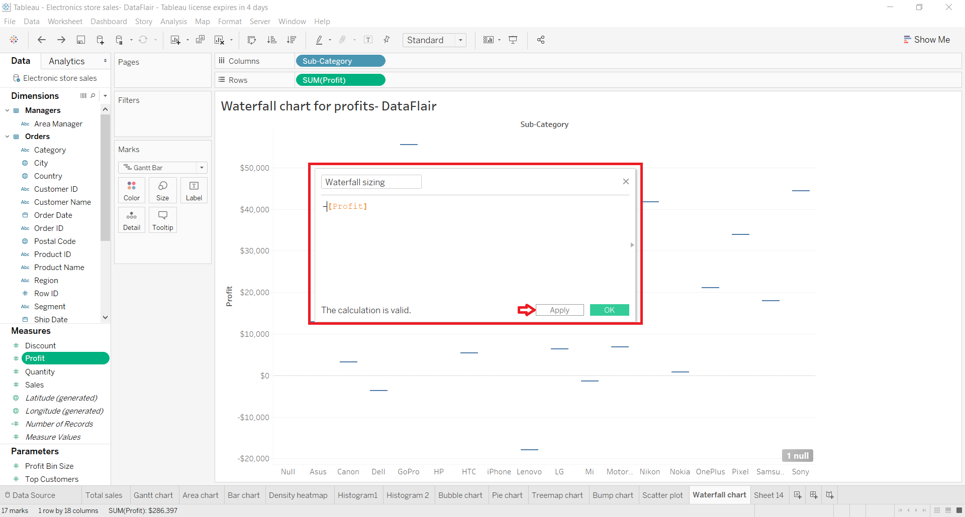
Step 4: Create Waterfall Bars
Now, we add our field Profit into Color card and Waterfall sizing into Size card present in the Marks section. This will create waterfall-like bars instantly on the plot.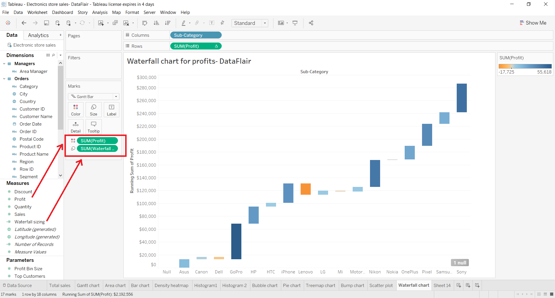
Step 5: Add Duplicate Measure to Duplicate the Chart
Now we need to duplicate the chart that we have and to do this, we add a duplicate measure field; SUM(Profit). This shows two fields in the Rows section.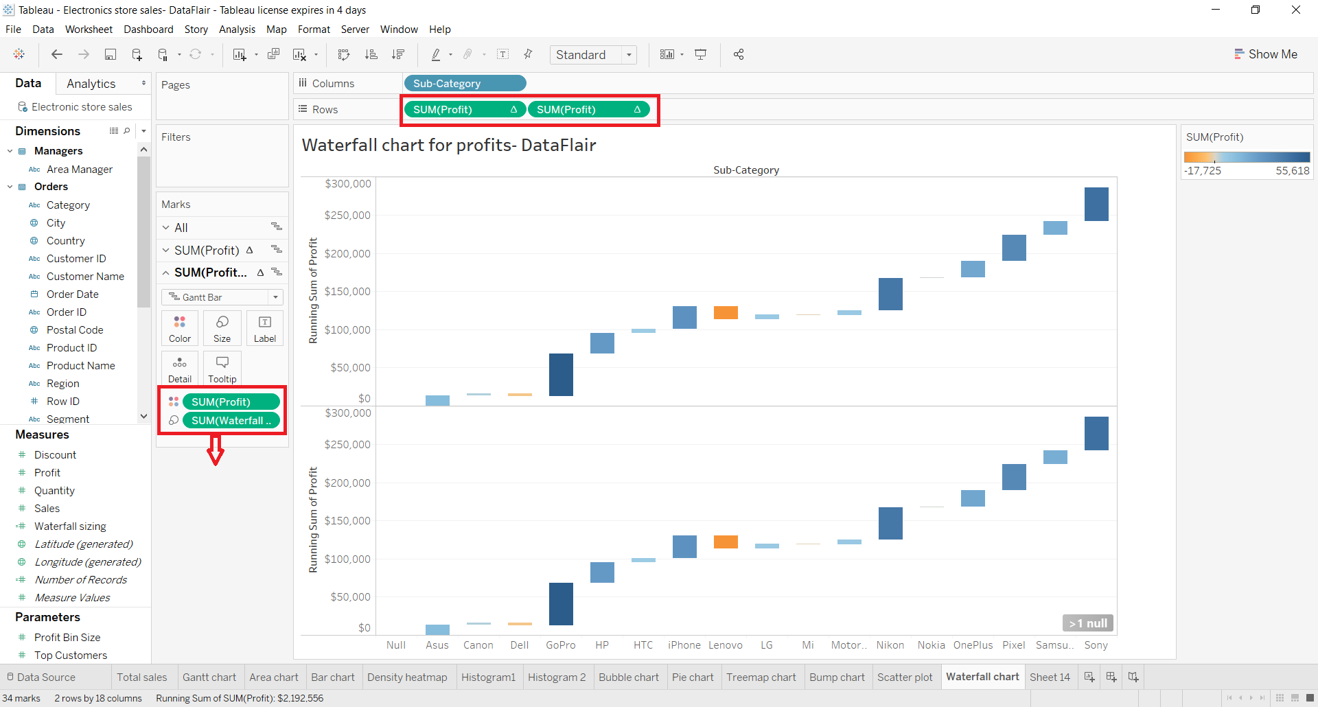
This will duplicate the chart and split the editing area into two. As you can see in the lower half of the chart, the mark type is set as Gantt Bar.
We can also increase or decrease the thickness of the Gantt bars through Size card. Now, we have two plots sharing the same x-axis and two duplicated y-axis. All we need to do next is to combine or merge these two plots into one.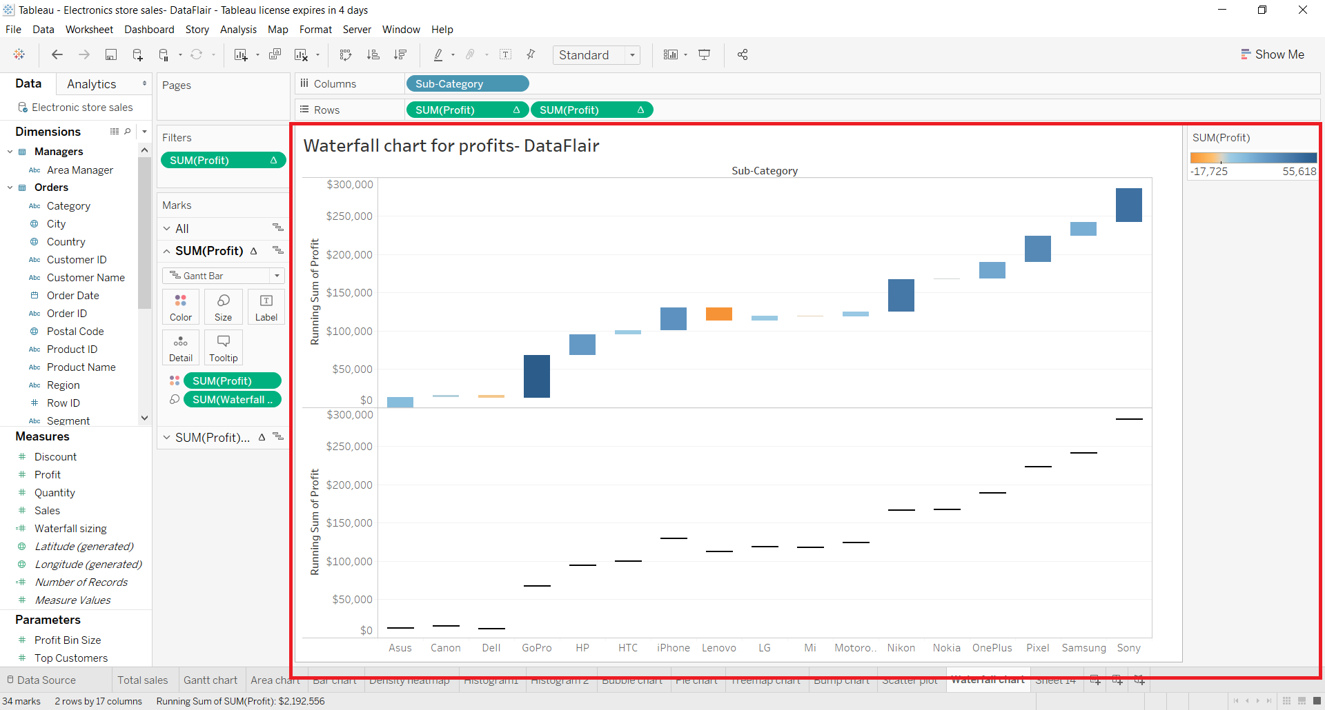
Step 6: Merge the Two Plots into One
To merge these two plots into one, we right-click on one of the fields in the Rows section and then select Dual Axis from the drop-down list.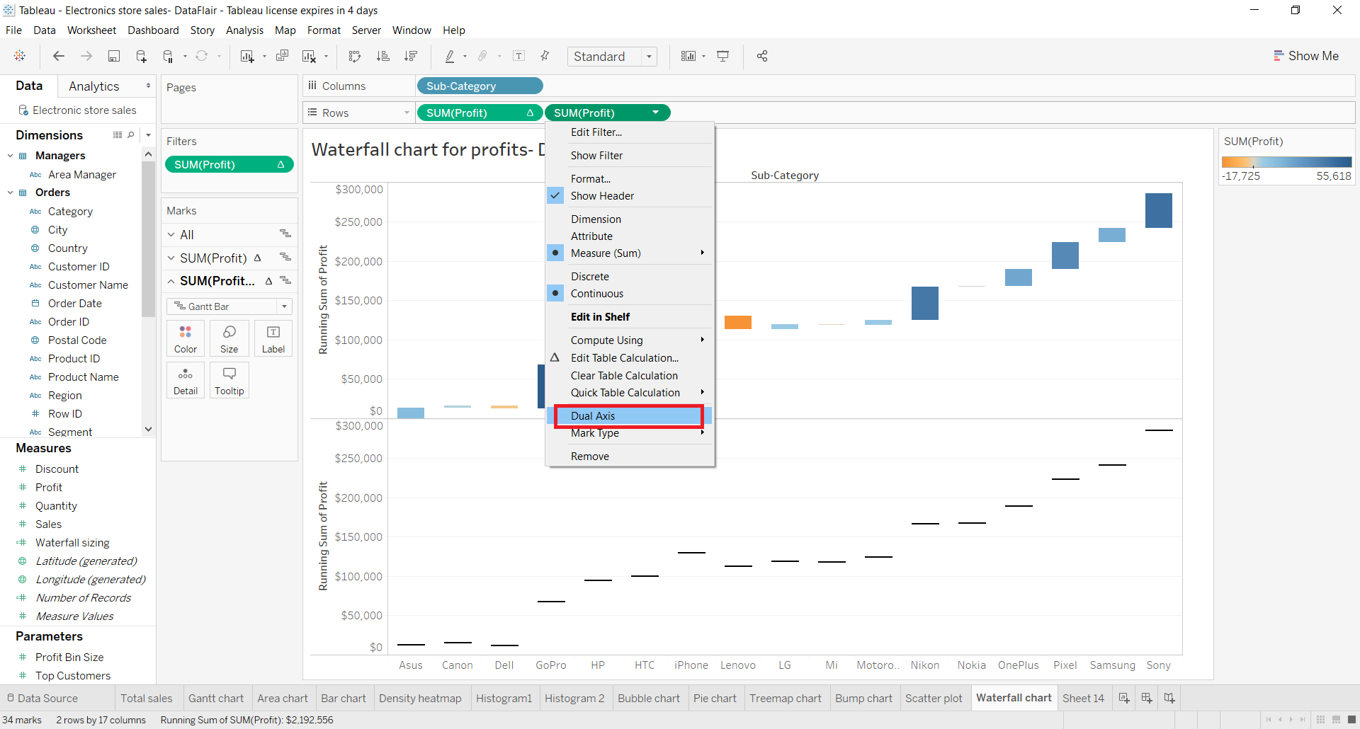
This merges the two plots into one and brings the two y-axes on either side (on the left and right) of the plot. You can format or edit the axis by right-clicking on it and exploring the options.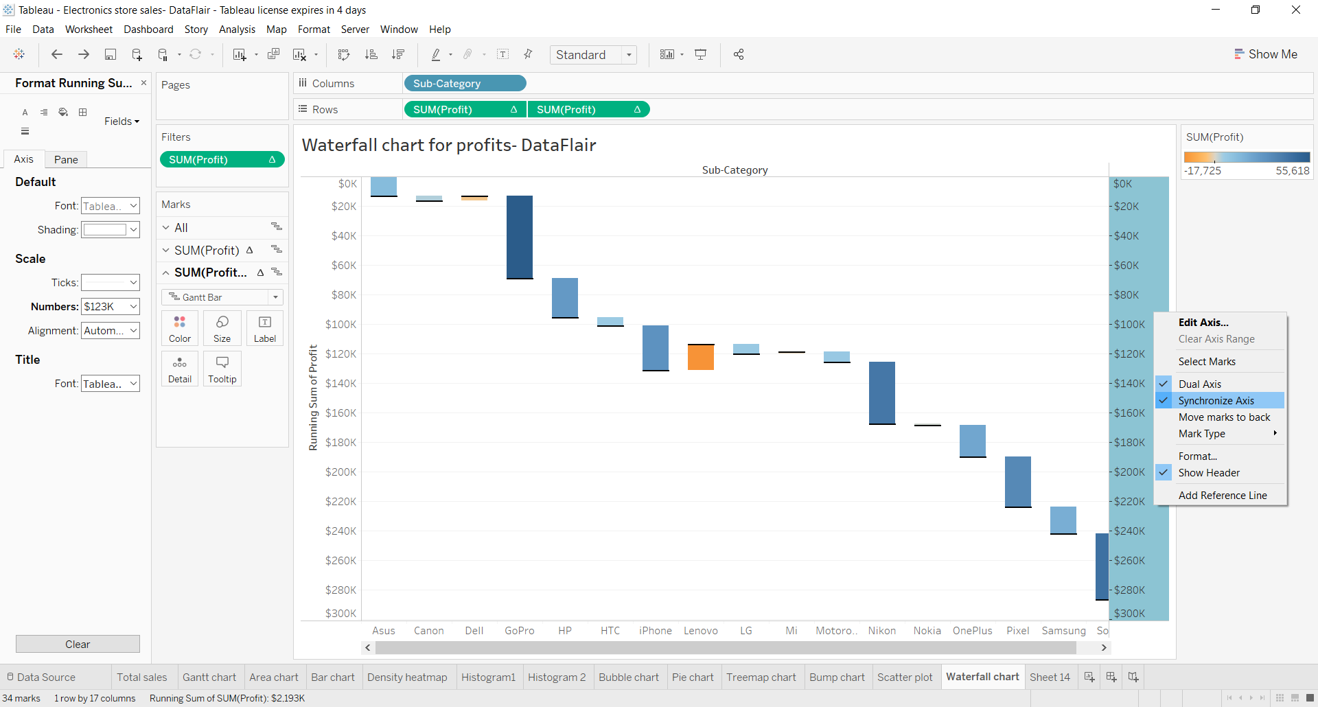
Step 7: Waterfall Chart Showing Positive and Negative Profit
In this way, our waterfall chart showing brand-wise profits incurred from the sales of electronic items is ready. On the right, there is a reference bar showing the color gradient for-profit values. As you can see, it goes from being orange to dark blue showing a negative profit to positive profit.
From this, we can understand which brands managed to incur most profits and which underwent loss. In this way, waterfall charts prove to be extremely useful in analysis.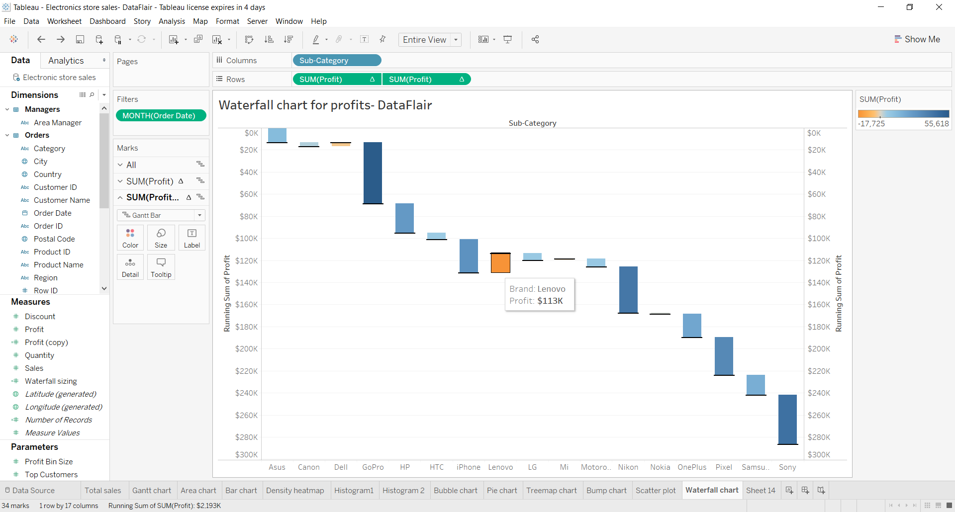
Summary
This concludes our tutorial on Tableau waterfall charts. Here, we learned the definition and use of a waterfall chart in analysis and then saw how to create a waterfall chart in Tableau.
Now!! This is the right moment to find out the hidden trend of your data with Tableau Scatter Plot.
Hope you enjoyed the tutorial. If you have any queries regarding this article, mention your queries in the comment section. We will be happy to help you.