


Job-ready Online Courses: Click for Success - Start Now!
In our last tutorial, we discuss How to Create Sankey Chart in Tableau, here, we are going to study Tableau Filter Operations and how to create Filter Operations in Tableau with proper illustrations.
So, let us start with Tableau Filter Operations.
Tableau Filter Operations
One of the ways to add interactivity to Tableau dashboards is by adding actions. Tableau supports three actions, and one of them is a filter action. A filter action enables one view to narrow down the information shown in other views, either in the same dashboard or different dashboards.
In this recipe, we will use one of the sheets in our dashboard to filter all other sheets in the dashboard.
Creating a Filter Operations in Tableau
These are the following steps to create Tableau Filter Operations:
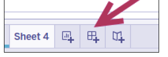
i. At the bottom of your Tableau design area are sheet tabs. There are three tabs with plus signs, which allow you to create a new sheet, dashboard and story point respectively. Click on the middle icon with the grid to create a new dashboard.
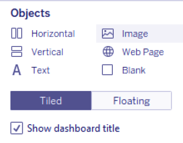
ii. When in the dashboard design area, the sidebar becomes a Dashboard bar, showing the available worksheets and other dashboard components.
iii. Check the Show dashboard title checkbox, located at the bottom of the Objects section. This will show the dashboard title text box on the dashboard.
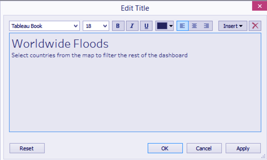
iv. Change the dashboard title to show the following:
v. Right-click on the dashboard title, and select Format Title. Choose a light gray background to the title.
vi. If needed, adjust the height of dashboard title so the whole text is visible.
vii. Under the Objects section, ensure that Tiled is selected and not Floating.
viii. Under the Sheets section in the Dashboard tab, drag the related worksheets onto the dashboard:
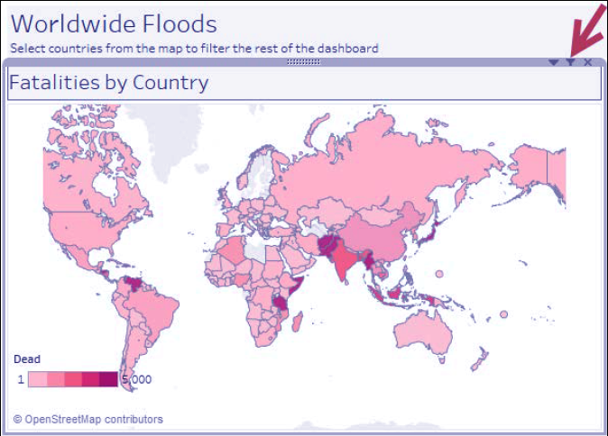
- Drag Floods by Country. By default, when Tiled is selected, this will occupy the whole dashboard space.
- Drag the Flood Damage worksheet and place it below Floods by Country. When you drag it, you will notice certain areas will get shaded. Release your mouse only when the shaded area is underneath the Floods by Country worksheet.
- Drag Floods by Cause to the right of Floods by Country and above Flood Damage.

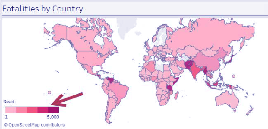
ix. Increase the width of Fatalities by Country so it is wider than the Floods by Cause worksheet.
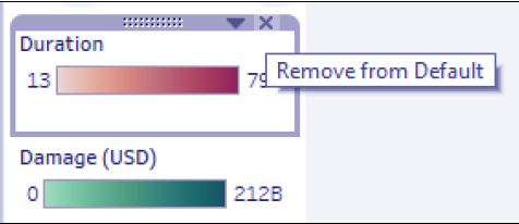
x. Remove the Duration and Damage (USD) color legends by clicking on the X mark.
xi. Set the Dead color legend to Floating. You can do this by selecting the color legend, which will show the legend’s gray border. Click on the drop-down arrow in the top-right corner, and select Floating. Selecting the Floating option will take the legend out of the grid and allow it to be layered on top of other items in the dashboard.
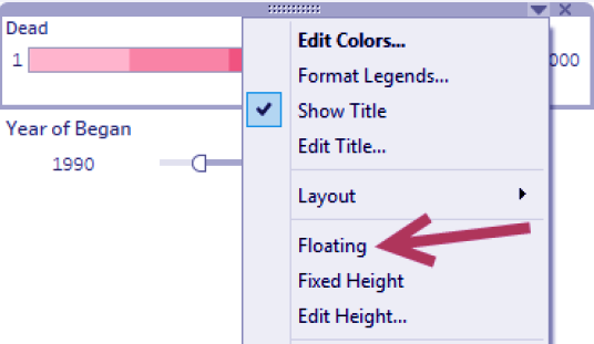
xii. Place the Dead color legend closer to the Fatalities by Country map worksheet, closer to the bottom-left area so it does not cover any countries in the map.
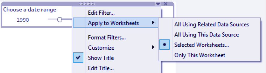
xiii. Change the title of the Year of Began filter to Choose a date range. To do this:
- Click on the Year of Began filter to show the gray border
- Click on the drop-down menu in the top-right corner
- Select Edit Title and make the changes
Adding Worksheets And Renaming Worksheet In Tableau
xiv. Change the scope of the date filter to all worksheets in the dashboard.
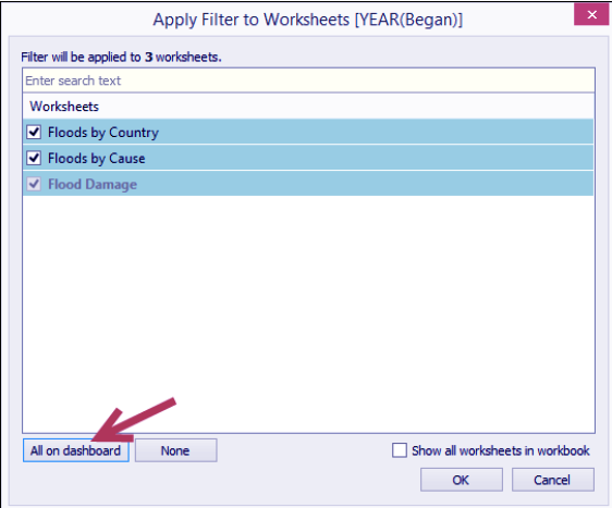
- Click on the drop-down of the filter, and choose to Apply to Worksheets, and then Selected Worksheets.
- Click the All on dashboard button in the Apply Filter to Worksheets window that appears. Click on OK when done.
xv. Format the filter to have light gray shading using the same color as the dashboard title. You can do this by selecting the filter, and clicking on the drop-down arrow in the top-right corner. From here, you can choose Format Filters. You can change the shading from the formatting sidebar that appears.
xvi. Click on the drop-down of the date filter, and choose Float. Place the filter in the top-right corner of the dashboard, beside the dashboard title.
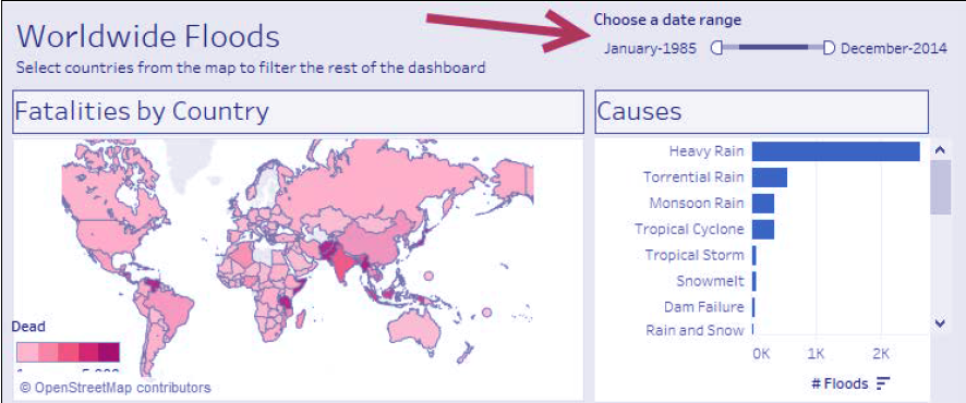
xvii. Click on the Floods by Country worksheet, and click on the funnel icon that appears in the top-right corner. This enables the map to filter all the worksheets in the dashboard.
xviii. Change the dashboard name to Flood Dashboard. You can double-click on the dashboard tab, and rename from there.
xix. Test the dashboard. Use the presentation mode (or press F7) to see what the end users will see. Click on countries in the map and/or change the date range in the filter. Confirm that the rest of the worksheets are filtered by that country.
This was all in Tableau Filter Chart. Hope you like our Explanation.
Conclusion
Hence, in this tutorial we learned about the Tableau Filter Operations, how to create Operations in Tableau and it’s working, thus completing another type of plotting in Tableau. Furthermore, if you have any query, feel free to ask in the comment section.