

Job-ready Online Courses: Knowledge Awaits – Click to Access!
In this tutorial of R lattice package, we will learn about graphs, graphics and R lattice graphs. Along with this, we will also discuss different types of lattice functions which we use in lattice graphs.
So, let’s start the R Lattice package tutorial.
Introduction to R Lattice Package
What is Lattice?
A lattice in R is known for its robust, elegant and aesthetic data visualisation system. That is, being inspired by Trellis graphics. Although, it is designed with an emphasis on multivariate data which allows easy conditioning to produce “small multiple” plots.
1. Lattice Graphs
The lattice package was written by Deepayan Sarkar. The package provides better defaults. It also provides the ability to display multivariate relationships and it improves on the base-R graphics. This package supports the creation of trellis graphs:
- graphs that display a variable or
- the relationship between variables, conditioned on one or
- other variables.
The typical format is:
graph_type(formula, data=)
We will select graph_type from the table listed below. The formula displays the variables and other types of conditioning.
For example:
~x|A for each level of factor (A), it displays a numerical variable which is x;
y~x | A*B for every combination of factor A and B, there exists a relationship between the variables x and y.
~x means display numeric variable x alone.
| Graph_type | Description |
Formula Examples
|
| barchart | bar chart | x~A or A~x |
| bwplot | boxplot | x~A or A~x |
| cloud | 3D scatter plot | z~x*y|A |
| contourplot | 3D contour plot | z~x*y|A |
| Densityplot | kernel density plot | ~x|A*B |
| dotplot | dotplot | ~x|A |
| histogram | histogram | ~x |
| levelplot | 3D level plot | z~y*x |
| Parallel | parallel coordinates plot | data frame |
| Splom | scatterplot matrix | data frame |
| stripplot | strip plots | A~x or x~A |
| xyplot | scatterplot matrix | y~x|A |
| wireframe | 3D wireframe graph | z~y*x |
Wait! Have you checked – R Graphical Models Tutorial
2. Customizing R Lattice Graphs
For example:
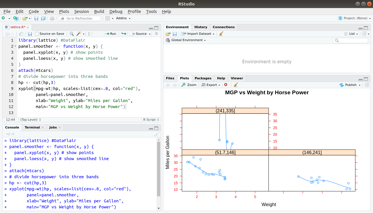
library(lattice)
panel.smoother <- function(x, y) {
  panel.xyplot(x, y) # show points
  panel.loess(x, y) # show smoothed line
}
attach(mtcars)
# divide horsepower into three bands
hp <- cut(hp,3)
xyplot(mpg~wt|hp, scales=list(cex=.8, col="red"),
       panel=panel.smoother,
       xlab="Weight", ylab="Miles per Gallon",
       main="MGP vs Weight by Horse Power")
Output:
3. R Graphics
3.1 R has two independent graphics subsystems:
Traditional graphics
- Available in R from the beginning.
- A rich collection of tools.
- Not very flexible.
Grid graphics
- recent (2000)
- A low-level tool, flexible.
3.2 Grid forms the basis of two high-level graphics systems:
- Lattice: based on Trellis graphics (Cleveland).
- ggplot2: inspired by “Grammar of Graphics”(Wilkinson).
Do you know about Graphical Data Analysis with R
R Lattice Package
- Trellis graphics for R (developed in S).
- A powerful high-level data visualization system.
- Provides common statistical graphics with conditioning.
- Emphasis on multivariate data.
- Enough for typical graphics needs.
- Flexible enough to handle most non-standard requirements.
Traditional user interface:
- Collection of high-level functions: xyplot, dotplot, etc.
- Interface based on formula and data source.
High-Level Functions in Lattice
Function Default Display
histogram() Histogram
densityplot() Kernel Density Plot
qqmath() Theoretical Quantile Plot
qq() Two-sample Quantile Plot
stripplot() Stripchart (Comparative 1-D Scatter Plots)
bwplot() Comparative Box-and-Whisker Plots
barchart() Bar Plot
dotplot() Cleveland Dot Plot
xyplot() Scatter Plot
splom() Scatter-Plot Matrix
contourplot() Contour Plot of Surfaces
levelplot() False Color Level Plot of Surfaces
wireframe() Three-dimensional Perspective Plot of Surface
cloud() Three-dimensional Scatter Plot
parallel() Parallel Coordinates Plot
Summary
In this R Lattice Package tutorial, we have studied in deep about different graphics and their functions. Moreover, learned their properties which help in creating graphs and functions. Still, if you have any query regarding R Lattice Package, ask in the comment section.
Now, it’s time to learn – How to Save Graphs to Files in R programming