


Master Python with 70+ Hands-on Projects and Get Job-ready - Learn Python
In this python project, we will implement a live dashboard for COVID 19 spread analysis. This dashboard will provide many insightful visualizations for the study of coronavirus spread. In this project, we will work on three different datasets and generate different dashboards.
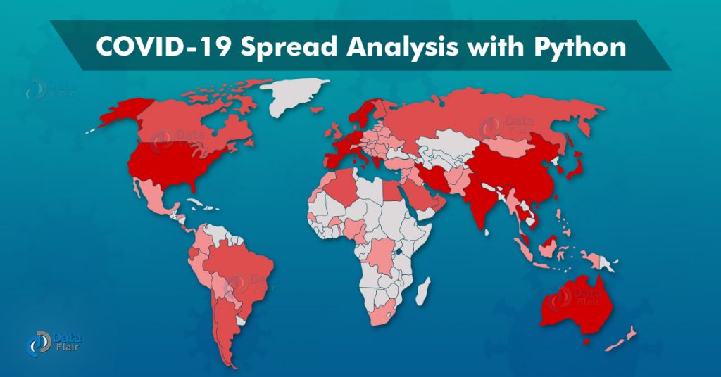
Analyze COVID-19 Virus Spread with Python
We will be using flask and folium python packages for making interactive dashboards.
Flask: It is a web server gateway interface application in python. This is used for developing web apps. Using Flask we can build applications that can scale up to complex applications. Install Flask using:
pip install Flask
Folium: It is a python API for visualizing data. It is a good API to include map related visualizations. Install Folium using:
pip install folium
Download Dataset
The dataset consists of corona spread data from different countries and different cities. This dataset also contains the latitude and longitude of corona affected areas. We will filter and visualize the countries and the cites within countries with maximum corona cases.
Please download all the datasets: Covid-19 DataSet
Let’s dive to project code
The directory tree for the project is as follows:
- app.py
- templates:
- home.html
- base.html
- static:
- style.css
Create a file app.py and add the following code:
1. Load the dataset and collect the top 15 regions having the largest corona cases:
import pandas as pd
corona_df = pd.read_csv('dataset.csv')
by_country = corona_df.groupby('Country_Region').sum()[['Confirmed', 'Deaths', 'Recovered', 'Active']]
cdf = by_country.nlargest(n, 'Confirmed')[['Confirmed']]
For ease, let’s make a function that will return the updated data frame, cdf.
def find_top_confirmed(n = 15):

  import pandas as pd
  corona_df = pd.read_csv('dataset.csv')
  by_country = corona_df.groupby('Country_Region').sum()[['Confirmed', 'Deaths', 'Recovered', 'Active']]
  cdf = by_country.nlargest(n, 'Confirmed')[['Confirmed']]
  return cdf
2. Make a sample map using the folium package and write a function to make circles on active corona cases regions:
import folium
import pandas as pd
corona_df = pd.read_csv('dataset.csv')

corona_df=corona_df.dropna()

m=folium.Map(location=[34.223334,-82.461707],
            tiles='Stamen toner',
            zoom_start=8)

def circle_maker(x):
    folium.Circle(location=[x[0],x[1]],
                 radius=float(x[2])*10,
                 color="red",
                 popup='{}\n confirmed cases:{}'.format(x[3],x[2])).add_to(m)
corona_df[['Lat','Long_','Confirmed','Combined_Key']].apply(lambda x:circle_maker(x),axis=1)

html_map=m._repr_html_()
3. Now do the required settings for flask app.
from flask import Flask,render_template

app=Flask(__name__)

@app.route('/')
def home():
    return render_template("home.html",table=cdf, cmap=html_map,pairs=pairs)

if __name__=="__main__":
    app.run(debug=True)
4. Now create two HTML pages inside templates folder: base.html and home.html and paste the below code in it.
base.html:
<head>
  <link
    rel="stylesheet"
    href="https://stackpath.bootstrapcdn.com/bootstrap/4.5.0/css/bootstrap.min.css"
    integrity="sha384-9aIt2nRpC12Uk9gS9baDl411NQApFmC26EwAOH8WgZl5MYYxFfc+NcPb1dKGj7Sk"
    crossorigin="anonymous"
  />

  <link
    rel="stylesheet"
    type="text/css"
    href="{{ url_for('static',filename='style.css')}}"
  />
</head>

{% block content %} {% endblock %}
home.html:
{% extends "base.html" %} {% block content %}
<div class="container">
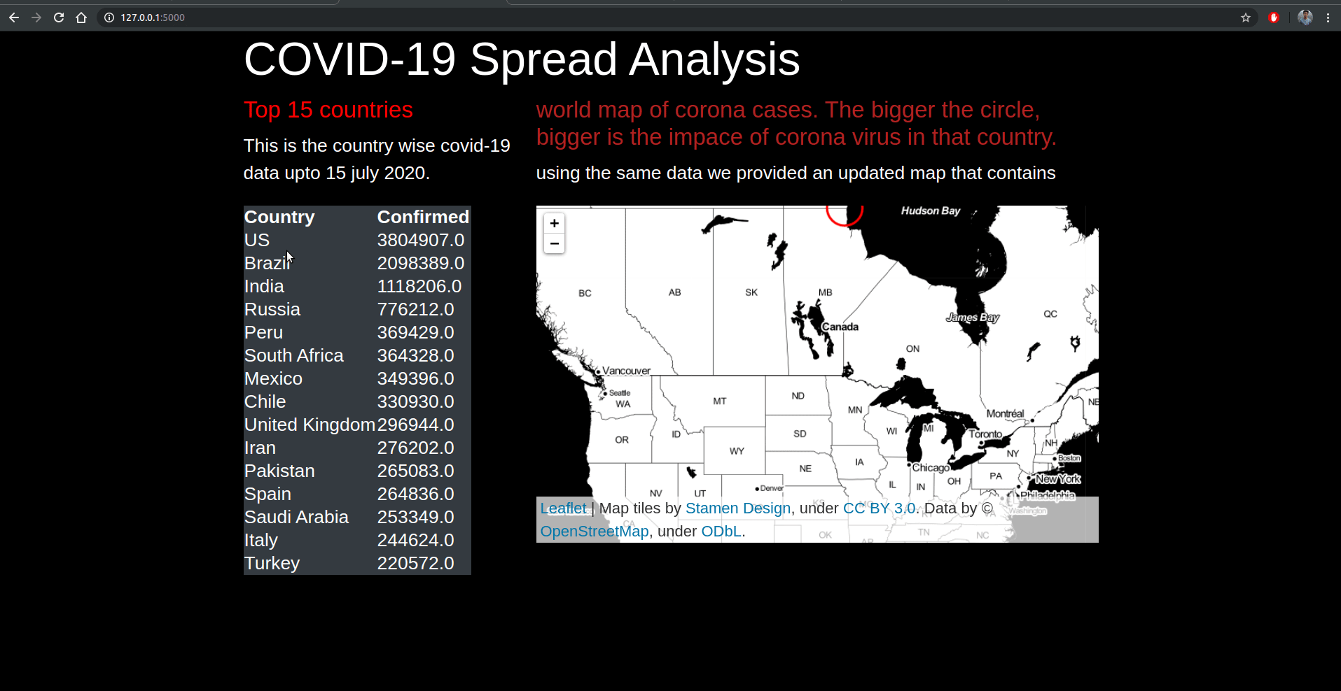
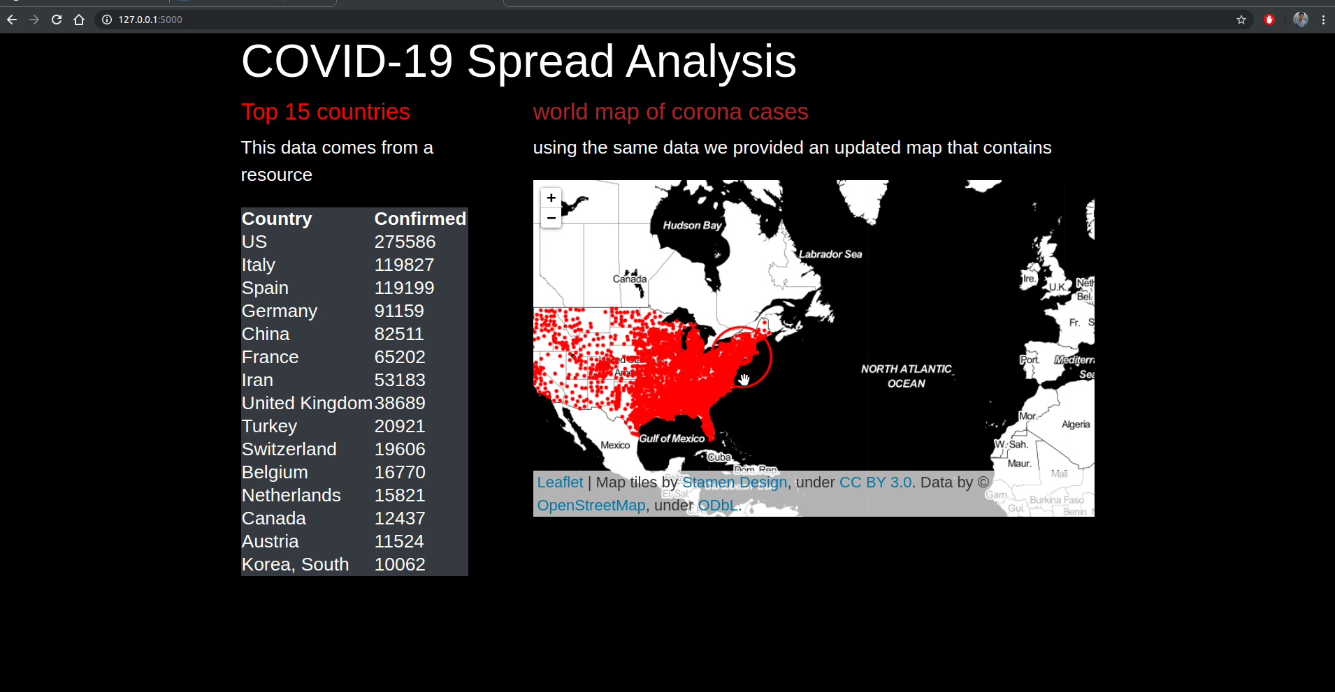
<h1>COVID-19 Spread Analysis</h1>
<div class="row">
<div class="col-4">
<h5><font color="red">Top 15 countries</font></h5>
<p>This data comes from a resource</p>
<table class="table-responsive-sm table-dark">
<thead>
<tr>
<th scope="col">Country</th>
<th scope="col">Confirmed</tr>
</tr>
</thead>
<tbody>
{% for pair in pairs %}
<tr>
<td>{{ pair[0]}}</td>
<td>{{ pair[1]}}</td>
</tr>
{% endfor %}
</tbody>
</table></div>
<div class="col-8">
<h5><font color="firebrick">world map of corona cases</font></h5>
<p>using the same data we provided an updated map that contains</p>
{{cmap|safe}}</div>
</div>
</div>
{% endblock %}
5. Inside static folder make style.css file and paste the below code.
style.css:
body {
  background-color: black;
  color: white;
}

h1, td, tr {
    color: white;
}
Now run the flask app and visualize corona statistics using the dashboard. To run the flask app open the terminal and run the app.py file.
python3 app.py
Now, open the dashboard at localhost:5050
Project part-2
Let’s perform a similar analysis on new datasets. The steps are similar which we have discussed in the previous run
Download the dataset
Please download the second dataset: Covid-19 DataSet
Create the following files:
- app.py
- base.html, and home.html inside templates folder
- style.css inside static folder.
After creating all the files paste the below code inside respective files:
app.py:
def find_top_confirmed(n = 15):

    import pandas as pd
    corona_df=pd.read_csv("dataset2.csv")
    by_country = corona_df.groupby('Country').sum()[['Confirmed', 'Deaths', 'Recovered', 'Active']]
    cdf = by_country.nlargest(n, 'Confirmed')[['Confirmed']]
    return cdf

cdf=find_top_confirmed()
pairs=[(country,confirmed) for country,confirmed in zip(cdf.index,cdf['Confirmed'])]


import folium
import pandas as pd
corona_df = pd.read_csv("dataset2.csv")
corona_df=corona_df[['Lat','Long_','Confirmed']]
corona_df=corona_df.dropna()

m=folium.Map(location=[34.223334,-82.461707],
            tiles='Stamen toner',
            zoom_start=8)

def circle_maker(x):
    folium.Circle(location=[x[0],x[1]],
                 radius=float(x[2]),
                 color="red",
                 popup='confirmed cases:{}'.format(x[2])).add_to(m)
corona_df.apply(lambda x:circle_maker(x),axis=1)

html_map=m._repr_html_()
from flask import Flask,render_template

app=Flask(__name__)

@app.route('/')
def home():
    return render_template("home.html",table=cdf, cmap=html_map,pairs=pairs)

if __name__=="__main__":
    app.run(debug=True)
base.html:
<head>
  <link
    rel="stylesheet"
    href="https://stackpath.bootstrapcdn.com/bootstrap/4.5.0/css/bootstrap.min.css"
    integrity="sha384-9aIt2nRpC12Uk9gS9baDl411NQApFmC26EwAOH8WgZl5MYYxFfc+NcPb1dKGj7Sk"
    crossorigin="anonymous"
  />

  <link
    rel="stylesheet"
    type="text/css"
    href="{{ url_for('static',filename='style.css')}}"
  />
</head>

{% block content %} {% endblock %}
home.html:
{% extends "base.html" %} {% block content %}


<div class="container">
    <h1>COVID-19 Spread Analysis</h1>
  <div class="row">

    <div class="col-4">
        <h5><font color="red">Top 15 country</font></h5>
        <p>This is the countrywise covid-19 data upto 20 july 2020.</p>
        <table class="table-responsive-sm table-dark">
        <thead>
            <tr>
            <th scope="col">Country</th>
            <th scope="col">Confirmed</tr>
                </tr>
        </thead>
        <tbody>
    {% for pair in pairs %}
    <tr>
    <td>{{ pair[0]}}</td>
    <td>{{ pair[1]}}</td>
    </tr>
    {% endfor %}
    </tbody>
    </table></div>
    <div class="col-8">
        <h5><font color="firebrick">world map of corona cases. The bigger the circle, bigger is the impace of corona virus in that province state.</font></h5>
        <p>using the same data we provided an updated map that contains</p>
        {{cmap|safe}}</div>

  </div>
</div>


{% endblock %}
style.css:
body {
  background-color: black;
  color: white;
}

h1,
td,
tr {
  color: white;
}
Run the app.py file to run the flask app:
python3 app.py
Project part 3
Let’s perform a similar analysis on a different datasets. The steps are similar which we have discussed in the previous run
Download dataset3 and repeat the steps for this dataset: Covid-19 DataSet
This dataset contains state-wise information of COVID 19 cases.
app.py:
def find_top_confirmed(n = 15):

  import pandas as pd

  corona_df=pd.read_csv("dataset3.csv")
  by_country = corona_df.groupby('Province_State').sum()[['Confirmed', 'Deaths', 'Recovered', 'Active']]
  cdf = by_country.nlargest(n, 'Confirmed')[['Confirmed']]
  return cdf


cdf=find_top_confirmed()
pairs=[(province_state,confirmed) for province_state,confirmed in zip(cdf.index,cdf['Confirmed'])]


import folium
import pandas as pd
corona_df = pd.read_csv("dataset3.csv")
corona_df=corona_df[['Lat','Long_','Confirmed']]
corona_df=corona_df.dropna()

m=folium.Map(location=[34.223334,-82.461707],
            tiles='Stamen toner',
            zoom_start=8)

def circle_maker(x):
    folium.Circle(location=[x[0],x[1]],
                 radius=float(x[2]),
                 color="red",
                 popup='confirmed cases:{}'.format(x[2])).add_to(m)
corona_df.apply(lambda x:circle_maker(x),axis=1)

html_map=m._repr_html_()
from flask import Flask,render_template

app=Flask(__name__)

@app.route('/')
def home():
    return render_template("home.html",table=cdf, cmap=html_map,pairs=pairs)

if __name__=="__main__":
    app.run(debug=True)
base.html:
<head>
  <link
    rel="stylesheet"
    href="https://stackpath.bootstrapcdn.com/bootstrap/4.5.0/css/bootstrap.min.css"
    integrity="sha384-9aIt2nRpC12Uk9gS9baDl411NQApFmC26EwAOH8WgZl5MYYxFfc+NcPb1dKGj7Sk"
    crossorigin="anonymous"
  />

  <link
    rel="stylesheet"
    type="text/css"
    href="{{ url_for('static',filename='style.css')}}"
  />
</head>

{% block content %} {% endblock %}
home.html:
{% extends "base.html" %} {% block content %}


<div class="container">
    <h1>COVID-19 Spread Analysis</h1>
  <div class="row">

    <div class="col-4">
        <h5><font color="red">Top 15 States</font></h5>
        <p>This is the province state wise covid-19 data upto 20 july 2020.</p>
        <table class="table-responsive-sm table-dark">
        <thead>
            <tr>
            <th scope="col">Province State</th>
            <th scope="col">Confirmed</tr>
                </tr>
        </thead>
        <tbody>
    {% for pair in pairs %}
    <tr>
    <td>{{ pair[0]}}</td>
    <td>{{ pair[1]}}</td>
    </tr>
    {% endfor %}
    </tbody>
    </table></div>
    <div class="col-8">
        <h5><font color="firebrick">world map of corona cases. The bigger the circle, bigger is the impace of corona virus in that province state.</font></h5>
        <p>using the same data we provided an updated map that contains</p>
        {{cmap|safe}}</div>

  </div>
</div>


{% endblock %}
style.css:
body {
  background-color: black;
  color: white;
}

h1,
td,
tr {
  color: white;
}
Again run the app.py file and open the dashboard at localhost:5050
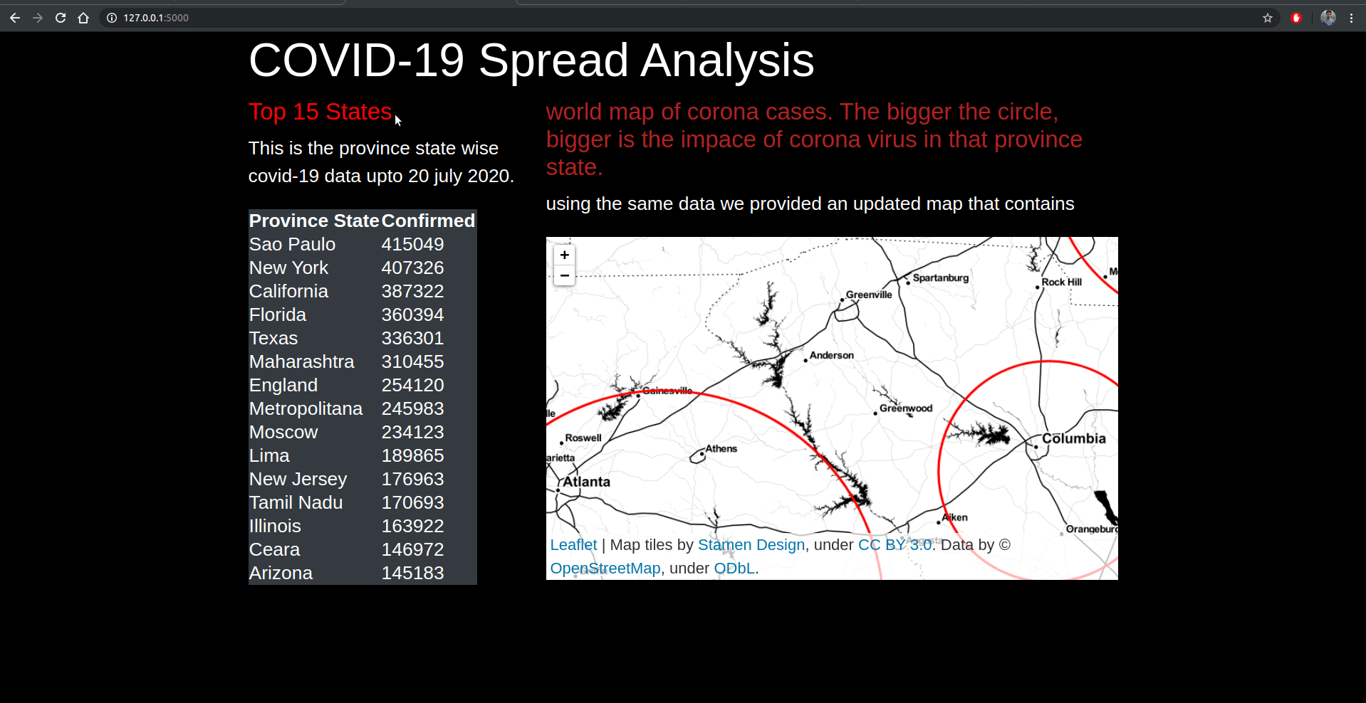
Summary
In this COVID-19 spread analysis project, we have seen how to build a dashboard using flask and python folium. In this dashboard, we are visualizing the region-wise effect of coronavirus. The table in the left panel shows the total active cases till date in the respective region. In the right panel, we have integrated a world map and represent the impact of the virus using a red circle. More the number of cases in the region on the map, the bigger is the red circle in that region. To integrate world map and red circles we make use of the python folium library.