


Machine Learning courses with 110+ Real-time projects Start Now!!
Understanding Matplotlib Pie Charts
Pie Charts: A Brief Introduction
Pie charts are often used to display percentages or other relative measures of data. Categorical data may be easily understood in terms of its distribution and relative proportions thanks to its visual depiction. When contrasting the relative sizes and weights of several groups, pie charts really shine.
What Makes a Matplotlib Pie Chart Unique
1. Seeing how categories are used and how they stack up visually
Pie charts are a visual representation of the distribution of categorical data, where the percentage of each category is shown as a slice of a circle. Each wedge’s size is indicative of the fraction or percentage it represents in the whole. This facilitates a rapid comprehension of the data’s general distribution.
2. Visualising category contributions
By graphically representing the relative contributions of distinct categories, pie charts allow us to examine the structure of a dataset at a glance. In a pie chart, the degree to which each wedge points indicates the relative size of that category within the entire, making it simple to evaluate relative importance.
Making Pie Charts in Matplotlib
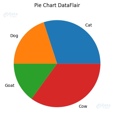
Matplotlib makes it simple to make a standard pie chart. If we provide the pie function the data and labels that describe the percentages and categories, it will produce a pie chart. Here’s a case in point:
import matplotlib.pyplot as plott


vals = [60, 40, 30, 70]  # Proportions of each category
cats = ['Cat', 'Dog', 'Goat', 'Cow']  # Labels for each category


plott.pie(vals, labels=cats)
plott.title('Pie Chart DataFlair')
plott.show()
To improve the visual appeal and legibility of pie charts, Matplotlib provides a number of options for personalization. The chart’s aesthetic appeal may be modified by changing its colours, labels, and text characteristics. For instance, we may give each group its own colour, change the size and design of the labels, and give the whole thing a title.
Exploding Matplotlib Pie Chart Slices
Pieces of the Pie Chart Blowing Up
One way to draw attention to a subset of data shown in a pie chart is to “explode” or move the relevant slice away from the centre of the chart. This highlights the category of interest. To do this, we may give the pie function a “explode” argument. Each slice’s offset is represented by a value in the “explode” argument. Here’s a case in point:
list_e = [0, 0.1, 0, 0]
plott.pie(vals, labels=cats, explode=list_e)
plott.title('Exploded Pie Chart DataFlair')
plott.show()

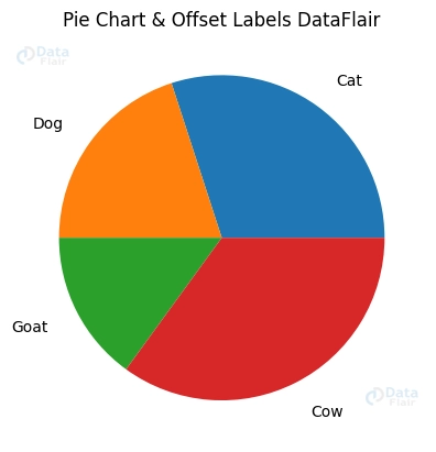
Offsetting the Labels in a Pie Chart
Labels may be moved outside the pie slices for greater visibility if they overlap or otherwise hinder the reading of the chart. Matplotlib’s labeldistance option enables us to do this by setting the label’s radial distance from the pie chart’s origin. The labels may be moved farther away from the slices by raising the labeldistance value. Because of this, overlapping labels are avoided, and readability is improved.
plott.pie(vals, labels=cats, labeldistance=1.2)
plott.title('Pie Chart & Offset Labels DataFlair')
plott.show()
Personalising Pie Chart Designs in Matplotlib
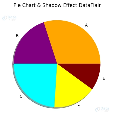
Properties of Shadows and Wedges
Including a shadow effect will give our pie chart a three-dimensional aspect, increasing its aesthetic appeal and making it stand out from the crowd.
list_s = [15, 10, 12, 8, 5]
cats = ['A', 'B', 'C', 'D', 'E']
list_c = ['orange', 'purple', 'cyan', 'yellow', 'maroon']


plott.pie(list_s, labels=cats, colors=list_c, shadow=True)
plott.title('Pie Chart & Shadow Effect DataFlair')
plott.show()
Pie charts may be made to seem more creative by modifying their “wedge properties,” which allow us to add our own spin on the traditional pie shape. The width, edge colour, and other characteristics may be modified to get the desired look.
Donut Charts
Representing data in a different way, donut charts are a variant of pie charts in which the centre is cut out, producing a hollow circle. This variant may shed light on the data’s proportions and makeup in a new light.
plott.pie(list_s, labels=cats, colors=list_c, wedgeprops={'width': 0.5})
plott.title('Donut Chart DataFlair')
plott.show()

To show data in a novel and aesthetically attractive way, we may use donut charts as an alternative to pie charts for visualising proportion and composition.
Labels and Legends in Pie Charts
Annotating the data labels
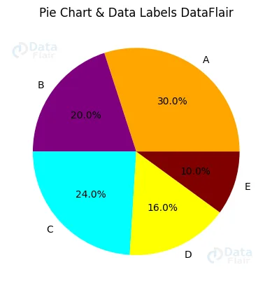
1. Labelling each slice with the percentage or absolute value
Each pie slice may be labelled with information such as the percentage or absolute value it represents.
plott.pie(list_s, labels=cats, colors=list_c, autopct='%1.1f%%')
plott.title('Pie Chart & Data Labels DataFlair')
plott.show()
2. Changing the format, position, and style of the labels
Matplotlib has many options for changing the format, position, and style of the data labels, allowing us to customise them to our individual needs.
Configuring the Legend:
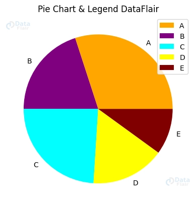
1. Adding a category legend
Pie charts may be made more understandable by including a legend that provides a key to the many categories shown within the chart.
plott.pie(list_s, labels=cats, colors=list_c)
plott.title('Pie Chart & Legend DataFlair')
plott.legend()
plott.show()
2. Changing the placement, font, and look of the legend
Matplotlib allows us to position the legend as well as customise its font, size, and style, enabling us to build a visually appealing and useful chart.
Conclusion
To sum up, pie charts are a flexible method of displaying data’s relative parts and wholes. Matplotlib provides a wide variety of aesthetic and presentation choices for pie charts. Shadow effects, doughnut charts, data labels, and legends are just a few of the methods that may be used to produce eye-catching and useful visualisations. Pie charts have many applications in data visualisation, and we hope you’ll take the time to learn how to make the most of them using Matplotlib.