


Machine Learning courses with 110+ Real-time projects Start Now!!
Matplotlib is a strong Python library commonly used for plotting and graphing data. It has a wide variety of features for producing eye-catching graphs and conveying data insights. As labels in matplotlib play a significant role in improving plot understanding and transmitting information to the viewer, we will devote this article to discussing labels and their usefulness in Matplotlib.
Learning Labels in Matplotlib
Definitions and Classifications of Matplotlib Labels
Labels in data visualisation are textual annotations that describe the data points, axes, and other parts of the visualisation. They help to clarify the story’s meaning and make the action easier to follow.
Different kinds of Labels in Matplotlib
Matplotlib’s label options include axis labels, plot titles, and legends, among others.
Data on the x and y axes may be described by their respective axis labels. They aid in the recognition of the displayed variables and provide meaning to the data.
The plot’s title should be a brief, descriptive phrase that conveys the story’s central theme or conflict. It’s a headline that sums up the visualization’s key point.
Axis Labels and Titles in Matplotlib
Labelling the X and Y Axes
Matplotlib’s xlabel() and ylabel() methods allow us to label the x and y axes, respectively. Label text is specified by passing a string to these methods as an argument. Moreover, we have control over the positioning, size, and colour of labels.
import matplotlib.pyplot as plott


list_a = [2, 4, 6, 8, 10]
list_b = [20, 30, 14, 24, 18]
list_c = [20, 32, 40, 24, 52]


plott.plot(list_a, list_b)
plott.xlabel("X-axis Label")
plott.ylabel("Y-axis Label")


plott.show()
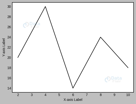
Labels for the x and y axes have been added with the help of the xlabel() and ylabel() utilities in this code. Feel free to alter the label wording and try other layouts.
Graph Title
The title of the narrative tells you all you need to know about what it’s about. The title() method in Matplotlib enables us to customise the plot’s name. The alignment, size, and colour of the text are only a few of the features we have control over.
plott.plot(list_a, list_b)
plott.title("Plot Graph Title DataFlair")


plott.show()
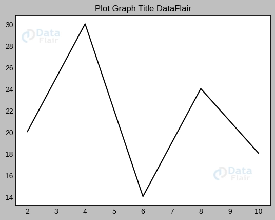
The title() function is used in this code to designate “Plot Title” as the plot’s official name. To get the best title and layout for your data visualisation tasks, try a few different things.
Legends and Labels in Matplotlib
Making History
When numerous lines or data series are available, Matplotlib’s legends come in handy for distinguishing the various plot parts. The legend() method allows us to easily build a legend using the labels used in the plot’s generation process.
plott.plot(list_a, list_b, label='Line A')
plott.plot(list_a, list_c, label='Line B')
plott.legend()


plott.show()
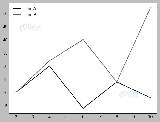
The legend() method in this code sample generates a legend based on the labels that were given to the lines through the label argument. Make your own labels and try out various legend placements.
Layout and Naming of Legends
Matplotlib offers a number of ways to alter the legend labels so that they are more understandable. The legend’s appearance, font attributes, and spacing may all be adjusted with the use of optional options.
plott.plot(list_a, list_b, label='Line A')
plott.legend(title='Legend Title [DataFlair]', loc='upper right', fontsize='large')


plott.show()
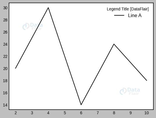
The title argument in this code sample specifies the legend’s title, the loc parameter places the legend in the top right corner, and the fontsize parameter modifies the legend’s font size. Try out many layouts to find one that works for your legend.
Matplotlib: Tick and Label Configuration
The ticks on a graph’s axes denote individual data points or intervals. The values assigned to ticks are referred to as “tick labels.” Matplotlib computes the appropriate ticks and ticks labels for the given data range automatically. But we may adjust them so that they’re easier to read and comprehend.
Customising the Positions and Names of Ticks
Let’s have a look at a basic sine wave graphic. Matplotlib uses the data range to determine where to place ticks and what to name them. To make the plot more useful, though, we may alter the tick positions and labels.
import matplotlib.pyplot as plott
import numpy as numpyy


# Generate data
x_axis = numpyy.linspace(1, 5 * numpyy.pi, 50)
y_axis = numpyy.sin(x_axis)


# Create the plot
plott.plot(x_axis, y_axis)


# Customize tick locations and labels
plott.xticks([0, 2 * numpyy.pi, 4 * numpyy.pi], ['0', '2$\pi$', '4$\pi$'])
plott.yticks([-1, 0, 1], ['-1', '0', '1'])


# Add labels and title
plott.xlabel('Angle (radians)')
plott.ylabel('Amplitude')
plott.title('Sine Wave DataFlair')


# Display the plot
plott.show()
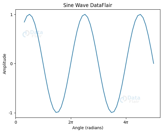
Here, we see how to modify the x and y axis tick positions and labels with the help of plott.xticks() and plott.yticks(). Tick locations are sent to these functions as the first parameter, and tick labels are provided as the second. Here, we’ve placed x-axis ticks at 0 and 2 and y-axis ticks at -1, 0, and 1. Tick labels also have the symbol, which is shown in LaTeX notation.
Using the Scalar Formatter with Tick Labels
The labels on the ticks might become difficult to see when the numbers involved are particularly large or little. Matplotlib has a ScalarFormatter, which produces tick labels in scientific notation automatically.
import matplotlib.pyplot as plott


# Sample data
x_axis = [5e6, 10e6, 15e6, 20e6]
y_axis = [100000, 150000, 260000, 500000]


# Create the plot
plott.plot(x_axis, y_axis)


# Use ScalarFormatter for tick labels
plott.ticklabel_format(style='sci', axis='both', scilimits=(0, 0))


# Add labels and title
plott.xlabel('People')
plott.ylabel('Gross Income')
plott.title('People vs. Gross Income DataFlair')


# Display the plot
plott.show()
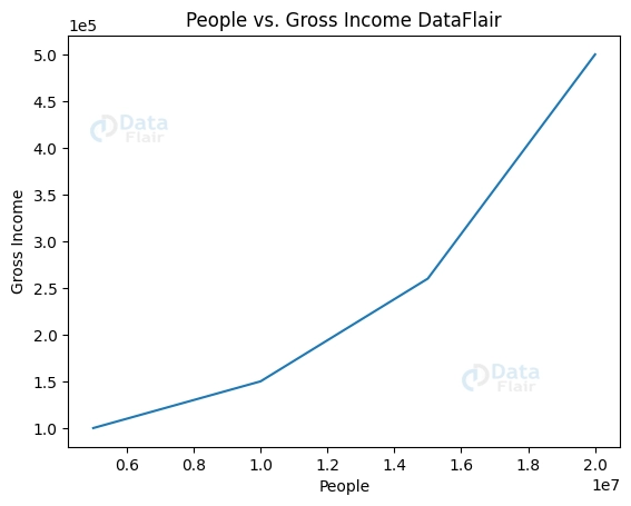
In this case, the x and y axes are formatted using the ScalarFormatter using plott.ticklabel_format(). With the style=’sci’ argument, Matplotlib is instructed to display values in scientific notation; the scilimits=(0, 0) option causes all tick labels to be shown in scientific notation as well.
The annotations and Labels in Subplots
Labels for Axis and Subplot Titles
Matplotlib’s subplots make it possible to include numerous plots into a single diagram, streamlining the process of comparing and contrasting various data points. Subplot names and labels improve readability and highlight key information that is distinct to each subplot.
Identifying and titling each subplot separately:
Subplot titles and labels may be customised with the help of set_title() and set_xlabel()/set_ylabel(). Using these techniques, we may customise the subplot titles, axis labels, and y-axis labels.
import matplotlib.pyplot as plott


figuree, axiss = plott.subplots(2)


axiss[0].plot([2, 4, 6, 8], [3, 12, 6, 9])
axiss[0].set(title='Subplot A', xlabel='X-axis', ylabel='Y-axis')


axiss[1].plot([2, 4, 6, 8], [3, 12, 6, 9])
axiss[1].set(title='Subplot B', xlabel='X-axis', ylabel='Y-axis')


figuree.suptitle('Customizing Subplots DataFlair')
plott.tight_layout()
plott.show()
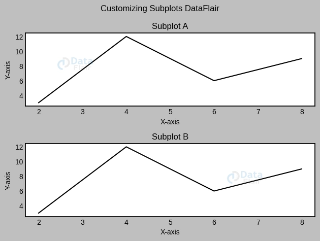
In this piece of code, we generate a subplot grid and name the axes, y-axes, and subplots. You may alter the content and the available formats to meet your needs.
Similarity in Axis Labelling
When many subplots utilise the same x- or y-axis, it might be more efficient to have a single label for that axis rather than multiple labels. Matplotlib enables us to reduce duplication and increase readability by reusing axis labels across several subplots.
Using the same axis labels for several charts at once: When creating subplots, the sharex and sharey options allow us to share axis labels. This guarantees that the subplots all use the same axis (and label) for their respective axes.
Conclusion
Annotations and labels in Matplotlib were the topics of this article, with a special emphasis on subplot titles, axis labels, and shared axis labels. We figured out how to personalise the appearance of the subplots, modify their attributes, and make axis labels that apply to several plots. The clarity and readability of our graphs may be improved by the strategic use of annotations and labels.
Don’t forget to try out new label styles, formats, and customisation choices as you continue to explore Matplotlib’s realm of data visualisation. You’ll be able to make graphs that convey your data insights clearly and aesthetically.