


Full Stack Web Development Courses with Real-time projects Start Now!!
In this article, you will learn about CSS Pseudo Elements. Let’s start with what is CSS Pseudo Elements.
What are CSS Pseudo Elements?
When a keyword is applied to a selector, you can style a particular area of both the individual samples using CSS pseudo-elements.
When a keyword is applied to a selector, it creates a CSS pseudo-element that allows you to design a particular area of the chosen element (s). For instance,::first-line may be used to alter the font of a paragraph’s first line.
A term that is utilised with a selector to specify the unique status of the selected items is known as a pseudo-class. In contrast to pseudo-classes, that are employed to style the entire element, quasi are used to style a certain portion of an element.
For instance, the very first letter or line of the an element can be styled using a pseudo-element. The content can be be added before or after an element using the pseudo-elements.
To style certain areas of an element, use a CSS pseudo-element. It can be utilized for instance to:
- The element’s initial letter or line in style
- Add content either before or after an element’s content.
Pseudo-elements are possibly one of the most profound elements of CSS as pseudo-elements enable the developer to change certain sections of an element without necessarily changing the HTML code. This is especially important when optimizing visually appealing designs of web pages while maintaining clean semantic HTML at the same time.
The pseudo-element syntax:
selector::pseudo-element {
property: value;
}
Classes and pseudo-elements in CSS
To style the exact element that has that class, the quasi can be used in conjunction with CSS classes. This serves as an illustration of a CSS class-based pseudo-element.
<html>
<head>
<style>
body{
text-align: center;
font-size: 30px;
}
h1.example::first-letter {
color: rgb(255,0,242);
font-size: 2cm;
font-family: Lucida Calligraphy;
}
</style>
</head>
<body>
<h1 class="example"> DataFlair </h1>
<h1 style="color:blue"> Hello World!!! </h1>
<h3> This serves as an illustration of a CSS class-based pseudo-element.</h3>
</body>
</html>
Output:

In this case, through the utilization of pseudo-elements, designers are in a better position of coming up with more elaborate interfaces. They allow you to add design elements like initial caps or your own tags for the list items but without introducing more HTML. This also enhances the maintainability of codes and helps simplify the html and other related files.
Singular colon (:) syntax is used in CSS1 and CSS2 for the both pseudo-elements and pseudo-classes. For backward compatibility, CSS1 and CSS2 pseudo-elements can use the single colon syntax.
While there are a number of CSS pseudo-elements, we will focus on some of the most popular ones. These are the most popular CSS pseudo-elements listed:
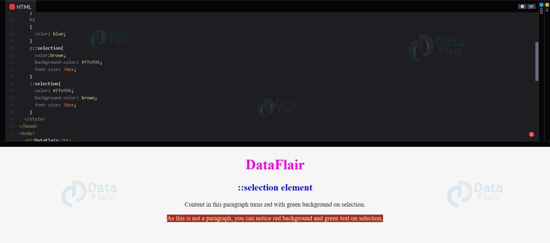
- selection: It is employed to pick the portion of an item that the user has chosen.
- first-line: The text’s opening line is styled.
- first-letter: It chooses the text’s first letter.
- after: It is employed to add something following the content of the element.
- before: It is employed to insert something prior to the content of the element.
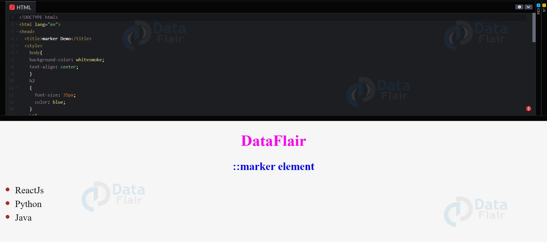
- marker: Pseudo-element chooses the list item’s marker box, which frequently has a punch or numeral. Any component or psuedo intellectual that is set to display can use it: list-items like the <summary> and <li> components
Selection Pseudo Element:
<!DOCTYPE html>
<html lang="en">
<head>
<title>selection Demo</title>
<style>
body{
background-color: whitesmoke;
text-align: center;
font-size: 20px;
}
h1
{
color: rgb(255,0,242);
font-size: 45px;
}
h2
{
color: blue;
}
p::selection{
color:brown;
background-color: #ffe996;
font-size: 30px;
}
::selection{
color: #ffe996;
background-color: brown;
font-size: 30px;
}
</style>
</head>
<body>
<h1>DataFlair</h1>
<h2>::selection element</h2>
<p>Content in this paragraph turns red with
green background on selection.</p>
<span>As this is not a paragraph, you can notice red
background and green text on selection.</span>
</body>
</html>
Output:
First-line Pseudo Element:
<html>
<head>
<style>
body{
text-align: center;
}
h1::first-line {
font-family: Lucida Calligraphy;
font-size: 3cm;
color: #a71a9f;
text-shadow: 5px 8px 9px #14d7d2;
}
</style>
</head>
<body>
<h1> DataFlair</h1>
<h2> Here is an illustration of the first-line pseudo-element. </h2>
</body>
</html>
Output:

First-letter Pseudo Element:
<html>
<head>
<style>
body{
text-align: center;
}
h1::first-letter {
font-family: Lucida Calligraphy;
font-size: 4cm;
color: #a71a9f;
text-shadow: 5px 8px 9px #14d7d2;
}
h1{
color: green;
font-size: 2cm;
}
</style>
</head>
<body>
<h1> DataFlair</h1>
<h2> Here is an illustration of the::first-letter pseudo-element.</h2>
</body>
</html>
Output:

After Pseudo Element:
<!DOCTYPE html>
<html>
<head>
<style>
body
{
text-align: center;
}
h1::after {
content: "\01F525";
}
</style>
</head>
<body>
<h1 style="color:rgb(255,0,242); font-size:40px">DataFlair</h1>
<p style="color:blue; font-size:25px">The::after pseudo-element adds content following an element's content.</p>
</body>
</html>
Output:

Before Pseudo Element:
<!DOCTYPE html>
<html>
<head>
<style>
body
{
text-align: center;
}
h1::before{
content: "\01F525";
}
</style>
</head>
<body>
<h1 style="color:rgb(255,0,242); font-size:60px">DataFlair</h1>
<p style="color:blue; font-size:45px">The::after pseudo-element adds content following an element's content.</p>
</body>
</html>
Output:

Marker Pseudo Element:
<!DOCTYPE html>
<html lang="en">
<head>
<title>marker Demo</title>
<style>
body{
background-color: whitesmoke;
text-align: center;
}
h2
{
font-size: 35px;
color: blue;
}
h1{
color: rgb(255,0,242);
font-size: 50px;
}
ul{
width: 40px;
font-size:30px;
}
ul li::marker{
color: brown;
font-size: 40px;
}
</style>
</head>
<body>
<h1>DataFlair</h1>
<h2>::marker element</h2>
<ul style="text-align:center">
<li>ReactJs</li>
<li>Python</li>
<li>Java</li>
</ul>
</body>
</html>
Output:
Conclusion
In this article, we get an overview of what pseudo elements are and the different ways to implement them. When using a pseudo-element, you can target or add an additional component without having to input further HTML.