


Full Stack Web Development Courses with Real-time projects Start Now!!
CSS Grid is a powerful layout system that allows web developers to create complex, multi-dimensional layouts with ease. It is a two-dimensional layout system that allows for more granular control over layout and positioning of elements on a web page.
In the past, developers had to use floats or positioning to achieve complex layouts, which often resulted in messy, hard-to-maintain code. CSS Grid simplifies this process by providing a set of tools that enable developers to create flexible and dynamic layouts that respond to different screen sizes and device orientations.
Another major strength that can be attributed to CSS Grids is the fact that it provides the user control over both the rows and the columns; something that conventional layout techniques have only been able to do one at a time. What makes it possible is the fact that it is a dual-dimensional approach whereby the developers can make designs as complex and flexible as they wish, without the need for nesting or recomputation.
Basic Terminology of CSS Grid
Before diving into the details of CSS Grid, it’s important to understand the basic terminology used in this system:
1. Grid Container: The parent element that contains all the grid items.
2. Grid Item: The child element that is placed inside the grid container.
3. Grid Line: The lines that separate the rows and columns of the grid.
4. Grid Cell: The space between two adjacent grid lines.
5. Grid Track: The space between two adjacent grid lines in either a row or a column.
6. Grid Area: The space between four grid lines that contains one or more grid items.
Example of CSS Grid: Properties
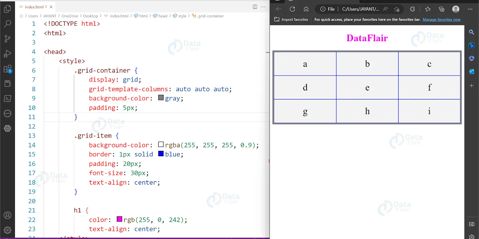
This illustration demonstrates how to use the display: grid; property
<!DOCTYPE html>
<html>
<head>
<style>
.grid-container {
display: grid;
grid-template-columns: auto auto auto;
background-color: gray;
padding: 5px;
}
.grid-item {
background-color: rgba(255, 255, 255, 0.9);
border: 1px solid blue;
padding: 20px;
font-size: 30px;
text-align: center;
}
h1 {
color: rgb(255,0,242);
text-align: center;
}
</style>
</head>
<body>
<h1>DataFlair</h1>
<!-- Grid -->
<div class="grid-container">
<div class="grid-item">a</div>
<div class="grid-item">b</div>
<div class="grid-item">c</div>
<div class="grid-item">d</div>
<div class="grid-item">e</div>
<div class="grid-item">f</div>
<div class="grid-item">g</div>
<div class="grid-item">h</div>
<div class="grid-item">i</div>
</div>
</body>
</html>
Output:
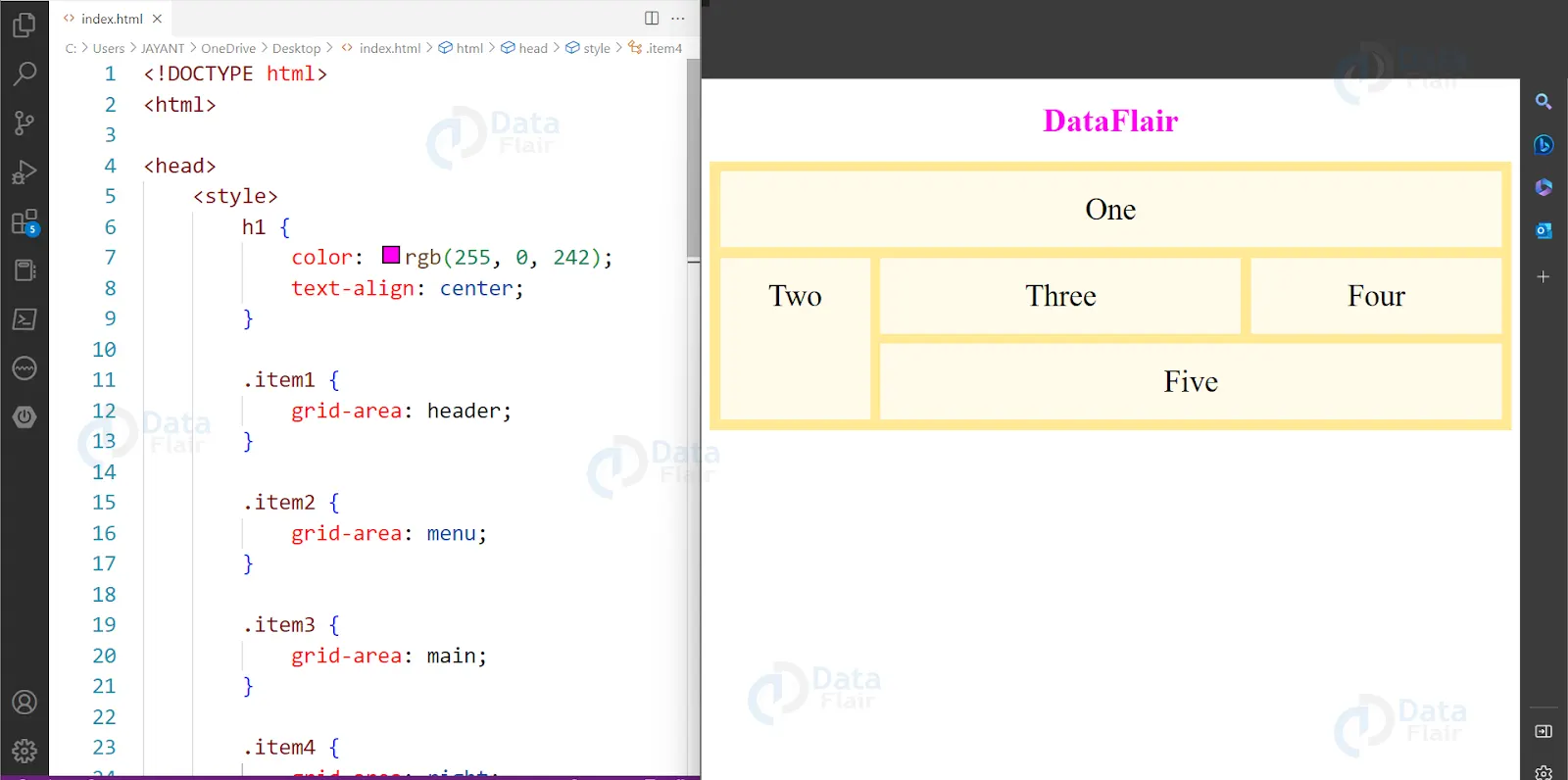
<!DOCTYPE html>
<html>
<head>
<style>
h1
{
color: rgb(255,0,242);
text-align: center;
}
.item1 { grid-area: header; }
.item2 { grid-area: menu; }
.item3 { grid-area: main; }
.item4 { grid-area: right; }
.item5 { grid-area: footer; }
.grid-container {
display: grid;
grid-template-areas:
'header header header header header header'
'menu main main main right right'
'menu footer footer footer footer footer';
gap: 10px;
background-color: #ffe996;
padding: 10px;
}
.grid-container > div {
background-color: rgba(255, 255, 255, 0.8);
text-align: center;
padding: 20px 0;
font-size: 30px;
}
</style>
</head>
<body>
<h1>DataFlair</h1>
<div class="grid-container">
<div class="item1">One</div>
<div class="item2">Two</div>
<div class="item3">Three</div>
<div class="item4">Four</div>
<div class="item5">Five</div>
</div>
</body>
</html>
Output:
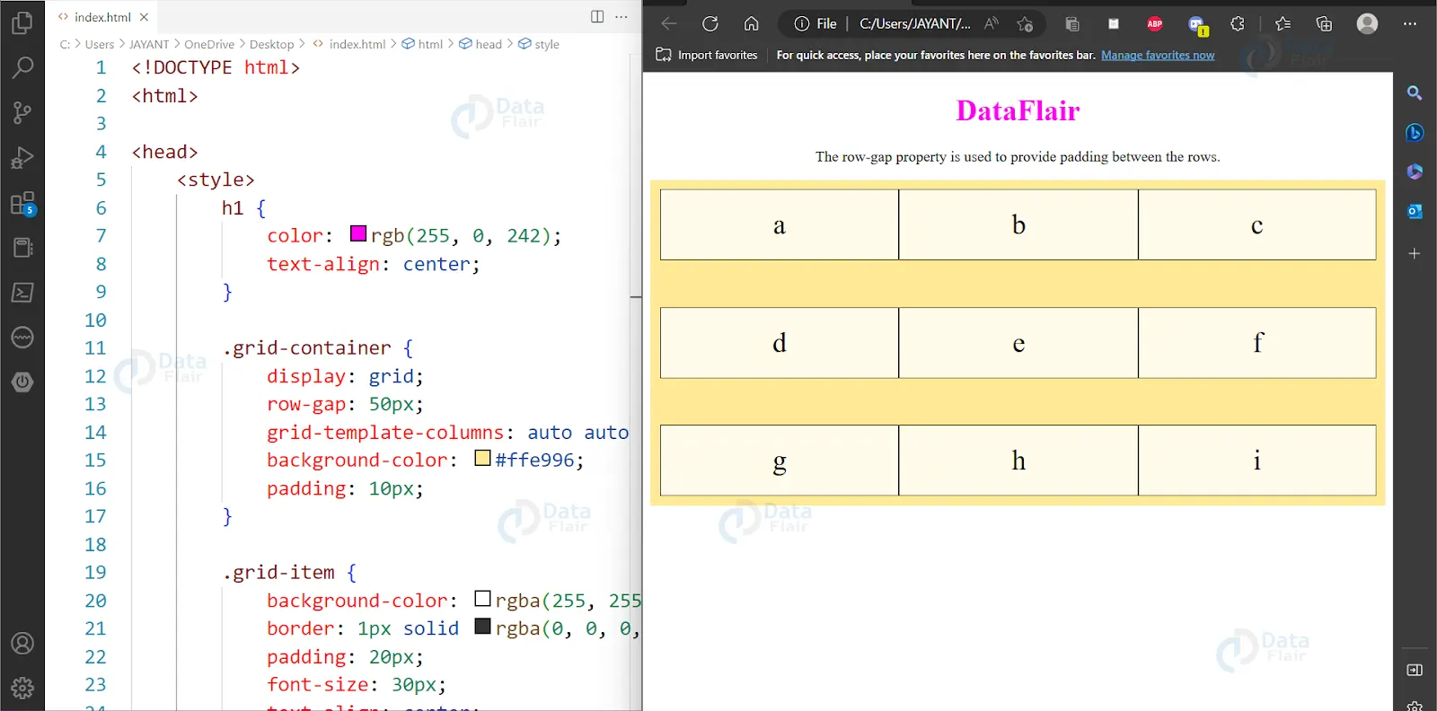
Row grid in CSS
The parts that make up a grid are composed of rows.
While the default behavior of CSS Grid is to create a two-dimensional grid, it’s also possible to create a row grid. This is useful when you want to lay out content in a single row, rather than in a grid with multiple rows and columns.
To create a row grid, you need to set the display property of the grid container to grid, and then set the grid-auto-flow property to column. This tells the grid to flow items into columns, rather than rows.
<!DOCTYPE html>
<html>
<head>
<style>
h1
{
color:rgb(255,0,242);
text-align: center;
}
.grid-container {
display: grid;
row-gap: 50px;
grid-template-columns: auto auto auto;
background-color: #ffe996;
padding: 10px;
}
.grid-item {
background-color: rgba(255, 255, 255, 0.8);
/* you can choose any bg color for your DataFlair Row grid */
border: 1px solid rgba(0, 0, 0, 0.8);
/* you can choose any bg color for your DataFlair Row grid */
padding: 20px;
font-size: 30px;
text-align: center;
}
</style>
</head>
<body>
<h1>DataFlair</h1>
<p style="text-align:center">The row-gap property is used to provide padding between the rows.</p>
<div class="grid-container">
<div class="grid-item">a</div>
<div class="grid-item">b</div>
<div class="grid-item">c</div>
<div class="grid-item">d</div>
<div class="grid-item">e</div>
<div class="grid-item">f</div>
<div class="grid-item">g</div>
<div class="grid-item">h</div>
<div class="grid-item">i</div>
</div>
</body>
</html>
Output:
CSS Column Grid
The vertical lines that comprise up grid elements are called columns.
While CSS Grid can be used to create both row and column grids, it is often used to create column grids. Column grids are useful for laying out content in a single column, with items flowing into rows as needed.
To create a column grid, you need to set the display property of the grid container to grid, and then set the grid-auto-flow property to row. This tells the grid to flow items into rows, rather than columns.
<!DOCTYPE html>
<html>
<head>
<style>
h1
{
color:rgb(255,0,242);
text-align: center;
}
.grid-container {
display: grid;
column-gap: 50px;
grid-template-columns: auto auto auto;
background-color: #ffe996;
padding: 10px;
}
.grid-item {
background-color: rgba(255, 255, 255, 0.8);
/* you can choose any bg color for your DataFlair Columns grid */
border: 1px solid rgba(0, 0, 0, 0.8);
/* you can choose any bg color for your DataFlair Columns grid */
padding: 20px;
font-size: 30px;
text-align: center;
}
</style>
</head>
<body>
<h1>DataFlair</h1>
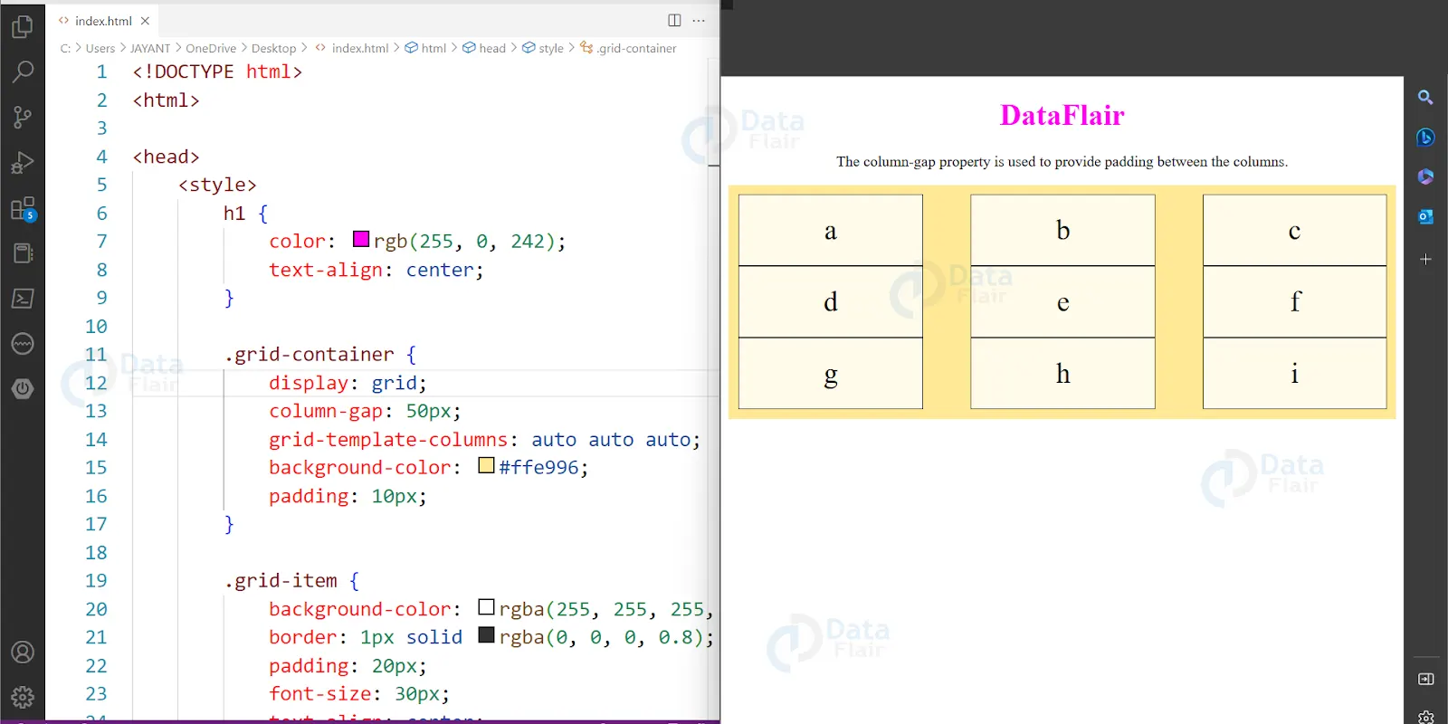
<p style="text-align:center">The column-gap property is used to provide padding between the columns.</p>
<div class="grid-container">
<div class="grid-item">a</div>
<div class="grid-item">b</div>
<div class="grid-item">c</div>
<div class="grid-item">d</div>
<div class="grid-item">e</div>
<div class="grid-item">f</div>
<div class="grid-item">g</div>
<div class="grid-item">h</div>
<div class="grid-item">i</div>
</div>
</body>
</html>
Output:
CSS Grid Holes
Gaps are the spaces that exist between each column or row.
The row-gap and column-gap characteristics can be referred to collectively as the gap property. Grid holes can be useful for creating unique and interesting layouts. For example, you might want to create a layout where certain grid items overlap or are positioned in a non-uniform way. To do this, you can intentionally create holes in your grid container.
To create Grid holes, you can use the grid-template-areas property. This property allows you to define named grid areas, which can be left empty to create holes in the grid.
<!DOCTYPE html>
<html>
<head>
<style>
h1
{
color:rgb(255,0,242);
text-align: center;
}
.grid-container {
display: grid;
gap: 50px;
grid-template-columns: auto auto auto;
background-color: #ffe996;
padding: 10px;
}
.grid-item {
background-color: rgba(255, 255, 255, 0.8);
/* you can choose any bg color for your DataFlair grid holes */
border: 1px solid rgba(0, 0, 0, 0.8);
/* you can choose any size and border color for your DataFlair grid holes*/
padding: 20px;
font-size: 30px;
text-align: center;
}
</style>
</head>
<body>
<h1>DataFlair</h1>
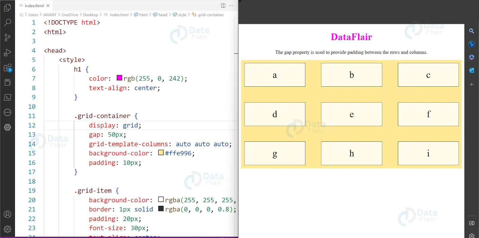
<p style="text-align:center">The gap property is used to provide padding between the rows and columns.</p>
<div class="grid-container">
<div class="grid-item">a</div>
<div class="grid-item">b</div>
<div class="grid-item">c</div>
<div class="grid-item">d</div>
<div class="grid-item">e</div>
<div class="grid-item">f</div>
<div class="grid-item">g</div>
<div class="grid-item">h</div>
<div class="grid-item">i</div>
</div>
</body>
</html>
Output:
Example:
<!DOCTYPE html>
<html>
<head>
<style>
/* Designing all grid */
.grid-container {
display: grid;
grid-template-columns: auto auto auto;
grid-gap: 10px;
background-color: brown;
padding: 10px;
}
/* Designing all grid-items */
.grid-container > div {
background-color: #ffe996;
text-align: center;
padding: 20px 0;
font-size: 30px;
}
/* Grid Column */
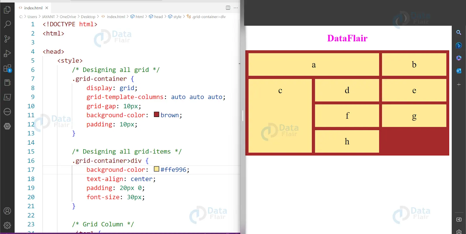
.item1 {
grid-column-start: 1;
grid-column-end: 3;
}
.item3 {
grid-row-start: 2;
grid-row-end: 5;
}
h1 {
color: rgb(255,0,242);
text-align: center;
}
</style>
</head>
<body>
<h1>DataFlair</h1>
<div class="grid-container">
<div class="item1">a</div>
<div class="item2">b</div>
<div class="item3">c</div>
<div class="item4">d</div>
<div class="item5">e</div>
<div class="item6">f</div>
<div class="item7">g</div>
<div class="item8">h</div>
</div>
</body>
</html>
Output:
Benefits of CSS Grid
There are many benefits to using CSS Grid for layout, including:
1. Flexibility: CSS Grid enables developers to create highly flexible and adaptable layouts. These can adjust to different screen sizes and device orientations.
2. Granular Control: CSS Grid provides a high degree of control over layout and positioning, allowing developers to create complex, multi-dimensional layouts with ease.
3. Accessibility: CSS Grid can improve the accessibility of web content by making it easier to create responsive layouts that work well with assistive technologies like screen readers.
4. Simplified Code: CSS Grid simplifies the code required to create complex layouts. This reduces the need for workarounds like floats and positioning.
5. Improved Performance: By reducing the complexity of layout code, CSS Grid can help improve the performance of web pages, making them load faster and run more smoothly.
CSS Grid also has good flexibility that easily supports some of the modern web design approaches, for instance, the mobile-first design. Thus, the adaptive image grid can be built with the help of grid-template-areas, which along with media queries allow developers to create responsive and device-oriented layouts. It leads to harmony while creating a more effective interface which is convenient for every user across the platforms.
Conclusion
There have been numerous ways to tackle this layout over the years. But CSS grid makes it not only relatively simple but also gives you a wide range of possibilities. Grid is perfect for this type of layout because it excels at fusing the control that external sizing offers with the adaptability of intrinsic sizing.
Grid is a layout technique made specifically for two-dimensional content, which explains why. That is, arranging items in both columns and rows at once.
We construct a grid with columns and rows while making a grid layout. Then you either arrange items on that grid manually or leave it up to the browser to automatically place them in the cells you’ve defined. Grid has a lot to offer, but with a quick review, you’ll be creating grid layouts with no time.