


Full Stack Web Development Courses with Real-time projects Start Now!!
When it comes to web design, adding movement and interactivity can greatly enhance the user experience. CSS 2D transform provides a simple yet powerful way to manipulate elements on a webpage in a variety of ways, including rotation, scaling, skewing, and translating. In this article, we’ll explore the basics of CSS 2D transforms, provide some examples, and show you how to implement them in your own web projects.
CSS 2D transforms are not only aesthetic to implement to a page, but also add to the real-world interaction of the page. Considered in such a manner, these transforms help developers build highly engaging interfaces that are sensitive to users’ interactions.
The major advantage of such transforms is that they potentially provide for a smoother animation and transition in contrast to the solution based on JavaScript.
CSS transforms use hardware acceleration, which ensures that the frame rate is high and the CSS animation lags. This performance efficiency is particularly important for generating intricate animations and other features that will enhance the webpage’s aesthetics, yet not hinder its general promptness.
Understanding CSS 2D Transform
CSS 2D transforms allow you to modify the position, size, and shape of elements on your webpage in two dimensions. You can use a variety of transform functions to achieve different effects, including:
1. Translate: This function moves an element along the x and y axes. To move an element along one or both axes, use translateX() and translateY() for one axis or translate() for both axes at once.
2. Scale: This function changes the size of an element. You can use the scaleX() and scaleY() functions to scale an element along one axis at a time, or the scale() function to scale an element along both axes simultaneously.
3. Rotate: This function rotates an element around a specified point. You can use the rotate() function to rotate an element by a specified number of degrees.
4. Skew: This function skews an element along the x and y axes. Use skewX() and skewY() to skew an element along one axis or skew() to skew along both axes at once.
CSS 2D Transform Examples
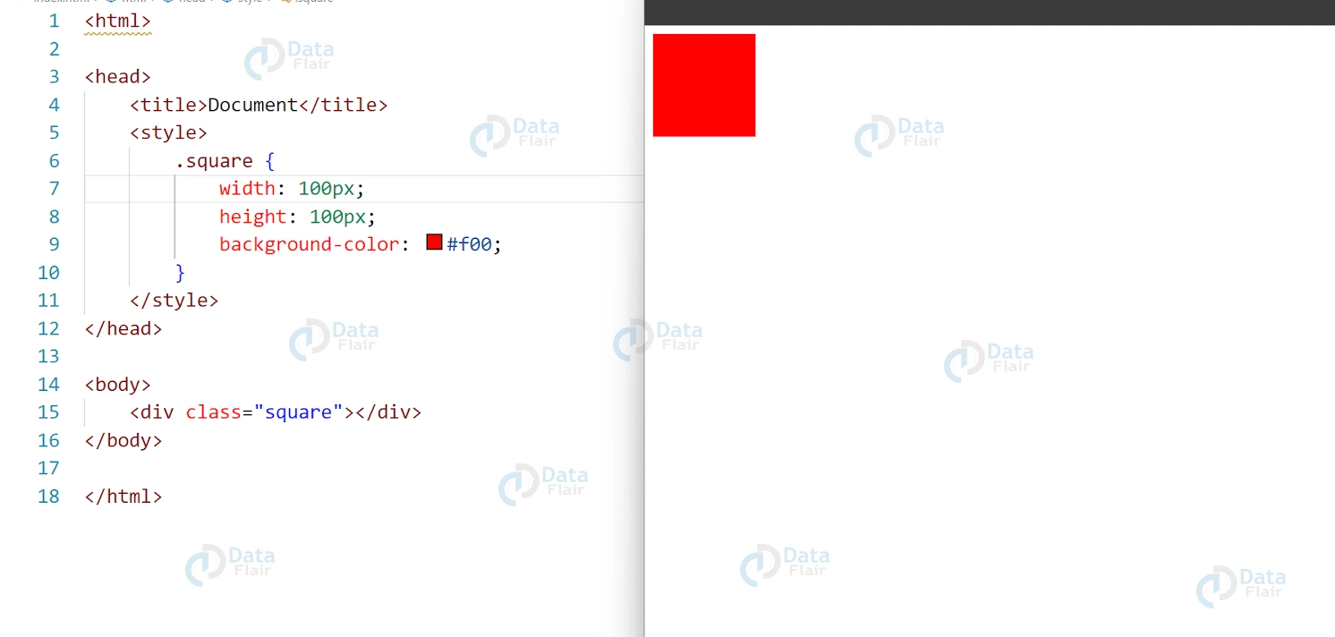
Let’s take a look at some examples of CSS 2D transforms in action. Here’s the HTML and CSS code for a simple square element that we’ll use in our examples:
HTML:
<div class="square"></div>
CSS:
.square {
width: 100px;
height: 100px;
background-color: #f00;
}
Output:
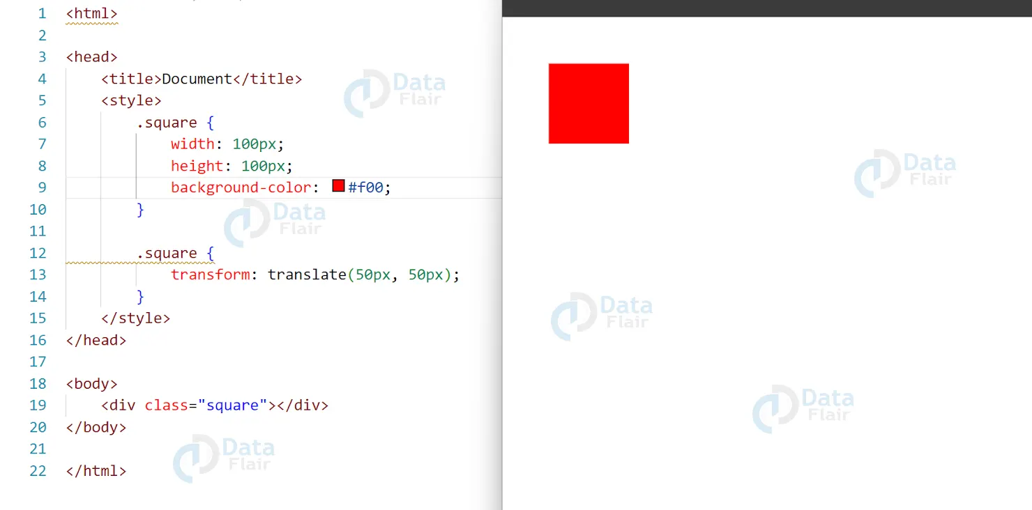
CSS Translate Example
In this example, we’ll use the translate() function to move our square element 50 pixels to the right and 50 pixels down.
HTML:
<div class="square"></div>
CSS:
.square {
width: 100px;
height: 100px;
background-color: #f00;
}
.square {
transform: translate(50px, 50px);
}
Output:
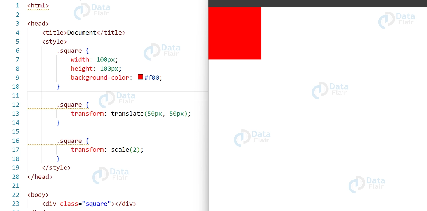
CSS Scale Example
In this example, we’ll use the scale() function to double the size of our square element.
CSS
.square {
transform: scale(2);
}
Output:
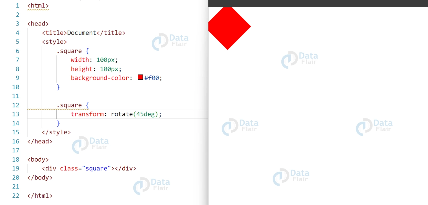
CSS Rotate Example
CSS
.square {
transform: rotate(45deg);
}
Output:
CSS Skew Example
CSS:
.square {
transform: skew(30deg, 30deg);
}
Output:

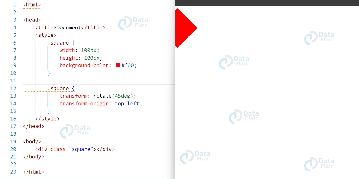
CSS Transform Origin
The transform-origin determines the point around which an element is transformed. By default, the transform-origin is set to the center of an element. However, you can modify the transform-origin using the transform-origin property.
CSS
.square {
transform: rotate(45deg);
transform-origin: top left;
}
Output
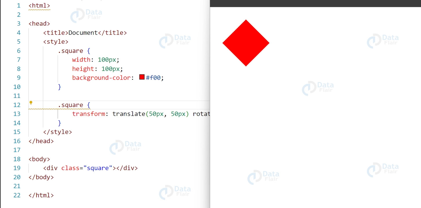
CSS Combining Transforms
You can combine multiple transforms by separating them with a space.
CSS
.square {
transform: translate(50px, 50px) rotate(45deg);
}
Output:
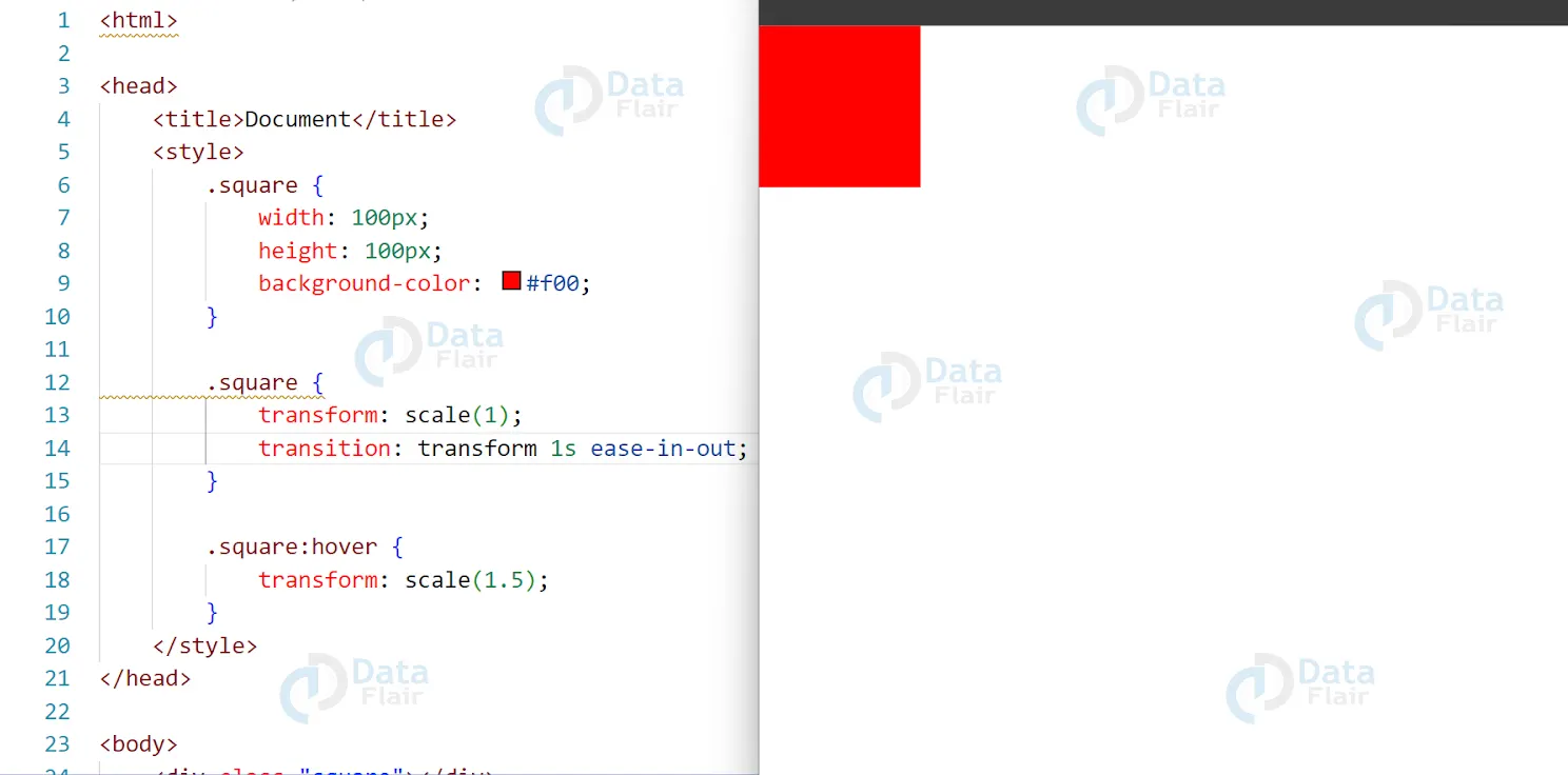
CSS Transitioning Transforms
You can apply transitions to transforms using the transition property. This allows you to create smooth animations as an element is transformed
CSS:
.square {
transform: scale(1);
transition: transform 1s ease-in-out;
}

.square:hover {
transform: scale(1.5);
}
Output:
2D transform method in CSS
2D transform methods in CSS are used to manipulate the position, size, and shape of HTML elements on a 2D plane. There are several types of 2D transform methods available in CSS, including:
1. translate() – moves an element in a given direction along the x and/or y-axis
2. rotate() – rotates an element around a given point
3. scale() – increases or decreases the size of an element along the x and/or y-axis
4. skew() – skews an element along the x and/or y-axis
5. matrix() – combines multiple transformations into a single transformation
These 2D transform methods are often used together to create more complex transformations and animations. They can be applied to individual elements or to groups of elements and can be used to create a wide range of visual effects on a web page.
Accessibility concerns in CSS 2D Transforms
CSS 2D Transforms, when used improperly, can create accessibility concerns for users who rely on assistive technologies to access web content. Here are some of the key accessibility concerns to keep in mind when using CSS 2D Transforms:
1. Visual distraction: Animations and transitions created using 2D Transforms can be visually distracting for some users, especially those with cognitive or neurological disabilities.
2. Motion sensitivity: Some users are sensitive to motion and can experience motion sickness or vertigo when exposed to certain types of animations or transitions.
3. Focus management: When elements are transformed using CSS 2D Transforms, the focus order may change, making it difficult for users who rely on keyboard navigation to interact with the page.
4. Screen reader compatibility: CSS 2D Transforms may not be fully compatible with screen readers and other assistive technologies, making it difficult for some users to access and understand the content.
To address these accessibility concerns, it’s important to use CSS 2D Transforms judiciously and to provide users with options to control or disable animations and transitions if necessary. It’s also important to test your designs with assistive technologies to ensure that they are fully accessible to all users.
Conclusion
CSS 2D transforms are a powerful tool for adding movement and interactivity to your web designs. By using functions such as translate(), scale(), rotate(), and skew(), you can manipulate the position, size, and shape of elements on your webpage. By combining transforms and applying transitions, you can create eye-catching designs that enhance the user experience. Experiment with different transform functions and values to create unique and engaging web designs.